Concept
I wanted to make an experience that wasn’t just a sketch but a narrative. What I had in mind was an interactive exploration of the human body and its hidden stories. Think of it as stepping into a cyberpunk scanner; each part of the body reveals a facet of personality and capability. The head sparks ideas, the heart pulses with emotion, hands create, and legs propel forward. The inspiration was from a portfolio website, where instead of convnetional text boxes, there is skeleton and you scroll into it with a zooming effect. Any part you scroll into, the attribitues of it a revealed. This could be tranformed to a mulitfold story telling from a basic achievement deck.
The journey begins with a “scan in progress” message, setting a cinematic tone. Clicking on any part of the body leads the user deeper into the system. Images, sound, and written text combine to create a multi-sensory experience
How it Works
The backbone of the project is OOP. Each body part is represented by a BodyPart object, which stores its position, clickable area, description, associated image, and sound. This modular approach made the project easy to maintain and extend.
class BodyPart {
  constructor(name, xRatio, yRatio, r, info, soundName) {
    this.name = name; // e.g., "head"
    this.xRatio = xRatio; // relative horizontal position
    this.yRatio = yRatio; // relative vertical position
    this.r = r; // clickable radius
    this.info = info; // description text
    this.soundName = soundName; // linked sound effect
  }

  get x() { return width * this.xRatio; }
  get y() { return height * this.yRatio; }

  clicked() {
    let d = dist(mouseX, mouseY, this.x, this.y);
    if (d < this.r / 2) {
      currentPart = this;
      state = "part";
      playSound(this.soundName);
    }
  }
}
The sketch scales dynamically to fullscreen. The portrait, interactive zones, and text all resize proportionally, making it consistent across resolutions.
Another highlight is the typewriter text effect with blinking cursor, inspired by coding interfaces in movies. It gives the impression that the system is alive and responding in real time. Neon panels and glitch text effects reinforce the cyberpunk aesthetic, enhancing immersion.
The core working of the skethc in the potrait. Every body part has its own personality and story. Clicking triggers an image, descriptive text, and sound effect. As for now I have made 5 interactable part which are
-
- Head.
- Heart
- Ears
- Hands
- Legs
Coding Highlights
The sketch includes animated rain, interactive portrait, and Dynamic Typewriter Text.
function drawRain() {
  stroke(0, 255, 255);
  strokeWeight(2);
  for (let drop of rain) {
    line(drop.x, drop.y, drop.x, drop.y + 12);
    drop.y += drop.speed;
    if (drop.y > height) {
      drop.y = 0;
      drop.x = random(width);
    }
  }
}
The combination of visuals, interactivity, and sound was a technical challenge but creates a unified, immersive experience.
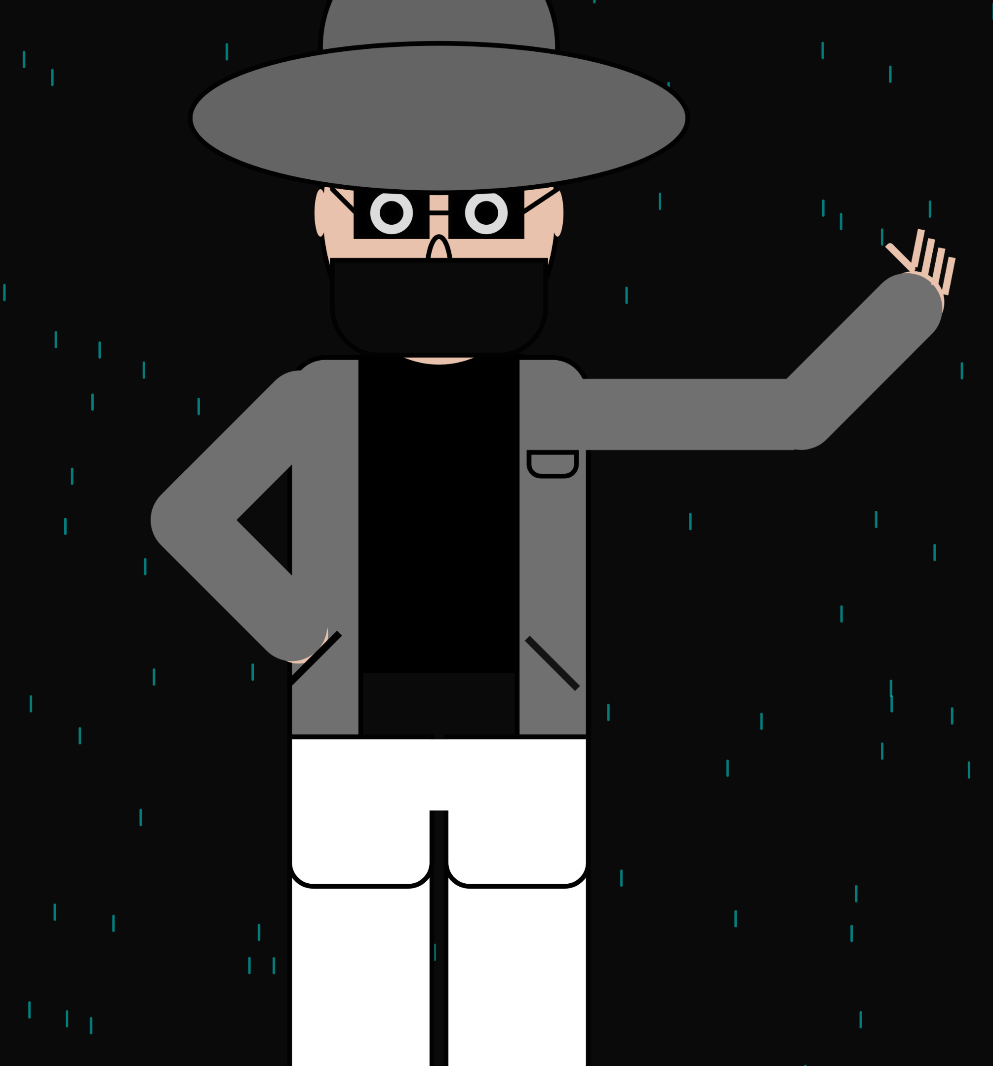
Screenshot
The Potrait

For the remaining screenshots, I am leaving them out of the post so that they can discoverd along with their sounds in the sketch
Challenges & Lessons Learned
Building this project was a journey in itself. I ran into mutlpiple issues like assets failing to load, the portrait wouldn’t render properly in fullscreen, and the rain would appear but stay static I solved these by:
- Ensuring preloading of images and sounds with reasonable file sizes. I found out that p5,js doesn;t let me upload files wiht more tha 5mb so i had to look for small loopable audios instead of voiceovers
- Using relative positioning and scaling for the portrait and body parts. I didn’t considered this to be a problem but when I had a few constant moving elements i.e. rain and typewriting. I had to fix it by keeping track of orignal window size
Areas for future improvement:
- Animated transitions
- Custom portrait illustrations
- Additional hover and sound effects
- Expand body part descriptions with deeper storytelling
AI Usage
AI partiulary helped in developing my potrait. I helped me keep track on of my origin point as I have used multiple rotations init. I believe I could achieve the same reuslt by hit and trial but that would have consumed a lot more time. Another place where AI was helpful was the additon of neon panel. It added a major asthetic to the project. lastly I tried using AI to add comments but they were mostly generaic and self explanatory from the code. So, I decided to leave them out. Generally I didn’t use AI to write a lot of code for me but keep track of the moving elements. As shifting screen sizes did prove to be a challenge. Most cases I noticed that I have been using a lot of variable to keep track of previous states but AI came up with calculations like
typewriterText(intro, windowWidth/2-100, windowHeight*0.3, windowWidth*0.4, LEFT);
to save memory. This did add on to the tidiness of code eventually
Conclusion
This project is both technical and artistic; a small interactive narrative exploring human form, identity, and emotion. Each element, from clickable body parts to typewriter text, contributes to a cohesive experience. The goal was immersion: to make the user feel like they are interacting with a living digital system rather than a static sketch specially with sounds and texts.