Concept
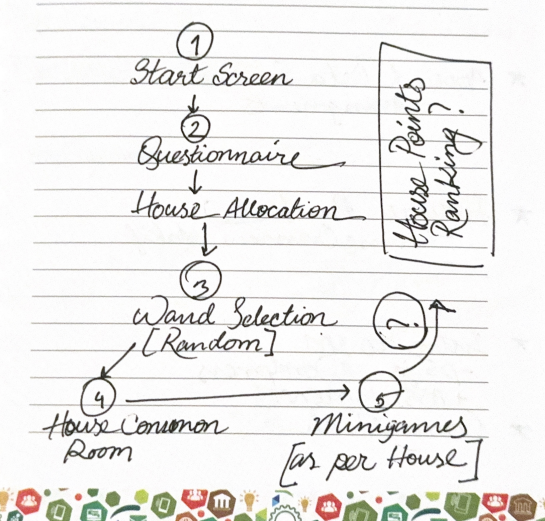
Hogwarts Experience is an interactive web experience inspired by the whimsical world of Hogwarts.
It blends a classic sorting quiz, a maze challenge, and wand selection into one compact game built entirely in JavaScript (using p5.js).
The idea was to explore how storytelling, visuals, and interactivity could merge to create something that feels alive; something more than just a quiz or a mini-game.
Inspiration
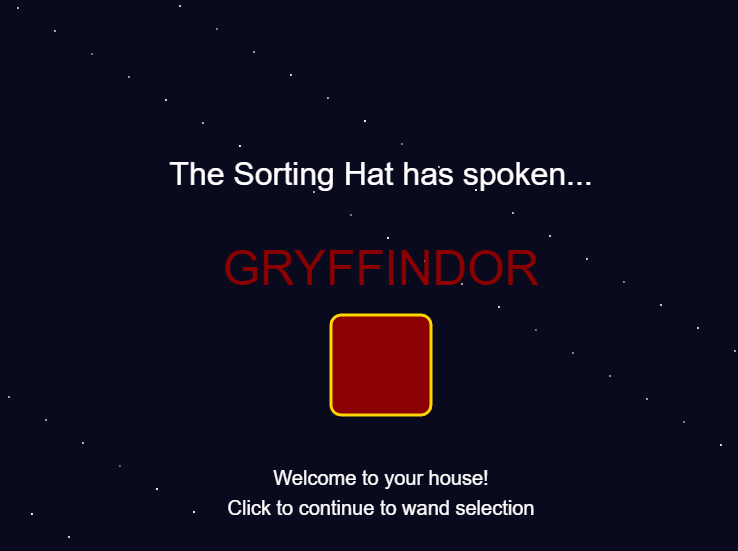
From my fascination of JK Rowling’s use of symbols (a hat, a house, wand) in Harry Potter explores identity and choice. I wanted to capture that feeling of “who am I?” in a lightweight browser experience.
Technically, this project was also a personal experiment:
how far can I go with only vanilla p5.js, with minimal frameworks and assets, what be drawn or generated?
Visual Elements
The visuals are all hand-coded with p5.js shapes and color palettes chosen to reflect the four houses:
- Gryffindor: warm reds and golds, courage in motion
- Ravenclaw: deep blues and calm precision
- Hufflepuff: mellow yellows and earthy tones
- Slytherin: sleek greens and silvers, a hint of ambition
[I got the color codes from codepen.io]
The wand selection features small glowing particle bursts when you find your correct match, a simplified particle system I built directly into the Wand class.
It’s minimal but expressive: circles of light that rise and fade like sparks from Ollivander’s wand shop.
Interaction & Controls
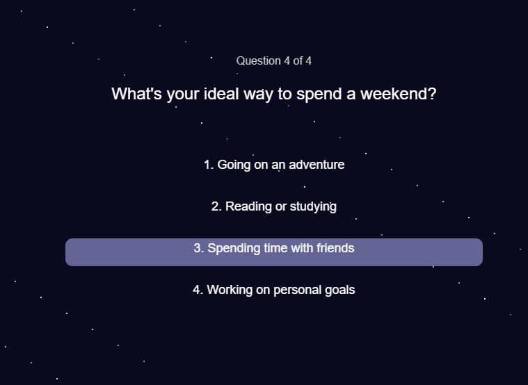
- The quiz is fully clickable — each answer dynamically updates your house “weight.”
- Once sorted, you navigate a small maze using arrow keys (or WASD).
- You can activate your house ability with a single keypress (spacebar).
- The wand test responds to clicks, showing visual feedback for correct or incorrect matches.
Each stage was designed to feel self-contained but connected, a simple rhythm of choice, discovery, and action.
Sound Design
Sound is subtle but intentional.
A soft background theme plays during the game, punctuated by short cues:
- a shimmer when your wand responds,
- a gentle whoosh for movement,
- a celebratory chime when you win,
- and scary dementor sound when you fail to exit the maze.
All sound events are managed with a simple sound registry that starts, stops, and restarts based on player state. I tried to get rid of any overlaps or chaos. I wanted it to add atmosphere without overwhelming the visuals.
Code Architecture
The game is built around a few modular classes:
- Question → handles quiz text, answers, and house mapping
- Player → manages movement, collision, and ability us
- Enemy → manages the enemies in the maze
- Wand → merges wand logic and particle effects for magical feedback
- GameManager (lightweight) → controls flow between quiz, wand test, and maze
Each class does one job well.
The code favors clarity over complexity; the division into classes make it readable, flexible, and easily expandable.
Code Snippet to Highlight
test() {
    if (this.isCorrect) {
        this.glowing = true;
        for (let i = 0; i < 20; i++) {
            this.particles.push({
                x: this.x,
                y: this.y,
                vx: random(-3, 3),
                vy: random(-5, -1),
                life: 60,
                success: true
            });
        }
        return true;
    } else {
        for (let i = 0; i < 10; i++) {
            this.particles.push({
                x: this.x,
                y: this.y,
                vx: random(-3, 3),
                vy: random(-5, -1),
                life: 60,
                success: false
            });
        }
        return false;
    }
}
It’s small, but it brings the world to life, literally adding a sparkle of magic when you choose correctly.
Future Additions
- Better sprites & art direction: hand-drawn assets for characters, wands, and the maze walls
- Fullscreen adaptive display: scaling visuals gracefully across devices
- House competition system: each player’s score stored via browser cookies or
localStorage, allowing a shared “House Points” leaderboard
- Integration with ml5.js: experimenting with emotion or gesture recognition to let your facial expression or hand movement influence sorting outcomes
Each of these is a small step toward a more responsive, immersive experience, a bit closer to real enchantment.