
Sketch
The Concept
I wanted to make something that felt exciting and had that arcade game tension where you’re always on edge. The idea came from thinking about those old falling-object games, but I wanted to add my own twist, for example, what if the game itself reacted to how much time you have left? What if it got harder as you played? And what if the music changed when things got intense? So Nebula Chase became this space game where you’re flying through a nebula collecting stars while dodging bombs. Simple concept, but I put a lot of work into making it feel engaging.
The Game in Action
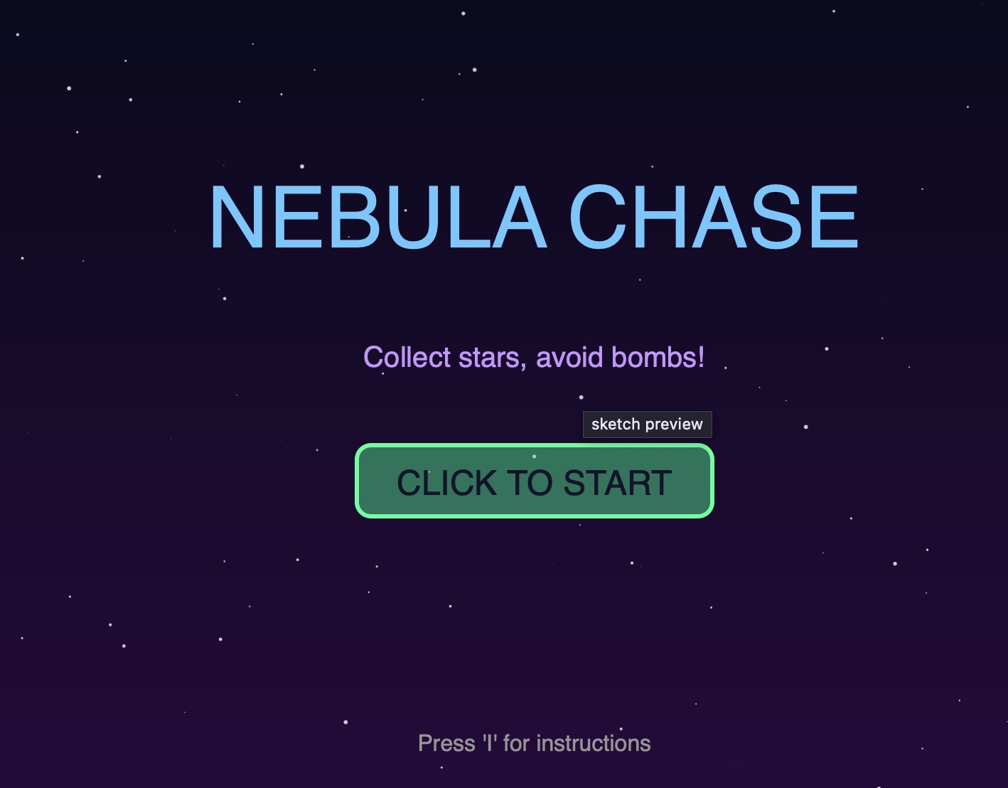
Start Screen:
Gameplay:
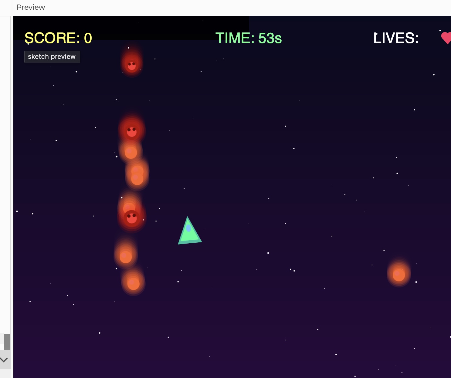
Once you’re playing, the screen gets busy very fast. Yellow stars fall down, those are the good ones, and red bombs come at you too. Your ship follows your mouse, and you will have only 60 seconds to grab as many stars as possible without hitting bombs. The UI at the top shows your score, timer, and lives. I made the timer turn red and the whole screen flash when you’re under 10 seconds.
Object-Oriented Design
I used three classes to organize everything:
- Star Class
-
class Star {
  constructor() {
    this.x = random(width);
    this.y = random(-600, -50);
    this.speed = random(2, 4) * difficulty;
    this.wobble = random(TWO_PI);
  }

  move() {
    this.y += this.speed;
    this.wobble += 0.05;
    if (this.y > height + 50) {
      this.y = -50;
      this.x = random(width);
    }
  }

  display() {
    push();
    translate(this.x + sin(this.wobble) * 10, this.y);
    tint(255, tintAmount, tintAmount);
    image(starImg, -20, -20);
    pop();
  }
}
Each star wobbles side to side as it falls which makes them really hard to catch. The speed multiplies by the difficulty variable, so as the game goes on, everything gets faster and it makes everything harder for the user.
- Bomb Class – The obstacles
class Bomb {
  constructor() {
    this.x = random(width);
    this.y = random(-600, -50);
    this.speed = random(3, 5) * difficulty;
    this.rotation = 0;
    this.pulsePhase = random(TWO_PI);
  }

  move() {
    this.y += this.speed;
    this.rotation += 0.05;
    this.pulsePhase += 0.1;
    if (this.y > height + 50) {
      this.y = -50;
      this.x = random(width);
    }
  }

  display() {
    push();
    translate(this.x, this.y);
    rotate(this.rotation);
    let pulseSize = 1 + sin(this.pulsePhase) * 0.15;
    scale(pulseSize);
    image(bombImg, -22, -22);
    pop();
  }
}
I made the bombs rotate and pulse to make them feel dangerous. They also move slightly faster than stars on average, which created the pressure for the player.
- Particle Class
class Particle {
  constructor(x, y, col) {
    this.x = x;
    this.y = y;
    this.vx = random(-3, 3);
    this.vy = random(-3, 3);
    this.life = 255;
    this.col = col;
  }

  update() {
    this.x += this.vx;
    this.y += this.vy;
    this.vy += 0.1;  // Gravity
    this.life -= 5;
  }

  display() {
    fill(red(this.col), green(this.col), blue(this.col), this.life);
    ellipse(this.x, this.y, this.size);
  }
}
Whenever you collect a star or hit a bomb, it creates approx 15 particles that spray out in random directions. They fade out over time and fall slightly from gravity. I made this just to make the interactions feel way more satisfying.
The Spaceship:
I didn’t want to use basic shapes for everything, so I made custom graphics using p5’s createGraphics():
playerImg = createGraphics(60, 60);
// Outer glow
playerImg.fill(0, 255, 200, 100);
playerImg.triangle(30, 5, 10, 50, 50, 50);
// Main body
playerImg.fill(0, 255, 150);
playerImg.triangle(30, 10, 15, 45, 45, 45);
// Cockpit detail
playerImg.fill(100, 200, 255);
playerImg.ellipse(30, 25, 8, 12);
Since to come up with this code was very challenging for me, I used these resources to help me navigate:
https://www.deconbatch.com/2022/01/blendmode-add.html
https://www.youtube.com/watch?v=pNDc8KXWp9E
As you can see the stars and bombs have this glowing effects because I drew multiple overlapping circles with decreasing opacity to create that glow. The stars are yellow or white and the bombs are red with a darker center that kind of looks like a skull. 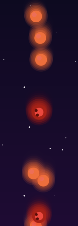
The code I’m proud of:
It is definitely the sound system since I didn’t want to just upload the mp3 because I didn’t find the suitable one. So, I decided to generate it myself , that’s the reason why I spent a lot of time on it.
function updateBackgroundMusic() {
  if (timer > 10) {
    // Calm ambient music
    bgMusic.amp(0.15, 0.5);
    bgMusic.freq(220 + sin(frameCount * 0.02) * 20);
    bassLine.amp(0.1, 0.5);
    urgentMusic.amp(0, 0.5);
  } else {
    // DRAMATIC URGENT MUSIC FOR FINAL 10 SECONDS
    bgMusic.amp(0.05, 0.3);
    urgentMusic.amp(0.25, 0.3);
    urgentMusic.freq(110 + sin(frameCount * 0.1) * 30);
    bassLine.amp(0.2, 0.3);
  }
}
For most of the game you hear this calm wave that wavers slightly (that’s the sin(frameCount * 0.02) * 20 part, it creates a slow sound in pitch). There’s also a quiet bass line. But when you hit 10 seconds left the music completely changes. The bass gets louder and the calm music fades. I just wanted to make feel the pressure for the user.
Reflection
I’m really happy with how this game turned out. The music transition at 10 seconds is probably my favorite part because it genuinely makes the game feel more intense and interesting. The particle effects were also surprisingly easy to implement but it added so much to the feel of the game. The biggest thing I learned was about game balance. It’s one thing to make mechanics work, but making them feel good for the user is way harder. I probably spent as much time tweaking numbers like how fast things fall and etc. as I did writing the actual code.