Project Concept
Operation: Campus Cat is a fast-paced game inspired by the beloved community cats of NYU Abu Dhabi. Set against the backdrop of a stylized campus map, players must protect their food from a hungry, mischievous orange cat who roams freely and relentlessly across the scene. It’s a tongue-in-cheek interpretation of a very real situation many NYUAD students have experienced: trying to eat while a campus cat watches… and slowly approaches.
While planning this game, I intended to blend together light strategy, reflex-based mechanics, and playful visuals that are based on NYUAD’s. As you can see, he tone is humorous but is still grounded in campus life, and, quite frankly, don’t expec a fantasy game about fighting cats, but rather a funny tribute to the cats who rule the Interactive Media garden and food court. Operation: Campus Cat aims to turn a slice of real NYUAD culture into an accessible, replayable p5.js browser game. So, if you happen to be one of our campus cats’ victims, if they stole your food, I hope this makes you feel better in some way!
How the Game Works
Well, the core loop is pretty simple: food spawns randomly on the screen every few seconds, and the player must reach the food before the cat reaches it. Each successful click earns 5 points. But if the cat eats a food item, the player loses 2 points and it adds to the “cat ate” counter. Once the cat eats 5 items in a round, or if the round timer hits 0, the player loses one of their 3 lives. Once all lives are gone, the game ends with a final score.
The cat’s movement isn’t passive; it actively chases the nearest food using simple vector math. It glides across the campus map toward its next target, making the player prioritize which items to save. Clicking on the cat itself instead of the food will make it temporarily disappear (a “Signal Lost” message appears in its place), but doing so costs 3 points. Imagine you’re using a satellite to track the cats’ movement. This is basically it! This mechanic creates a high-stakes trade-off: delay the cat briefly, or focus on clearing food? Rounds last 60 seconds, and the player must keep moving fast and making strategic decisions.
A full-screen responsive shows score, remaining lives (as hearts), the number of missed food items in the current round, and a countdown timer. The game also features a start screen, instruction screen, and a game over screen, with appropriate transitions and buttons to replay or restart the session.
Code Snippet
Here’s the logic for the cat’s food-chasing behavior, which uses distance checks and angle math:
const angle = atan2(nearestFood.y - this.y, nearestFood.x - this.x);
this.x += cos(angle) * this.speed;
this.y += sin(angle) * this.speed;
The Food class includes a pulse animation using a sine wave to make items feel more alive and clickable:
const pulse = map(sin(frameCount * 0.1 + index), -1, 1, 0.85, 1.15);
The game is organized using object-oriented design. The core classes are:
- Game: Overall state manager (start, play, game over)
2. Cat: Handles cat behavior, movement, hiding state
3. Food: Controls food spawning, visuals, and interaction
4. HUD: Manages the interface and gameplay data display
5. Button: A reusable UI component for menus and controls
Assets like images and sound effects are loaded via the Assets object, with fallback logic in case of load failure (e.g., drawing simple shapes instead of broken images). This ensures that even with missing files, the game still runs and remains playable.
What I’m Proud Of
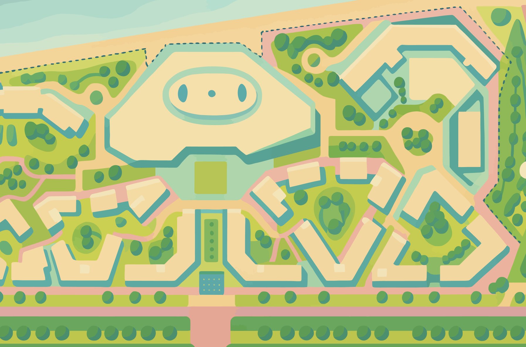
- Game’s background

I made this in freshman year while taking a core design class here at NYUAD. When I was looking for a drawing that shows our campus from above, this one worked perfectly! The only thing that was time consuming about it was finding the right palette that is both relatable and playful to suit the mood of the game. I decided to make it more green, make the top of campus center to resemble/imply the head of a cat (not sure if it shows). As I said, choosing the colors was challenging, and so ChatGPT helped me with the color choice as well.
-
One section of the code I’m particularly proud of is the pulsing animation inside the Food class. It’s a small visual detail, but it adds a lot of liveliness to the screen. Each food item subtly “breathes” using a sine wave function, making it feel dynamic and easy to spot. This animation helps guide player attention and makes the gameplay feel more polished.
// Inside Food.draw()
const pulse = map(sin(frameCount * 0.1 + index), -1, 1, 0.85, 1.15);
const img = Assets.img.food[this.imageKey];

if (img && img.width > 0) {
  push();
  translate(this.x, this.y);
  scale(pulse);
  imageMode(CENTER);
  image(img, 0, 0, this.size * 2, this.size * 2);
  pop();
}
This little animation uses sin(frameCount * 0.1) to smoothly oscillate each food’s scale over time, creating a soft pulsing effect. I like this snippet because it shows how much visual impact can come from just a few lines of math and thoughtful timing, no extra assets or libraries needed. It makes the entire game feel more animated and alive without adding any performance cost.
Challenges & Areas for Improvement
One of the biggest challenges was cat movement; initially the cat was too fast or too slow, or would teleport unexpectedly. I had to tune the speed and collision radius multiple times to make it feel fair. Similarly, I ran into trouble with image preloading: sometimes food items or the campus map would fail to load. I added fallback logic so that the game shows a colored circle if images fail.
In terms of gameplay, it currently doesn’t scale difficulty; every round is the same length, and the cat moves at a constant speed. In future updates, I’d like to introduce progressive rounds where spawn intervals shorten and the cat gets faster. Other ideas include adding multiple cats, special food items, or power-ups like “cat repellent” or “freeze time.”
Lastly, while the game runs in fullscreen and resizes on window change, it’s not yet optimized for mobile/touch input, which would make it more accessible to a wider audience. Touch support and gesture input would be a major next step.