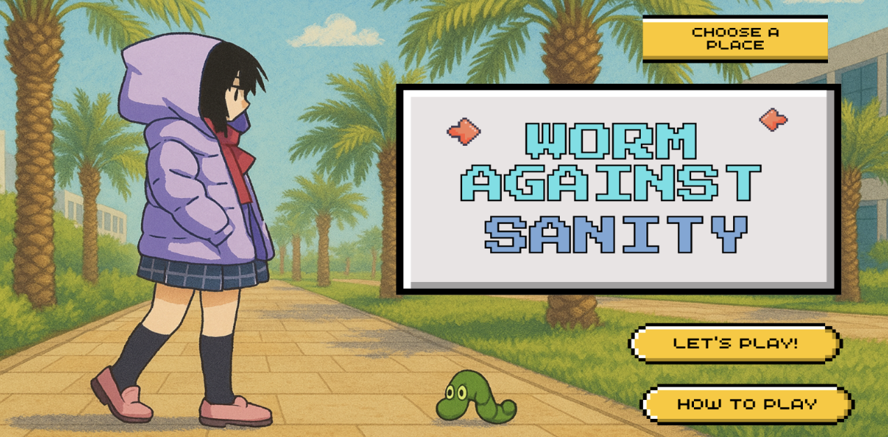
Week 8: HeartFelt Connection

There is something profoundly magical about receiving affection: a hand that reaches out, a presence that wraps you in warmth, a small gesture that makes the world feel less heavy. Love, in its quietest form, has the power to make us feel seen, valued, and alive. Through my project, I wanted to explore that invisible current the emotional electricity that flows between two people who care for each other.

The interactive piece symbolizes the way love and connection illuminate us. When you touch the hand of someone you love, or even move close enough to feel their presence, your heart lights up  not just metaphorically, but literally within the work. The glowing heart represents how affection has the power to activate something deep within us, a light that reminds us we are not alone.

Demo Video:


Future Improvement:

If I had more time, I would have expanded the project to include sound and more expressive lighting to create a deeper emotional experience. I would have added soft heartbeats, ambient sounds, or even gentle whispers that respond to movement and proximity. As two people approach each other, the soundscape could evolve, symbolizing how connection changes both our inner feelings and the atmosphere around us.

I also would have made the heart light more dynamic by allowing it to change color and rhythm based on the kind of relationship or emotion being expressed. Warm tones could represent comfort and love, cooler shades could suggest distance or nostalgia, and rhythmic pulses could express moments of excitement and joy. These additions would transform the project into a poetic language of sound and light, a more immersive way to express how love and presence illuminate our lives.

Week 8: Reading Reflection

Attractive things Work Better

I’ve always noticed how looks can open doors. It’s something people like to call pretty privilege. In most industries, they prefer someone who has good looks. You see it everywhere at the airport check-in counter where the smiling, well-dressed staff makes you feel calm, or in a company that hires someone polished to sit at the front desk because, somehow, they represent the brand better.

We are naturally drawn to beauty, whether it’s a charming smile or a sleek phone screen. Companies know this; that’s why a tech gadget with a glowing logo or a car with smooth curves often sells better than a clunky but equally powerful competitor. Don Norman’s idea that “attractive things work better” isn’t just about vanity. it’s about psychology.

A MacBook isn’t the fastest laptop in the world, and yet when we open that smooth aluminum case and feel the satisfying click of the keys, we tend to believe it’s faster, smarter, and somehow more capable. The elegant design creates a sense of trust and delight that shapes how we experience the product. The beauty of it literally makes us think it works better.

Attractive design doesn’t just sell. It softens us. It makes us more patient with flaws, more forgiving of errors, and more willing to explore. That’s the secret power of beauty: it opens the door for better experiences.

Norman explains this beautifully in “Attractive Things Work Better.” He talks about how our emotions influence the way we interact with the world. When something looks good, it makes us feel good and when we feel good, we actually perform better. He even gives a simple example: imagine walking on a wooden plank that’s safely on the ground you’d stroll across without a second thought. But put that same plank high in the air, and suddenly, your fear takes over, your body stiffens, and it becomes ten times harder. The situation didn’t change; your feelings did.

That’s what happens with design too. When we see something beautiful like a teapot with elegant curves or a smartphone that feels right in our hands it puts us in a positive mood. We become more relaxed, more open, and surprisingly, even more creative. Norman calls this the power of positive affect. It’s why we forgive a beautiful product for small flaws but get frustrated quickly with an ugly one, even if it works just as well.

So when I think about “pretty privilege,” it’s not just about faces or appearances it’s about how beauty changes behavior. Attractive people, like attractive designs, create comfort and trust before a single word is spoken or a single button is pressed. And through this text, I feel like it helped me see that aesthetics aren’t shallow; they’re psychological. Beauty works because it changes us somehow.

Her Code Got Humans On The Moon — And Invented Software Itself

When I was in eighth grade, our school hosted a  movie event through a club called Global Female in STEM (Science Technology Engineering and Mathematics). They showed movie called “Hidden Figures” which is  the story of three brilliant African-American women, Katherine Johnson, Dorothy Vaughan, and Mary Jackson, whose work made NASA’s early space missions possible. I remember sitting there, completely mesmerized, realizing for the first time how many women had shaped history from behind the scenes, only to have their names forgotten.

Since that day, I’ve carried a quiet admiration, and maybe a little fire, for women in STEM who were never given the recognition they deserved. Now, as a Computer Science major myself, I’ve felt small moments of that same bias. Sometimes, it’s a look that says “are you sure you can do this?” It’s subtle, but it stings like being told you have to prove your worth twice before anyone believes it once.

That’s why reading about Margaret Hamilton hit differently and fill me up with pride. Here was a woman in the 1960s, leading a team at MIT, writing code that would land humans on the moon  all while raising her daughter.

The image of her bringing her little girl to the lab late at night felt so familiar. My mom, also a working mother in STEM, used to take me to her computer lab  when I used to be alone. Margaret’s story reminded me of my mother of every woman who’s ever juggled passion, work, and motherhood with quiet strength.

What moved me most was how Margaret didn’t just write code; she invented software engineering itself. She gave structure, respect, and permanence to something the world didn’t even consider a real science yet. And when her code saved the Apollo 11 mission, it wasn’t just a victory for NASA. It was proof that brilliance has no gender.

Reading her story filled me with pride. It made me realize that every time a woman like Margaret Hamilton, or my mother, or even I sit behind a computer and type, we’re not just writing code. We’re continuing a legacy.

Midterm Project: Worm vs Sanity

Concept

Food has always been something deeply emotional forme  a way to heal, connect, and recharge after long or lonely days. Whether it’s sharing a meal with friends and family or eating quietly in solitude, food always finds a way to lift the spirit. For me, food is more than just fuel; it’s comfort, joy, and sometimes even memory itself. Every dish I eat reminds me of a moment, a feeling, or a person.

But, of course, there’s another side to that relationship  those unforgettable moments when something unexpected shows up in your food: a hair, a fly, a worm, even a tiny stone. It’s disgusting, sometimes shocking, and yet  over time  it becomes something you laugh about. The idea for this project actually struck me when I once found a fly in my food. In that split second, my emotions bounced between anger, disgust, and disbelief and then, later, laughter. I realized how something so small could completely shift my mood and turn an ordinary meal into a story I’d never forget.

It also reminded me of moments with my grandmother. She used to cook for the whole family, and occasionally, there would be a stray hair in the food. Instead of getting angry, I’d turn it into a lighthearted joke so everyone could laugh. Those moments became cherished  not because the food was perfect, but because the imperfections made it real, made it ours. They were messy, human, and full of love.

Through my project, I wanted to recreate those shifting emotions  from disgust and frustration to humor and warmth. I tried to capture the entire emotional cycle we experience in those moments: the anger when something feels ruined, the creepiness of noticing something “off,” and the humor that comes when you finally laugh it off.

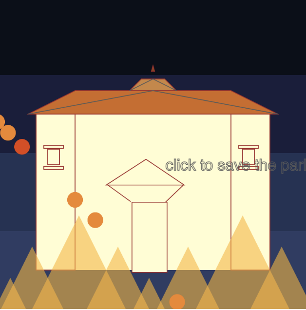
  • Anger is portrayed through intense, chaotic visuals  like the “deadly” appearance of the dining hall, the harsh red tones.

  • Creepiness comes through the eerie atmosphere  the bloody dining hall textures, dim lighting, and strange, almost horror-like visual style that makes you feel uneasy, the same way you feel when you find something in your food that shouldn’t be there.

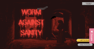
  • Humor ties it all together. I added funny instructions like “Ultimate Guide to impress Worm” that turns disgust into comedy. It’s a playful reminder that these moments, while annoying, are also absurd and relatable  something we can laugh about later.

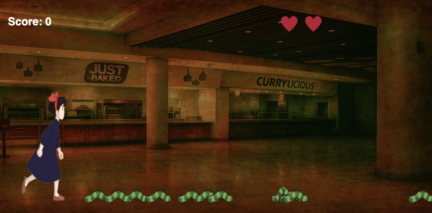
To make it more personal, I brought in imagery from NYUAD  specifically D2 and the Library, two of my favorite places on campus. They hold countless memories of food, laughter, and friendship, so I wanted to reimagine them in my project. I took photos and used ChatGPT to generate artistic, surreal versions of these spaces  blending reality and imagination. The result is an environment that feels both familiar and eerie, mirroring that strange feeling of discovering something unexpected in what you love.

Lastly, I chose to use hand gestures as one of the interaction method because I wanted the experience to feel physical and expressive, not just mechanical. In real life, our hands are what connect us to food. We cook with them, eat with them, react with them. So, using gestures like moving the left hand to go left, right hand to go right, and closing the fist to jump feels symbolically and emotionally right. It mirrors how our hands instinctively respond when we’re disgusted or startled. We pull back, push away, or clench up.

While it might not be the most conventional control scheme, that’s precisely what makes this project unique  and artistic  rather than a simple computer game. The goal wasn’t to make a polished arcade game, but to create a more embodied experience  one that makes the player aware of their own physical reactions.


How to Play:

At its core, the project is an interactive game centered around a simple but expressive idea: defeat the worms that are being generated from right of the screen before they reach the end of the screen on left.

Players can interact with the game in two different ways:

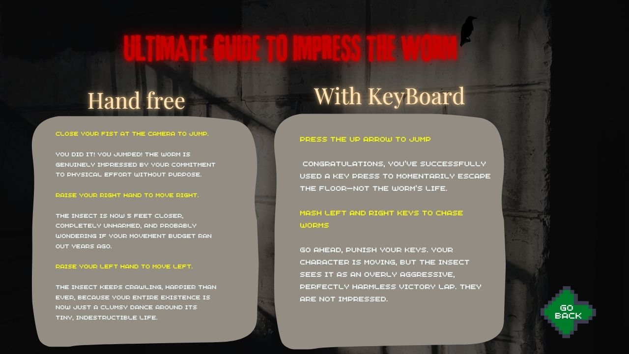
Keyboard controls — using the arrow keys to move and jump: → to go right, ← to go left, and ↑ to jump.

Hand gesture controls — raise your left hand to go left and raise your right hand to go right. By raise I mean make your hand visible to the camera and when u don’t want to go say left make you left hand unvisible to the sight of the camera. If you make a fist or close your finger the girl will jump.

The basic rule is simple: jump over the worms to eliminate them before they cross the screen. Players have three lives, and if they manage to survive until time >= 900 (meaning the draw function has run 900 times) with at least one life left, they win.

At first, it might feel unintuitive, but as you play, it becomes surprisingly fun and natural  like you’re physically fighting off those unwanted “guests” in your meal.

Parts I’m Proud Of

The part I’m most proud of is integrating Machine Learning into a project that’s not only technical but emotional and personal. As a Computer Science major, I’m always drawn to exploring how technology can express feeling and creativity. Implementing gesture control allowed me to bridge art and code  to make something that doesn’t just work, but feels alive.

I’m also proud of how I personalized the experience. By using NYUAD-specific places like D2 and the Library, I rooted the project in a world I know and love. It gives the game a familiar atmosphere one that other NYUAD students can relate to  while still transforming it into something strange and artistic.

Areas for Improvement 

While I’m proud of how the game turned out, there are several areas I’d like to refine. The hand gesture control, though innovative, can feel slightly clunky at first. I’d like to make it more responsive and intuitive  perhaps by training the ML model with more data or maybe using ML to detect body that can say if a person is turning left or right and the character themself move left or right.

I’d also love to expand the visual storytelling. Right now, the “bloody” D2 gives the right kind of creepiness, but I imagine adding more levels or moods maybe transitioning from a calm dining scene to a chaotic food fight as the difficulty increases.

Problems that you ran into

While building the project, I faced a few interesting technical challenges that pushed me to think creatively about how motion and input are detected and processed.

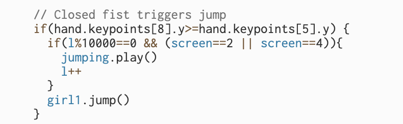
1. Detecting when the hand is closed (fist gesture):
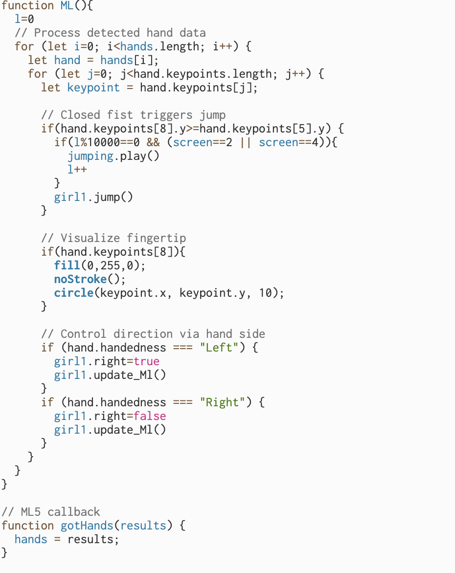
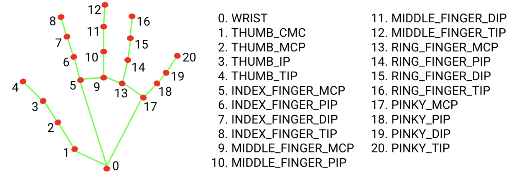
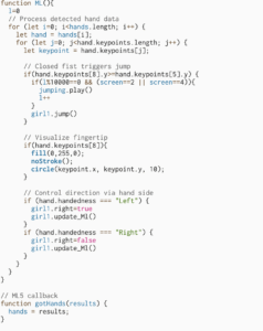
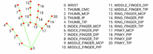
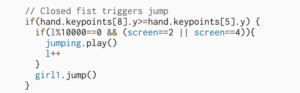
My first major challenge was figuring out how to detect when the user’s hand is closed. I wanted the “fist” gesture to trigger a jump action, but at first, I wasn’t sure which hand landmarks to compare. Eventually, I decided to track the index fingertip (keypoint 8) and the base of the index finger (keypoint 5).

The idea was simple: if the y-coordinate of the fingertip (hand.keypoints[8].y) becomes greater than that of the finger base (hand.keypoints[5].y), it means the fingertip is lower in the camera frame  in other words, the finger is curled in, forming a fist.

I used console.log(hand.keypoints[8].y, hand.keypoints[5].y) to visualize the values and experimented by opening and closing my hand repeatedly to see when the condition triggered. This trial-and-error approach helped me fine-tune the threshold for reliable gesture recognition. It was satisfying to see the jump action respond accurately once the logic clicked.


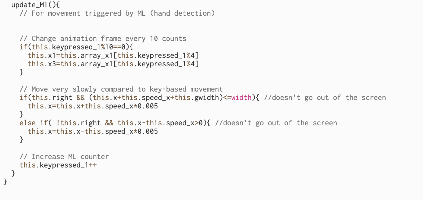
2. Managing repeated function calls with hand gestures:
The second issue was with repeated trigger events when using gesture control. Unlike pressing a key  which calls the action just once per pressraising a hand is a continuous motion, so the detection function kept firing dozens of times per second.

For example, calling girl1.jump() or movement functions using hand gestures caused the action to repeat uncontrollably fast. To solve this, I implemented a counter-based system and used a modulus condition to limit how often the action executes. Essentially, if the function was being called too rapidly, I only allowed it to execute once every ten calls.

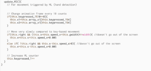
Similarly, I adjusted the character’s movement speed when controlled by gestures. Instead of moving by this.speed_x each frame (which made her move unrealistically fast), I scaled it down to this.speed_x * 0.005 inside the update_Ml() function. This made her movement smooth and proportional to the natural pace of a hand gesture, giving the game a more balanced and controlled feeling.

This also applied to animation strip changes by updating them every tenth frame, the animation stayed visually consistent without flickering or overloading.


My Sketch :

view only screen link: https://editor.p5js.org/aa11972/full/b224cudrh


Week 5: Midterm progress

My Midterm Project Concept

Last week, after a long and tiring day, I decided to take a short break and treat myself to a simple dinner. I made a fresh salad, seasoned it well, and added a generous scoop of hummus. I thought that a good meal would help me feel better. However, halfway through eating, I noticed a fly lying right in my food. The sight instantly ruined my appetite and left me feeling uneasy, worried I might end up with a stomach ache. I couldn’t help but think how much better the evening would have been if that fly hadn’t landed in my meal.

Interestingly, a friend later shared a similar unpleasant experience of finding a worm in their food. That conversation sparked an unusual but fun idea for a game: Worm Against Sanity. In this game, the player goes around the campus covering spots like the library, D1, D2, marketplace, and the Palms eliminating worms before they ruin the food.

.One of the most challenging parts of building Worm Against Sanity was making the game seamlessly switch between multiple screens while also animating the girl and worm sprites so that they moved realistically across the canvas. I wanted the opening screen, the play area, and the menu to feel like distinct spaces, but still connect smoothly when the player clicked a button. To achieve this, I kept track of a screen variable that updates whenever a mouse click falls within certain button coordinates. In the draw() function, I check the current value of screen and display the correct background and elements for that state. At the same time, I focused on fluid character and enemy movement. For the girl, I downloaded a running GIF and converted it into a sprite sheet, then wrote logic to cycle through the sprite frames every time an arrow key is pressed, flipping the image when she moves left. The worm uses a similar sprite-sheet approach, but it continuously advances across the screen on its own, updating its frame at regular time intervals and reducing the player’s life if it escapes. Coordinating these mechanics screen transitions, sprite-sheet animation, and frame-by-frame movement took careful planning and debugging, but it created a smooth and lively gameplay experience once everything clicked together.

I also experimented with adding interactive features, such as having the character jump on a worm when I move my hand or make a fist. Although I haven’t fully figured out how to implement motion-based controls yet, I’m actively exploring solutions and refining the concept.

In terms of visuals, I wanted the game to feel lively and unique, so I used AI tools to generate a cartoony illustration of the NYUAD campus to serve as the background for the different screens. This gives the game a playful, campus-specific atmosphere and saves time that would have gone into manual drawing.


My Work so Far


Week 5: Reading Response

The part that stopped me was Suicide Box (1996), a camera pointed at the Golden Gate Bridge, quietly counting every time someone jumped. It sounds blunt, almost cold, yet I like the idea behind it. The artists (Natalie Jeremijenko and Kate Rich) flipped surveillance on its head: instead of policing people, the camera bore witness to a tragedy that the official numbers under-reported. I even looked it up afterward and found more debate and follow-up writing. Some people doubt the footage, others question the ethics of recording suicides. That tension actually makes the piece stronger for me; it shows how art can force uncomfortable truths into view.


What struck me next was how the essay treats technology as something physical and playful. Levin keeps pointing out that success often comes from the scene you build, not just the code you write: light a wall evenly, add reflective tape, adjust the lens. I like that attitude. It feels more like setting a stage than crunching math, and it makes computer vision sound approachable even fun for artists and students. The student project LimboTime, for example, came together in one afternoon with a webcam and a bright background. That shows how the simplest setups can spark creative interaction.


Overall, reading this made me want to experiment myself. The mix of raw data, social urgency, and poetic framing in Suicide Box shows how art and code can meet to notice what society tries not to see and maybe, slowly, help change it.

Week 4: Reading

As an international student at NYUAD who often travels, I’ve found sensor-activated washroom taps frustrating and time-consuming, whether in airports or public restrooms in different countries. There are different types of sensors in different locations, many of which behave unpredictably, and sometimes they simply don’t work at all. Even the taps in NYUAD occasionally fail. When I first arrived, I remember waving my hands around trying to figure out where to start the water, unsure if the faucet was broken or if I was using it wrong. From Don Norman’s perspective, this is a textbook example of weak signifiers (no clear visual cue where to place hands), poor feedback (no light or sound to confirm detection), and a missing conceptual model (no simple mental picture of how the sensor works). A better design could include a soft light to indicate the active zone and an immediate, gentle chime when the sensor registers movement. Thinking beyond faucets, In Interactive Media, I want every sketch and installation I build to “explain itself,” so that users can start playing without extra instructions. Don Norman’s principles give me a practical checklist: I can design strong affordances by making buttons and draggable objects look touchable or moveable; create clear signifiers through animated highlights, glowing borders, or subtle sounds; keep mappings natural so a slider that moves right always increases a value; and provide immediate feedback with color changes, vibration, or playful sound effects. Most importantly, I can help visitors form the right conceptual model by giving them a short, visual introduction or letting the interface demonstrate its own rules when the design is complex. 

Week 4: Vltava River and Memories it holds

This summer I had the chance to spend my J-Term in Prague, Czech Republic, and I kept finding myself drawn to the Vltava River. It flows from north to south right through the center of the city and is visible almost everywhere you go. Growing up near a famous lake in Nepal, I’ve always felt a special connection to water, so the Vltava immediately felt familiar.

I’ve long believed that rivers and lakes quietly collect memories of people, nature, culture, and whole civilizations as if they’re absorbing the life around them. Walking along the Vltava, I sensed that same deep, layered history. As I learned more, I discovered just how central the river has been to Prague’s story.

In this artwork, I tried to capture impressions I had in Prague. The colorful houses painted in shades I noticed all around Prague represent the charming, almost storybook homes seen throughout much of Europe. They bring in the vibrant palette I remember from my time there. The flowing text woven through the piece symbolizes the countless memories and stories the Vltava carries, and, more broadly, the memories held by all great water bodies.

My work

Week 3: Reading Response


During marhaba week I was being trained as a Weyak facilitator. The drill was simple: one person speaks, the other listens really listens and then reflects back what they understood. I tried using that outside the training too, with friends. I noticed something uncomfortable: I’m decent at the first two moves, listening and interpreting, but I stumble on the third one that is speaking back clearly and on time. Reading Crawford snapped that pattern into focus. His “listen, think, speak” cycle didn’t feel like theory only. 

Also, I don’t agree with everything. He says reading a book isn’t interactive. I get his point (a book can’t answer back), but as a reader I still feel a kind of inner talk with the text. For design work, his strict rule helps; for real life, it feels a bit narrow. Still, his main idea don’t confuse reaction with real back-and-forth was very useful.

The book also made me think about control. Sometimes a system looks interactive, but the user is just pressing “next” while the program forces its path. That’s not a real conversation. It also somehow reminds me of home: there’s a lot of noise and movement during the protest against corruption, but the direction is being set by a few people with their own goals. Everyone is acting, but very few are actually listening. It’s busy, not interactive exactly the difference Crawford talks about.


While reflecting on all this, I realized something about my own art. The digital sketch I had been working on suddenly looked lifeless—beautiful in pieces but, to me, dead. It wasn’t listening to the user; it just sat there. That recognition pushed me to start over. I stripped out the old smoke elements and rebuilt the scene around the burning parliament building, designing an interaction where a single click can pause the fire and wash the frame in blue. In the process, Crawford’s idea of a true “listen–think–speak” loop came alive for me: my sketch now responds instead of merely flashing back.


Lastly, what I appreciated in the book is how stubbornly he refuses to call every flashy response “interactive.” He cares about the quality of the loop: how precisely the system listens, how intelligently it processes, and how meaningfully it responds.

Week 3: Assignment

My concept:

This week my mind has been heavy with news from home. There are protests happening in my country, and instead of bringing hope, some of them have turned destructive. Bad actors disguised as protesters are setting fire to public property, using a genuine Gen-Z movement against corruption as cover to erase their own crimes. Several police stations were burned, letting prisoners escape. Thousands of criminals are now roaming free, which makes me constantly worry about my family’s safety.

This piece of art is my response to that chaos. The base of the picture shows fire representing the burning buildings and the anger on the streets. Above it, thick smoke rises and spreads, like the dark energy that hangs over everything. In the middle there’s a shape that at first was meant to be drifting smoke, but as I worked, it began to look like a person. So later I decided to embrace that.

That smoky figure stands for the opportunists, the gangs, and the political players who twist the protest for their own gain. Just like smoke, their hearts are gray. They walk on fire because they don’t fear destruction; they only care about their own benefit, even as the country suffers.

Through this piece I wanted to capture both the physical reality of fires and smoke and the deeper feeling of a society clouded by selfishness and violence.

After I thought I was done with the art I started to read The Art of Interactive Design. This made me see that an earlier sketch I had made felt dull and not interactive at all. I removed the original smoke class and all its elements and began drawing the parliament building once Asia’s most luxurious and one of the largest palaces before it was destroyed by fire. I worked to mimic its structure and sweeping rooflines.

For the interactive element, when a viewer clicks on the building, the flames stop and a wash of blue appears, symbolizing calm and happiness. Releasing the click reignites the fire. Each time I clicked to halt the burning, I felt a rush of conflicting emotions an almost physical wish that I could do the same in real life, to save the parliament and, in some way, my country itself.

Process and Reflection:

When I first started this piece, I pictured thick smoke clouds spreading across the top of the canvas. I spent a long time trying to build that effect by dropping bubble after bubble, checking their spots with console.log(mouseX, mouseY), and trying to make the shapes feel alive. But after a while it turned into a slow, repetitive task. The more I worked, the less it looked like the smoky sky I had imagined.

In the middle of that frustration, something unexpected happened. One cluster of bubbles began to form a faint human shape. At first I thought it was just a glitch in my layout, but the longer I looked, the more it felt right. It reminded me of how, in real life, people with hidden motives were blending into the protests. That was the moment the “smoke man” was born.

The background went through a similar transformation. I had started with a grayish color to match the idea of smoke, but the fire didn’t stand out. On a whim I tried a deep black, and suddenly the flames glowed with an intensity that felt closer to the real scene. Black made the fire look alive, and it captured the mood of a night filled with tension and danger when prisoners were set free.

Looking back, the way this piece evolved feels close to the story I wanted to tell. Plans I was sure about like a full smoky sky kept falling apart, and new shapes kept appearing out of nowhere. The smoke man, which began as a small accident, became the heart of the artwork, just like how unexpected figures can change the course of a protest.

If I had more time, I would push the scene even further: let the smoke drift and curl like real fumes, add buildings, maybe even small moving figures to suggest the chaos on the ground. But even without those details, this process showed me how art sometimes leads rather than follows. What started as a careful plan turned into a piece shaped by chance, change, and the very uncertainty I was trying to capture.

My Sketch:

Reading Reflection: Week 2

Before watching the video, I used to doubt modern art a lot. Many times I would look at paintings or installations and feel they were meaningless or random, like they didn’t really say anything. But after listening to Casey Reas’ Eyeo 2012 talk, I realized that even when art looks random, there can be hidden patterns within it, patterns the artist sets into motion but doesn’t fully control. That changed how I see modern art or arts with randomness not as nonsense, but as something that balances freedom and structure.

One of the moments that stuck with me was when Reas mentioned Jean Arp’s practice of dropping paper shapes and gluing them where they landed. At first, this felt almost like a joke to me like how could that be art? But the more I thought about it, the more I understood the courage it takes to let go of total control. Arp allowed a chance to step in and become part of the artwork, and in doing so he opened up a space for something unexpected to appear.

Moreover, I was surprised at how alive his examples felt. Even though they were created by code, they reminded me of nature like plants growing in unpredictable directions or waves forming on the surface of water. When Reas used the word “homeostasis,” it clicked for me. I paused the video and looked up the meaning to understand it better. I learned that it’s a biological term describing how systems keep balance, like how our bodies regulate temperature or how living things adjust to survive. That connection made the talk feel deeper, because I began to see his generative art almost like a living organism rather than just random code. It showed me that what seems like chaos can actually be a system constantly finding its own balance, just like in nature. Later, when I stepped outside my room, I noticed how randomness and order combine all around us in the way stars scatter across the sky or the way tree branches spread into patterns.

After this talk, I don’t see randomness as meaningless anymore. I see it as another tool, maybe even a partner, that can push art into places the artist alone couldn’t reach. For me, that was the biggest takeaway: the idea that beauty can emerge not just from control, but from the spaces where control ends.