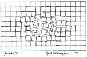
I picked the design Boxes I by William Kolomyjec to recreate in this assignment. 
This image fascinates me. As the viewer, I naturally focus in the center of the image where the distortion in the boxes is the greatest. It feels as if my gaze is what’s causing that distortion. This is why I wanted to recreate, or create something similar to, this piece.
I started by creating a grid of squares – 10×17 squares on the canvas – using nested for loops. The first for loop is used to address the rows, creating rectangles starting from the left most to the right most side of the canvas. For every rectangle created in this row, the second nested for loop adds rectangles as columns for the row.
I thought of many views to achieve the same distortion effect as seen in the original image. The most important underlying concept in all those methods was that the lesser the distance of the squares from the center of the canvas, the greater the distortion. Using four if-statements, and dividing the canvas into quadrants, I record the above mentioned distance for every square into two variables: randx and randy. I also reserve a small rectangular space in the middle of the canvas where no squares are drawn (to achieve a higher distortion).
Finally, I use the random function coupled with the corresponding randx and randy values to set offsets for the coordinates for every squares. While experimenting with colors, I found an aesthetic combination and decided to implement it – instead of adhering to the style in the original. Here is what I came up with:
In the future, I will try to implement a rotation relative to the square’s distance from the center in all the squares to enhance the distortion effect in the original image.
