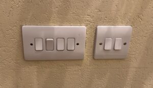
This reading is probably my favorite reading so far. It triggered me to reflect on various objects we encounter daily that are not very efficient, and have not had a change in their mechanisms for years. When reading about mapping lights to their switches, it reminded me of my own house, where we have a set of switches near the main door.
Even after living in this house for around 10 years, I still flick multiple switches until I find the one I need. The placement of the switches is especially inefficient because some of these switches are for lights outside the house in the front yard, and some are for lights inside the house.
It took me a while to think of something that functions inefficiently besides what was already mentioned in the reading, because I feel like Norman covered some of the core ones. Then, I remembered my electric toothbrush. My electric toothbrush is the most basic Oral-B model, and it only has one button (as do most electric toothbrushes). On top of this button, the word “timer” is written, indicating that this button is a timer. However, this button is also the same button I use to turn on the toothbrush. I was always confused about how to trigger the timer, and I did not have access to the manual to check. It took me around a year to realize that the toothbrush vibrates in a specific pulsing pattern for a short 2 seconds after 2 minutes of being on. I always wondered why the toothbrush would randomly vibrate weirdly mid-brush, and then I connected the dots. Using Norman’s definitions, this is an issue with the feedback of the system. How was I to know that the timer had started? While to me specifically, I think something like a light or a sound would’ve been a better indicator for the timer, I actually think this design is the most accessible design. It means deaf and blind people can still sense the toothbrush’s vibrations to know the timer is up. So, I think sometimes designs can seem inefficient to some people, but in reality they are designed this way to make them functional to everyone no matter their abilities.
This is a clear example of an item that affords timing your brush, but has poor design with signifiers that allow the usage of this feature. Norman’s argument on the importance of designing products keeping in mind the complexity of humans and eliminating the thought that how to use a feature you create will be obvious to its users can be applied to our interactive media projects. Interactive media is all about experience and interactivity. Without clear instructions from the artist on how to interact with their artwork or their game, users cannot maximize their experience. Imagine how frustrating it would be for a user to play a game with no instructions on how to control the game or about the main goal of the game. The game loses its purpose to entertain, because the user is frustrated with figuring out how to work the game.

