
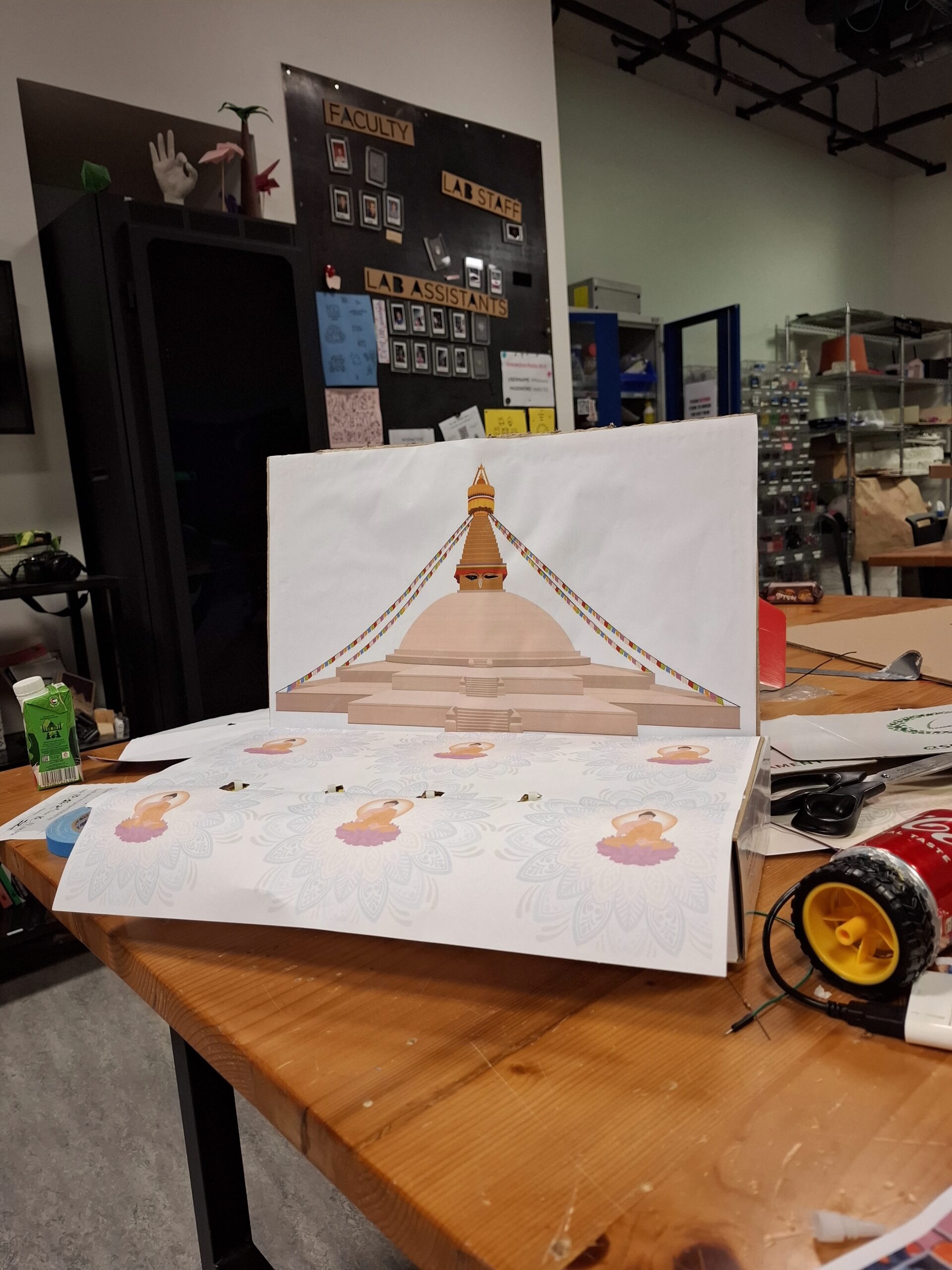
Most users were able to understand the basic concept of interacting with the prayer wheel and the stupa. They could figure out that touching different parts of the stupa would cause the lights to turn on and trigger audio responses. However, the main area of confusion was which specific areas of the stupa were touch-sensitive. Users often touched the wrong parts and then tried to adjust their behavior based on trial and error.
Even though the mapping between each touch point and the animation/light feedback did make sense to them after discovery, the initial uncertainty slowed down the interaction. Some users expressed that they “felt like they knew better,” meaning they expected the interactive areas to match their own understanding of how a stupa is structured, rather than how my sensor layout was designed.
What Worked Well & What Could Be Improved
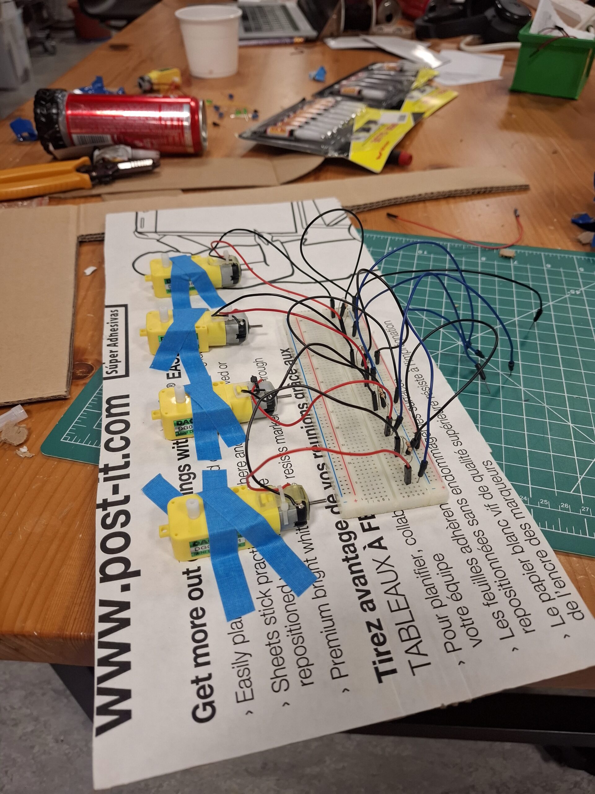
The prayer wheel interaction worked especially well. Users intuitively understood that the wheel was meant to be spun, and the connection between spinning motion and sound was clear. The feedback loop felt natural and satisfying.
The lighting on the stupa, however, could be improved. While the concept of touching different architectural parts (pinnacle, dome, mandala, etc.) was meaningful, the technical responsiveness wasn’t always consistent. This inconsistency made some users second-guess whether they were interacting correctly or whether the system was malfunctioning. Improving sensor sensitivity or adding clearer visual affordances would help eliminate this confusion.
Areas I Felt the Need to Explain
The two aspects that required the most explanation were:
The cultural concept of the prayer wheel
Some users were not familiar with what a prayer wheel is or how it traditionally functions. This lack of background knowledge made the interaction less immediately intuitive for them.
Which specific parts of the stupa activate the LEDs
The stupa layout visually makes sense, but it wasn’t obvious to users where to touch. They needed guidance on how the different zones mapped to the lighting changes.
To make these areas clearer in the future, I could incorporate visual cues, such as subtle highlights, icons, or glowing outlines that indicate interactive regions. Alternatively, I could add a brief onboarding animation that demonstrates the interaction without relying on text.
User testing video: google drive