User Testing Summary
Video Link (Private Youtube): https://youtube.com/shorts/3OV1dg049Hw?feature=share
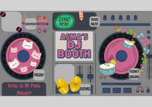
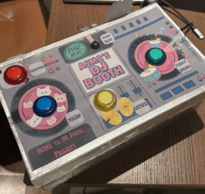
I conducted two user-testing sessions: one with the full DJ booth box and one with just the exposed buttons. In both cases, users were able to understand how to interact with the project immediately, even without instructions. People naturally pressed the buttons, experimented with the toggle button, and quickly recognized that the setup functioned as a DJ booth. The simplicity of the interface encouraged playful exploration, and users said they had fun triggering beats and seeing the visuals respond.
Here’s what it looks like so far:
Usability & Understanding
Overall, users were able to figure out the controls very quickly. There was no major confusion about what each button did, and the mapping between the buttons and the sounds felt intuitive once they pressed a few of them. Because the interface uses familiar affordances like large, brightly colored arcade buttons, users instantly understood the “press to activate” logic. The toggle switch for the looping beat was also understood without explanation after users interacted with it once.
What Worked Well
The strongest aspect of the experience was the clarity and simplicity of the interaction. The four push buttons and the toggle button created a direct, satisfying feedback loop between touch, sound, and visual response. Users consistently said the experience was fun and easy to use. Those who tested the version with the box especially appreciated the “Start Here” label placed near the main looping beat, which gave them a clear entry point into the experience.
Areas for Improvement
The main improvement I identified was the potential to add a potentiometer to control volume or effects. However, I realized that adding more components might clutter the interface and overwhelm first-time users. The current minimal setup (four buttons and one toggle) supports quick understanding and keeps the user experience simple. If I had more time, I would explore adding more features only if they didn’t compromise the clean layout or intuitive interaction.
Things I Needed to Explain
I found that I didn’t need to explain much during the tests. The only times I stepped in were when users were curious about the internal electronics or how the p5.js visuals were generated. In terms of interaction, everything was clear on its own. If I were to improve this project further I could also add a feature where users could play back the beat they just created, but I didn’t want to overwhelm myself with the coding too close to the date of the showcase. Overall, though, the project communicated itself very effectively.


