Concept:
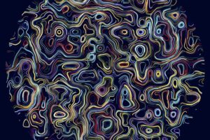
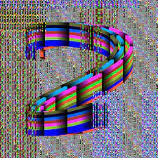
Diving into this project, I was really drawn to the bright colors and the way shapes came together in those two images. It made me think about how sometimes less can be more. This idea isn’t new, but seeing it in action sparked something for me. I remembered those simple, yet catchy thumbnails on NoCopyright Sounds videos (Third Image) and wondered if I could apply the same principle. So, I decided to cut back on the clutter in my work, aiming for simplicity while still keeping it colorful and lively. It was a bit of a challenge, trying to find the right balance between too much and just enough. But in the end, it paid off. This approach helped me see my work in a new light, proving that you can make something stand out by stripping it down to its essentials. It was a great reminder that sometimes, the simplest approach can be the most effective.
A highlight of some code that you’re particularly proud of:
// Define a class for the Wiggly Circle
class WigglyCircle {
  constructor(x, y, radius, color) {
    this.x = x;
    this.y = y;
    this.radius = radius;
    this.color = color;
    this.time = 0; // Time property for animation
  }
Embedded sketch:
Reflection and ideas for future work or improvements:
Reflection on this assignment I would have liked adds layer of engagement, transforming the viewer’s experience from passive observation to active participation. Even with my academic commitments, I managed to experiment freely with colors and shapes, which was a liberating process.
If I were to work on this again in the future improvements, I would consider either thickening the lines to give the shapes more definition or reducing the background’s opacity to allow for a clearer view of the action on the canvas. Both adjustments aim to enhance the visual impact and ensure that the vibrancy and movement I’m striving for are fully realized.


