The game:
link: here
inspiration:
There used to be this game called Purble Place by Oberon Games. This game was available on windows operating systems by was removed from the newer ones. The game has a collection of smaller games and the one I was most inspired by was called comfy cakes.
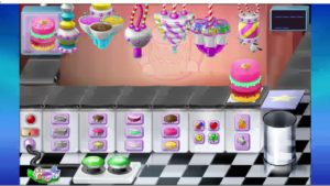
The goal of the game is to try and mimic the cake displayed in the top left corner while the conveyer belt moves the plate(papers in this case). The game has buttons to move the conveyer belt however the cake orders would keep coming so you would need to work fast.
what my version has:
I looked at the game version and picked the aspects I want to recreate and the ones I wanted to change. I watched a few videos of the game, and looked at pictures since I couldn’t play the game because it’s no longer available. I decided to simplify the graphics so I can focus on the code aspect. (Picture of notes on the side, not sure why it’s blurry)
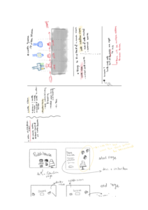
I also had to decide on a game logic of how the players win and lose and so on. This would also help me decide on what classes would control which part. This is the logic I decided on:
-
-
- the player would first be presented with the main page the move to the instructions page after-which the player can start the game
- the game it self would consist of a conveyer belt that moves the plates. once the cake is under one the dispensers the player must click the dispenser to add the cake part.
- The player’s goal is to add as many cake parts correctly before running out of orders.
- The player wins if the player gets at scores 80%.
-
things implemented successfully:
-
-
- a new cakes are being automatically recreated once the current one leaves the window
- two classes are created (
-
- cake creator class
- keeps track of the total score
- number of cakes
- creates new cakes
- draws the cakes
- cake creator class
- single cake class
- creates only one cake
- adds parts to said cake
- keeps track of only it’s score
- check if said cake is under (within a certain range of) the dispenser
-
- the cake parts are added once the user clicks on the dispensers
-
Features I didn’t plan to implement but would be cool:
-
-
- a score board (learned how to send and req data from APIs in connections lab, so I can use a google sheets API to store the user’s data and display them)
- Different difficulty levels
- add more cake features to make it more challenging
-
Design aspects
-
- I also wanted to work on the design aspect and make sure that the design of each page is intuitive and also has a consistent theme.
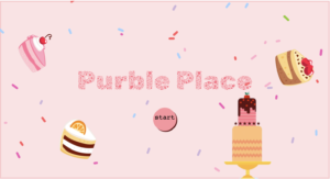
- The main page looks like this. I looked for free graphics online and cropped the ones I liked. the cake slices are rotated and “float”(move) a round a bit to make the page less static. The background has sprinkles which are randomly drawn lines.
- there is a button that says start. if the user hovers over it it darkens to make it clearer that it is a button. the cursor also changes to a pointer.
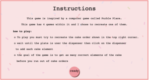
- the instruction page has the same sprinkles but has a translucent rectangle in front of it to make sure that the text is readable. this page also has a button
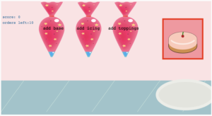
- This is the game page. it shows the score and the number of orders left. It also shows what the cake should look like. It has an audio that indicates that a new cakes is created and another that plays when the dispensers are used.
- One thing I would change is the way the dispensers look. I wanted to get better graphics for them and include the text better did not have time to do that.
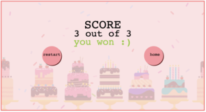
- This is the end game page. It offers the user the option to go to the home page or to restart the game. It also displays if the user won or lost and their score (the score here is there was only one cake order, I was only testing here)
- The page also has the same translucent layer as the instructions page but here I added some more graphics.
- I also wanted to work on the design aspect and make sure that the design of each page is intuitive and also has a consistent theme.
aspects that I am proud of:
I think that the code was neater than I expected it would turn out. I anticipating that this project would be a long one and that things might not be as intuitive looking back a few days later I tried to neaten the code as I went, keep the variable names descriptive, and create functions for things that I expect to use multiple times (like the buttons). But I usually say I’d do that and end up being lazy and picking unintuitive names for variables, but I stuck to it this time which I am proud of. I think that the code could still benefit from being spread on multiple js files (if that is possible).
challenges:
one of the challenges was handling all the different components of the game. The code got really long (like I assumed it would), I tried to prepare for that by making sure that my code is modular and by using many drafts with clearly stating the functions each draft achieves. Those two things made it easier for me to go back to previous versions, and also ensured that if a feature did break, the code would be minimally affected and recovering would be easier. I changed the cursor when hovering over the navigation buttons, added an instructions page, and tried to keep the design simple. However, I believe that there are still some things that I didn’t anticipate the user would need. I’ll fix this gap by letting someone interact with the game and noting down where they struggled and what they didn’t understand on their own. I think that this would give me more insight into the user’s experience however I did not have the time to do this for this project.
some things that were helpful in p5js:
-
-
-
-
- you can use textWidth(“Text”) to get the width of the text. this helps when centering text
- you can do random(list_name) to get a variable from the list instead of doing random( list_name[random(range)) and using a function to get random integers to get an index.
-
-
-
