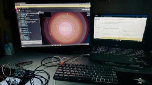
For this week’s user test, I asked a couple of acquaintances to interact with the Memory Dial without explaining anything upfront. I wanted to see how much the system communicates on its own and whether the visuals give any sense of “cause and effect” without my narration.
The first reaction was always the same: “It looks pretty, but what does it do?”
That told me something immediately – people understood they were looking at a reactive visual piece, but they couldn’t tell what influenced what. They waved their hands, stepped closer, dimmed the room lights with their phone flash, spoke near the laptop mic, and slowly started noticing patterns:
Once they figured out these relationships, the piece became much more interesting to them. The visuals were described as “alive,” “breathing,” and “calming.” But almost every tester needed a little hint about the sensors before they fully understood the interaction.
Because of this, I later added a few lines on the landing page briefly explaining what the room is controlling:
After that addition, testers understood the interaction far faster.
One more observation: the timed poetry reveal was a pleasant surprise for everyone, but since the demo interval was short, the poem sometimes popped up before they had fully understood the visuals. They liked it, but it felt “mysterious without warning.”
What worked well
The aura system made sense once users noticed the patterns.
People liked how the three layers moved differently. The breathing halo reacting to sound was the most immediately understood and got the most comments. Testers also said the overall motion felt calm instead of distracting.
The poem reveal was everyone’s favorite moment.
Even though it startled a few people, the transition and fade-in were described as “soft” and “cinematic.” Users said it made the piece feel thoughtful and “less like a tech demo and more like an experience.”
The visuals feel cohesive.
No one felt overwhelmed by the amount of motion, which was a relief because this system has a lot going on.
Room for Improvement
People needed guidance early on.
Without context, the sensors were basically invisible. Users tried to understand the visuals by guessing instead of experimenting. A tiny amount of text solved the issue, which shows the landing page actually matters.
Poem timing needs a cue.
Since users didn’t know a poem would appear, the transition felt abrupt during testing. A small hint like “The room is writing…” or a subtle dimming before the text appears might help lead the eye.
Distance-based motion was harder to notice.
Unlike sound or light, distance required more exaggerated motion. Some testers were just sitting down and moving their hands in front of the ultrasonic sensor. I guess that’s what matters more in the end since the difference might not be entirely comprehensible from a distance.
Final Thoughts
The Memory Dial works without instructions, but only after a short moment of confusion. Once people learn what the sensors represent, the piece becomes engaging and even meditative. It encourages slow interaction rather than quick action, and that resonated with users.
This test showed me that the concept is strong, but the system benefits from gentle onboarding, even something as simple as a few lines on the landing screen. With those adjustments, the Memory Dial becomes easier to understand and more enjoyable for first-time viewers.

