All Posts

Week 13 – Final Project User Testing

For the final project’s user testing, I asked my friend Sarfraz to play my game “Go Ichi-Go!” Based on his feedback, and the feedback of two other players, I got some insight and areas for improvement.

A common struggle they all had was understanding the jump and dive buttons. To jump/dive, you have to press and hold the button. But all of them only pressed it the first try. This made me realise that I should probably mark these instructions either one of the console or in the instructions at the start of the game.

Another suggestion my friend gave me was that the game was too easy, and that it could be faster. So I decided to modify the game accordingly. Either make the whole thing faster, or make it faster with each obstacle.

These suggestions helped me understand what can make my game more engaging and enjoyable. It also helped me understand where the players might be confused or lost.

Because my fabrication isn’t complete yet, my friends didn’t get the sweet treat at the end of the game, but they all loved the idea of it!

Video :


Assignment 13: Final Project User Testing

As we neared the due date of our final project, we were asked to conduct user testing prior to our submission.

I had two of my friends play my game, after which I had them give me feedback on what they liked, what they disliked, and any other features.

User Testing 1

User testing 2

From their experience, I was able to gain valuable insight into what I could improve in my game.

What I needed to add:

  • An Instructions Screen: the gameplay mechanic wasn’t immediately obvious to anyone who played, so I implemented an instructions screen within my game that the user would have to go through if they wanted to play the game.
  • Faster turnout time between rounds: Each new “round” of the game was taking a really long time to load, so I shortened the time between the pattern displaying
  • User Interactivity: Another thing I noticed was that there was a slight delay between when the user clicked the button connected to my Arduino and the button lighting up and playing a sound, so I had to go back to my Arduino code and integrate a debouncing delay, so that the experience felt more seamless

I plan to integrate these within my game for a more polished and complete feeling, taking into account their criticisms to improve.

User Testing-Week 13

Final Concept: Motion-Activated Mini Garden Visualizer

My final project is the Motion-Activated Mini Garden Visualizer—an interactive installation that uses an ultrasonic sensor and individualLEDs embedded in miniature garden that I built. The project simulates how a garden might come to life in response to presence and movement. Instead of using a microphone to detect sound, the system now detects distance and motion. As a person approaches, LEDs light up in various colors, mimicking the way plants might react to human presence.

This visual experience is enhanced by a P5.js sketch that features lava lamp-inspired blobs. These blobs move and shift color based on proximity—creating a unified physical-digital display that changes in mood depending on how close someone is to the garden.

Why These Changes Were Made

Originally, the project was a mood tree visualize using an LED strip and microphone sensor. However, due to hardware limitations (the Arduino could only power 5 LEDs reliably), I shifted to using individual LED lights. At the same time, I replaced the microphone sensor with an ultrasonic sensor to create a more responsive and stable interaction system. These changes also allowed me to design a mini garden setup that feels more visually integrated and conceptually clear.

Real-World Relevance & Future Use Cases

This concept has real potential for garden and farm environments:

In gardens it could act as a calming, responsive lighting system.
On farms, the same setup could help detect animals like foxes approaching livestock (e.g., sheep). In the future, it could be upgraded with:

Sirens or alerts- when something comes too close.
Automatic light deterrents- to scare animals away.
Wireless notifications- to a user’s phone.

User Testing Reflection

I conducted user testing without providing any instructions, observing how people interacted with the installation:

What worked well:
Users naturally moved closer to the garden and quickly noticed that proximity activated the lights**. The more they explored, the more they connected movement with the garden’s glowing response.

What caused confusion:
each lights colour meant what- where was the sensor exactly

What I had to explain:
I explained the system was using

motion sensing was a bit confusing , and once clarified, users became more engaged.

How I’ll improve the experience:
To make it clearer, I plan to place a small instruction that says:
“Walk closer to bring the garden to life.”
This subtle cue will help guide new users and enhance intuitive interaction.

Final Thoughts

Changing from sound-based input to motion-based sensing not only solved technical challenges, but also made the experience smoother and more immersive. The use of single LEDs in a mini garden created a more grounded and intimate installation. These changes—while unplanned—ultimately led to a more thoughtful, future-facing project that bridges creative expression with real-world functionality.

The video:

https://drive.google.com/drive/u/0/folders/1Kk2lkQgoAyybXSYWVmY2Dog9uQVX_DMq


Week 11 – Reading Response

Design Meets Disability

Reading opens up with the example of a leg splint, and how contrary to the ‘trickle-down’ effect, we have the design for a small segment or portion of the community being inducted into the mainstream industry. The argument is made surrounding the example of prosthetics or aids for differently abled people, which are designed to camouflage and blend in, as if it is a shame to use them in the first place. The reading discusses how there is a tension between the two concepts of presentation and concealment, and how it is difficult to provide both. Solid examples such as eyewear are provided where “from medical necessity into key fashion accessory” the transition was made, despite entities like the NHS opting for transparent frames to make it less noticeable.

The case of hearing aids and game-changer HearWear was also made. Throughout the reading, the emphasis was put on the concept of design, and how the effort and energy put into it is crucial to the performance of the product. An instance of this can be the example of prosthetics, which, being different in nature as they are an extension of one’s body part, are designed in a way to be both functional and socially pleasing. However, the designing  element when it comes to looks and feel is not credited enough, and people behind such are snubbed. Now, the author doesn’t use the word “ snub” directly, but personally it can be agreed that this area or line of work isn’t commended much. Although, this isn’t the case all of the time. The case of the iPod differs. With its small design and portability, it not only revolutionized the tech industry in terms of its performance but also set a bar when it came to design and aesthetics – gathering different accolades and awards in this segment.

After having read, it was imperative to draw a connection with a similar concept discussed in the previous reading, on how the design aesthetics make even the most complicated systems in terms of their operability, appear to be perceived as easy to work with thanks to their design and interactivity component. However, it is also the case that sometimes, in certain cases, the functionality and usability are sacrificed to what the eye truly beholds as worthwhile, whereas the mind deems it to be a misfit. As mentioned in the reading ‘Attractive Things Work Better’, objects like impossible teapots stand out in terms of fashion/decorative statement, but lack usefulness. Personally, I believe that through the outward statement made by products such as hearing aids, the public perception towards differently abled can be neutralized. Instead of miniturizing aids to reduce visibility and lose out on functional efficiency due to small size, why not give up concealment and improve the usefulness? I certainly believe that design and engineering both go hand-in-hand. Like peanut butter and jelly inside of a sandwich. Therefore, being a crucial component, concealment in such cases should be dealt with the idea of ‘presentation’.

However, I also believe that exaggeration in terms of design should be avoided. In the pursuit of making a fashion statement, the redundancy and unnecessary patterns can be introduced. Therefore, it is equally important to attain equilibrium between the adequate design and functionality.

Week 10 – Reading

The web article entitled “A Brief Rant on the Future of Interaction Design” evokes a range of emotions in its readers. Initially, the video produced by Microsoft appeared flawless and aligned with the reader’s expectations of the future. However, the subsequent discussion on tools and interaction components prompted a reevaluation of what constitutes an improvement. The author effectively illustrates this point by comparing a hammer to human interaction, emphasizing that our hands are the primary component in tangible interactions. The author argues that despite the underlying technology, our interactions have slightly improved. This argument is supported by the concept of “tactile richness.”

While I generally agree with the author’s assertion that corporations often exaggerate the advancements in their products, I find the notion that tactile richness can be fully extracted from non-tangible elements to be flawed. Furthermore, the development of haptics and sensors like gyroscopes has enabled the creation of products such as smart glass, which have revolutionized human-computer interaction by incorporating gestures like head tilts, voice commands, and other active inputs. These advancements significantly surpass the limitations of traditional touchscreens. Consequently, I believe they contradict the author’s claim that tangible improvements are not being made.

Nevertheless, I acknowledge that in terms of manipulation and tactile richness, the emphasis on branding and hype may not accurately reflect the actual level of advancement.

Regarding the other reading, it sent me into a frenzy full of laughter. The majority of the disagreements and counterarguments I had, such as the use of gestures, voice, and tangible-non-tangible elements, were addressed in this follow-up response. I acknowledge that the writer possesses a distinct perception and perspective, and how they employ certain claims to support their arguments, such as densely nerve-covered finger tips and their correlation with brain development. However, I firmly believe that it ultimately reduces to the concept of interpretivism. How we define technology. For someone completely unfamiliar with the concept of a stylus, they would likely find little to utilize or develop with. In their eyes, a transition from a stylus to an OLED glass display would appear more advantageous and innovative. Personally, I grew up with a Nintendo DS that came with a stylus. The next generation of PS-Vita captured my attention, and since then, I have never touched that Nintendo. The tool we use to amplify certain phenomena—for some, the desired amplification may vary. Therefore, I firmly believe that our responses differ. Furthermore, considering the significant advancements in technology since the publication of this article fourteen years ago, I suspect that the author may simply be making certain exceptions.

Week 10 – Production Assignment

Musical Instrument

Introduction:

An instrument is something that helps us humans either measure the data or produce it. For this assignment, we were supposed to build a musical instrument in a group of two. Given my health challenges, I was unable to team up with anyone, and decided to pursue it on my own. I started off by asking the most fundamental question – “What is a musical instrument ? ” Something that plays sound when triggered? Or something that plays sound on its own? What kind of sound? How many sounds? It is when after pondering on the philosophy of a musical device, I questioned my surroundings. I don’t happen to have a dorm mate, and very less likely do I get to socialize with others around the campus. Sometimes the thoughts themselves get too loud that I start second guessing my self. This is where the eureka moment came in! A musical device that talks to me – interacts with my as if a roommate for instance would have done. To start off with basics, a greeting or a salutation would have had sufficed as well. There and then the idea of ‘Welcominator’ was born!

Concept and design:

After having decided upon what to make and accomplish, I got down to work. The basic logic of ‘Welcominator’ would involve use of a trigger mechanism which would recognize the moment I settle inside my room, and a speaker, alongside a digital and an analogue switch to trigger and adjust response.

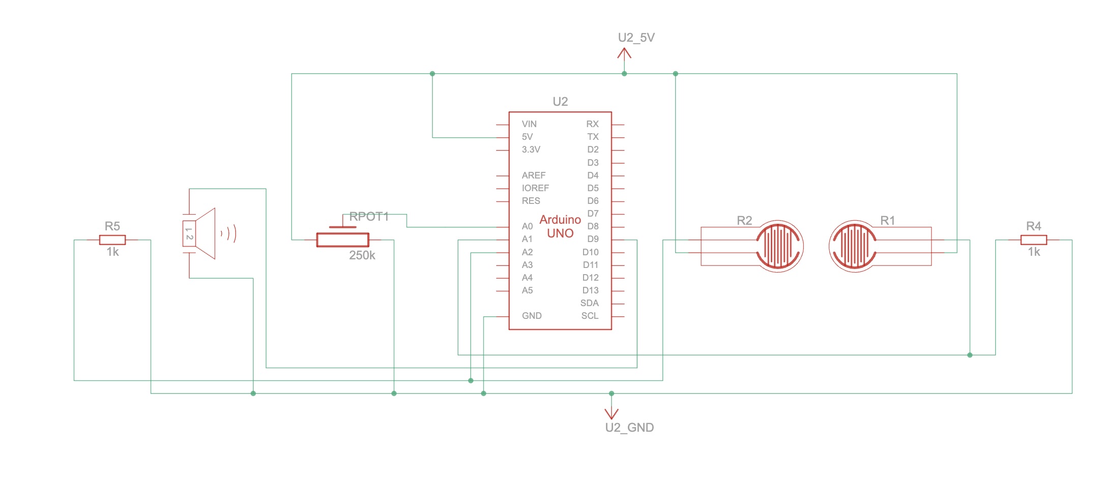
For the digital sensor / switch I decided to use the FSR sensor (Force Sensing Resistor). This sensor reduces the resistance with greater pressure applied, and by logic qualifies for the analogue sensor. However, the basic concept to this instrument was me putting down my items such as my watch as soon as I enter and settle down inside my dorm. Thus, two FSR sensors were used for greater surface area, and the value read by these sensors was read using digitalRead. Therefore, acting as a switch, the value of 1 or 0 was only read.

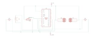
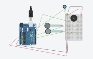
As for the analogue sensor, the potentiometer was used. The potentiometer in this case was not used to adjust the volume, but rather to choose between the audio tracks. The code written would select which sound to play depending on the current fed in by the wiper toward the A0 pin on the Arduino. The schematic and sketch below show the connection and logical mapping of the ciruit:


The buzzer or the speaker takes voltage signals from pin 9, whilst the digitalRead performed on FSR sensor is sent to pin A1 and A2 respective of the sensor.  It is an active buzzer and hence can play different sound tunes.

Code:

//crucial file added to understand how pitches and notes work
#include "pitches.h"

#define BUZZER_PIN 9
#define POT_PIN A0
#define SENSOR1_PIN A1
#define SENSOR2_PIN A2

bool isPlaying = false;

// godfather
int godfather_melody[] = {
  NOTE_E4, NOTE_A4, NOTE_C5, NOTE_B4, NOTE_A4, NOTE_C5, NOTE_A4, NOTE_B4, NOTE_A4, NOTE_F4, NOTE_G4,
  NOTE_E4, NOTE_E4, NOTE_A4, NOTE_C5,
  NOTE_B4, NOTE_A4, NOTE_C5, NOTE_A4, NOTE_C5, NOTE_A4, NOTE_E4, NOTE_DS4,
  NOTE_D4, NOTE_D4, NOTE_F4, NOTE_GS4,
  NOTE_B4, NOTE_D4, NOTE_F4, NOTE_GS4,
  NOTE_A4, NOTE_C4, NOTE_C4, NOTE_G4,
  NOTE_F4, NOTE_E4, NOTE_G4, NOTE_F4, NOTE_F4, NOTE_E4, NOTE_E4, NOTE_GS4,
  NOTE_A4
};

int godfather_durations[] = {
  8, 8, 8, 8, 8, 8, 8, 8, 8, 8, 8,
  2, 8, 8, 8,
  8, 8, 8, 8, 8, 8, 8, 8,
  2, 8, 8, 8,
  2, 8, 8, 8,
  2, 8, 8, 8,
  8, 8, 8, 8, 8, 8, 8, 8,
  2
};

// nokia tune
int nokia_melody[] = {
  NOTE_E5, NOTE_D5, NOTE_FS4, NOTE_GS4, 
  NOTE_CS5, NOTE_B4, NOTE_D4, NOTE_E4,
  NOTE_B4, NOTE_A4, NOTE_CS4, NOTE_E4,
  NOTE_A4
};

int nokia_durations[] = {
  8, 8, 8, 8,
  8, 8, 8, 8,
  8, 8, 8, 8,
  8
};


void setup() {
  pinMode(BUZZER_PIN, OUTPUT);
  pinMode(SENSOR1_PIN, INPUT);
  pinMode(SENSOR2_PIN, INPUT);
  pinMode(POT_PIN, INPUT);
}


void loop() {
  int potValue = analogRead(POT_PIN);
  bool useGodfather = potValue < 512;  // Left side (low) pot = Godfather, Right (high) = Nokia

  int sensor1Value = digitalRead(SENSOR1_PIN);
  int sensor2Value = digitalRead(SENSOR2_PIN);

  bool sensorTriggered1 = sensor1Value == HIGH;
  bool sensorTriggered2 = sensor2Value == HIGH;

  if ((sensorTriggered1 || sensorTriggered2) && !isPlaying) { // checks if no music is playing and either of the sensor trigger is recorded for
    isPlaying = true;
    if (useGodfather) {
      playMelody(godfather_melody, godfather_durations, sizeof(godfather_melody) / sizeof(int));
    } else {
      playMelody(nokia_melody, nokia_durations, sizeof(nokia_melody) / sizeof(int));
    }
    isPlaying = false;
  }
}

//function for playing melody
void playMelody(int melody[], int durations[], int length) {
  for (int i = 0; i < length; i++) {
    int noteDuration = 1000 / durations[i];
    tone(BUZZER_PIN, melody[i], noteDuration);
    delay(noteDuration * 1.2); // time duration added betnween notes to make it seem buttery smooth.
    noTone(BUZZER_PIN);
  }
}
// pitches.h
#define REST 0

#define NOTE_B0 31
#define NOTE_C1 33
#define NOTE_CS1 35
#define NOTE_D1 37
#define NOTE_DS1 39
#define NOTE_E1 41
#define NOTE_F1 44
#define NOTE_FS1 46
#define NOTE_G1 49
#define NOTE_GS1 52
#define NOTE_A1 55
#define NOTE_AS1 58
#define NOTE_B1 62
#define NOTE_C2 65
#define NOTE_CS2 69
#define NOTE_D2 73
#define NOTE_DS2 78
#define NOTE_E2 82
#define NOTE_F2 87
#define NOTE_FS2 93
#define NOTE_G2 98
#define NOTE_GS2 104
#define NOTE_A2 110
#define NOTE_AS2 117
#define NOTE_B2 123
#define NOTE_C3 131
#define NOTE_CS3 139
#define NOTE_D3 147
#define NOTE_DS3 156
#define NOTE_E3 165
#define NOTE_F3 175
#define NOTE_FS3 185
#define NOTE_G3 196
#define NOTE_GS3 208
#define NOTE_A3 220
#define NOTE_AS3 233
#define NOTE_B3 247
#define NOTE_C4 262
#define NOTE_CS4 277
#define NOTE_D4 294
#define NOTE_DS4 311
#define NOTE_E4 330
#define NOTE_F4 349
#define NOTE_FS4 370
#define NOTE_G4 392
#define NOTE_GS4 415
#define NOTE_A4 440
#define NOTE_AS4 466
#define NOTE_B4 494
#define NOTE_C5 523
#define NOTE_CS5 554
#define NOTE_D5 587
#define NOTE_DS5 622
#define NOTE_E5 659
#define NOTE_F5 698
#define NOTE_FS5 740
#define NOTE_G5 784
#define NOTE_GS5 831
#define NOTE_A5 880
#define NOTE_AS5 932
#define NOTE_B5 988
#define NOTE_C6 1047
#define NOTE_CS6 1109
#define NOTE_D6 1175
#define NOTE_DS6 1245
#define NOTE_E6 1319
#define NOTE_F6 1397
#define NOTE_FS6 1480
#define NOTE_G6 1568
#define NOTE_GS6 1661
#define NOTE_A6 1760
#define NOTE_AS6 1865
#define NOTE_B6 1976
#define NOTE_C7 2093
#define NOTE_CS7 2217
#define NOTE_D7 2349
#define NOTE_DS7 2489
#define NOTE_E7 2637
#define NOTE_F7 2794
#define NOTE_FS7 2960
#define NOTE_G7 3136
#define NOTE_GS7 3322
#define NOTE_A7 3520
#define NOTE_AS7 3729
#define NOTE_B7 3951

The code above addresses the logic and the pitches.h is another file used for defining and storing the notes that are used by our program. Code for the pitches and the sounds for ‘Godfather theme’ and ‘Nokia ‘ tune were taken from Arduino Project HUB website .

Both FSR sensor trigger HIGH or LOW value, and if potentiometer is registering lower voltage, then Godfather theme plays, and when it registers higher voltage, the Nokia tune plays. Once it ends, it sets the isPlaying state to false. This is to avoid interruption. Last but not the least, chatgpt was used to order pitches.h file as coding it myself would have been impossible.


Challenges:

One and the only challenge I faced was the FSR registering high, even when there was no pressure being applied. This led me to do some researching. Turns out that sometimes inaccuracy and condition of the sensor renders false positives. Hence, I used a resistor connection with the sensor and ground to get rid of the  tingling current, and register high only when a solid threshold was provided. An led was attached before the buzzer, for visual aesthetics and for indication that current was going through the buzzer. Initially the buzzer would work as well. This led me to code and find the bug in wrong pin assignment

Demo:

Future Revisions:

For future revision I intend to add multiple songs, FSR sensors, and an array of leds which can mimic the sound pattern.

Week 11: Reading Response

This week’s reading stayed with me more than any other. It made me think about how disability is usually approached through design, not with pride, but with silence. So many assistive devices are made to blend in, to be as invisible as possible. But what if visibility is the point? What if difference is not something to hide? This prosthetic eye with a small butterfly detail says more than a thousand clean, neutral medical devices ever could. It does not pretend to be a real eye. It says, I am here. I am not hiding.

Prosthetic eye with butterfly detail

This prosthetic eye doesn’t try to hide. It turns a medical object into a moment of expression.

That reminded me of how often people are taught to minimize themselves. To shrink into what is considered normal. Even in design school, we are often told to prioritize simplicity and universality, which sometimes ends up erasing complexity and identity. The reading showed how glasses once carried shame, but now they are fashion. We pick them in colors, shapes, and moods. That change happened because someone dared to design with beauty in mind, not because they tried to make glasses disappear.

The part about Aimee Mullins was especially striking. She does not just wear prosthetic legs. She expresses herself through them. Some are made of carved wood. Some are translucent. Some are bold and sculptural. They are not about fitting in. They are about standing in her truth. That made me wonder why assistive design is still expected to be beige, flat, and purely functional. Why do we still act like blending in is better than standing out?

This reading helped me realize something personal. I have spent so much time trying to design things that are clean, minimal, and safe. But rarely have I asked myself if they help someone feel more like themselves. That is the kind of work I want to make going forward. Not just design that works, but design that empowers. Not just access, but expression.

Owning yourself is powerful. It means showing up as you are, even when the world wants you to stay small. And design should not be about helping people disappear. It should be about helping them be seen.

Week 10: Reading Respponse

Bret Victor’s rant made me realize how passive we’ve become about the future of design. It’s not just that we’re stuck with screens, but that we’ve stopped questioning them. Everyone seems satisfied with touchscreens and voice assistants, as if that’s all interaction could ever be. What bothered me most is the lack of imagination. For a field that’s supposed to be creative, interaction design has become weirdly repetitive.

What stood out in the responses is that Victor isn’t against progress — he’s against settling. He points out that the tech world keeps selling the same ideas with slightly updated hardware, but very little actual vision. That feels especially relevant now, when even “futuristic” designs are just smoother versions of old things. I found myself wondering how often I do the same in my own projects. Am I just remixing what already exists, or am I really thinking about what interaction could become?

This made me think more about risk. It’s easier to build something people already understand, even if it’s a little boring. But real design, the kind Victor is asking for, takes more risk. It asks what else we could be doing, not just what works today. I want to start asking those questions earlier in my process, not just at the end when everything feels finished.

Week 9: Reading Response

Physical Computing’s Greatest Hits (and misses)

I often feel like nothing is original anymore. Every time I come up with an idea, I search it and find five people who have already done it, sometimes in more impressive ways. That can be discouraging. It makes me wonder what the point is if everything has already been made. But reading Tom Igoe’s piece helped shift that mindset. He talks about the “greatest hits” of physical computing — projects like musical gloves or motion-controlled sounds — not as clichés, but as classic forms that people keep coming back to. These ideas repeat because they are approachable, fun, and full of room for variation.

What I appreciated most was the reminder that repetition doesn’t cancel out creativity. A musical glove might not be new, but the way I make it, the story I tell through it, and how I design the experience can still feel personal. Igoe encouraged adding a twist, and that made me realize I do not have to be original in concept, but in execution.

I also liked his point about meaningful gestures. A motion that triggers a sound might technically work, but if the movement feels random or doesn’t make sense in the context, the interaction loses impact. That made me think more critically about how I design user input. I want people to feel like what they do matters, and that their actions are met with responses that feel natural and thoughtful. That, to me, is the real magic of interaction.

Making Interactive Art: Set the Stage, Then Shut Up and Listen

Tom Igoe’s post made me realize I often over-explain my work. I worry people won’t get it unless I guide them, but he makes a strong case for stepping back. In interactive art, it’s not just about what I make. It’s about what the audience does with it.

I liked how he compared it to setting a stage. I provide the space and tools, but the audience brings it to life. That means accepting unexpected interpretations and trusting the piece to speak for itself. I think good design should be guidance enough. If the design is clear and intentional, it should naturally lead the audience through the experience without me having to explain everything.

Moving forward, I want to create work that invites exploration without over-directing. That kind of openness feels more honest and more meaningful.

Week 8: Reading Response

Emotion & Design: Attractive things work better

This week’s reading made me laugh a little because it called me out directly. Norman’s idea that attractive things work better really stuck with me, but not because I think they literally work better. It’s because they make us feel better about them. That feeling changes how we treat the object. Case in point: this pink-bow mug I saw online. I would buy it instantly just because it’s cute. But if I actually tried drinking from it, I know the bow handle would probably poke me in the eye. And yet, I still want it.

Cute pink bow mug

I would 100% buy this, and it would 100% poke my eye.

It reminded me of how we collect things like stickers or fancy stationery just to admire them and never actually use them. Sometimes, function becomes secondary when something looks good enough. Norman makes the case that beauty improves usability by creating positive emotions, but I think this also raises a bigger question. How far are we willing to let go of functionality just to have something pretty? And when does that stop being design and start becoming decoration? It’s something I want to think about more in my own work. I still want my interactive projects to function well, but maybe it’s okay to prioritize joy and visual pleasure too. Sometimes, looking at something beautiful is the function.

Her Code Got Humans on the Moon

Reading about Margaret Hamilton reminded me why I love creative tech in the first place. She wasn’t just writing code. She was building the foundation of what software could even be. What really stood out to me wasn’t only that she helped put people on the moon, but that she did it at a time when software engineering wasn’t even considered real engineering. She coined the term herself because nobody else was giving it the weight it deserved. That says a lot about the kind of vision she had. She wasn’t just part of the system. She was defining it.

What I found especially inspiring was her mindset around error handling. She didn’t assume the user would always follow instructions perfectly. She designed with failure in mind, and made sure the code could still function under pressure or human error. That’s a mindset I want to carry into my own work, especially when building interactive projects. Not everything needs to be perfect, but it should be ready for the unexpected. That’s not just smart coding, it’s thoughtful design. The user might not always know what to do, but the system should be kind enough to keep going.