For this project, I wanted to make something fun, so I created a random law generator. The goal was to create absurd but still convincing-sounding fake laws that feel like they could exist in some strange town. The program works by randomly generating a town name, a weird law, and an exception. When the user clicks on the canvas, a new random law appears. As for the visual aspect, the law is displayed on a lined piece of paper with a pencil next to it. I added a brown background to make it look like the paper is resting on a wooden table.
One of the main parts of the project is how the laws are randomly generated and displayed:
function generateLaw() {
  let town = random(towns);
  let action = random(illegalActions);
  let exception = random(exceptions);

  randomLaw = `In the town of ${town}, it is illegal to ${action} ${exception}.`;
}
This selects a random town name from the towns array and picks a random illegal action from illegalActions. Then it selects a random exception from exceptions and combines them into an absurd law.
I faced a few challenges I had to overcome, including correctly aligning the pencil. At first, the pencil eraser and tip didn’t align properly with the body, so I had to adjust the x and y positions carefully to ensure the pencil remained vertical. Additionally, the lines on the paper were too bold, which made it feel unrealistic so I had to adjust the stroke colour and spacing.
Overall, I am satisfied with the way this turned out as it was a fun way to practice generative text output in p5.js. I learned how randomization in programming can create entertaining and unexpected results. Additionally, I had another chance to explore loops, which were useful for drawing repetitive elements like notebook lines. However, there are a few things I could improve on next time like including a hand holding the pencil or making the paper slightly curved for a more realistic effect. I also thought of an interesting element I could add, where I may add a “law history” section that can keep track of the previous laws.
One of the things that frustrates me a lot and is not mentioned in the reading are the air blowers found in public bathrooms. As you might now some of the malls or other public bathrooms for some reason decide to put air blowers instead of paper towels for drying hands. In most cases these blowers can’t detect when we place our hands under and we are left there standing next to to the machine going forwards and backwards with our hands like we are doing some stupid dance choreography. Not to mention how some bathrooms have very strong blowers which will dry my hands faster, but I will go out with a wet shirt. Papers are towels are easier to use, straight forward and do the job much quicker and better than the blowing machines.
In order to avoid my design being hard or unpleasant to use I will apply the following principals to my design. I will make the buttons look clickable and the links underlined or colored differently so it is obvious to the user that button or link is intended for clicking. I will make sure that the user gets immediate response to their interaction of any part of the design and I will place buttons and other interactive objects in places where it makes sense. No hidden menus or buttons which are weirdly colored or hidden so they are barely visible. Some websites don’t do the color matching correctly so the links look like every other word in the sentence and is hard to determine on what to click, I will make sure I don’t do such thing.
I was going through Kaggle, looking at interesting datasets that I could use to visualize some data. I stumbled upon a dataset about “IMDB Top 250 Movies Dataset” and decided to give it a look. After looking through the dataset I became interested to how the budget the movie had initially gotten corelates to the Box-office revenue it received so I decided to make a graph using that data and present it using p5js.
The project might have a simple look, but I believe the data that it shows and the results are quite interesting.
Process
For the process I first looked at the dataset on my computer, trying to find interesting data that I could present visually. After finding the budget and the box office values I then loaded them into the p5js and first printed a few values just to see if the dataset works. Then came the process of actually pulling all the data and plotting it on the preview. This process was a bit tricky as I had to play around with the map function to understand it completely and make the graph look how it should. I am proud of the way I found mins and maxes and the way I mapped them.
// Getting the minimums and maximums, by pulling only the budget or only the boxOffice data
let minBudget = min(movieData.map((m) => m.budget));
let maxBudget = max(movieData.map((m) => m.budget));
let minBoxOffice = min(movieData.map((m) => m.boxOffice));
let maxBoxOffice = max(movieData.map((m) => m.boxOffice));

//Maping and placing the data
for (let movie of movieData) {
  let x = map(movie.budget, minBudget, maxBudget, 50, width - 50);
  let y = map(movie.boxOffice, minBoxOffice, maxBoxOffice, height - 50, 50);
  fill(0, 255, 0);
  ellipse(x, y, 5, 5);
}
Reflection and Future improvements
For the future improvements I would maybe want to find a bigger dataset and try to plot more movies into the existing one and see what the difference it makes. Maybe I could also incorporate allowing user to tweak what other “filters” are present to see what maybe affects the budget to box office revenue difference in movies. Overall I found this project very interesting and challenging, but at the same time tons of fun!
Faucets, soap dispensers, and towel dispensers in public restrooms can be really frustrating. One reason is because of the uptick in automatic dispensers and sinks. Sometimes, faucets look like they’re automatic but are really operated by handles, and same thing goes for soap/towel dispensers. Another frustrating point is when soap dispensers look like faucets. I also once saw an air/hand dryer, soap dispenser, and faucet all with the same color, build, and shape surrounding a sink; the only distinguishing factor was their size. I had to test out all of them to figure out which one was which.
Don Norman says, “The same technology that simplifies life by providing more functions in each device also complicates life by making the device harder to learn, harder to use. This is the paradox of technology and the challenge for the designer”, which I thought was interesting. The designer has to make complicated information easily digestible. Designers are like the middlemen between new technology and users.
I also think the point about having to spell out a function or affordance for users with words is poor design is compelling, but also very difficult to get right. Making designs intuitive is the ultimate goal, but the thing about intuition is that you don’t consciously think about it, so designers can’t know immediately what it intuitive. Too often, I personally lean towards words to let people know what a design does. However, I need to get more used to designing without words and simply use visual or physical cues to guide a user’s attention.
Don Norman’s main idea about how people aren’t at fault for poor design is also very important. It’s up to designers, engineers, manufacturers, and businesses to create a pleasant user experience; if a user isn’t enjoying their product, it’s not the user’s fault. Too often, experts are biased in their own highly skilled perspective that they expect others to be on that level. For example, sometimes when I’m teaching someone a skill like crochet, I see the stitches and shapes very easily, but they can’t. If I were to design a beginner’s crochet kit or tutorial, I need to take into account the average beginner’s perspective.
I really liked how Don Norman distinguishes between affordances and signifiers, indicating that affordances are relationships between people and designs, and signifiers are physical attributes that lend to discovering affordances. Distinguishing them helps designers understand what they’re working towards and how to work towards it.
When approaching this project, I wanted to create something that felt organic, dynamic, and visually engaging while staying true to my interest in systems, patterns, and movement. I’ve always been fascinated by the hidden structures that govern the natural world—whether it’s the way air currents shape cloud formations, how magnetic fields interact with charged particles, or how fluid dynamics influence ocean currents. These invisible forces dictate movement and structure on both microscopic and massive scales, yet they often go unnoticed in daily life.
This fascination led me to explore generative art as a way to reveal these hidden forces. By using a flow field generated through Perlin noise, I aimed to simulate an abstract yet realistic movement of particles through a force-driven system. The goal was to make the movement feel both unpredictable and structured—like a balance between chaos and order, mirroring how natural systems operate.
Another reason this concept resonated with me is my interest in interactive media and computational design. I see creative coding as a bridge between logic and aesthetics—using algorithms not just to solve problems but to create emotionally engaging experiences. This project became a way to explore how simple rules (vector fields and movement constraints) can lead to complex, emergent behaviors.
How I Decided on the Approach
Initially, I considered different ways of visualizing movement:
Cellular automata (which follows a discrete rule set)
Particle systems with basic physics (which simulate real-world gravity and collisions)
Algorithmic drawing techniques (such as recursive fractals)
However, I specifically wanted smooth, flowing movement, where particles appear to drift through an unseen force field rather than follow rigid, predictable patterns. This led me to research flow fields, a technique often used in generative art to create dynamic motion based on vector fields derived from Perlin noise. The key insight was that by giving each particle a force vector at every point in space, I could create an artwork where movement itself became the visual expression.
Connecting to My Interests
This project ties into my broader interest in interactive systems and generative design. In the future, I could see expanding this into an interactive piece, where users could manipulate the flow field in real-time, changing the behavior of the particles with gestures or sound inputs. Additionally, this exploration of emergent patterns aligns with my curiosity about how simple rules can create complexity, something that applies not just to visual art but also to fields like engineering, physics, and artificial intelligence.
Ultimately, this artwork serves as both a study of motion and structure and a reflection of how natural forces shape our world in ways we don’t always perceive.
My code:
let particles = [];
let flowField;
let cols, rows;
let scl = 20; // Scale of the grid
let zOff = 0; // Noise offset for animation

function setup() {
  createCanvas(600, 600);
  cols = floor(width / scl);
  rows = floor(height / scl);
  flowField = new Array(cols * rows);

  // Create particles
  for (let i = 0; i < 500; i++) {
    particles.push(new Particle());
  }
}

function draw() {
  background(0, 10); // Faint trail effect

  // Generate the flow field using Perlin noise
  let yOff = 0;
  for (let y = 0; y < rows; y++) {
    let xOff = 0;
    for (let x = 0; x < cols; x++) {
      let index = x + y * cols;
      let angle = noise(xOff, yOff, zOff) * TWO_PI * 4;
      let v = p5.Vector.fromAngle(angle);
      flowField[index] = v;
      xOff += 0.1;
    }
    yOff += 0.1;
  }
  zOff += 0.01;

  // Update and display particles
  for (let particle of particles) {
    particle.follow(flowField);
    particle.update();
    particle.edges();
    particle.show();
  }
}

// Particle class
class Particle {
  constructor() {
    this.pos = createVector(random(width), random(height));
    this.vel = createVector(0, 0);
    this.acc = createVector(0, 0);
    this.maxSpeed = 2;
    this.color = color(random(255), random(255), random(255), 100);
  }

  follow(vectors) {
    let x = floor(this.pos.x / scl);
    let y = floor(this.pos.y / scl);
    let index = x + y * cols;
    let force = vectors[index];
    this.applyForce(force);
  }

  applyForce(force) {
    this.acc.add(force);
  }

  update() {
    this.vel.add(this.acc);
    this.vel.limit(this.maxSpeed);
    this.pos.add(this.vel);
    this.acc.mult(0);
  }

  edges() {
    if (this.pos.x > width) this.pos.x = 0;
    if (this.pos.x < 0) this.pos.x = width;
    if (this.pos.y > height) this.pos.y = 0;
    if (this.pos.y < 0) this.pos.y = height;
  }

  show() {
    stroke(this.color);
    strokeWeight(2);
    point(this.pos.x, this.pos.y);
  }
}
When brainstorming for this project, I wanted to represent data in a way unique to the dataset. I wanted to use what the data was about and frame it in a visually engaging way that best represented what it was about. I was digging through Kraggle and found a simple dataset about streaming platforms, so I thought it’d be cool to represent it inside a TV and the glitchy effects of a TV screen. Each bar of glitch/color is proportional to the percentage of shows or movies the streaming platform has compared to the others. Since there were two sets of data, I created buttons on the TV to toggle between them; I really liked how the functionality of the system was tied in to the visual cohesion of the piece. The colors for the glitches are also randomized, so each time you click the buttons, the colors will change regardless of whether or not the dataset changed.
Some challenges I encountered included not being able to pass in arguments to a function I call when the buttons are pressed. To overcome it, I found a way to change the mousePressed function:
In the future, I want to make this piece more engaging because it feels a bit more static right now. Maybe users can click on the specific streaming platform and learn more about it. Or I can find more data on these platforms and users can see even more data visualization upon clicking each individual platform. Overall, this project came with a lot of testing and looking for datasets. I had to frequently test the spacing of the rectangular bars used to represent each streaming platform, text rotation, and button sizing. There was also a lot of math involved for turning the values in the dataset into rectangles that fit within a confined space.
In The Design of Everyday Things by Don Norman, the main argument is that usability issues stem from poor design rather than user error. This challenges the common assumption that people are to blame when they struggle with everyday objects. Come to think of it, well-designed objects should naturally guide users, minimizing confusion.
One example of poor design that was not mentioned in the reading but has always frustrated me are cable, especially USB ones. The traditional USB connector can only be inserted one way, yet there is rarely a clear indication of which side is correct. This often leads to flipping the plug multiple times before it fits. A simple signifier like a physical marker or a visible point, could solve this issue and make the interaction effortless.
Norman’s principles are also highly relevant to interactive media. Websites and apps often suffer from unclear navigation, hidden menus, or buttons that don’t look clickable. Applying affordances and signifiers like distinct buttons and clear labels would improve usability. Similarly, feedback is important as when users submit a form or click a link, they should receive a confirmation to avoid uncertainty.
Something that drives me crazy is doing laundry on campus. Many of the drying machines in my building don’t show the duration of the cycle/program, so it is hard to know exactly when it will finish and often times, I end up making multiple trips to the laundry room just to take out my clothes from the dryer. The washing machines are also not without their problems – even though they have timers that show how much time is left for the cycle to finish, the timers are often inconsistent and don’t match up with the progress of the washing programs. I feel that my laundry experience would be so much better if the laundry machines enabled me to: 1. know exactly how long it will take 2. by the time I get to the laundry room after my alarms go off, my laundry is actually finished and I don’t have to wait extra 10-15 minutes for the machine to stop spinning. Something as routine as laundry should be intuitive and not become a guessing game.
I think the ideas mentioned in the book are all applicable and relevant to interactive media. Affordances and signifiers are important to make the interaction between the user and the system clear. For example, buttons should look clickable and links need to be presented in such a way to indicate that they can be clicked. The controls that allow the user to interact with the system need to logically map to their effects to provide an intuitive experience. When the user performs an action, they should get a feedback signal to notify that their actions were registered.
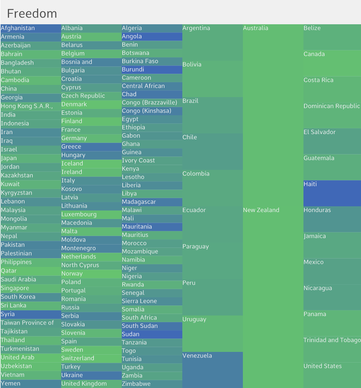
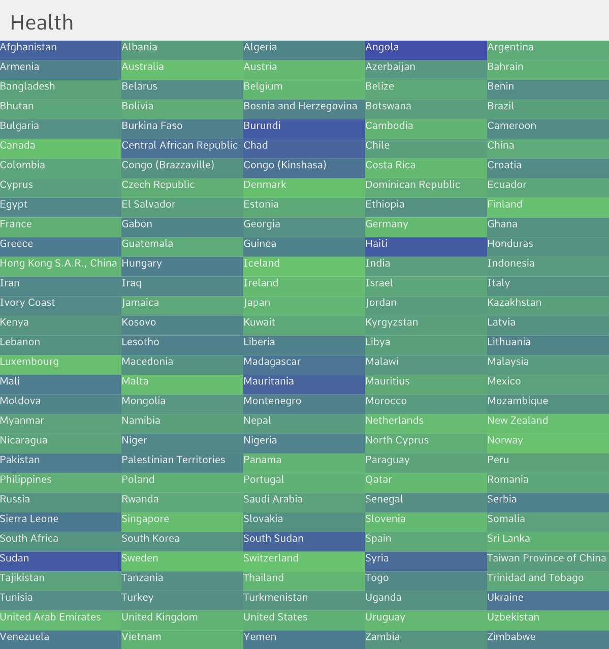
I was looking through the datasets linked in Professor Mathura’s repo when I came across the data for the World Happiness Report. It contained numerical data for various happiness indicators across countries around the world and I was immediately interested as I was looking to create some sort of a color visualization. Using this data, I decided to create a data visualization using color that shows where each country stands in terms of happiness, as well as in terms of the other indicators that impact happiness, including health, freedom and economy.
Process
I planned to create individual visualizations for each of the four focus indicators using different colors, and then make them transition into one another smoothly. While searching about ways to do color transitions and gradients, I came across the lerpColor() function that works similarly to the lerp() function, and allows to interpolate between two colors based on a parameter.
Initially, I drew equal size rectangles for each country. Even though I liked that the whole canvas was perfectly divided into uniform rectangles, it felt like it lacked coherent meaning. I thought it might make the visualization much more interesting if it offered a comparison of the indicators across not only countries, but also across continents. The original data file unfortunately did not have continent data, so I manually went through the CSV file to add a continent column entry for each country. Using this data, I divided the canvas vertically into 6 equal columns representing each continent (Asia, Europe, Africa, South America, North America, Oceania), and then further divided each column into smaller segments for each country. This way, the visualization offered a richer narrative – it illustrates how happiness indicators vary across the different regions in the world, and exposes potential trends linked to geography and economic factors.
AfterBefore
Brighter/lighter colors represent higher scores on the happiness level indicators and darker colors represent lower scores. This means that a country ranks high in happiness if it consistently appears bright throughout the visualization. Toggle feature is added to allow the sketch to also be viewed solely as an art piece, so if you want to see the countries represented by the boxes, you have to click the mouse.
Challenges
Implementing the transition between the visualizations was the biggest challenge of this project.
I created a helper function to get the color based on the score and the indicator, by mapping the score ranges for each indicator to RGB color ranges (0-255). Setting the RGB color values took surprisingly many trials and repeated references to RGB color theory to get the exact color gradient I wanted for each indicator.
// helper function to get the color based on score & indicator
function getColorForIndicator(score, indicator) {
  // higher the score, brighter/lighter the color
  // lower the score, darker the color (nearing 0)
  if (indicator === "Happiness") {
    // yellow <-> dark
    return color(map(score, 2, 8, 0, 255), map(score, 2, 8, 0, 255), 100);
  } else if (indicator === "Health") {
    // green <-> dark
    return color(100, map(score, 0, 1, 0, 255), 100);
  } else if (indicator === "Freedom") {
    // blue <-> dark
    return color(50, map(score, 0, 1, 50, 200), map(score, 0, 1, 50, 200));
  } else if (indicator === "Economy") {
    // magenta <-> dark
    return color(map(score, 0, 2, 40, 255), 100, map(score, 0, 2, 20, 255));
  }
  return color(200);
}
To achieve a smooth color transition, I used the lerp() and lerpColor() functions to get the colors corresponding to the indicator scores interpolated by the current progress of the transition.
// get the country's scores for the current and next indicator
let currScore = getScore(countries[j], currIndicator);
let nextScore = getScore(countries[j], nextIndicator);
// get the current and next score belend by interpolating by the transition progress
let blendedScore = lerp(currScore, nextScore, transitionProgress);

// get the colors for the current and next indicator based on blended score
let col = getColorForIndicator(blendedScore, currIndicator);
let nextCol = getColorForIndicator(blendedScore, nextIndicator);
// retrieve the final color by similarly interpolating by progress
// this ensures smooth color transition between the visualizations
let finalColor = lerpColor(col, nextCol, transitionProgress);
Reflections & Improvements for Future Work
I learned a lot while working on this week’s project, including new functions like lerpColor(), millis() and loadFont(). The process was not only technically challenging, but also required thinking more deeply about how to transform raw numbers into a compelling visual story. Moving forward, I hope to continue being intentional about the design and meaning of my projects.
This project is Barbie-themed quote generator where the user can pick different moods and see a random quote associated with each mood. The mood options, such as “Empowered Barbie”, “Sassy Barbie” and “Sad Barbie” each trigger a quote that is supposed to motivate the user and uplift their mood.
Code Highlight
The most challenging part of this project was integrating randomly changing quotes based on user selection. To achieve this, I set up a function to handle button clicks, where each button is linked to a specific mood and quote. I also added hover effects and smooth transitions to create a more interactive experience.
// Quote Generator Page
function displayQuotePage() {
  tint(255, 180); // Makes background a little more subtle)
  image(bg, 0, 0);
  noTint();

  // Title and text layout
  textAlign(CENTER);
  textFont('Montserrat');
  textSize(36);
  fill('#ff3385');
  text("Choose your mood:", width / 2, 50);

  // Mood options
  textFont('Open Sans');
  fill(0);
  textSize(24);
  text("Empowered Barbie", width / 2, 110);
  text("Sassy Barbie", width / 2, 160);
  text("Sad Barbie", width / 2, 210);

  // Quote section
 if (quote !== "") {
    fill('#ff3399');
    noStroke();
    rect(150, 280, 400, 80, 15);
    fill('white');
    textSize(22);
    text(quote, width / 2, 310);
  }
Reflections
The concept for this project was inspired by the diversity of Barbie characters and the different moods they represent. Barbie has always reminded me of the kind of uplifting quotes I use in my projects, which makes me feel better and motivated.
Looking back, one area for improvement would be the design. Since I didn’t have much time this week, I focused more on the interactivity aspect. Ideally, i would add elements like animated transitions or colorful backgrounds that change based on the selected mood. I’d also love to add sound effects or background music to better the mood and make the experience even more immersive. I was also thinking about taking user’s name to make the experience feel more personal. Overall, I’m happy with the way it turned out as i used a lot of new elements.