I do not associate medical or disability-assistive products with design. To me, it only mattered how functional or practical they were, and not their aesthetic value. What I appreciated about the author’s perspective was how they treated people with disabilities as a distinct user group whose preferences and needs are often overlooked by designers and engineers.
Further into the reading, I started to feel bad that people with disabilities are often forced to choose between a device that functions well and one that’s subtle or aesthetically pleasing. These goals seem to conflict with current design approaches. Even within the category of disability, there’s a wide range of experiences that should shape how products are created.
I really liked the author’s example of eyeglasses. Glasses are no longer seen as a disability aid, but are now a fashion statement. Although, to be honest, personally glasses have always just been a medical necessity for me. But also I refuse to get laser because I now think I look better with glasses anyways. I could think of some other examples back from high-school as well: hearing aids and braces for teeth.
I strongly believe that the notion that assistive devices must remain discreet reflects a broader limitation or bias in design thinking. It is a kind of hesitation in creating bold, confident products that users would actually be proud to display. However, I do think that with every passing year, adaptive fashion is becoming increasingly popular, and this will help begin a new era of accessibility.
The Mini DJ Booth is a physically interactive sound system that combines Arduino and p5.js to simulate the experience of a digital DJ console. The project uses four physical buttons connected to an Arduino board, each mapped to a unique beat and corresponding visual effect displayed through p5.js. When a button is pressed, a signal is sent from the Arduino to the computer via serial communication, triggering both a sound loop and a colorful visual animation on screen.
The physical setup will be built using cardboard, designed to resemble a miniature DJ booth with labeled, color-coded buttons—each representing a different sound or track. The interface invites users to experiment with rhythm and visual design, mimicking the creative flow of live mixing.
Visual Prototype (Generated on ChatGPT)
Interaction Design
Input: Arduino detects button presses.
Processing (Thinking): The signal is sent to p5.js, which identifies which button was activated.
Output: p5.js responds by playing a corresponding beat and generating a synchronized visual (color and shape animation) on screen.
Each of the four buttons triggers:
A unique sound (e.g., drum, bass).
A distinct color palette and animation style that matches the mood of the beat.
The more users press the buttons after one another they create different beats and sounds mimicking a real DJ booth.
Materials
Arduino
4 push buttons (I wanna use the bigger ones that we saw during the lab tour as they feel more tactile and look better overall)
4 resistors (10kΩ)
Jumper wires
Breadboard
USB cable
Laptop running p5.js
Cardboard and paint/decor for the booth design
User Experience
Users interact with the booth by pressing different buttons to layer and remix beats. The immediate audio-visual feedback creates a playful and performative experience, encouraging rhythm exploration and creative expression. The physicality of pressing real buttons, combined with the digital response on screen, merges tactile and visual engagement, much like an actual DJ setup.
Goal
To explore how physical input devices (Arduino buttons) can enhance digital multimedia experiences (p5.js visuals and sounds), creating an accessible, low-cost prototype that bridges sound, motion, and design.
When doing this weeks reading what actually surprised me most was how the Eames leg splint becomes a symbol of empathy turned into form. I was fascinated by how something born from wartime necessity, an object designed for injured soldiers, evolved into a design philosophy that shaped everyday furniture. It reminded me that innovation often begins in moments of constraint. Charles Eames’s belief that “design depends largely on constraints” reframes disability not as limitation, but as a source of creativity. Reading this, I thought about how many of our most elegant designs emerge not from freedom, but from friction.
The later sections on fashion and prosthetics complicated my idea of good design. I was moved by how eyewear, once a medical device now transformed into a fashion statement, while hearing aids remained confined by the medical model of concealment. That difference says a lot about visibility, shame, and what we consider socially acceptable. When the text described pink plastic hearing aids as a form of “white Western bias,” it made me reflect on how aesthetics can either humanize or marginalize. Why is it that invisibility is seen as dignity, while expression is seen as vanity?
Apple’s iPod and the Muji CD player added another layer to this question. Both suggest that simplicity can be radical, that good design isn’t about adding features but removing noise. The iPod’s “1,000 songs in your pocket” (which now reading this in 2025 is so funny to me because I genuinely can’t imagine a world in which every song I could ever want isn’t three taps away on my phone) echoed the Eameses’ plywood splint: a single elegant solution born from constraint. Yet, the reading also warns that universality and simplicity can’t always coexist. It made me rethink whether inclusive design should aim to be for everyone, or instead embrace difference with honesty.
In the end, I felt the book wasn’t just about disability, it was about humility in creation. Whether in a leg splint, a pair of glasses, or a music player, design becomes an ethical act: one that balances visibility and dignity, simplicity and inclusion, beauty and necessity.
Bret Victor argues that hands do two things, feel and manipulate, and that most screen-first products ignore both. On the counter I judge texture, resistance, and weight, I adjust heat by feel, I correct errors through immediate tactile feedback. On the screen I scroll and tap with one finger, I convert rich physical cues into flat sequences of steps, accuracy falls and attention shifts from food to interface.
Fitness tracking shows a similar pattern. A watch counts reps and time, yet it cannot teach grip pressure, bar path, stance, or breath. Effective coaching speaks through the body, the right cue is a change in force or timing, not another chart. A better tool would offer variable resistance and haptic prompts, small vibrations for tempo, pressure feedback for grip, and state you can feel without looking.
Even productivity tools can illustrate the loss in “transaction”. Physical sticky notes on a whiteboard build spatial memory, clusters are recalled by location and reach, the body encodes the arrangement. Dragging cards on a screen removes proprioception, scanning columns replaces simple recall by place. Tangible controllers and deformable surfaces could restore some of that embodied structure, information would be carried in texture and force, not only pixels.
To improve this, I propose we treat touch as information but not just input. Design for affordances that speak through force, texture, and spatial arrangement. If a tool mediates physical tasks or spatial understanding, add haptic and tangible feedback before adding new visual layers.
For our interactive media sound project, my partner, Yiyang, and I decided to create a simple yet expressive instrument with a few sensors, and a buzzer on Arduino Uno. We wanted to build something that was intuitive to play and produced a unique, percussive sound. The result is this force-sensitive drum. Tapping different pads creates different notes, and a toggle switch shifts the entire instrument into a higher-pitched mode.
Concept
Our initial idea was inspired by the force sensors used in class to control sound. We thought, what if we could use multiple sensors to combine frequencies and create rhythms? We brainstormed a few possibilities. Could we assign different chords to each sensor, where pressing harder makes a certain chord more prominent? Or could the sensors act as modifiers for a continuous track?
Ultimately, we settled on a more direct approach for a playable instrument. We decided to have three Force Sensitive Resistors (FSRs) that would each trigger a distinct note, like pads on a drum machine. To meet the project requirements and add another layer of interactivity, we incorporated a digital two-way switch. Flipping this switch would transpose the notes of all three pads to a higher octave, giving the player two different sound palettes to work with.
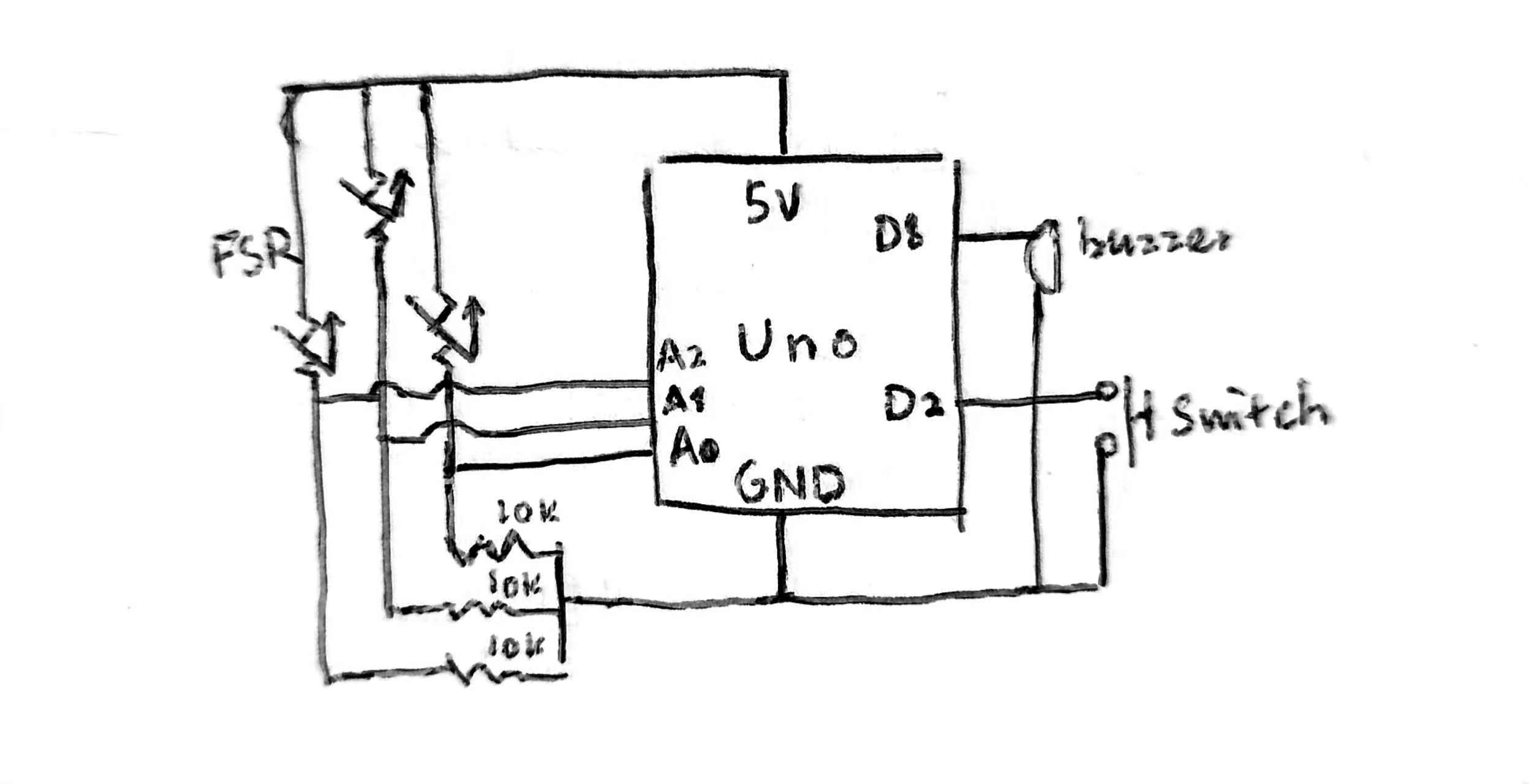
Schematic
The build was straightforward, centered around an Arduino Uno and a breadboard.
Components Used:
1x Arduino Uno
1x Breadboard
3x Force Sensitive Resistors (FSRs) – our analog sensors
1x Two-way toggle switch – our digital sensor
1x Piezo Buzzer
Resistors (for the FSRs and switch)
Jumper wires and Alligator clips
Each of the three FSRs was connected to a separate analog input pin on the Arduino. This allows the Arduino to read a range of values based on how much pressure is applied. The toggle switch was connected to a digital pin to give us a simple ON/OFF (or in our case, Mode 1/Mode 2) reading. Finally, the piezo buzzer was connected to a digital pin capable of PWM (Pulse Width Modulation) to produce the tones.
The Arduino code continuously checks the state of our mode switch and reads the pressure on each of the three force sensors. If a sensor is pressed hard enough to cross a defined hitThreshold, it calls a function to play a corresponding sound.
There was evolution of our instrument. We started with a basic concept (v0.1) and then refined it by adjusting the frequency gaps between the sensors for a more distinct and musical sound (v1.0a). Finally, we tweaked the delay to give it a more responsive and percussive, drum-like feel (v1.0b).
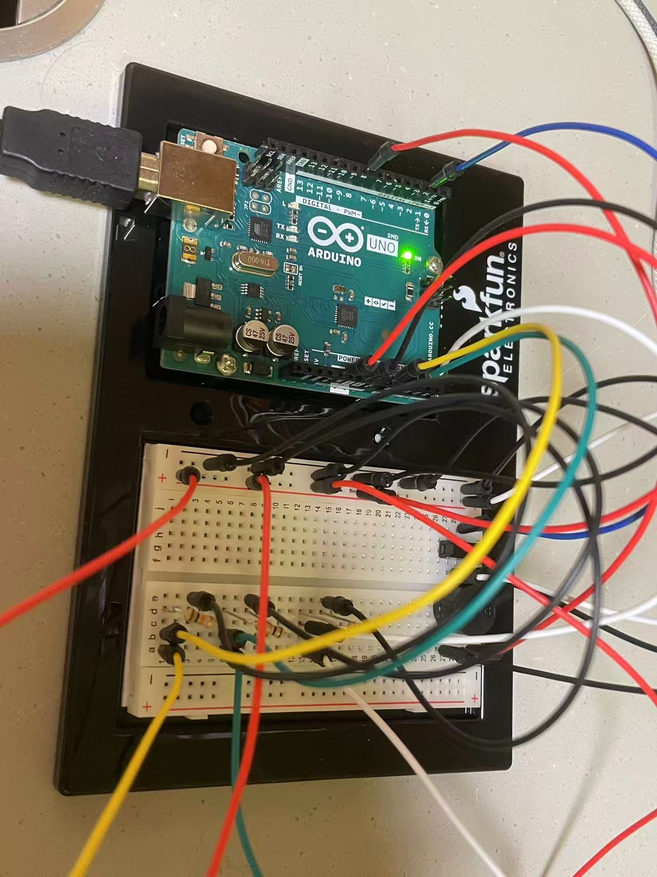
Video/Image Documentation
Code Snippet I’m proud of
To simulate it more as a drum effect, I made this for loop to create this pitch decay effect:
// drum pitch decay effect
  for (int f = baseFreq + 40; f > baseFreq; f -= 5) {
    tone(buzzer, f);
    delay(10);
  }
Future Improvements/ Problems Encountered
Our biggest physical challenge was the alligator clips. It was indeed a handy tool to create a prototype, but their exposed metal heads made it very easy to accidentally create a short circuit if they touched. We learned to be meticulous about checking that the rubber insulators were covering the clips properly before powering on the Arduino.
On the software side, getting the sound right was an iterative process. First, we spend time exploring the pitch gaps. Initially, the pitches were too close together and didn’t sound very musical. By trial and error, we adjusted the base frequencies to create a more noticeable and pleasant musical gap between the pads. Second, rhythm and feelin hand needed to match a those of a “drum machine”. We played with the delay() value in the main loop. A shorter delay made the instrument feel much more responsive and rhythmic.
If we were to continue this project, we could add more sensors for a full octave, or perhaps use the analog pressure value to control the volume (amplitude) of the note in addition to triggering it. It would also be interesting to experiment with different waveforms or sound profiles beyond the simple tones.
Reading “Making Interactive Art” made me realize what I created for this week, needs prior explanation before the user can figure out what the device is about. The buttons I made do not have any signs or words attached so the users will need some time to process and play around witht he project before realizing that what I made is a beat memorizer. However, since I took account for possible actions that the user might do, the system won’t crash. I can essentailly, set the stage, shut up ad listen to what the user will do when given my project. In those terms, I can say that I created a successful project that follows what the reading describes.
For physical computing reading, I was able to relate to many of his projects but especially “Things you yell at”. It reminded me of my midterm project because it also used voices to control the system. Pitch detection and voice recognizition is hard at first, but the result is worth the process.
For our interactive media sound project, my partner, Joy Zheng, and I decided to create a simple yet expressive instrument with a few sensors and a buzzer on Arduino Uno. We wanted to build something that was intuitive to play and produced a unique, percussive sound. The result is this force-sensitive drum. Tapping different pads creates different notes, and a toggle switch shifts the entire instrument into a higher-pitched mode.
Our initial idea was inspired by the force sensors used in class to control sound. We thought, what if we could use multiple sensors to combine frequencies and create rhythms? We brainstormed a few possibilities. Could we assign different chords to each sensor, where pressing harder makes a certain chord more prominent? Or could the sensors act as modifiers for a continuous track?
We settled on a more direct approach for a playable instrument. We decided to have three Force Sensitive Resistors (FSRs) that would each trigger a distinct note, like pads on a drum machine. To meet the project requirements and add another layer of interactivity, we incorporated a digital two-way switch. Flipping this switch would transpose the notes of all three pads to a higher octave, giving the player two different sound palettes to work with.
Arduino Build
The build was straightforward, centered around an Arduino Uno and a breadboard.
Components Used:
1x Arduino Uno
1x Breadboard
3x Force Sensitive Resistors (FSRs), our analog sensors
1x Two-way toggle switch, our digital sensor
1x Piezo Buzzer
Resistors (for the FSRs and switch)
Jumper wires and Alligator clips
Each of the three FSRs was connected to a separate analog input pin on the Arduino. This allows the Arduino to read a range of values based on how much pressure is applied. The toggle switch was connected to a digital pin to give us a simple ON/OFF (or in our case, Mode 1/Mode 2) reading. Finally, the piezo buzzer was connected to a digital pin capable of PWM (Pulse Width Modulation) to produce the tones.
The Arduino code continuously checks the state of our mode switch and reads the pressure on each of the three force sensors. If a sensor is pressed hard enough to cross a defined hitThreshold, it calls a function to play a corresponding sound.
To simulate it more as a drum effect, we made this for loop to create this pitch decay effect:
// drum pitch decay effect
  for (int f = baseFreq + 40; f > baseFreq; f -= 5) {
    tone(buzzer, f);
    delay(10);
  }
Challenges and Improvement
There was evolution of our instrument. We started with a basic concept (v0.1) and then refined it by adjusting the frequency gaps between the sensors for a more distinct and musical sound (v1.0a). Finally, we tweaked the delay to give it a more responsive and percussive, drum-like feel (v1.0b).
Our biggest physical challenge was the alligator clips. It was indeed a handy tool to create a prototype, but their exposed metal heads made it very easy to accidentally create a short circuit if they touched. We learned to be meticulous about checking that the rubber insulators were covering the clips properly before powering on the Arduino.
On the software side, getting the sound right was an iterative process. First, we spend time exploring the pitch gaps. Initially, the pitches were too close together and didn’t sound very musical. By trial and error, we adjusted the base frequencies to create a more noticeable and pleasant musical gap between the pads. Second, rhythm and feelin hand needed to match a those of a “drum machine”. We played with the delay() value in the main loop. A shorter delay made the instrument feel much more responsive and rhythmic.
If we were to continue this project, we could add more sensors for a full octave, or perhaps use the analog pressure value to control the volume (amplitude) of the note in addition to triggering it. It would also be interesting to experiment with different waveforms or sound profiles beyond the simple tones.
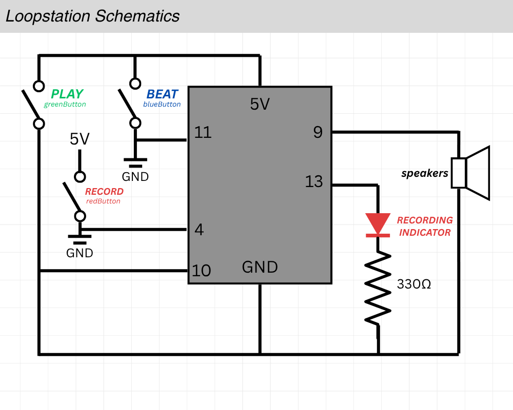
This week Yongje and myself paired up to make our very own musical instrument.
I thought about the capabilities of the arduino speaker and was unimpressed with the sound “texture” of it, so we discussed what we could do with a rather limited range of sounds we could generate. I’m not much of a musician so I suggested what if we made a simple beat recorder, kinda like a metronome of sorts? Yongje informed me that what I was describing is called a “loopstation” and we got to designing.
Concept (With Visuals) – Hubert
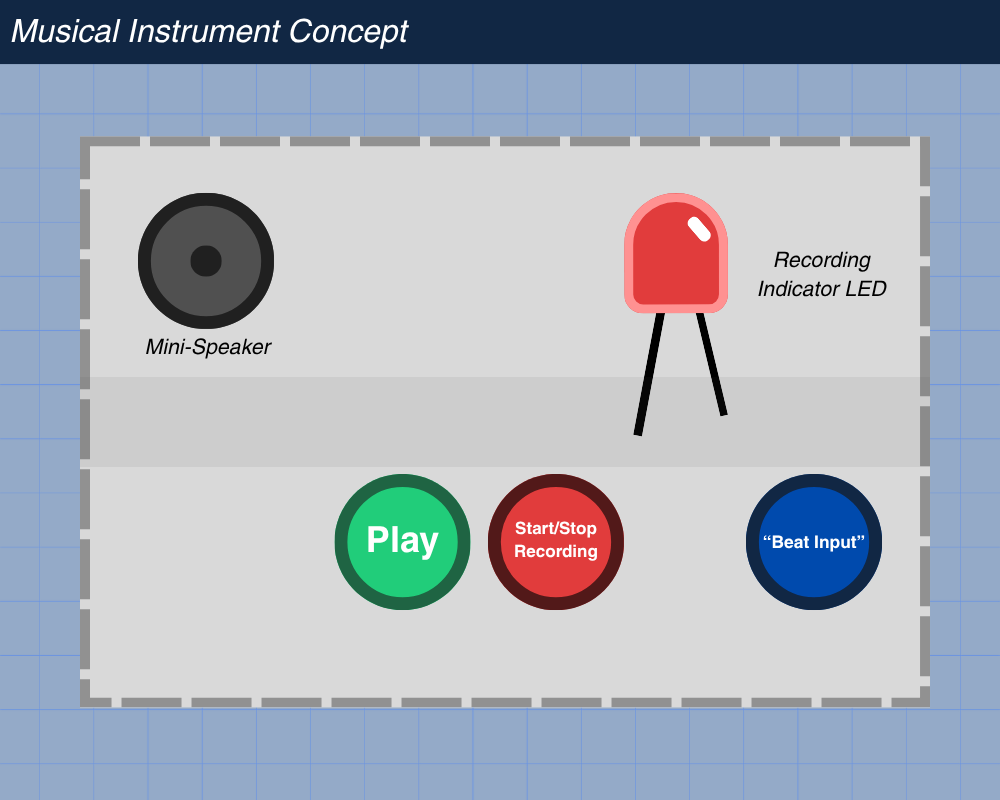
After we planned what we wanted to do, I decided to visualize the user interaction side of the project first before designing the schematics and technical side.
The red button would be to start/stop the recording process. A red LED would indicate whether it was currently recording.
The blue button would be there for the user to tap in their beat.
When you are done with your beat, you can save it by clicking the red button once again. You can see whether it was properly stopped by the indicator turning off. Then you can press the green button to play your recorded beat.
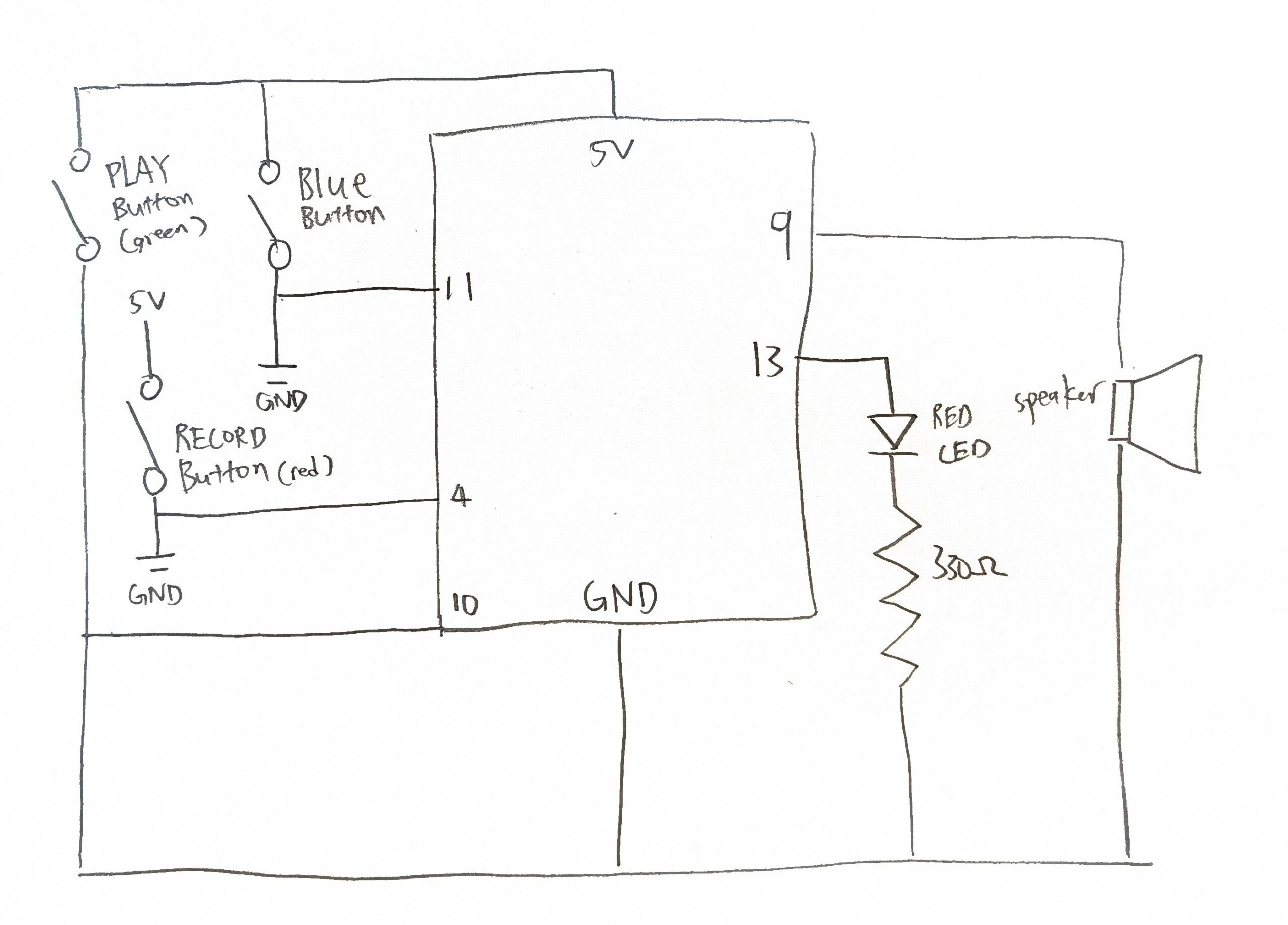
Schematics & Planning – Hubert
Before we started connecting metal to metal, I made a schematic to quickly map out everything we needed to connect.
Code & Difficulties Encountered – Yongje
There are 3 main parts to the code.
The first is figuring out debouncing logic, which is used to remove the state when the system is bouncing between true and false when the switch is pressed. The second part is playback, actually playing back the recorded soundLastly, the third which is the hardest part: finding how to store the beat recording.
I’ll start by explaining the hardest part first, which is storing the beat recording.
The beat recording logic works by tracking the time of each button press and release while the device is in recording mode. Every time the beat button is pressed, the program calculates the gap since the previous press (gap = now – tRef) to capture the spacing between beats. When the button is released, it measures the duration the button was held (dur = now – lastPressTime) to record how long that beat lasted. Both values are stored in arrays (gaps[] and durs[]), building a timeline of when each beat starts and how long it plays. Figuring out this logic was the most difficult part.
Now onto explaining the playback logic. The playback logic is responsible for reproducing the rhythm that was recorded. It does this by reading through the stored arrays of gaps and durations in order. For each beat, the program first waits for the gap time, which is the delay before the next beat begins and then plays a tone on the speaker for the duration that was originally recorded. Because each recorded gap includes the previous beat’s duration, the playback code subtracts the previous duration from the current gap to get the true silent time between beats. This ensures that the playback matches the timing and spacing of the user’s original input, accurately reproducing both the rhythm and the length of each beat. I had to create a logic to turn negative silence time to positive because sometimes it gave errors when the inputs and the durations of beats were too short. This is explained in depth in the comment section of the code.
Finally, the debounce logic ensures that each button press or release is detected only once, even though mechanical switches naturally produce rapid, noisy fluctuations when pressed. When a button’s state changes, the program records the current time and waits a short period to confirm that the signal has stabilized. Only if the input remains steady for longer than this debounce delay does the program treat it as a valid press or release event. This filtering prevents false triggers caused by electrical noise or contact bounce, giving the system clean, reliable button inputs for recording and playback control. At first, I didn’t have this debounce logic implemented and had a hard time figuring out why the system sometimes failed to recognize button presses or seemed to trigger multiple times for a single press. Once the debounce logic was added, the button responses became stable and consistent.
Reflection
I believe this project turned out really well, and it was very interesting to work on our first group project of the semester.
We decided to create a beat memorizing machine. A simplified version of the loop machine used in beat creation. Essentially, we have button to record the beat, button used to tap the beat and a button used to play the recorded beat.
Concept (With Visuals)
After we planned what we wanted to do, I decided to visualize the project first before designing it.
The red button would be to start/stop the recording process. A red LED would indicate whether it was currently recording.
The blue button would be there for the user to tap in their beat.
When you are done with your beat, you can save it by clicking the red button once again. You can see whether it was properly stopped by the indicator turning off. Then you can press the green button to play your recorded beat.
Schematics & Planning – Hubert
Before we started connecting metal to metal, I made a schematic to quickly map out everything we needed to connect.
Code & Difficulties Encountered
There are 3 main parts to the code.
The first is figuring out debouncing logic, which is used to remove the state when the system is bouncing between true and false when the switch is pressed. The second part is playback, actually playing back the recorded soundLastly, the third which is the hardest part: finding how to store the beat recording.
I’ll start by explaining the hardest part first, which is storing the beat recording. The beat recording logic works by tracking the time of each button press and release while the device is in recording mode. Every time the beat button is pressed, the program calculates the gap since the previous press (gap = now – tRef) to capture the spacing between beats. When the button is released, it measures the duration the button was held (dur = now – lastPressTime) to record how long that beat lasted. Both values are stored in arrays (gaps[] and durs[]), building a timeline of when each beat starts and how long it plays. Figuring out this logic was the most difficult part.
uint32_t clampToZero(long x) { //used in playback function when sometimes each beat is pressed too quickly and this is used to remove negative timings
  if (x > 0) {                            //for example, to find the silence between each beat, gap[i] represents time since previous press, durs[i-1] is how long it was held
    return static_cast<uint32_t>(x);      //we do gap[i] - dur[i-1] to find the silence between the notes, but when its sometimes pressed very quickly this value becomes negative
  } else {                                //since in playback, we cant delay negative, this is to prevent that
    return 0UL;
  }
}

void playback() {
  if (beatCount == 0) {   //if nothing is recorded exit
    return;
  }
  noTone(speaker); //turn speaker off before we play
  delay(120);       //added delay to make sure nothing is cut off

  for (uint16_t i = 0; i < beatCount; i++) {  //loop through recorded beat
    uint32_t waitMs = gaps[i];

    if (i > 0) {
      long corrected = static_cast<long>(gaps[i]) - static_cast<long>(durs[i - 1]);   //this basically is the logic to finding the true silence between each beat as explained before
      waitMs = clampToZero(corrected);
    }

    delay(waitMs); //delay by true silence

    //play the tone for the recorded duration
    tone(speaker, freq, durs[i]);

    //let the tone run to completion before stopping it
    delay(durs[i] + 2);
    noTone(speaker);
  }
}
Now onto explaining the playback logic. The playback logic is responsible for reproducing the rhythm that was recorded. It does this by reading through the stored arrays of gaps and durations in order. For each beat, the program first waits for the gap time, which is the delay before the next beat begins and then plays a tone on the speaker for the duration that was originally recorded. Because each recorded gap includes the previous beat’s duration, the playback code subtracts the previous duration from the current gap to get the true silent time between beats. This ensures that the playback matches the timing and spacing of the user’s original input, accurately reproducing both the rhythm and the length of each beat. I had to create a logic to turn negative silence time to positive because sometimes it gave errors when the inputs and the durations of beats were too short. This is explained in depth in the comment section of the code.
void update() {   //ran inside the loop to update button state
  bool reading = digitalRead(pin); //read button

  if (reading != lastReading) { //if reading has changed since last time, record when it changed (it means it maybe bouncing)
    lastDebounceMs = millis();
    lastReading = reading;
  }

  if ((millis()- lastDebounceMs) >debounce) { //if the input has stayed the same for more than 20ms, what I set as accept it as real change
    if (reading != stableState) {
      stableState = reading;

      if (stableState== LOW) {
        pressEvent =true;      //we ontl change pressEvent and release Event only when input stayed same for 20ms
      } else {
        releaseEvent =true;
      }
    }
  }
}
Finally, the debounce logic ensures that each button press or release is detected only once, even though mechanical switches naturally produce rapid, noisy fluctuations when pressed. When a button’s state changes, the program records the current time and waits a short period to confirm that the signal has stabilized. Only if the input remains steady for longer than this debounce delay does the program treat it as a valid press or release event. This filtering prevents false triggers caused by electrical noise or contact bounce, giving the system clean, reliable button inputs for recording and playback control. At first, I didn’t have this debounce logic implemented and had a hard time figuring out why the system sometimes failed to recognize button presses or seemed to trigger multiple times for a single press. Once the debounce logic was added, the button responses became stable and consistent.
This piece, A Brief Rant on the Future of Interaction Design, really made me stop and think about how disconnected we’ve become from the physical world, even as our technology gets “smarter.” The author argues that our so-called “futuristic” devices are actually quite limited, everything has become a flat piece of glass we tap on, instead of something we truly interact with. He calls out this obsession with “pictures under glass” as lazy design — a downgrade from the richness of real, tactile experience.
What really stuck with me was his reminder of how incredible our hands are. They can sense texture, pressure, temperature, yet we now use them mainly to poke at screens. His comparison to trying to tie your shoes with numb fingers really drives it home. It’s not just that we’ve lost physical feedback, we’ve lost creativity and subtlety in how we use our bodies to understand the world.
But as much as I agree with him, I think his critique could use a bit more realism. There’s a reason touchscreens took over: they’re convenient, cheap, and universal. Designing physical, tactile, or responsive interfaces on a large scale would be expensive and hard to standardize. For example, the Apple Vision Pro tries to reintroduce gesture-based control, but even that feels awkward and unnatural for many people. It’s like we’ve already trained ourselves to think in 2D, to expect smooth glass, not texture or resistance.
Still, I think his rant is important because it challenges the direction of design thinking. It made me think about situations like education or online learning. imagine how much richer it would be if students could physically interact with virtual models or data instead of just scrolling and clicking. Or think of creative fields like art or architecture, where so much of the learning used to come from the feel of materials. Now, everything happens behind a screen.
So, while his rant might sound idealistic, it’s also a necessary wake-up call. It reminds us that innovation shouldn’t just mean “simpler” or “sleeker”, it should mean more human. The goal shouldn’t be to erase physicality for convenience, but to design technology that reconnects us to the world instead of flattening it.

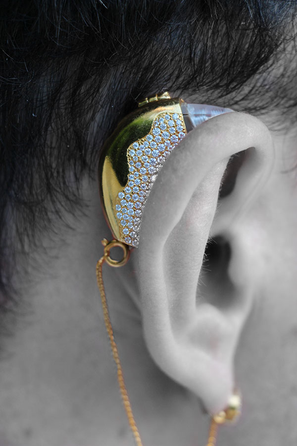 Glasses are no longer seen as a disability aid, but are now a fashion statement. Although, to be honest, personally glasses have always just been a medical necessity for me. But also I refuse to get laser because I now think I look better with glasses anyways. I could think of some other examples back from high-school as well: hearing aids and braces for teeth.