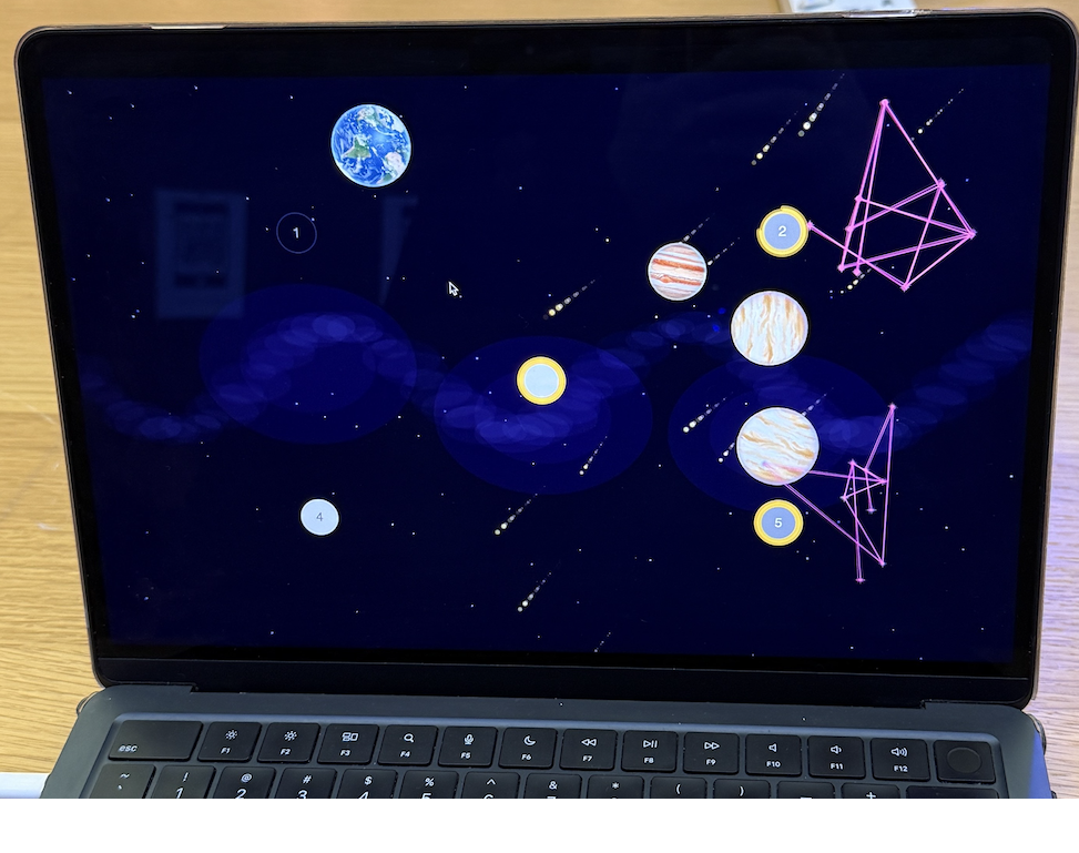
Portal Clash is a two-player spaceship battle game that merges the physical and digital worlds. One player plays on a physical 16×16 NeoPixel LED grid using a custom hardware controller, and the second player plays on a digital p5.js canvas using the keyboard. The core idea is the “portal” mechanic: if the physical player shoots a bullet off the edge of their LED screen, it instantly teleports onto the digital screen to attack the other player, and vice versa. It’s a battle across dimensions.
The project relies on a heavy communication loop between the hardware and the browser. The p5.js sketch acts as the “brain” of the game, calculating all the physics, scoring, and portal logic for both worlds. The Arduino acts as a specialized display driver and input device.
Interaction Design
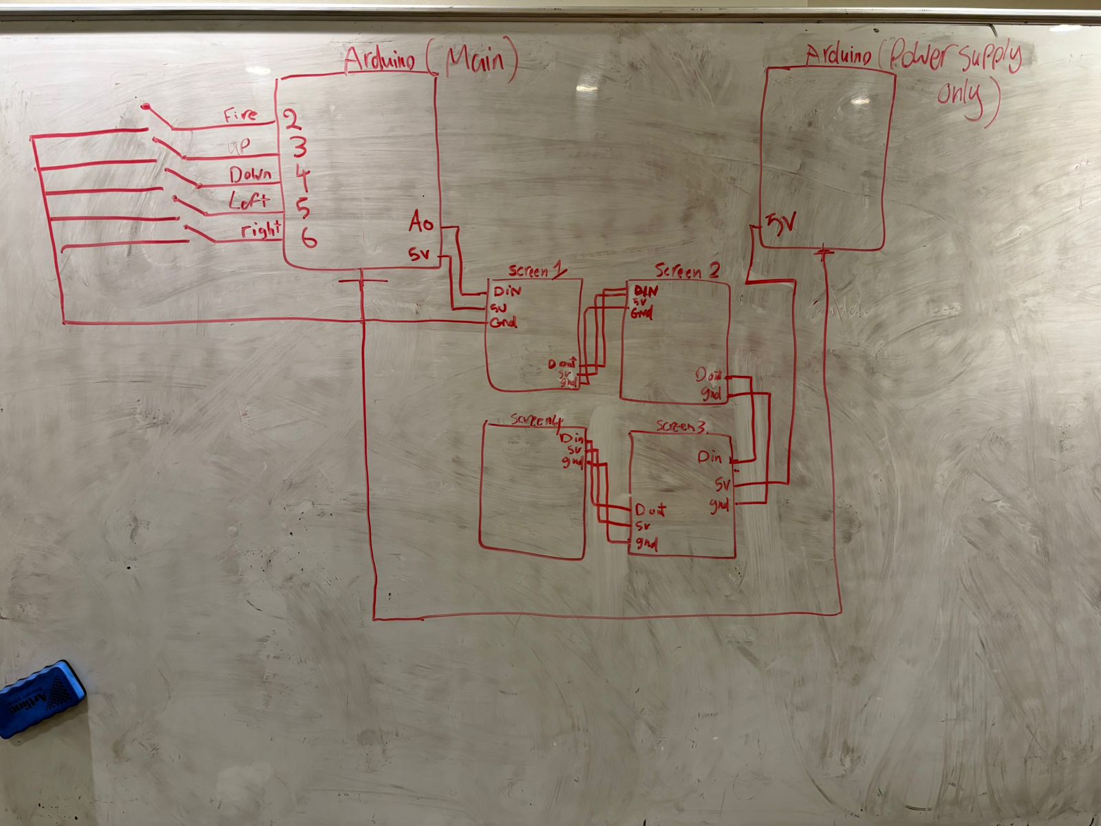
For the physical player, I built a controller with 5 push buttons: four for movement (Up, Down, Left, Right) and one for Firing. The digital player uses the computer keyboard (WASD for movement and ‘V’ for fire). The feedback is immediate—if you get hit, your ship explodes into particles on your respective screen.
Hardware & Circuit
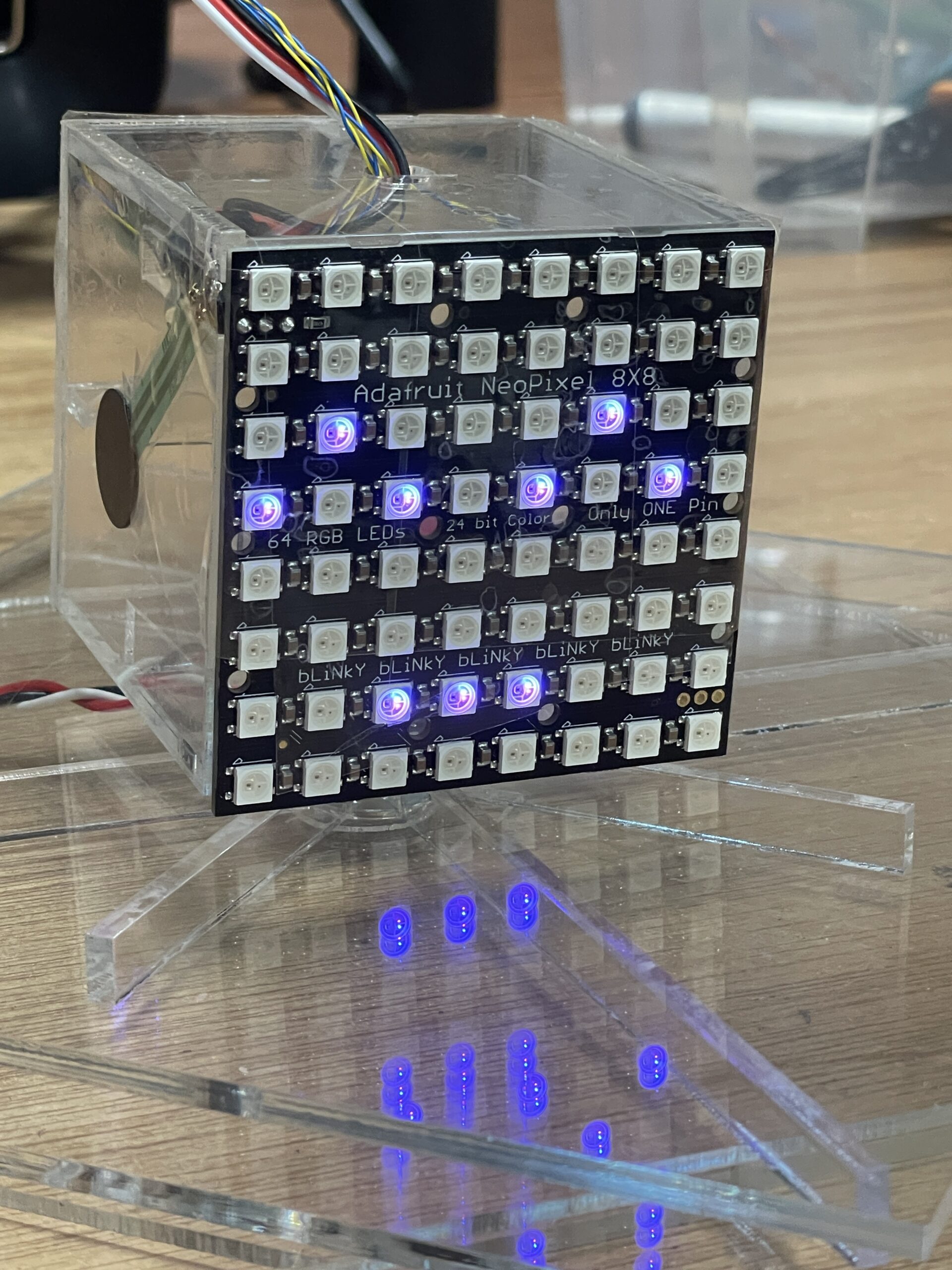
I used four 8×8 NeoPixel matrices tiled together to create a 16×16 grid. This was a bit of a pitfall at first. Powering 256 LEDs is heavy. I tried different wirings, but eventually, I figured out a parallel connection setup where I split the power . I actually used a second Arduino solely as a 5V power source to feed two of the screens while the main Arduino handled the data and powered the other two.
Arduino Code
The code on the Arduino is optimized to avoid lag. It listens for pixel data from p5 to light up the grid. At the same time, it reads the 5 buttons and sends their state back to p5. I had to implement a “state change” logic so it only sends data when I actually press or release a button, which kept the game smooth.
#include <Adafruit_NeoPixel.h>
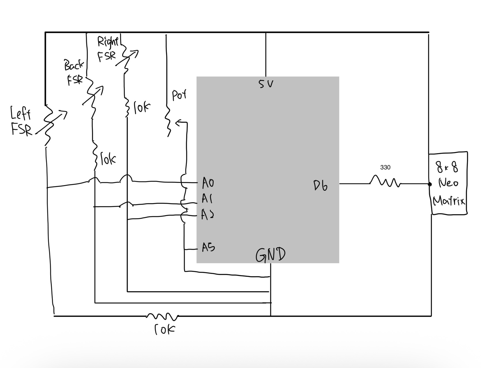
#define PIN_MATRIX A0
#define NUMPIXELS 256
// WIRING: Pin -> Button -> Diagonal Leg -> GND
#define PIN_FIRE 2
#define PIN_UP 3
#define PIN_DOWN 4
#define PIN_LEFT 5
#define PIN_RIGHT 6
Adafruit_NeoPixel matrix(NUMPIXELS, PIN_MATRIX, NEO_GRB + NEO_KHZ800);
int lastU=0, lastD=0, lastL=0, lastR=0, lastF=0;
unsigned long lastHeartbeat = 0;
void setup() {
Serial.begin(115200);
matrix.begin();
matrix.setBrightness(20);
matrix.show();
pinMode(PIN_FIRE, INPUT_PULLUP);
pinMode(PIN_UP, INPUT_PULLUP);
pinMode(PIN_DOWN, INPUT_PULLUP);
pinMode(PIN_LEFT, INPUT_PULLUP);
pinMode(PIN_RIGHT,INPUT_PULLUP);
}
void loop() {
// 1. RECEIVE VIDEO DATA
while (Serial.available() > 0) {
char cmd = Serial.read();
if (cmd == 'C') matrix.clear();
else if (cmd == 'S') matrix.show();
else if (cmd == 'P') {
int x = Serial.parseInt();
int y = Serial.parseInt();
int r = Serial.parseInt();
int g = Serial.parseInt();
int b = Serial.parseInt();
int idx = getPixelIndex(x, y);
if (idx >= 0 && idx < NUMPIXELS) matrix.setPixelColor(idx, matrix.Color(r, g, b));
}
}
// 2. SEND CONTROLLER DATA
int u = !digitalRead(PIN_UP);
int d = !digitalRead(PIN_DOWN);
int l = !digitalRead(PIN_LEFT);
int r = !digitalRead(PIN_RIGHT);
int f = !digitalRead(PIN_FIRE);
bool stateChanged = (u != lastU || d != lastD || l != lastL || r != lastR || f != lastF);
if (stateChanged || (millis() - lastHeartbeat > 50)) {
Serial.print("I:");
Serial.print(u); Serial.print(",");
Serial.print(d); Serial.print(",");
Serial.print(l); Serial.print(",");
Serial.print(r); Serial.print(",");
Serial.println(f);
lastU = u; lastD = d; lastL = l; lastR = r; lastF = f;
lastHeartbeat = millis();
}
delay(2);
}
int getPixelIndex(int x, int y) {
if (x < 0 || x >= 16 || y < 0 || y >= 16) return -1;
int screenIndex = 0;
int localX = x; int localY = y;
if (x < 8 && y < 8) { screenIndex = 0; }
else if (x >= 8 && y < 8) { screenIndex = 1; localX -= 8; }
else if (x < 8 && y >= 8) { screenIndex = 2; localY -= 8; }
else { screenIndex = 3; localX -= 8; localY -= 8; }
return (screenIndex * 64) + (localY * 8) + localX;
}
p5.js Code
This is where all the logic happens. The sketch manages two “SpaceShip” objects. It tracks which “World” a bullet is in. If a bullet crosses the boundary coordinate, the code swaps its world variable, causing it to stop rendering on the canvas and start rendering on the LED matrix (via Serial).
During development, I used a debugging trick where I mirrored the NeoPixel view onto the p5 canvas. This helped me figure out if the pixels were mapping correctly before I even looked at the LEDs.
Communication
I used the p5.webserial library. The challenge was timing; initially, there was a delay between pressing the button and the ship moving. I realized the serial buffer was getting clogged with old data. I fixed this by making p5 read all available data every frame and only using the most recent packet. Now, it feels instant. I knew from the beginning that the processing speed of the pixel traversing on the neoPixel screen relative to p5 might be a challenge big enough to make the idea not feasible; but I didn’t except good implementation tricks on p5 side would make it this smooth.
I am most proud of the idea and the gameplay itself. Seeing the bullet disappear from the physical LED screen and immediately pop up on the laptop screen feels really satisfying. It turned out exactly how I imagined it, and the competitive aspect makes people want to keep playing.
AI Section
I utilized Generative AI (ChatGPT) as a technical assistant to speed up the development process. The core game concept, the hardware design, and the logic flow were my own ideas. I used AI mainly to help me debug syntax errors in the Serial communication and to suggest optimizations for the lag I was experiencing. For example, when I struggled with the buffer bloat, the AI suggested clearing the buffer loop, which solved the issue. I also used it to help write the “Class” structure for the Spaceships to keep the code clean. The writing and documentation were done by me.
Future Improvements
To improve the experience, I would build a more permanent enclosure for the controller so the buttons are easier to hold. I also want to add a clear “Start Screen” with instructions, as user testing showed that people sometimes needed a moment to figure out the controls.
Also I want to elevate the gameplay and implement an advanced Idea I had in mind to randomize the sending and receiving edges of fires every 10 seconds. So that the users get surprised when the bullets attacking them start to portal from an unexpected direction and they also need to figure out which direction will send their own fires to the other world.