For this week’s assignment, Zeina and I worked on three different exercises that focused on serial communication.
NOTE: We mostly used the exact copy of the arduino and p5 that was demoed in class with just an addition of 2-3 lines for each program. For these 2-3 lines we added comments, and for the rest of the lines we kept the same comments already included by the code
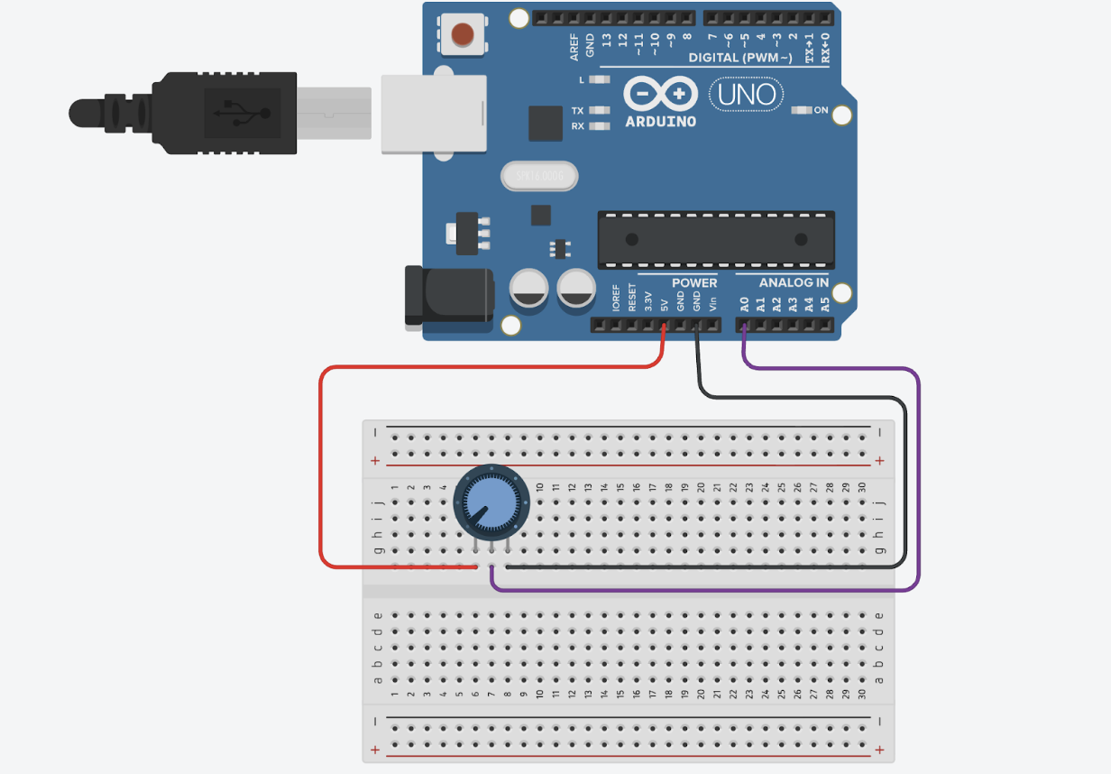
1- Make something that uses only one sensor on Arduino and makes the ellipse in p5 move on the horizontal axis, in the middle of the screen, and nothing on arduino is controlled by p5
ARDUINO CODE
void setup() {
  Serial.begin(9600);
}

void loop() {
  int sensorValue = analogRead(A1); // 0–1023
  Serial.println(sensorValue);             // send to p5.js
  delay(50);
}
P5 CODE
let port;
let connectBtn;
let baudrate = 9600;
let lastMessage = "";
let sensorValue = 0;

function setup() {
  createCanvas(400, 400);
  background(220);

  //Setting the global variable port to a new serial port instance inside setup:
  port = createSerial();

  // we can open ports we have used previously without user interaction
  let usedPorts = usedSerialPorts(); //array of used ports
  if (usedPorts.length > 0) {
    port.open(usedPorts[0], baudrate); //if any used port is in the array, open that port with 9600 baudrate
  }

  // any other ports (new ones) can be opened via a dialog after user interaction (see connectBtnClick below)
  connectBtn = createButton("Connect to Arduino");
  connectBtn.position(width/2, 270);
  connectBtn.mousePressed(connectBtnClick);

}

function draw() {
  background("white");

  // Read from the serial port. This is a non-blocking function. If a full line has come in (ending in \n), it returns that text. If the full line is not yet complete, it returns an empty string "" instead.
  let str = port.readUntil("\n");
  if (str.length > 0) {   // if str -a string- has any characters
    // print(str);
    lastMessage = str;
    sensorValue = int(lastMessage);
  }

  //draw ellipse mapped to horizontal axis
  let x = map(sensorValue, 0, 1023, 0, width);
  ellipse(x, height / 2, 40, 40);

  // Display the most recent message
  text("Last message: " + lastMessage, 10, height - 20);

  // change button label based on connection status
  if (!port.opened()) {
    connectBtn.html("Connect to Arduino");
  } else {
    connectBtn.html("Disconnect");
  }
}

function connectBtnClick() {
  if (!port.opened()) {
    port.open("Arduino", baudrate);
  } else {
    port.close();
  }
}
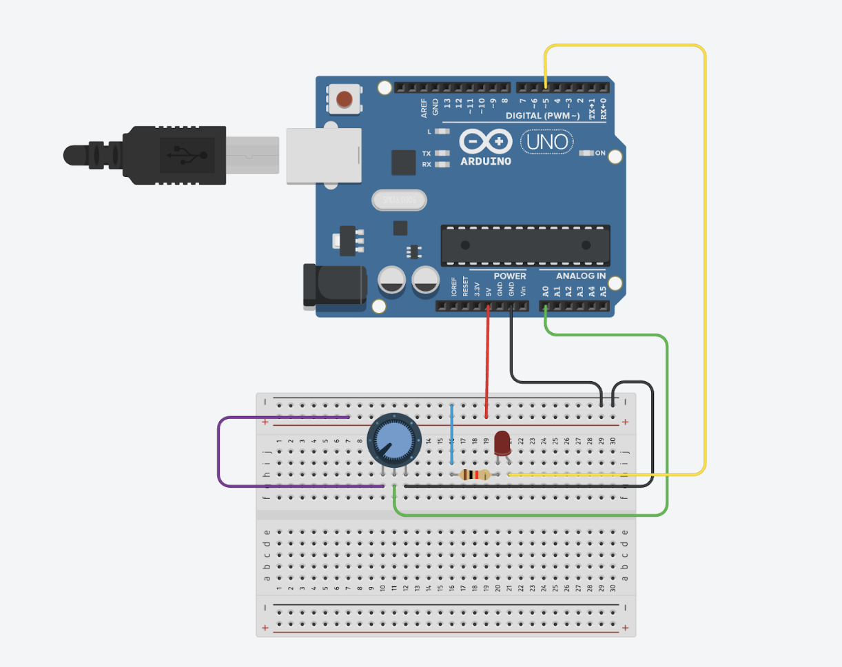
2-Make something that controls the LED brightness from p5
DEMO
IMG_8392 (2)
ARDUINO CODE
// Week 12 Example of bidirectional serial communication

int leftLedPin = 2;
int rightLedPin = 5;

void setup() {
  Serial.begin(9600);

  pinMode(LED_BUILTIN, OUTPUT);
  pinMode(leftLedPin, OUTPUT);
  pinMode(rightLedPin, OUTPUT);

  digitalWrite(leftLedPin, HIGH);
  digitalWrite(rightLedPin, HIGH);
  delay(200);
  digitalWrite(leftLedPin, LOW);
  digitalWrite(rightLedPin, LOW);

  while (Serial.available() <= 0) {
    digitalWrite(LED_BUILTIN, HIGH);
    Serial.println("0,0");
    delay(300);
    digitalWrite(LED_BUILTIN, LOW);
    delay(50);
  }
}

void loop() {
  while (Serial.available()) {
    digitalWrite(LED_BUILTIN, HIGH);

    int left = Serial.parseInt();
    int right = Serial.parseInt();

    if (Serial.read() == '\n') {

      // -----------------------
      // ONLY CHANGE IS HERE:
      // -----------------------
      digitalWrite(leftLedPin, left);     // left stays ON/OFF
      analogWrite(rightLedPin, right);    // right is now BRIGHTNESS (0–255)
      // -----------------------

      int sensor = analogRead(A0);
      delay(5);
      int sensor2 = analogRead(A1);
      delay(5);
      Serial.print(sensor);
      Serial.print(',');
      Serial.println(sensor2);
    }
  }
  digitalWrite(LED_BUILTIN, LOW);
}
p5 CODE
let port; // making a var to hold the serial port
let baudrate = 9600; // speed for talking to arduino
let brightnessSlider; // slider to pick brightness
let smoothBrightness = 0; //transition into the brightness instead of jumping

function setup() {
  createCanvas(400, 200); // just making a small canvas for ui
  textSize(18); // bigger test

  brightnessSlider = createSlider(0, 255, 0); // slider from 0 to full bright
  brightnessSlider.position(20, 80); // where it shows up on screen
  brightnessSlider.style('width', '200px'); // make it a bit wider

  port = createSerial(); // create a serial object so we can connect to arduino

  let used = usedSerialPorts(); // check if we already used a port before
  if (used.length > 0) {
    port.open(used[0], baudrate); // auto connect to the last used port
  }
}

function setupSerial() {
  if (!port.opened()) { // if no connection yet
    port.open("Arduino", baudrate); // try to open one
  } else {
    port.close(); // if already open then close it (toggle)
  }
}

function draw() {
  background(240); // light grey

  if (!port.opened()) {
    text("Press SPACE to connect", 20, 30); // tell the user what to do
  } else {
    text("Connected!", 20, 30); // connection message
  }

  let target = brightnessSlider.value(); // get the slider value

  // do transitional brightness
  smoothBrightness = lerp(smoothBrightness, target, 0.07);


  text("Brightness: " + int(smoothBrightness), 20, 70); // show the number

  // actually send the brightness to the arduino
  if (port.opened()) {
    let sendString = "0," + int(smoothBrightness) + "\n"; // left=0 right=smooth
    port.write(sendString); // send it over serial
  }
}

function keyPressed() {
  if (key === " ") {
    setupSerial(); // hitting space toggles the port connection
  }
}
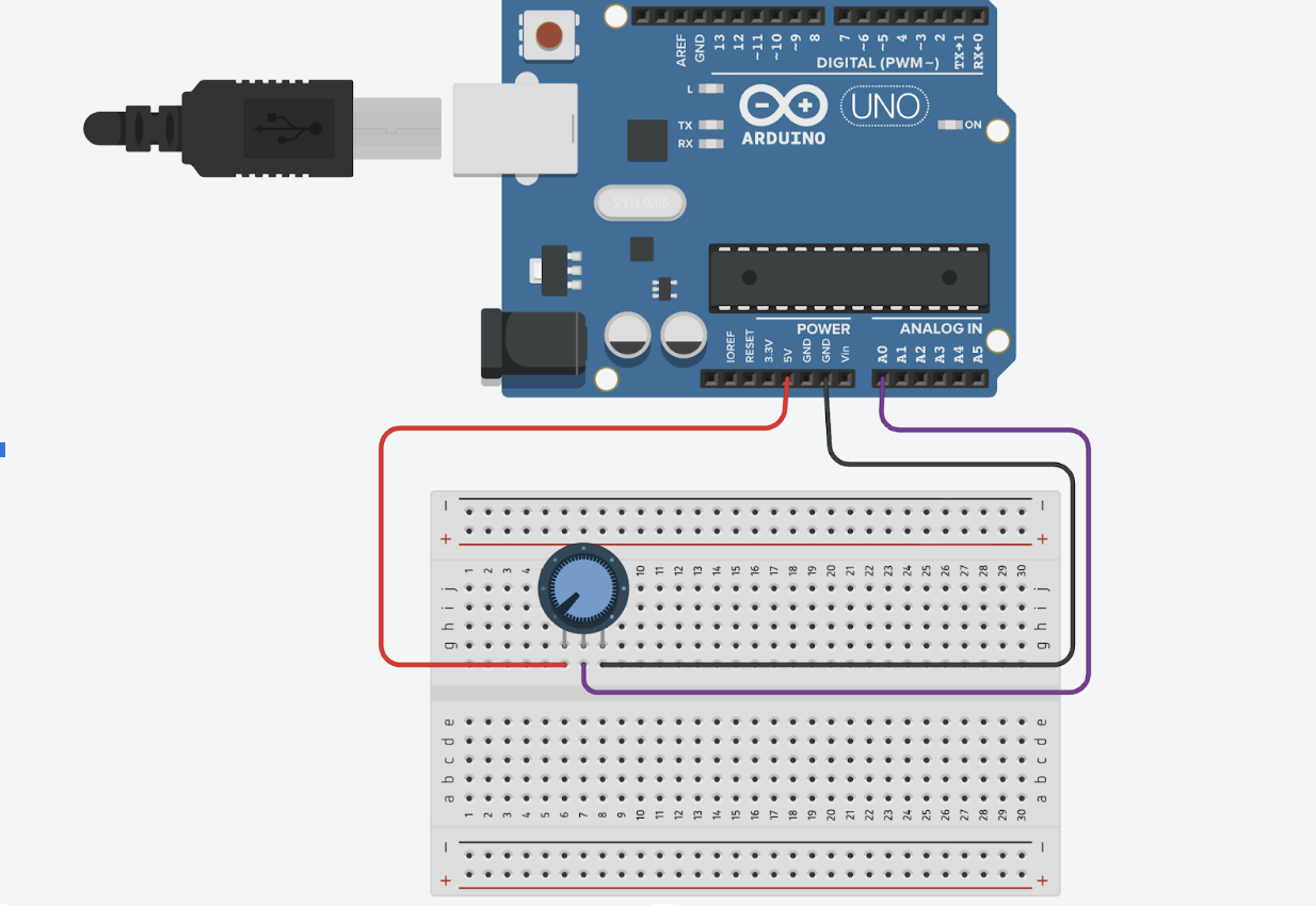
3-Take the gravity wind example (https://editor.p5js.org/aaronsherwood/sketches/I7iQrNCul) and make it so every time the ball bounces one led lights up and then turns off, and you can control the wind from one analog sensor
ARDUINO CODE
void setup() {
  pinMode(2, OUTPUT);
  Serial.begin(9600);
}

void loop() {
  int sensorValue = analogRead(A1);
  Serial.println(sensorValue);

  //check for bounce
  if (Serial.available() > 0) {
    //if 1, light up led
    if (Serial.parseInt() == 1) {
      digitalWrite(2, HIGH);
      delay(100);
      digitalWrite(2, LOW);
    }
  }
  delay(10);
}
P5.JS CODE
let velocity;
let gravity;
let position;
let acceleration;
let wind;
let drag = 0.99;
let mass = 50;
let port;
let connectBtn;
let baudrate = 9600;
let lastMessage = "";
let sensorValue = 0;

function setup() {
  createCanvas(640, 360);
  noFill();
  position = createVector(width / 2, 0);
  velocity = createVector(0, 0);
  acceleration = createVector(0, 0);
  gravity = createVector(0, 0.5 * mass);
  wind = createVector(0, 0);

  //Setting the global variable port to a new serial port instance inside setup:
  port = createSerial();


  // we can open ports we have used previously without user interaction
  let usedPorts = usedSerialPorts(); //array of used ports
  if (usedPorts.length > 0) {
    port.open(usedPorts[0], baudrate); //if any used port is in the array, open that port with 9600 baudrate
  }
// any other ports (new ones) can be opened via a dialog after user interaction (see connectBtnClick below)
  connectBtn = createButton("Connect to Arduino");
  connectBtn.position(width/2, 270);
  connectBtn.mousePressed(connectBtnClick);
}

function draw() {
  background(255);

  // Read from the serial port. This is a non-blocking function. If a full line has come in (ending in \n), it returns that text. If the full line is not yet complete, it returns an empty string "" instead.
  let str = port.readUntil("\n");
  if (str.length > 0) {   // if str -a string- has any characters
    // print(str);
    lastMessage = str.trim();
    sensorValue = int(lastMessage);
  }


  //wind controlled by analog sensor
  wind.x = map(sensorValue, 0, 1023, -1, 1);
  console.log("Sensor value: " + sensorValue);


  applyForce(wind);
  applyForce(gravity);

  velocity.add(acceleration);
  velocity.mult(drag);
  position.add(velocity);
  acceleration.mult(0);

  ellipse(position.x, position.y, mass, mass);

  // Bounce detection
  if (position.y > height - mass / 2) {
    velocity.y *= -0.9; // Dampening
    position.y = height - mass / 2;

    //send bounce signal to Arduino
    port.write("1\n");
  }
// Display the most recent message
  text("Last message: " + lastMessage, 10, height - 20);

  // change button label based on connection status
  if (!port.opened()) {
    connectBtn.html("Connect to Arduino");
  } else {
    connectBtn.html("Disconnect");
  }
}

function applyForce(force){
  // Newton's 2nd law: F = M * A
  // or A = F / M
  let f = p5.Vector.div(force, mass);
  acceleration.add(f);
}

function keyPressed(){
  if (keyCode==LEFT_ARROW){
    wind.x=-1;
  }
  if (keyCode==RIGHT_ARROW){
    wind.x=1;
  }
  if (key==' '){
    mass=random(15,80);
    position.y=-mass;
    velocity.mult(0);
  }
}

function connectBtnClick() {
  if (!port.opened()) {
    port.openDialog(); // user selects port
  } else {
    port.close();
  }
}
For this week’s reading assignment :
This reading made me really rethink the relationship between disability, design, and visibility. The author’s point about discretion was especially interesting, for example, how so many medical devices are intentionally designed to disappear, as if invisibility equals good design. But the reading also made me question what that invisibility actually communicates. If a product is meant to blend into the skin or look like it’s barely there, does that subtly imply that disability should be hidden? What is the further message?
The contrast with fashion added another interesting layer in my opinion. Fashion openly accepts the idea of being seen, of expressing identity, which is almost the opposite of traditional medical design. I liked the example of eyewear, which shows that a product can address a disability without carrying social stigma, and also can become something expressive and desirable. That overlap suggests disability-related products don’t need to be trapped between being “invisible” or “medical-looking,” and that they can have personality without becoming sensationalized.