1. Concept
Duet Dance is an interactive, dual-player dance-themed survival game that blends physical input, digital animation, and music into a single cohesive experience. The project uses Arduino as the physical interface and p5.js as the visual environment, creating a tangible game where players control two dancing characters using a physical rotating disc.
Instead of conventional keyboard or mouse input, movement is driven entirely by a hardware wheel connected to a potentiometer. As the wheel rotates, Arduino measures the analogue values, converts them into angle readings, and sends them to p5.js through serial communication. These readings position two characters on a circular track, mirroring a ballroom “duet dance.”
During gameplay, petals fall from above, and the player must rotate the wheel to prevent the dancers from colliding with falling objects. The game combines:
- Physical movement (wheel rotation)
- Audio reactivity (LEDs flashing on musical peaks)
- Visual animation (dancers rotating gracefully)
- Survival gameplay
This creates a playful duet between physical interaction and digital performance.
2. Images of the Project
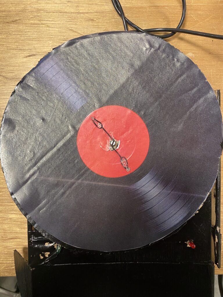
figure 1: User Interface of the project
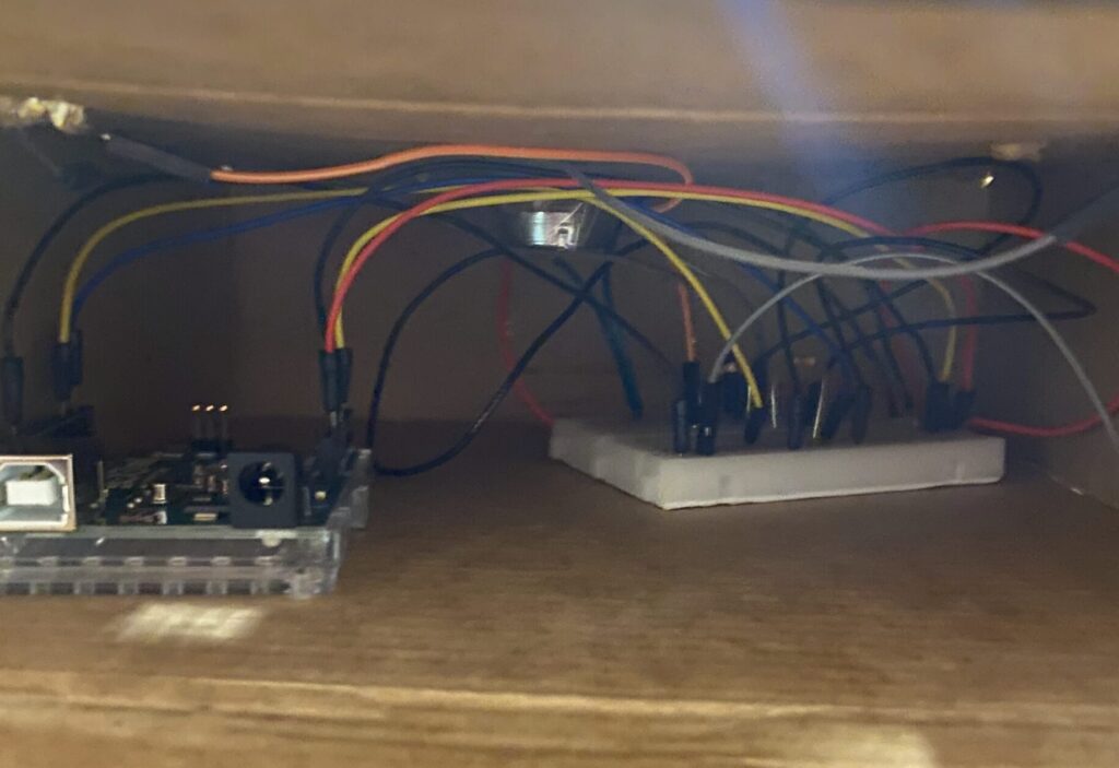
fig 2: Circuit of the project
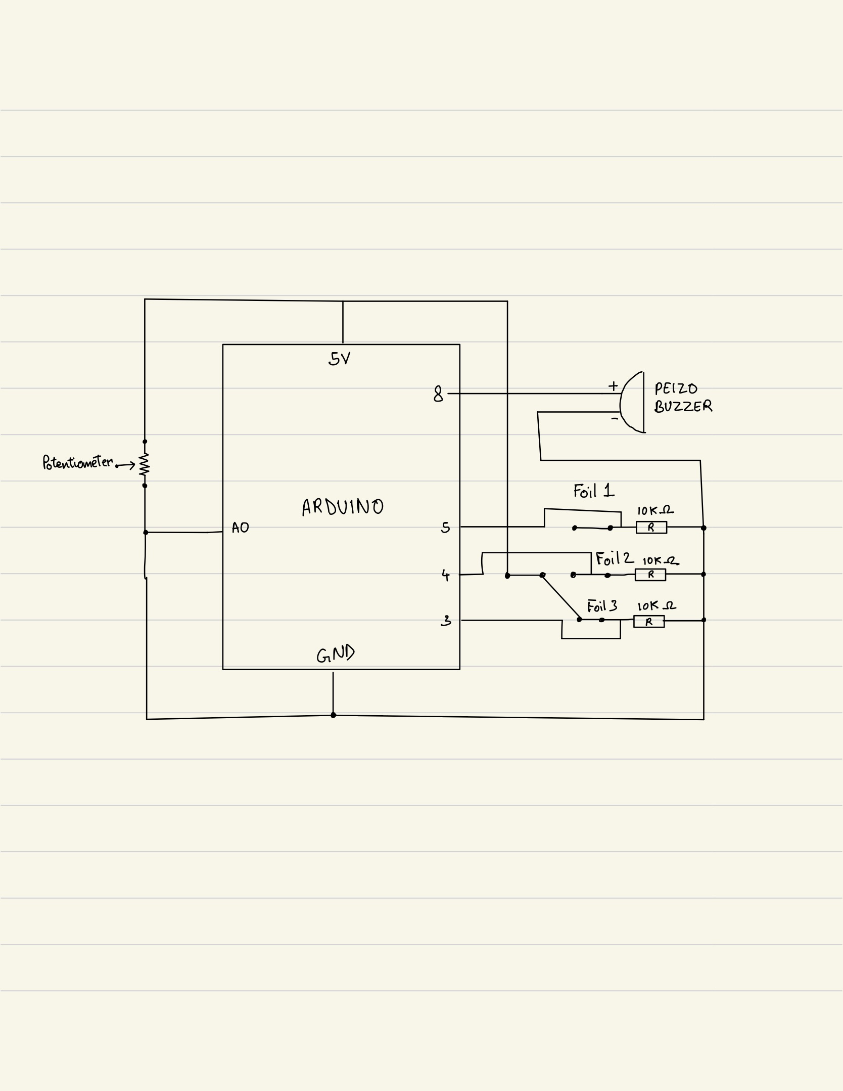
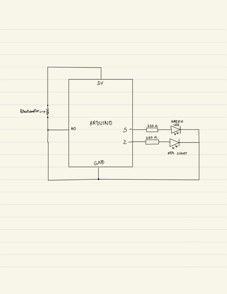
3. Schematic
4. User testing videos
5. Implementation
Interaction:
The core principle behind Duet Dance is physically embodied interaction. Instead of pressing buttons, players rotate a disc, mimicking the motion of turning a vinyl record or spinning a dance partner. This physicality makes the movement more intuitive, rhythmic, and engaging.
- User rotates the wheel
- Arduino reads potentiometer
- p5.js moves the dancers
- Falling petals appear
- LEDs respond to music beats
- Player attempts to survive as long as possible
Arduino:
On the hardware side, Arduino handles:
- Input: Potentiometer reading (0–1023)
- Output: Red and green LEDs toggled according to music beats
- Serial Communication: Continuous two-way messaging with p5.js
The Arduino handles three primary responsibilities within the system. First, it continuously reads the analog input from the potentiometer and sends the corresponding values to the p5.js sketch, ensuring smooth and accurate control of the rotation mechanic. Second, it receives beat indicators from p5.js sent as a boolean (either a 0 or 1). It uses these signals to toggle between the red and green LEDs, creating a synchronized lighting effect that reacts to the music. Finally, it maintains a consistent serial handshake with p5.js, ensuring stable, real-time communication between the physical hardware and the digital interface.
// start the handshake
  while (Serial.available() <= 0) {
    digitalWrite(LED_BUILTIN, HIGH); // on/blink while waiting for serial data
    Serial.println("0"); // send a starting message
    delay(300);            // wait 1/3 second
    digitalWrite(LED_BUILTIN, LOW);
    delay(50);
  }
}

void loop() {
  // wait for data from p5 before doing something
  while (Serial.available()) {
    digitalWrite(LED_BUILTIN, HIGH); // led on while receiving data

    int beat = Serial.parseInt();  // 0 or 1
    if (Serial.read() == '\n') {
      if (beat == 1) {
        // toggle LED state
        currentColor = !currentColor;
      }
      digitalWrite(redLedPin, currentColor ? LOW : HIGH);
      digitalWrite(greenLedPin, currentColor ? HIGH : LOW);


      int sensor = analogRead(A0);
      delay(5);
      Serial.println(sensor);
    }
  }
P5.js:
The p5.js sketch is responsible for managing the entire visual and interactive experience of the game. It handles the visual display, including the background, dancers, and falling petals, while also performing FFT analysis and peak detection to synchronize elements of the game with the music.
Core game logic such as the start screen, active gameplay, and game-over state is controlled within the sketch, alongside character rotation driven by real-time data received from the Arduino. The system also performs collision detection, updates the score, and sends beat signals back to the Arduino to trigger LED responses.
Several key mechanics shape the gameplay: the potentiometer value is mapped from 0 to 1023 to a full 0 to 2π rotation for smooth and fast circular motion; the two characters are placed directly opposite each other at 180 degrees; new falling objects spawn every set interval; collisions with petals end the game while successful dodging increases the score; and the LEDs blink in response to musical peaks detected through FFT analysis.
if (!port.opened()) {
    text("Disconnected - press space to connect", 250, 30);
  } else {

    ////////////////////////////////////
    //READ FROM ARDUINO HERE
    ////////////////////////////////////
    let data = port.readUntil("\n");
    if (data.length > 0) {
      // We received a complete line, split the message
      let fromArduino = split(trim(data), ",");
      if (fromArduino.length == 1) {
        angle = int(fromArduino[0]);
      }

      //////////////////////////////////
      //SEND TO ARDUINO HERE (handshake)
      //////////////////////////////////
      let sendToArduino = (sendBeat ? 1 : 0) + "\n";
      port.write(sendToArduino);
    }
    sendBeat = false;
  }
Arduino to p5.js Communication
The communication between Arduino and p5.js relies on a continuous serial handshake that enables smooth, real-time interaction. Arduino constantly sends potentiometer readings (formatted as sensor-data\n) to p5.js, which reads these values using readUntil(“\n”) to determine the dancers’ rotational position. On the other side, p5.js performs FFT-based sound peak detection and sends beat (either a 0 or 1) back to the Arduino. Upon receiving these indicators, the Arduino responds by toggling the red and green LEDs, creating lighting feedback synchronized with the music. This bidirectional exchange ensures that hardware inputs and digital outputs remain tightly synchronized throughout gameplay.
6. Challenges Faced
One of the major challenges in this project was ensuring that the potentiometer values were transmitted from Arduino to p5.js without delay. In early iterations, the rotation on-screen lagged behind the physical movement of the wheel because there was no communication loop but only a conditional statement. The Arduino was sending data inconsistently, and p5.js was not reading each line of serial input efficiently. To solve this, I refined the serial communication structure by implementing a clear, continuous handshake and using while loop on the arduino side to avoid partial or broken readings. This created a steady flow of data between the two systems, allowing the dancers’ rotation to update smoothly in response to real-time physical movement.
Another challenge involved the physical setup, specifically, securely attaching the potentiometer to the wheel so that its rotation accurately corresponded to what happened on-screen. Initially, the potentiometer would slip and the wheel would rotate independently of the potentiometer, resulting in no characters moving. I experimented with several mounting methods, including tape, cardboard supports, and temporary adhesives, but none provided the stability needed. Eventually, I created a more secure mechanical design and connection using wires to attach potentiometer to the wheel. This ensured the wheel turned the potentiometer directly and consistently. Once this was fixed, the rotation displayed in p5.js finally matched the physical motion of the disc, creating a reliable control mechanism.
A third challenge emerged when integrating the audio analysis into the project. While testing the sound input, I realized that the peak detection in p5.js was not registering any audio spikes using the default settings of p5.PeakDetect(). Even when the music clearly had strong beats, the system failed to detect them, which meant the LEDs were not responding to sound as intended. After investigating further, I found that the default sensitivity and frequency range were too broad for the type of audio being used. To address this, I manually adjusted the parameters and set a more appropriate threshold.
7. Code I’m Proud of:
One part of my code that I am particularly proud of is the implementation of p5.js’s sound analysis tools, especially because we never learned these functions in class and I had to explore and understand them independently. I incorporated an FFT (Fast Fourier Transform) object and paired it with a p5.PeakDetect function. I configured with specific frequency and threshold values to isolate beats in the music track. By linking the FFT to the audio input and using peakDetect.onPeak(triggerBeat), I created a custom callback that activates whenever a peak is detected. Inside the callback, the triggerBeat() function sets sendBeat = true, which then sends a signal to the Arduino to toggle the LEDs in sync with the music. I am proud of this implementation because it demonstrates my ability to extend the project beyond what was taught, integrate real-time audio analysis, and create a visual LED effect using it.
fft = new p5.FFT();
  peakDetect = new p5.PeakDetect(50, 150, 0.15);
  fft.setInput(song);
  peakDetect.onPeak(triggerBeat);

function triggerBeat() {
  sendBeat = true;
}
8. Link to Resources
- https://editor.p5js.org/creativecoding/sketches/BkBnH1qlN: This reference helped me understand how FFT and peak detection work in p5.js, allowing me to incorporate real-time music analysis into my project. It guided me in configuring frequency ranges, thresholds, and callbacks to detect beats accurately.
- https://www.youtube.com/watch?v=8kGl2Yd-clI: This video was essential for learning how to build a functional steering-wheel mechanism using a potentiometer. It showed how to connect and stabilize the hardware so it accurately reflects movement on-screen.
9. Future Improvements
Looking ahead, one potential improvement for Duet Dance is to introduce multiple difficulty levels that adjust both the speed and frequency of the falling objects. This would make the game more engaging for a wider range of players, from beginners to experienced users, and add an element of progressive challenge that encourages repeated play. Another area for enhancement is the hardware interface itself; currently, the single potentiometer limits the type of movement the player can perform. Incorporating a more advanced input device could allow for smoother, more precise control and even open possibilities for multiplayer interactions, further enriching the physical-digital experience.
10. IM Showcase
The project was presented at the NYU Abu Dhabi Interactive Media End of the Semester Showcase. These are some of the pictures and videos from the exhibition.