Concept
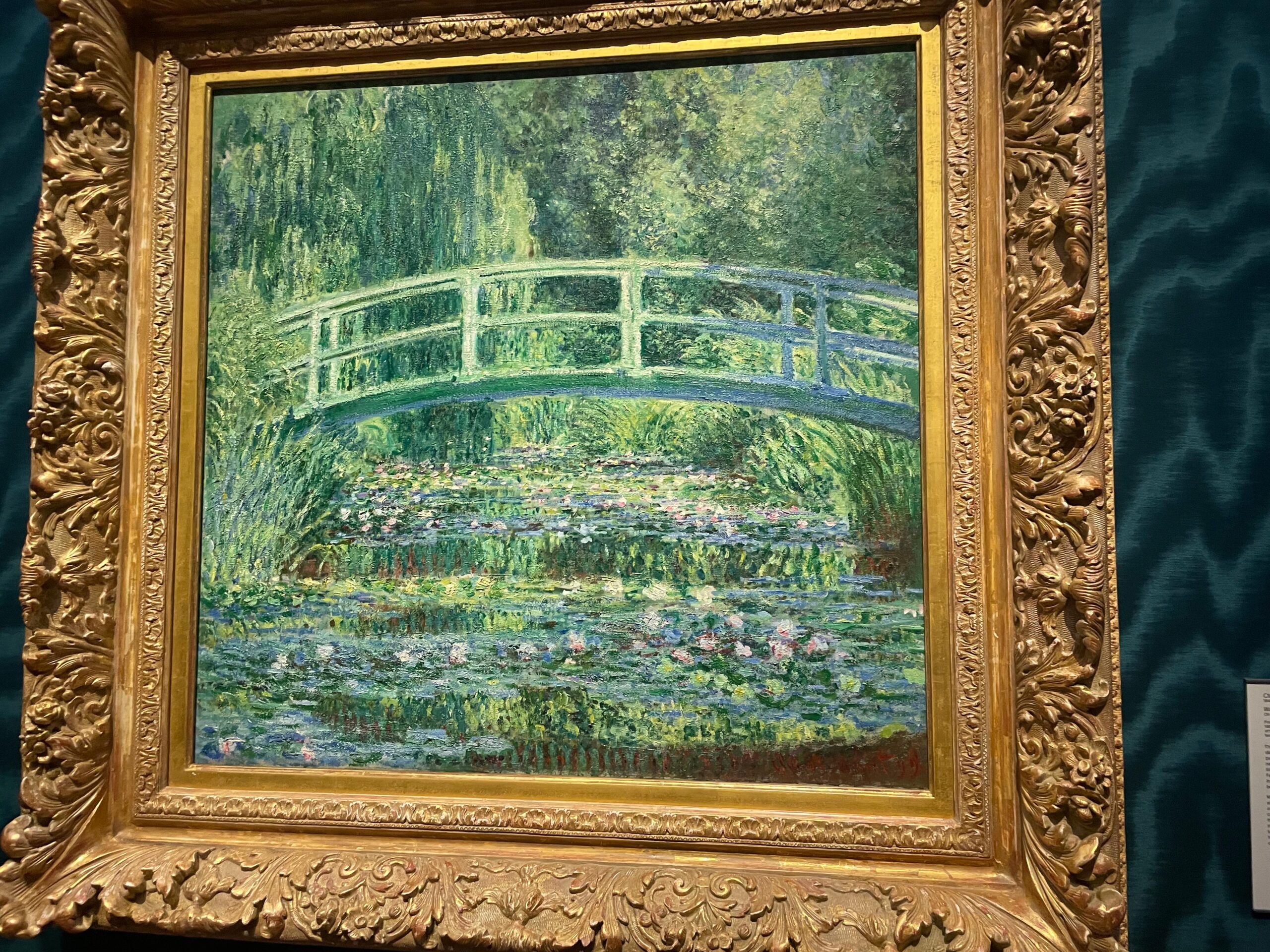
During my visit to the US this November, I had the chance to see an original Claude Monet painting at Princeton University, and that experience I believe became the spark for this entire project. Standing in front of the canvas, I was struck not just by the colors, but by how alive the surface felt, how the brush strokes seemed dissolve depending on where I focused my eyes. There was a sense of motion and atmosphere that I had never fully appreciated in prints or online images.
After the initial direction of my project didn’t go as intended, I knew immediately that I wanted to recreate that feeling, trying to capture the energy of his mark-making using code, video, and interactive hardware. In a way, this project became my attempt to translate the emotional impact of that painting into a dynamic, generative medium of my own.
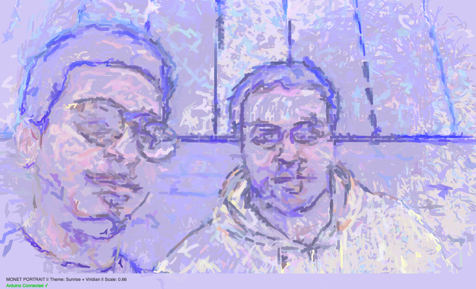
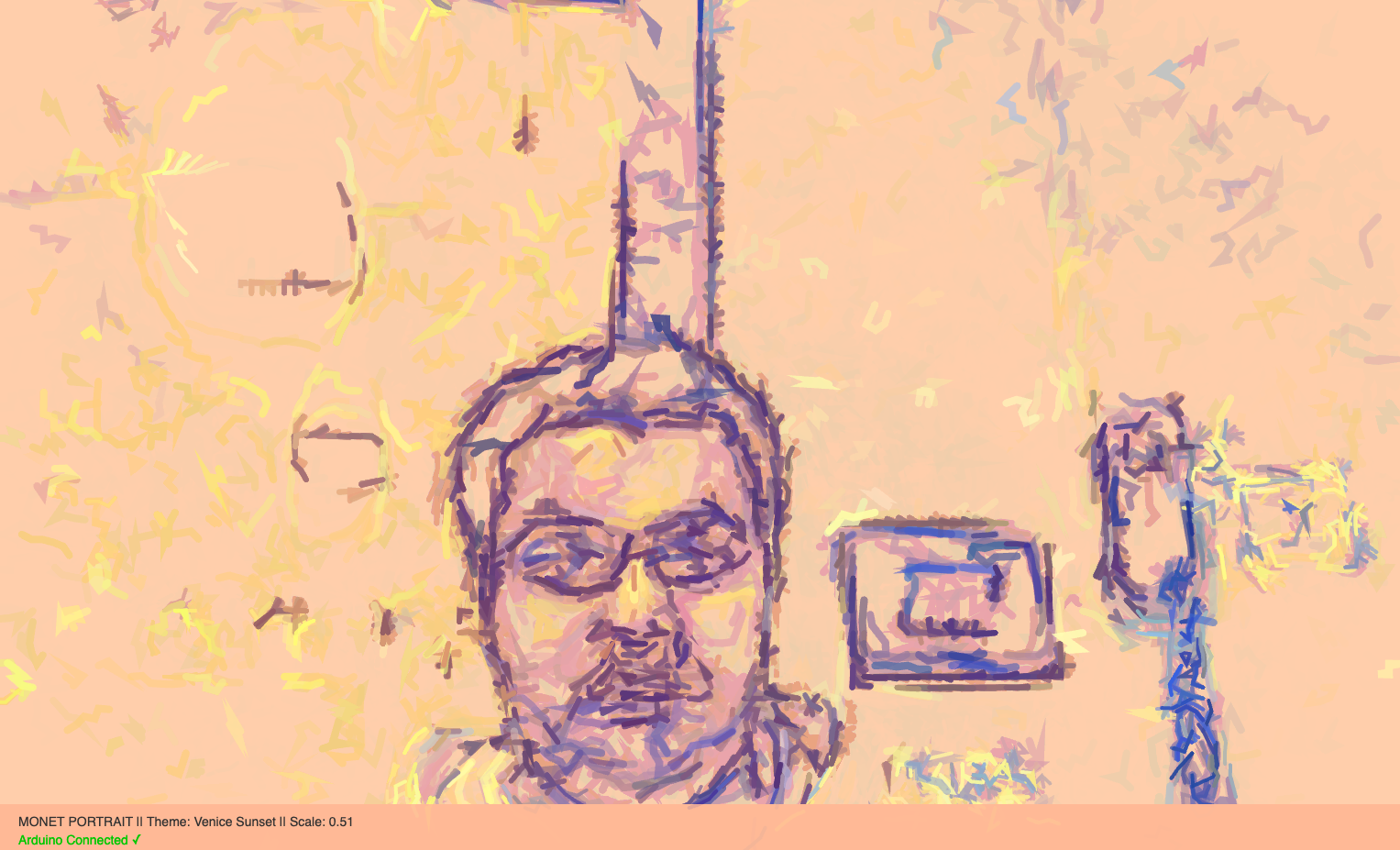
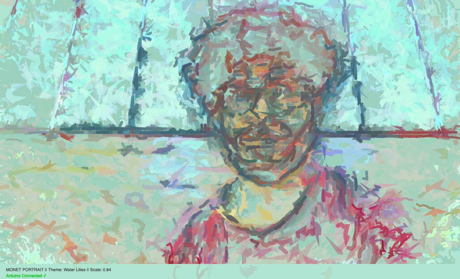
So, yes, my idea is simply a filter that turns the live footage from camera to a relatively similar style.
Photos / Video of Project Interaction
How the implementation works
The implementation consists of three interconnected layers:
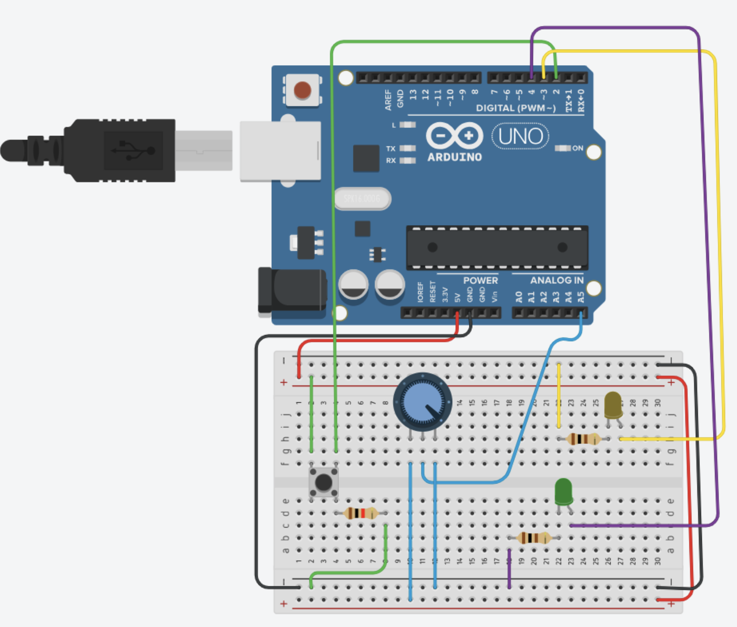
1. Hardware (Arduino Uno)
The Arduino reads five physical inputs:
-
- Potentiometer – controls global scaling of brush strokes
- Button 1 – switches to “Venice Sunset” palette
- Button 2 – switches to “Water Lilies” palette
- Button 3 – switches to “Sunrise + Viridian” palette
- Button 4 – triggers a photo snapshot
The Arduino packages these values into a comma-separated serial string and sends them to the browser.
2. p5.js
The browser receives the serial data via the Web Serial API.
p5.js:
-
- Analyzes the webcam image pixel-by-pixel
- Computes local edge gradients using a Sobel operator
- Generates a flow field for stroke direction
- Combines brightness, edge magnitude, radial position, and noise to determine stroke color, size, and jitter
- Paints small stroking particles each frame and adjust color modes, scale, and triggers photo capture
3. Interaction Design
const int POT_PIN = A0;
const int BTN1_PIN = 2;
const int BTN2_PIN = 3;
const int BTN3_PIN = 4;
const int BTN4_PIN = 5;

void setup() {
  Serial.begin(9600);
  pinMode(BTN1_PIN, INPUT_PULLUP);
  pinMode(BTN2_PIN, INPUT_PULLUP);
  pinMode(BTN3_PIN, INPUT_PULLUP);
  pinMode(BTN4_PIN, INPUT_PULLUP);
}

void loop() {
  int potValue = analogRead(POT_PIN);
  int btn1 = !digitalRead(BTN1_PIN);
  int btn2 = !digitalRead(BTN2_PIN);
  int btn3 = !digitalRead(BTN3_PIN);
  int btn4 = !digitalRead(BTN4_PIN);

  Serial.print(potValue);
  Serial.print(",");
  Serial.print(btn1);
  Serial.print(",");
  Serial.print(btn2);
  Serial.print(",");
  Serial.print(btn3);
  Serial.print(",");
  Serial.println(btn4);

  delay(50);
}
Description of p5.js code and embed p5.js sketch in post
The p5.js sketch is responsible for everything visual. It uses several coordinated systems:
A. Webcam + Pixel Processing
Each frame is analyzed for, brightness, edges (using Sobel filter), and radial distance from center. This information determines where strokes should appear.
B. Flow Field
Edge gradients produce an angle for each region of the image. Brush strokes follow this angle, creating the illusion of form and direction.
C. Monet-Inspired Color Logic
I handcrafted three color transformation modes that reinterpret facial features differently depending on shadow, mid-tones, and highlights.
D. Stroke Drawing
Hundreds of tiny “tracers” travel across the video frame, leaving curved paths like brush strokes. Noise adds natural variation.
E. Arduino Controls
-
- Potentiometer adjusts scale
- Buttons switch color modes
- Button 4 triggers
takePhoto()
Communication Between Arduino and p5.js
Communication relies on the Web Serial API, which allows a webpage to read from an Arduino.
What I’m proud of the most
What I’m most proud of is the generative painting engine. I wasn’t sure at first if I could combine live video input with a brush-stroke system that feels expressive instead of random, but the structure I ended up building feels genuinely satisfying. The way I compute brightness and gradient values from the webcam frame using a Sobel operator was a challenge, but finally writing:
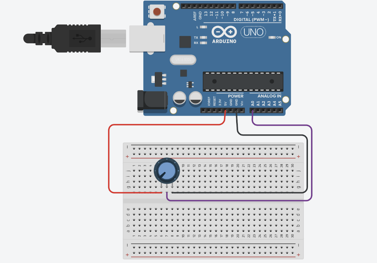

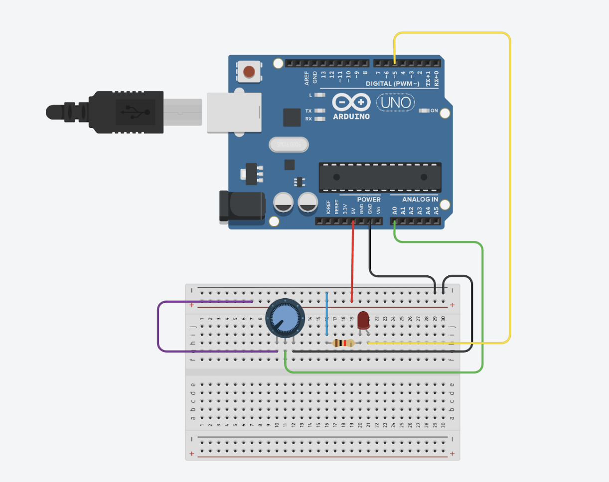

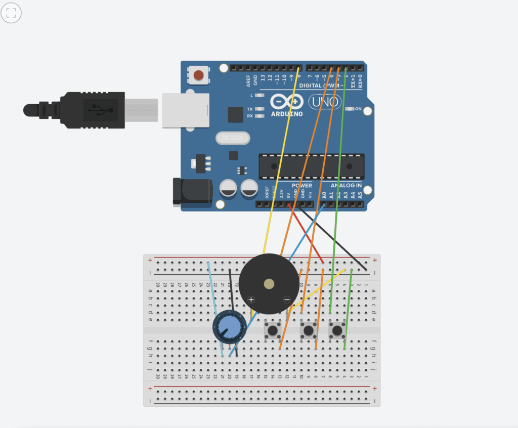 Figure 2 ( Circuit design with code and simulation on “Magnificent Jaiks” by Abdelrahman