Assignment 4: Flights Data Visualization

For this assignment I wanted to use data visualization and how I could use simple data to create an artwork or something interactive. After watching few videos and searching for possible data that I could use I came across this Visual Data Analysis lab that had used this flights dataset to create a data visualization.

After looking at this i was inspired to use the same dataset but to create an interactive world map using this dataset which could allow the user to enter a country as input and the sketch would show all the destinations they flights have gone to and what the number of flights are.

Initially, the downloaded flights.csv file was more than 5mb and P5.js did not allow me to upload the file. Hence I filtered the data as per the things I would need for this assignment. Since I was focusing on countries alone I removed the airport names along with the cities the flights were coming and going to.

For loading the data into my sketch i used the loadTable() function in P5.js that allowed me to read the data from my file and store it into my table.

After loading the table I set up a function call process where each line of the data would be fed in as a row. Then I’m using a get info function which gets the longitude and latitude from the row of the departure and destination location. It also maps out the longitude and latitude coordinates onto the dimensions of the sketch which is later used to draw circles at each location. This initial mapping and drawing of ellipses allows the green dots to create a rough outline of the world map onto the sketch. 

Then I’m using a get flights detail function that matches the input from the user to the row data and to avoid case sensitivity issues a converted both strings to uppercase and check if they are the same.  If so, and I am using the row’s departure and destination mapped coordinates to draw a line between them by pushing and popping each one. I’m also using a flight counter variable which allows me to keep track of the number of flights and displayed to the user as output.

Click here to view the sketch in fullscreen mode.


Gravity – Assignment 4

Ideation

I wanted to do something with falling letters, like those movie openings where they have 3D letter blocks falling from the sky but I quickly found that doing 3D stuff can get really complicated especially with letters so I decided to implement the 2D version of it.

First iteration

Initially, I wanted to mimic a pull of the letters with my mouse, so I recreated some of the code that we saw in class (seekHome) to have the letters seek the mouse pointer if it got close enough. (With some help from professor Aaron, I was able to figure out how to make the pull smoother, thanks!) This was working fine and so I decided to move on to the next part which is the falling letters.

Falling!

For this part, I had to dig up some high school physics and figure out how I would simulate gravity! I decided to give each letter a random mass (each letter is an object) and a random resistance to mimic air resistance. I also kept a time counter once gravity is turned on so that the falling speed increases with time.

I think it turned out pretty okay but I would like to figure out how to make the falling smoother as it seems quite jittery at the start.

Assignment 4 – Typography

Inspiration

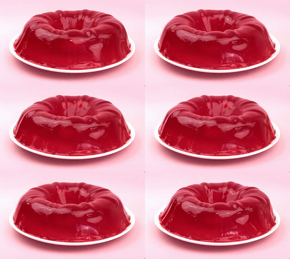
I wanted to make a typography that imitates the shaky nature of jello. I want the boundaries of the letters to move haphazardly while maintaining a their general features.

Jello GIFs | Tenor

Implementation

I preloaded a font called Aquino for to its thick,blocky appearance. This was so the word at least stays loosely legible even when it wobbles. The array of boundary objects is made using the textToPoints function in line 19 and 22. This is the basis of my topography. For the wobbly jello effect, I used the noise function in line 35 to make each point fluctuate.

The two texts have the same jello behavior, but differ in their points’ appearance. I like both designs, so I left them both on. They interact with the mouse position, by increasing pointer diameter when the mouse is close. When this happens the top text gets more bubbly, while the bottom text looks like a torch is being pointed at it. This is done using the using the dist() function.

Sometimes, the typography appears too disfigured, in which case please reload the page.

Conclusion

I leant a lot from this assignment, one of which being that one’s creativity is the only limit. My assignment, although farly simple, opened my eyes to countless other alterations I could implement in future assignments.

Assignment #4

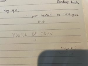
As soon as I found out what the assignment was and learning how the professor was able to make the letters seek home and float around the screen, I knew I wanted to play around with it. I immediately took out my notebook and sketched my idea, which can be seen below (excuse the roughness of the sketch):

I then started to look for monospaced fonts that I liked. Since the messaging was personal, I wanted a font that could express that, instead of the common blocky, cold monospaced fonts. It took me hours, because preload would often not work, and sometimes I came across the error of not having any space to upload my fonts (even though I only uploaded 2 font files). The other problem I kept coming across is that the font was not actually monospaced, so that ruined the spacing of the individual letters when I put them in an array.

After finally deciding on a font, I then needed to figure out how to make several strings and arrays to make my idea work – I needed to separate out the three sentences in order to control how they seeked home. At one point, it did not allow me to use my class because it had not been initialized and guess what the problem was? I forgot a } somewhere in the code. One simple mistake stopped the entire code from running. It drove me insane. Now though, whenever my code doesn’t run, my first instinct is to check my brackets, and {}.

Credit to https://openprocessing.org/sketch/1351086 for the heart function <3 It is a little busy, but overall I'm really proud at how long I kept trying to make my idea happen and the amount of times I felt the urge to throw my laptop but didn't 🙂 Here it is:

Assignment 4: Visualizations

Inspiration

For this project, i wanted to showcase some data from my childhood: Pokémon. I found a dataset on Kaggle which showed all pokemon and their typings, battle statistics, amongst other details.

I decided to create a pie chart that showcased the distribution of primary pokemon typings in P5js.

Implementation

I imported the dataset into p5js and began collecting information on each pokemon by creating a map, and assigning the keys to each type, and accumulated as I went through. I then pushed this to an array so I could create the pie chart.

pokemonMap = new Map();
numRows = table.getRowCount();
for (let r = 0; r < numRows; r++){
    let type = table.getString(r, 'type1');
    if(!pokemonMap.get(type)){
      pokemonMap.set(type, {val: 1});
    }else{
      pokemonMap.get(type).val+=1;
    }
}
anglearr = [];
for(let [type,obj] of pokemonMap){
  anglearr.push({type,val:obj.val})
}

I standardized each value by dividing by the total number of rows then multiplying by 360 to get the arc of each type by degrees. I increased the currangle variable so I could slowly build towards 360 degrees.

background(255);
  let currangle = 0;
  for(let i=0; i < anglearr.length; i++){
    fill(random(255),random(255),random(255));
    let nextdeg = anglearr[i].val/numRows*360;
    arc(width/2, height/2, width/2, height/2, currangle, nextdeg, PIE);
    currangle+=nextdeg;
  }

It wasn’t possible to tell which type belonged to which slice, so I added some trigonometry to add text that was offset by a radius to display each type next to their slice, with the same background color.

let midangle = (2*currangle+nextdeg)/2
let y = textrad * sin(midangle)
let x = textrad * cos(midangle)
text(anglearr[i].type, width/2+x, height/2+y)

The completed pie chart looks like this:

Reflection

I think there are some issues surrounding some of the sizes of the slices, but I am happy with the result. Most of my time writing the code for this comprised of figuring out the operations to use to standardize the angles and where to place the text. I know that pokemon was a part of many of our childhoods, and I find that looking back with an analytical lens is pretty interesting.

Week 4 Text – Code examples

Manipulating Characters:

Circle Letters:

Simple Data Viz: (data from https://trends.google.com/)

Word made with Circles:

Circle Word (with interaction):

Wild Wild Taxi (OOP)

For this week’s assignment, I first struggled to come up with an idea, I didn’t want to keep the same idea from last week, or I didn’t really see how it would benefit from an OOP, so instead, I thought about different games I like to play. Wild Wild Taxi has been (as “childish” as it may be) one of my favorite games since I was in maybe 1st grade.

Recently I haven’t been able to play it because it requires Flashplayer, which is not longer available. So, I began with the activity we did in class,

I then wanted to change the speeds of the car and control the Y position of the red car, but with this I wasn’t able to control the car so I tried added if loops in different places.

Still, even when I added an if statement to update the car, it was updating the position of all of the cars, I could control the Y position, but again, of all the cars. I had to figure out a way to control the Y position of just the red car.

Finally, I figured out that in order to control just one car that was created through the class, I would have to run it separately so that I could update its position, I also flipped the cars because moving side to side isn’t very realistic for cars. I also played around with other components and added a few other things, like changing the speed and color, so it would appear to be different cars that are passing.

Since I chose this project for me to be able to play the game, I would like to continue adding components, like a score, and the position of the car being changed by the keys being pressed, but for now, here is what I have! You can move the car to a different lane so it doesn’t get rear-ended by other cars.

Assignment #3

Overall this was quite difficult for me – organizing it into functions and classes made it all the more confusing to understand the structure of how the code is being read and displayed.

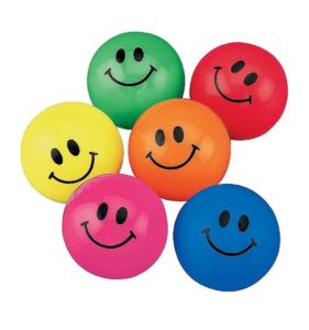
I knew that I wanted to recreate my childhood toy, the bouncy smiley ball – as shown here:

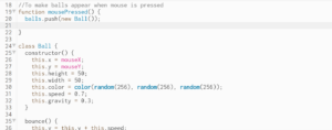
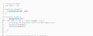
But I couldn’t figure out how to make the smiley face as part of the Ball class – nonetheless I wanted to make sure I incorporated the colorful aspect of the balls and play around with the gravity and speed to get the bounciness that I know. So I made sure to make my Ball class and in the draw() section push a new ball into my array so that it would create many balls on screen –

Here is what the final product looks like – it looks really fun when you spam click the canvas and place the balls at different heights.

Assignment 3

For this assignment, we specifically had to use OOP and create a generative art piece. I drew inspiration from Professor’s code here and a generative spiral code online.

Professor’s example:

Generative Spiral:

I wanted to have circles moving in a spiral way around the screen. I initially planned to do have it circle spirals randomly across the screen, however, one issue that I faced was that the circles just randomly moved across the not in a spiral manner (something like the Professor’s example).

So I had to set the positions and size of the circles by myself.

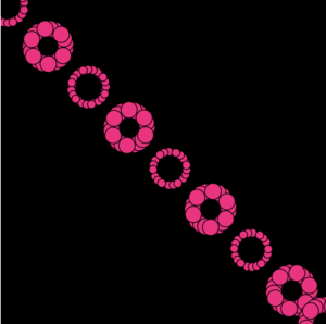
The design is such that circles rotate in a spiral manner and their positions expand across the screen. Each circle comprises 20 circles, I used a for loop here to store these circles(objects) in an array and then pop them out of the array i.e. run them later.

This is what it finally looked like:

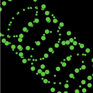
Some pictures of the design:

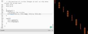
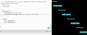
I manipulated a code a little when we are supposed to draw the ellipse/circle and this is how it looked:

Overall, it was fun to do it! What I found difficult was to come up with an idea but I am glad it worked in the end!