Quick Notes for use in assignment:
- image get (mouseX, mouseY, 50, 50)

Quick Notes for use in assignment:
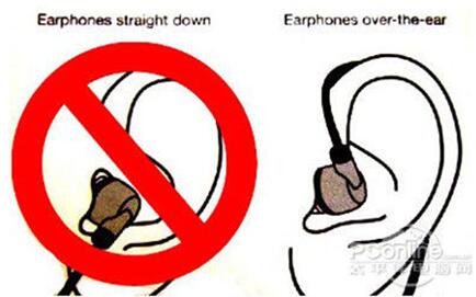
Personally, something that might frustrate me is an object for which multiple people hold varying mental conceptual models of it. Imagine the complication if these varying mental conceptual models conflict. Earphones might not necessarily drive me crazy, but it is initially designed to be worn wrapped around the ear and countless people simply plug it into their ear. I realize the problem is that usually a lack of signifier indicating a round wrapping action around their ear, and that users tend to place huger focus on the earbud, which is to be plugged in the earhole, leading to users simply plugging the earphone into their ear without wrapping it around their ear. I did ponder over how it could be designed to let people know clearly how earphones should be worn, but a better design that I can think of involves a long round rubber earhook placed before the earbud that indicates to the user it should be placed in the long around the antihelix, for which it can only be placed that way if the earphone cable was wrapped around ear.
Taking careful steps in designing an object is necessary, and it is crucial to consider the conceptual model that might be constructed, for these provide value for understanding, in predicting how things will behave, and in figuring out what to do when things do not go as planned.
I learned to consider affordances, the possible interactions between people and the environment, as well as incorporate signifiers to signal things, in particular what actions are possible and how they should be done. Signifiers must be perceivable, else they fail to function. I also learned that in design, signifiers are more important than affordances, for they communicate how to use the design. A signifier can be words, a graphical illustration, or just a device whose perceived affordances are unambiguous.
I have a real-life experience of the need for design improvement on my last data visualization project using the author’s principles of design to interactive media. The project involves viewing stellar objects in 3D space, allowing users to zoom in, zoom out and move across the space using mouse controls. Excitedly, I asked my friend to see it. She was keen to try out my project, but she didn’t seem delighted with her experience. Problems? There were not just one, but several:
I hope to incorporate these design considerations and principles in my upcoming assignments and future projects. I would love to help users enjoy a wonderful experience!
One I thing I find frustrating is the lack of customization in close-source systems. My iphone that uses IOS for example, I like it, I think its great, but it lacks a lot of customizable features that other systems like android, which lets you customize almost everything in your phone, from keyboard appearance to even system functionalities.
When it comes to designing interactive media, applying key design principles can make all the difference in usability. First, affordances and signifiers should be clear—buttons and links need to look like what they are, so users don’t waste time guessing. Feedback is just as crucial; when a user taps a button, they should see or hear an immediate response that confirms their action. And then there’s mapping—controls should align naturally with their effects, like familiar gestures and intuitive layouts that make navigation feel seamless.
What’s something (not mentioned in the reading) that drives you crazy and how could it be improved?
One everyday design failure that drives me crazy is poorly designed TV remotes. Many remotes today have an overwhelming number of buttons with unclear labels, making simple tasks like changing the volume or input source frustrating. This problem could be improved by applying Don Norman’s principles of discoverability and mapping. For example, remotes should group related buttons more logically and use tactile or color-coded signifiers to indicate key functions. A minimalistic design, similar to Apple’s Siri Remote, which relies on fewer buttons and intuitive gestures, would make the experience much more user-friendly.
How can you apply some of the author’s principles of design to interactive media?
Interactive media, such as mobile apps and websites, can greatly benefit from Norman’s principles of affordances and signifiers. For instance, buttons in an app should clearly indicate their function through visual cues like color, shape, or animations when hovered over. Poor feedback, such as a lack of confirmation when submitting a form, can leave users confused about whether their action was successful. Applying clear feedback mechanisms, like progress indicators or subtle vibrations for mobile interactions, would improve usability and user satisfaction, making digital experiences more intuitive and engaging.
Music has always had a profound effect on me—it can transform my mood, inspire creativity, and even transport me to another place. But what if we could see music, not just hear it? That was the inspiration behind my music visualization project. I wanted to create something that would take raw audio data and turn it into a living, breathing visual experience.
I set out to design a program that listens to a song and dynamically generates visuals based on its frequencies. The goal was to make the visualization feel fluid, immersive, and organic—like the music itself. With a gradient background, floating particles, and an animated frequency bar display, the result is a captivating blend of movement and sound.
At the core of this project is the drawVisualizer function. This function takes the Fourier Transform (FFT) data from the song and maps it to visual elements—essentially transforming audio frequencies into colorful, dynamic bars.
The function first analyzes the sound spectrum using fft.analyze(), which returns an array of frequency amplitudes. These values determine the height of the bars, making them respond dynamically to the beat of the song.
function drawVisualizer() { // draw bars
  let spectrum = fft.analyze(); // get spectrum data
  let barWidth = width / 60;
  let maxHeight = height / 4;
  for (let i = 0; i < 60; i++) { // loop 60 bars
    let barHeight = map(spectrum[i], 0, 255, 10, maxHeight); // calc bar height
    let hue = map(i, 0, 60, 180, 360); // set hue
    let yPos = height - barHeight; // top pos of bar
    let xPos = i * barWidth + barWidth / 2; // center pos of bar
    fill(hue % 360, 80, 80, 80); // set fill color
    rect(xPos - barWidth / 2, yPos, barWidth * 0.8, barHeight, 5); // draw bar
    if (barHeight > maxHeight * 0.7 && frameCount % 5 === 0) { // add sparkle if tall
      fill(255, 255, 255, random(50, 100)); // sparkle color
      ellipse(xPos, yPos, random(3, 8)); // draw sparkle
    }
  }
}
One of my favorite touches is the conditional statement that adds “sparkles” to the taller bars. This subtle effect makes the visualization feel more alive, as if the bars are bursting with energy at their peaks.
One of the biggest challenges was fine-tuning the balance between randomness and control. The bars needed to feel reactive but not chaotic, structured but not rigid.
Another area I’d like to explore is incorporating more interactive elements. Right now, the only interaction is toggling the song on and off with a mouse click. Adding features like changing color themes based on the song’s mood or allowing users to manipulate the bars with the mouse could make the experience even more engaging.
Your concept:
My project is an interactive genie lamp simulation where bubbles of smoke rise from the spout when the user holds the “R” key. As the bubbles grow, they form a speech bubble that displays a random percentage between 1-100%. This percentage acts as a playful response from the genie lamp, making the interaction fun and unpredictable. The bubbles disappear after a few seconds, allowing for continuous engagement
Code highlight:
I thought this part would be easy, just make bubbles appear when “R” is pressed. But at first, they wouldn’t stop generating, and itd fill the whole screen. The diagonal movement also felt off, no matter how I adjusted the values.
After some trial and error, I fixed it by limiting the bubbles and refining the movement formula. It was frustrating at first, but seeing the end result made it worth the effort:
function draw() {
  background(190, 195, 255);
  drawGenieBottle();

  // starts generating when r key is pressed
  if (keyIsPressed && key === "r" && !generating) {
    generating = true; // starts generation process
  }

  //generate bubbles if within limit
  if (generating && bubbles.length < maxBubbles) {
    let x = width / 1.35 + bubbles.length * 5; // slight diagonal movement
    let y = height - 100 - bubbles.length * 15;
    bubbles.push({ x, y, size: 10 + bubbles.length * 3 });
  }
Press “R” key:
Reflection and future improvement:
Overall, I am happy with how my project turned out, especially the animation of the bubbles and the random percentage display. However, I think it could be improved by adding glowing effects, sound, and different animations based on the percentage shown. Adding more visuals and variety would make the experience even more engaging.
Faced with the decision of choosing between working on data visualization or creating a generative text output, I considered that since I had a good understanding of how to create the generative text from class, and working in data visualization could help me gain some valuable skills, I chose to work on data visualization.
I was inspired by the data visualization of flights in the U.S. I was amazed at that a flight network could tell so much information, such as through its resemblance to the U.S. geography, and where the large airports are.
I was interested in applying data visualization mapping techniques to astronomical data. I explored Kaggle datasets and decided Gaia Astronomical Data to be very appropriate for my project as I noted I could visualize data in 3D space using x (parsecs) coordinates, y (parsecs) coordinates and z (parsecs) coordinates.
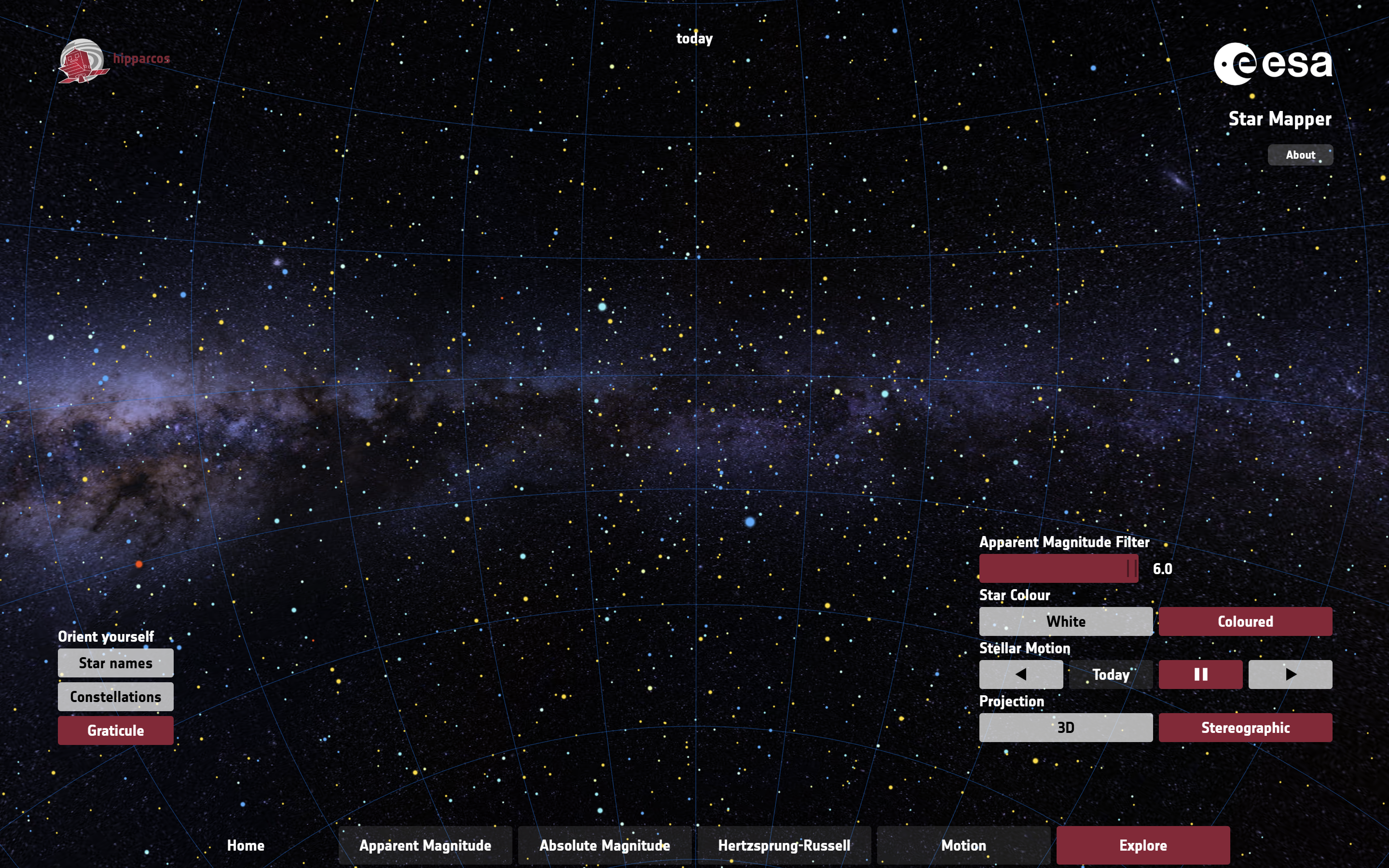
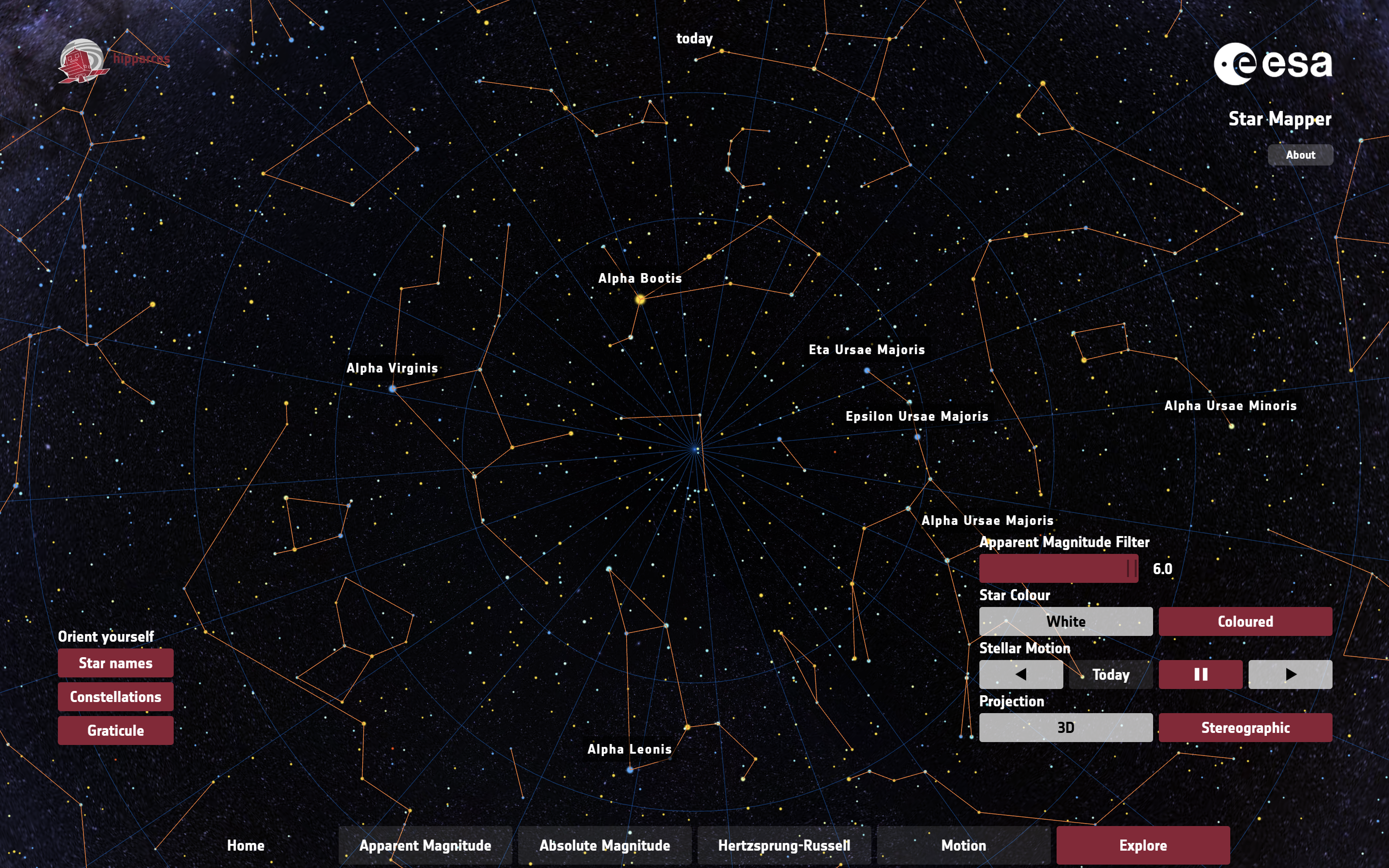
I also tried to explore other space visualization projects. In particular, I was inspired by the European Space Agency’s Star Mapper, a visualisation based on data from the European Space Agency’s Hipparcos star mapper. Not only were the views under ‘Explore’ tab very beautiful and breathtaking (see images below), I especially enjoyed the interactivity element of the website; being able to control the view of stars in space using my mouse when it is pressed, and I intended to incorporate this into my p5js animation.
The project involves manipulating the Gaia Astronomical Data to map stellar objects into 3D space, and enable users to zoom in, zoom out and move across the space using mouse controls. This would be my very first time animating in 3D space, as well as controlling camera and perspective through code! How exciting.
I used the code template for wind turbines data which was discussed in class and made many revisions to obtain the outcome.
I encountered various major challenges, resolved with the help of AI.
First, my goal includes being able to move across the space using mouse controls, which is new to me, and watching Coding Train’s WebGL and p5js tutorial on Camera and Perspective helped me understand these unfamiliar concepts in p5js. I learned important ideas including field of view (fov), perspective, orbitControl, camera([x], [y], [z], [centerX], [centerY], [centerZ], [upX], [upY], [upZ]). It was still very challenging, and with the help of AI, I learned to incorporate astronomical measurements:
At some point in the project development, the stellar objects weren’t visible to my eye in the initial view – though if I moved my mouse to something like mouseX = 395 and mouseY = 340, the stellar objects were visible. This posed a problem, because users might not realize at first glance that there are stars they can explore. So I used target mouse coordinates to have the stellar objects within initial view: const targetMouseX = 397.5 and const targetMouseY = 340, camera(initialCamX, initialCamY, initialCamZ, initialLookAtX, initialLookAtY, 0, 0, 1, 0). Since camera is incorporated when mouse is not pressed, the user’s view would reset to a place they can view the objects in case they lost sight of it.
function draw() {
  background(10); // Darker background for better contrast

  // Field of View - Only update if mouse is pressed.
  let fov;
  if (mouseIsPressed) {
    // Maps mouse X-position to 30°-90° zoom range. Wider FOV (90°) shows more galactic context, narrower (30°) focuses on specific star formations. Uses actual astronomical angular measurements (π/6 = 30°, π/2 = 90°).
    fov = map(mouseX, mouseY, width, PI / 6, PI / 2);
  } else {
    fov = map(targetMouseX, targetMouseY, width, PI / 6, PI / 2); // Use targetMouseX
  }
  // Sets viewing frustum matching typical astronomical scales: 1 parsec near clip (prevents nearby masers from clipping); 10000 parsec far clip (accommodates distant OB associations)
  perspective(fov, width / height, 1, 10000);

  // Camera Controls - orbitControl handles movement when pressed.
  if (!mouseIsPressed) {
        camera(initialCamX, initialCamY, initialCamZ, initialLookAtX, initialLookAtY, 0, 0, 1, 0);
  } //orbitControl handles the rest

  print(mouseX, mouseY);
  ...
}
Second, since I needed to move across space, it is important that I draw all stellar objects every frame, so that when the user moves the cursor, the view of all stellar objects may adjust accordingly. The original code where each data point was drawn once per frame needed to be adjusted. Processing all the relevant coordinates for each stellar object was performed in a function, which was called by setup() instead of draw(). An array of stellar objects is used to hold stellar object data, with each element being an object storing the data for that stellar object (xpos, ypos, zpos, size determined according to distance from viewer).
function findMinMaxXYZAndProcessData() {
  let singleRow = [];

  // loop over each row in the file
  for (let csvRowNumber = 1; csvRowNumber < strings.length; csvRowNumber++) {
    // get a single row and split that row
    // into individual words
    singleRow = split(strings[csvRowNumber], ",");

    // We know that the last two fields are the
    // latitude and longitude and so they are
    // numerical:
    let x = float(singleRow[5]);
    let y = float(singleRow[6]);
    let z = float(singleRow[7]);

    // The file may be missing a field, in which case
    // the converstion to a float might have failed
    if (isNaN(x) || isNaN(y) || isNaN(z)) {
      print("conversion to float failed; skipping row " + csvRowNumber);
      continue;
    }
    // Initialize min/max on the first valid row.
    if (minX === undefined || x < minX) minX = x;
    if (maxX === undefined || x > maxX) maxX = x;
    if (minY === undefined || y < minY) minY = y;
    if (maxY === undefined || y > maxY) maxY = y;
    if (minZ === undefined || z < minZ) minZ = z;
    if (maxZ === undefined || z > maxZ) maxZ = z;

    // --- Data Processing and Storage ---

    // Calculate mapped positions *here* (during setup).
    let xpos = map(x, minX, maxX, -width / 2, width / 2);
    let ypos = map(y, minY, maxY, -height / 2, height / 2);
    let zpos = map(z, minZ, maxZ, -width / 2, width / 2);
    let screenZ = map(z, minZ, maxZ, 8, 1); // Size based on distance.

    // Create an object to store the data for this stellar object.
    stellarObjects.push({
      x: xpos,
      y: ypos,
      z: zpos,
      size: screenZ,
      // You could add color, type, or other attributes here from the CSV.
    });

    if (csvRowNumber >= strings.length) {
      print("finished");
      noLoop();
    }
  }

  print("X (min, max) = (" + minX + "," + maxX + ") ");
  print("Y (min, max) = (" + minY + "," + maxY + ")");
  print("Z (min, max) = (" + minZ + "," + maxZ + ")");
} // end of findMinMaxXYZ
Third, my text on WebGL apparently read backwards. I made a logical guess that this was because of the view (I was behind the stellar objects rather than in front or my z-coordinates should be far the other way). I made an attempt to fix this, but it didn’t work. So with the help of AI, I learned to reset the camera for 2D drawing (orthographic projection) and default camera just specifically for text, the text read left-right.
// --- 2D Overlay (Text) ---
// Disable depth test for 2D overlay
drawingContext.disable(drawingContext.DEPTH_TEST);

// Reset the camera for 2D drawing (orthographic projection)
ortho();
camera(); // Reset to default camera

// Draw the textScreen
image(textScreen, -width / 2 + 20, -height / 2 + 20);

// Re-enable depth test for 3D rendering in the next frame
drawingContext.enable(drawingContext.DEPTH_TEST);
This project allowed for vast improvement in my data visualization skills in 3D space as well as valuable opportunities to try using WebGL for 3D animation in a personal project for the first time. An area for future improvement could be incorporating being able to animate the stellar objects in motion, as if in orbit.
Week 4 – The Design of Everyday Things, The Psychopathology of Everyday Things
In Chapter 1, Don Norman introduces the idea of human-centered design (HCD) and claims that a well-designed object should be intuitive and easy to use. He emphasizes how poor design may lead to confusion and frustration, which highlights that when people are struggling to use a product, it’s often the fault of the designer, not the user. Additionally, there are a few key principles that were introduced including affordances, signifiers, feedback, and conceptual models. Affordances refer to the properties of an object that indicate how it should be used (a handle affords pulling). Signifiers give clues about how an object functions, such as labels or icons. Feedback ensures that users receive a response when they interact with a design (a light turning on when a button is pressed). Lastly, conceptual models help users predict how an object will behave based on previous experiences. Norman critiques some common usability failures, such as confusing doors (push vs. pull) and complicated appliances. He believes that a well-thought-out design prioritizes clarity, simplicity, and usability rather than just aesthetics.
His valuable insights point out how much bad design impacts daily life. Usually, people will blame themselves for struggling with an object when, in reality, the issue lies in poor design choices. This made me think about how many times I’ve encountered objects that don’t work the way I expect them to, especially digitally where buttons are unresponsive. The chapter reinforces the idea that usability should always come before aesthetics in design. One thing that I find annoying is some modern car systems. Many car manufacturers have replaced physical buttons with touchscreen controls for functions like climate control. The reason that this is frustrating is that they often have poor menu structures, which require you to open multiple tabs for simple tasks like changing the AC temperature. There are various ways to improve this with one being to simply bring back physical buttons for frequently used functions like temperature, volume, and hazard lights. Another thing that could be done is the use of haptic feedback on touchscreens so users can feel when they’ve selected something. Applying Norman’s principles to interactive media can significantly improve usability and user experience. For example, buttons should look clickable, and the links should be distinguishable. Loading animations, confirmation messages, or vibrations on a touchscreen can signal that an action has been completed. Similarly, error messages should be clear and instructive and tell users what went wrong and how to fix it. By prioritising usability over aesthetics, designers are able to create interactive media that feels intuitive rather than frustrating.
For this project, I chose generative text but wanted to take a unique approach. Instead of displaying standard text, I decided to present the Greek alphabet in an interactive and visually engaging way. Finding all the symbols online was surprisingly easy. The inspiration for the rain-like effect came from the current rainy weather, adding a dynamic element to the design. I also incorporated interactivity and animation while making use of arrays, classes, and loops to enhance the experience.
Working on this assignment introduced me to new JavaScript features and functions, such as splice()for managing arrays and the fourth argument in background(), which allows for transparency effects. These discoveries helped refine the animation and improve the overall visual aesthetic. Some key blocks of code demonstrating these techniques are included below.
// Remove symbols that reach the bottom
if (particles[i].y > height) {
  particles.splice(i, 1);
function draw() {
  background(10, 10, 30, 100);
I enjoyed working on this assignment and gained valuable insights into generative art. However, I originally wanted to explore data visualization but faced challenges in loading data effectively. Moving forward, I plan to practice more with data handling so I can confidently incorporate it into future projects. Additionally, I aim to experiment with more complex interactivity to further enhance the user experience.
PRESS C TO CHANGE COLOR, G TO INCREASE SPEED, CLICK MOUSE TO ENJOY🙂
One thing that frustrates me is the complexity of using ACs on campus. Despite using them regularly, I have never fully mastered their functions beyond adjusting the temperature. This might seem minor, but it highlights a larger issue—many devices include extra features without clear instructions or intuitive design. Manufacturers often add numerous buttons and settings beyond a device’s core function, but without proper labeling or guidance, users are left guessing. For example, dryers come with multiple buttons beyond basic power and fabric selection, yet their purposes are unclear. Without clear signifiers, users may misuse the device, leading to frustration or even damage. A simple improvement would be better labeling, intuitive icons, or brief explanations to enhance usability and ensure users get the most out of these everyday appliances.
With respect to interactive media, one beneficial concept from the reading is the importance of contributions from people in other disciplines. As Norman states toward the end of the reading, “Design requires the cooperative efforts of multiple disciplines.” I could seek feedback from non-CS students or those without an interactive design background to determine whether my interface is easy to navigate without prior technical knowledge. For example, art students may provide insights on clarity and aesthetic appeal, ensuring the design is both functional and visually engaging. By actively involving diverse perspectives, I can create interactive media that is more intuitive, inclusive, and user-friendly, making my designs accessible to a wider audience rather than just functional for me.