Week 4 response

Introduction:

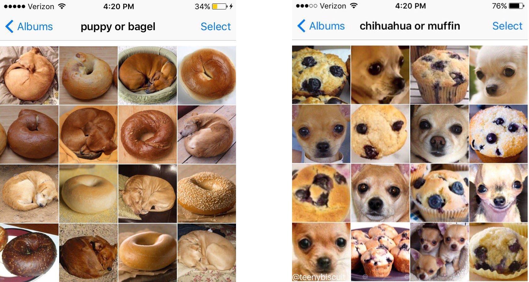
When I was reading the book I noticed how my thoughts that I had internally were said outside. Maybe I didn’t know how to word it as well but the idea was just as clear. The way he describes the process and the way the designers think of it vs how we as the users think of the items is different and that kind of makes it uncomfortable to use. There are things specifically on campus that drive me crazy sometimes because of how it is made and not efficient.

Reading Response:

Based on the reading something that annoys me would be the doors on campus, specifically the doors at Dining Hall 2. They don’t have sensors to enter and require you to pull but then open themselves automatically. The harder you pull the more opposing force it uses to prevent you from opening it manually. I prefer doors that can just open from a push either way. But how do I use the frustration of these inefficient made doors in interactive media? Well, I would make it so that it’s user-friendly. Something that is so easy to use that intrinsic to use people, something that’s almost close to common sense for the everyday layperson. Not focusing on creating something that’s easy as a coder or an artist but something thats easy for my audience.


Data visualization:

Below is a data visualization that’s very simple and not advanced at all but just very basic to show data that’s all.

let users = [];
let colors = ['#ff0000', '#00ff00', '#0000ff', '#ffff00', '#ff00ff', '#00ffff', '#ffa500', '#800080', '#008080', '#ffd700'];
let timeAwakeInput, timeWorkingInput, submitButton, newUserButton, userSelect;
let currentUser = 0;
let barWidth = 20;

function setup() {
  createCanvas(800, 500);
  background(240);
  drawAxes();

  timeAwakeInput = createSelect();
  for (let i = 2; i <= 24; i += 2) {
    timeAwakeInput.option(i);
  }
  timeAwakeInput.position(10, 10);

  timeWorkingInput = createSelect();
  for (let i = 0.5; i <= 24; i += 0.5) {
    timeWorkingInput.option(i);
  }
  timeWorkingInput.position(10, 40);

  submitButton = createButton('Submit Entry');
  submitButton.position(10, 70);
  submitButton.mousePressed(addEntry);

  newUserButton = createButton('New User');
  newUserButton.position(110, 70);
  newUserButton.mousePressed(createNewUser);

  userSelect = createSelect();
  userSelect.position(10, 100);
  userSelect.changed(changeUser);

  createNewUser();

  textAlign(LEFT, CENTER);
  text('Time Awake (hours):', 150, 25);
  text('Time Working (hours):', 150, 55);
}

function createNewUser() {
  let newUser = {
    id: users.length,
    color: colors[users.length % colors.length],
    entries: []
  };
  users.push(newUser);
  userSelect.option('User ' + (newUser.id + 1), newUser.id);
  userSelect.selected(newUser.id);
  currentUser = newUser.id;
}

function changeUser() {
  currentUser = parseInt(userSelect.value());
}

function addEntry() {
  let timeAwake = parseFloat(timeAwakeInput.value());
  let timeWorking = parseFloat(timeWorkingInput.value());

  if (timeWorking > timeAwake) {
    alert("Time working cannot exceed time awake!");
    return;
  }

  users[currentUser].entries.push({
    timeAwake: timeAwake,
    timeWorking: timeWorking
  });

  updateGraph();
}

function drawAxes() {
  stroke(0);
  line(50, height - 50, width - 50, height - 50); // X-axis
  line(50, height - 50, 50, 50); // Y-axis
  
  textAlign(CENTER);
  text("Time Awake (hours)", width/2, height - 10);
  
  push();
  translate(15, height/2);
  rotate(-HALF_PI);
  text("Time Working (hours)", 0, 0);
  pop();
  
  for (let i = 0; i <= 24; i += 4) {
    let x = map(i, 0, 24, 50, width - 50);
    line(x, height - 50, x, height - 45);
    textAlign(CENTER);
    text(i, x, height - 35);
  }
  
  for (let i = 0; i <= 24; i += 4) {
    let y = map(i, 0, 24, height - 50, 50);
    line(45, y, 50, y);
    textAlign(RIGHT);
    text(i, 40, y);
  }
}

function updateGraph() {
  background(240);
  drawAxes();
  
  let groupWidth = barWidth * users.length;
  
  for (let i = 0; i < users.length; i++) {
    let user = users[i];
    for (let entry of user.entries) {
      let x = map(entry.timeAwake, 0, 24, 50, width - 50);
      let barHeight = map(entry.timeWorking, 0, 24, 0, height - 100);
      
      // Adjust x position based on user index
      let adjustedX = x - groupWidth/2 + i * barWidth + barWidth/2;
      
      fill(user.color);
      rect(adjustedX - barWidth/2, height - 50 - barHeight, barWidth, barHeight);
      
      push();
      fill(0);
      textAlign(CENTER);
      textSize(10);
      text(entry.timeWorking + "h", adjustedX, height - 55 - barHeight);
      pop();
    }
  }
}


Week 5 — Reading Response

As I read about the differences between computer vision and human vision, I couldn’t help but reflect on how fascinating it is that these two systems operate so differently. I thought that the comparison really highlighted the strengths and limitations of both. Human vision is incredibly flexible and context-aware — we can recognize a friend’s face even in poor lighting or from an unusual angle. Computer vision, on the other hand, relies on algorithms that need carefully controlled conditions to function effectively. This made me realize how much work goes into “teaching” computers to see, and it reminded me of my own experiences. I’ve always been intrigued by how technology intersects with human behavior, and this article deepened my appreciation for the challenges of bridging that gap.

To help computers “see” what we’re interested in, the article outlines several techniques, like frame differencing, background subtraction, and brightness thresholding. I thought these methods were clever in how they simplify the problem — breaking down complex visual data into manageable pieces. For example, using brightness thresholding to track a single bright point, like a flashlight, seems almost elegant in its simplicity. I believe, that these foundational techniques are a great starting point for anyone looking to experiment with computer vision (like me hehe). They also highlight the importance of designing the physical environment to support the algorithm, which is something I hadn’t fully considered before. It’s not just about writing code; it’s about creating a world that the computer can understand.

The article’s discussion of tracking and surveillance in interactive art really resonated with me, especially given my legal background. I think computer vision is a perfect example of a tool that can be both empowering and unsettling. On one hand, it enables incredible artistic experiences, like Myron Krueger’s Videoplace, where participants can interact with virtual elements using their bodies. On the other hand, it raises questions about privacy and control, as seen in projects like Suicide Box or David Rokeby’s Sorting Daemon. These works use computer vision to critique surveillance, and I think they’re a powerful reminder of how technology can shape — and be shaped by — societal values.

Personally, I believe that computer vision’s capacity for tracking and surveillance adds a layer of complexity to its use in art. As a CS major with a legal background, I’m particularly drawn to the ethical dimensions of this technology. I’d love to explore how interactive art can balance the wonder of computer vision with a critical awareness of its implications. For instance, what if an installation invited participants to play with tracking technology while also making them aware of how their data is being used? I think there’s a lot of potential here to create works that are not only engaging but also thought-provoking, encouraging viewers to reflect on the role of technology in their lives.

Midterm Progress Report

Concept/Ideation

I started off by thinking about what is the vibe I wanted to have in my project. I browsed through Pinterest boards to see if I could find some inspiration. This is where I came across this cute photo:

This may contain: the sky is filled with stars and clouds

I wanted my game’s background photo to have a similar color palette and aesthetic. It also reminded me of the nostalgic feeling I had as a kid when playing simple, food-themed games — like cooking games where you’d make ramen or decorate baked goods. Inspired by that, I decided to create a game with a similar concept but scaled down to fit within my scope. I knew from the start that I wanted it to be candy-themed.

Brainstorming

I quickly drew up the ideas that I had for the design and started to sketch the initial visuals:
I then used Figma to actually create the background of the game in addition to the necessary visual assets:

I idea is that the game involves three boxes, each corresponding to a color of candy falling from the sky. To catch the candy, you move the box of the matching color to the spot where the candy is about to fall. To switch between the boxes, simply press the spacebar. While there is no traditional winning system, you score one point for each candy you catch. And there will never be more than one candy falling at the same vertical level at a time.

Code Progress/Concerns

Right now, I’m focused on having two classes: one for the box and one for the candy. These will be central to the gameplay mechanics, as the candy will fall and the player will control the box to catch it. The most uncertain part of my midterm project is ensuring smooth interaction between the boxes and candies, especially when switching between boxes using the spacebar. This could lead to timing issues or bugs that affect the gameplay experience. To minimize this risk, I plan to write some code to test the collision detection and box-switching functionality. Currently I’ve preloaded by assets:

function preload() {
  bg = loadImage("bg.png");
  startButton = loadImage("start.png");
  mouseSound = loadSound("mouse.mp3");

  boxImages[0] = loadImage("box1.png");
  boxImages[1] = loadImage("box2.png");
  boxImages[2] = loadImage("box3.png");

  candyImages[0] = loadImage("candy1.png");
  candyImages[1] = loadImage("candy2.png");
  candyImages[2] = loadImage("candy3.png");
}

in addition to structuring my two main classes for OOP:

class Box {
  constructor(x, y, width, img) {
    this.x = x;
    this.y = y;
    this.width = width;
    this.img = img;
  }

  move(dx) {
    this.x = constrain(this.x + dx, 0, width - this.width);
  }

  display(isActive) {
    image(this.img, this.x, this.y, this.width, 60);
    if (isActive) {
      stroke(255, 0, 0);
      strokeWeight(2);
      noFill();
      rect(this.x, this.y, this.width, 60);
    }
  }
}

class Candy {
  constructor(x, y, img, type) {
    this.x = x;
    this.y = y;
    this.size = 40;
    this.img = img;
    this.type = type;
  }

  fall() {
    this.y += gravity;
  }

  display() {
    image(this.img, this.x, this.y, this.size, this.size);
  }
}


Reading Reflection – Week 5

In Computer Vision for Artists and Designers by Golan Levin, the main difference between human and computer vision is that while humans naturally interpret context and meaning, computers analyze images numerically.

People can recognize objects in varying conditions, but computers need specific training to do the same. For example, while we can recognize a face even if it’s partially obscured, computer vision would struggle unless it’s specifically trained to do so. This difference stood out to me because it shows how much more complex human perception is compared to a computer’s mechanical analysis.

To help computers track things we’re interested in, techniques like thresholding (simplifying images), edge detection (finding shapes), and optical flow (tracking movement) are used. More advanced methods, like machine learning, help computers recognize objects by learning from large datasets. These methods don’t give the computer understanding, just the ability to process data.

Levin also explores how CV’s tracking abilities are used in both art and surveillance. Artists use CV for interactive installations that respond to movement, but the same tech is used for facial recognition and monitoring. This can be a bit problematic as while CV enhances art, it also enables tracking people, sometimes without consent. Some artists challenge this by confusing or exposing surveillance systems.

This made me think about how CV has become so embedded in our everyday lives, from facial recognition on our phones to tracking in stores. While these systems often make things more convenient, they also normalize constant monitoring. For artists, I think it’s important to be aware of the implications of using CV, especially for privacy and surveillance.

Midterm Progress Report

My concept

I had several ideas for my midterm, but as the spring break is coming up, everyone keeps asking: “Where do you wanna go?” The variety of my friends’ responses made me think: what if people travel not to see a desired destination per se, but to experience certain emotions?

That’s how i came up with my project idea: an airport departure board where, instead of regular destinations, users choose from emotional states like: peace, guidance, re-start, sign. 

User Interaction

Here’s how the interaction works:
1. The user sees the departure board with different emotional destinations.
2. Clicking on a mood smoothly zooms in on that selection.
3. After zooming in, a pop-up appears with a random message or affirmation related to their chosen emotion.
4. Users can go back to the main screen and pick another mood.

I might remove the zoom in feature if that doesn’t work out and let the user receive their message right away. I also wanna add different sounds: airport sound as the background noise and the pop-up sound.

Complex Part

Complexities with this project started before i even got to the coding part. I had a certain picture in my mind and i realized the only way to bring it to reality is by drawing it myself, so i made this:

Then, i realized that it will take me too much time to colour it and have the best final look, so i just took another picture and redesigned it a bit:

If the quality worsens or something else goes wrong, i’ll have to redesign this completely by combining several pictures, but hopefuly i’ll stick with this one.

Code-wise the most challenging part of this project is the zoom-in transition when a user selects a mood. If the zoom feels too abrupt, the experience won’t be immersive.

To solve this, i want to try implementing smooth zoom animation using lerp() and ensure the quote pop-up appears naturally after zooming in.

if (zooming) {
  zoomFactor = lerp(zoomFactor, targetZoom, 0.08);
  if (zoomFactor > targetZoom - 0.1) {
    zooming = false;
    messageShown = true; 
  }
}


Reading Reflection – Week 5

Computers do not have any general visual understanding unless they are told exactly what to look for, and this is quite shocking considering how powerful they are. A task as simple as differentiating between a dog and a cookie can pose an incredible challenge to machines.

Tim Stearns on X: "I use @teenybiscuit's wonderful animal vs. food images when I teach 1st-year undergrads about the challenges that AI faces in image recognition tasks that we're good at, but

Humans process visual information holistically, incorporating prior knowledge, experience and intuition to interpret the visible world. Meanwhile, computers speak the language of 1s and 0s, and they have to be taught by humans to see and discern certain objects and situations, using specific techniques like frame differencing for detecting motion, background subtraction for detecting presence and brightness algorithms for tracking objects. As it is up to humans to teach computers how to make sense of pixels, I think there is room for creativity in how we translate and represent the visual world to machines.

In a world where computers are developing a greater sense of “sight” day by day, data privacy and surveillance becomes an important topic of discussion. Those developing and deploying products based on computer vision, including computer scientists, artists and anyone in between, have to ensure fair and ethical use of the data, if any is collected. At the same time, I think it is also important for everyone else to learn to recognize and question the real world applications of computer vision as we go on with our daily lives.

Week 4 – Reading Response

One thing that drives me crazy is modern microwaves. Many microwaves have confusing button layouts, very cryptic labels, and just overall  inconsistent functionality across different brands. Like, some have dedicated buttons for specific foods like popcorn or  pizza and bury basic functions like adjusting power levels. Worse, sometimes  theres very little feedback if you press the wrong button, the microwave might beep, but it won’t tell you why. To improve this, designers could apply mapping and feedback more effectively. For example, a better approach would mean grouping related buttons together, and maybe place the most important buttons at the top, or make them significantly bigger.

In relation to the author and his principles of design, in the future, I could incorporate clearer feedback mechanisms for user actions in my projects. For instance, if a user hovers over an interactive element, I could add visual signifiers like small animations or color changes to show that the item is clickable. In addition to that, I would pay close attention to mapping, making sure that the user’s input feels directly connected to the system displayed. If I were creating a game where the user controls a character for example, I would make sure that the movements are mapped logically to the controls, such as using the arrow keys to move the character in the expected direction (up for up, down for down).


Week 4 – Assignment

Concept

My inspiration for this project was a magic 8-Ball, which is like a classic toy that lets people ask a question, shake the ball, and then receive a random answer like “Yes,” “No,” or “Ask again later.” My project is similar to this but in a digital form, so instead of shaking a physical object, the user types a question and presses enter. The program then generates a response from a set list of answers.

Code Highlight

The core of this code is pretty straightforward. The setup function creates the canvas, places the input box, and ensures everything is aligned properly. Then generateResponse function then picks a random answer from a list whenever the user presses Enter. The draw function then continuously updates the screen, displaying the prompt and response.

let inputBox; 
let response = "";  // variable to store the response text
let fade = 0;  
let answers = [ 
  "Yes.", "No.", "Definitely.", "Absolutely not.", 
  "Likely.", "Without a doubt.", "Maybe?", "Never."
];

function setup() {
  createCanvas(600, 400);  
  textAlign(CENTER, CENTER);  
  textSize(24);  
  
  // inputbox
  inputBox = createInput("");
  inputBox.position(width / 2 - 100, height / 2 - 50);  
  inputBox.size(200);  
  inputBox.style("font-size", "16px");  
  
  
  inputBox.changed(generateResponse);  // calls generateResponse when text inside inputbox changes
}
// generates a random response when the input changes
function generateResponse() {
  response = random(answers);  // selects random responses from answers array

Reflection/Imporvements

If I were to improve this, I’d start by making the responses feel more dynamic. Right now, all of the answers appear in the same style, but I could change the color of the text based on the response, so maybe green for positive, red for negative, and yellow for uncertain ones. I could even add sound effects or animations would also really improve the experience, making it feel more interactive. Finally, I’d like to refine the user input, so that the box automatically clears after the question is asked.  Overall, I like how this project turned out. It’s a small but effective way to capture the fun of a Magic 8-Ball.

Week #4 – Production Assignment ( Data Visualization)

Introduction:

I have always found bar graphs to be quite fascinating. The ability to stack and compare data visually allows it to be easily perceived. In my case, I wanted to make sure, that I can log my study hours, as an extrinsic motivation. Something which will give me visual overview of my efforts in the form of time put into studying.

Concept:

In theory, I wanted the data visualization and bar graph to be based on weekly basis. A snapshot of just one week as opposed to a complete log since the dawn of time.  Each day in the week will have a bar , extending from top to bottom axis, and will vary in height, to signify which day was the most productive (I know this isn’t exactly considered productivity, but we might just pretend). Each bar will have designated study hours listed on top of it, and will give a quantitive and qualitative visual of study pattern.

The user will be greeted by start page, then taken to a page to log in study hours, and then again upon a button click, will see the graphs appear.

Code Highlight:

function setup() {

}

function startProgram() {

  }
 
}

function submitData() {
  // check and store if 
  for (let i = 0; i < studyInputs.length; i++) {
    //cycle through the inputs to verify the nature of data.
    let val = parseFloat(studyInputs[i].value());
    // parseFloat is a javascript function, which parses
    // a value as string and then converts it to number
    studyHours.push(isNaN(val) ? 0 : val);
    /*
    isNaN is 'Not a number' function which returns true if the value is     passed is not a number. in our case if the value passed is a 
    number, then its true, and pushes 'val' into study hours. and for
    the one where if there is no number entered for instance a letter /
    character instead, this will push the value '0' for the hours.
    */
    studyInputs[i].hide(); // hide the input field after submission
  }
  submitButton.hide();
  state = "graph";  // change state so that draw() will call drawGraph()
}

function drawGraph() {
  
}

//atlas draw function which keeps on cycling, and only draws graph when the state has been changed to draw graph.
function draw() {
  // if state is "graph" continuously draw the graph. 
  if (state === "graph") {
    drawGraph(); // custom function
  }
}

The code in submit data is what I am proud of. At first, I encountered the possibility where the user might not enter a numerical value, but rather a string or character. Hence I made use of ‘parseFloat’ and ‘isNaN’ javascript functions paired with a inline if-else logic statement to check for the nature of input. If the input happened to be other than a number, then push a ‘zero’ value into the ‘studyHours’ array.


Things I struggled with:

I struggled the most with the placement and sizing of the bar graphs. There coordinates were inconsistent, and the spacing was off. Hence, I decided to use mathematical formulation to calculate the division of space on the spot , and keep its coordinates and their margin  consistent.

let margin = 60;
 let gap = 20; //gap between days
 let availableWidth = width - 2 * margin;
 let barWidth = (availableWidth - (days.length - 1) * gap) / days.length; 
 let maxHours = max(studyHours); // maxiumum value in the array
 if (maxHours === 0) {
   maxHours = 1;  // to avoid division by zeor
 }
 let graphHeight = height - 100;
 stroke(0);
 //horizontal bar
 line(margin, height - 50, width - margin, height - 50);
 
 // For each day, draw the corresponding bar and label its study hours and name
 for (let i = 0; i < days.length; i++) {
   let x = margin + i * (barWidth + gap);
   let barHeight = map(studyHours[i], 0, maxHours, 0, graphHeight);
   
   // Draw a blue bar representing the study hours
   fill(50, 150, 200);
   rect(x, height - 50 - barHeight, barWidth, barHeight);


Instruction on How to Use:

Click on ‘start’ to proceed to data logging stage.

Then, enter numerical values for the hours studied each day.


Once pressed on ‘submit’, the user will see visualized pattern of data entered.

Since ‘ali’ is not a numerical value, it shows zero, and for the rest, it visualizes the trend and numbers entered.

Embedded Sketch:


Future Improvements:

In the future, I want to make it even more dynamic. For instance 7 is not far away from hitting the title. Even though the current program is able to resize depending on the maximum and the minimum relative to other bars, and the graph, yet still, better margins and specific coloration to each bar can make it more sybmolic. For instance hot red can refer to the most hours studied, and simple greenish can refer to the least.

Complete code:

The complete code is extremely lengthy, not really but can be accessed via clicking on the sketch.


Week #4 – Reading Response

Overview of the reading:

I thoroughly enjoyed this reading. I had no idea the famous ‘Norman Door’ was literally named after a personality named Norman! The reading touches upon various concepts and examples such as doors and teapot for masochists. By using the example of his friend and his struggle with an aesthetically pleasing array of doors, the author made and argument that ‘discoverability’ and ‘understanding’  are two of the most critical elements of design, which are often neglected. Discoverability means the how easy it is for users to discover possible actions and understanding refers to what extent user can understand the meaning of those actions.


What’s something (not mentioned in the reading) that drives you crazy and how could it be improved?

If there is one thing, that I happened to have been struggling with recently are the plastic latches. To be more precise, the battery latches on cameras.

Turns out, I am not the only one, many folks over the internet have been struggling with these latches. The latch mechanism works by pulling a small protruded lever. Instead, those unfamiliar, end up pooling the whole latch backwards, which ends up damaging , loosening, or even breaking it. No wonder,  why they have so many spare plastic latches lined up on amazon:

In order to improve, I think a release mechanism can be designed, based on a simple push mechanism, rather than a pull mechanism. A simple button, which releases the hatchet rather than you having to pry it with your nails, making it extremely difficult and scratching the plastic in the process. Most importantly, memory card has to be removed every time to transfer images, and with latch being this annoying, it is bound to be damaged and broken in the long run. Therefore, a push to open mechanism would be more important than a push / pry to open mechanism.

Note: I am not referring to the movement of the latch (wouldn’t make any different to door), but rather the release mechanism that works in latches and sometimes say’s push to open or ‘pull’ but reality results in user confused which axis to apply force in.

Solution: A press to open and press to release mechanism, similar to kitchen drawers.


How can you apply some of the author’s principles of design to interactive media?

Feedback mechanism is one of the main visual or multi-sensory cue (signifier) that can be implemented to interactive media projects. Upon user input, the designed system should either inform the user after an adequate amount of time wether his/her action has been negated or accepted. I personally like the idea of sound or haptics. For instance on Macintosh mousepad, when user is performing a drag or drop action with the mouse which is beyond the graphical constraints of that program, the springs in the mousepad harden and vibrate. This gives the simulation of difficulty when dragging . Similarly that annoying sound from windows 7, when prompt window not dealt with are some of the examples.

Secondly affordances such as designs which allow for ‘easy’ discoverability is something that I would like to work upon.  Easy to understand designs, which prompts user in the right direction, such as drawing borders in the game selectively to direct the player in the right direction.