Project concept
This project was inspired by a real experience on my family’s farm—I saw foxes approaching our chickens at night, and my dad was complaining on how to deal with the situotion it made me think about how to create a simple way to detect movement at a low cost and respond immediately. I wanted something that could work without constant supervision, so I came up with the idea of using an ultrasonic sensor and lights to react when something gets close.
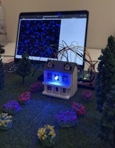
From there, I built a mini garden setup using individual RGB LEDs and connected it to P5.js for visual feedback. I started with a different idea—using sound and an LED strip—but changed direction after facing hardware limitations. and honestly I love how it turned better. That process helped shape the final concept,i also wanted to create something similar to lava lamps that’s why ii ended up doing the visuals in p5.js similar to the blobs in the lava lamps which now works as both an interactive installation and a practical assistive device for animal and crop protection.
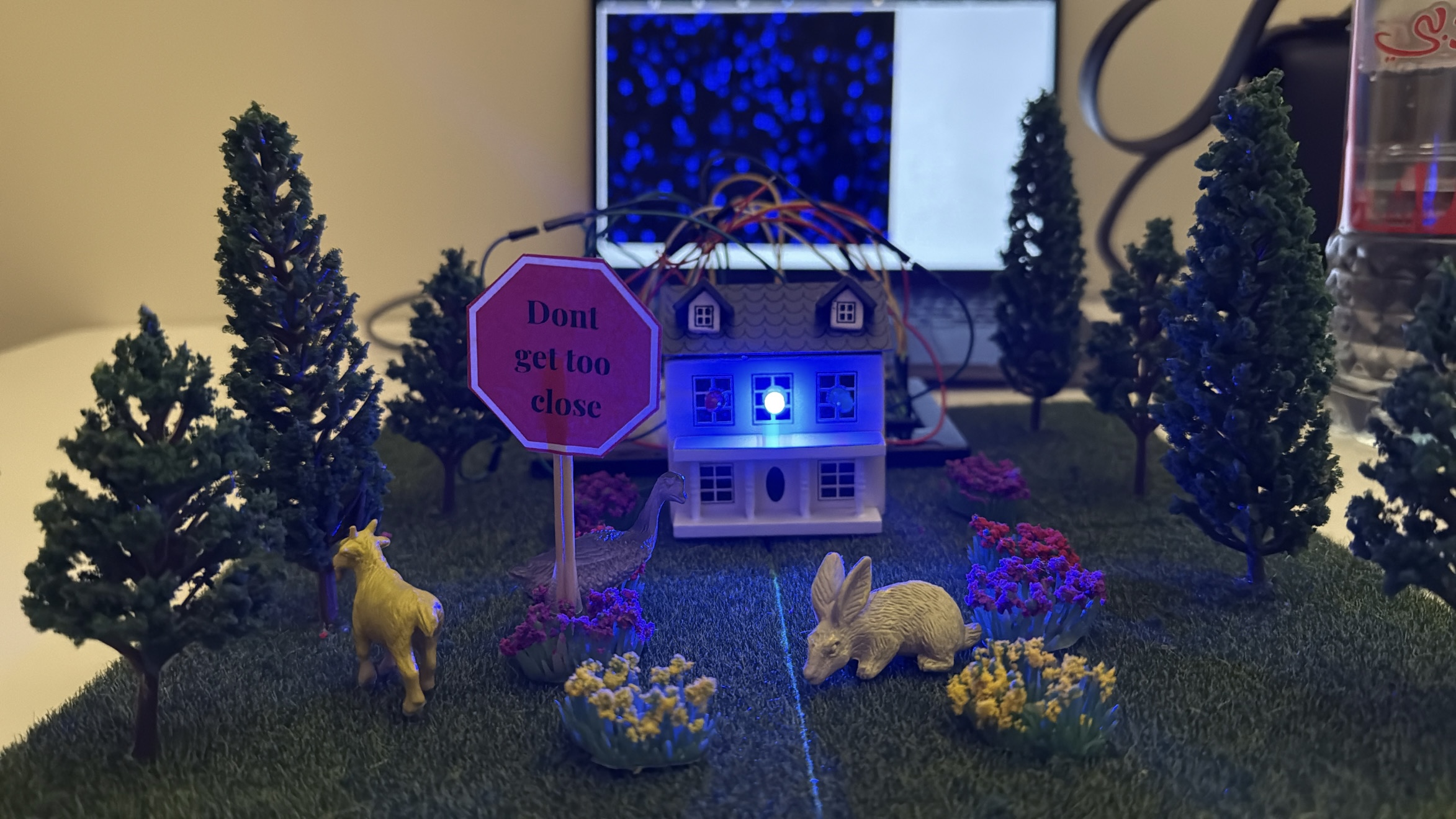
My final project is the Motion-Activated Mini Garden/farm Visualizer, an interactive installation that responds to movement and presence using an ultrasonic sensor. – house and the garden I built . When someone approaches the garden, the LEDs light up based on proximity—closer movement causes brighter, more vibrant lights, while standing farther away results in dimmer, calmer effects.
-blue is for far away
-green in for in the middle
-red is for very close
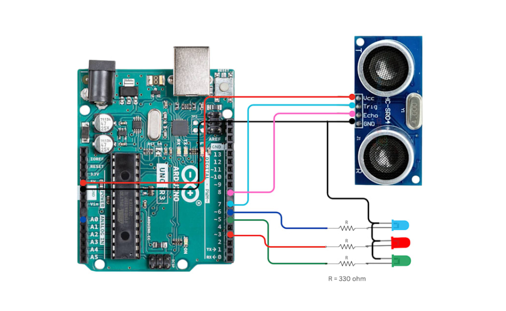
The schematic digram:
 Aruidno code:
// HC-SR04 Ultrasonic Sensor Pins
#define TRIG_PIN 7
#define ECHO_PIN 8

// RGB LED Pins
#define RED_LED_PIN 3
#define GREEN_LED_PIN 5
#define BLUE_LED_PIN 6

long duration;
int distance;

void setup() {
  Serial.begin(9600);

  // Sensor Pins
  pinMode(TRIG_PIN, OUTPUT);
  pinMode(ECHO_PIN, INPUT);

  // RGB LED Pins
  pinMode(RED_LED_PIN, OUTPUT);
  pinMode(GREEN_LED_PIN, OUTPUT);
  pinMode(BLUE_LED_PIN, OUTPUT);

  turnOffAll(); // Ensure LEDs are off initially
}

void loop() {
  // Trigger the ultrasonic sensor
  digitalWrite(TRIG_PIN, LOW);
  delayMicroseconds(2);
  digitalWrite(TRIG_PIN, HIGH);
  delayMicroseconds(10);
  digitalWrite(TRIG_PIN, LOW);

  // Read echo and calculate distance (cm)
  duration = pulseIn(ECHO_PIN, HIGH);
  distance = duration * 0.034 / 2;

  // Print distance to serial
  // Serial.print("Distance: ");
  Serial.println(int(distance));
  // Serial.println(" cm");

  // LED logic based on distance
  if (distance < 10) {
    setColor(255, 0, 0);   // Close → Red
  }
  else if (distance >= 10 && distance <= 30) {
    setColor(0, 255, 0);   // Medium → Green
  }
  else {
    setColor(0, 0, 255);   // Far → Blue
  }
  delay(100);
}

// Control RGB LEDs using digital logic
void setColor(uint8_t r, uint8_t g, uint8_t b) {
  digitalWrite(RED_LED_PIN, r > 0 ? HIGH : LOW);
  digitalWrite(GREEN_LED_PIN, g > 0 ? HIGH : LOW);
  digitalWrite(BLUE_LED_PIN, b > 0 ? HIGH : LOW);
}

void turnOffAll() {
  digitalWrite(RED_LED_PIN, LOW);
  digitalWrite(GREEN_LED_PIN, LOW);
  digitalWrite(BLUE_LED_PIN, LOW);
}
p5.js code:
let serial;
let distance = 0;

function setup() {
  createCanvas(windowWidth, windowHeight);
  background(0);

  serial = new p5.SerialPort();
  serial.on('connected', () => console.log("Connected to Serial!"));
  serial.on('data', serialEvent);
  serial.open("/dev/tty.usbmodem101"); // Change to your actual COM port
  console.log();
}

function draw() {
  background(0, 30);

  // let size = map(distance, 0, 1023, 10, 100); // Adjust if your micValue goes up to 1023
  let size = 30;
  let col;
  if (distance < 10) {
    col = color(255, 0, 0); // Low
  } else if (distance < 30) {
    col = color(0, 255, 0); // Medium
  } else {
    col = color(0, 0, 255); // High
  }

  fill(col);
  noStroke();

  for (let i = 0; i < 20; i++) {
    ellipse(random(width), random(height), size);
  }
}


function serialEvent() {
  let data = serial.readLine().trim();
  if (data.length > 0) {
    distance = int(data);
    console.log("mic:", distance);
  }
}
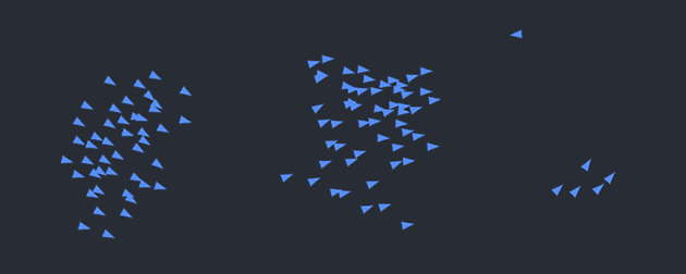
A short clip showing someone approaching the mini garden. As they move closer, the LED lights respond by changing color, and the screen displays animated, color-shifting blobs in sync with the movement:
https://drive.google.com/drive/u/0/folders/1Kk2lkQgoAyybXSYWVmY2Dog9uQVX_DMq
The process:


How does the Implementation work
An ultrasonic sensor detects how close a person or object is to the garden. This distance value is read by the Arduino and mapped to RGB LED colors. The same data is also sent over serial communication to P5.js, which animates abstract blobs on the screen. These blobs shift in speed, size, and color based on how close the user is, creating a consistent and engaging visual language that mirrors the physical lighting
interaction design :
The design of the project relies on intuitive interaction. Users are not given instructions—they are simply invited to explore. As they move closer to the garden, the changes in light and digital visuals guide them to understand the system’s behavior. This makes the experience playful and discoverable.
| Distance from Sensor |
LED Color |
P5.js Visual Response |
| Less than 10 cm |
Red |
Fast motion, bright red blobs |
| 10–30 cm |
Green |
Medium speed, green blobs |
| More than 30 cm |
Blue |
Slow, soft blue motion |
A clear explanation focusing on how the device assists with animal and crop protection,
Assistive Use Cases: Protecting Animals and Crops:
This motion-activated system has strong potential as an assistive device in agricultural and animal care settings, where clear and reliable response is essential.
For Animals (Livestock Protection):
The system can be used to monitor the area around livestock enclosures such as sheep pens, chicken coops, or goat fields. When a predator like a fox, stray dog, or wild animal approaches, the ultrasonic sensor detects motion, triggering an immediate response—such as flashing lights, alarms, or future-connected alerts. This helps deter predators non-invasively and gives farmers real-time awareness of threats without being physically present.
For Crops (Field and Garden Monitoring):
In gardens, greenhouses, or open crop fields, this system can be used to detect intruders, trespassers, or large animals that may damage crops. The lights act as a deterrent, and with future improvements (like wireless communication), it could alert the farmer via phone or connected system. This is especially helpful at night or in remote locations, allowing for continuous, low-maintenance monitoring.
Assistive Use Case: Law Enforcement and Security
This motion-activated system can be effectively adapted for law enforcement and security by serving as a low-cost, responsive perimeter monitoring tool. Installed at property lines, remote checkpoints, or restricted access areas, the device detects unauthorized movement and can trigger lights, sirens, or silent alerts depending on the situation. With future enhancements, it could be linked to mobile devices or integrated with camera systems for real-time surveillance. Its compact, portable design makes it suitable for temporary deployments during investigations, search operations, or event monitoring, offering a clear and reliable response without requiring continuous human oversight.
what im proud of :
-
Creating a synchronized experience between physical light and digital visuals
-
Making the interaction intuitive and inviting, even without instructions
-
Learning how to connect Arduino to P5.js and achieve stable real-time communication
- Areas of improvement
-
Add wireless communication (e.g., Bluetooth or Wi-Fi) to trigger mobile alerts
-
Improve the physical build by embedding LEDs into real plants or creating a more polished enclosure
-
Include a reset or mode switch to allow the user to cycle through different animation types
- The final outcome:

- Last video:
- https://drive.google.com/drive/u/0/folders/1Kk2lkQgoAyybXSYWVmY2Dog9uQVX_DMq

 Aruidno code: