Concept:
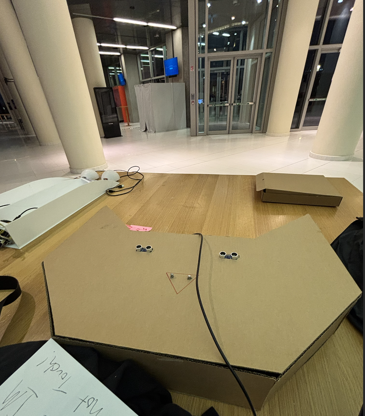
My final project is a bomb defusal game inspired by Keep Talking and Nobody Explodes. Just like in the original game, the player has to disarm several modules on the bomb in order to successfully defuse it. Currently it includes three types of modules: The first is Simon Says, using four LED arcade buttons. The second is an adaptation of cutting wires, where the player will have to either disconnect or rearrange the wires correctly. The last module requires the user to use a potentiometer as a tuning knob and try to hone in on the correct frequency. Once all three modules are disarmed, the bomb is defused and the game ends. Image, Video
Implementation:
Arduino:
- Reads button presses, potentiometer values, and wire states.
- Blinks arcade button LEDs to display the current Simon Says sequence, and activates the green LED on each module to indicate that they have been disarmed.
- Uses a piezo buzzer to audibly indicate how much time remains, which helps add tension.
- The UNO and two breadboards are contained inside the cardboard shell, and the inputs are mounted on top.
p5.js:
- Renders a representation of the physical bomb, including module status.
- Displays the countdown timer since the LCD screen from the kit was not used.
- Handles initializing each new round, including options for difficulty.
- Randomly generates the solution for each module (e.g. color sequence for Simon Says, sweet spot for potentiometer).
Interaction Design:
The player is presented with three modules, which can be independently disarmed in any order. As the modules are disarmed, green status LEDs light up to indicate that the user has succeeded and can move on. Once all three modules are disarmed, p5.js will halt the timer and display a win screen. If the player fails to defuse the bomb in time, they will instead see a loss screen.
- Simon Says: Flashes a sequence of colors on the arcade buttons, increasing in length with each successful input. If the player makes an incorrect input or fails to respond within a set amount of time, the sequence will repeat. The length of the sequence is determined by the difficulty selected.
- Tuning: A value within the potentiometer’s viable range is randomly chosen. The player moves the knob, and once it comes within a certain range of the target value it begins a short countdown while displaying a progress bar. Both the current and target values are visualized using the sin function. The leniency range is also determined by difficulty.
- Wires: The player must figure out the correct sequence to connect the four wires. They are not penalized for attempts in this adaptation, so they are free to use trial-and-error. A rendered visual helps guide them towards the correct configuration.
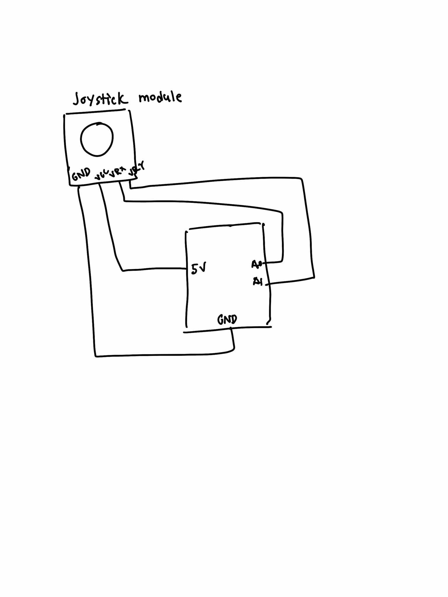
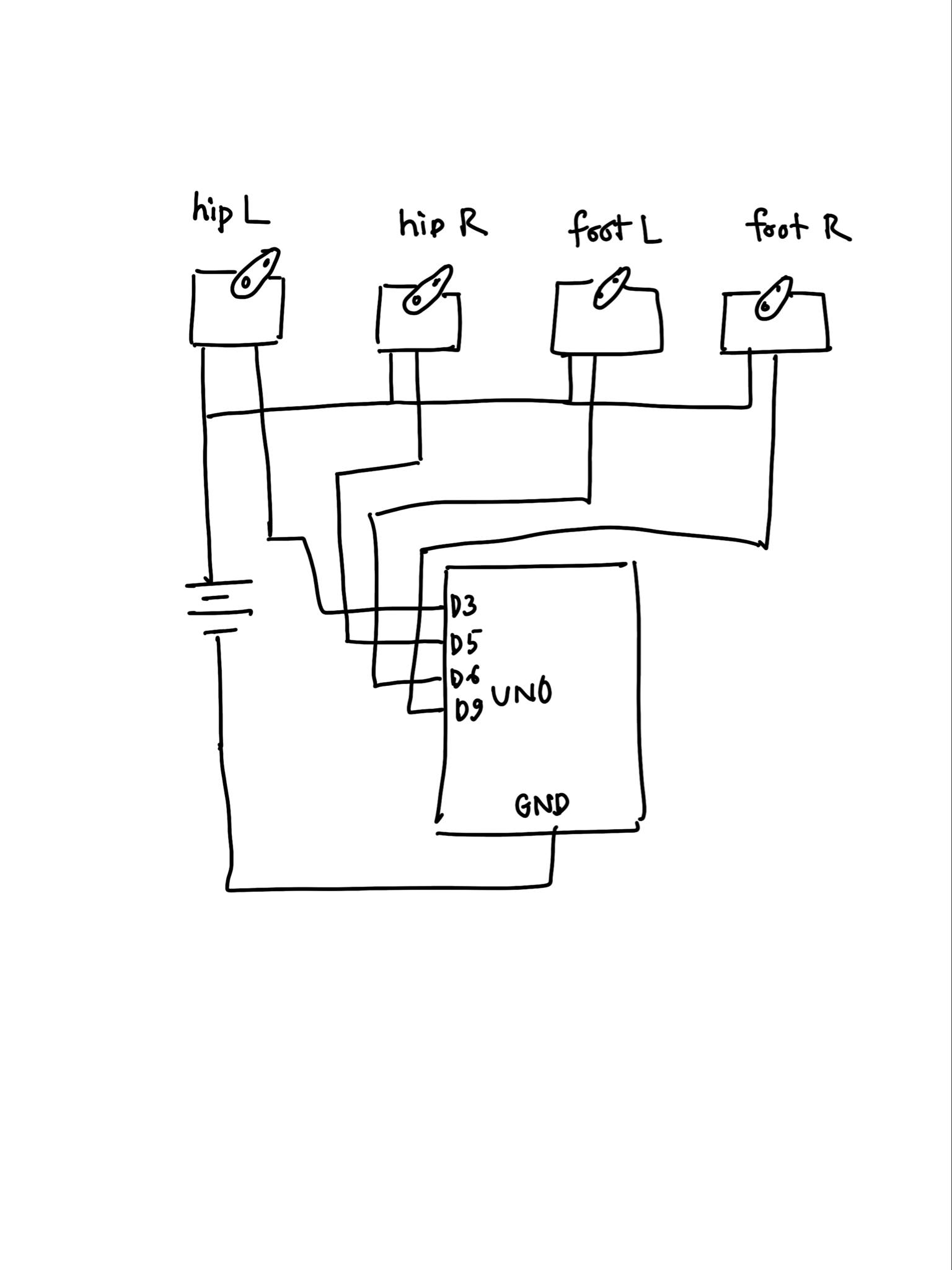
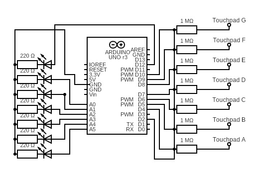
Schematic:
Arduino Code:
The Arduino code is fairly straightforward. It has a few functions used in the main loop to send/receive control messages, check the relevant inputs, and handle timing for the audiovisual components.
/*
Final Project (WIP)
By Matthias Kebede
*/


// // // Global Variables
const int valueCount = 9;
int active = 0;

// // Inputs
const int potPin = A4;
const int wirePins[4] = {A0, A1, A2, A3};
const int blueButtonIn = 6;
const int redButtonIn = 7;
const int yellowButtonIn = 8;
const int greenButtonIn = 9;

// // Input stuff
int inputs[valueCount] = {potPin, wirePins[0], wirePins[1], wirePins[2], wirePins[3], blueButtonIn, redButtonIn, yellowButtonIn, greenButtonIn};
int inputVals[valueCount] = {-1, -1, -1, -1, -1, -1, -1, -1, -1};
float smoothVals[5] = {0, 0, 0, 0, 0};
char headers[valueCount][13] = {
  {"TUNE:POT"}, {"WIRES:W1"}, {"WIRES:W2"}, {"WIRES:W3"}, {"WIRES:W4"},
  {"SIMON:BLUE"}, {"SIMON:RED"}, {"SIMON:YELLOW"}, {"SIMON:GREEN"}
};

// // Outputs
const int speakerPin = A5;
const int blueButtonOut = 2;
const int redButtonOut = 3;
const int yellowButtonOut = 4;
const int greenButtonOut = 5;
const int simonLED = 10;
const int wiresLED = 11;
const int tuneLED = 12;

// // Output Information
const int beepFreq = 2000;   // hz
const int beepDur = 50;   // ms
int beepInterval = 500;   // ms
int lastBeepTime = 0;   // ms
const int simonBlink = 350;   // ms

// // Misc.
// Keep time for Simon Says lights
struct Blink {
  int pin;
  bool lit;
  long offTime;
};
Blink simonLights[] = {
  {blueButtonOut, false, 0},
  {redButtonOut, false, 0},
  {yellowButtonOut, false, 0},
  {greenButtonOut, false, 0}
};
// Wire thresholds
const int TH0 = (1000 + 928) / 2;   // 964
const int TH1 = (928  + 512) / 2;   // 720
const int TH2 = (512  +  92) / 2;   // 302
// For analog smoothing
const float alpha = 0.2;
const int potDelta = 4;


// // // Main Processes
void setup() {
  Serial.begin(9600);

  // // Inputs and Outputs
  pinMode(potPin, INPUT);
  pinMode(blueButtonIn, INPUT);
  pinMode(redButtonIn, INPUT);
  pinMode(yellowButtonIn, INPUT);
  pinMode(greenButtonIn, INPUT);
  for (int i = 0; i < 4; i++) {
    pinMode(wirePins[i], INPUT);
  }
  pinMode(LED_BUILTIN, OUTPUT);
  pinMode(speakerPin, OUTPUT);
  pinMode(blueButtonOut, OUTPUT);
  pinMode(redButtonOut, OUTPUT);
  pinMode(yellowButtonOut, OUTPUT);
  pinMode(greenButtonOut, OUTPUT);
  pinMode(simonLED, OUTPUT);
  pinMode(wiresLED, OUTPUT);
  pinMode(tuneLED, OUTPUT);

  // // Check built-in LED
  digitalWrite(LED_BUILTIN, HIGH);
  delay(200);
  digitalWrite(LED_BUILTIN, LOW);

  // // Temp check
  digitalWrite(blueButtonOut, HIGH);
  digitalWrite(redButtonOut, HIGH);
  digitalWrite(yellowButtonOut, HIGH);
  digitalWrite(greenButtonOut, HIGH);
  delay(200);
  digitalWrite(blueButtonOut, LOW);
  digitalWrite(redButtonOut, LOW);
  digitalWrite(yellowButtonOut, LOW);
  digitalWrite(greenButtonOut, LOW);

  // // Start handshake w/ p5.js
  while (Serial.available() <= 0) {
    digitalWrite(LED_BUILTIN, HIGH);
    Serial.println("Waiting for data..."); // identifiable starting number
    delay(300);
    digitalWrite(LED_BUILTIN, LOW);
    delay(50);
  }
}

void loop() {
  // // Wait for p5.js
  while (Serial.available()) {
    digitalWrite(LED_BUILTIN, HIGH);

    String target = Serial.readStringUntil('=');
    int value = Serial.parseInt();
    if (Serial.read() == '\n') {
      writeTarget(target, value);
    }

    digitalWrite(LED_BUILTIN, LOW);
  }

  // // Send data to p5.js
  for (int i = 0; i < valueCount; i++) {
    checkValue(i);
    delay(1);
  }

  // // Clear Simon Says lights
  clearSimon();

  // // Play beeps
  if (active) timerSound();

  // // // Temp read wires
  // Serial.print(analogRead(A0)); Serial.print(',');
  // Serial.print(analogRead(A1)); Serial.print(',');
  // Serial.print(analogRead(A2)); Serial.print(',');
  // Serial.println(analogRead(A3));
}


// // // Helper Functions
// // Check current input values and compare to last known value
void checkValue(int index) {
  // // Check value // Wires: 100=1000, 1k=928, 100k=91, 10k=512   <-- W1, W2, W3, W4
  int checking;
  if (index < 1) { // < 5
    // // Add delay and smoothing for analog reads
    delay(1);
    checking = analogRead(inputs[index]);
    smoothVals[index] = alpha * checking + (1 - alpha) * smoothVals[index];
    checking = int(smoothVals[index]);
    // // Check if pot has significant change
    if (abs(checking - inputVals[index]) >= potDelta) {
      inputVals[index] = checking;
      Serial.print(headers[index]);
      Serial.print('=');
      // // Send pot value
      if (index == 0) {
        Serial.println(checking);
      }
      // // Send index of wire connection
      // else {
      //   Serial.println(identifyWire(checking));
      // }
    }
  }
  // else if (index < 5) {
  //   delay(1);
  //   checking = analogRead(inputs[index]);
  //   smoothVals[index] = alpha * checking + (1 - alpha) * smoothVals[index];
  //   checking = int(smoothVals[index]);
  //   int binaryVal = digitalWire(checking);
  //   if (abs(checking - inputVals[index]) >= potDelta && binaryVal != inputVals[index]) {
  //     inputVals[index] = binaryVal;
  //     Serial.print(headers[index]);
  //     Serial.print('=');
  //     Serial.println(binaryVal);
  //   }
  // }
  else {
    checking = digitalRead(inputs[index]);
    // // Compare
    if (checking != inputVals[index]) {
      inputVals[index] = checking;
      Serial.print(headers[index]);
      Serial.print('=');
      Serial.println(checking);
    }
  }
}

// // Handle writing to the target pin
void writeTarget(String target, int value) {
  if (target == "ACTIVE") {
    active = value;
  }
  else if (target == "BUILTIN") {
    digitalWrite(LED_BUILTIN, value);
    delay(150);
    digitalWrite(LED_BUILTIN, LOW);
  }
  // // Change beep interval based on p5.js timer
  else if (target == "BEEP") {
    beepInterval = value;
  }
  // // Simon Says
  else if (target == "SIMON") {
    digitalWrite(simonLED, value); // // Simon Says = defused
  }
  else if (target == "BLUE") {
    flashSimon(blueButtonOut);
  }
  else if (target == "RED") {
    flashSimon(redButtonOut);
  }
  else if (target == "YELLOW") {
    flashSimon(yellowButtonOut);
  }
  else if (target == "GREEN") {
    flashSimon(greenButtonOut);
  }
  // // Wires
  else if (target == "WIRES") {
    digitalWrite(wiresLED, value);
  }
  // // Tune
  else if (target == "TUNE") {
    digitalWrite(tuneLED, value);
  }
}

// // Play beeping noise
void timerSound() {
  if (lastBeepTime > beepInterval) {
    // // Reset
    lastBeepTime = 0;
    noTone(speakerPin);
    // // Play
    tone(speakerPin, beepFreq, beepDur);
  }
  else {
    lastBeepTime++;
  }
}

// // Non-blocking flash for Simon Says
void flashSimon(int pin) {
  for (auto &btn : simonLights) {
    if (btn.pin == pin) {
      digitalWrite(pin, HIGH);
      btn.lit  = true;
      btn.offTime = millis() + simonBlink;
      break;
    }
  }
}
void clearSimon() {
  long now = millis();
  for (auto &btn : simonLights) {
    if (btn.lit && now >= btn.offTime) {
      digitalWrite(btn.pin, LOW);
      btn.lit = false;
    }
  }
}

// // // Determine wire connections
// int identifyWire(int val) {
//   // if (val < 25) return -1;   // unplugged or other issue
//   if (val > TH0) return 0;   // 100 ohm
//   else if (val > TH1) return 1;   // 1k ohm
//   else if (val > TH2) return 3;   // 10k ohm
//   else return 2;   // 100k ohm // remember bottom-up order is 100, 1k, 100k, 10k
// }
// int digitalWire(int val) { // 92, 512, 928, 1000
//   if (val < 50) return 0;
//   if (val <  110 && val > 70) return 1;
//   if (val < 530 && val > 480) return 1;
//   if (val < 950 && val > 905) return 1;
//   if (val < 1024 && val > 975) return 1;
//   return 0;
// }
p5.js Code:
p5.js handles the actual game logic, and generates unique solutions for the modules every time a game starts. The Game class contains an array of modules, and continuously calls their update methods. Each module has its own child class extending the Module class, and contains the code for its own specific mechanics. The user can select a difficulty level from the main menu, and start a game.
Serial Communication:
The protocol used here follows the basic idea from the in-class examples, reading up until it reaches a newline character. In order to avoid sending the state of every input device to p5.js with every message, I broke things down into messages of the format `HEADER=value`. I mainly used this to indicate which module was sending input data, and combined it with a switch statement to separate things out on the p5.js side. In terms of transmitting to Arduino, I followed a similar idea but only had to send messages to disarm modules (e.g. `SIMON=0`) or defuse the bomb itself to stop the beeping. I also used this to have p5.js increase the frequency of the beeping when its timer reached certain breakpoints.
What I’m Proud Of:
I was happy with a number of decisions I made. For one, I was able to cleanly use OOP to separate out the p5.js logic for my modules while including overlapping functionality like disarming. I was also proud of the protocol I came up with for serial communication. It gave me a lot of trouble at first, so it was very fulfilling to end up with a lightweight method where I could direct messages exactly where they needed to go. Lastly, I was proud of my Simon Says module in particular. I spent a lot of time on it early on since it was the first to be implemented, and I feel like it came out the best. I had to figure out how the arcade buttons work and soldered all the necessary wires, but it was worth it since it is probably the most engaging module.
Areas for Improvement:
In contrast to Simon Says, I was really disappointed by my Wires module. It was originally the one I was most excited about, since this gave me a chance to actualize the experience of the inspiring game in a unique way. However, I tried a number of different ways to implement it that all failed in the end. My first attempt was to use resistors of different values and use analogRead() to determine which wire was plugged in where. However, the floating values when the wires were unplugged threw things off too much.
Another area for improvement would be the design of the bomb. Using cardboard turned out just fine, but laser cutting a wooden box might have looked more professional. I put a lot of time and effort into the initial construction, especially since I cut the cardboard down by hand, but after that I became far too busy to add any decoration and finishing touches. The p5.js visuals also suffered a bit for the same reason. There was one choice I made that I’m still on the fence about, which was to omit an explosion sound when the player loses a round. It would have been a nice touch, but I already drove myself crazy listening to the beeping sound, and I felt that having the beep frequency pick up speed was sufficient by itself.