Inspiration for This Project
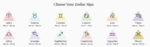
I wanted to create an interactive and visually engaging experience that merges astrology with generative art. The idea was to provide users with a simple yet immersive way to receive a zodiac-based “psychic reading,” followed by animations and visuals. Astrology is often associated with mysticism and magic, so I aimed to reflect that via changing background colours and adding floating particles. For the visual part, I took my inspiration from this website: https://www.horoscope.com/us/index.aspx
Code Highlight I Am Proud Of
One part of the code I’m particularly proud of is the getZodiacColor function, which assigns a unique background color to each zodiac sign:
function getZodiacColor(sign) {
  let colors = {
    "Aries": color(255, 99, 71), "Taurus": color(107, 142, 35), "Gemini": color(255, 215, 0), "Cancer": color(70, 130, 180),
    "Leo": color(255, 165, 0), "Virgo": color(46, 139, 87), "Libra": color(123, 104, 238), "Scorpio": color(148, 0, 211),
    "Sagittarius": color(255, 140, 0), "Capricorn": color(139, 69, 19), "Aquarius": color(0, 191, 255), "Pisces": color(72, 61, 139)
  };
  return colors[sign] || color(240);
}
This function is simple, but it instantly transforms the visual feel of the project based on the user’s selection, creating some sense of personalization.
Reflection
For future projects, I’d love to explore more complex generative animations, such as constellations that change based on the zodiac sign. Things like integrating sound effects or subtle ambient music could enhance the mystical atmosphere. Another direction could be adding more interactive elements, like having particles respond to mouse movement, making the experience feel even more magical and immersive.
Here is the full code:
let signs = [
  "Aries", "Taurus", "Gemini", "Cancer", "Leo", "Virgo",
  "Libra", "Scorpio", "Sagittarius", "Capricorn", "Aquarius", "Pisces"
];

// Zodiac readings for each sign
let readings = {
  "Aries": ["Today is a day for bold moves.", "A new adventure awaits you.", "Your energy will attract opportunities."],
  "Taurus": ["Stay grounded, but take a leap of faith.", "Patience will bring unexpected rewards.", "A financial opportunity is coming your way."],
  "Gemini": ["A conversation will spark inspiration.", "Your curiosity leads to a surprising discovery.", "Adaptability is your greatest strength today."],
  "Cancer": ["Your emotions will guide you well.", "A nostalgic moment will bring clarity.", "Trust your intuition—it knows the way."],
  "Leo": ["Your confidence will open doors.", "A bold move will lead to admiration.", "Shine your light and others will follow."],
  "Virgo": ["Your keen eye will catch an important detail.", "Organization will bring unexpected rewards.", "A small habit change will lead to a breakthrough."],
  "Libra": ["Balance is key today.", "A relationship will deepen in an unexpected way.", "Harmony will find you when you least expect it."],
  "Scorpio": ["Mystery surrounds you—embrace it.", "Transformation is closer than you think.", "Your passion will lead you to new heights."],
  "Sagittarius": ["An exciting journey is on the horizon.", "Your optimism will inspire someone today.", "The universe is conspiring in your favor."],
  "Capricorn": ["Hard work pays off—stay focused.", "A disciplined approach will yield results.", "Your perseverance will be rewarded soon."],
  "Aquarius": ["Innovation is your ally today.", "A sudden insight will change your path.", "Your unique perspective is your greatest strength."],
  "Pisces": ["Your dreams hold important messages.", "Creativity will flow effortlessly.", "A moment of solitude will bring deep understanding."]
};

let dropdown, button, output;
let bgColor;
let particles = [];

function setup() {
  createCanvas(400, 300);
  textSize(16);
  textAlign(CENTER, CENTER);

  // Create dropdown menu for zodiac signs
  dropdown = createSelect();
  dropdown.position(100, 100);

  for (let sign of signs) {
    dropdown.option(sign);
  }

  // Create button to generate reading
  button = createButton("Get Your Reading");
  button.position(100, 140);
  button.mousePressed(generateReading);

  output = "Select your sign and receive your reading";
  bgColor = color(240);

  // Create floating particles for magical effect
  for (let i = 0; i < 50; i++) {
    particles.push(new Particle());
  }
}

function draw() {
  background(bgColor);
  fill(50);
  text("Psychic Zodiac Reading", width / 2, 50);
  text(output, width / 2, 80);

  // Update and show floating particles
  for (let p of particles) {
    p.update();
    p.show();
  }
}

// Generate random reading based on selected zodiac sign
function generateReading() {
  let selectedSign = dropdown.value();
  let possibleReadings = readings[selectedSign];
  output = possibleReadings[int(random(possibleReadings.length))];
  bgColor = getZodiacColor(selectedSign);
}

// Assign unique background color for each zodiac sign
function getZodiacColor(sign) {
  let colors = {
    "Aries": color(255, 99, 71), "Taurus": color(107, 142, 35), "Gemini": color(255, 215, 0), "Cancer": color(70, 130, 180),
    "Leo": color(255, 165, 0), "Virgo": color(46, 139, 87), "Libra": color(123, 104, 238), "Scorpio": color(148, 0, 211),
    "Sagittarius": color(255, 140, 0), "Capricorn": color(139, 69, 19), "Aquarius": color(0, 191, 255), "Pisces": color(72, 61, 139)
  };
  return colors[sign] || color(240);
}

// Particle class for floating magic effect
class Particle {
  constructor() {
    this.x = random(width);
    this.y = random(height);
    this.vx = random(-1, 1);
    this.vy = random(-1, 1);
    this.alpha = random(100, 255);
  }

  // Update particle movement
  update() {
    this.x += this.vx;
    this.y += this.vy;
    if (this.x > width || this.x < 0) this.vx *= -1;
    if (this.y > height || this.y < 0) this.vy *= -1;
  }

  // Display particle as a glowing dot
  show() {
    noStroke();
    fill(255, this.alpha);
    ellipse(this.x, this.y, 5, 5);
  }
}