Reading Donald Norman’s take on affect and design really got me thinking about what we do in physical computing. His idea that attractive things work better made me question the way we usually talk about design. It’s so easy to think that usability is the most important thing, but Norman makes a solid point—aesthetics, usability, and functionality all need to work together, depending on the context. That’s something I really want to keep in mind as we start building our own devices.
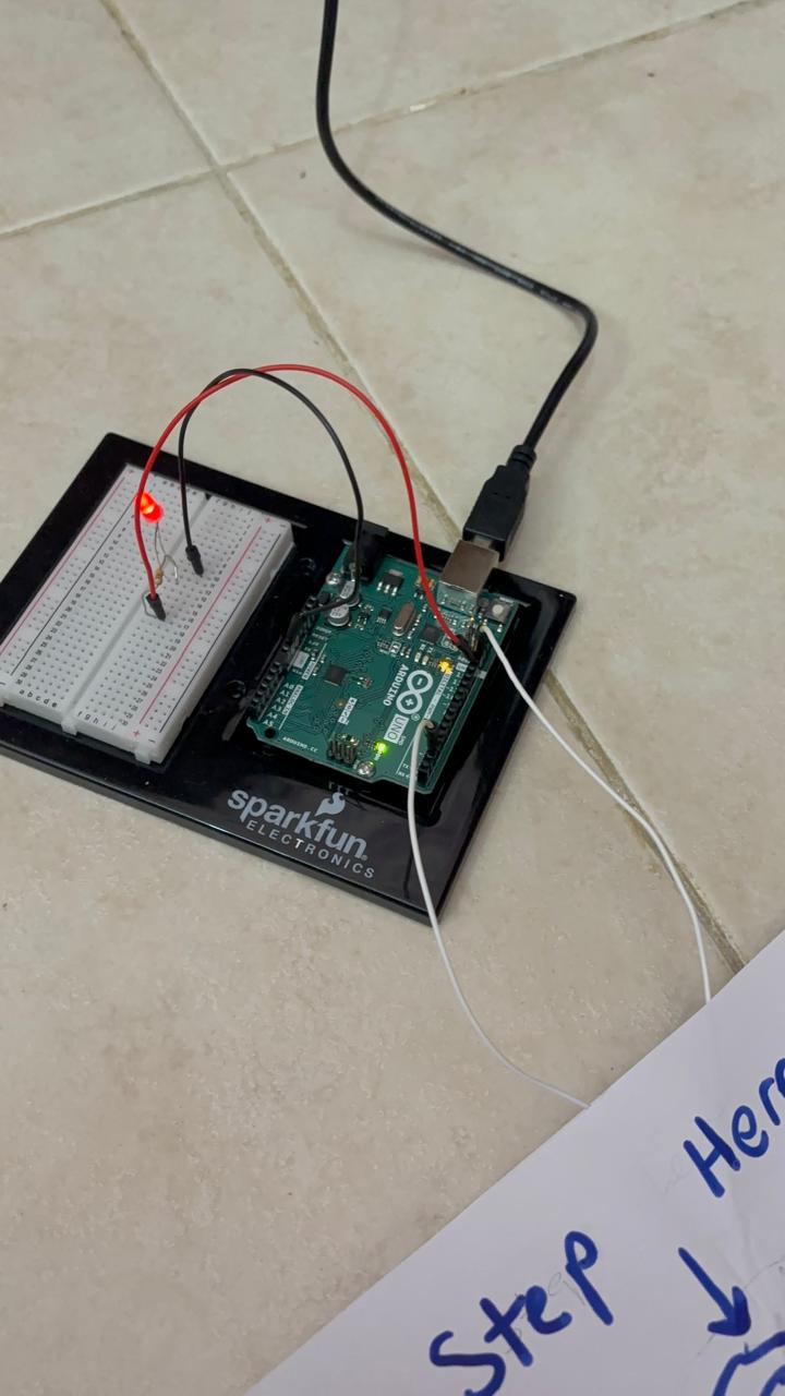
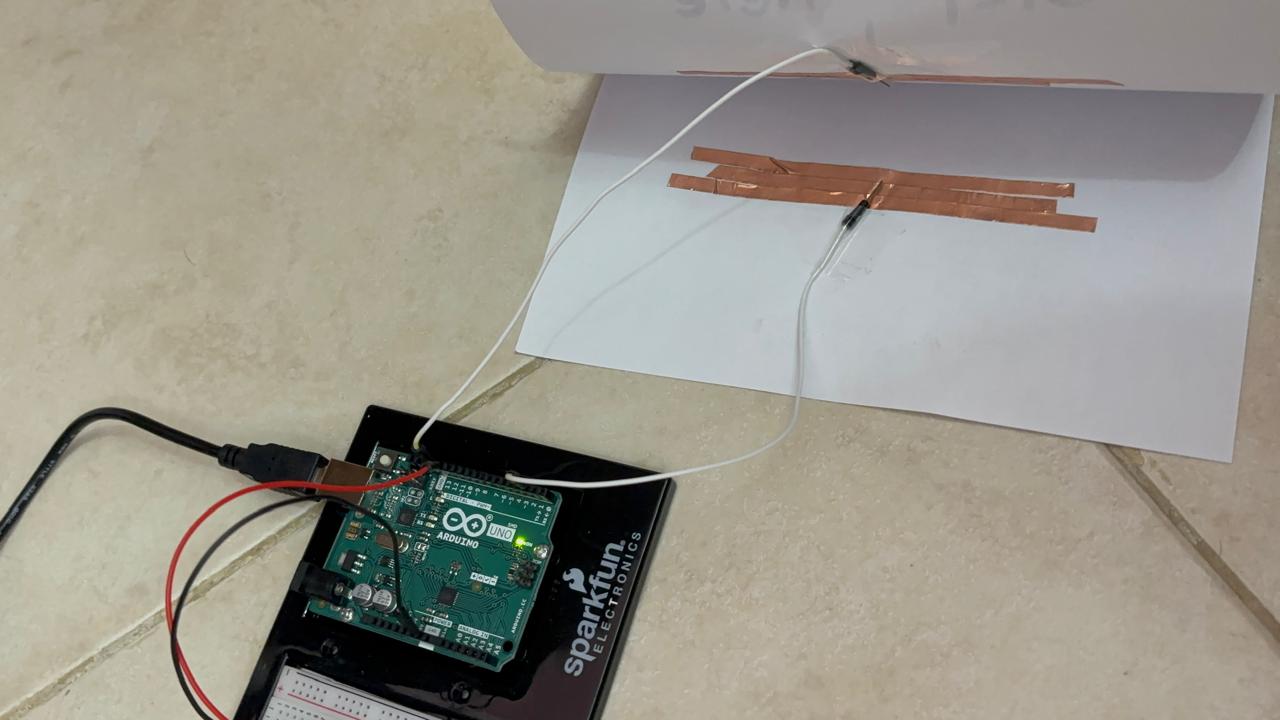
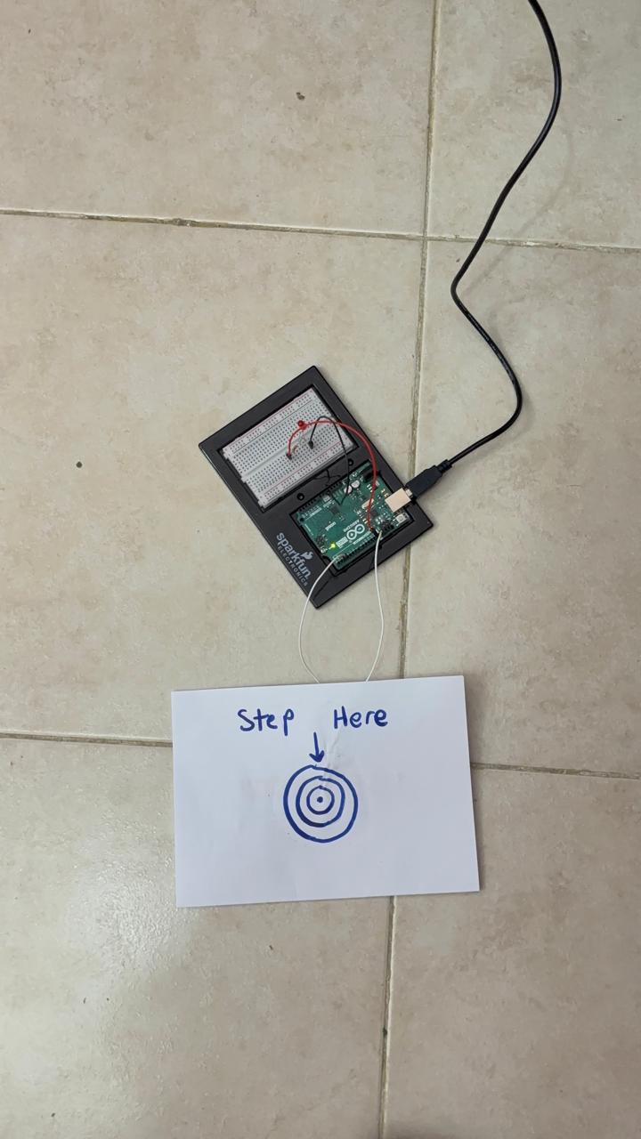
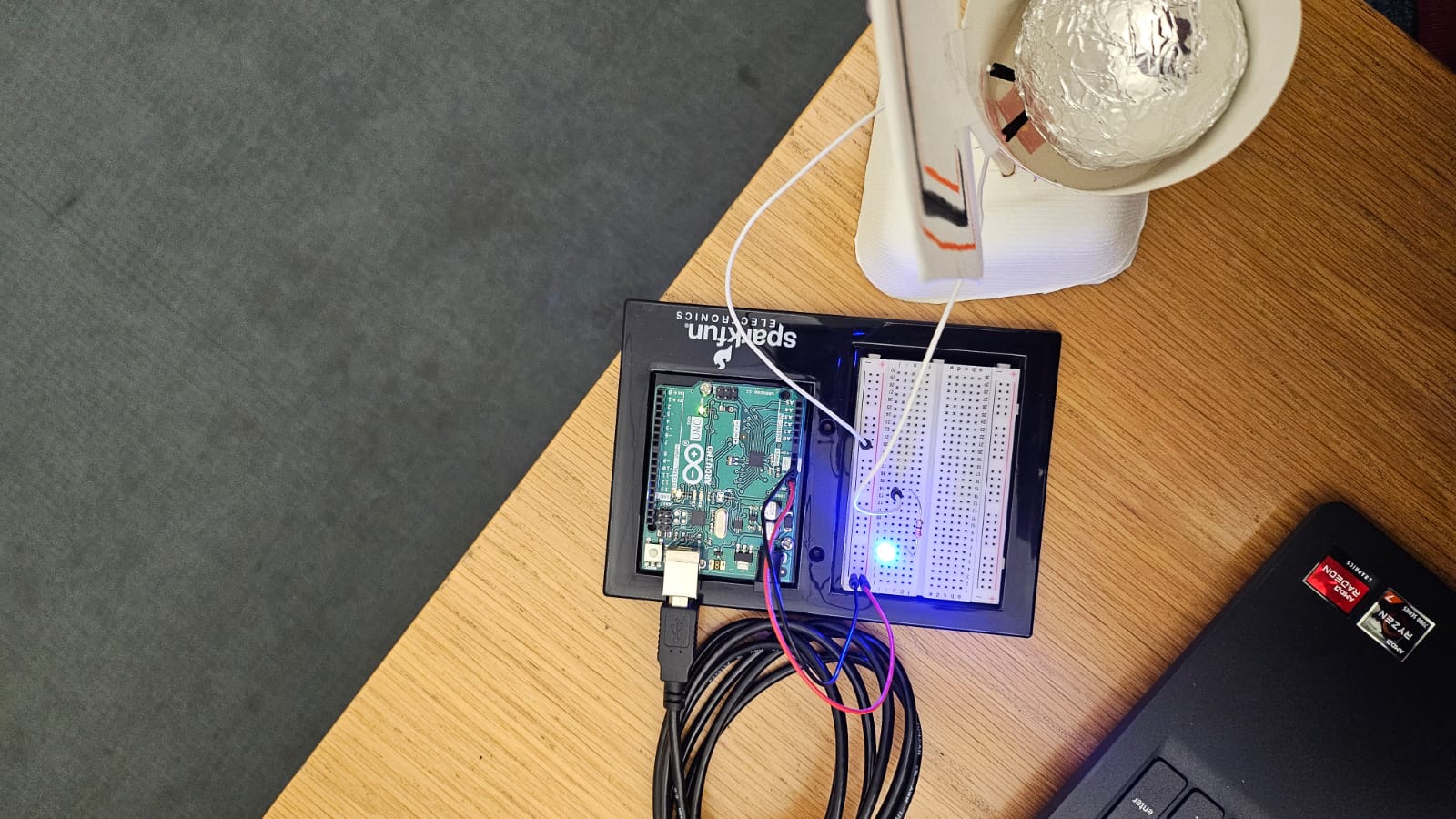
With physical computing, we’re not just designing screens or interfaces—we’re making real objects that people will physically interact with. That makes things more complicated because now we have to think about how something looks, how easy it is to use, and what it’s actually meant to do all at the same time. The balance between these depends on what we’re building. If it’s something like a smart home controller, aesthetics matter because it’s going to sit in someone’s house, and they’ll see it every day. But if we’re making a fire escape guidance system, function is everything. No one in an emergency should have to stop and figure out how to use it, it just has to work.
The three teapots analogy really stuck with me too. It’s a great reminder that different users and situations need different design choices. I hadn’t really thought much about how a person’s emotional state affects how they interact with a device, but it makes so much sense. If someone is stressed—like using a medical alert system—they need clear, obvious controls. No distractions, no unnecessary design elements, just pure functionality. But if we’re designing something more creative, like an interactive art installation, we can push the boundaries and make it more about the experience rather than efficiency.
As we start designing our own projects, I don’t want to fall into the trap of just thinking, whether it works or no? Of course, usability matters, but if something feels cold or uninviting, people won’t want to use it.
At the end of the day, physical computing isn’t just about circuits and code but rather about how people feel when they use what we create. A device isn’t just good because it functions. It’s successful when it resonates with people and feels right to use. That’s something I really want to keep in mind moving forward.