For week 11, the task was to work in groups to finish 3 exercises. Our group was Me (Asma), Hajar, and Mukhlisa 🙂
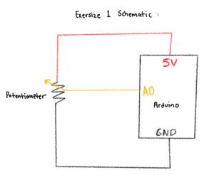
Exercise 1: ball moving horizontally with potentiometer
Group Member: Asma (Me)
Video:

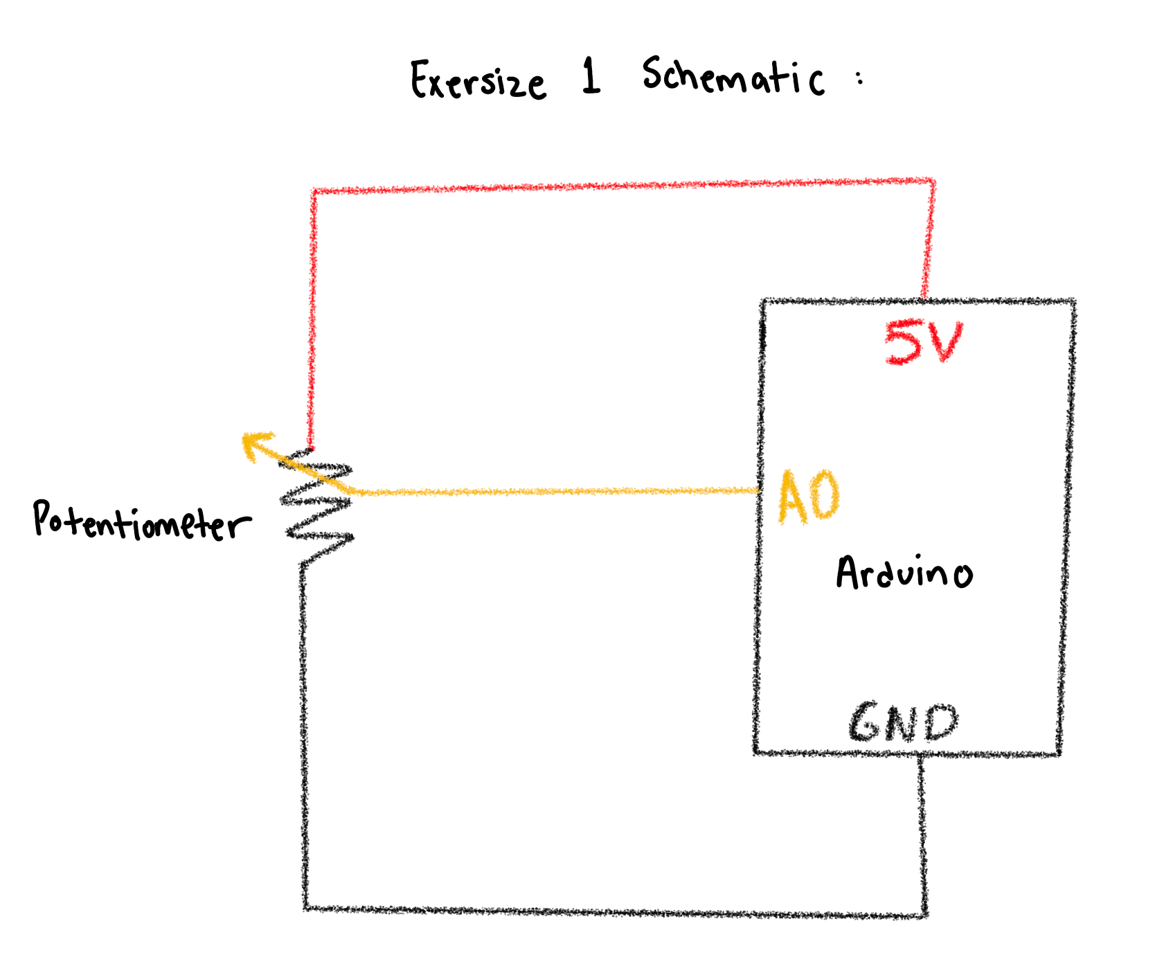
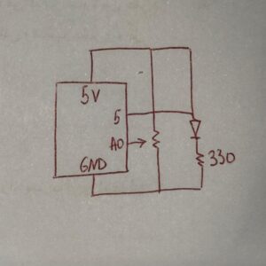
Schematic:
Arduino Code:
const int potPin = A0;

void setup() {
  Serial.begin(9600);
}

void loop() {
  int val = analogRead(potPin);   // 0..1023
  Serial.println(val);
  delay(10);
}
P5js Code:
// === Arduino + p5.js WebSerial (directional movement, fixed) ===
// Pot controls direction/speed by how its value changes. p5 does NOT control Arduino.

let port;
let reader;
let connectButton;
let isConnected = false;

let latestData = null; // last parsed int from serial (0..1023)
let prevData   = null; // previous sample to compute delta
let lineBuffer = '';   // accumulate serial chunks until '\n'

let posX = 0;          // ellipse position
let speed = 0;         // horizontal velocity

function setup() {
  createCanvas(windowWidth, windowHeight);
  background(240);
  textFont('monospace');

  connectButton = createButton('Connect to Arduino');
  connectButton.position(20, 20);
  connectButton.mousePressed(connectToSerial);

  // start centered; we'll keep it centered until first data arrives
  posX = width / 2;
}

async function connectToSerial() {
  try {
    // Request and open port
    port = await navigator.serial.requestPort();
    await port.open({ baudRate: 9600 });
    isConnected = true;
    console.log(' Port opened');

    // Create a text decoder stream and reader for clean line-by-line reads
    const textDecoder = new TextDecoderStream();
    const readableClosed = port.readable.pipeTo(textDecoder.writable);
    reader = textDecoder.readable.getReader();

    // Kick off read loop
    readSerialLines();
  } catch (err) {
    console.error(' Connection failed:', err);
    isConnected = false;
  }
}

async function readSerialLines() {
  try {
    while (true) {
      const { value, done } = await reader.read();
      if (done) break; // reader released
      if (!value) continue;

      // Accumulate and split by newline
      lineBuffer += value;
      let lines = lineBuffer.split(/\r?\n/);
      lineBuffer = lines.pop(); // save incomplete tail

      for (let line of lines) {
        line = line.trim();
        if (!line) continue;
        const v = parseInt(line, 10);
        if (!Number.isNaN(v)) {
          // Clamp to expected 10-bit range
          latestData = Math.min(Math.max(v, 0), 1023);
          // Initialize prevData on first valid sample
          if (prevData === null) prevData = latestData;
        }
      }
    }
  } catch (err) {
    console.error(' Read error:', err);
  } finally {
    try { reader && reader.releaseLock(); } catch {}
  }
}

function draw() {
  background(240);

  if (!isConnected) {
    fill(200, 0, 0);
    noStroke();
    textAlign(CENTER, CENTER);
    textSize(20);
    text("Click 'Connect to Arduino' to begin", width / 2, height / 2);
    return;
  }

  // If we haven't received any valid data yet, show waiting status
  if (latestData === null || prevData === null) {
    fill(0);
    textSize(16);
    textAlign(LEFT, TOP);
    text('Waiting for data...', 20, 60);
    // Keep ellipse centered until first data arrives
  } else {
    // Change in pot reading determines direction and speed bump
    const delta = latestData - prevData;

    // Deadband to ignore small noise
    const deadband = 4;
    if (delta > deadband) {
      speed = constrain(speed + 0.6, -12, 12); // turn right -> move right
    } else if (delta < -deadband) {
      speed = constrain(speed - 0.6, -12, 12); // turn left -> move left
    } else {
      // friction when knob still
      speed *= 0.90;
    }

    // Integrate position and clamp
    posX += speed;
    posX = constrain(posX, 0, width);

    // Update prev for next frame
    prevData = latestData;
  }

  // Draw ellipse at vertical center
  noStroke();
  fill(50, 100, 255);
  ellipse(posX, height / 2, 80, 80);

  // HUD
  fill(0);
  textSize(14);
  textAlign(LEFT, TOP);
  const shown = latestData === null ? '—' : latestData;
  text(`Sensor: ${shown}`, 20, 60);
  text(`Speed:  ${nf(speed, 1, 2)}`, 20, 80);
}

function windowResized() {
  resizeCanvas(windowWidth, windowHeight);
  // Keep position on-screen if you resize smaller
  posX = constrain(posX, 0, width);
}
Reflection:
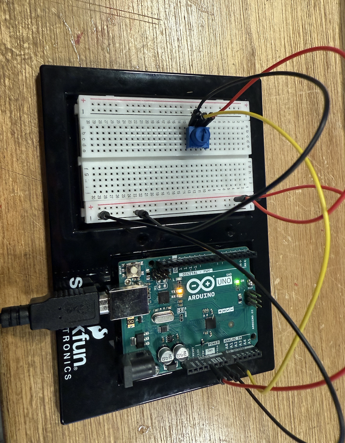
I built a simple circuit using the Arduino and a 10kΩ potentiometer to control an on-screen ellipse in p5.js. I connected the potentiometer’s outer legs to 5V and GND and the middle leg to the analog pin A0, allowing it to act as a variable voltage divider. After uploading the Arduino code and checking the serial monitor, I could see how turning the knob changed the analog readings from 0 to 1023. This helped me understand how analog sensors translate physical movement into numerical data that can be visualized digitally. It was satisfying to see the system work after troubleshooting my wiring and realizing how the order of connections affects the readings.
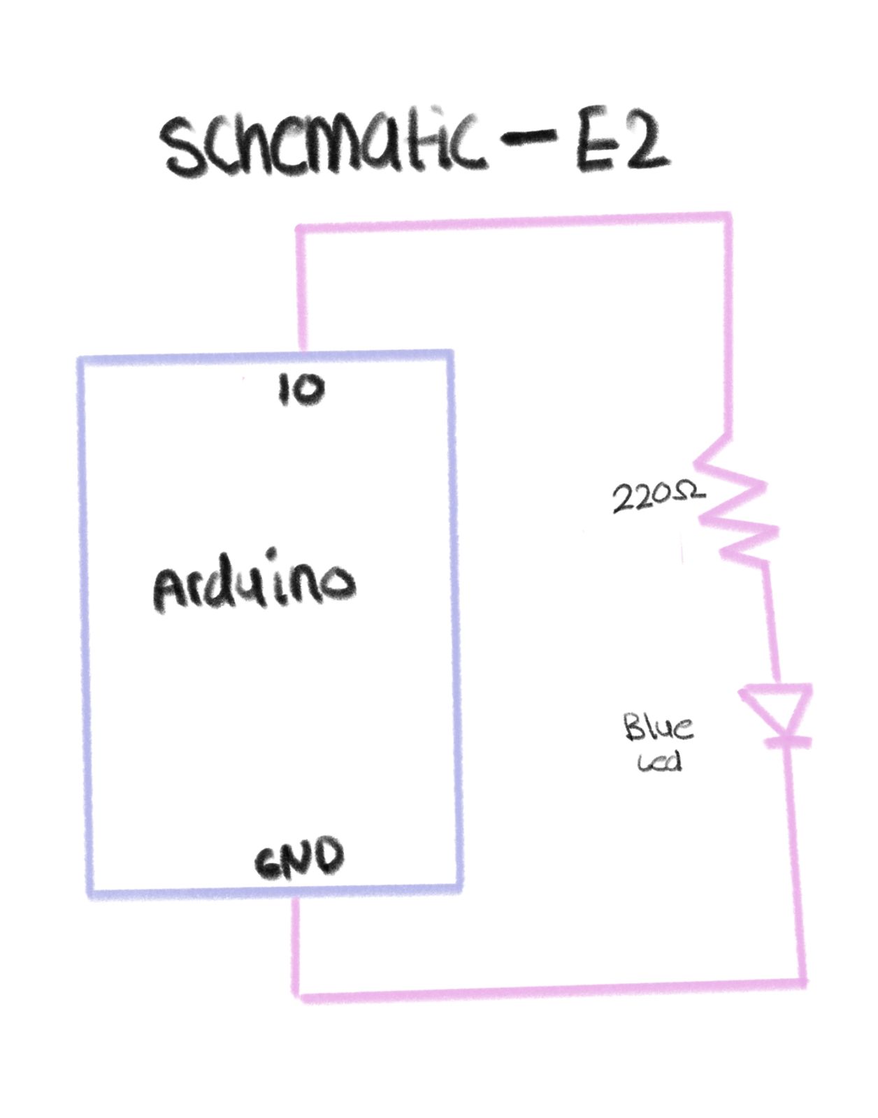
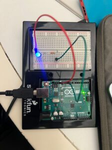
Exercise 2: Controlling the LED
Group Member: Hajar
Video:
Arduino Code:
//  Arduino: LED brightness from p5.js

const int ledPin = 10;  // LED connected to pin 10

void setup() {
  Serial.begin(9600);   // must match p5.js baud rate
  pinMode(ledPin, OUTPUT);
}

void loop() {
  if (Serial.available() > 0) {
    int brightness = Serial.read();      // read 0–255
    brightness = constrain(brightness, 0, 255);
    analogWrite(ledPin, brightness);     // control LED brightness
  }
}
P5js code:
let port;
let writer;

async function setup() {
  createCanvas(512, 512);
  background(0);
  textSize(16);
  textAlign(CENTER, CENTER);
  text('Click to connect to Arduino', width/2, height/2);
}

async function mousePressed() {
  if (!port) {
    port = await navigator.serial.requestPort();
    await port.open({ baudRate: 9600 });
    writer = port.writable.getWriter();
    console.log('Connected!');
  }
}

function mouseDragged() {
  if (writer) {
    let brightness = floor(map(mouseY, 0, height, 255, 0));
    brightness = constrain(brightness, 0, 255);
    writer.write(new Uint8Array([brightness]));
  }
}
Schematic:

Reflection:
(Hajar) For this project, I created both the schematic and the circuit, and I kept them very simple. My setup only included one LED and one resistor connected to the Arduino and grounded. The main purpose of the assignment was to use serial communication with p5.js to control the brightness of the LED, so I focused more on the coding rather than making the hardware complex. Before starting the p5 part, I tested my circuit using a simple Arduino code just to make sure that the LED was lighting up correctly and everything was connected properly. Once I confirmed that it worked, I added the schematic and moved on to the serial communication part. The schematic itself was very basic something I’ve done before so it wasn’t hard to figure out. I liked that I could keep the circuit minimal but still meet the goal of the exercise, which was to control the LED’s brightness through p5. It showed me how even a simple circuit can become interactive and meaningful when combined with code.
The coding part was definitely the hardest and most time-consuming part of this project. I’ve never connected p5.js and Arduino together before, so figuring out how to make them communicate took a lot of trial and error. At first, I kept trying to make it work on Safari without realizing that the serial connection doesn’t actually work there, it only works on Google Chrome. So, I kept rewriting and rechecking my code, thinking there was something wrong with it, even though the logic itself was fine. My professor had already shown us the structure for serial communication, so I kept following it, creating and recreating the same code over and over again, but it just wouldn’t connect.
It got really frustrating at one point because I had everything wired correctly, and my code looked right, but the Arduino and p5 still weren’t talking to each other. I spent a lot of time trying to figure out what was wrong. Once I finally switched to the right browser and saw the serial connection actually working, it was such a relief. The LED started responding, and it felt like everything finally came together. After so many attempts, seeing both the Arduino and p5.js working together perfectly was honestly so rewarding. I was really proud of how it turned out in the end it looked simple but worked exactly how I wanted it to. All that frustration was worth it because the final design turned out really good, and it felt amazing to watch it finally come to life.
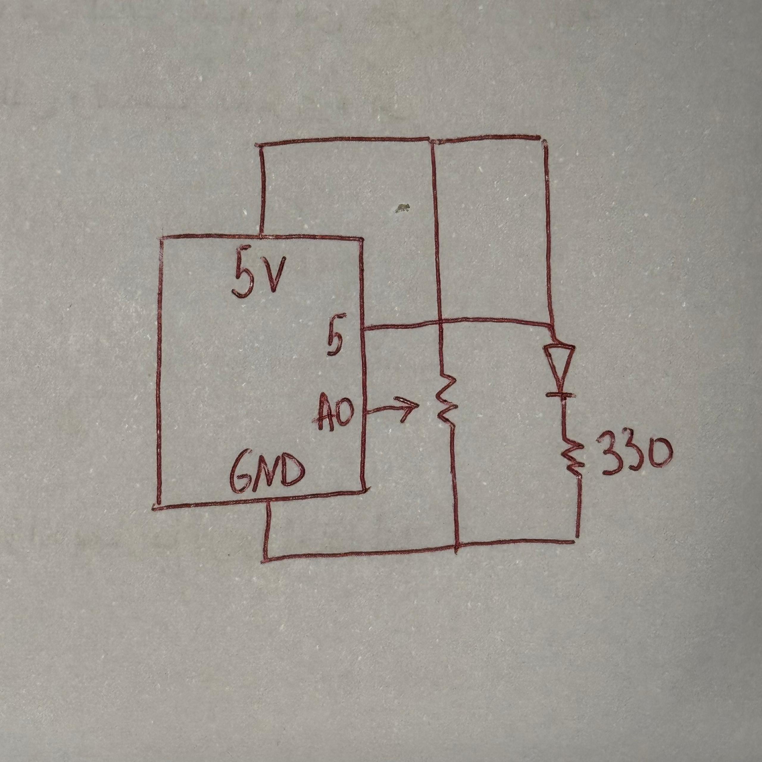
Exercise 3: Make the LED light up when the ball bounces
Group Member: Mukhlisa
Video:
b52d0a23-cf7d-4cf2-81e1-e2255dc62cad
Ardunio Code:
int potPin = A5;   // Potentiometer
int ledPin = 3;    // LED on PWM pin

void setup() {
  Serial.begin(9600);
  pinMode(ledPin, OUTPUT);

  // Blink LED to confirm setup
  analogWrite(ledPin, 255);
  delay(200);
  analogWrite(ledPin, 0);
}

void loop() {
  // Read potentiometer (0–1023)
  int raw = analogRead(potPin);

  // Map to PWM range (0–255)
  int brightness = map(raw, 0, 1023, 0, 255);

  // Continuously send brightness value to p5 if you need it
  Serial.println(brightness);

  // Check for serial commands from p5
  if (Serial.available()) {
    String data = Serial.readStringUntil('\n');

    // When ball hits ground → p5 sends "1,0"
    if (data == "1,0") {
      analogWrite(ledPin, brightness);  // flash with pot brightness
      delay(100);
      analogWrite(ledPin, 0);           // turn off after flash
    }
  }

  delay(30); // loop stability
}
P5js Code:
let velocity;
let gravity;
let position;
let acceleration;
let drag = 0.99;
let mass = 50;

let brightnessValue = 0; // Potentiometer value from Arduino (0–5)
let ballDropped = false;
let ledOn = false;

function setup() {
  createCanvas(640, 360);
  noFill();
  textSize(18);

  position = createVector(width / 2, 0);
  velocity = createVector(0, 0);
  acceleration = createVector(0, 0);
  gravity = createVector(0, 0.5 * mass);
}

function draw() {
  background(255);

  fill(0);
  if (!ballDropped) {
    text("Press D to drop the ball", 20, 30);
    text("Press Space Bar to select Serial Port", 20, 50);
    return;
  }

  if (serialActive) {
    text("Connected", 20, 30);
    text(`Potentiometer: ${brightnessValue}`, 20, 50);
  } else {
    text("Serial Port Not Connected", 20, 30);
  }

  // Gravity only (no wind)
  applyForce(gravity);

  // Update ball
  velocity.add(acceleration);
  velocity.mult(drag);
  position.add(velocity);
  acceleration.mult(0);

  // Draw ball
  ellipse(position.x, position.y, mass, mass);

  // Bounce
  if (position.y >= height - mass / 2) {
    velocity.y *= -0.9;
    position.y = height - mass / 2;

    // Tell Arduino: turn LED on briefly
    if (serialActive && !ledOn) {
      writeSerial("1,0\n");
      ledOn = true;
    }
  } else if (ledOn) {
    // Tell Arduino: turn LED off
    writeSerial("0,0\n");
    ledOn = false;
  }
}

function applyForce(force) {
  let f = p5.Vector.div(force, mass);
  acceleration.add(f);
}

// Serial setup and drop ball
function keyPressed() {
  if (key == " ") setUpSerial();
  if (key == "D" || key == "d") dropBall();
}

function dropBall() {
  position.set(width / 2, 0);
  velocity.set(0, 0);
  mass = 50;
  gravity = createVector(0, 0.5 * mass);
  ballDropped = true;
}

// Read data from Arduino
function readSerial(data) {
  if (data != null) {
    let fromArduino = split(trim(data), ",");
    if (fromArduino.length === 1) {
      brightnessValue = int(fromArduino[0]); // Potentiometer value
    }
  }
}
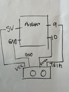
Schematic:
Reflection:
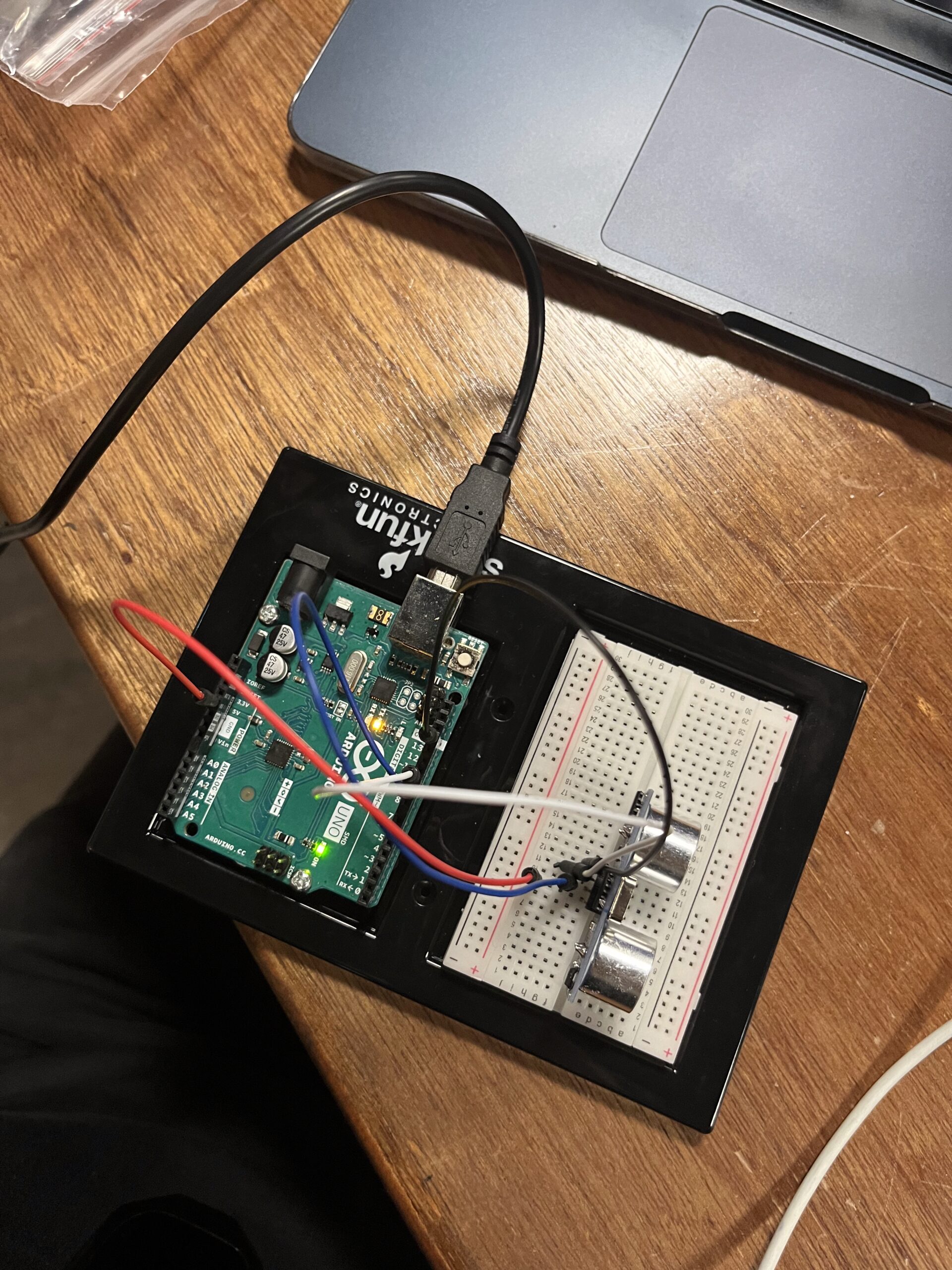
(Mukhlisa) For this project, I combined both physical computing and digital simulation by connecting an Arduino circuit to a p5.js sketch. My setup included a potentiometer to control the wind force in the animation and an LED that lit up every time the falling ball hit the ground. I built a simple circuit using one LED, a resistor, and a 10kΩ potentiometer, and then connected it to my computer through serial communication. Even though the hardware was straightforward, the real challenge came from getting the Arduino and p5.js to communicate properly. I spent a lot of time testing the potentiometer readings, debugging the serial connection, and making sure the LED responded at the right moment in the animation.