Concept
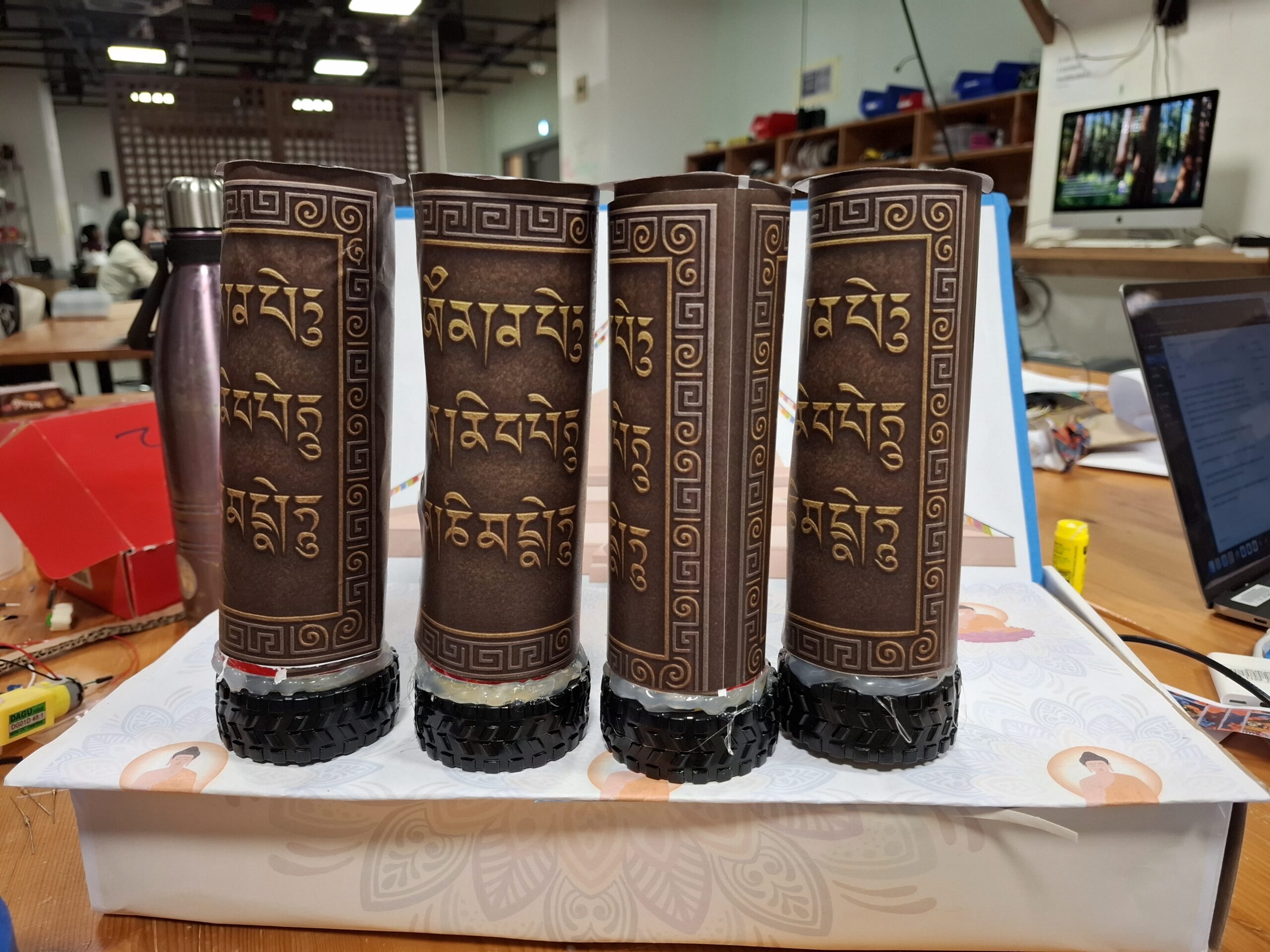
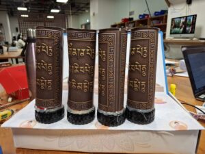
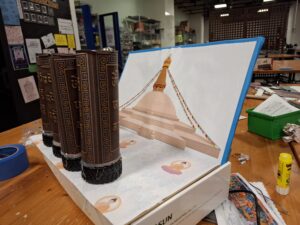
For my final project, I wanted to build an installation that captures a piece of home: the experience of walking around a stupa in Nepal and spinning the prayer wheels. Growing up, I always loved the peaceful repetition of spinning each wheel, even before I fully understood their spiritual meaning. Over time, I learned that prayer wheels (Mani wheels) are believed to spread blessings and compassion every time they turn.
My goal was to translate that ritual into an interactive digital-physical artwork. The project consists of two main parts:
A physical prayer wheel that plays a sacred “Om” sound when spun.
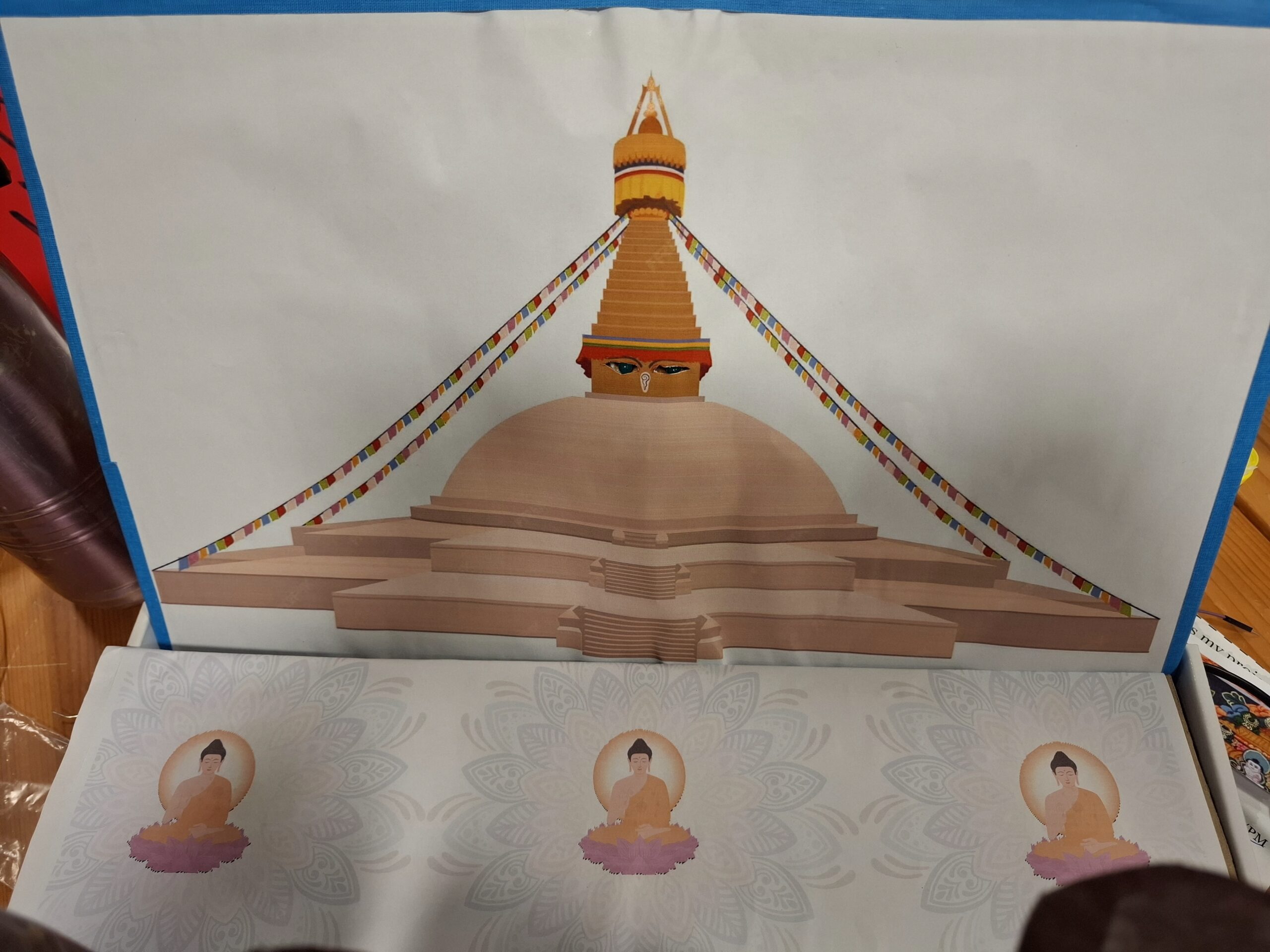
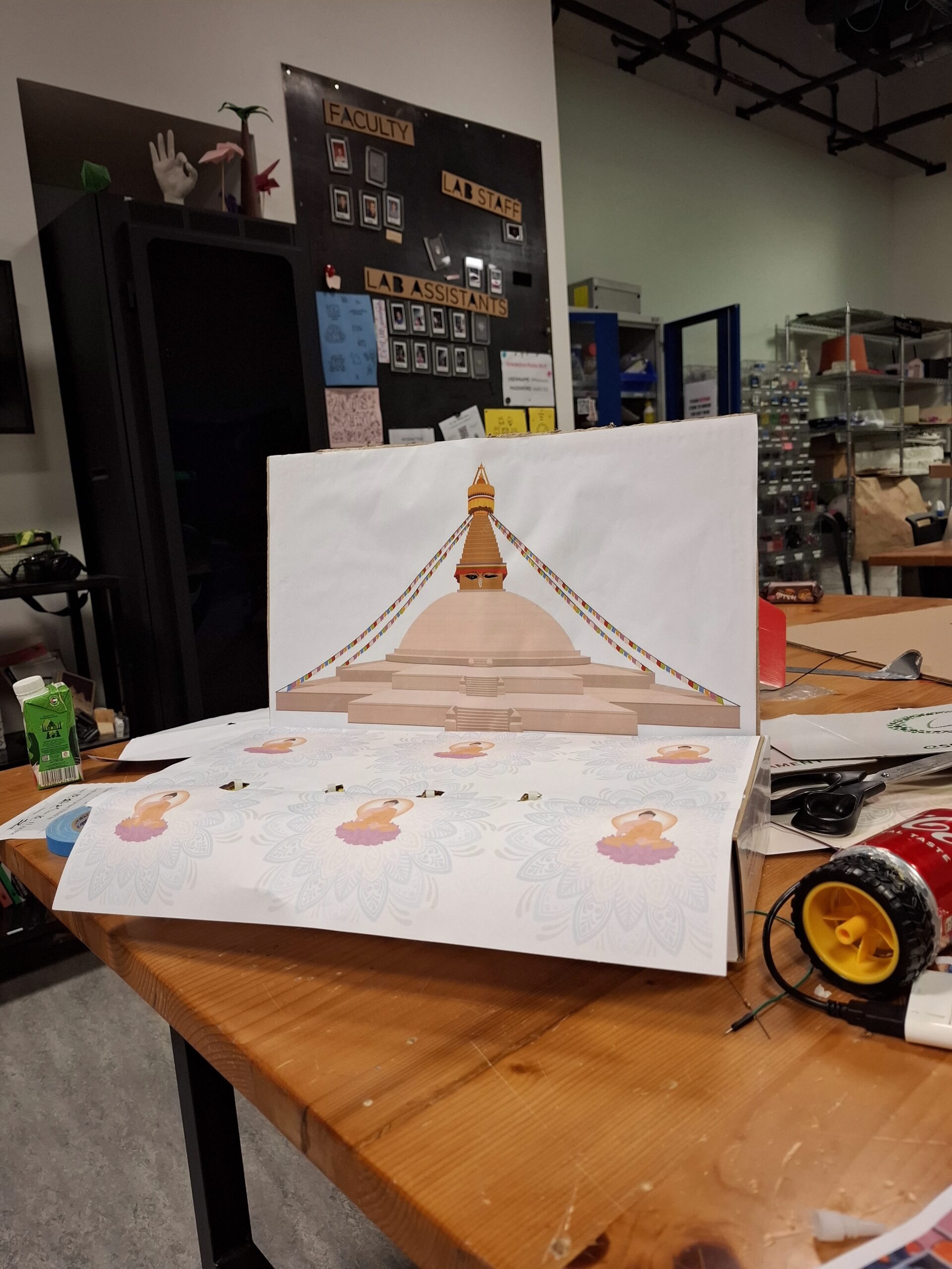
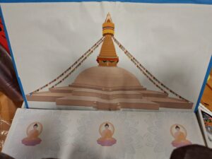
A digitally illustrated stupa in p5.js, where different architectural sections light up on the physical stupa when touched.
Together, the two elements let the user explore both the ritualistic and symbolic aspects of the stupa.
How the Implementation Works
Interaction Design
The experience begins with the user spinning the prayer wheel. Instead of powering the wheel with a motor, I use the motor as a generator, when the wheel spins, it produces a small voltage. That voltage is read by the Arduino as a signal.
At the same time, the stupa illustration in p5.js acts like an interactive map. When the user touches different physical regions of the stupa (pinnacle, dome, Buddha’s eyes, mandala, etc.) in p5js then p5js sends signal to arudino and light up the parts in physical space.
The design relies on:
Discovery: Users figure out what is touch-sensitive by interacting.
Cultural symbolism: Each part of the stupa has meaning, and the lighting reveals that visually.
Multi-modal feedbackL Sound (prayer wheel), light (stupa), and animation (p5.js).
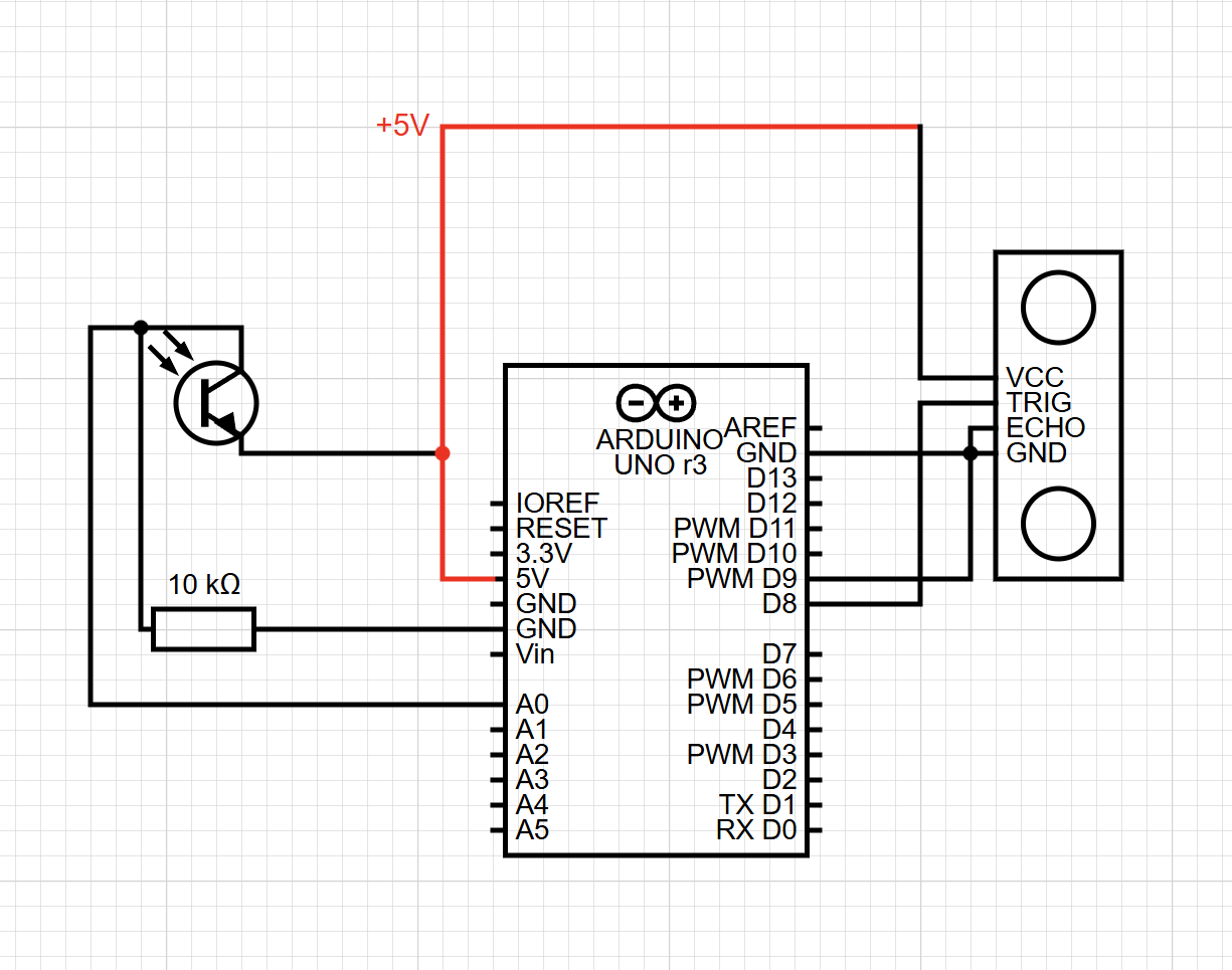
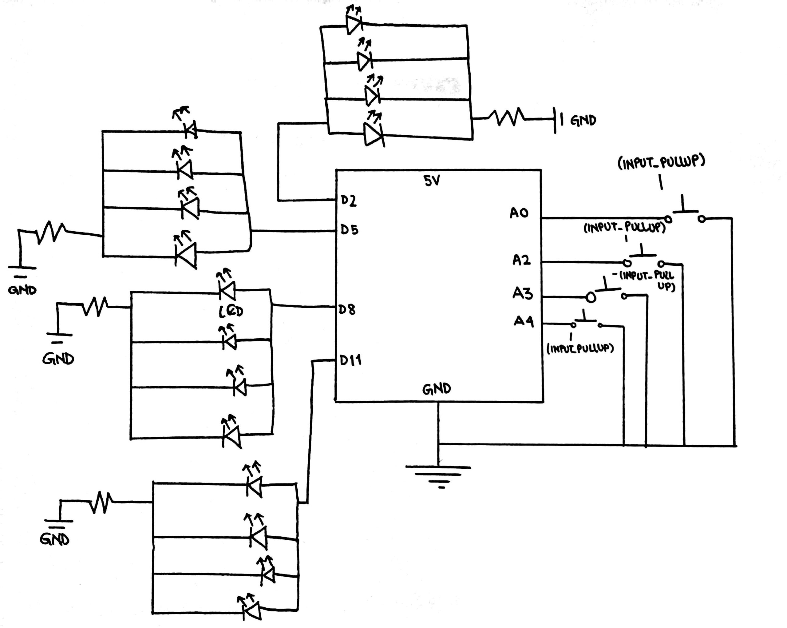
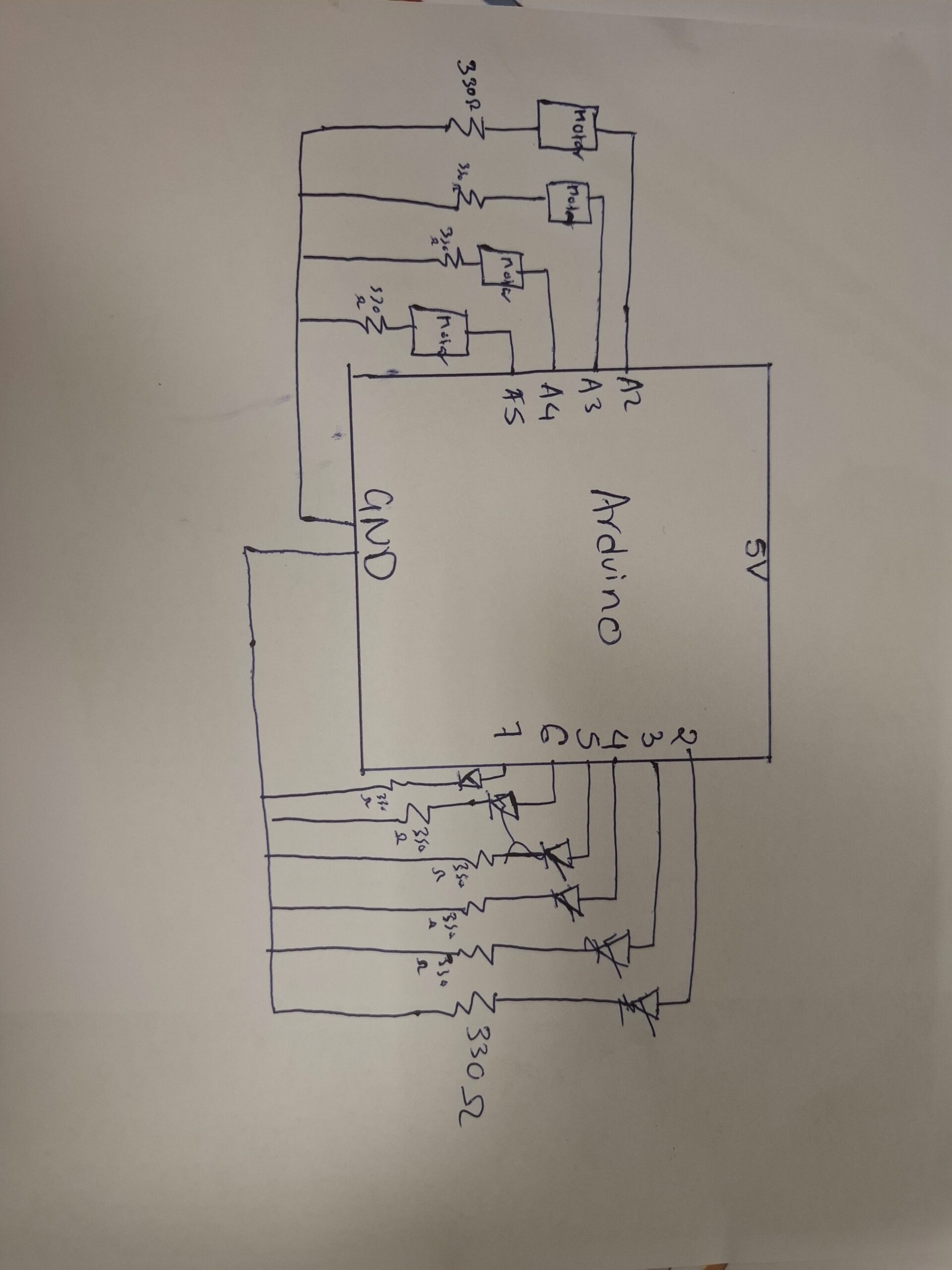
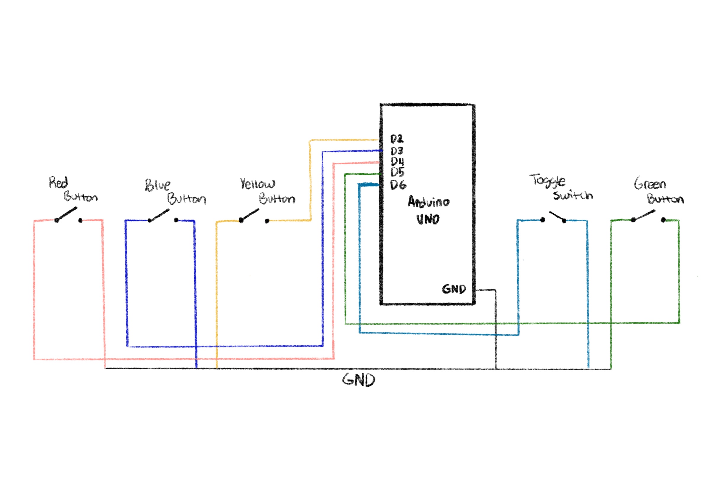
Arudino Code:
My Arduino reads four analog voltages from the prayer wheel motor and also listens for letters sent from p5.js. Each letter corresponds to a part of the stupa that should light up.
// ----- Analog input pins -----
const int volt2 = A2;   // Sensor or voltage input on A2
const int volt3 = A3;   // Sensor or voltage input on A3
const int volt4 = A4;   // Sensor or voltage input on A4
const int volt5 = A5;   // Sensor or voltage input on A5

// ----- Digital output pins (LEDs / relays / indicators) -----
const int pinnacle = 2;
const int thirteen = 3;
const int eye1 = 4;
const int eye2 = 5;
const int dome = 6;
const int mandala = 7;
const int flag = 8;

void setup() {
  // Configure analog input pins
  pinMode(volt2, INPUT);
  pinMode(volt3, INPUT);
  pinMode(volt4, INPUT);
  pinMode(volt5, INPUT);

  // Configure all digital output pins
  pinMode(pinnacle, OUTPUT);
  pinMode(thirteen, OUTPUT);
  pinMode(eye1, OUTPUT);
  pinMode(eye2, OUTPUT);
  pinMode(dome, OUTPUT);
  pinMode(mandala, OUTPUT);
  pinMode(flag, OUTPUT);

  // Start serial communication
  Serial.begin(9600);
}

void loop() {

  // ----- Read all analog inputs -----
  int a2 = analogRead(volt2);
  int a3 = analogRead(volt3);
  int a4 = analogRead(volt4);
  int a5 = analogRead(volt5);

  // ----- Send readings to the Serial Monitor (comma-separated) -----
  Serial.print(a2);
  Serial.print(",");
  Serial.print(a3);
  Serial.print(",");
  Serial.print(a4);
  Serial.print(",");
  Serial.print(a5);
  Serial.print("\n");

  delay(50); // Small delay for stable output


  // ----- Handle incoming serial commands -----
  while (Serial.available() > 0) {

    char message = Serial.read();   // Read one character command

    allOff();   // Always reset all outputs first


    // ----- Activate specific outputs based on incoming character -----
    if (message == 'p') {
      digitalWrite(pinnacle, HIGH);     // Turn on pinnacle
    }
    else if (message == 't') {
      digitalWrite(thirteen, HIGH);     // Turn on thirteen
    }
    else if (message == 'e') {          // "e" turns on both eyes
      digitalWrite(eye1, HIGH);
      digitalWrite(eye2, HIGH);
    }
    else if (message == 'd') {
      digitalWrite(dome, HIGH);         // Dome on
    }
    else if (message == 'm') {
      digitalWrite(mandala, HIGH);      // Mandala on
    }
    else if (message == 'f') {
      digitalWrite(flag, HIGH);         // Flag on
    }
    // Any other character is ignored
  }
}


// ----- Helper function: turn ALL outputs OFF -----
void allOff() {
  digitalWrite(pinnacle, LOW);
  digitalWrite(thirteen, LOW);
  digitalWrite(eye1, LOW);
  digitalWrite(eye2, LOW);
  digitalWrite(dome, LOW);
  digitalWrite(mandala, LOW);
  digitalWrite(flag, LOW);
}
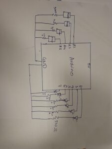
Schematic of the Circuit
p5.js Code Description
The p5.js sketch does these things:
Draws multiple screens (welcome screen → prayer wheel → stupa)
Listens for sensor values sent from Arduino
Plays an “Om” sound only when the wheel spins
Sends letters (‘p’, ‘t’, ‘e’, ‘d’, ‘m’) back to Arduino to activate lights
Handles all on-screen interactions through mouse clicks
code:
// -------------------------------------------------------------
// GLOBAL VARIABLES
// -------------------------------------------------------------

let port;                 // Serial port object for Arduino communication
let button;               // Connect button
let open = false;         // Tracks whether the port is open
let trimvalue;            // Parsed Arduino sensor values
let screen = 1;           // Screen state controller
let sentCommand = false;  // Tracks if Arduino command is already sent
let soundPlaying = false; // Prevents OM sound from retriggering too fast


// -------------------------------------------------------------
// ASSET LOADING (Audio + Images)
// -------------------------------------------------------------
function preload() {

  /////////music////////
  om_sound = loadSound('om.mp3'); // sound from https://pixabay.com/music/search/om/

  // UI Images (all from canva.com as cited)
  welcomescreen = loadImage("startpage.png"); // image from canva.com
  screen2i = loadImage("screen2i.png");       // image from canva.com
  screen3i = loadImage("screen3i.png");       // image from canva.com
  screenpi = loadImage("screenpi.png");       // image from canva.com
  screenmi = loadImage("screenmi.png");       // image from canva.com
  screendi = loadImage("screendi.png");       // image from canva.com
  screenei = loadImage("screenei.png");       // image from canva.com
  screenti = loadImage("screenti.png");       // image from canva.com
}


// -------------------------------------------------------------
// SETUP FUNCTION — Runs once
// -------------------------------------------------------------
function setup() {

  createCanvas(400, 400);

  // Create serial port object (p5.js → Arduino communication bridge)
  port = createSerial();

  // Create connect button
  button = createButton("Connect to Arduino");
  button.position(width / 2 - 50, height / 2);
  button.mousePressed(openArduino); // Attach handler
}


// -------------------------------------------------------------
// OPEN ARDUINO SERIAL PORT
// -------------------------------------------------------------
function openArduino() {

  // If port is not already open, open it
  if (!port.opened()) {

    port.open(9600);   // Must match Arduino baud rate
    open = true;       // Mark port as open
    button.remove();   // Hide button after connecting
  }
}


// -------------------------------------------------------------
// MAIN DRAW LOOP — Runs continuously
// -------------------------------------------------------------
function draw() {

  // Only run UI + sound + sensor logic after port is open
  if (open == true) {

    // ---------------------------------------------------------
    // Screen Navigation
    // ---------------------------------------------------------
    if (screen == 1) {
      welcomescreenf();  // Start page
    }
    else if (screen == 2) {
      screen2f();
    }
    else if (screen == 3) {
      screen3f();
    }
    else if (screen == 4) {
      screenpf();
    }
    else if (screen == 7) {
      screend();
    }
    else if (screen == 8) {
      screenm();
    }

    // ---------------------------------------------------------
    // Read serial input (Arduino → p5.js)
    // ---------------------------------------------------------
    value = port.readUntil("\n");  // Read full sensor line
    port.clear();                  // Clear leftover buffer

    trimvalue = value.trim().split(",");
    console.log(trimvalue);        // Print array of sensor values


    // ---------------------------------------------------------
    // SOUND TRIGGER LOGIC — OM sound plays when any sensor > 0
    // ---------------------------------------------------------
    if (!soundPlaying) {

      if (
        parseInt(trimvalue[0]) > 0 ||
        parseInt(trimvalue[1]) > 0 ||
        parseInt(trimvalue[2]) > 0 ||
        parseInt(trimvalue[3]) > 0
      ) {
        soundPlaying = true;  // Prevents double-trigger

        om_sound.play();      // Play OM sound

        // Reset lock after sound finishes
        om_sound.onended(() => {
          soundPlaying = false;
        });
      }
    }
  }

  // If port is closed → pause sound
  else {
    om_sound.pause();
  }
}


// -------------------------------------------------------------
// WELCOME SCREEN
// -------------------------------------------------------------
function welcomescreenf() {
  image(welcomescreen, 0, 0, 400, 400);
}


// -------------------------------------------------------------
// MOUSE-PRESSED HANDLER FOR SCREEN NAVIGATION + ARDUINO COMMANDS
// -------------------------------------------------------------
function mousePressed() {

  // ---------------- Screen 1 → Screen 2 -----------------
  if (screen == 1 &&
      mouseX >= 135 && mouseX <= 263 &&
      mouseY >= 354 && mouseY <= 371) {

    screen2f();
  }

  // ---------------- Screen 2 → Screen 3 -----------------
  else if (screen == 2 &&
           mouseX >= 120 && mouseX <= 346 &&
           mouseY >= 192 && mouseY <= 366) {

    screen3f();
  }

  // ---------------- Screen 3 Interactive Hotspots -----------------
  else if (screen == 3) {

    // Pinnacle (Top)
    if (mouseInside(192, 211, 117, 144)) {
      screenpf();  // Arduino: 'p'
    }

    // Thirteen tiers
    else if (mouseInside(185, 225, 147, 178)) {
      screent();   // Arduino: 't'
    }

    // Eyes
    else if (mouseInside(183, 244, 183, 195)) {
      screene();   // Arduino: 'e'
    }

    // Dome
    else if (mouseInside(124, 289, 194, 233)) {
      screend();   // Arduino: 'd'
    }

    // Mandala
    else if (mouseInside(0, 400, 240, 286)) {
      screen = 8;
      screenm();   // Arduino: 'm'
    }
  }

  // ---------------- Back Buttons for All Detail Screens -----------------

  else if (screen == 4 && mouseInside(148, 240, 339, 355)) goBackToMain();
  else if (screen == 5 && mouseInside(126, 274, 302, 325)) goBackToMain();
  else if (screen == 6 && mouseInside(122, 260, 302, 326)) goBackToMain();
  else if (screen == 7 && mouseInside(129, 274, 305, 329)) goBackToMain();
  else if (screen == 8 && mouseInside(115, 259, 304, 325)) goBackToMain();
}


// -------------------------------------------------------------
// HELPERS
// -------------------------------------------------------------

// Reusable function for BACK NAVIGATION
function goBackToMain() {
  port.write(' ');  // Sends "turn everything OFF" to Arduino
  screen = 3;
  screen3f();
}

// Check if mouse is inside a bounding box
function mouseInside(x1, x2, y1, y2) {
  return mouseX >= x1 && mouseX <= x2 &&
         mouseY >= y1 && mouseY <= y2;
}


// -------------------------------------------------------------
// SCREEN FUNCTIONS + ARDUINO COMMANDS
// -------------------------------------------------------------

function screen2f() {
  image(screen2i, 0, 0, 400, 400);
  screen = 2;
}

function screen3f() {
  image(screen3i, 0, 0, 400, 400);
  screen = 3;
}

function screenpf() {
  image(screenpi, 0, 0, 400, 400);
  port.write('p');  // Send “pinnacle”
  screen = 4;
}

function screent() {
  image(screenti, 0, 0, 400, 400);
  port.write('t');
  screen = 5;
}

function screene() {
  image(screenei, 0, 0, 400, 400);
  port.write('e');
  screen = 6;
}

function screend() {
  image(screendi, 0, 0, 400, 400);
  port.write('d');
  screen = 7;
}

function screenm() {
  image(screenmi, 0, 0, 400, 400);
  port.write('m');
  screen = 8;
}
p5js screen:
Full Screen p5js code:
// -------------------------------------------------------------
// GLOBAL VARIABLES
// -------------------------------------------------------------

let port;                 // Serial port object for Arduino communication
let button;               // Connect button
let open = false;         // Tracks whether the port is open
let trimvalue;            // Parsed Arduino sensor values
let screen = 1;           // Screen state controller
let sentCommand = false;  // Tracks if Arduino command is already sent
let soundPlaying = false; // Prevents OM sound from retriggering too fast


// -------------------------------------------------------------
// ASSET LOADING (Audio + Images)
// -------------------------------------------------------------
function preload() {

  /////////music////////
  om_sound = loadSound('om.mp3'); // sound from https://pixabay.com/music/search/om/

  // UI Images (all from canva.com as cited)
  welcomescreen = loadImage("startpage.png"); // image from canva.com
  screen2i = loadImage("screen2i.png");       // image from canva.com
  screen3i = loadImage("screen3i.png");       // image from canva.com
  screenpi = loadImage("screenpi.png");       // image from canva.com
  screenmi = loadImage("screenmi.png");       // image from canva.com
  screendi = loadImage("screendi.png");       // image from canva.com
  screenei = loadImage("screenei.png");       // image from canva.com
  screenti = loadImage("screenti.png");       // image from canva.com
}

// -------------------------------------------------------------
// SETUP — now starts in window size but ready for fullscreen
// -------------------------------------------------------------
function setup() {
  createCanvas(400, 400);           // your original size
  // If you open the sketch in a new tab it will start fullscreen-ready

  port = createSerial();

  button = createButton("Connect to Arduino");
  button.position(width / 2 - 50, height / 2);
  button.mousePressed(openArduino);
}

// -------------------------------------------------------------
// MAKE CANVAS ALWAYS FILL THE SCREEN (even after fullscreen)
// -------------------------------------------------------------
function windowResized() {
  resizeCanvas(windowWidth, windowHeight);
}

// -------------------------------------------------------------
// PRESS "F" → TOGGLE FULLSCREEN
// -------------------------------------------------------------
function keyPressed() {
  if (key === 'f' || key === 'F') {
    let fs = fullscreen();
    fullscreen(!fs);
  }
}

// -------------------------------------------------------------
// MAIN DRAW LOOP
// -------------------------------------------------------------
function draw() {
  background(0);

  if (open == true) {

    // ---------------------------------------------------------
    // Screen Navigation (your original images, now scaled)
    // ---------------------------------------------------------
    if (screen == 1) {
      image(welcomescreen, 0, 0, width, height);
    }
    else if (screen == 2) {
      image(screen2i, 0, 0, width, height);
    }
    else if (screen == 3) {
      image(screen3i, 0, 0, width, height);
    }
    else if (screen == 4) {
      image(screenpi, 0, 0, width, height);
    }
    else if (screen == 5) {
      image(screenti, 0, 0, width, height);
    }
    else if (screen == 6) {
      image(screenei, 0, 0, width, height);
    }
    else if (screen == 7) {
      image(screendi, 0, 0, width, height);
    }
    else if (screen == 8) {
      image(screenmi, 0, 0, width, height);
    }

    // ---------------------------------------------------------
    // Read serial input
    // ---------------------------------------------------------
    let value = port.readUntil("\n");
    port.clear();

    if (value != "") {
      trimvalue = value.trim().split(",");
      console.log(trimvalue);

      // ---------------------------------------------------------
      // SOUND TRIGGER LOGIC
      // ---------------------------------------------------------
      if (!soundPlaying) {
        if (
          parseInt(trimvalue[0]) > 0 ||
          parseInt(trimvalue[1]) > 0 ||
          parseInt(trimvalue[2]) > 0 ||
          parseInt(trimvalue[3]) > 0
        ) {
          soundPlaying = true;
          om_sound.play();

          om_sound.onended(() => {
            soundPlaying = false;
          });
        }
      }
    }
  }
  else {
    om_sound.pause();
  }
}

// -------------------------------------------------------------
// MOUSE-PRESSED HANDLER — scaled coordinates for fullscreen
// -------------------------------------------------------------
function mousePressed() {

  if (!open) return;

  // Scale mouse coordinates to original 400×400 layout
  let mx = mouseX * 400 / width;
  let my = mouseY * 400 / height;

  // ---------------------------------------------------------
  // SCREEN 1 → Start Button
  // ---------------------------------------------------------
  if (screen == 1) {
    if (mx >= 135 && mx <= 263 && my >= 354 && my <= 371) {
      screen = 2;
    }
  }

  // ---------------------------------------------------------
  // SCREEN 2 → Next Button
  // ---------------------------------------------------------
  else if (screen == 2) {
    if (mx >= 120 && mx <= 346 && my >= 192 && my <= 366) {
      screen = 3;
    }
  }

  // ---------------------------------------------------------
  // SCREEN 3 → 5 Interactive Zones
  // ---------------------------------------------------------
  else if (screen == 3) {

    // PF
    if (mx >= 192 && mx <= 211 && my >= 117 && my <= 144) {
      screenpf();
    }

    // T
    else if (mx >= 185 && mx <= 225 && my >= 147 && my <= 178) {
      screent();
    }

    // E
    else if (mx >= 183 && mx <= 244 && my >= 183 && my <= 195) {
      screene();
    }

    // D
    else if (mx >= 124 && mx <= 289 && my >= 194 && my <= 233) {
      screend();
    }

    // M
    else if (mx >= 0 && mx <= 400 && my >= 240 && my <= 286) {
      screenm();
    }
  }

  // ---------------------------------------------------------
  // BACK BUTTONS FOR SCREENS 4–8
  // ---------------------------------------------------------
  else if (screen == 4) {
    if (mx >= 148 && mx <= 240 && my >= 339 && my <= 355) goBackToMain();
  }

  else if (screen == 5) {
    if (mx >= 126 && mx <= 274 && my >= 302 && my <= 325) goBackToMain();
  }

  else if (screen == 6) {
    if (mx >= 122 && mx <= 260 && my >= 302 && my <= 326) goBackToMain();
  }

  else if (screen == 7) {
    if (mx >= 129 && mx <= 274 && my >= 305 && my <= 329) goBackToMain();
  }

  else if (screen == 8) {
    if (mx >= 115 && mx <= 259 && my >= 304 && my <= 325) goBackToMain();
  }
}

// -------------------------------------------------------------
// HELPERS
// -------------------------------------------------------------
function goBackToMain() {
  port.write(' ');  // turn everything off
  screen = 3;
}

// -------------------------------------------------------------
// SCREEN FUNCTIONS + ARDUINO COMMANDS (unchanged)
// -------------------------------------------------------------
function screenpf() {
  port.write('p');
  screen = 4;
}
function screent() {
  port.write('t');
  screen = 5;
}
function screene() {
  port.write('e');
  screen = 6;
}
function screend() {
  port.write('d');
  screen = 7;
}
function screenm() {
  port.write('m');
  screen = 8;
}

// -------------------------------------------------------------
// OPEN ARDUINO SERIAL PORT
// -------------------------------------------------------------
function openArduino() {
  if (!port.opened()) {
    port.open(9600);
    open = true;
    button.remove();
  }
}
Arduino and p5.js Communication
Flow:
User spins the wheel → motor sends voltage
Arduino reads values → prints as CSV string
p5.js reads the CSV → detects movement → plays sound
User clicks a part of the stupa in p5.js → p5 sends a letter
Arduino receives the letter → lights the corresponding LEDs
This loop creates a tight physical and digital connection.
What I’m Proud Of
One of the things I’m most proud of in this project is the way I used a motor as a sensor. In class, we mostly learned how to drive a motor, how to make it spin, how to control its speed, how to power it. But we never talked much about using a motor in reverse, as a generator. The idea actually came from something I learned back in high school: when you spin a motor manually, it becomes a dynamo and creates a small voltage. Remembering that old concept and realizing I could apply it here felt like a huge breakthrough. Instead of attaching extra sensors or complicated hardware, I turned the motor itself into the perfect input device for the prayer wheel. It made the interaction feel more authentic and made me feel resourceful like I made something out of almost nothing.
I’m also proud that the project became more than just a technical assignment. A lot of Arduino + p5.js demos end up being simple lights or sliders, but I wanted my project to feel culturally grounded and emotionally meaningful. Recreating the experience of spinning a prayer wheel and interacting with a stupa allowed me to share a part of Nepalese culture in a way that felt personal. It wasn’t just, “Here’s a sensor and an LED” it was a small spiritual journey for the user. The moment the “Om” sound plays when the wheel turns feels like the installation is breathing with you.
Finally, I’m proud of creating a fully two-way communication system between Arduino and p5.js. At the beginning of the semester, I struggled even to understand how serial communication worked. But in this project, the Arduino and p5.js are constantly talking to each other. Arduino sends sensor data to p5.js, p5.js analyzes it, then sends back precise commands to control the lights on the physical stupa. This feedback loop makes the experience feel alive and responsive. Building this system made me feel like I actually understand how physical computing and digital interaction can merge into one continuous experience.
Overall, the project pushed me technically, creatively, and culturally. It’s the first time I felt like I wasn’t just completing a class assignment. I was creating something that feels like mine.
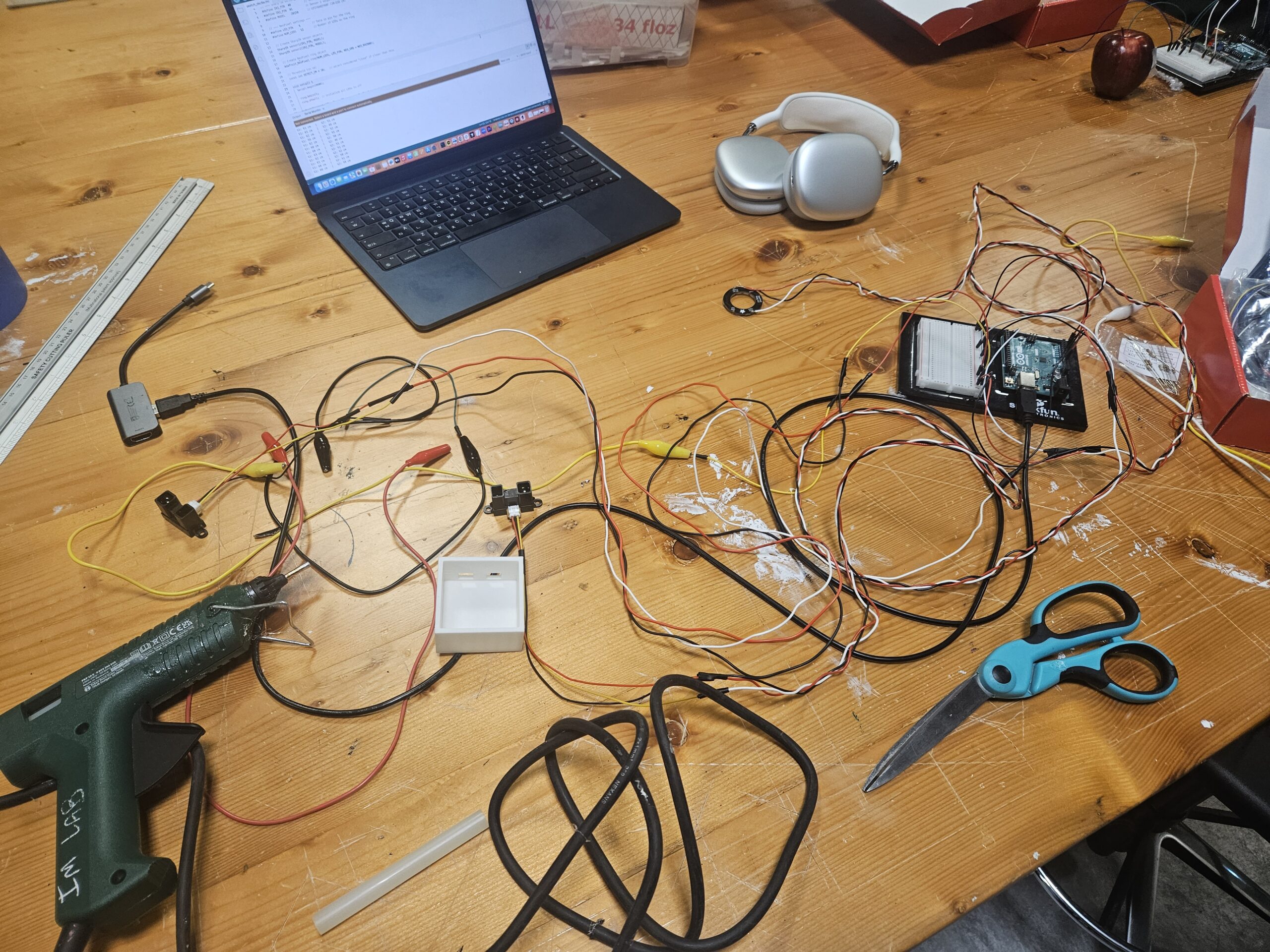
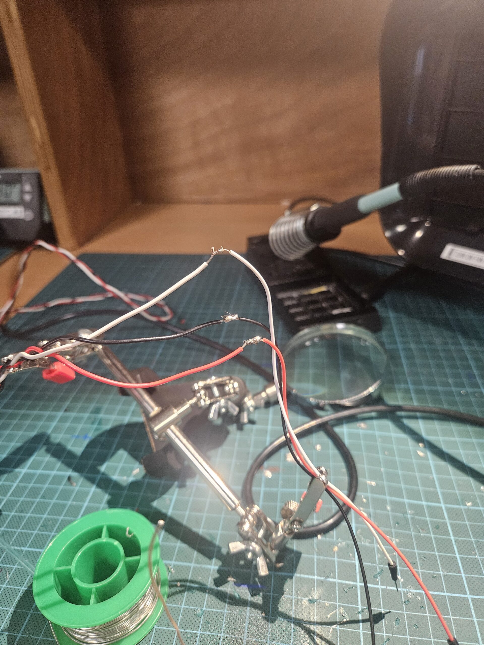
How This Was Made
I used several tools throughout this project:
Arduino UNO for sensing and controlling LEDs
p5.js for the interactive visuals and sound
Adobe Illustrator / Canva (or whichever tool you used) for drawing the stupa
A small DC motor as a dynamo sensor
WordPress to document the process
Generative AI (ChatGPT) to help debug my Arduino code, and explain concepts more clearly
The write-up for this project came together very organically. Instead of sitting down and trying to write a perfect report in one go, I started by brainstorming everything in my head and dumping ideas onto paper. I wrote down fragments of thoughts, sketches of memories about stupas and prayer wheels, notes about how the interactions should feel, and even some quick diagrams. It was messy at first, but that process helped me understand what parts of the project mattered the most to me.
From there, I organized the ideas into sections—concept, interaction, technical breakdown, cultural meaning, challenges, and future improvements. I rewrote and refined them little by little. Some parts came from real experiences I’ve had at stupas in Nepal, and others came from experimenting with the Arduino and p5.js until something clicked. Once I had the raw content, I shaped it into the final narrative you see here.
Area for future improvement:
I also want to add more lights and more detailed lighting zones on the stupa. At the moment, the LEDs represent the main sections (like the pinnacle, dome, eyes, mandala, etc.), but the lighting could be much richer. I imagine having multiple LEDs in each section, maybe even different colors or subtle animations (like pulsing or fading) to show the sacredness and energy of that part of the structure. More lights would not only make the physical model more visually striking, but also help guide the user’s attention and make the mapping between touch and light feel clearer.
Lastly, I’d like to include more educational content about stupa symbolism. Right now, the project hints at the meanings (like the dome representing the world or the eyes representing wisdom), but I could go deeper. For example, when a section lights up, a short description could appear explaining its spiritual role, history, or connection to Buddhist philosophy. This would turn the installation not just into an interactive artwork, but also a small learning experience about Nepali and Himalayan culture.
Final working video:
Google drive link