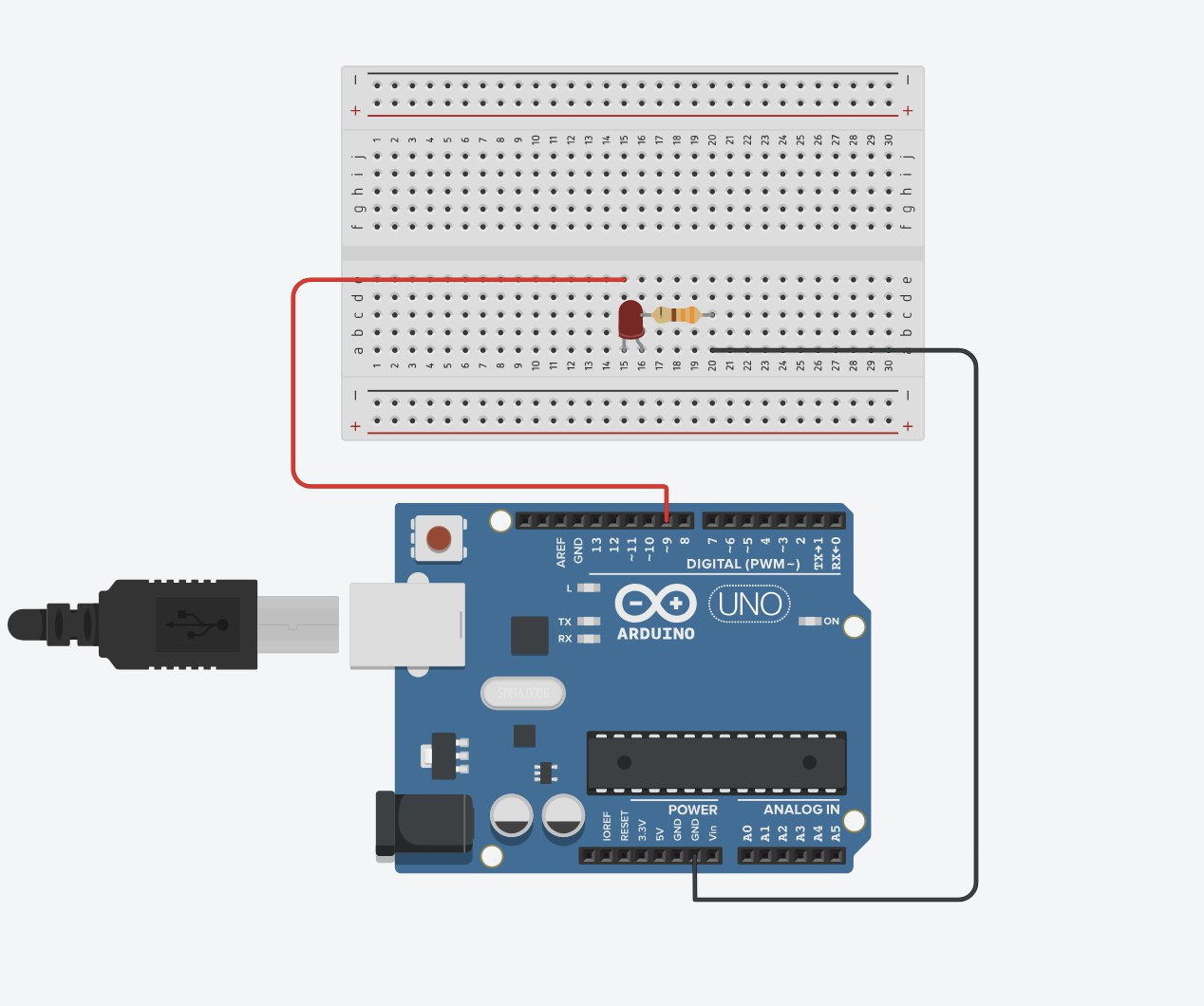
Exercise 1: Make something that uses only one sensor on Arduino and makes the ellipse in p5 move on the horizontal axis, in the middle of the screen, and nothing on arduino is controlled by p5.
Concept: When a person covers the light sensor, the reduced light makes the ball move horizontally in p5. The player controls the ball simply by changing how much light reaches the sensor.
P5 Code:
let address = 0;

function setup() {
  createCanvas(600, 600);
  noFill();
}

function draw() {
  background("purple");
  stroke("white");

  // Convert the incoming sensor reading (0–1023) into a horizontal screen position
  ellipse(map(address, 0, 1023, 0, width), height / 2, 100, 100);

  if (!serialActive) {
    // Show a connection screen while serial communication hasn’t started yet
    background("rgb(70,9,70)");
    stroke("white");
    textSize(50);
    text("Press Space Bar to select Serial Port", 20, 30, width - 30, 200);
  }
}

function keyPressed() {
  // When the space bar is pressed, begin the setup process for the serial port
  if (key == " ") setUpSerial();
}

function readSerial(data) {
  // If valid data arrives from the Arduino, save it for use in draw()
  if (data != null) {
    address = int(data);
  }
}
Arduino Code:
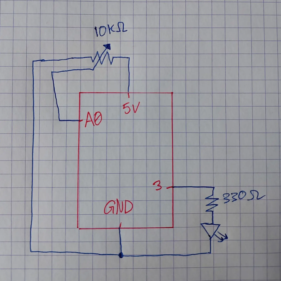
int LED = A0;

void setup() {
Serial.begin(9600);
pinMode(LED, INPUT);
}

void loop() {
int sensorValue = analogRead(A0);
Serial.println(sensorValue);
delay(5);
}
Github Link
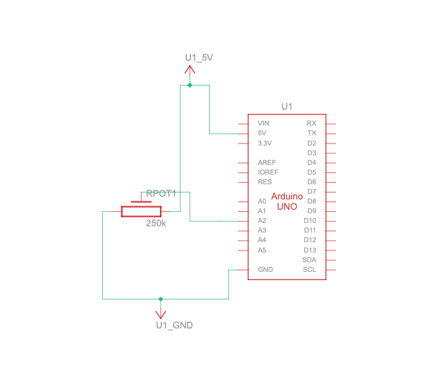
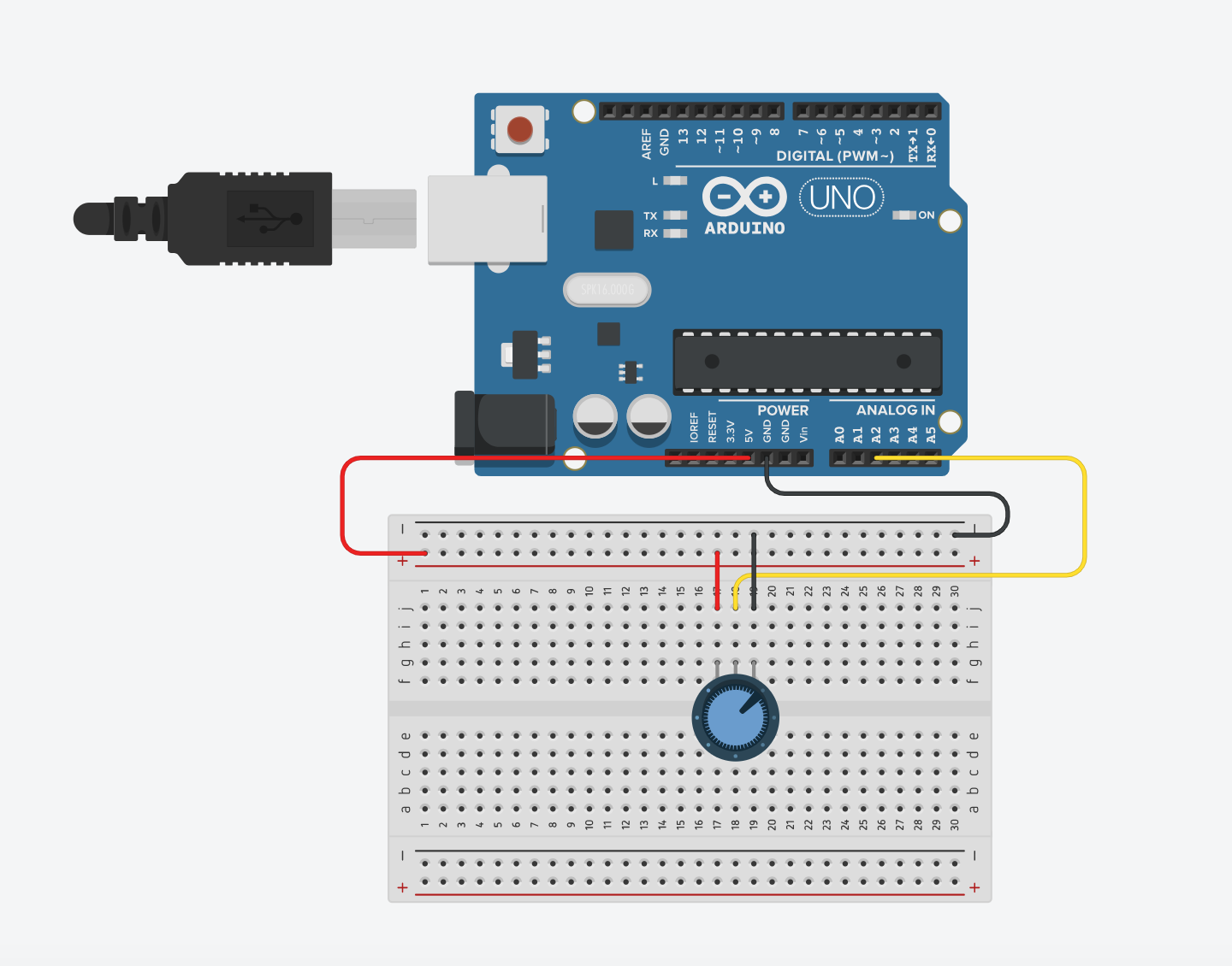
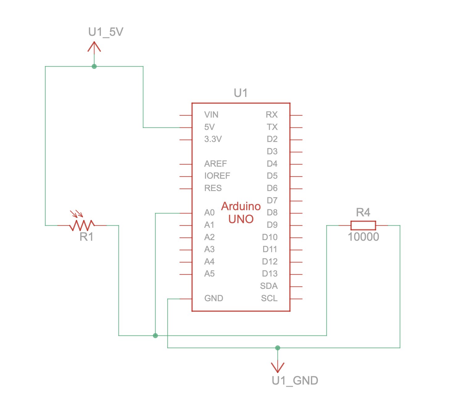
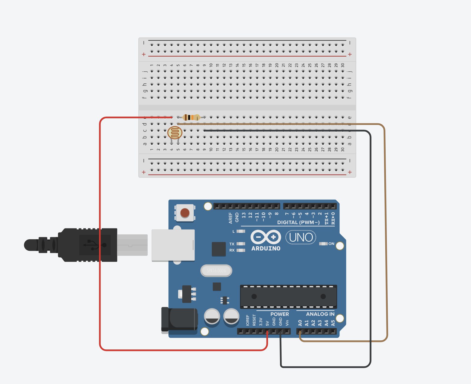
Setup and Schematic:

Video Demonstration
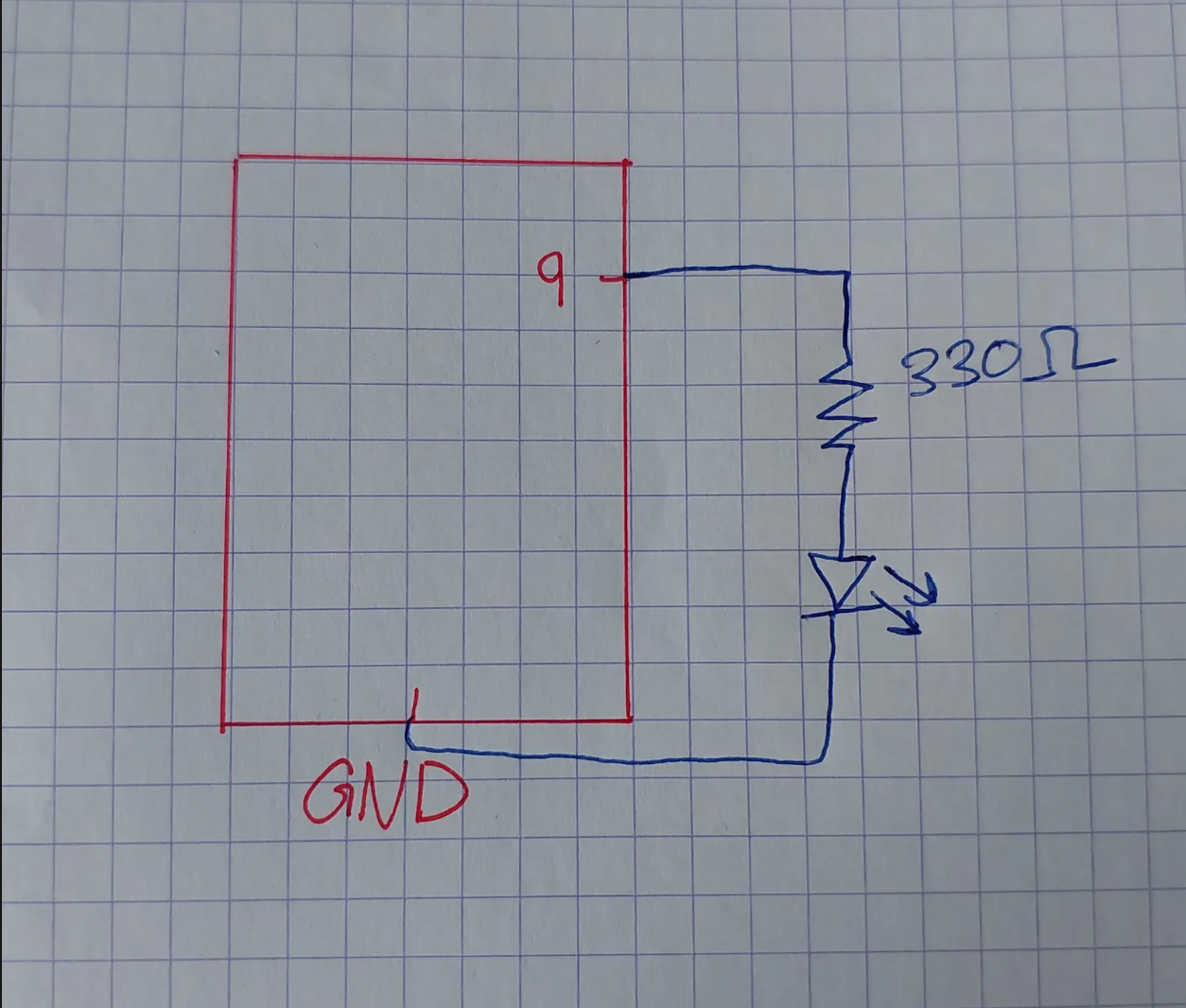
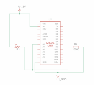
Exercise 2: Make something that controls the LED brightness from p5
Concept: When the player touches the trackpad and increases the sketch’s color from black to white, the LED also gets brighter.
// Holds the brightness value we will send to the Arduino
let brightness = 0;

// Stores any data received back from Arduino (not used, but required)
let latestData = "";

function setup() {
  // Create the canvas where visual feedback will appear
  createCanvas(600, 400);
  noStroke();
}

function draw() {
  // Clear the screen each frame with a black background
  background(0);

  // Convert trackpad/mouse X position (0 → width) into brightness (0 → 255)
  brightness = int(map(mouseX, 0, width, 0, 255));

  // Draw a rectangle whose fill intensity matches the brightness value
  fill(brightness);
  rect(0, 0, width, height);

  // If a serial port is active, send the brightness value to the Arduino
  if (serialActive) {
    writeSerial(brightness + "\n"); // "\n" ensures Arduino reads full numbers
  }

  // If serial is NOT open, show instructions to the user
  if (!serialActive) {
    background("purple");
    fill("white");
    textSize(28);
    text("Press SPACE to choose Serial Port", 20, 40);
  }
}

function keyPressed() {
  // Press SPACE to open the Web Serial port selection dialog
  if (key === " ") {
    setUpSerial();
  }
}

// This function is REQUIRED by p5.webserial
// It receives data sent from Arduino (even if unused)
function readSerial(data) {
  if (data) latestData = data;
}

// Sends data to Arduino IF the writer is available
function writeSerial(value) {
  if (writer) {
    writer.write(value);
  }
}
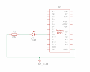
Arduino:
int ledPin = 9;
int brightness = 0;

void setup() {
  Serial.begin(9600);
  pinMode(ledPin, OUTPUT);
}

void loop() {
  if (Serial.available() > 0) {
    brightness = Serial.parseInt();
    brightness = constrain(brightness, 0, 255);
  }

  analogWrite(ledPin, brightness);
}
Github link
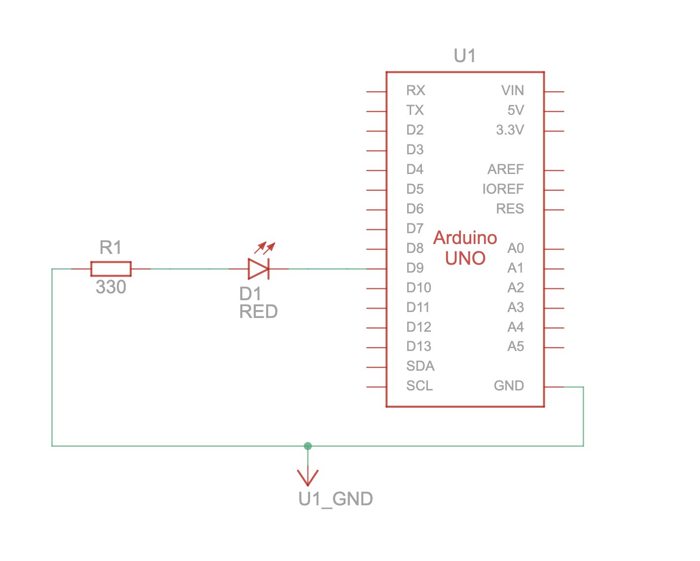
Setup and Schematic:

Video Demonstration
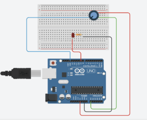
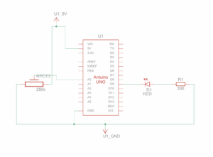
Exercise 3: Take the gravity wind example and make it so every time the ball bounces one led lights up and then turns off, and you can control the wind from one analog sensor
Concept: As our ball bounced, and the red LED lit up. Using the potentiometer, the player controlled the wind, making the ball move from one side to the other.
P5 Code:
let velocity;
let gravity;
let position;
let acceleration;
let wind;
let drag = 0.99;
let mass = 50;
let on = 0;

function setup() {
  createCanvas(640, 360);
  //noFill();
  position = createVector(width/2, 0);
  velocity = createVector(0,0);
  acceleration = createVector(0,0);
  gravity = createVector(0, 0.5*mass);
  wind = createVector(0,0);
}

function draw() {
  background(255);

  if (!serialActive) {
    text("Click on the Screen to select Serial Port", 20, 30);
  } else {
    text("Connected", 20, 30);
  }

  applyForce(wind);
  applyForce(gravity);
  velocity.add(acceleration);
  velocity.mult(drag);
  position.add(velocity);
  acceleration.mult(0);
  ellipse(position.x,position.y,mass,mass);
  if (position.y > height-mass/2) {
      velocity.y *= -0.9;  // A little dampening when hitting the bottom
      position.y = height-mass/2;
  }
  // turn on the LED only when it's on the ground or hits the ground
  if(position.y == height-mass/2){
    on = 0;
  }else{
    on = 1;
  }
}
function applyForce(force){
  // Newton's 2nd law: F = M * A
  // or A = F / M
  let f = p5.Vector.div(force, mass);
  acceleration.add(f);
}
function keyPressed(){
  if (key==' '){
    mass=random(15, 80);
    position.y=-mass;
    velocity.mult(0);
  }
}
function mousePressed() {
    setUpSerial();
}
function readSerial(data) {
  if (data != null) {
    // make sure there is actually a message
    // split the message
    wind.x = data;
    //////////////////////////////////
    //SEND TO ARDUINO HERE (handshake)
    //////////////////////////////////
    let sendToArduino = on + "\n";
    writeSerial(sendToArduino);
  }
}
Arduino Code:
const int LED = 9;
const int POT = A0;


void setup() {
Serial.begin(9600);
pinMode(LED, OUTPUT);


// Test the LED
digitalWrite(LED, HIGH);
delay(500);
digitalWrite(LED, LOW);
}


void loop() {
int p_value = analogRead(POT); // read from the potentiometer
int move = map(p_value, 0, 1023, -1, 2); // map the value to -1, 0, and 1
Serial.println(move);


if (Serial.available() > 0) {
// read from p5.js
int touch = Serial.parseInt();
// set the LED command
if (touch == 1) {
digitalWrite(LED, HIGH);
} else {
digitalWrite(LED, LOW);
}
}
}
Github file
Setup and Schematic:
Video Demonstration
Reflection: Across all three projects, I learned how different sensors can shape the experience through serial communication and p5. Working with light, the trackpad, and the potentiometer showed me how physical input can smoothly translate into visual changes on the screen. In the future, I would improve the responsiveness and make the serial connection more stable so the interactions feel smoother and more reliable.