Inspiration
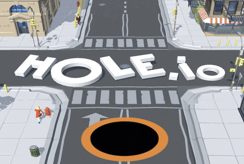
The idea for Blackhole was born from one of my all-time favorite casual games: hole.io. The core concept of “the more you eat, the more you grow” fascinated me. However, my goal was never to recreate an existing game, but to reinterpret that mechanic in an entirely different environment.
In hole.io, the objective is to have the largest area among all players, consuming the environment and other players to maintain your crown. So I though of reimagining that concept in space? What if the hole was a blackhole preying everything in its path? This became the foundation of my project; A space-themed, single-player survival game centered around growth, gravity, and chaos.
Concept
Blackhole is a single-player arcade-style game set in deep space. The player controls a blackhole that grows by consuming asteroids and powerups, while avoiding larger threats.
To bring the theme to life, I envisioned asteroids as natural “food” for the blackhole (blending the space aesthetic with the satisfying loop of consuming and expanding). To make the gameplay more dynamic, I added powerups that appear on screen at random intervals, offering temporary boosts or effects to make the experience more engaging.
The main goal is simple: survive as long as possible while growing your blackhole and collecting stars for bonus points. The longer you last, the higher your score.
Implementation
Developing Blackhole was an iterative process. I began by prioritizing functionality, ensuring the mechanics worked before focusing on visuals or audio.
Blackhole
The foundation of the game lies in the Blackhole class, responsible for handling player growth, shrinking, and interaction with other entities. For simplicity, I represented all objects (asteroids and powerups) as circles. This made collision detection intuitive and computationally efficient. Using the dist() function in p5.js, I determined when the player’s blackhole had consumed another object or collided with a threat.
Blackhole Class:
class Blackhole{
  constructor(){
    this.size=25;
    this.speed=3;
    this.x = 100;
    this.y = 100;
  }

  // call when eats star or expand powerup
  grow(){
    this.size *= 1.2;
  }

  shrink(){
    this.size *= 0.8;
  }

  move() {
    if (keyIsDown(UP_ARROW)) {
      // guarding against boundaries
      if (this.y - this.speed > 0){
        this.y -= this.speed;
      }
    }
    if (keyIsDown(DOWN_ARROW)) {
      // guarding against boundaries
      if (this.y + this.speed < height){
        this.y += this.speed;
      }
    }
    if (keyIsDown(RIGHT_ARROW)) {
      // guarding against boundaries
      if (this.x + this.speed < width){
        this.x += this.speed;
      }
    }
    if (keyIsDown(LEFT_ARROW)) {
      // guarding against boundaries
      if (this.x - this.speed > 0){
        this.x -= this.speed;
      }
    }
  }

  display(){
    stroke('white');
    strokeWeight(2);
    fill('black');
    circle(this.x, this.y, this.size);
  }

  // returns boolean
  collides(obj) {
    let d = dist(this.x, this.y, obj.x, obj.y);
    return d <= this.size/2;
  }
}
Powerups and Movement
Initially, I designed the powerups to spawn randomly and stay on screen indefinitely. However, I quickly realized that this cluttered the visuals and made it hard to differentiate between background stars and powerups. Even adding a blinking effect before disappearance didn’t feel natural.
Taking inspiration from Tetris Rush, I redesigned the mechanic. Now, powerups drop from the top of the screen and disappear at the bottom, creating a natural movement cycle. This solved both visibility and clutter issues while keeping the game lively and visually coherent.
Powerup Class:
class Powerups {
  constructor(_x, _y, _type, _img) {
    this.x = _x;
    this.y = _y;
    this.type = _type;
    this.img = _img;
    this.fallSpeed = random(1, 3); // random falling speed
  }

  // to have powerups fall from up to down
  move() {
    this.y += this.fallSpeed;
    if (this.y > height) {
      this.y = height;
    }
  }

  display() {
    textSize(20);

    if (this.type == "fast") {
      this.size = textWidth(''); // for detecting collissions
      text('', this.x, this.y);
    }
    else if (this.type == "freeze") {
      this.size = textWidth('❄️'); // for detecting collissions
      text('❄️', this.x, this.y);
    }
    else if (this.type == "grow") {
      // image for grow
      push();
      imageMode(CENTER);
      this.size = 75; // for detecting collissions
      image(this.img, this.x, this.y, this.size, this.size)
      pop();

    }
    else if (this.type == "shrink") {
      // image for shrink
      push();
      this.size = 40; // for detecting collissions
      imageMode(CENTER);
      image(this.img, this.x, this.y, this.size, this.size)
      pop();

    }
    else if (this.type == "star") {
      this.size = textWidth('⭐️'); // for detecting collissions
      text('⭐️', this.x, this.y);
    }
    else if (this.type == "bomb") {
      this.size = textWidth(''); // for detecting collissions
      text('', this.x, this.y);
    }
  }
}
Asteroids
For this class it was difficult preventing the asteroids from moving in predictable or repetitive patterns. To make the game feel organic and chaotic, I implemented an Asteroid class that allows each asteroid to move in random directions and change course periodically.
Each asteroid picks a random direction from a list of possible vectors including diagonal and straight-line movement and updates its velocity every few seconds. This ensures the movement feels spontaneous, mimicking the drifting, floating nature of space.
Asteroid class
class Asteroid {
  constructor(_x, _y, _img, _size) {
    this.x = _x;
    this.y = _y;
    this.img = _img
    this.size = _size;

    // separate velocities
    // this.vx = random([-1, 1]); // left or right
    // this.vy = random([-1, 1]); // up or down
    this.speed = 1.5;

    this.setRandomDirection();
  }

  // asteroids move in any direction randomly
  setRandomDirection() {
    let choices = [
      [1, 0],   // right
      [-1, 0],  // left
      [0, 1],   // down
      [0, -1],  // up
      [1, 1],   // diagonal down-right
      [-1, 1],  // diagonal down-left
      [1, -1],  // diagonal up-right
      [-1, -1]  // diagonal up-left
    ];

    let dir = random(choices);
    this.vx = dir[0]; // x-axis dir
    this.vy = dir[1]; // y-axis dir
  }

  move() {

    // every 2s change direction
    if (frameCount % 120 === 0) {
      this.setRandomDirection();
    }

    this.x += this.vx * this.speed;
    this.y += this.vy * this.speed;

    // Bounce off edges
    if (this.x < 0 || this.x > width)this.vx *= -1;
    if (this.y < 0 || this.y > height) this.vy *= -1;
  }

  display() {
    push();
    imageMode(CENTER);
    image(this.img, this.x, this.y, this.size, this.size);
    pop();
  }
}
Code I’m Proud of
One of the features I’m most proud of implementing is the freeze and speed-up powerups. Increasing/ Decreasing the speed the speed at collision was easy but how do I revert those changes back to their original state after a fixed duration (around 4 seconds).
I knew I could use frameCount to track time progression, but the question was where and how to integrate it efficiently without breaking the game loop. The solution came through the use of two external constants: freezeTimer and fastTimer.
Whenever the player collided with a powerup, the corresponding timer was assigned a specific value. In each frame of the game, these timers would decrement until they reached zero. Then the original state was restored.
// timers
  if (freezeTimer > 0) {
    freezeTimer--; // keep decreasing with every frame count
  } else if (fastTimer > 0) {
    player.speed = 5;
    fastTimer--; // keep decreasing with every frame count
  } else {
    // resetting speed for player and aesteroids
    player.speed = 3;
    for (let asteroid of asteroids) {
      asteroid.speed = 2;
    }
  }
Design and Visuals
For the backdrop, the choice was obvious, a starry night sky. I later replaced my simple circular asteroids with actual asteroid images to enhance immersion.
Sound design also became an important aspect. I added distinct sound cues for eating asteroids and activating powerups. Interestingly, while I was coding, the song “All the Stars” started playing and it immediately felt like the perfect fit. So I included it as background music, giving the game a cinematic atmosphere.
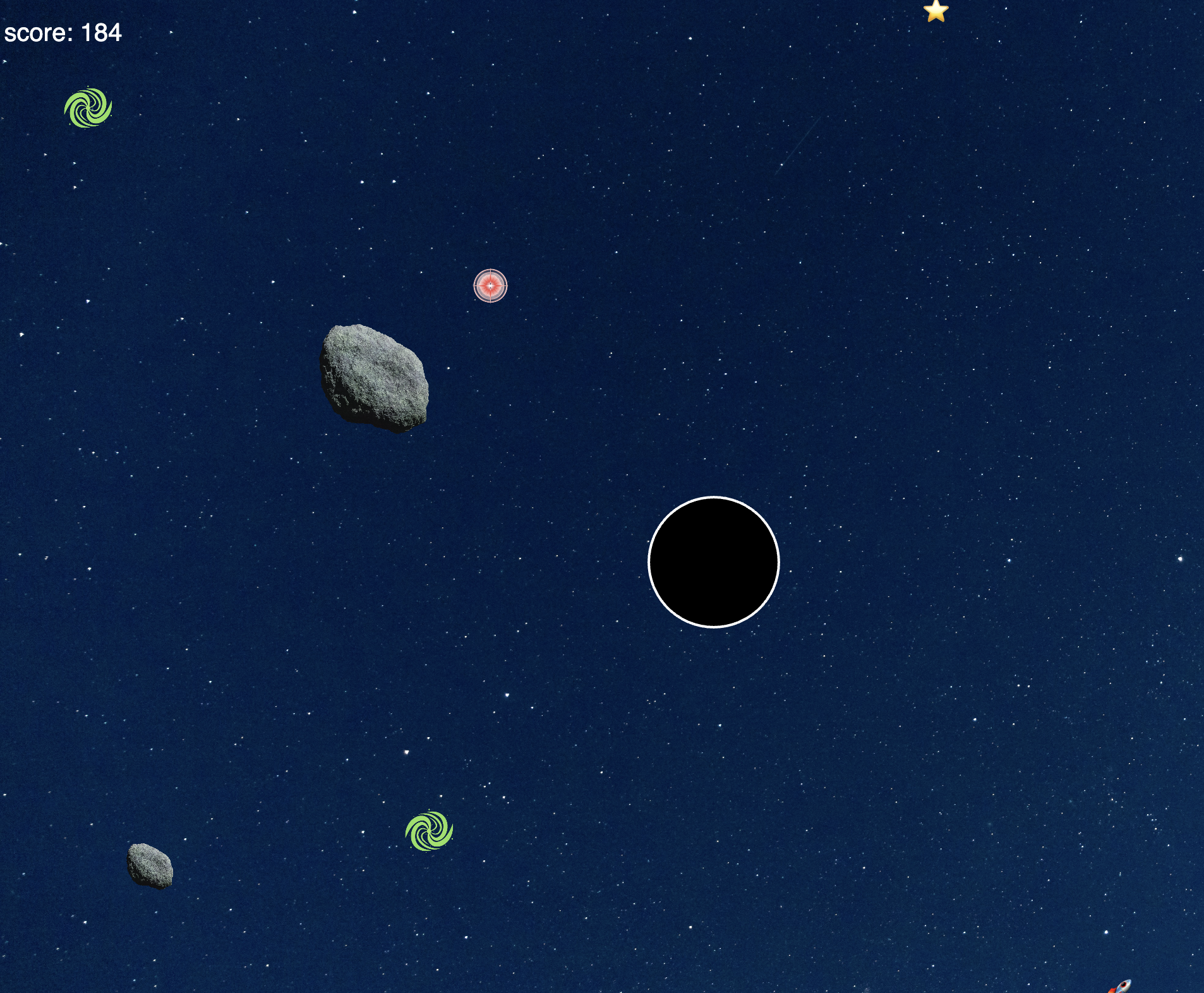
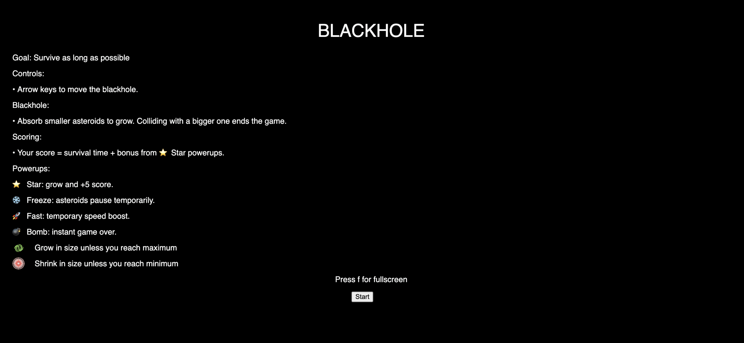
Instructions Screen
Game Screen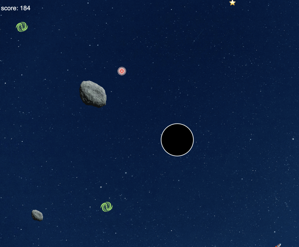
Game Over screen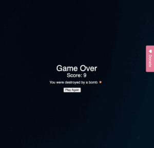
Key Challenges and Solutions
-
Resizing Mechanics
One of the more subtle but tricky challenges I faced was maintaining a consistent visual layout across different screen sizes. A problem I faced was that whenever I would resize on the instructions or Game Over screen, it would give me an error and paint a black empty backdrop. This was because I used noLoop() to freeze the game on both the instruction screen and the Game Over screen. To solve this, I ensured that after resizing, the program would temporarily call redraw function (even when in a noLoop() state) to refresh the layout and correctly reposition all visual elements according to the new width and height.
-
Blackhole and Asteroid size
Another major design challenge came from the scaling mechanics of the Blackhole and the Asteroids. Since the central idea of the game revolves around “eating to grow,” the player’s size could increase infinitely if left unchecked. Thereby, eventually covering the entire canvas and breaking the gameplay. Similarly, large asteroids could spawn that were nearly impossible to avoid or defeat, making the game feel unfair or chaotic.
To address this, I implemented maximum and minimum size constraints for both the Blackhole and the Asteroids. The Blackhole’s growth is now capped at a defined MAX_SIZE, preventing it from expanding beyond the playable area, while asteroids are spawned within a limited size range relative to the player’s current size. This balancing ensures that gameplay remains challenging yet visually coherent.
Potential Developments
While I’m proud of the current version of Blackhole, there’s plenty of room for evolution.
-
Improved Scoring System:
Currently, the score depends on survival time and the number of stars collected. In the future, I’d like to integrate the player’s size into the scoring formula (though my earlier attempts caused the score to grow too rapidly to track meaningfully).
-
Explosive Powerups:
Introducing a special powerup that destroys all asteroids within a radius could add an exciting burst element and reward risky gameplay.
-
Dynamic Difficulty:
Over time, the game could progressively increase asteroid speed or bomb spawn rate, keeping the challenge alive as the player grows.