Duet Dance is an interactive, dual-player dance-themed survival game that blends physical input, digital animation, and music into a single cohesive experience. The project uses Arduino as the physical interface and p5.js as the visual environment, creating a tangible game where players control two dancing characters using a physical rotating disc.
Instead of conventional keyboard or mouse input, movement is driven entirely by a hardware wheel connected to a potentiometer. As the wheel rotates, Arduino measures the analogue values, converts them into angle readings, and sends them to p5.js through serial communication. These readings position two characters on a circular track, mirroring a ballroom “duet dance.”
During gameplay, petals fall from above, and the player must rotate the wheel to prevent the dancers from colliding with falling objects. The game combines:
Physical movement (wheel rotation)
Audio reactivity (LEDs flashing on musical peaks)
Visual animation (dancers rotating gracefully)
Survival gameplay
This creates a playful duet between physical interaction and digital performance.
The core principle behind Duet Dance is physically embodied interaction. Instead of pressing buttons, players rotate a disc, mimicking the motion of turning a vinyl record or spinning a dance partner. This physicality makes the movement more intuitive, rhythmic, and engaging.
User rotates the wheel
Arduino reads potentiometer
p5.js moves the dancers
Falling petals appear
LEDs respond to music beats
Player attempts to survive as long as possible
Arduino:
On the hardware side, Arduino handles:
Input: Potentiometer reading (0–1023)
Output: Red and green LEDs toggled according to music beats
Serial Communication: Continuous two-way messaging with p5.js
The Arduino handles three primary responsibilities within the system. First, it continuously reads the analog input from the potentiometer and sends the corresponding values to the p5.js sketch, ensuring smooth and accurate control of the rotation mechanic. Second, it receives beat indicators from p5.js sent as a boolean (either a 0 or 1). It uses these signals to toggle between the red and green LEDs, creating a synchronized lighting effect that reacts to the music. Finally, it maintains a consistent serial handshake with p5.js, ensuring stable, real-time communication between the physical hardware and the digital interface.
// start the handshake
  while (Serial.available() <= 0) {
    digitalWrite(LED_BUILTIN, HIGH); // on/blink while waiting for serial data
    Serial.println("0"); // send a starting message
    delay(300);            // wait 1/3 second
    digitalWrite(LED_BUILTIN, LOW);
    delay(50);
  }
}

void loop() {
  // wait for data from p5 before doing something
  while (Serial.available()) {
    digitalWrite(LED_BUILTIN, HIGH); // led on while receiving data

    int beat = Serial.parseInt();  // 0 or 1
    if (Serial.read() == '\n') {
      if (beat == 1) {
        // toggle LED state
        currentColor = !currentColor;
      }
      digitalWrite(redLedPin, currentColor ? LOW : HIGH);
      digitalWrite(greenLedPin, currentColor ? HIGH : LOW);


      int sensor = analogRead(A0);
      delay(5);
      Serial.println(sensor);
    }
  }
The p5.js sketch is responsible for managing the entire visual and interactive experience of the game. It handles the visual display, including the background, dancers, and falling petals, while also performing FFT analysis and peak detection to synchronize elements of the game with the music.
Core game logic such as the start screen, active gameplay, and game-over state is controlled within the sketch, alongside character rotation driven by real-time data received from the Arduino. The system also performs collision detection, updates the score, and sends beat signals back to the Arduino to trigger LED responses.
Several key mechanics shape the gameplay: the potentiometer value is mapped from 0 to 1023 to a full 0 to 2π rotation for smooth and fast circular motion; the two characters are placed directly opposite each other at 180 degrees; new falling objects spawn every set interval; collisions with petals end the game while successful dodging increases the score; and the LEDs blink in response to musical peaks detected through FFT analysis.
if (!port.opened()) {
    text("Disconnected - press space to connect", 250, 30);
  } else {

    ////////////////////////////////////
    //READ FROM ARDUINO HERE
    ////////////////////////////////////
    let data = port.readUntil("\n");
    if (data.length > 0) {
      // We received a complete line, split the message
      let fromArduino = split(trim(data), ",");
      if (fromArduino.length == 1) {
        angle = int(fromArduino[0]);
      }

      //////////////////////////////////
      //SEND TO ARDUINO HERE (handshake)
      //////////////////////////////////
      let sendToArduino = (sendBeat ? 1 : 0) + "\n";
      port.write(sendToArduino);
    }
    sendBeat = false;
  }
Arduino to p5.js Communication
The communication between Arduino and p5.js relies on a continuous serial handshake that enables smooth, real-time interaction. Arduino constantly sends potentiometer readings (formatted as sensor-data\n) to p5.js, which reads these values using readUntil(“\n”) to determine the dancers’ rotational position. On the other side, p5.js performs FFT-based sound peak detection and sends beat (either a 0 or 1) back to the Arduino. Upon receiving these indicators, the Arduino responds by toggling the red and green LEDs, creating lighting feedback synchronized with the music. This bidirectional exchange ensures that hardware inputs and digital outputs remain tightly synchronized throughout gameplay.
6. Challenges Faced
One of the major challenges in this project was ensuring that the potentiometer values were transmitted from Arduino to p5.js without delay. In early iterations, the rotation on-screen lagged behind the physical movement of the wheel because there was no communication loop but only a conditional statement. The Arduino was sending data inconsistently, and p5.js was not reading each line of serial input efficiently. To solve this, I refined the serial communication structure by implementing a clear, continuous handshake and using while loop on the arduino side to avoid partial or broken readings. This created a steady flow of data between the two systems, allowing the dancers’ rotation to update smoothly in response to real-time physical movement.
Another challenge involved the physical setup, specifically, securely attaching the potentiometer to the wheel so that its rotation accurately corresponded to what happened on-screen. Initially, the potentiometer would slip and the wheel would rotate independently of the potentiometer, resulting in no characters moving. I experimented with several mounting methods, including tape, cardboard supports, and temporary adhesives, but none provided the stability needed. Eventually, I created a more secure mechanical design and connection using wires to attach potentiometer to the wheel. This ensured the wheel turned the potentiometer directly and consistently. Once this was fixed, the rotation displayed in p5.js finally matched the physical motion of the disc, creating a reliable control mechanism.
A third challenge emerged when integrating the audio analysis into the project. While testing the sound input, I realized that the peak detection in p5.js was not registering any audio spikes using the default settings of p5.PeakDetect(). Even when the music clearly had strong beats, the system failed to detect them, which meant the LEDs were not responding to sound as intended. After investigating further, I found that the default sensitivity and frequency range were too broad for the type of audio being used. To address this, I manually adjusted the parameters and set a more appropriate threshold.
7. Code I’m Proud of:
One part of my code that I am particularly proud of is the implementation of p5.js’s sound analysis tools, especially because we never learned these functions in class and I had to explore and understand them independently. I incorporated an FFT (Fast Fourier Transform) object and paired it with a p5.PeakDetect function. I configured with specific frequency and threshold values to isolate beats in the music track. By linking the FFT to the audio input and using peakDetect.onPeak(triggerBeat), I created a custom callback that activates whenever a peak is detected. Inside the callback, the triggerBeat() function sets sendBeat = true, which then sends a signal to the Arduino to toggle the LEDs in sync with the music. I am proud of this implementation because it demonstrates my ability to extend the project beyond what was taught, integrate real-time audio analysis, and create a visual LED effect using it.
fft = new p5.FFT();
  peakDetect = new p5.PeakDetect(50, 150, 0.15);
  fft.setInput(song);
  peakDetect.onPeak(triggerBeat);

function triggerBeat() {
  sendBeat = true;
}
8. Link to Resources
https://editor.p5js.org/creativecoding/sketches/BkBnH1qlN: This reference helped me understand how FFT and peak detection work in p5.js, allowing me to incorporate real-time music analysis into my project. It guided me in configuring frequency ranges, thresholds, and callbacks to detect beats accurately.
https://www.youtube.com/watch?v=8kGl2Yd-clI: This video was essential for learning how to build a functional steering-wheel mechanism using a potentiometer. It showed how to connect and stabilize the hardware so it accurately reflects movement on-screen.
9. Future Improvements
Looking ahead, one potential improvement for Duet Dance is to introduce multiple difficulty levels that adjust both the speed and frequency of the falling objects. This would make the game more engaging for a wider range of players, from beginners to experienced users, and add an element of progressive challenge that encourages repeated play. Another area for enhancement is the hardware interface itself; currently, the single potentiometer limits the type of movement the player can perform. Incorporating a more advanced input device could allow for smoother, more precise control and even open possibilities for multiplayer interactions, further enriching the physical-digital experience.
10. IM Showcase
The project was presented at the NYU Abu Dhabi Interactive Media End of the Semester Showcase. These are some of the pictures and videos from the exhibition.
When I was younger, I loved buying small packets of seeds and trying to grow different flowers, even though most of them never survived in the dry soil of the UAE. I remember checking on them every day and watering them, moving them around for sunlight, and hoping each time that a sprout would appear. Even though many of these attempts failed, the process itself was exciting, and it sparked a fascination with plants that stayed with me. The Plant Care Station grew directly from that childhood experience: it is my way of recreating the joy, curiosity, and trial-and-error learning that I felt when I tried to care for real plants.
Concept
The Plant Care Station, is an interactive experience that allows users to experience the basic steps of caring for a plant using arduino sensors and creative digital feedback through p5. The concept blends physical interaction with a digital narrative. For instance, users provide sunlight, water, fertilizers and leaf maintenance to a virtual plant by triggering corresponding sensors in the physical setup. Light sensors respond to flashes of brightness, a moisture sensor detects watering actions, and a capacitive sensor tracks leaf trimming. Each successful step of taking care of the plant advances the user through a series of stages, visually reflecting the plant’s growth and wellbeing. The goal of the concept is to make plant care feel engaging, intuitive, and educational by transforming everyday actions into an interactive journey.
Implementation: Interaction Design
The interaction design of my project mainly involves elements of p5.js that responds directly to sensor input (digital and analog) from the Arduino. Each stage from sunlight, watering, to leaf-trimming has its own visual environment and logic, and the user’s physical actions with the sensors determine how the the sketch moves forward.
The light sensors trigger progression when the brightness crosses a defined threshold, making the sun figures appear larger and brighter in the p5 program. The moisture sensor stops updating once the soil reaches the required moisture level, based on our defined threshold that was set during testing. Lastly, the capacitive sensor on both sides of the scissors detects transitions from “NO_TOUCH” to “TOUCH” to count how many leaves the user has pruned. This design ensures that the interaction feels responsive and purposeful.
Arduino Code:
#include <CapacitiveSensor.h> // we are using the CapacitiveSensor library so we can use capacitive touch sensing this is measuring changes in capacitance

CapacitiveSensor capSensor = CapacitiveSensor(8, 7); // here we make the cap sensor object whic uses pins 8 and 7 ans the send and recieve pins
const int TOUCH_PIN = 2;// this is the pin which we have the foil touch connected

const int ledPins[4] = {12, 11, 10, 13}; // these are all the pins we have dedictedm for the leds

bool partyMode = false; //party mode is set for the order in which the leds are lit
int currentLED = 0; //index of the current led starts from 0 ends at 3
int waveDirection = 1;   // wave direction varaible alternates between 1 and -1 for the order in which the leds wave is lit
unsigned long lastUpdate = 0; //stores the last time the leds were updated


const int waveInterval = 30; // adjust to 20 for fast led change


void setup() {
  Serial.begin(9600);  //settung the serial connection at 9600 baud so ard can talk to p5
  pinMode(TOUCH_PIN, INPUT_PULLUP); // this allows for the conductive contact: when touched- reads HIGH when not reads LOW

  for (int i = 0; i < 4; i++) {//looping over all the led light
    pinMode(ledPins[i], OUTPUT);
    digitalWrite(ledPins[i], LOW); //turn off initialluy
  }
}


void loop() {

  int soil = analogRead(A4); delay(2); // for the soil moisture senor
  int a0 = analogRead(A0); delay(2); // light sensors
  int a1 = analogRead(A1); delay(2);//light sensors
  int a2 = analogRead(A2); delay(2);//light sensors
  int a3 = analogRead(A3); delay(2);//light sensors

  long capValue = capSensor.capacitiveSensor(30); //number of samples set to 30, after testing found this was the best value that did not compromise the speed and had good enough accuracy
  bool touched = (digitalRead(TOUCH_PIN) == LOW); //reading of digital pin 2 LOW--> baiscally indicated contact
//send all readings to Serial for p5
  Serial.print(soil); Serial.print(",");
  Serial.print(a0); Serial.print(",");
  Serial.print(a1); Serial.print(",");
  Serial.print(a2); Serial.print(",");
  Serial.print(a3); Serial.print(",");
  Serial.print(capValue); Serial.print(",");
  Serial.println(touched ? "TOUCH" : "NO_TOUCH");


//here we listen for commands from P5
  if (Serial.available()) {
    String cmd = Serial.readStringUntil('\n'); //check for incoming data stop when you find a new line
    cmd.trim();//break there

    if (cmd == "LED_ON") { //we send this from p5 when we reached the last page
      partyMode = true; //turn party mode on for leds
      currentLED = 0;
      waveDirection = 1;// move leds on from left to right
    }
    else if (cmd == "LED_OFF") {
      partyMode = false;//turn party mode off for leds
      for (int i = 0; i < 4; i++) digitalWrite(ledPins[i], LOW);//one by one
    }
  }


if (partyMode) { //light turning on order
    unsigned long now = millis();
    const int blinkInterval = 120; // adjust speed here

    if (now - lastUpdate >= blinkInterval) { //checking the time intervals beywen leds lit

        static bool ledsOn = false; //in every blinkInterval we toggle whether leds should be on or of
        ledsOn = !ledsOn;  // toggle on to off

        for (int i = 0; i < 4; i++) {//loops through all 4 LEDs
            digitalWrite(ledPins[i], ledsOn ? HIGH : LOW); //true set high false set low
        }

        lastUpdate = now; //refresh the last updated time fpr the next toggle
    }
}


  delay(5);
}
Description and Main functionalities: My Arduino program combines multiple sensors (analog and digital) and LED effects to communicate with a p5.js sketch and create interactive plant care visuals. It uses the CapacitiveSensor library to detect touch through changes in capacitance , while a separate foil touch sensor on pin 2 provides a simple digital touch reading. Four LEDs connected to pins 12, 11, 10, and 13 are controlled through a party mode system that makes them blink together when triggered by p5.js. In the main loop, the Arduino continuously reads data from the soil moisture sensor (A4), four light sensors (A0–A3), the capacitive touch sensor, and the foil touch input. All these sensor values are then sent over Serial at 9600 baud to p5.js in a comma-separated format- which was helpful for debugging especially with the soil moisture sensor when the wires would come off. The code also listens for incoming Serial commands from p5, such as our ending LED-ON which activates party mode, causing all LEDs to flash on and off . A small delay at the end stabilizes the sensor readings and controls the noise.
Schematic:
P5 Description:
1. Serial Communication & Sensor Integration
The p5.js sketch’s main logic that makes this game interactive is built around serial communication with the Arduino. The sketch kind of acts as the visual and interactive front-end for plant-care data. For every frame the program checks whether the serial port is open, reads a full line of comma-separated values, and parses seven different sensor readings: soil moisture, four light sensors, a capacitive sensor, and the foil touch state. These values drive the logic of each game stage from light balancing to watering and pruning. The code also sends signals back to the Arduino using simple text commands such as “LED_ON”, “LED_OFF” allowing the arduino side(specifically the LED) to respond to the user’s progress. This bidirectional setup makes the interface feel alive, creating a tight feedback loop between the digital visuals and real environmental interactions.
2. Recursive Tree System (Inspired by Decoding Nature Lectures)
A major visual element of my p5 sketch is a dynamic, recursive tree -inspired directly by concepts from the Decoding Nature course lectures. Each game page grows to a more mature tree configuration, by changing trunk thickness, branch angles, branch scaling, blossom density, and root structure. The trees are generated using a recursive branching function that draws a segment, translates upward, and then splits into multiple smaller branches with subtle randomness. The result is a nature-inspired visualization built from mathematical rules, but artistically tuned to feel alive and expressive.
3. Additional Interactive & UI Features
Beyond the analog and digital sensors and trees, the sketch builds a complete game like some functions that make animated text, responsive buttons, confetti celebrations, and stage-based UI transitions. Each page has its own layout, and unified design for the buttons, and a modern interface with moving characters for the titles. The bouncing text titles adds a playful touch. The sketch also has an input field that allow the user to specify how many leaves they expect to prune- by observing the darker color leaves. Confetti bursts appear when a light sensor zone is completed, rewarding the user visually and allowing them to move to the next round. Throughout the experience, actions like watering, pruning, and finishing a session are tied to both sensor readings and visual transitions, giving users a feeling of caring for a plant step by step, both physically and digitally.
Embedded Sketch:
Communication Between Arduino and P5:
The communication between the Arduino and p5.js begins as soon as the sketch loads. This is when p5 creates a serial port object and tries to open the port at a baud rate of 9600. Once the port is open, p5 continuously listens for incoming data in the draw loop. The Arduino in return sends a full line of comma-separated sensor values: soil moisture, four light readings, capacitive value, and foil-touch state. This is then read by p5 using the readuntil where we stop at /n for new lines. It then updates into its variables each frame. As the user interacts with the interface, p5 interprets these sensor values to move the game logic forward and visuals, such as lighting suns, filling the soil bar, or counting pruning events. Communication also flows in the opposite direction: when the user reaches certain milestones for exaple like completing the session, p5 will send back the commands to Arduino using port.write , such as “LED-ON” and trigger celebratory LED behavior. This back-and-forth loop of sending sensor data from Arduino and sending commands from p5 creates a synchronized, interactive experience tightly linking physical actions with digital responses.
Parts I am Particularly Proud of:
At the start of the project, I had no experience working with sensors like the the soil moisture sensor, so even understanding their raw readings felt overwhelming. I didn’t know how to interpret the values, how to calibrate them, or how to integrate them into meaningful interactions. Through tutorials, schematics, documentation, and simple testing sketches, I gradually learned how each sensor behaved and what its data actually meant. This process helped me understand how to map their values into thresholds, smooth out noise, and ultimately use them confidently within my project.
I am also particularly proud of the physical design work . Using the laser cutter, I built a wooden enclosure for the plants and the tools(scissors, water and flash light). This was my first time designing designing something like this, and learning how to convert a digital sketch into precise vector cuts was incredibly rewarding. In addition, I used Tinkercad and the 3D printer to design small globe pieces that sit over the LEDs and act as tiny diffusers, creating a fun disco-style glowing effect during the celebration mode. These handmade physical elements added personality to the project and made the final interaction feel more polished and playful.
Struggles:
One major challenge was scaling the interaction by switching from an Arduino Uno to an Arduino Mega so I could add more sensors, such as piezo inputs, but the process was difficult, and I accidentally burned the Mega while troubleshooting wiring. Another struggle came from the fabrication side: when designing LED covers, the 3D printer malfunctioned and could only produce partial hemispheres instead of full spheres, which limited the effect I originally envisioned. These setbacks were frustrating in the moment, but they pushed me to adapt quickly, rethink my design choices, and find creative workarounds.
Areas of Future Improvement:
In the future, I would love to expand the project by integrating different, more advanced sensors that could make the plant-care experience even more immersive. Adding sensors like temperature probes, humidity sensors, airflow detectors, or even distance/gesture sensors could enrich the interaction and make the plant feel more “alive.” For example, a temperature sensor could simulate climate effects, a humidity sensor could influence plant hydration, or an ultrasonic sensor could let users wave their hands to create virtual wind. Exploring these cooler sensors would open up new possibilities for storytelling, responsiveness, and deeper environmental simulation within the project.
Resources and Credits
Throughout this project, I relied on a variety of resources that supported both the technical development and creative direction of the Plant Care Station. I followed several online tutorials—linked below.
I also used AI (ChatGPT) in two key ways: first, to refine the visual design of the interface by helping me choose cohesive color schemes and polished button styling; and second, to analyze batches of raw sensor readings from the serial monitor so I could determine reliable thresholds for light, moisture, and touch detection. These tools and references collectively helped shape the final project, balancing hands-on experimentation with guided learning.
Here’s an example of what those blocks of code look like:
function styleLeafInput(inp) {
  inp.style("padding", "10px 14px"); // inner spacing for comfortable typing (chatgpt design choice)
  inp.style("font-size", "18px"); // readable font size
  inp.style("border-radius", "999px"); // pill-shaped rounded input (chatgpt styling suggestion)
  inp.style("border", "2px solid " + COLOR_ACCENT_SOFT); // soft accent border for aesthetic consistency
  inp.style("outline", "none"); // removes default browser outline
  inp.style("font-family", "Poppins, Arial, sans-serif"); // clean modern font (chatgpt ui recommendation)
  inp.style("box-shadow", "0 3px 10px rgba(136, 182, 155, 0.35)"); // subtle shadow for depth (chatgpt design touch)
  inp.style("background-color", "#FFFFFF"); // white background for high readability
  inp.style("color", COLOR_TEXT_DARK); // dark text for good contrast
}
Inspired by Season 2 of the Netflix series Arcane, this project offers an interactive experience that incorporating subtle references to the show. Found in the game page (state is playing) is a colorful sphere, floating in a dark space, inspired by the “Wild Rune”, introduced as a seed of destruction and chaos.. In the series, this is an unstable, magical object that is constantly distorting and causing chaos around it. For this reason, in my project, this sphere will be open to drastic changes. While it is in a constant state of rotating flux, the player must adjust its size, growing it and shrinking it, until it reaches the “ideal size” in order to fix the stability of the rune, all while some of the most popular songs from the season’s soundtrack play.
Goal of the game: “Stabilize the Wild Rune”
2. Images of project
Arcade box painted by myselfArcade box with button and potentiometer. Final Project completed
The game begins with the Homepage, a combination of a screenshot taken from the series with illustrations made by myself. Once the players clicks on the lower “s” key on the laptop, they get access to the introduction page, which explains how the game works. Once they click “s” again, they are able to access the game playing state.The sphere begins at the runeSize, or the initial size. Since the sphere was set in a completely black background and the sphere was layered with a thick stroke, this gives the initial illusion that the sphere is not present. Once the user twists the potentiometer, they are able to make the sphere grow larger or smaller according to the potentiometer’s position. If the user grows or shrinks the sphere past the allowed sizes, a red LED turns on only as a warning.Once they find the “winning” size, the green LED flicks for a moment before the player is transferred to end screen and congratulated for their efforts. This page also contains important information regarding the following steps that must be taken, which is clicking on any key to return to the homepage, and returning the potentiometer back to the initial position so the next user can play.
5.2 Description of Arduino code + code snippets + add link to Github full code
In the Arduino Uno, the main interactions consist of sending information to p5 from the potentiometer, and the button. At the same time, it introduces essential information from the LEDs, such as their pin location in the Arduino board, or microcontroller board, the pinMode, and digitalWrite that allow P5 to understand how to proceed when each of the LEDs is on, off, and how they must begin the interaction once while(Serial.available()= is executed.
Other important snippets from the code include the “if statement” that contain information regarding the state of the button, whether it is off or on, and what was the last button state.
int lastButtonState = 0; // LOW or GND when pressed

int winLedPin = 7;
int loseLedPin = 4;

// lose = red LED
//win = green LED

void setup() { // setup code

// Start serial communication so I can send data over the USB connection to my p5js sketch
  Serial.begin(9600);
  pinMode(button1, INPUT_PULLUP);
  pinMode(LED_BUILTIN,OUTPUT);

  pinMode(winLedPin,OUTPUT);
  pinMode(loseLedPin,OUTPUT);

}

void loop() {

    while(Serial.available()){
      digitalWrite(LED_BUILTIN,HIGH);

      int win = Serial.parseInt();
      int lose = Serial.parseInt();

      if(Serial.read() == '\n'){

       digitalWrite(winLedPin, win);
        digitalWrite(loseLedPin, lose);


        // digitalWrite(loseLedPin, lose);
      int buttonState = digitalRead(button1);
     delay(5);
      if (buttonState == LOW && lastButtonState == 0) {
      lastButtonState = 1; // BY Gemini. To make sure the code doesn't miss when one presses the button

      }
      else if
        (buttonState == LOW && lastButtonState == 1){
          lastButtonState = 0;
        }
While every line of code matters in programming and is an essential component that contributes to the success of a project, I found these blocks of code to be the most challenging yet crucial fragments of my game.
The first block shown below contains the functions, variables, and statements necessary for the game’s main objective. The “if statement” was built so that: 1) if the rune size (sphere) was larger than 275, the red LED would turn on as a warning, as well was any value under 100. This function also connected with the Arduino, with the “lose” and “win” acting as the states of the LED. Meaning, if lose = 1, the red LED turns on, the green remains off, and will only change if the size is adjusted. On the other hand, if the player “wins”, the red LED remains off, and the green LED turns on, then turns off again when this is no longer true, or to be more specific, when the player is on the ending screen. Lastly, if neither of these statement are true, if the player is not winning or is not above or below the limit sizes, then the LEDs will remain off , otherwise known as the “safe zone”.
The second block was essential to receive the information from Arduino in order to make the button change the song playing upon clicking. By using an “if” statement contains the lastButtonState, playNextSong, and introducing the sections in which the songs would play (when “playing” mode is activated), this allowed for a smooth processing of data and making sure the songs would change only after clicking the button.
The third block is the initial foundation of the game, a Class made to design the sphere and facilitate its use in the main sketch. By implementing all the layers from the shaders in separate files (normalShader.frag, and normalShader.vert), and introducing all the lines of codes I learned from the tutorials, I made the sphere rotate on its own, added a large number to the strokeWeight of the lines around the sphere to give the illusion of multiple fragments making up the object, and set the size open to transform only when the player twists the potentiometer.
  if (rune.size > 375 || rune.size < 100) {
    lose = 1; // RED LED turns on
    win = 0; // GREEN LED is off

    let sendToArduino = win + "," + lose + "\n";
    port.write(sendToArduino);
  }

  // sphere the perfect size between 290 and 300 "win"
  else if (
    rune.size >= 295 &&
    rune.size <= 300 &&
    runeSize >= 295 &&
    runeSize <= 300
  ) {
    lose = 0; // RED LED is off
    win = 1; //GREEN LED turns on
    wonGame = true;

    let sendToArduino = win + "," + lose + "\n";
    port.write(sendToArduino);
    //print (sendToArduino);

    gameState = "end";
  }

  // Safe zone: not winning or losing
  else {
    lose = 0; // RED LED is off
    win = 0; // GREEN LED is off

    let sendToArduino = win + "," + lose + "\n";
    port.write(sendToArduino);
    //print (sendToArduino);
  }
} // END OF ELSE STATEMENT
let fromArduino = split(trim(data), ",");
      if (fromArduino.length == 2) {
        sensorValue = int(fromArduino[0]); // Keeps this updated always
        buttonState = int(fromArduino[1]);

        // play songs if state is in playing or in instructions
        if (
          buttonState === 1 &&
          lastButtonState === 0 &&
          (gameState === "playing" || gameState === "instructions")
        ) {
          playNextSong();
        }

        lastButtonState = buttonState;
      }
5.4 Description of communication between Arduino and p5.js
From Arduino to P5
The arcade button allows the users to change the songs played in the background while the “game state” is active. Found in an array, each song plays on infinite loop while it runs in the background, and will only change when the player clicks the button.
The Potentiometer allows the users to change the size of the sphere. After connecting Arduino UNO on p5, once the user presses “start”, the user is able to increment or decrease the size of the sphere by twisting the potentiometer.
From P5 to Arduino
If the player grows the sphere past a specific radius on the p5 canvas (above 375), a red LED light will turn on. Once the sphere shrinks back to the “SAFE ZONE” or return to the home page, the LED will turn off.
Similarly, if the player shrinks the sphere past a specific radius on the canvas (below 100), the red LED light will turn on. Once they grow the sphere back to the “SAFE ZONE” or return to the home page, the LED will turn off.
When the player keeps the sphere at a certain size (between 295 and 300) for a few seconds, a green LED light turns on and takes the user to the “winning” page. The LED then turns off.
6. What are some aspects of the project that you’re particularly proud of?
One of the main aspects of the project that I am proud of is the p5 to Arduino bidirectional communication. Once the game starts running, without the data of the potentiometer on Arduino to p5, adjusting the size with just a p5 slider would be far too simple. However, the potentiometer adds a whole new layer of value that engages the user through a hands-on practice. Only once this transfer of information was made, it was possible to make the LEDs react to what was happening to the sphere. I found this process fascinating, how an action happening on the screen triggered by an action on a physical, adjustable object (potentiometer), could cause a reaction back on another tangible object (the LEDs). Doing this offered me a glimpse to how the logic behind the arcade games I used to love as a kid work, and reinforces the pride of being a human who can accomplish so much with a. few circuits and programming platforms. While it is not the most advanced game system, I am very happy with the outcome, and making this bidirectional exchange after having no previous experience in coding makes me feel proud of my progress,
8. AI Tools Reference (How they were used and where)
function preload() {
//... rest of code
  normalShader = loadShader("normalShader.vert", "normalShader.frag"); //Allows lights, shaders, textures, in 3D objects.

}

///////////////////////////////////////////////////////////
function restartGame() {
//... rest of code

  sensorValue = 0;
  runeSize =130;

}

/////////////////////////////////////////////////////////////
function draw() {
  background(51);

  readArduino();
  //... rest of code

} // END of draw()

//------- Arduino + Sphere Game -----------------
function drawGame() {
  background(5);

  // resetMatrix(); by ChatGTP so that the arduino button will appear despite the differences of the WEBGL
  if (!port.opened()) {
    push();
    resetMatrix();
    //... rest of code


    }
  } //... rest of code
}
////////////////////////////////////////////////////////////
function drawHome() {
  resetShader(); // disable 3D shader so text can be drawn
  noLights();
  //runeSize=130;

  push(); // Drawing the fullscreen cover image
  translate(-width / 2, -height / 2); // move image to top-left for WEBGL
  translate(0, 0, -30);
}

////////////////////////////////////////////////////////////
function drawEndScreen() {
  if (port.opened()) {
    port.write("0,0\n");
  }

//... rest of code
  }
}

///////------ TO PLAY NEXT SONG----------------////////////////
function playNextSong() {
  // Stop all songs
  for (let s of songList) {
    if (s.isPlaying()) s.stop();
  }

  // Go to next track
  currentSong = (currentSong + 1) % songList.length;

  // Loop the new track
  songList[currentSong].loop();
}

//////////////////////////////////////////////////////

function readArduino() {
  //... rest of code
}
The use of ChatGTP and Gemini was used specifically to assist me organizing my code as I advanced in my project, fix a few problems I was facing that prevented the code from running or affected some aspect of the project, and adding a few lines of codes when there was no other resource that could fix an issue.
Shaders for 3D Shapes
To create the colors shown in the sphere, originally I used this tutorial https://www.youtube.com/watch?v=GYFiu7nLTak as reference and from there I started to read all the instructions in the p5 3D object instructions, and information about types of shaders. Initially I was going for a normalMaterial(); shader to create the colorful layer (check the references section to see all the links). However, I also wanted the sphere to have changes in its brightness to add more realism, just as the Wild Rune appears in the Arcane series. This is when I shifted my focus to the baseMaterialShader, since in one of the examples provided https://p5js.org/reference/p5/baseMaterialShader/ it contained all the properties I wanted for my own sphere. Nevertheless, I faced two problems with this:
I wanted these elements from the shaders to apply in a Class, since I wanted the main focus on the sketch to be the Arduino and P5 exchange.
Given that we had only learned how to work with 2D objects, layers, and other variables in class, I struggled to understand how to apply the variables present in the baseMaterialShader into a smooth sphere, combined with the color patterns from the normalMaterial(); from the tutorial.
This is why I asked ChatGTP to help me combine the foundation functions for the sphere, and the shaders and integrate them into Classes (normalShader.vert) and (normalShader.frag). Basically, the codes in normalShader.frag are elements from GLSL fundamentals, introduced in the Introduction to Shaders of p5. By following the instructions on how to adjust the properties of brightness over the sphere, this Class simplifies some of the fundamental lines of code from the Shaders, such as precision mediump float; which is needed to calculate the values of the floating points, varying vec3 vNormal; which calculates the color in this case, the Uniform makes the values the same for every pixel, and the uBrightness naturally controls the brightness cast on the sphere.
And for normalShader.vert, this Class focuses more on the general aspects of the sphere, with the aPosition focusing on the position of every vertex in the 3D space in x,y, and z positions, the aNormal which focuses on direction, and the attribute that assigns each vertex its own value.
Winning State and Resetting Sphere Values
After I achieved to make every state of the game function effectively (Homepage, Instructions, drawGame, and end page/winning), I realized a new problem had emerged, one that took me a long time to resolve. After growing the sphere to the “winning” size and ending the game, I noticed that every time I wanted to start a new round, the sphere wouldn’t return to its original size, even after returning the potentiometer to the starting position. This caused the sphere to lock itself on the winning position, and no matter how many times I was taken back to the homepage to restart the game, I would be immediately “win”, unable to change the size of the sphere again. After much trial and error, this was the process towards solving this issue.
In the restartGame() function, Gemini suggested to add the sensorValue = 0; runeSize =130; } . With the sensorValue= 0; and the runeSize = 130; the sphere would return back to the original size for the next player, and ensure the value of the potentiometer was at 0 as well.
It also suggested to add the function if (port.opened()) { port.write(“0,0\n”); under drawEndScreen() to make sure the port to the Arduino was functioning and reading the new values after the game ended.
When these changes didn’t work, Gemini pointed out that the Arduino code was only running during the drawGame (the state of the game is “playing”). This meant that the Arduino was no longer reading the new values and was stuck in the last position the sphere was on. For this reason, I added the function readArduino(), containing the lines of code in which P5 would read the information from Arduino UNO that we learned in class: (if (port.opened()) { let data = port.readUntil(“\n”); ….etc).
After this, I wrote down readArduino(); on top of the data in the draw() function so that it would read the information at any state of the experience:
readArduino();
if (gameState == “start”) {
drawHome();
// rest of code
Fortunately this allowed p5 to reset the game’s data and fix the original problem.
Text on WEBGL Canvas
After learning how to create a sphere and how to hold it in a WEBGL as part of the canvas size, I discovered that the text that I had for my home page was not showing, nor the button to connect p5 with Arduino. Despite watching numerous tutorials and doing research on similar 3D works, I couldn’t find the reason of why the text wouldn’t appear. And without understanding what was happening, I couldn’t search for a solution. After reading every line of code and analyzing its effects on the game, I learned thanks to ChatGTP that the text was designed to be layered on a 2D plane, and not a 3D plane which was only meant to sustain the sphere and other 3D objects. By using the resetShader(); and the noLights(); and translating the background images with negative values, I was able to fix the layer for the introduction, the endGame, and the HomePage so that the text would show, all without affecting the “playingState”. These functions allowed to: 1) Reset the shader for the sphere so that it wouldn’t affect the previously mentioned pages, 2) translate the background image behind the text, and adapt the data in spite of using WEBGL.
Changing Songs with Arduino Button
Lastly, after compiling all the songs that would play, while the game was running, into an array (songList), and following the basic structure to play a sound file (https://p5js.org/reference/p5.sound/p5.SoundFile/), my objective was to have this list of songs ready to play, so that every time the user clicked on the Arduino button, they would be able to change the song. However, doing this required a complicated logic.
The songs had to play in an infinite loop, so that every time the song playing ended, it would reset itself and play from the beginning.
The moment the player clicked the button, the old song would stop playing
After the old song stopped playing, the new song would start playing on loop.
All of this had to be executed through the Arduino button, and not through p5
// Go to next track currentSong = (currentSong + 1) % songList.length; // Loop the new track songList[currentSong].loop(); }
And Chat GTP helped me understand the logic behind each line. First, I had to create a function (playNextSong) to play each song, stop the current song if the user clicked the button, look back to the song list and pick the next song in line, play the song and make sure the old song is no longer plating. Once the current song was playing, this would go on a loop.
After doing this, it was just matter of introducing this function into the gameState “playing” so that it would run while the game was running and everything was reset when the game was set to restart, as shown in the block of code below inside fuctionKeyPressed()
function keyPressed()

{ //... rest of code

// Start first song on loop currentSong = 0;

songList[currentSong].loop(); }

else if (gameState === "end") { restartGame();

// stop ALL songs for (let s of songList)

{ if (s.isPlaying()) s.stop(); } } }

///////------ TO PLAY NEXT SONG----------------//////////////// function playNextSong() {
9. Challenges faced and how I overcome them
As previously mentioned, the main challenges I faced were understanding the the logic of Shaders for 3D Shapes, how to fix the Winning State and Resetting Sphere Values, adding text on a WEBGL Canvas, and changing the songs with the Arduino Button. Every time I encountered an obstacle, I tried to first resort to tutorials or other sources in the internet to find a solution. If this didn’t work, I would ask my peers or approach Professor Aya. While I wish I hadn’t resort to using AI platforms, when I did, I made sure that they would always provide long explanations, step by step, and simplify the information so I could understand the logic behind every line of code.
WEBGL ChatGTP aidSongs loop aid from Gemini
Shaders aid from ChatGTP
Shaders 2 aid from ChatGTP
LEDs and P5 to Arduino Exchange
Another challenge I struggled with was with the p5 to Arduino interaction. Initially the intention was for a red LED to turn on when the sphere grew past the size of 400 or under 50. However, despite following the template we learned in class to send the information of the LEDs to p5 on Arduino UNO and applying it to work with my “winning” and “losing” format, the LED’s were not turning on once I inserted them inside the code in which p5 received the information from Arduino.
// Start serial communication so I can send data over the USB connection to my p5js sketch
  Serial.begin(9600);
  pinMode(button1, INPUT_PULLUP);
  pinMode(LED_BUILTIN,OUTPUT);

  pinMode(winLedPin,OUTPUT);
  pinMode(loseLedPin,OUTPUT);

}

void loop() {

    while(Serial.available()){
      digitalWrite(LED_BUILTIN,HIGH);

      int win = Serial.parseInt();
      int lose = Serial.parseInt();
After a long session with Professor Aya, however, I finally understood my mistake.
In p5, I set the minimum size of the sphere to be 50, and the maximum size to be 400. However, my bidirectional exchange was stating that the red LEDs would turn on only if the sphere grew under and above these sizes. Naturally it didn’t make sense for the maximum size to also be the size which the sphere could not grow above of. After realizing the mistake in my logic, we changed the maximum size to be 700, and kept the minimum as 50. On the P5 and Arduino exchange, however, we changed the data so that if the sphere was instead above of 375 or under 100, the red LED would turn on. And the green LED would only turn on when the sphere reached a size between 295 and 300. Once this was fixed along smaller adjustments in Arduino UNO, the program ran successfully.
10. What are some areas for future improvement?
For future improvements, I would explore adding more interactive elements to the game, as the current version feels too simple for my liking. While I did integrate music into the project, one suggestion I received and would definitely implement with more time is the addition of sound effects that indicate whether the player is getting closer to or farther from the correct size, similar to the “warm and cold” childhood games. This would not only guide the player more effectively, but would also make the experience more engaging. I would also consider adding more layers of complexity, such as different difficulty levels or challenges where the player must find not only the correct size but also the correct rotation speed of the sphere. These variations could be presented as different rounds, helping to keep players more engaged over time. Another feature that could enhance the experience is a time-based element, where players attempt to beat the shortest completion time. At the end of the game, all records could be preserved and checked for future interest. Finally, I would like to introduce more interactive controls that allow the player to change additional aspects of the sphere, such as its rotation speed and color, in a way that complements the game’s overall aesthetic.
11. IM show documentation, images, videos, people interacting with your project
For my final project, I created an interactive healthy-choice game inspired by foods and everyday habits familiar in Kazakh culture. It features a girl character positioned at the center of the canvas. The core mechanic involves catching and avoiding falling items that represent healthy and unhealthy choices. Healthy foods such as apples, dates, milk, and water increase the player’s score, while unhealthy items like burgers and Coca-Cola reduce it by 10 points. Different point values are assigned to healthy foods, for example apples and milk give +20 points, while dates and water give +10 to encourage players to visually recognize and prioritize healthier options rather than relying solely on quick reactions.
The game is structured into two alternating phases to maintain engagement. In Phase 1, apples, dates, and burgers appear (food), while Phase 2 introduces milk, water, and Coca-Cola (liquid). Player movement is controlled through real apples connected to Arduino using capacitive touch sensors, with Arduino sending control signals to p5.js. Touching the green apple moves the character left, while touching the red apple moves the character right, translating real-world interaction into on-screen movement. When the timer ends, p5.js communicates back to Arduino to trigger an LED. The Kazakh national music plays during gameplay, reinforcing cultural context and creating an immersive experience that combines physical computing, digital interaction, and culturally grounded storytelling. Adding on that, to hide the wiring and make the project look clean, I built a wooden box that holds the Arduino. The box has the game name engraved on top, apple designs on the sides, and traditional Kazakh ornaments engraved along the bottom and in the corners (please see the picture below)
I am especially happy with my choice of controllers—the apples. While working on the project in the IM Lab, many people were curious about how the game worked and approached me with questions or asked to try it themselves. This led to informal user testing, where I was able to observe how people interacted with the game in real time. From this feedback, I learned how to make the project clearer and more accessible, and I added improved and more descriptive instructions so that first-time players could understand the controls more easily. Many users also mentioned that they enjoyed touching the real apples while playing. Some even pointed out the fresh apple smell, which made the experience feel more engaging and sensory. Please see the first user experience video:
The interaction design of the game relies heavily on embodied physical input through real apples, which successfully bridges the digital and physical worlds. This approach encourages players to engage tactilely with the interface, making the act of moving the character more memorable and immersive than conventional keyboard or touchscreen controls. Observations during testing revealed that the novelty of physically touching an apple, paired with its natural scent, enhances user engagement and creates an intuitive connection between the player’s actions and in-game consequences. This sensory dimension supports learning, as players are more likely to remember which items are healthy or unhealthy when the interaction is multisensory.
Arduino Part:
For the Arduino part I used the following wiring:
Schematic:
Code Snippet:
// Determine if sensors are being touched
    bool rightActive = rightValue > (rightBase + touchOffset);
    bool leftActive  = leftValue  > (leftBase  + touchOffset);


 // Send RIGHT command only when the right sensor is newly touched
    if (rightActive && !rightTouched) {
      Serial.println("RIGHT");
    }
 // Send LEFT command only when the left sensor is newly touched
    if (leftActive && !leftTouched) {
      Serial.println("LEFT");
    }
  // Detect release: touch was active before but now inactive
    bool rightReleased = rightTouched && !rightActive;
    bool leftReleased  = leftTouched  && !leftActive;
// Send STOP only when both sensors are released
    if ((rightReleased || leftReleased) && !(rightActive || leftActive)) {
      Serial.println("STOP");
    }
  // Update current touch state
    rightTouched = rightActive;
    leftTouched  = leftActive;
I really like the part of the Arduino code that checks when the apples are touched and sends commands. It only sends a command when the touch actually starts or ends, which prevents too many repeated messages and keeps the game running smoothly. The code tracks three states: touch started, touch ended, and no touch, making the sensors easy to understand and reliable. By remembering whether each apple was already being touched, the Arduino responds only to intentional actions, so the character in the game moves accurately. This design makes the game feel responsive and natural when players use the apples. To build the capacitive touch sensors, I used the CapacitiveSensor library (Paul Badger’s CapacitiveSensor) and a 1 MΩ resistor, which allows the Arduino to detect even gentle touches on the apples. I also soldered my LEDs to put it into wood box. This setup is effective for creating sensitive, stable input for the game.
function handleFallingObjects() {
    // Generate a new object approximately once every second (60 frames)
    if (frameCount % 60 === 0) {
        generateFallingObject();
    }

    // Iterate backwards to safely remove objects during the loop
    for (let i = fallingObjects.length - 1; i >= 0; i--) {
        let obj = fallingObjects[i];
        obj.y += objectSpeed; // Move object down
        drawObject(obj); // Draw object

        // Collision check
        let d = dist(obj.x, obj.y, charX, charY);
        if (d < (obj.size / 2) + (CATCHER_RADIUS / 2)) {
            handleCatch(obj, i); // Process score and remove item
            continue; // Skip to next item since this one was removed
        }
        // Check if object has fallen off the bottom of the screen
        if (obj.y > height + 50) {
            fallingObjects.splice(i, 1); // Remove missed object
        }
    }
}
I like this part because it keeps the gameplay dynamic and challenging while staying organized. Objects appear randomly, move smoothly, and are removed cleanly when they are caught or missed, which prevents the array from growing unnecessarily. It also checks for collisions in a simple and effective way, making the game feel responsive and fun.
Communication between Arduino and P5.js
The communication between Arduino and p5.js works by sending and receiving serial data. Arduino detects touches on the capacitive sensors and sends commands like left, right, or stop. The p5.js sketch listens for these messages and changes the character’s movement on the screen, creating a seamless interaction between the physical sensors and the digital game. From p5.js to Arduino interaction happens when the game is over, as the LED lights up.
// Serial Data Processing
function readSerial(data) {
    let msg = data.trim(); // Clean up incoming string from Arduino

    // Set movement direction based on serial commands
    if (msg === "LEFT") {
      currentDirection = -1; // Move left
    }
    else if (msg === "RIGHT"){
       currentDirection = 1; // Move right
    }
    else if (msg === "STOP") {
      currentDirection = 0; // Stop movement
    }
}
Challenges and what I am most proud of:
This part of the challenge is handled in the Handle Falling Object, and Generate Falling Object functions. As it was my first time creating the game in p5, where the objects fall down from the top, it was at first hard to manage it. As I started I noticed that too many objects were appearing at the same time or in the same spot, which made it hard for the player to catch anything. To manage how often objects appear, I used the game’s frame count as a timer. The program runs many times per second, and I checked the frame count to create a new object only when it reached a certain number, specifically every 60 frames. Since the game usually runs at 60 frames per second, this means a new object appears roughly once per second. This method made the falling items appear at a steady, predictable pace, giving the player enough time to react and catch them. I also set a random horizontal position for each object within the valid range using random (minX, maxX). What I am proud of is that after these adjustments, the game became much smoother and more playable. Each object now appears evenly across the screen and at a steady pace, making it easier for the player to react. This shows how careful timing and thoughtful use of randomness can improve the gameplay experience.
ChatGPT was used to generate the image for the start and play pages and helping me finding the sources about the capacity touch sensor, to be more specific, by asking ChatGPT: give me more information and tutorials on capacity touch sensor, he gave me this tutorial, which I looked up to understand the wiring and the whole circuit better.
The Game Over page was made using Canva.
The images of the food, liquid and the character was found on the internet, specifically this website.
Future Improvements:
For future improvements, I could make the game more dynamic and engaging by adding different difficulty levels where objects fall faster or in more complex patterns. I could also include more types of items with different point values or effects, like power-ups or obstacles. Another improvement would be to make the character movement smoother or add animations for catching objects to make it feel more responsive. On the Arduino side, I could refine the touch sensors to be more sensitive and consistent, or even add more sensors to allow new types of interactions. Finally, integrating sound effects for each catch or miss could make the game more immersive and fun.
IM Showcase:
Many people tried out my game and they really liked the interaction. Please see the photos below
Describe your concept Mädeniet is an interactive project that teaches people about Kazakh culture through movement. The user stands in front of a webcam and controls 3D cultural objects like asyq, kiiz ui, dombyra, and taqiya. The hand becomes the controller. Simple gestures change rotation, scale, color, and even switch between different objects. The goal is to let people learn about culture in a playful way. When the user moves, the objects feel alive. The experience also includes background music from the Kazakh ensemble Dos Mukasan, and a physical arcade button and NeoPixel ring for extra feedback.
Include some pictures / video of your project interaction Video.
How does the implementation work? The project combines p5.js, ml5.js handpose, 3D OBJ models, and an Arduino with a NeoPixel ring. The webcam sends video to the Handpose model. Handpose finds keypoints on the hand. The p5.js code looks at finger positions and turns them into rotation values, scale values, color changes, and model switching. When a fist is detected, the next 3D model appears. When a peace sign is detected, the ambient lighting color changes. When the user pinches their fingers, the model scales. The Arduino reads the arcade button to start the game. It also reads a number from p5.js that tells which 3D model is currently shown. Based on that number, the Arduino changes the NeoPixel ring color.
Description of interaction design The interaction is simple so anyone can use it. The user raises their hand in front of the webcam.
The gestures:
• Move index finger up or down to rotate the model
• Thumb and index pinch distance changes the model size
• Fist changes to the next 3D model
• Peace sign changes ambient lighting color
• Double tap index finger starts or stops spinning
• Double tap ring finger flips the model
• Double tap middle finger lets the user change music volume by raising or lowering that finger.
A short guide is always shown on the screen. On the left side the user also sees the cultural meaning of the object they are controlling.
Description of Arduino code and include or link to full Arduino sketch The Arduino controls two things:
1. It listens to the arcade button. When the user presses the button, Arduino sends “PRESSED” to p5.js. This starts the experience.
2. It listens for model numbers sent from p5.js. If p5.js sends “0”, “1”, “2”, or “3”, the Arduino updates the NeoPixel ring to the matching color. Each cultural object has a color theme. The ring also has a pre game animation (blue and white) and a wave animation during the game (mixing different colors with white to create a pattern).
Schematic of your circuit (hand drawn or using tool) Description of p5.js code and embed p5.js sketch in post The p5.js sketch loads the 3D OBJ models, the font, and the audio. It sets up Handpose for gesture tracking. It also handles the Web Serial connection to the Arduino. In draw(), the sketch updates rotation, scaling, color, spin, and transitions. It displays the video preview, model instructions, and cultural information.
Description of communication between Arduino and p5.js Arduino → p5.js. Arduino sends the line “PRESSED” when the arcade button is pushed. p5.js reads this line and starts the game or resets it. This lets the physical button control the digital experience. p5.js → Arduino. Whenever the user makes a fist and the model changes, p5.js sends a number like “0”, “1”, “2”, or “3”. Arduino reads that number and updates the NeoPixel ring to the matching color pattern. This creates clear lighting feedback tied to the cultural object on screen.
What are some aspects of the project that you’re particularly proud of?
• I designed creative gestures. For example, the peace sign changes the 3D model color.
• My fist gesture reliably switches between 3D models, which makes the interaction playful and active.
• I combined digital and physical interaction. The NeoPixel ring changes color with each cultural object.
• I included real cultural descriptions so people learn while they play.
• I used Handpose in an expressive way, including pinch scaling, rotation, and double tap detection.
• I built a full installation setup with a laser cut box, arcade button, and headphones, which makes the project feel complete.
• I kept Kazakh heritage at the center of the project.
Use of AI
I used AI throughout the project as a learning tool. It helped me understand how the Handpose model in the ml5.js library works and how to map finger positions to gestures. I was also very interested in WEBGL from the first day of the Intro to IM class. If the professor remembers, during our very first p5.js exercise I was the only student who drew a donut shaped circle using WEBGL. That moment made me want to explore 3D even more. I used ChatGPT to learn how WEBGL works in p5.js and how to combine it with hand tracking. AI also supported me in fixing errors, structuring the code.
What are some areas for future improvement? I want to add voice commands so the user can say simple words like “next” or “back” to change models without using gestures. I also want to improve the hand tracking. The current ml5.js Handpose model struggles with accuracy and does not support two hands. I tested the MediaPipe Hand Tracking library, which works much better and can track both hands at the same time. Using two hands makes size control feel more natural, and it also opens the possibility for new gestures. For example, I experimented with flipping the model by clapping hands together instead of using a ring finger double tap gesture. I would like to explore this approach further and see if I am allowed to use MediaPipe in the final version of the project.
UPD. from IM showcase
It was an amazing experience to see people come and ask questions about my project. I took some pictures and videos, and I installed a large monitor so the project could be viewed more easily for a better experience. I think the Handpose detection was a bit hard for users to understand, even though it felt easy for me since I was the one developing it. Using a different library, such as MediaPipe, would probably make detection much easier for first-time users. The hand gestures like double-bending the index, ring, or middle finger to spin or flip the 3D model, or even manipulating the volume of the background music were fun to implement, but not always intuitive for newcomers. Still, people said it was one of the coolest projects at the IM showcase, so I’m really glad. Right after the showcase, I also had my piano recital, so I was a bit stressed, but everything went well.
This project is a small car that connects to my laptop with a USB cable. Instead of using buttons, I control it with my voice. I say simple words like “forward,” “left,” “right,” “back,” or “stop,” and the car moves instantly. There is also an auto mode that lets the car drive itself while the screen shows what it’s doing.
My goal was to make something fun, hands-free, and beginner-friendly. Some videos of the project interaction can be found below
My laptop runs the p5.js and the Web Speech API. When I speak, the browser turns my speech into text, then the code matches the text to a command. It sends a single letter over the Web Serial API to an Arduino. The Arduino reads that letter and moves the motors to go forward, back, turn, or stop.
A small “health check” in the JavaScript restarts the microphone if it stops listening. This makes the whole loop smooth and fast: I talk → the browser listens → Arduino moves the car.
Interaction Design
The webpage shows everything clearly: whether the car is connected, if the mic is listening, the last command heard, and if you are in auto or manual mode.
A pulsing microphone icon tells you when to speak. Quick onboarding text teaches the basic words. The screen also shows what the system heard, so you know why the car reacted in a certain way.
Arduino Code Description
The Arduino code controls all the movement and safety features of the car. It uses the Adafruit Motor Shield to run four DC motors and two ultrasonic sensors to check the front and back distances. The laptop sends one-letter commands over serial—f, b, l, r, and s—and the Arduino reacts right away.
When a command arrives, the Arduino checks the sensors first. If the car is too close to something in the front and you say forward, the car protects itself by going backward instead. The same logic works for the back sensor. This gives the car a simple but smart safety layer.
Two LEDs show safety states:
Green → safe
Red → danger or warning
The code also includes turning functions that rotate the car in place for about 1 second to make a clean left or right turn. Everything is written in a clear, modular way so you can change speeds, turning time, and safety distances easily.
Below is the full Arduino sketch, which includes motor control, safety checks, distance reading, and serial command handling.
The p5.js code is the control center of the whole project. It listens to your voice, figures out what you meant, and sends a one-letter command to the Arduino. It uses the Web Speech API to hear your words and a fuzzy-matching system so it can understand similar phrases like “go,” “ahead,” or “move forward.” Even small mistakes or accents are handled using a simple distance-matching algorithm.
The sketch draws the full interface: the microphone icon, the last command, auto-mode status, and a short list of voice commands. It also shows what the system heard in real time. If needed, you can use the arrow keys as backup control. The canvas resizes automatically, and there’s a fullscreen button for demos.
The connection between p5.js and the Arduino happens through the Web Serial API in the browser. When you press start button, the browser asks you to choose the Arduino’s USB port. After you allow it, p5.js opens the port at 9600 baud.
Whenever the voice system recognizes a command, p5.js sends a single letter to the Arduino:
f → forward/go
b → backward
l → left
r → right
s → stop
a → auto mode
The Arduino listens on its serial port and reacts immediately to whichever letter arrives. p5.js also sends an s (stop) right after connecting to make sure the car doesn’t move unexpectedly.
This simple one-letter system makes communication fast, reliable, and easy to debug.
What I’m Proud Of
I like the voice system is, at first I was having a lagging in the voice control system , and also getting wrong inputs , so I saw this python system(Fuzzy string matching – Levenshtein distance)., which simplified everything for me. Also the auto-restart loop keeps the mic alive even during long testing sessions. And the UI makes the whole system feel clear and great. These little details make the whole experience smoother.
Future Improvements
Here are some things I want to add:
A wake word, so the mic listens only after a trigger phrase
Smoother motor speed and softer turns
Sensors for obstacle avoidance in auto mode
A stronger chassis with cleaner wiring and a power switch
Logging data to help tune performance over time
REFERENCES: This project used AI tools mainly to support coding and debugging . AI was used to help clarify technical concepts. It assisted in explaining algorithms such as fuzzy matching and Levenshtein distance, and in organizing the projects. The creative decisions, programming logic, user testing, and system design were all done by me, with AI acting only as a supportive tool for communication and explanation.
I asked two of my friends to try the project without giving them any instructions at all. I basically stepped back and just watched how they interacted with it. I wanted to see what they touched first, what they ignored, what they were drawn to, and where they hesitated.
The first user started gently, almost testing the waters, but the moving colors grabbed his attention fast. He pressed the big button and immediately saw his face in the painterly camera view, which made him smile. After that, he began switching modes and taking pictures like it made sense right away. The potentiometer especially got him excited. He kept turning it back and forth and saying how cool it felt that the strokes actually changed with the knob. The only time he paused was when he said it would be really helpful to have a quick three second countdown before the picture is taken so people can pose. Other than that, everything felt natural to him.
The second user had a totally different vibe. He came in pressing buttons really fast just to see what would happen. The system actually handled that well and he picked up the mapping between the controls and the changes on screen pretty quickly. He really liked how turning the knob changed the strokes and even said it felt more physical and satisfying than using a mouse. The only point where he seemed confused was after he saved a photo, because the interface didn’t really say anything. He wasn’t sure if the picture actually saved or how to get back to the live view. That moment definitely needs better feedback.
What felt great
People figured things out by exploring, not thinking.
The hardware controls feel natural — especially the knob!
The color modes make people react emotionally (in a good way!).
What needs to change
Clear photo-save feedback (a flash, message, anything!).
A countdown before capturing the image.
A more obvious return-to-camera cue
What I wanted to explain
I think just two things: which button saves, and how to return after saving. If the UI signals those moments better, the whole experience becomes effortlessly smooth.
Are they able to figure it out? Where do they get confused and why?
My friends were a bit confused what to do in first place. So, I included instructions on top left corner, that by doing a fist they could transition between different 3D models and by using index finger and thumb they could manipulate the sketch.
Do they understand the mapping between the controls and what happens in the experience?
They do understand it. Controls how to use it is already given in the top left corner as instructions, so no problem with that.
What parts of the experience are working well? What areas could be improved? I’m still working on adding new 3D models and adding explanation to each one and how it is specifically tied to Kazakh culture. I want people to learn about Kazakh culture and feel the items, observe them, and etc. I want to do a menu screen, and another instructions screen. Add 3 more Kazakh Cultural elements. Also, more features that would allow to do something interesting with the sketch line draw lines and oscillations and something interactive like this on the background of 3D model. In addition, I will working heavily on Arduino side from now on, I want to make Neopixel Adafruit not just turn a particular color, but make a beautiful pattern, so others on the exhibition will also come to take a look.
What parts of your project did you feel the need to explain? How could you make these areas more clear to someone that is experiencing your project for the first time? I think using a fist to transition between different 3D models is pretty cool idea, and I get to explore hand gestures more. I will try to make instructions constant on the page, in case user forgot, they will always be there. Also, in main menu I will try to explain a bit about the project itself. The project teaches people about Kazakh culture through interactive 3D objects. The user moves their hand in front of the webcam and controls a 3D asyq, kiiz ui, dombyra, taqiya in real time. Hand rotation and hand openness change rotation, scale, and animation of the models. The goal is to make cultural objects feel alive and playful. Handpose in p5.js finds key points on the user hand. The code maps these points to rotation and size values. The 3D models load from external OBJ files. The models update their rotation and scale on every frame based on hand movement. The interaction is simple so anyone can explore the cultural objects. The user brings their hand into the camera. Turning the index finger rotates the model. Bigger pinch between thumb and index distance makes the model grow. I want to implement moving the hand forward or backward changes the distance of the models. The idea is to mix physical movement with digital cultural storytelling. The Arduino sends arcade button state to. p5.js reads the values using the Web Serial API and starts the game. From p5.js to Arduino communication happens when user does a fist, then the 3D model changes and Adafruit Neopixel lights up a different color depending on which particular 3D model is on the screen. So far, asyq (blue), kiiz ui (orange), dombyra (red), taqiya (green). I am proud that the project takes Kazakh cultural objects and makes them interactive. I like that people can learn culture through movement. I am happy that the 3D models work smoothly with hand tracking. I used generative AI to help fix errors, structure the code, and write the description. All cultural objects are based on real Kazakh designs. I found 3D models online on Sketchfab, and I will reference them. I want to add more gestures for cultural actions like throwing the asyq. I want to add more Kazakh cultural objects. I also want to create a cleaner guide so visitors can learn the meaning of each cultural object.
The first video was at the initial stages of development, where the user have feedback on the basic functions of the project. The feedback was integrated into the work before the second stage of user testing. The second user testing was done at a more advanced stage to see if the controls were improved and what steps need to be taken to improve the user experience and clarify the rules and functions of the project.
Are they able to figure it out? Where do they get confused and why? Do they understand the mapping between the controls and what happens in the experience?
They were able to figure it out with minimal instructions provided to them which will be added to the introduction screen at the start of the experience. Though one user did confused on whether it was necessary to keep pressing the sensor or whether one press would be sufficient to reach the work, which will be integrated in the instructions to avoid confusion. Further, they expressed that the speed difference that comes with more pressure being applied to the sensor was not noticeable so creating a larger range of speed could also be beneficial in clarifying the workings of the project.
What parts of the experience are working well? What areas could be improved?
The first user expressed her worry about the movement not being smooth during the walk to the artwork, with multiple stops despite them not removing their hand of the sensor. Which turned out to be an issue with the physical set-up of the wires, that created instability in their readings. Which was then improved for the second user testing, resulting in smoother transitions between artworks when the sensors are pressed. They also expressed that they wished there was a way to enter the artworks from the controller itself, not from the keyboard, which resulted in me adding a toggle switch to the controller for a more compact and full function control area that improved the experience to be easier to navigate. I believe hiding the wires below the board is the next step to further improve the user experience and make sure it is as easy to navigate and visually appealing as possible.
What parts of your project did you feel the need to explain? How could you make these areas more clear to someone that is experiencing your project for the first time?
With a introduction screen to introduce the user to the controls, I believe I can avoid adding sentences at the top of the screen which I believe can be distracting, so for a more engaging experience I’d like to integrate an opening screen that holds all the instructions in a concise and digestible form that the user can understand. I am also currently working on improving the artworks to include the different elements discussed in the project plan with integrating sound and visuals into the experience to make it more interesting and meaningful.
The process of testing was very insightful on what an outside look on the project is like and has assisted me in planning out my next steps more productively to create the best possible experience for the users. I will be integrating the feedback of the users during the next development steps along with my original plan.
This project is a voice-controlled Arduino car that allows a user to control a moving robot using simple spoken commands. Instead of buttons, remotes, or apps, the user speaks commands such as “forward,” “turn left,” “reverse,”or “stop.” The car listens and responds in real time.
The system uses the Web Speech API (built into modern browsers) to recognize speech. A fuzzy matching algorithmhelps the system understand different ways of saying the same thing. For example, if the user says “go forward,” “move forward,” or simply “forward,” the system will run the same command.
The computer communicates with the Arduino through serial communication (USB cable). Once the browser identifies the command, it sends a single character (f, b, l, r, s) to the car. The Arduino then interprets the command and drives the motors.
This creates a smooth and natural interaction where your voice becomes the controller.
The implementation is designed to feel natural, simple, and automatic. When the user opens the web page, the system asks for microphone access and immediately begins listening for voice commands once permission is given. It listens continuously, and a microphone icon provides live feedback by turning into a green pulsing circle when actively listening and a gray circle when idle. When the user speaks, the microphone captures the audio, the Web Speech API converts it into text, and a fuzzy matching algorithm chooses the closest valid command, even if the person says it in a different way. The interface then shows what the system heard, which command was selected, whether the Arduino is connected, and the current auto-mode status, helping the user understand what is happening at all times. Once a command is recognized, the browser sends it through USB to the Arduino, which drives the motors using the Motor Shield so the car can move, turn, stop, or reverse immediately.
Parts I’m Proud of
I am especially proud of how smart and flexible the command recognition system is, because the fuzzy matching allows the car to understand many different ways of saying the same command, making the interaction feel natural. I also like that the user experience is very smooth—the system starts listening automatically, works without any extra buttons, and gives clear visual feedback showing what it heard and what command it chose. The error handling is strong as well, so even if the microphone fails, the Arduino disconnects, or a command is unclear, the system continues running and informs the user about what went wrong. The real-time indicators for listening status, recognized text, executed commands, and connection state make the experience easy to follow. I am also proud of the continuous listening design, which removes the need to press a talk button and makes the car react instantly to the user’s voice. Finally, the code is clean and uses modern web APIs and smart algorithms, giving the project a professional and reliable feel.
AI Assistance. : This project used AI tools mainly to support coding, hardware wiring, testing, and final implementation were completed by me. AI was used to help clarify technical concepts. It assisted in explaining algorithms such as fuzzy matching and Levenshtein distance, and in organizing the projects. Any AI-generated text was reviewed, edited, and adapted to fit the actual project work. The creative decisions, programming logic, user testing, debugging, and system design were all done by me, with AI acting only as a supportive tool for communication and explanation.

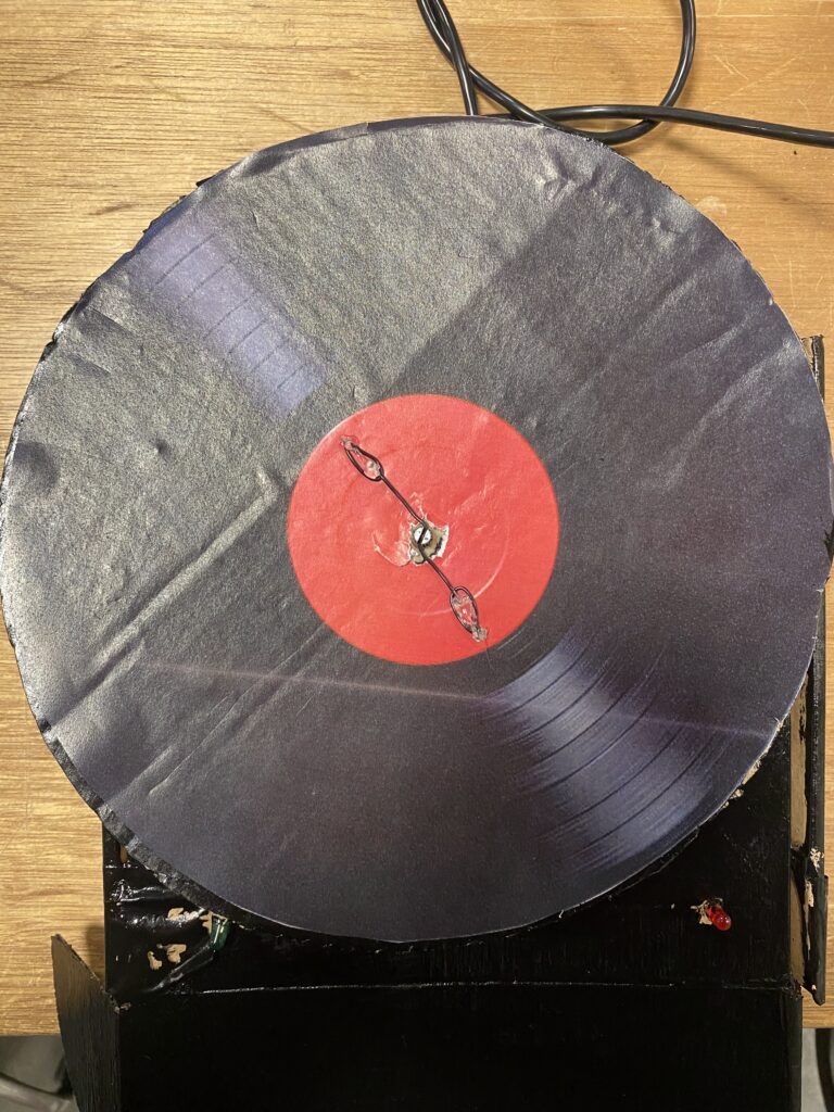
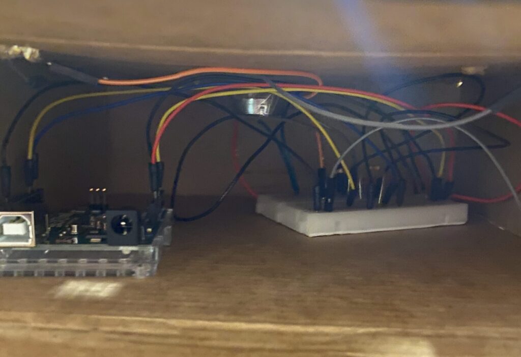
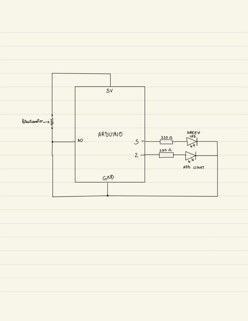

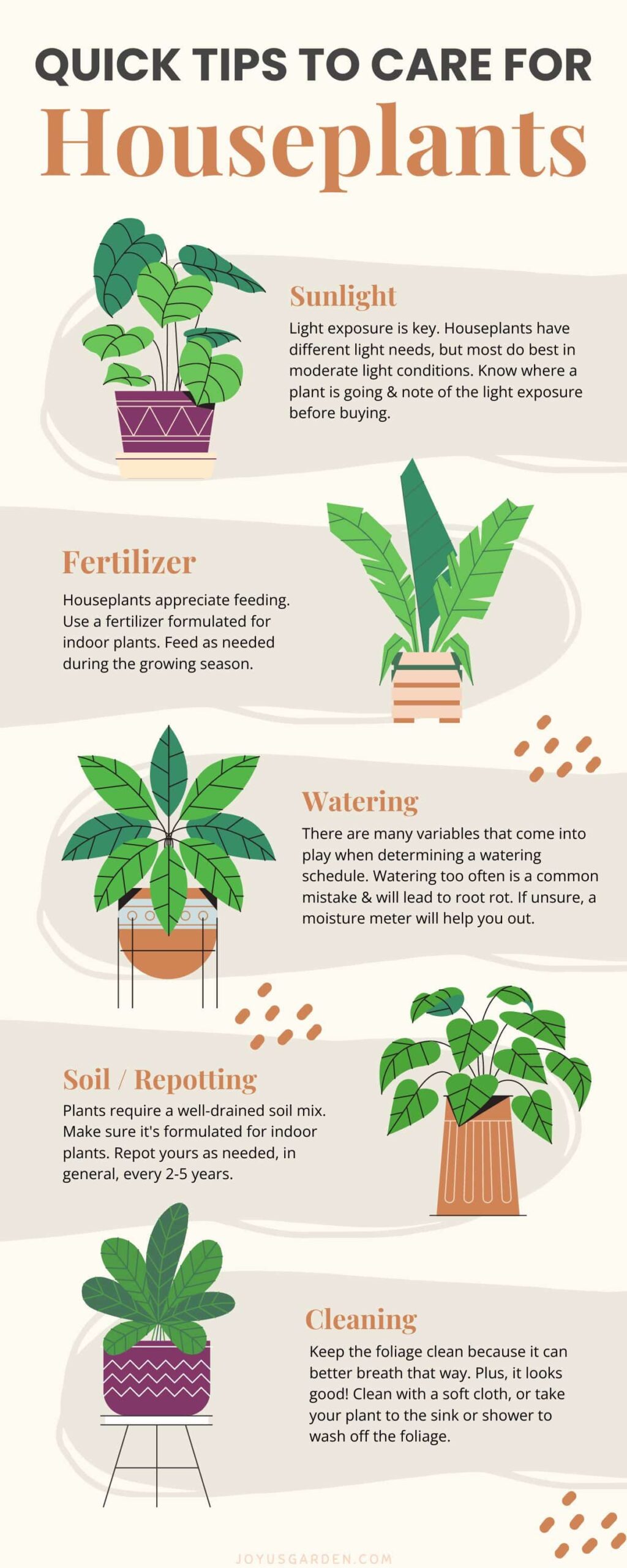

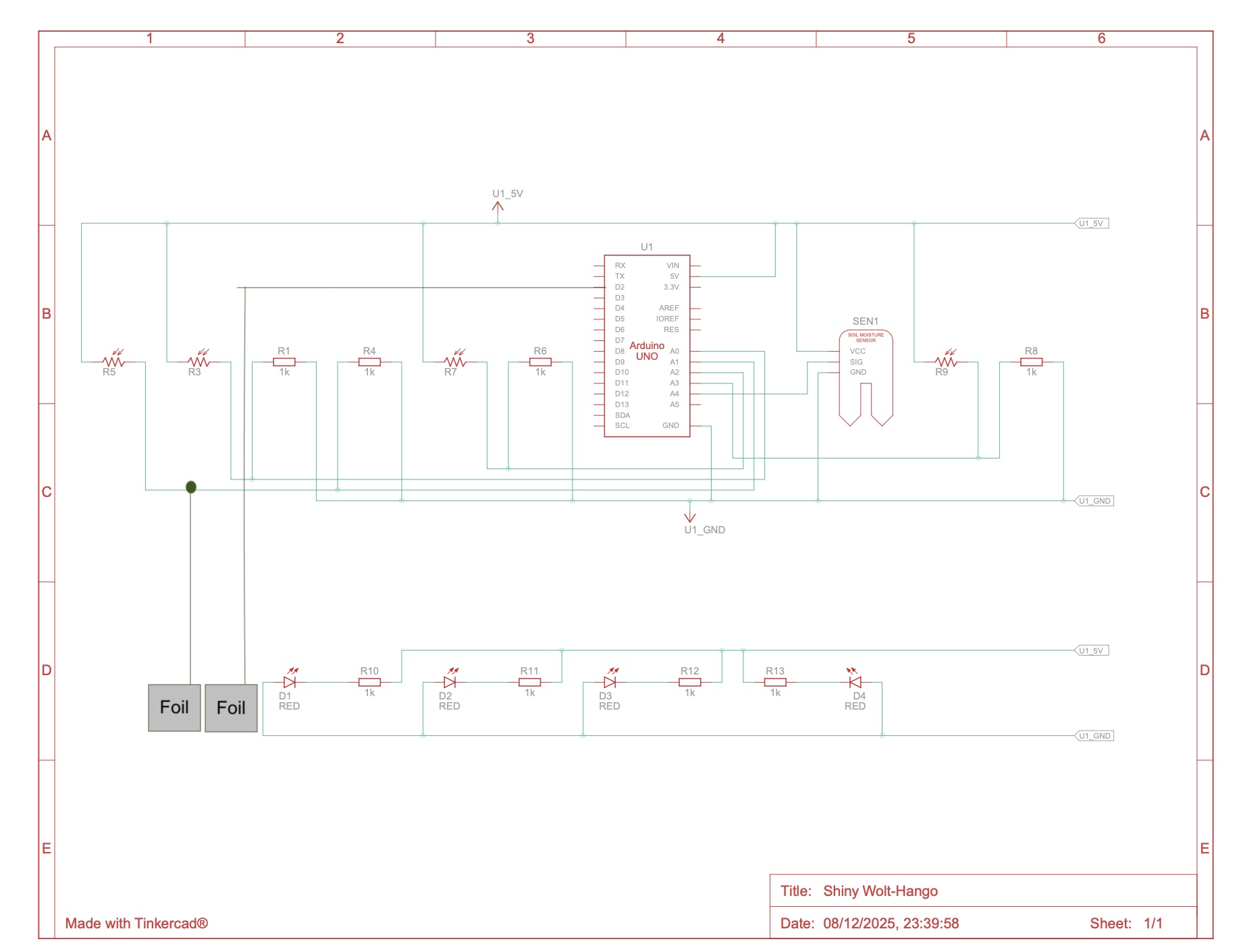
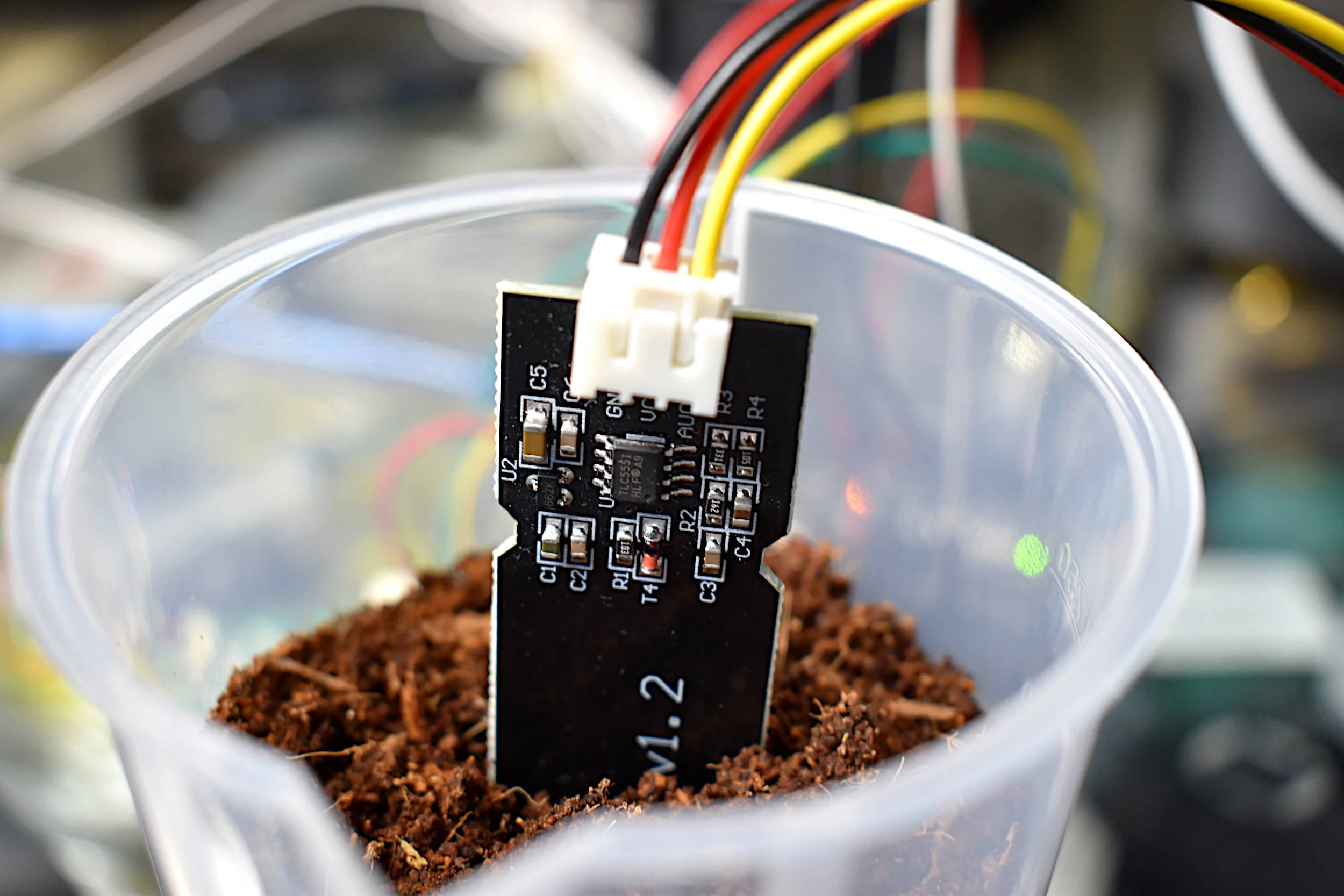
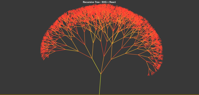
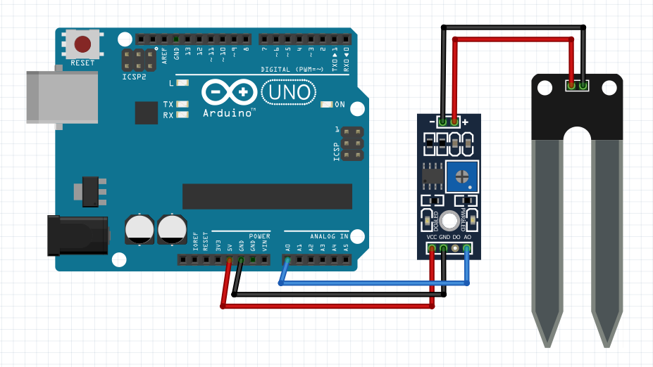
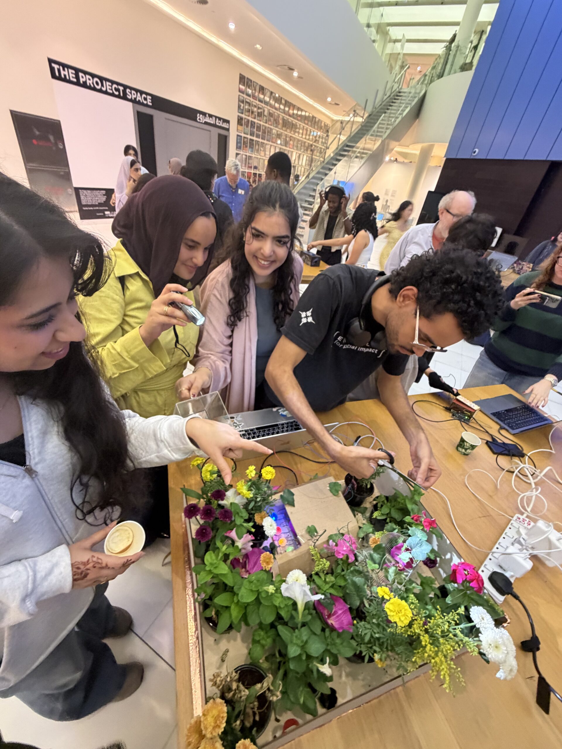
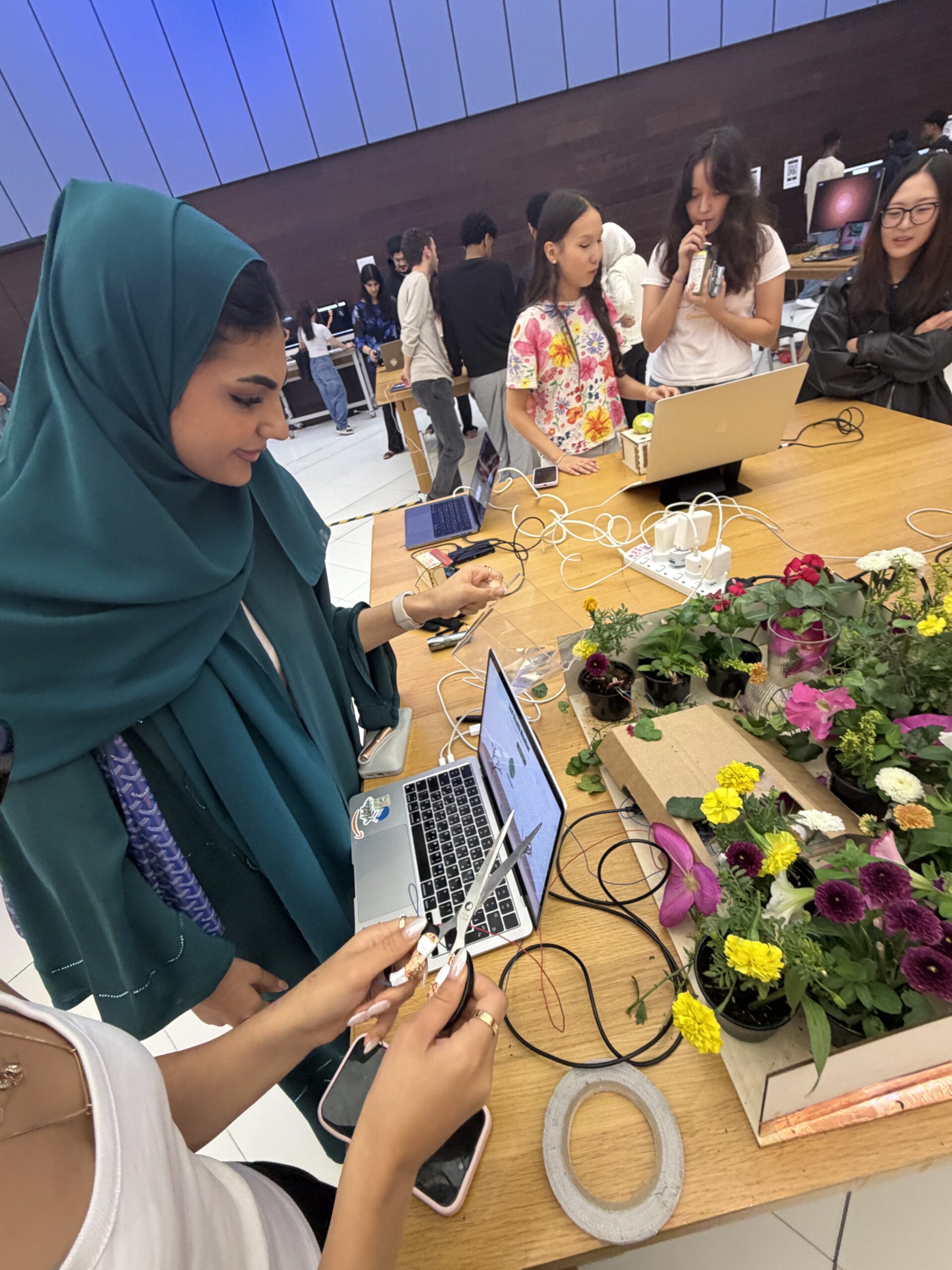
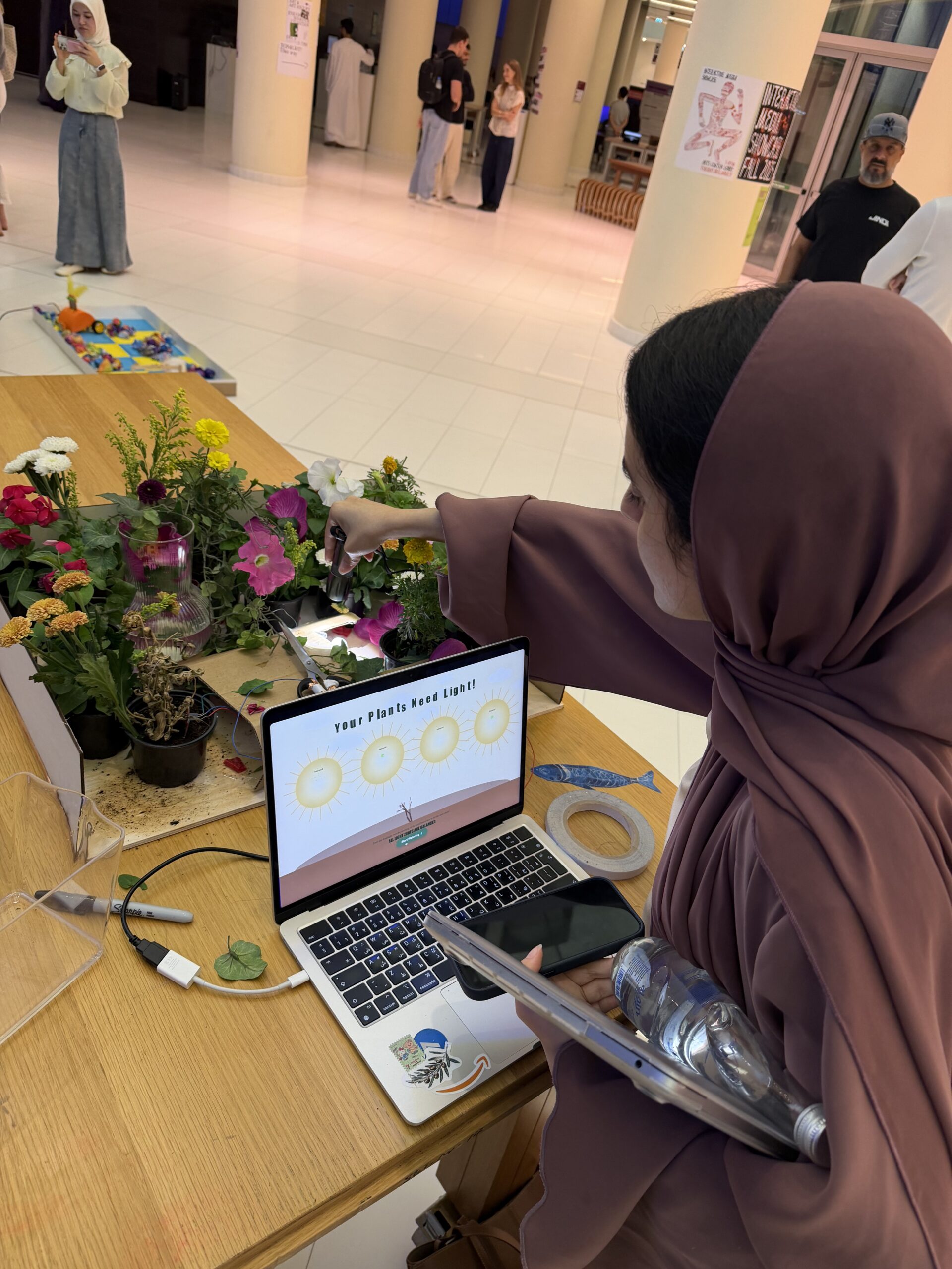

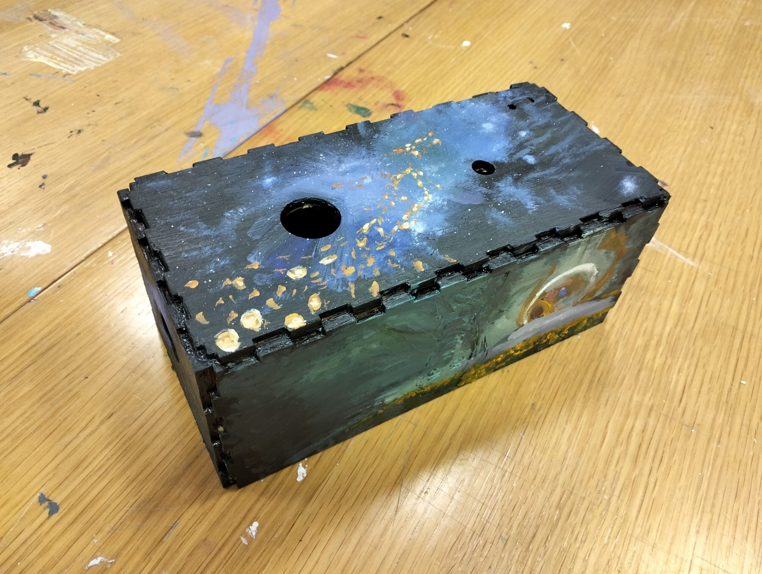
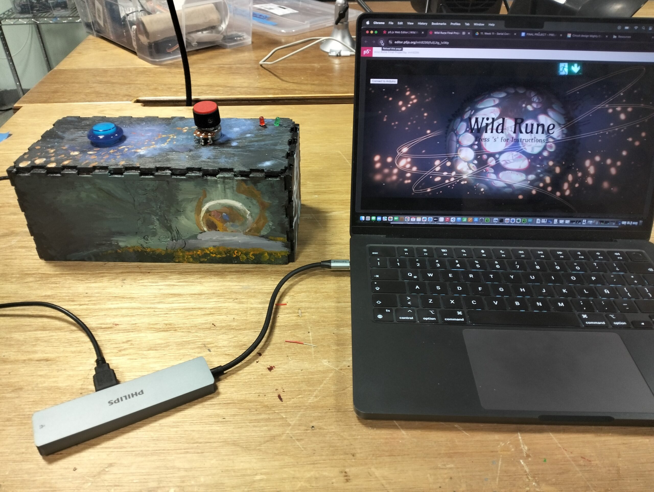
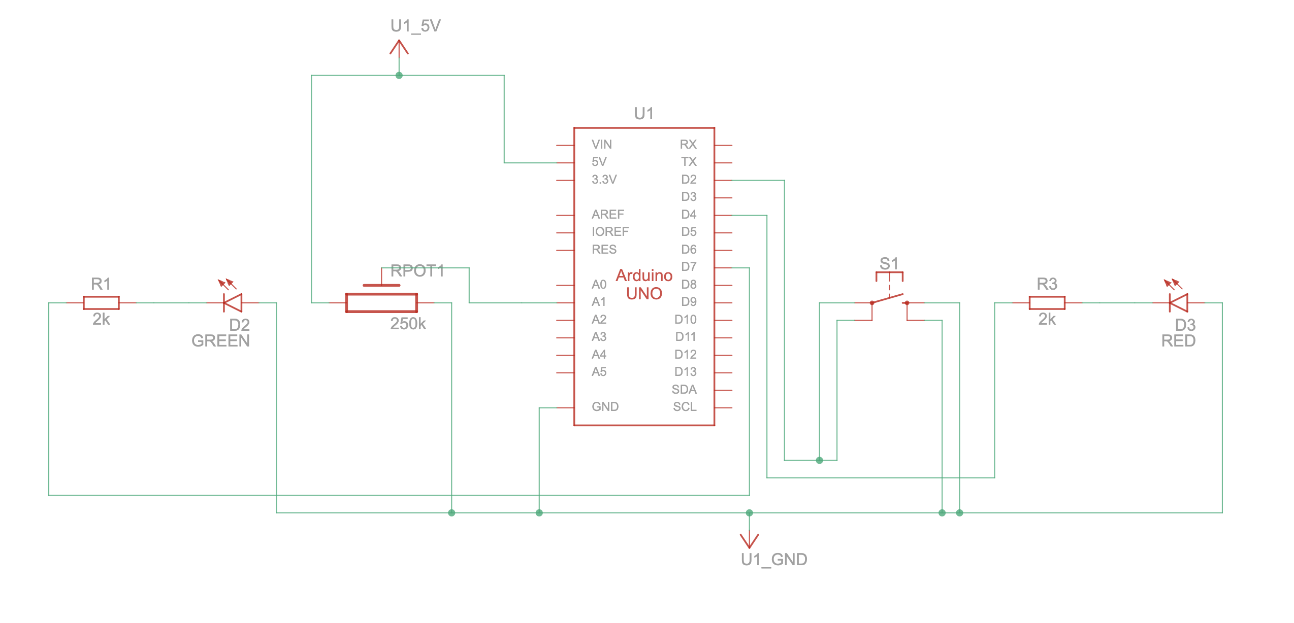
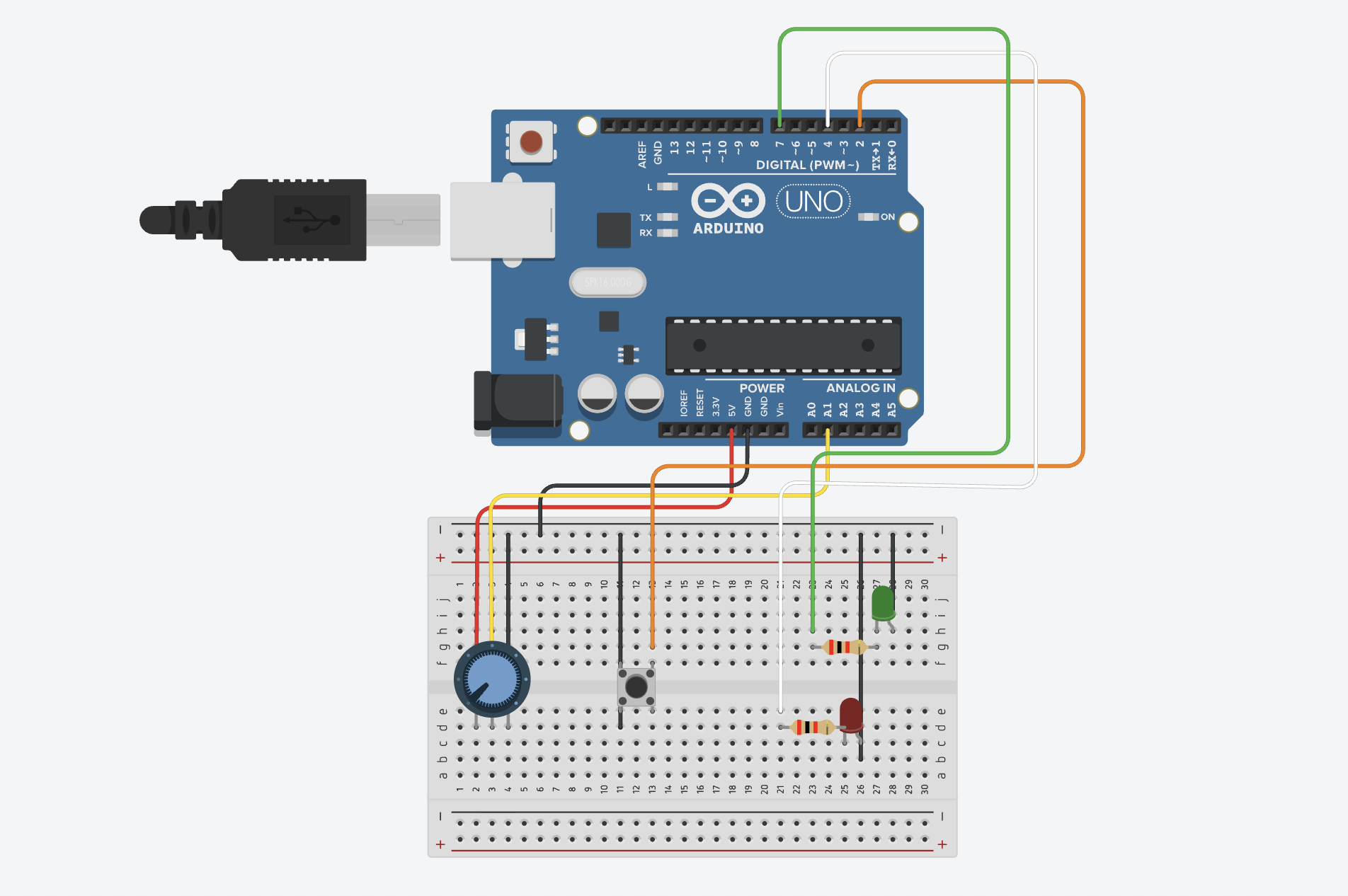
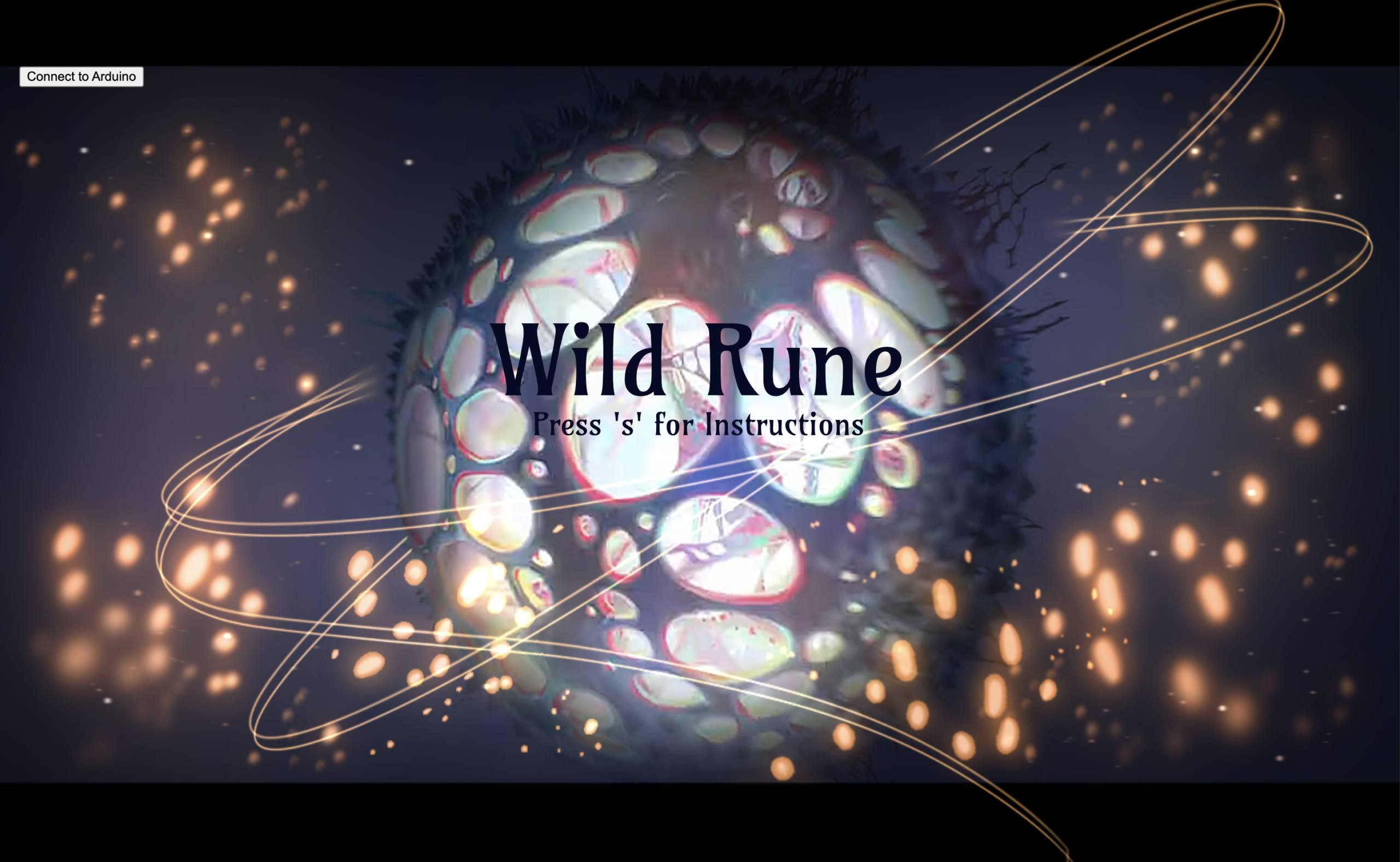
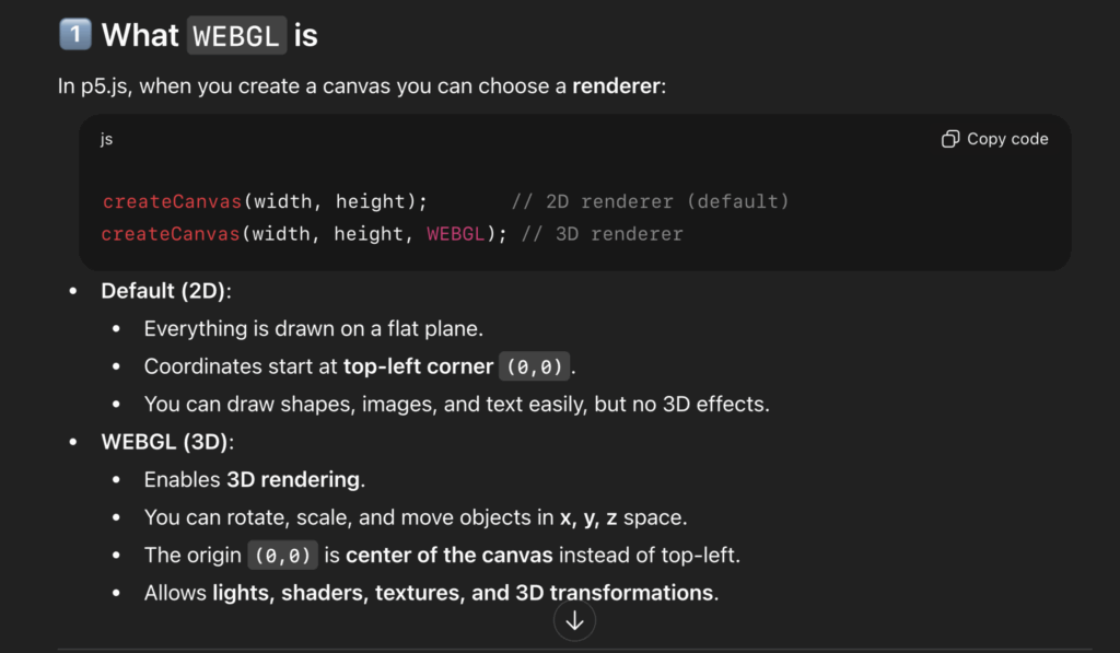
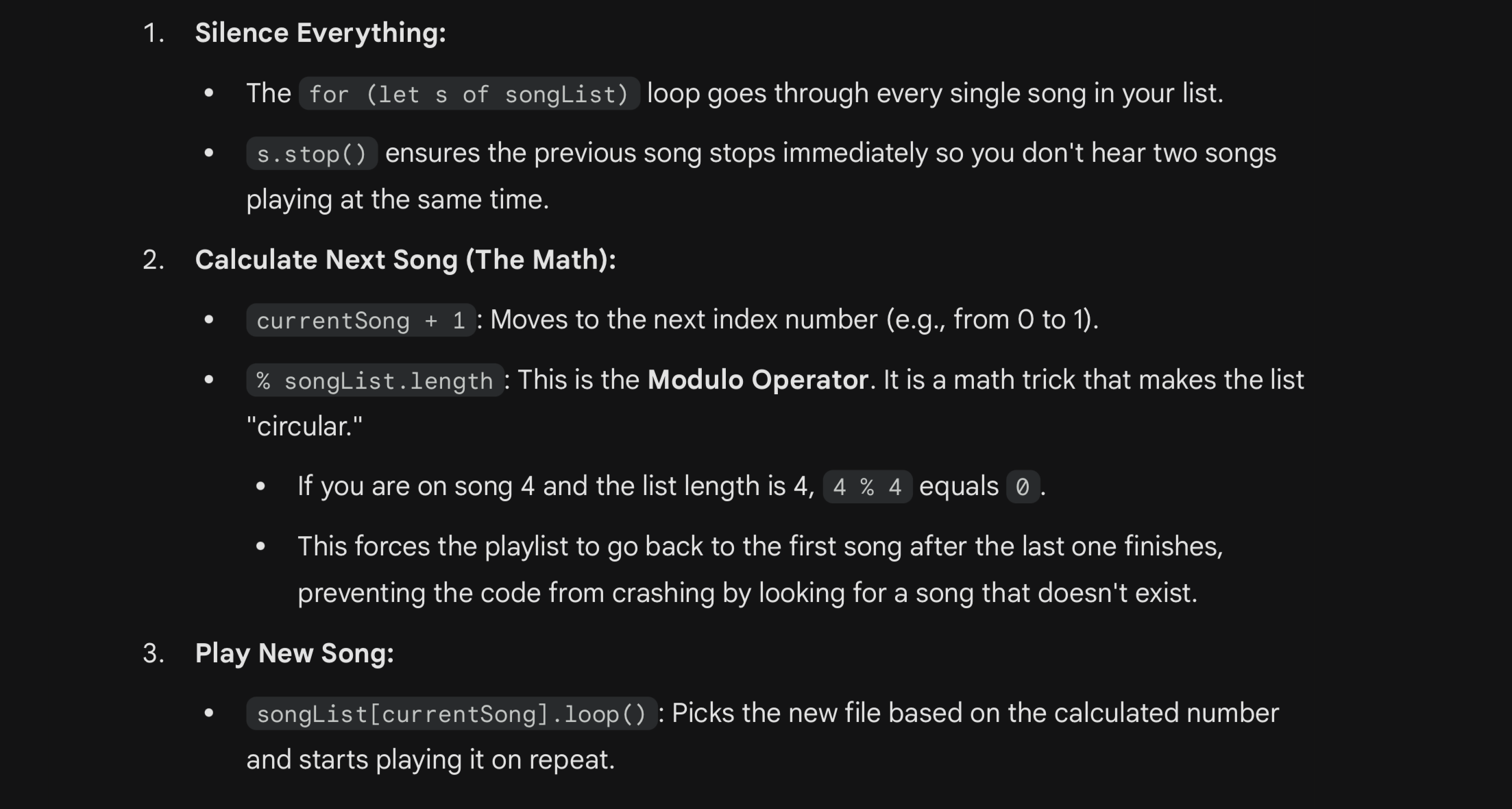
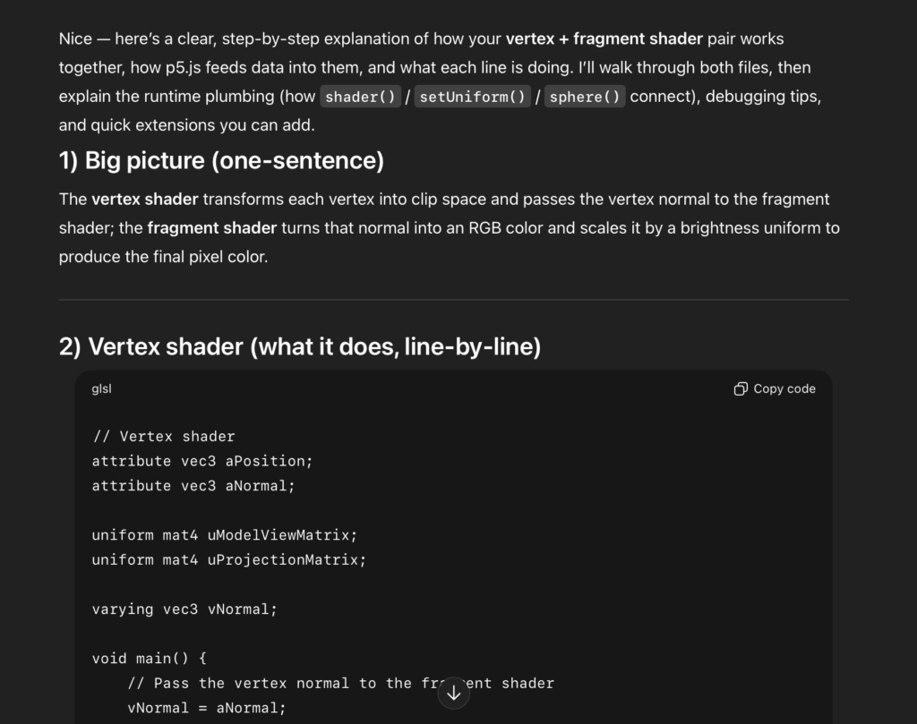
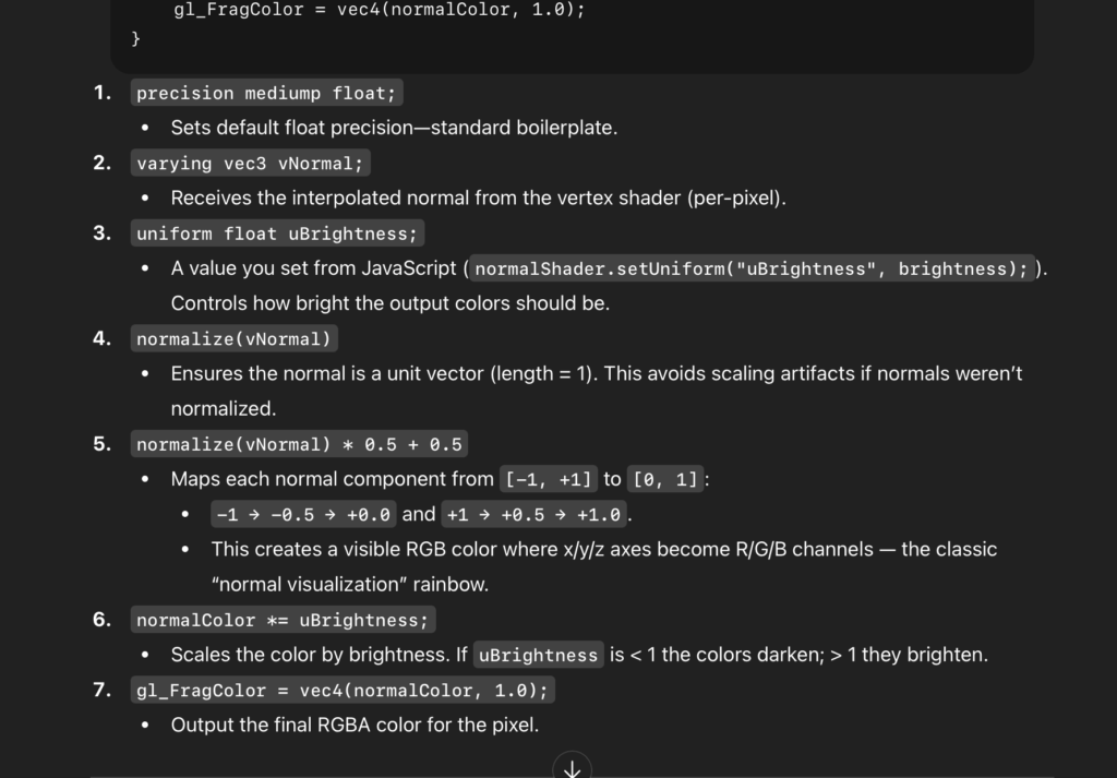
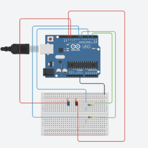


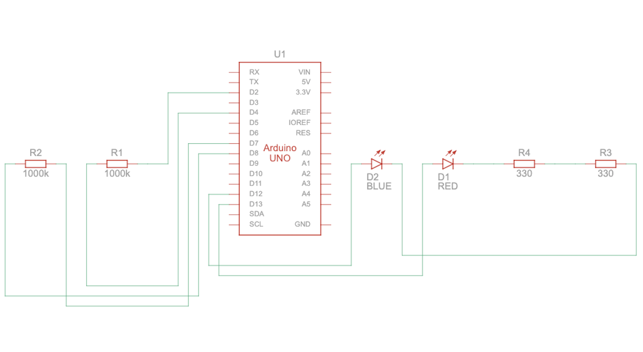

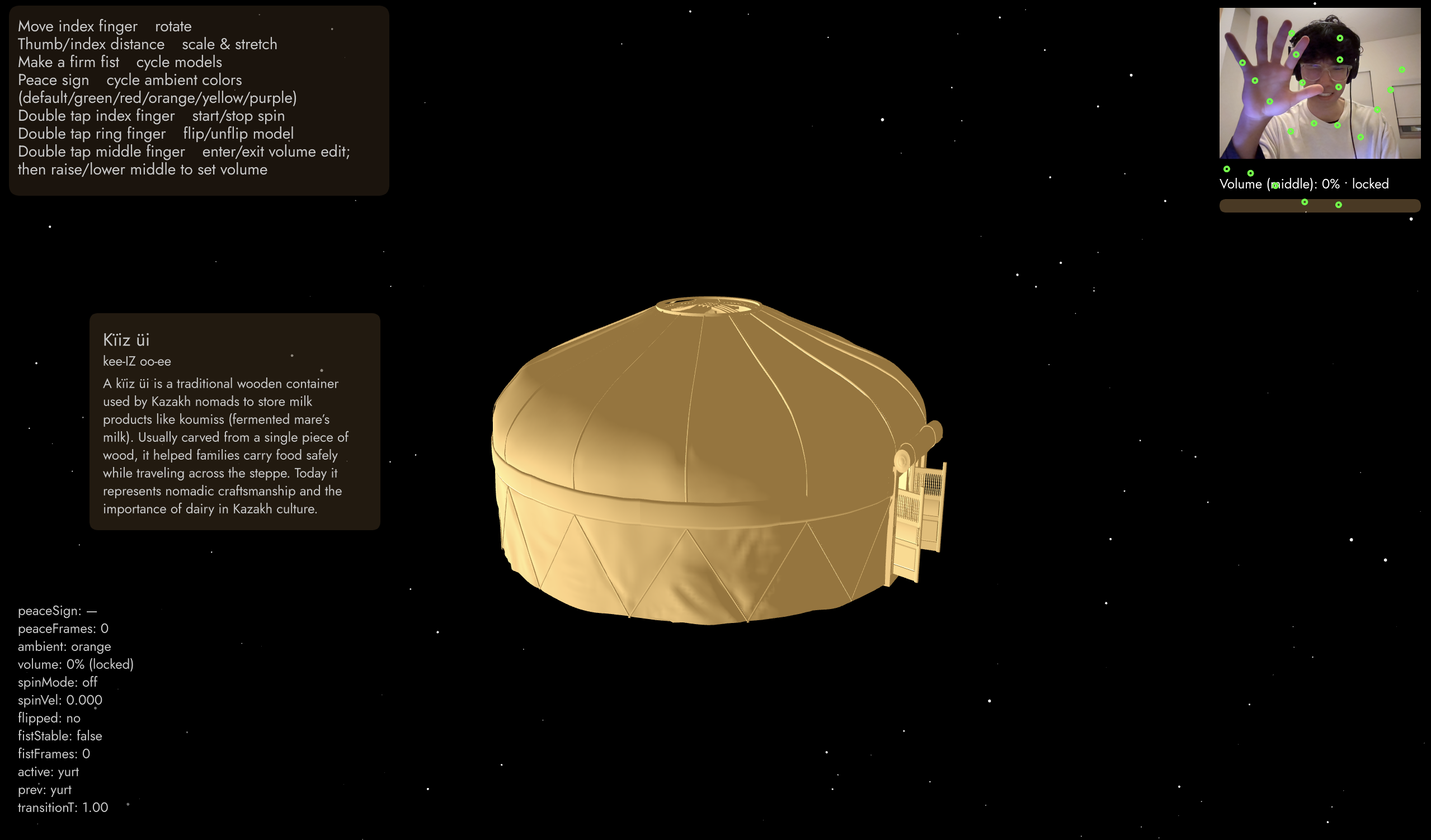
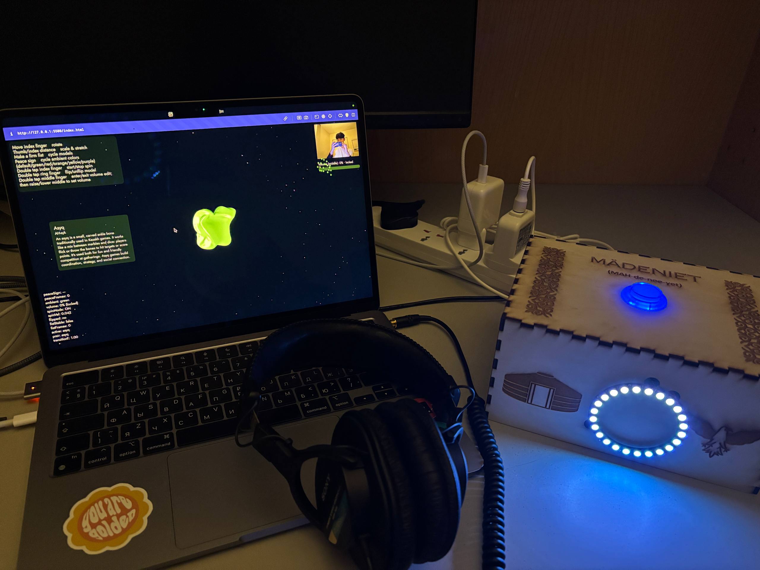
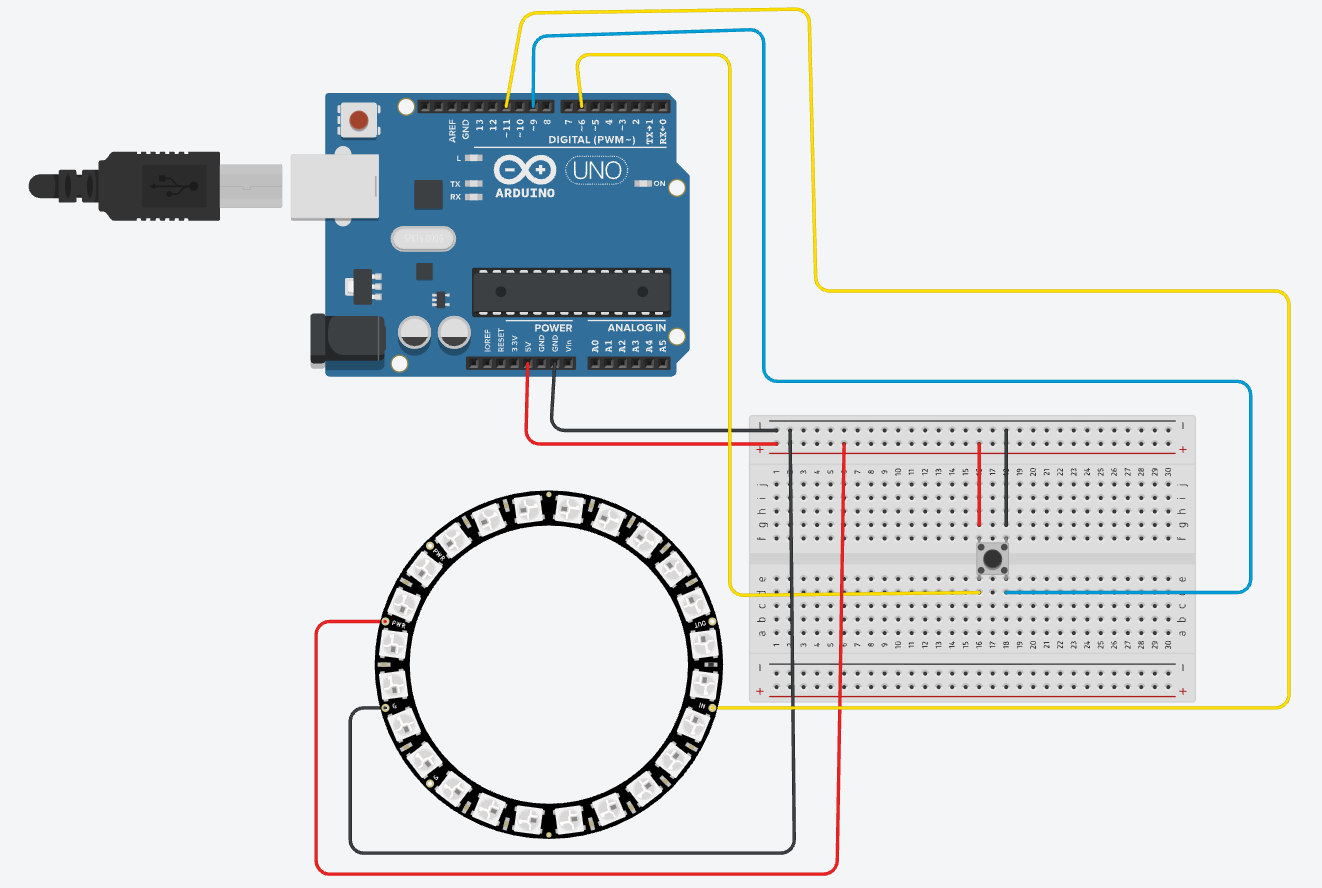
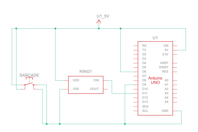
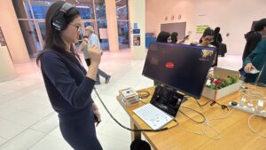
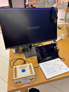
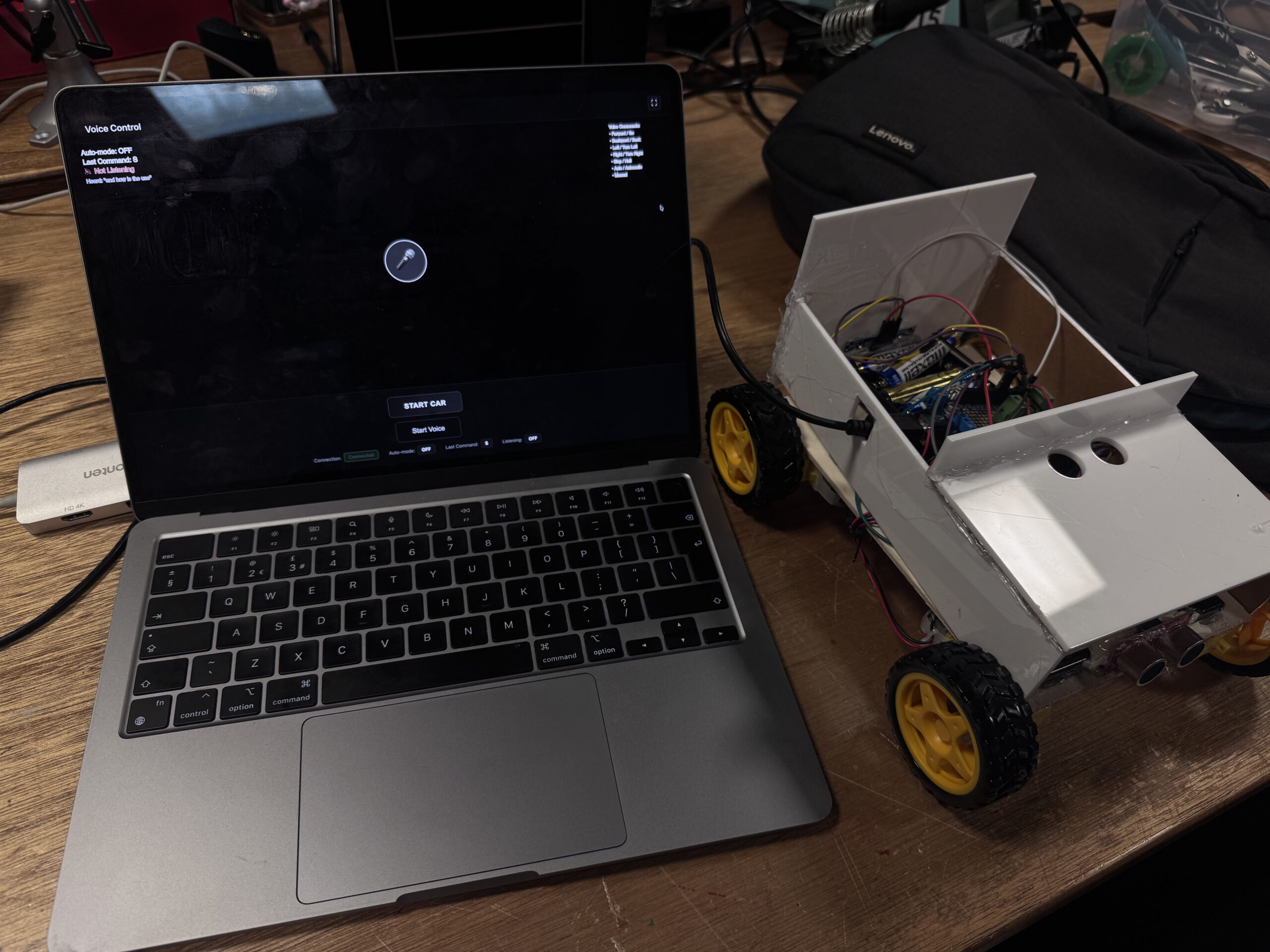
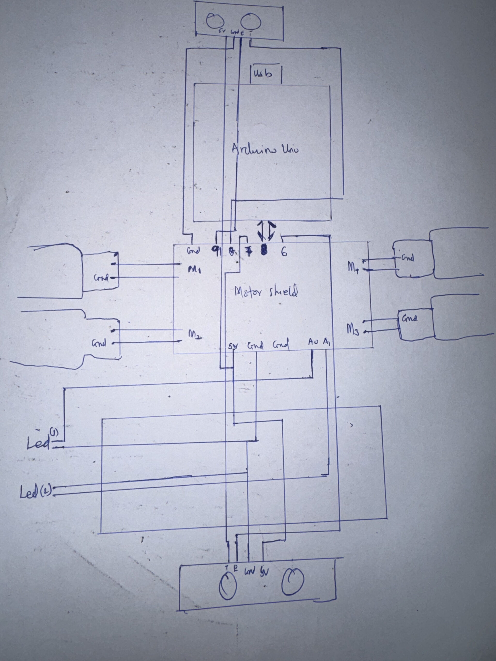
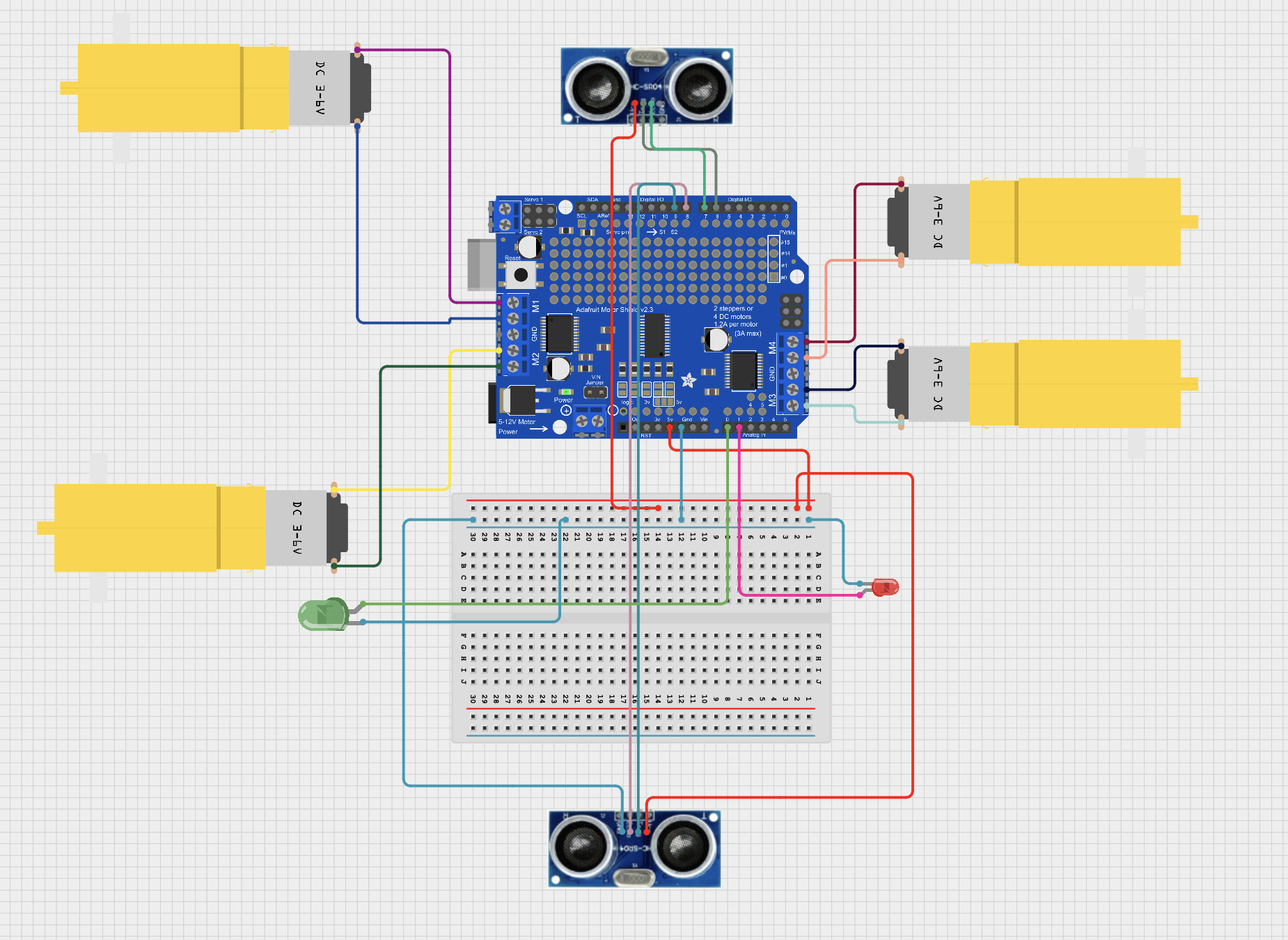
