
After reading this article, I was reminded of Mark Zuckerberg’s quote where he said that the next biggest innovation is going to be VR. The author emphasized that the incorporation of more senses into these technological devices allows people to really interact with them in a much deeper sense, whereas smartphones are just composed of screens and we just scroll on the glass, not getting any feedback. At first, I thought we still get tactile feedback from the screen. For instance, when we are playing games and get attacked by someone, we feel the vibration. But that does not foster any intimate interaction between users and the device itself. What makes an experience more unique and immersive is stimulating as many human senses as possible, something that I learned in the class I took when I was a sophomore, called Immersive Experiences. I think for my final project, I want to do something that can impact people’s thoughts and make them reflect on their past experiences through immersive experiences. Through these two articles, I learned that we are shifting to a world where the distance between technology and humans is getting much closer. I am somewhat worried about it because there are already cases where people get confused about their identities since they spend most of their time in a digital world. I think it is best to create a boundary between us and technology to remain humanities in this world.
Category: F2025 – Aya
Week 10 Reading Reflection
I really agreed with what Bret Victor was saying in “A Brief Rant on the Future of Interaction Design.” The piece did exactly what it was meant to do; it made me aware of something I never really saw as a problem before. When he talked about “Pictures Under Glass,” I honestly felt a bit called out. I’ve never questioned how flat and disconnected our interactions with screens have become; I just accepted them as normal.
Working with Arduino this semester made his point hit even harder. For some reason, it feels so much more rewarding than coding in p5, maybe because I can actually touch and see what I’m creating. It’s not just visuals on a screen; it exists in the real world. Even our first project, where we had to design creative switches that didn’t rely on hands, felt like a step toward the kind of thinking Victor wants designers to embrace.
I don’t know enough about the field to say whether designs nowadays are really “timid,” but I get where he’s coming from. The black-and-white photography analogy stuck with me; it shows how something can be revolutionary for its time but still just a transition toward something better. This reading made me rethink what “interaction” really means and imagine a future for technology that feels more connected to the body, not just the screen.
Week 10 – Musical Instrument (with Elyaziah)
Inspiration:
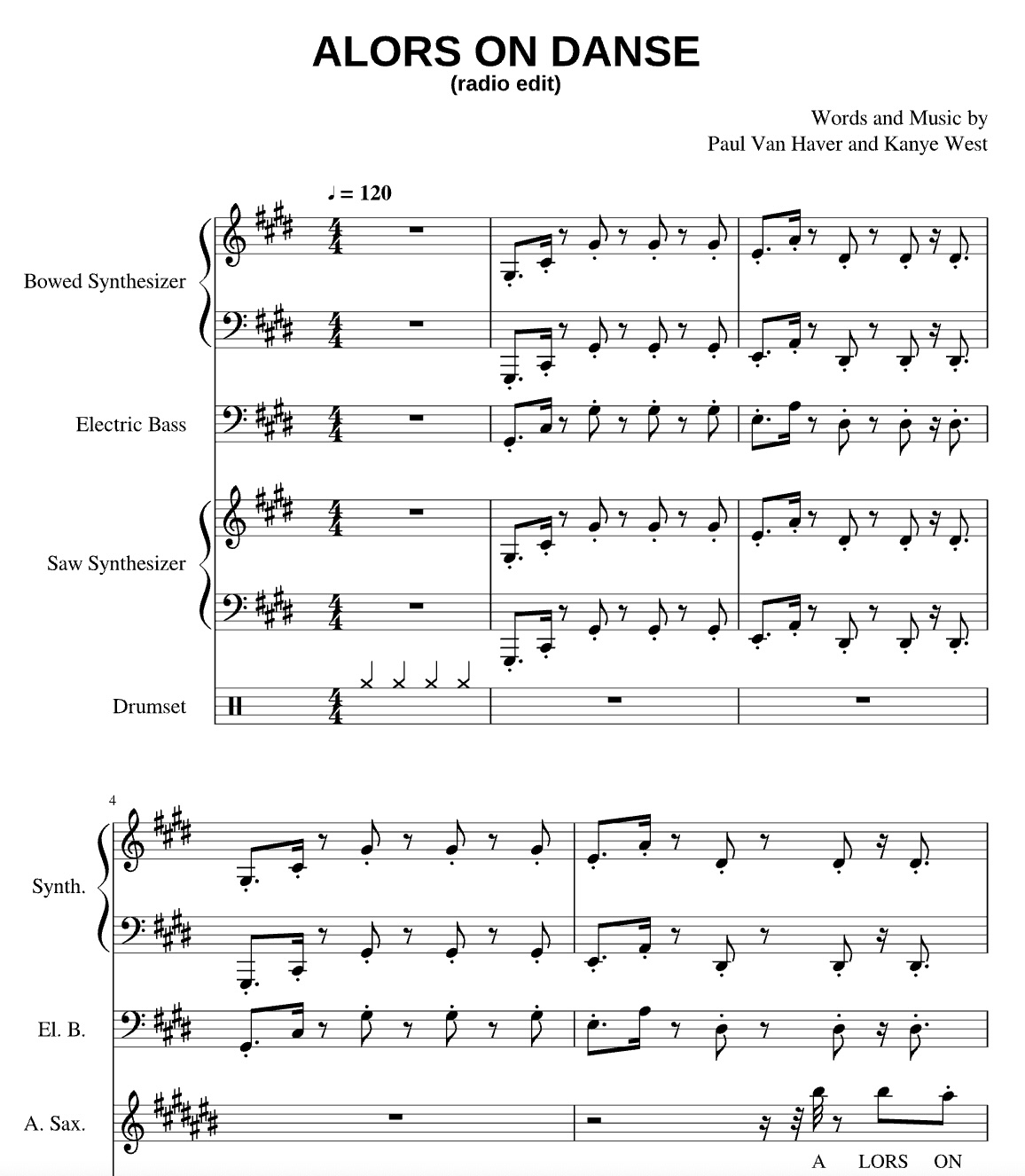
For this week’s project, the main inspo for our instrument was Stormae’s Song “Alors on Danse”. We were mainly inspired by the way that the songs main notes are split into 3 notes of varying pitches, with one sound constantly playing in the background. For that reason we varied the pitches of the three sounds our project produces with a 4th note that is constantly playing when the button is pressed.
Concept:
For this week’s project, we used 3 light sensors to play sounds on the piezo speaker, with one note being played constantly when a button is clicked. With the light sensor, once the user’s finger covers the sensor that is when the note is played. Furthermore, we have three sensors each of which plays a different pitch on the piezo speaker. The condition that allows for this is the reading of the sensor in comparison to the threshold we defined. An additional component we added was the button that allows for the sounds to be played on the piezo speaker and then stopped once the button is pressed again.
Code:
int photoPins[3] = {A0, A1, A2};// first we define a list of integers holding the analog pins
int buttonPin = 2; // digi pin 2 for the buttons
int piezzoPin = 8; //digi pin 8 for the piezzo speaker

int threshold = 700; //this is the threshold fo rte light/no light intensity that worked wit our light sensors in our environment/lighting

bool prevPhoto[3] = {false, false, false}; //keeping track of whether the light sebsir was interacted with or not false initially
bool prevButton = false; //initially false
bool buttonState = false;//initially false

void setup() {
  pinMode(buttonPin, INPUT_PULLUP); //for the button pint as an input for the arduino
  pinMode(piezzoPin, OUTPUT); //setting the buzzor pin as output so the arduino sneds the sound signal
  Serial.begin(9600); // serial monitor for debugging
}

void loop() {
  for (int i = 0; i < 3; i++) { //looping over the 3 sensors to reasd their analog value
    int value = analogRead(photoPins[i]);
    bool tapped = value < threshold; //comparing the value captured by the sensor and the defined threshold
    if (tapped && !prevPhoto[i]) { //checking for tap in the current state compared to prev
      if (i == 0) tone(piezzoPin, 440, 200); // translates to A0
      if (i == 1) tone(piezzoPin, 523, 200); // translates to A1
      if (i == 2) tone(piezzoPin, 659, 200); // translates to A2
    }
    prevPhoto[i] = tapped; //MAKING SURE TO NOTE it as tapped to have a singular tap rather than looping

    Serial.print(value); //serial print
    Serial.print(",");
  }

  bool pressed = digitalRead(buttonPin) == LOW; //setting the reading of the button to low meaning the button is pressed
  if (pressed && !prevButton) { //when the button is pressed state changes from not pressed(false) to presssed(true)
    buttonState = !buttonState;
    if (buttonState) tone(piezzoPin, 784);// if toggled on play a continuoue G5 tone
    else noTone(piezzoPin); //otherwise stop the buzzer
  }
  prevButton = pressed;

  Serial.println(pressed ? "1" : "0"); //for monitoring purposes

  delay(50);//short delay
}
Disclaimer: Some AI/ChatGPT was used to help with debugging and allowing multiple elements to work cohesively.
More Specifically:
1- When trying to debug, to check if button is pressed is true on the serial monitor (this line: Serial.println(pressed ? “1” : “0”); //for monitoring purposes)
2- Recomended values for frequency in hertz to mimic Alors on Danse (if (i == 0) tone(piezzoPin, 440, 200); // translates to A0 if (i == 1) tone(piezzoPin, 523, 200); // translates to A1 if (i == 2) tone(piezzoPin, 659, 200); // translates to A2) The SECOND parameter
Schematic:
 Demo:
Demo:

Future Improvements:
As for the future improvements, one main thing we wanted to capture in this project is being to overlap the sounds, but since we were working with one piezo speaker, we were not able to do that. To address this we aim to learn more about how we can maybe start playing the sounds from our laptops instead of the physical speaker we connect to the Arduino. Other improvements could be exploring how we can incorporate different instrument sounds maybe and create an orchestra like instrument.
Week 10: Reading Reflection
Victor’s brief but powerful rant on the future of interaction design continued to open my eyes to the extent that technology has cut off human beings from the physical world. For him, the so-called “future” of design with its touchscreen and glossy surface is not a revolution but merely a very limited advance that pays no attention to the human side of things. He completely turns the issue around and states that our hands are the most delicate locks for the least skillful and least tech-savvy users. The describes actions as elementary as page turning and a glass of water holding caused me to realize the extent of feedback and consciousness that humans get from touch. At this point, one might conclude that most of the devices one has nowadays are the ones that take the feedback away from them. His term “Pictures Under Glass” truly resonated with me since it brilliantly encapsulates the notion of how dull and one-dimensional technology interactions can appear. The reading of his rant made me reflect on the directors’ point that soft human qualities should not be engendered by modern technology. In my opinion, he wants us to know that true advancement should keep us emotionally attached to our creations while tech, unfortunately, does the opposite.
In his later responses, Victor makes it clear that he was not trying to destroy de facto technology but to show the way to future development. He underlines that the iPad and the likes are already very important and revolutionary, and still, they are not the end. The comparison of the iPad with the old black-and-white photography was very pleasant to me. It was good for the time but the market for color film kept rising. Victor believes that it should be the same with interaction design. Not only should we seek the right ways to design technology that is visible, tangible, and interactable, but also we should explore such ways. What I found most striking was his stress on the whole body in interaction rather than just a fingertip. He said that most of us are sitting and staring at screens all day long, which makes a total separation from our original nature of moving, feeling, and exploring. This idea was very strong to me as it brings technology back to something very human. Reading both articles made me rethink the role of design in either restricting or enlarging our innate capabilities. Victor’s writing is a sign that the technology of the future should make us feel more alive and interconnected, while on the other hand, it should not have the opposite effect of making us feel dead and isolated.
Week 10 – Musical instrument (Group Project with Isabella)
Concept
Mini Piano
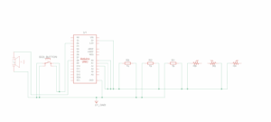
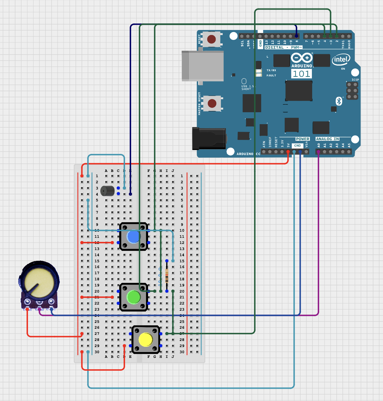
Given that we had to make a musical instrument, we were inspired by a project we found in YouTube of what seemed like a piano. From this, we aimed to make a smaller scale of this project following the requirements for the assignment. The circuit consists of one piezo speaker, a potentiometer as an analog sensor, and a three buttons as digital sensors.
Circuit Illustration

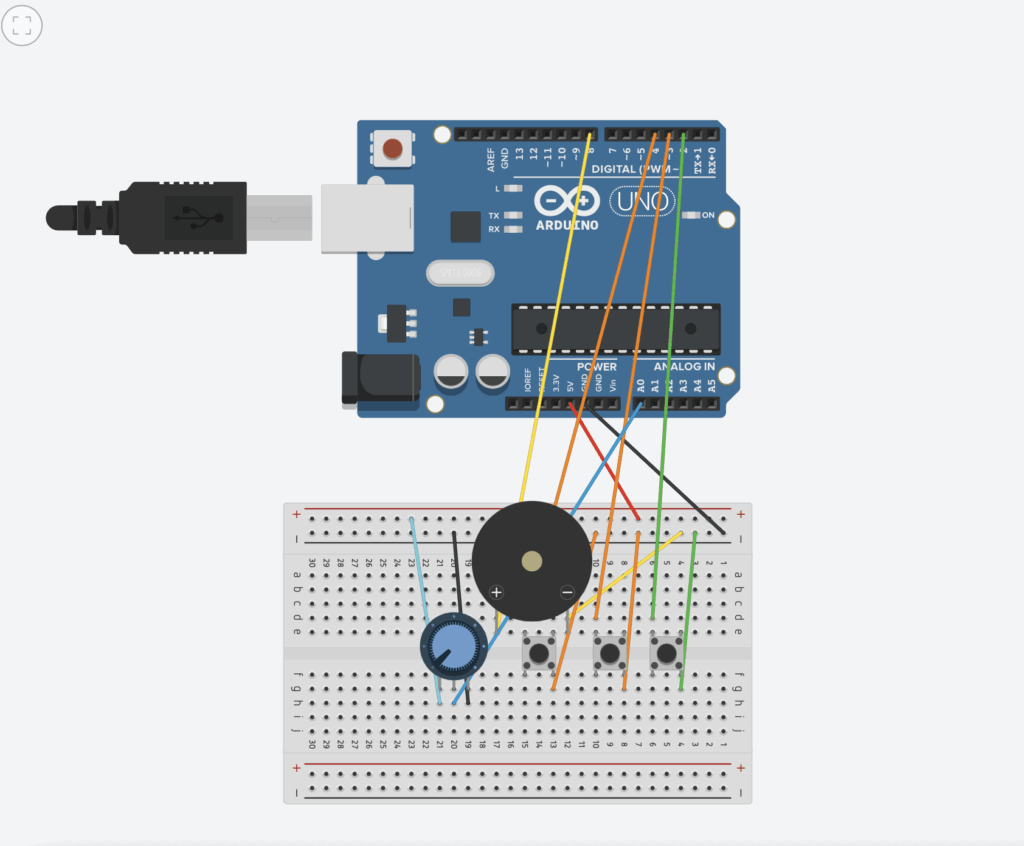 Figure 2 ( Circuit design with code and simulation on “Magnificent Jaiks” by Abdelrahman
Final Results
VIDEO
What I’m Proud Of
One aspect of this project I’m particularly proud of is the octave multiplier implementation. Instead of having fixed notes, I used the potentiometer to create a continuous pitch control that multiplies the base frequencies by a factor between 0.5x and 2.0x. This simple line of code:
float octaveMultiplier = map(potValue, 0, 1023, 50, 200) / 100.0;
transforms a basic three-note instrument into something much more expressive and fun to play with. You can play the same melody in different registers, which makes the instrument feel more like a real musical tool rather than just a tech demo.
Challenges and Further Improvements
Despite the complexity of the circuit, Abdelrahman successfully managed to produce a design in Magnificent Jaiks which I managed to follow without any issues. After arranging the jumper wires and all the other pieces, the final result was as we aimed for. One of the biggest challenges we faced was finding a way to divide the work as a result of the distance. Nevertheless, we managed to make a plan after meeting on zoom, and finished our circuit on time. For future projects, one thing I would like to improve on is developing an instrument of this kind with more buttons in order to have a larger version of the mini piano done for this assignment.
Week 10 Reading Response
Week 10 Reading Response
Week 10 Reading Response
This reading made me rethink what “future technology” really means. I used to think of futuristic interfaces as things like touchscreens or holograms, but the author argues that these are actually limiting, that “Pictures Under Glass” remove the tactile richness that makes human interaction powerful. The way he describes how our hands feel and manipulate objects made me realize how much design has ignored our most natural abilities. We’ve gotten so used to flat screens that we’ve forgotten how much more expressive and intuitive touch and movement can be.
What stood out most to me was the idea that technology should amplify human capabilities, not replace or dull them. The examples about picking up a book or tying your shoes really drove this home. Those actions are effortless because they’re built on feedback, texture, and motion. It made me think about how most digital interfaces feel numb and disconnected by comparison.
I also liked how the author ended with a kind of challenge that the future is a choice. It made me see that innovation shouldn’t just be about what’s new, but about what’s better for human experience. As someone interested in design and tech, this made me want to think beyond screens and imagine tools that respond to our hands, our bodies, and the way we naturally move through the world.
Week 10 – Musical Instrument
Concept:
This week, Richmond and I made a small musical instrument inspired by the piano. We used three switches to play notes. We also added a potentiometer that can change the pitch of the notes while playing. This means the player can make higher or lower sounds with the same switches. Using the switches and potentiometer together makes the instrument more interactive and fun, giving the player control over both the notes and their frequency.
Video Demonstration:
https://drive.google.com/file/d/1tpGMX4FXWm4Y2IJe1WP9MxxI7M97yWc0/view?usp=sharing
Schematic:
Code Highlight:
// Mini Piano: 3 switches, Piezo buzzer, optional pitch adjustment

const int buzzerPin = 8;      // Piezo buzzer
const int switch1 = 2;        // Key 1 (C)
const int switch2 = 3;        // Key 2 (E)
const int switch3 = 4;        // Key 3 (G)
const int potPin = A0;        // Optional: pitch adjust

// Base frequencies for the notes (Hz)
int note1 = 262;  // C4
int note2 = 330;  // E4
int note3 = 392;  // G4

void setup() {
  pinMode(buzzerPin, OUTPUT);
  pinMode(switch1, INPUT);
  pinMode(switch2, INPUT);
  pinMode(switch3, INPUT);
  Serial.begin(9600); // optional for debugging
}

void loop() {
  // Read potentiometer to adjust pitch
  int potValue = analogRead(potPin);        // 0-1023
  float multiplier = map(potValue, 0, 1023, 80, 120) / 100.0;  // 0.8x to 1.2x

  bool anyKeyPressed = false;

  // Check switches and play corresponding notes
  if (digitalRead(switch1) == HIGH) {
    tone(buzzerPin, note1 * multiplier);
    anyKeyPressed = true;
  }

  if (digitalRead(switch2) == HIGH) {
    tone(buzzerPin, note2 * multiplier);
    anyKeyPressed = true;
  }

  if (digitalRead(switch3) == HIGH) {
    tone(buzzerPin, note3 * multiplier);
    anyKeyPressed = true;
  }

  // Stop sound if no switch is pressed
  if (!anyKeyPressed) {
    noTone(buzzerPin);
  }

  delay(10); // short delay for stability
}
Github Link:
Reflections & Future Improvements:
This week’s assignment felt highly interactive, building upon previous projects while introducing multiple input elements and user-controlled parameters. We learned how to combine both digital and analog inputs to create a responsive musical instrument. For future improvements, we would like to implement a more realistic note duration system, where each note fades out naturally after being played, similar to a real piano. Additionally, adding more switches and possibly multiple buzzers could allow for more complex melodies and chords, enhancing the expressive possibilities.
Week 10 Sound, Servo motor, Mapping
Inspiration:
For this week’s project, the main inspo for our instrument was Stormae’s Song “Alors on Danse”. We were mainly inspired by the way that the songs main notes are split into 3 notes of varying pitches, with one sound constantly playing in the background. For that reason we varied the pitches of the three sounds our project produces with a 4th note that is constantly playing when the button is pressed.
Concept:
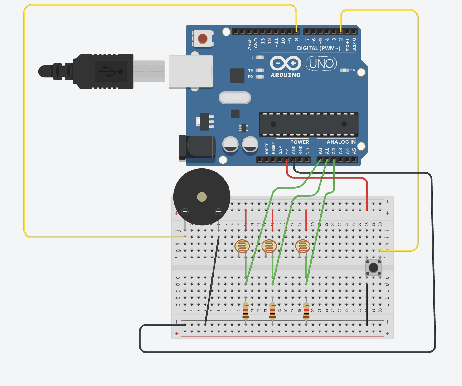
For this week’s project, we used 3 light sensors to play sounds on the piezo speaker, with one note being played constantly when a button is clicked. With the light sensor, once the user’s finger covers the sensor that is when the note is played. Furthermore, we have three sensors each of which plays a different pitch on the piezo speaker. The condition that allows for this is the reading of the sensor in comparison to the threshold we defined. An additional component we added was the button that allows for the sounds to be played on the piezo speaker and then stopped once the button is pressed again.
Code:
int photoPins[3] = {A0, A1, A2};// first we define a list of integers holding the analog pins
int buttonPin = 2; // digi pin 2 for the buttons
int piezzoPin = 8; //digi pin 8 for the piezzo speaker

int threshold = 700; //this is the threshold fo rte light/no light intensity that worked wit our light sensors in our environment/lighting

bool prevPhoto[3] = {false, false, false}; //keeping track of whether the light sebsir was interacted with or not false initially
bool prevButton = false; //initially false
bool buttonState = false;//initially false

void setup() {
  pinMode(buttonPin, INPUT_PULLUP); //for the button pint as an input for the arduino
  pinMode(piezzoPin, OUTPUT); //setting the buzzor pin as output so the arduino sneds the sound signal
  Serial.begin(9600); // serial monitor for debugging
}

void loop() {
  for (int i = 0; i < 3; i++) { //looping over the 3 sensors to reasd their analog value
    int value = analogRead(photoPins[i]);
    bool tapped = value < threshold; //comparing the value captured by the sensor and the defined threshold
    if (tapped && !prevPhoto[i]) { //checking for tap in the current state compared to prev
      if (i == 0) tone(piezzoPin, 440, 200); // translates to A0
      if (i == 1) tone(piezzoPin, 523, 200); // translates to A1
      if (i == 2) tone(piezzoPin, 659, 200); // translates to A2
    }
    prevPhoto[i] = tapped; //MAKING SURE TO NOTE it as tapped to have a singular tap rather than looping

    Serial.print(value); //serial print
    Serial.print(",");
  }

  bool pressed = digitalRead(buttonPin) == LOW; //setting the reading of the button to low meaning the button is pressed
  if (pressed && !prevButton) { //when the button is pressed state changes from not pressed(false) to presssed(true)
    buttonState = !buttonState;
    if (buttonState) tone(piezzoPin, 784);// if toggled on play a continuoue G5 tone
    else noTone(piezzoPin); //otherwise stop the buzzer
  }
  prevButton = pressed;

  Serial.println(pressed ? "1" : "0"); //for monitoring purposes

  delay(50);//short delay
}
Disclaimer: Some AI/ChatGPT was used to help with debugging and allowing multiple elements to work cohesively.
More Specifically:
1- When trying to debug and understand why the button was not working, we used chatGPT’s recommendation to have a statement check if button is pressed is true on the serial monitor (this line: Serial.println(pressed ? “1” : “0”); //for monitoring purposes)
2- Recommended values for frequency in hertz to mimic Alors on Danse (if (i == 0) tone(piezzoPin, 440, 200); // translates to A0 if (i == 1) tone(piezzoPin, 523, 200); // translates to A1 if (i == 2) tone(piezzoPin, 659, 200); // translates to A2) The SECOND parameter
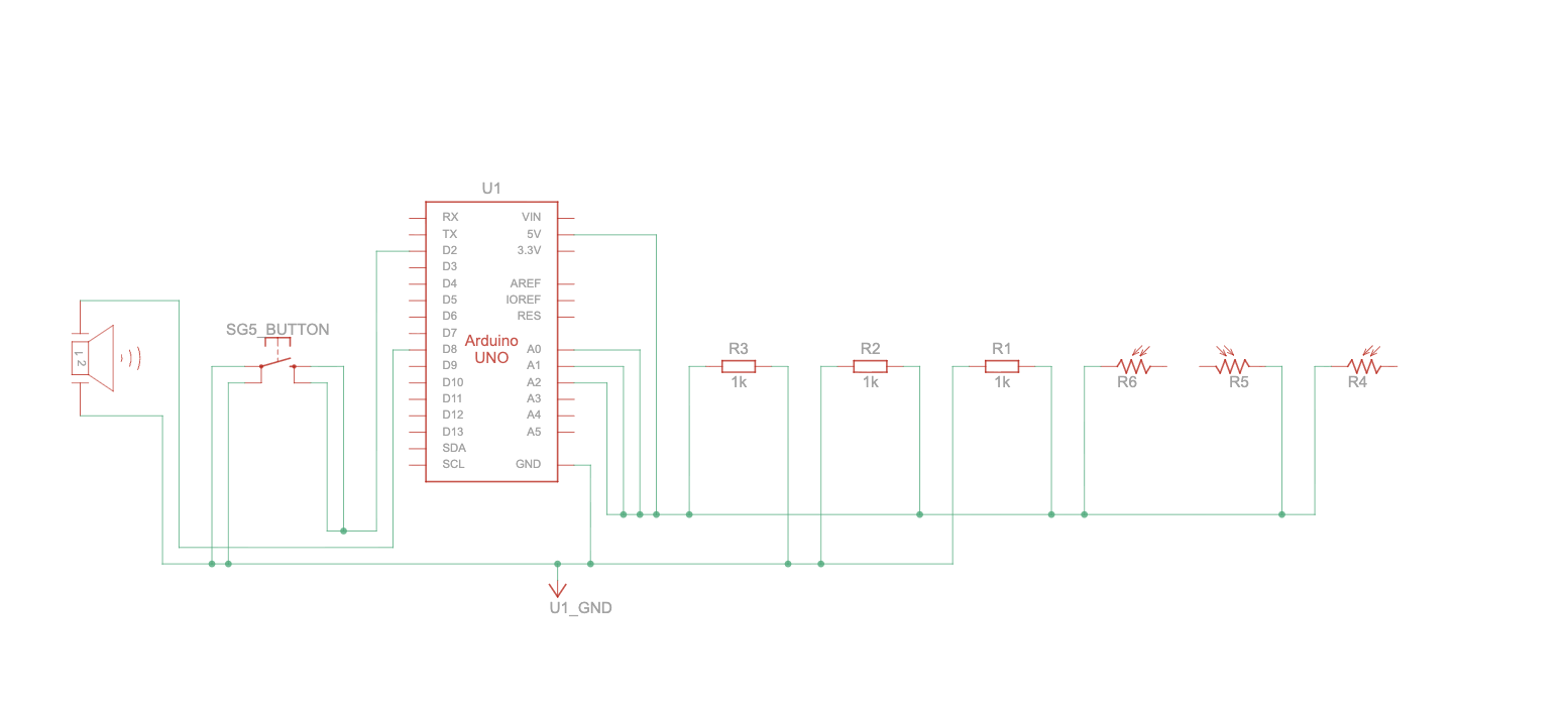
Schematic:
Demo:
Future Improvements:
As for the future improvements, one main thing we wanted to capture in this project is being to overlap the sounds, but since we were working with one piezo speaker, we were not able to do that. To address this we aim to learn more about how we can maybe start playing the sounds from our laptops instead of the physical speaker we connect to the Arduino. Other improvements could be exploring how we can incorporate different instrument sounds maybe and create an orchestra like instrument.
Reading Reflection:
Reading A Brief Rant on the Future of Interaction Design really made me rethink how we use technology and what we’ve lost in the process. The author points out that what we often label as “futuristic” design like touchscreens and flat device isn’t really that visionary or futurisitc. It’s actually very far from how we connect with the world. When he describes our current technology as “Pictures Under Glass,” it clicked for me how minimal that kind of interaction feels. We’re constantly sliding our fingers across flat screens, but we’ve given up the physical feedback that makes using our hands so intuitive and satisfying. I never thought about how much information we get through touch until he brought up examples like turning the pages of a book or feeling the weight of a glass of water.
What stood out most to me is his idea that our hands and really, our whole bodies are tools for understanding and shaping the world. Technology should amplify that, not suppress it. I realized how much design today caters to convenience and simplicity, but in doing so, it often strips away depth and engagement. His point about how touchscreens make us “finger-blind” hit hard—it’s true that we spend so much time tapping and swiping that we forget what it feels like to truly handle something.