Concept:
I wanted to make a game that’s fun, fast, and actually feels like you’re Spidey. The core idea is simple: you’re constantly moving forward, jumping from platform to platform, and your goal is to keep going without falling. But the twist is that instead of just pressing a key, I used a glove sensor to make the jumps happen. So when you move your hand, Spidey jumps, it’s kind of like you’re really doing it yourself.
The platforms aren’t all the same, so every run is a little different. Some are closer together, some are higher or lower, and the timing is everything. I wanted the game to feel smooth but challenging, where even a tiny mistake can make you mess up a jump and start over.
Photos and User Testing Link:
https://drive.google.com/drive/folders/1Ur0xwvngiJKxs0-OA5ZY9DNj2kDOEgcR?usp=sharing


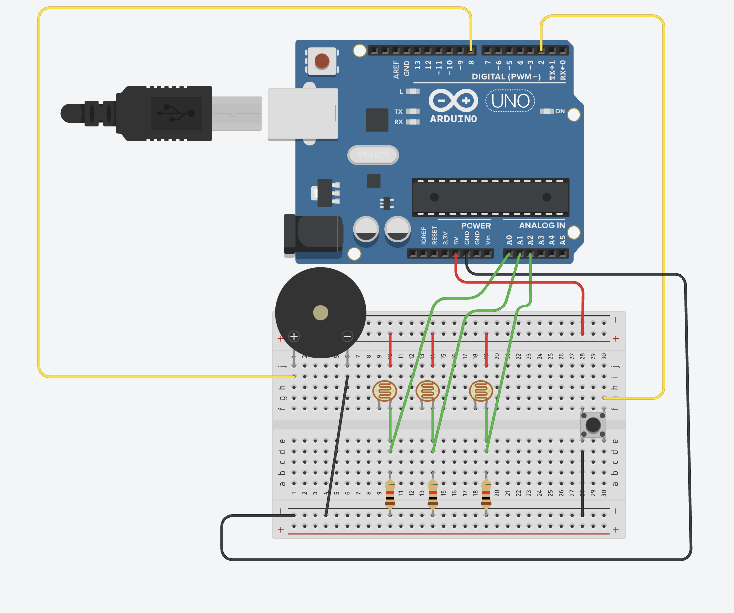
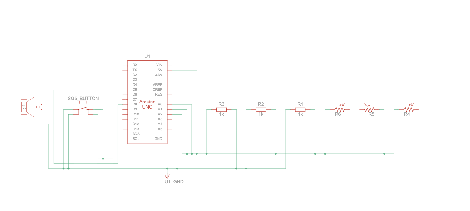
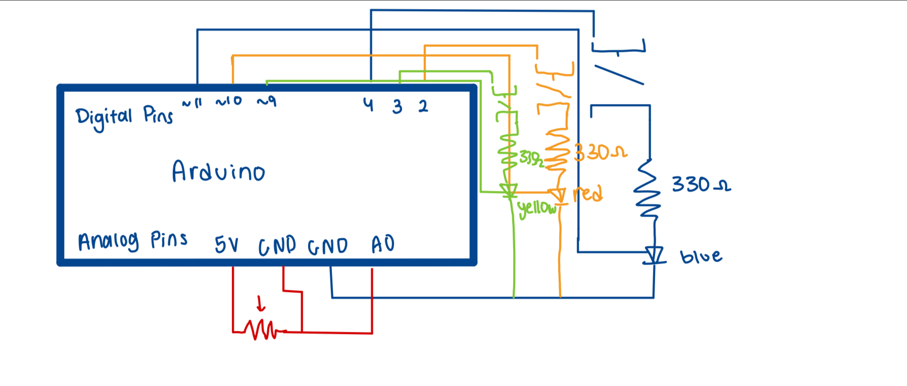
 Schematic:

Note: the button is in place of the copper pads, but the same logic in the sense that when the pads touch, it reads 1.
Implementation:
1. Description of Interaction Design
The interaction design is centered around turning your hand movements into Spidey’s actions on screen:
- When the copper tapes on the glove touch, it triggers Spidey to jump in the game.
- The glove also has an LED that lights up whenever Spidey jumps, giving physical feedback.
- The design is intuitive and playful, the player doesn’t need to press buttons; their gesture does the work.
2. Arduino Code
The Arduino reads the glove input and communicates with p5.js over the serial port. It also listens for commands from p5.js to control the LED.
//input from copper tapes
const int glovePin = 7;
const int ledPin = 8;

void setup() {
  pinMode(glovePin, INPUT_PULLUP);
  pinMode(ledPin, OUTPUT);
  Serial.begin(9600);
}

void loop() {
  //should read 1 if tapes are touching
  //causing spidey to jump in p5
  //0 if not
  int glove = digitalRead(glovePin) == LOW ? 1 : 0;
  Serial.println(glove);

  //p5 to arduino
  //when spidey jumps, led turns on
  if (Serial.available()) {
    char cmd = Serial.read();
    if (cmd == '1') digitalWrite(ledPin, HIGH);
    if (cmd == '0') digitalWrite(ledPin, LOW);
  }

  delay(20);
}
How it works:
Arduino constantly checks if the glove tapes are touching (1) or not (0).
It sends this value to p5.js in real time.
Arduino also listens for ‘1’ or ‘0’ from p5.js to turn the LED on or off, providing visual feedback.
GitHub: https://github.com/kzeina/Intro-To-IM
3. p5.js Code
p5.js handles game logic, graphics, and Arduino communication.
Main flow:
1- Screen flow: Intro → Instructions → Game. Mouse clicks navigate screens.
2- Arduino connection: The game connects to Arduino via the Web Serial API.
3- Glove input: Reads sensorValue from Arduino and triggers Spidey’s jump.
4- LED feedback: Sends ‘1’ to Arduino when Spidey jumps, then ‘0’ after a short delay.
5- Game physics: Applies gravity, jump forces, and platform collisions.
Code snippets:
Reading glove input and controlling LED:
if(sensorValue === 1 && jumpReady && game.started && !game.gameOver) {
  game.jump()
  spidey.playAction("jump")
  jumpReady = false
  setTimeout(() => jumpReady = true, 200)

  if(arduinoConnected) {
    const writer = port.writable.getWriter()
    writer.write(new TextEncoder().encode("1"))
    writer.releaseLock()
    setTimeout(() => {
      const writer2 = port.writable.getWriter()
      writer2.write(new TextEncoder().encode("0"))
      writer2.releaseLock()
    }, 150)
  }
}
Platform generation, scrolling, and collision handling:
//update game physics and platform scroll each frame
update() {
  if(this.gameOver) return;

  //handle intro/start delay before game begins
  if(!this.started) {
    if(millis() - this.startTime >= this.startDelay) this.started = true;
    else {
      this.spidey.updateAnimation(); // idle animation during delay
      return;
    }
  }

  //scroll platforms and apply gravity
  this.buildingSpeed = 6 + this.score * 0.1; // speed increases with score
  this.scroll += this.buildingSpeed;

  this.spidey.vy += this.gravity;
  this.spidey.vy = constrain(this.spidey.vy, this.jumpForce, this.maxFall);
  this.spidey.y += this.spidey.vy;
  this.spidey.onGround = false;

  //platform collision and scoring
  for(let b of this.buildings) {
    let sx = b.x - this.scroll;

    //check if spidey lands on platform
    if(
      this.spidey.getBottom() >= b.y &&
      this.spidey.getTop() < b.y &&
      this.spidey.getRight() > sx &&
      this.spidey.getLeft() < sx + b.w &&
      this.spidey.vy >= 0
    ) {
      this.spidey.y = b.y - this.spidey.hitboxHeight / 2;
      this.spidey.vy = 0;
      this.spidey.onGround = true;
      break;
    }

    //increment score when passing a platform
    if(!b.passed && sx + b.w < this.spidey.x) {
      b.passed = true;
      this.score++;
      if(this.score > this.highScore) {
        this.highScore = this.score;
        localStorage.setItem("spideyHighScore", this.highScore);
      }
    }
  }

  //remove offscreen platforms and generate new ones
  while(this.buildings.length && this.buildings[0].x - this.scroll + this.buildings[0].w < 0) {
    this.buildings.shift();
    this.generatePlatform();
  }

  //game over if spidey falls
  if(this.spidey.getBottom() > height + 40) this.gameOver = true;
}
Embedded Sketch:
4. Communication Between Arduino and p5.js
- Arduino to p5.js: Sends 1 or 0 depending on glove input.
- p5.js to Arduino: Sends ‘1’ to turn LED on and ‘0’ to turn it off when Spidey jumps.
- This two-way serial communication enables real-time interaction, with the glove controlling the game and the LED giving feedback.
What I’m Proud of:
I’m really proud of several aspects of this project. First, figuring out sprites was a big milestone for me, this was my first time using them, and seeing Spidey move on screen exactly how I imagined was incredibly satisfying. I’m also proud because this is technically my first large-scale project, where I had to manage multiple systems at once: screens, game logic, animations, and Arduino integration.
Finally, the game logic itself is something I’m proud of. Implementing collisions, platform generation, scoring, and jump physics made me realize just how much thought goes into even a “simple” game. I definitely have more admiration for game designers now; there’s so much happening behind the scenes that players don’t even notice, and figuring it all out myself gave me a whole new appreciation for the craft.
Resources Used:
- Spiderman Sprite: https://www.spriters-resource.com
- Intro and instruction screens: Created by me in Canva, using Spidey photos I found on Pinterest.
- Sprite logic reference: https://editor.p5js.org/aaronsherwood/sketches/H7D2yV3he
AI-Usage:
I used ChatGPT as a guidance and troubleshooting resource during the project. The only code it fully implemented was the code to get p5 to read from Arduino, and it recommended I make some functions async (for compatibility with the Web Serial API). I was originally going by the in-class method of integration but I kept running into a lot of errors that didn’t make sense so after a lot of attempts of debugging myself, I resorted to chat and what it recommended worked so I stuck with it.
ChatGPT also helped me design the high-score logic, showing how to store and retrieve scores using the browser’s local storage, which I then implemented and integrated into the game myself
It also helped me with the game logic in the sense that ChatGPT helped me think through platform collisions, jump physics, and screen transitions, but I implemented all the logic myself. I just needed a bit of help fine-tuning my logic.
Challenges Faced and How I Overcame Them
One of the biggest challenges was getting Arduino and p5.js to communicate reliably. I initially followed the in-class tutorial, but kept running into errors that didn’t make sense. After a lot of trial and error, I used guidance from ChatGPT to implement async functions and read/write properly over the Web Serial API, which finally worked.
I also ran into hardware challenges. I had planned to integrate the LED directly into the glove using a cut-through solderable breadboard, but the board wouldn’t cut, so I improvised and built a wooden enclosure for the LED instead. I also learned the hard way that the stray wires used for soldering are very delicate and prone to snapping.
Finally, the game logic was a huge challenge. Handling platform collisions, jump physics, scrolling platforms, and scoring took a lot of time to get right, but seeing the game play smoothly now makes all that effort feel worthwhile.
Areas for Future Improvement
There are several ways the project could be improved in the future. Adding graphics and animations to the platforms, background, or Spidey could make the game more visually engaging, as I intentionally kept it simple for now to avoid over-designing. I would also love to integrate the LED directly into the glove in a more durable and compact way, rather than using an external enclosure, if I had been able to get the solderable breadboard to work, it would have made the setup feel almost wireless. Another improvement could be adding a full leaderboard system to complement the existing high-score tracking, making the game more competitive and rewarding. Finally, using stronger wires or protective casing for the Arduino connections would help improve durability and reduce the risk of broken connections over time.