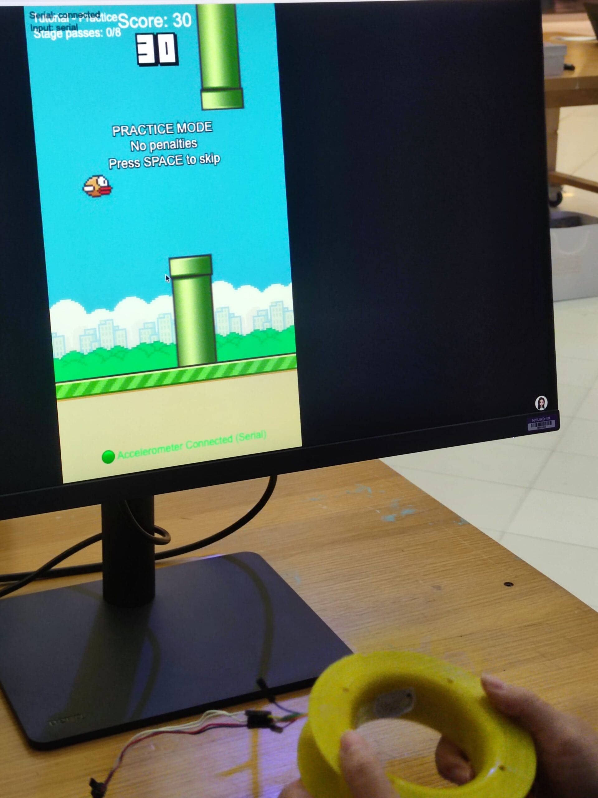
Wavy Bird is a physical rendering of the classic Flappy Bird. Instead of tapping a screen or clicking a mouse, the player holds a customary controller and physically waves their hand to keep the bird afloat.
The interaction design is simple by design but required significant tuning. The player holds a controller containing an accelerometer. A downward “Wave” gesture translates to a flap on the screen.
The challenge was calibration. A raw accelerometer reading is noisy as gravity pulls on the Z-axis differently depending on how the player holds the device. I designed a system where the game auto-calibrates the “rest” position on startup, which allows the player to hold the controller comfortably in any orientation, and the code detects relative acceleration changes (deltas) rather than absolute values.
Originally, I had ambitious plans to gamify an Implicit Association Test (IAT), forcing players to tilt the controller left or right to categorize words while flying to measure their implicit bias. However, during development, I realized the cognitive load was too high and the physical interaction was “muddy”. I pivoted to strip away the psychological testing and focus entirely on perfecting the core mechanic, i.e., the physical sensation of flight.
Project Interaction
P5.js: https://editor.p5js.org/yiyang/sketches/a2cexa377
Technical Implementation
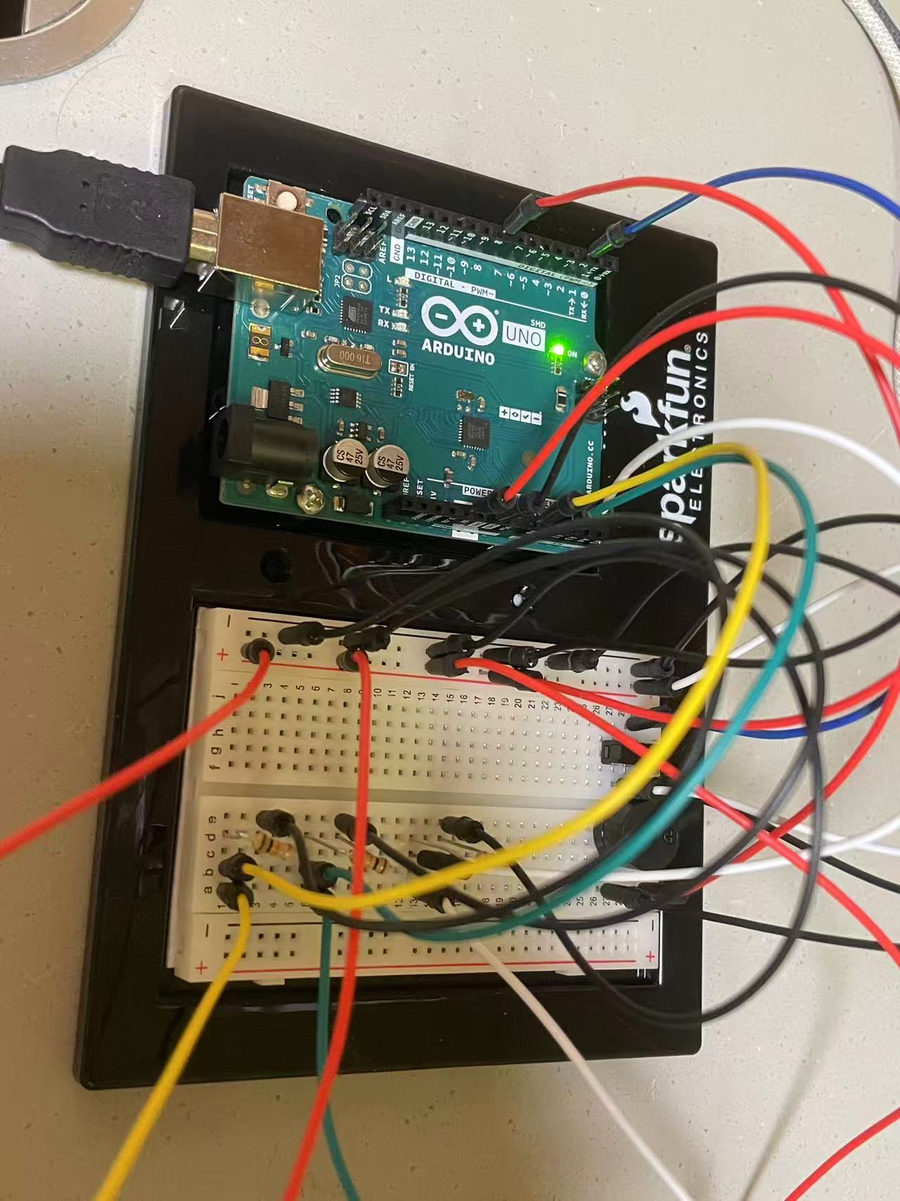
1. Arduino Code
The heart of the controller is an MMA8452Q accelerometer. I optimized the firmware to be lean. Instead of streaming raw data and letting the browser do the heavy lifting calculation, the Arduino processes the physics locally.
The code samples the Z-axis at 100Hz. If the acceleration drops significantly below the calibrated baseline (indicating a rapid downward movement), it registers a “Wave” to “Bump” up the bird. I implemented a debounce timer (200ms) to prevent a single wave from triggering a double-jump, which was a major point of frustration during early testing.
GitHub w/ Arduino Code: https://github.com/xuintl/wavy-bird
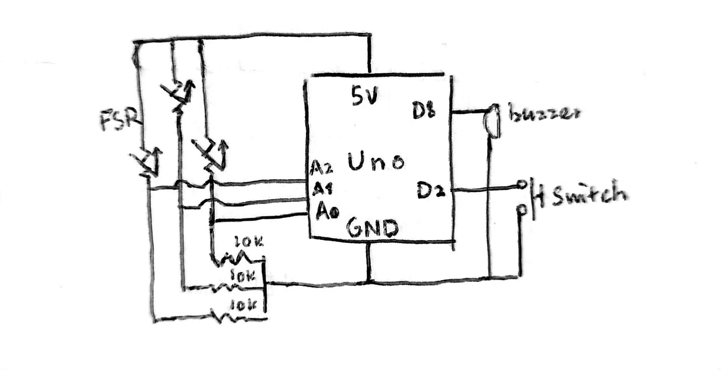
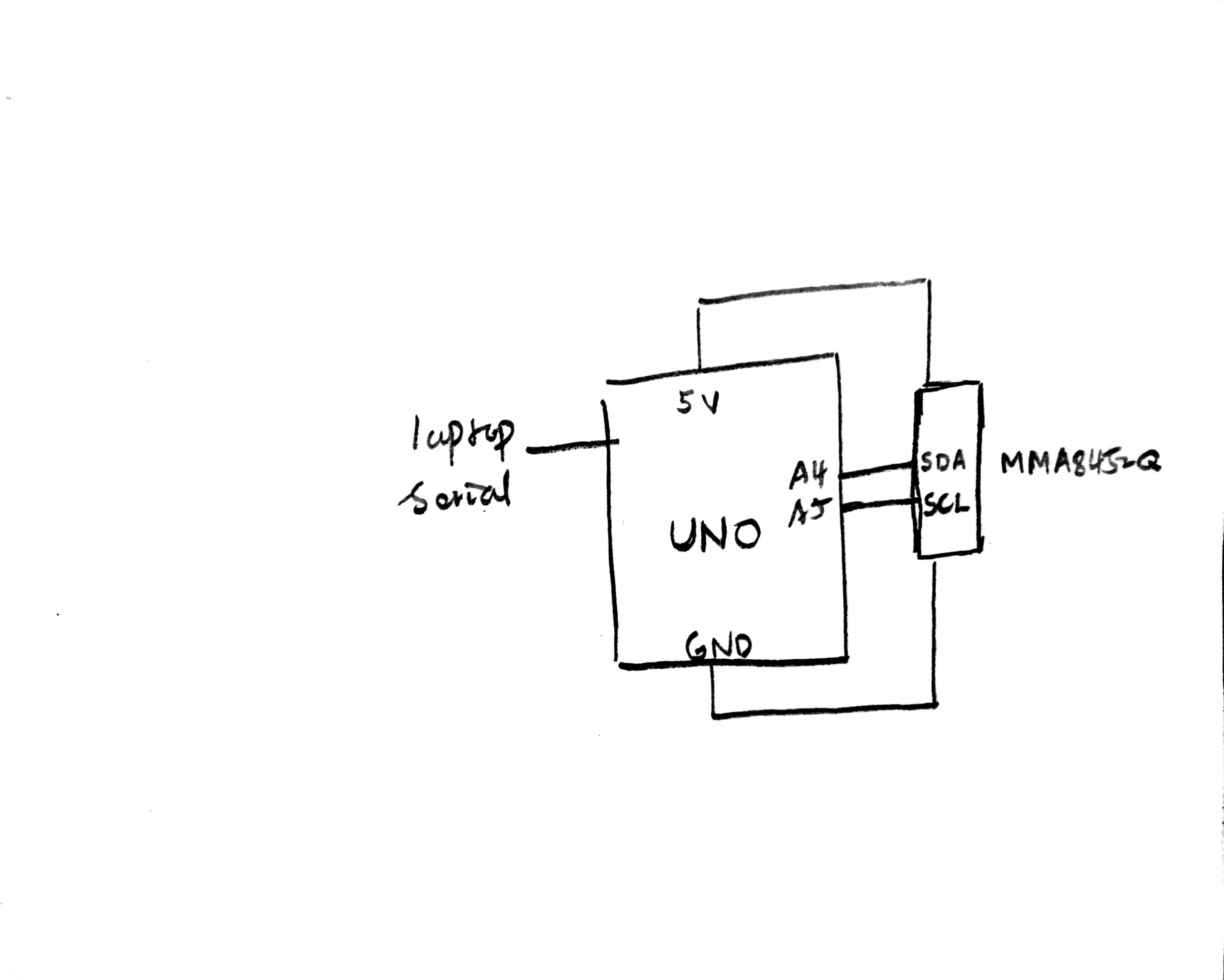
2. Circuit Schematic
The circuit uses I2C communication. I wired the MMA8452Q breakout board to the Arduino (3.3V power, GND, and A4/A5 for SDA/SCL).
3. p5.js Code
The visual front-end is built in p5.js. I refactored a massive and messy code into OOP-optimized code (bird, pipe, ui, serial).
The game loop handles the state machine (Name Entry → Tutorial → Gameplay → Results). I implemented a responsive viewport so the game scales to fit any window height, while maintaining the correct aspect ratio constrained by the sprites’ dimensions, preventing the graphics from stretching.
I am particularly proud of the game feel during the gameplay. Getting the “Wave” to feel responsive without becoming over-sensitive was a lot of trial-and-error. I had to tweak the G-force threshold (from 2g to around 0.5g deviation) to match the natural strength of a human wrist flick. In addition, a smooth control shift, with the addition of a Practice Mode, need to be thought carefully, and was far more a straight line to achieve in every condition.
4. Communication
Communication is handled via the Web Serial API.
- Handshake: The user presses
-and the browser connects to the Arduino. - Calibration: The user can press
=to send a0to the Arduino, triggering a recalibration routine if the device drifts. - Gameplay: When the Arduino detects a gesture, it sends the string
"WAVE\n"over the serial port. The p5.jsSerialManagerclass parses this line and immediately triggers thebird.flap()function.
A challenge I encountered was the serial communication. I struggled with baud rate mismatches (switching between 115200 and 9600) and browser compatibility issues where the port wouldn’t close properly, requiring a full page refresh. Refactoring the serial logic into its own class with robust error handling solved this.
Development and Discussion
The entire core logic and gameplay were manually engineered, including the decision to switch from absolute to relative coordinates, the tuning of the physics engine, and the refactoring of the game states. I was able to quickly learn the syntax for the SparkFun_MMA8452Q library and to scaffold the Web Serial API connection thanks to GitHub Copilot. These libraries and APIs are verbose and tricky to start from scratch. AI also helped me debug perplexing errors regarding “Wire.h”, but I had to direct the logic to ensure the game remained fun and fair. The code structure and sprite assets were organized by me to ensure maintainability.
For the future, I want to remove the cable entirely. Integrating a Bluetooth Low Energy (BLE) module would allow for a truly wireless controller. Additionally, I’d like to re-introduce the tilt mechanics I stripped out, perhaps allowing the player to strafe forward and backward to catch coins while dodging pipes.