Make a Wish ✨
Concept
My final project is a Disney’s Tangled themed reaction-time game. A major focus in Tangled is the floating lanterns that appear every year on Rapunzel’s birthday. These same lanterns are also popularly known as “wish” lanterns and I wanted to mix these two ideas to create my game. The overall flow of the game is that the user catches enough lanterns to earn a wish, and can then type and send out their wish into the universe with the other lanterns.
Video Documentation
Interaction Design
Once the user starts the game, the lanterns in front of them start to light up and turn off rapidly, and lively music, specifically the Kingdom Dance music from the film, plays in the background. The user needs to press a lit up lantern’s corresponding button to “catch” it. Every time they catch a lantern, their score (displayed on the p5js screen) goes up. Once they’ve reached a score of 20, the lanterns turn off and I See the Light begins to play in the background. They can input their wish on the screen and press ‘Enter’ to send it up with the floating wish lanterns. The physical lanterns blink pleasantly as the user’s wish floats upwards. Once out of sight, the light and music stops and the experience finishes. The user then gets the option to restart if they wish.
Arduino
Code:
// 4 lanterns (1 pin per lantern, 4 LEDs in parallel) + 4 buttons

// LED pins - one pin controls all 4 LEDs per lantern
const int lantern1 = 2;
const int lantern2 = 5;
const int lantern3 = 8;
const int lantern4 = 11;

// Button pins (using internal pullup resistors)
const int button1 = A0;
const int button2 = A2;
const int button3 = A3;
const int button4 = A4;

// track lit up lanterns
bool lanternActive[4] = {false, false, false, false};

// Button state tracking for debouncing
bool lastButtonState[4] = {HIGH, HIGH, HIGH, HIGH};   // last stable reading
unsigned long lastDebounceTime[4] = {0, 0, 0, 0};
const unsigned long debounceDelay = 50;   // 50ms debounce duration

void setup() {
  Serial.begin(9600);

  // Initialize LED pins
  pinMode(lantern1, OUTPUT);
  pinMode(lantern2, OUTPUT);
  pinMode(lantern3, OUTPUT);
  pinMode(lantern4, OUTPUT);

  // Initialize button pins with internal pullup
  pinMode(button1, INPUT_PULLUP);
  pinMode(button2, INPUT_PULLUP);
  pinMode(button3, INPUT_PULLUP);
  pinMode(button4, INPUT_PULLUP);

  // Turn off all LEDs initially
  turnOffAllLanterns();

  // Wait for serial to stabilize
  delay(1000);

  // debugging
  Serial.println("READY");
  Serial.println("Button test: Press each button");
  Serial.flush();
}

void loop() {
  // Check for commands from p5.js
  if(Serial.available() > 0) {
    String command = Serial.readStringUntil('\n');
    command.trim();

    if(command.startsWith("ON:")) {
      int lanternNum = command.substring(3).toInt();
      turnOnLantern(lanternNum);
    }
    else if(command.startsWith("OFF:")) {
      int lanternNum = command.substring(4).toInt();
      turnOffLantern(lanternNum);
    }
    else if(command == "ALLON") {
      turnOnAllLanterns();
    }
    else if(command == "ALLOFF") {
      turnOffAllLanterns();
    }
  }

  // Check buttons with debouncing
  checkButton(0, button1);
  checkButton(1, button2);
  checkButton(2, button3);
  checkButton(3, button4);
}

// Button check function
void checkButton(int buttonIndex, int buttonPin) {
  bool reading = digitalRead(buttonPin);

  // check if reading is bouncing, reset debounce timer
  if(reading != lastButtonState[buttonIndex]) {
    lastDebounceTime[buttonIndex] = millis();

    // If state is now LOW (pressed), send immediately
    if(reading == LOW) {
      Serial.print("BTN:");
      Serial.println(buttonIndex + 1);
      Serial.flush(); // data is sent immediately
    }
  }

  lastButtonState[buttonIndex] = reading;
}

// LED Control Functions

void turnOnLantern(int lanternNum) {
  lanternActive[lanternNum - 1] = true;

  switch(lanternNum) {
    case 1:
      digitalWrite(lantern1, HIGH);
      break;
    case 2:
      digitalWrite(lantern2, HIGH);
      break;
    case 3:
      digitalWrite(lantern3, HIGH);
      break;
    case 4:
      digitalWrite(lantern4, HIGH);
      break;
  }
}

void turnOffLantern(int lanternNum) {
  lanternActive[lanternNum - 1] = false;

  switch(lanternNum) {
    case 1:
      digitalWrite(lantern1, LOW);
      break;
    case 2:
      digitalWrite(lantern2, LOW);
      break;
    case 3:
      digitalWrite(lantern3, LOW);
      break;
    case 4:
      digitalWrite(lantern4, LOW);
      break;
  }
}

void turnOnAllLanterns() {
  for(int i = 0; i < 4; i++) {
    lanternActive[i] = true;
  }

  digitalWrite(lantern1, HIGH);
  digitalWrite(lantern2, HIGH);
  digitalWrite(lantern3, HIGH);
  digitalWrite(lantern4, HIGH);
}

void turnOffAllLanterns() {
  for(int i = 0; i < 4; i++) {
    lanternActive[i] = false;
  }

  digitalWrite(lantern1, LOW);
  digitalWrite(lantern2, LOW);
  digitalWrite(lantern3, LOW);
  digitalWrite(lantern4, LOW);
}
Description:
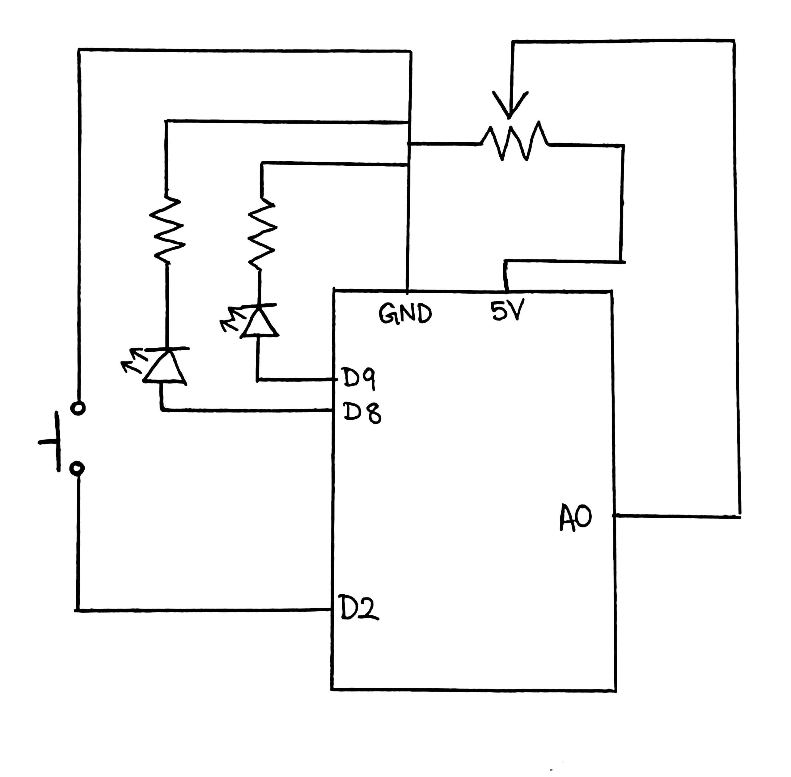
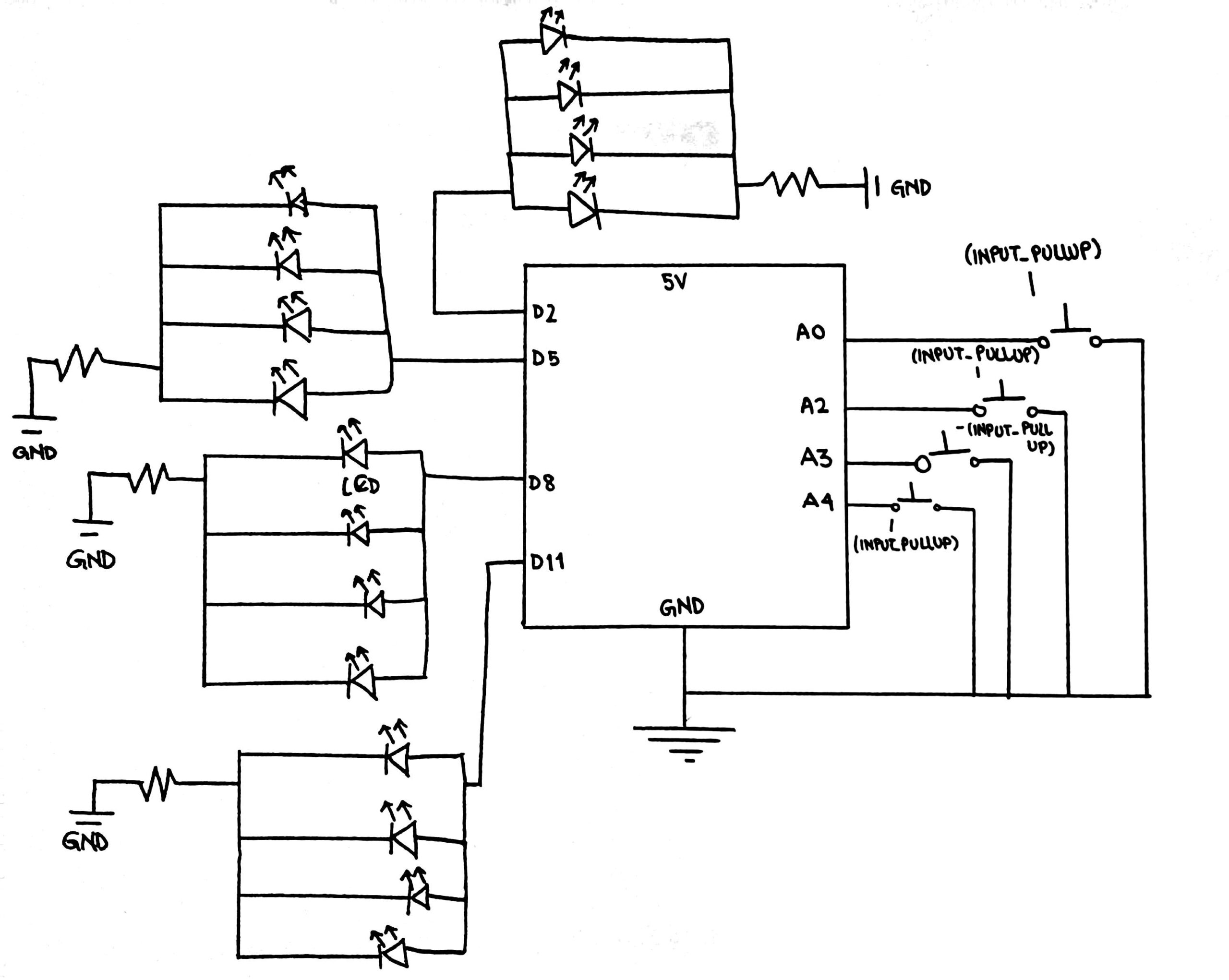
This Arduino sketch controls four LED-based lanterns and four physical push buttons while communicating with the p5.js application through the Serial connection. Each lantern consists of four LEDs connected in parallel and is controlled by a single digital output pin (2, 5, 8, and 11), while the buttons are connected to analog pins (A0, A2, A4, and A3) and use internal pull-up resistors, meaning they read HIGH by default and LOW when pressed.
The program tracks the active state of each lantern using an array and also monitors button activity with additional arrays that store the last button state and the last debounce time, applying a 50-millisecond debounce delay to prevent false or repeated presses caused by mechanical noise.
Inside the main loop, the Arduino continuously listens for serial commands sent from p5.js, such as instructions to turn individual lanterns on or off using formatted messages like “ON:1” or “OFF:3”, as well as commands that control all lanterns at once using “ALLON” and “ALLOFF”. At the same time, the loop constantly checks each physical button using a dedicated debouncing function that detects state changes, filters out signal noise, and immediately sends a message like “BTN:1” through the Serial port when a valid press occurs so that the visual system can respond instantly.
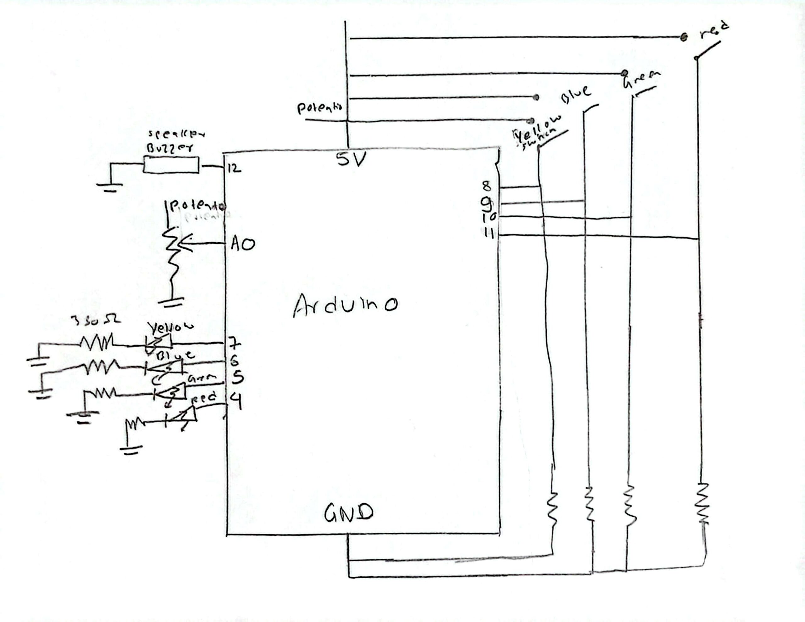
Schematic
P5.js
(you can enter fullscreen mode by double-clicking on the canvas in p5.js)
Description:
The p5.js sketch controls the full digital side of the interactive experience by handling the visuals, sound, gameplay logic, and communication with the Arduino. It manages multiple game states including the start screen, instructions, active gameplay, and the final wish sequence. The program sends commands to the Arduino to activate and deactivate physical lantern LEDs while simultaneously listening for incoming button press data through the Web Serial API. Animated lanterns are continuously spawned and float upward across the screen, a live score is tracked, and background music changes based on the game state. Once the user successfully collects enough lanterns, a text input appears to capture and animate their written wish before the experience resets.
Arduino + p5.js communication
The communication between the Arduino and p5.js is handled through serial data exchange. The Arduino continuously listens for text-based commands sent from p5.js, such as “ON:1”, “OFF:3”, ALLON, and ALLOFF, which control the physical LED lanterns. At the same time, the Arduino sends messages like “BTN:1” whenever a physical button is pressed. These messages are read and interpreted by p5.js to update the game state, score, and visuals. This two-way communication allows the physical hardware and the digital game to stay perfectly synchronized.
What I’m most proud of
I think what I’m most proud of is the physical components and setup of this game, as the software side of it is not too complex. I got to use a lot of new tools such as 3-D printing for the lanterns and laser cutting for the panel box for the buttons which I may not have used otherwise. Moreover, I got through several issues, such as the not visible yellow light from LEDs (which was the initial plan) by switching to blue, and the mess of wires going into the Arduino (that was an eyesore) by adding the cardboard base under the lanterns to hide the wires under. Just yesterday, I found that one of the buttons in my panel box was no longer working and I had to remove the solder from it to free the wires and replace the system with a new button. I’m also still very proud of the castle that’s part of the visuals in p5.js as I made every single individual shape of that silhouette through trial and error with the shape coordinates.
How this was made
Media sources:
The starting page’s background image came from this website: wallup.net
The font Homemade Apple cam from fonts.google.com
The background music was from the Youtube videos linked previously in the post
The game concept, code, and writeup were done by me, with AI being used for debugging the p5.js code. For example, it helped me debug the connectSerial() and readSerial() functions when they weren’t working as I still was not fully clear on how they connected and functioned, and it’s also how I found out about the windowResized() function.
// Keeps the layout responsive when the browser window is resized
function windowResized() {
  resizeCanvas(windowWidth, windowHeight);
  // Reposition input box
  if (wishInput) {
    wishInput.position(windowWidth/2 - 180, windowHeight - 100);
    // Keeps the wish input centered at the bottom of the screen
  }
  if (restartButton && experienceFinished) {
    restartButton.position(windowWidth / 2 - 110, windowHeight / 2 - 25);
    // Keeps the restart button centered on the screen after resizing
  }
}
My grammar and sentence phrasing in general in this writeup was occasionally polished by Grammarly to help make it more clear and concise.
Future Improvement
I think there are many things I would like to improve in the future:
1) Make a full platform (similar to the one for the buttons) for the lanterns to sit on under which I can hide the Arduino and the full wire.
2) Create a mechanism that allows the player to adjust the game speed, maybe through a potentiometer.
3) Use a brighter source of light such a neo pixels instead of LEDs so that lanterns shine brighter.
4) On the software side the user can still click anywhere on the screen and that creates their own lantern that begins floating upwards, but currently there is no corresponding reaction in the physical setup. It would be interesting to set up such a reaction for every new lantern that is spawned by clicking.