Concept
For my midterm project, I created a mind palace experience where users could choose to get rid of memories. For my final project, I wanted to continue exploring the theme of memory, but take it in the opposite direction. This time, users can’t choose whether they lose a memory or not; instead, it depends on their ability to remember.
In Faded, LEDs light up in a sequence, and the user has to repeat the sequence correctly. A blurred image on the screen represents a memory, if the user recalls the pattern correctly, the image becomes clear. If they make a mistake, the memory is lost, and the image fades.
It’s a slightly ironic twist: to hold on to a memory, you need a good memory. The project reflects how we remember or forget.
Pictures/Videos

How does the implementation work?
Interaction Design
- The experience begins with a landing screen and an instructions page.
- A “Connect to Arduino” button helps with easy serial connection. .
- The system is designed to enter fullscreen on mouse click, but also includes a failsafe:
- If the user presses the spacebar before going fullscreen, it first triggers fullscreen mode.
- On the next spacebar press, the game starts. (For the showcase, the experience will remain in fullscreen from the start.)
- On starting the game, a blurred image (memory) is displayed on screen.
- A random sequence of 4 LEDs flash one by one.
- The player must repeat the sequence using the corresponding physical buttons.
- If the sequence is correct:
- The blurred image becomes clear, representing a remembered memory.
- If the player makes a mistake:
- The memory is lost, and a “Game Over” message is shown as the memory fades away.
Arduino Code:
int buttonPins[4] = {2, 3, 4, 5};
int ledPins[4]    = {8, 9, 10, 11};
int lastState[4] = {HIGH, HIGH, HIGH, HIGH};

void setup() {
  Serial.begin(9600);
  for (int i = 0; i < 4; i++) {
    pinMode(buttonPins[i], INPUT_PULLUP);
    pinMode(ledPins[i], OUTPUT);
    digitalWrite(ledPins[i], LOW);
  }
}

void loop() {
  if (Serial.available()) {
    String input = Serial.readStringUntil('\n');
    input.trim();
    if (input == "-1") {
      // Turn off ALL LEDs
      for (int i = 0; i < 4; i++) {
        digitalWrite(ledPins[i], LOW);
      }
    }
    else {
      int index = input.toInt();
      if (index >= 0 && index < 4) {
        digitalWrite(ledPins[index], HIGH); // Turn on specific LED
      }
    }
  }

  for (int i = 0; i < 4; i++) {
    int reading = digitalRead(buttonPins[i]);
    // Because the buttons use INPUT_PULLUP, the pin reads HIGH when unpressed and LOW when pressed. So when button is pressed, state changes from HIGH to LOW.
    if (lastState[i] == HIGH && reading == LOW) {
      // Send button info to p5.js
      Serial.print("BUTTON:");
      Serial.println(i);
      // light up LED when that button is pressed
      digitalWrite(ledPins[i], HIGH);
      delay(120);
      digitalWrite(ledPins[i], LOW);
    }
    lastState[i] = reading;
  }
}
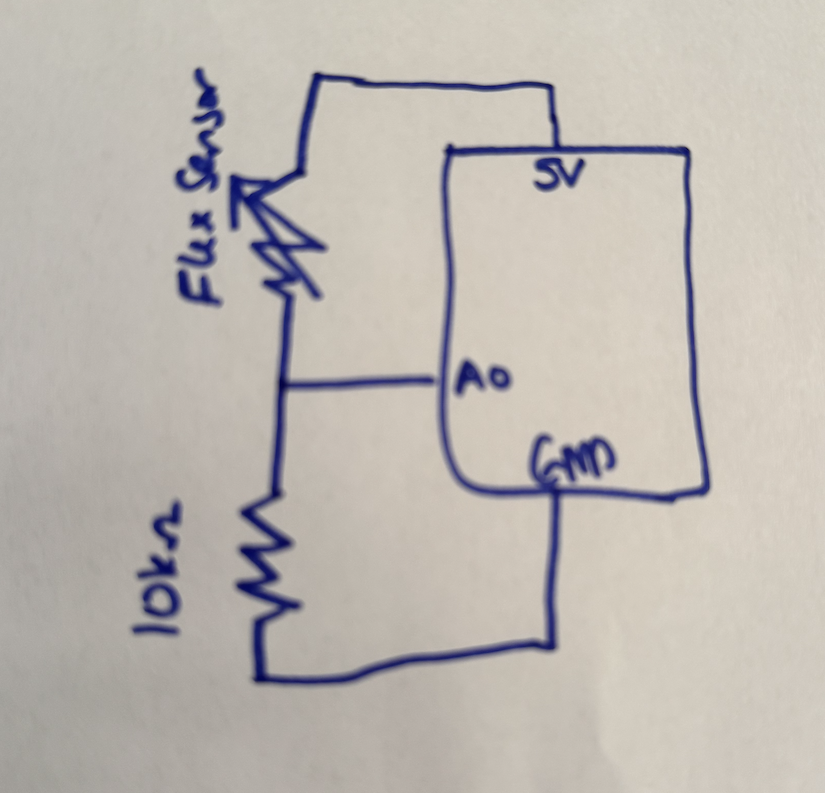
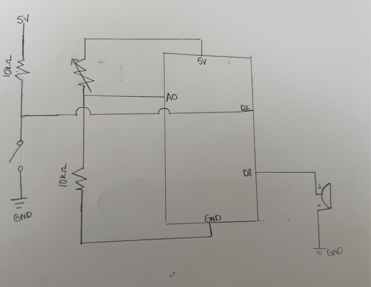
Schematic:

p5.js Code and Description
The p5.js sketch is the main part as it is managing visuals, game flow, and Arduino communication. It controls screen transitions using a currentScreen variable, loads and blurs memory images dynamically, and generates a random LED sequence that is shown with proper timing using millis() and flags. The sketch receives button input from Arduino via serial and checks it against the correct sequence to determine success or failure. It also sends LED control commands back to Arduino and provides audio feedback for correct or incorrect inputs, creating a cohesive and interactive experience.
View p5.JS codeArduino and p5.js Communication
- p5.js to Arduino:
- Sends LED index (“0\n” to “3\n”) to flash a specific LED.
- Send “-1\n” to turn all LEDs off.
- Arduino to p5.js:
- On button press, Arduino sends BUTTON:x (e.g., BUTTON:2) to identify which button was pressed.
- p5.js parses this input and compares it to the expected sequence.
Aspects I’m proud of?
I’m someone who isn’t very handy and had never soldered before, so being able to solder everything, no matter how long it took, was something I’m genuinely proud of. I’m also proud of the concept itself. It’s simple but carries a deeper, emotional meaning about memory and loss. Even though the technical side isn’t overly complex, I intentionally kept it that way to make the experience more approachable and enjoyable. I had fun building it, and I hope it is rewarding to see others engage with it without feeling overwhelmed by complicated interactions.
How this was made:
Initially, I used images from the internet, but I found it difficult to find ones that were nostalgic, aesthetic, and suitable for fullscreen display. Eventually, I turned to AI image generation, and while I’m often skeptical about its accuracy, this time I was genuinely pleased with the results. The generated images conveyed the intended atmosphere and worked well with the game’s visual design.
On the coding side, one of my main struggles was implementing the showSequence() function, which controls the timing of LED flashes. I initially attempted to manage it using simple flags, but the logic became unreliable. With help from ChatGPT, I learned to use millis() and a lastTime variable to precisely track time intervals. This made the LED sequence much more consistent and readable.
Another area where AI support was valuable was in blurring images. I had initially applied a filter(BLUR, 10) directly to the image, but it unintentionally blurred the entire canvas. ChatGPT suggested using a separate blurLayer graphics buffer to isolate and control the blur effect. Additionally, I was manually creating each button’s design and behavior across different screens, which led to a lot of repetitive code. On AI’s suggestion, I created a reusable drawButton() function, which significantly simplified the interface logic and made the code cleaner.
AI also helped me understand Arduino’s serial communication functions more clearly. I learned the difference between readStringUntil() and readBytesUntil(), and how readStringUntil(‘\n’) could be used to parse complete lines of input from the serial port from this example: Arduino documentation.
Future Improvements
To enhance the experience, I’d like to implement multiple levels with increasing difficulty, where the LED sequences become longer or faster as the player progresses. This would add a sense of progression. Additionally, I’d like to add subtle background audio that evolves based on the player’s performance, making the experience more immersive.