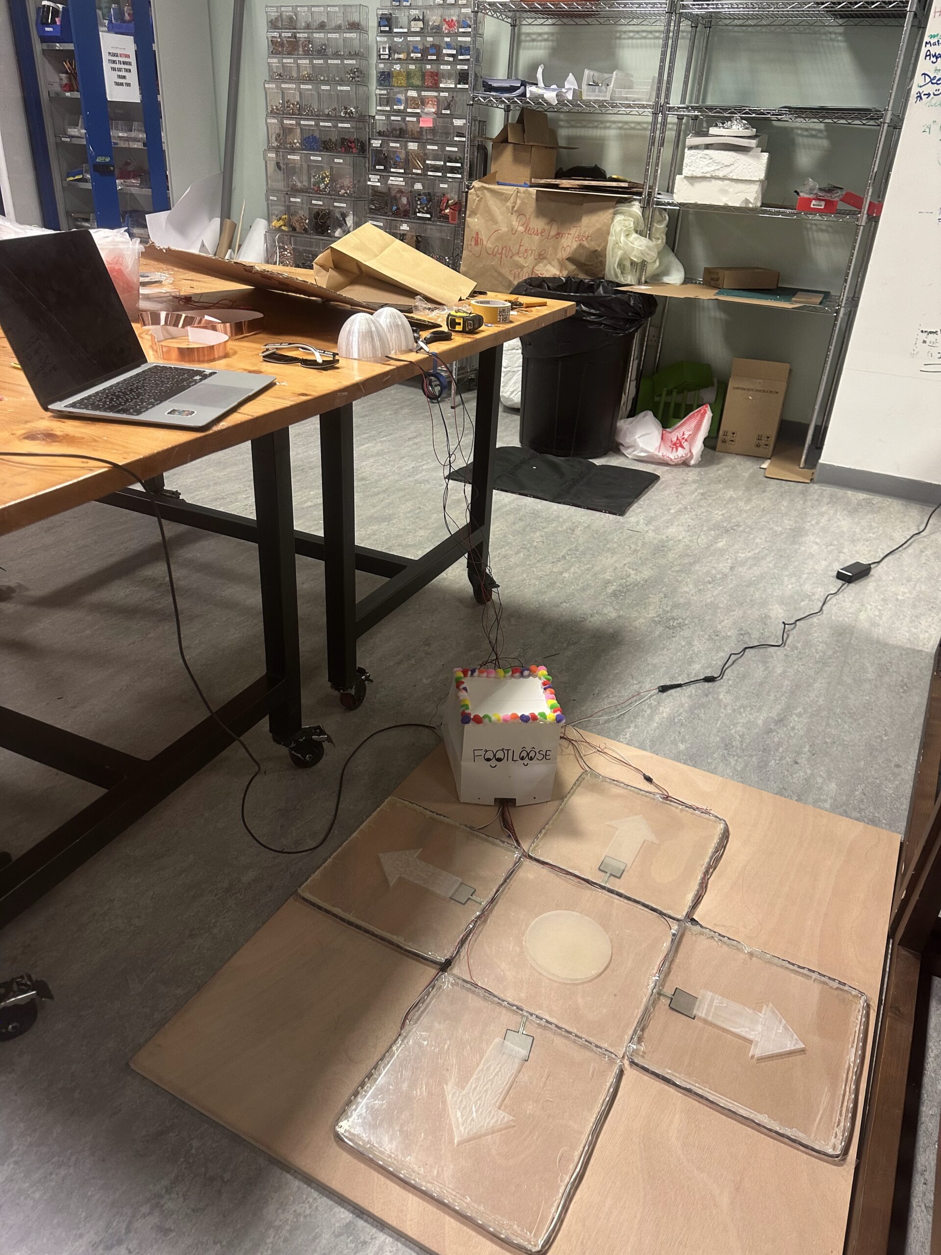
1. Concept
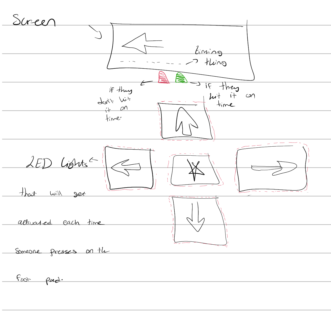
Foot Loose is an interactive rhythm game played using four physical floor sensors and a p5.js visual interface. Arrows fall down the screen, and players must step on the corresponding floor pad when the arrow enters the hit zone. Each step communicates with the p5 sketch through serial, triggering immediate visual and physical feedback. There are also different difficulty levels and each level gives a different amount of points for each correct hit. For example; on the easy level each correct hit gives the user 1 point, but on the medium level each correct hit gives 2 points per correct hit. I also implemented a high score option to add a sense of competition between the users.
My goal was to merge screen-based rhythm gameplay with embodied movement, making the player physically part of the interface. bright neopixel strips illuminate each pad on impact, and two 3D-printed domes on the side provide glowing “good” and “miss” signals during gameplay.
P5 sketch:
https://editor.p5js.org/rma9603/full/yx2PTBX3y
Arduino Sketch:
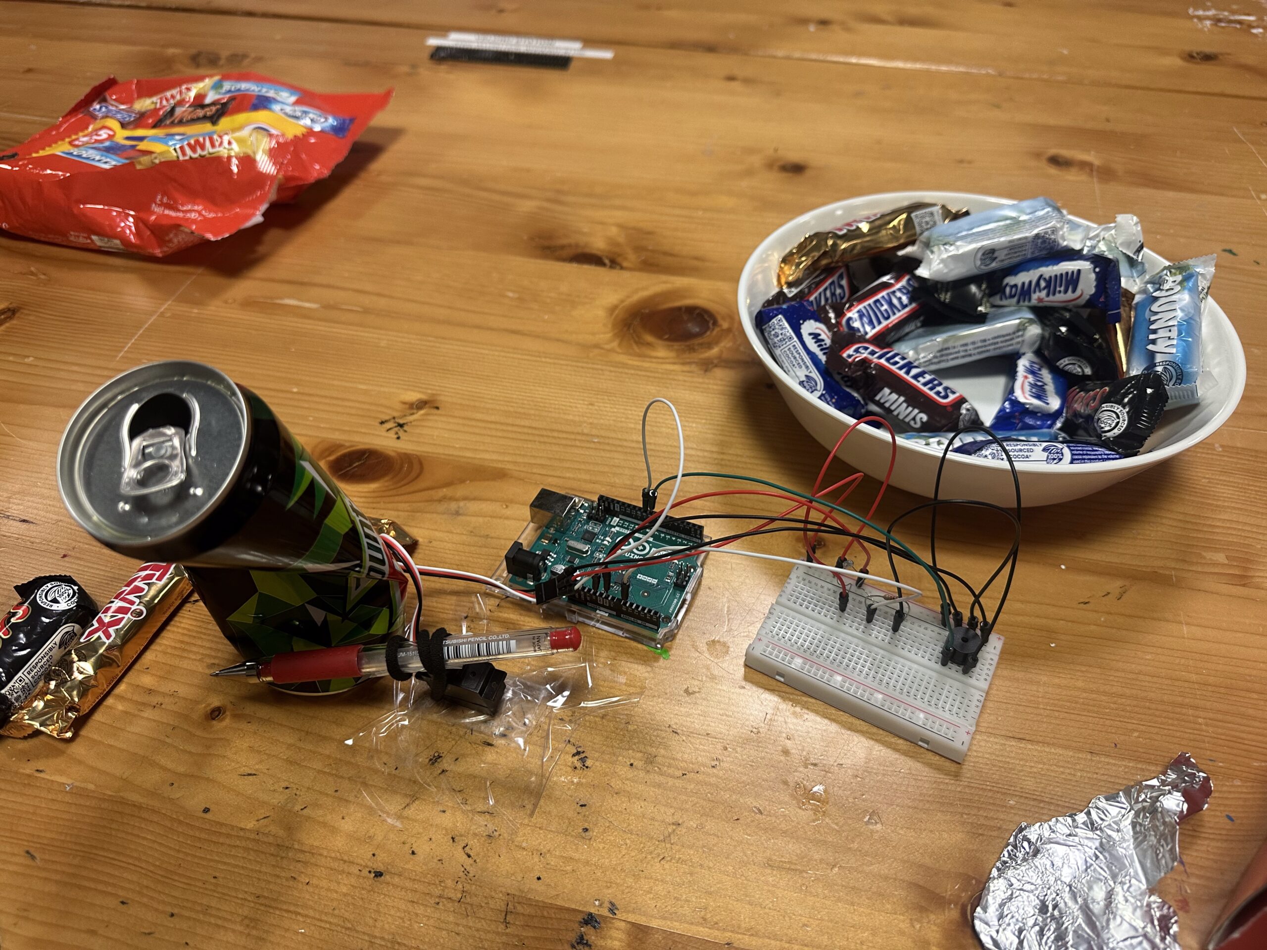
2. images of the project
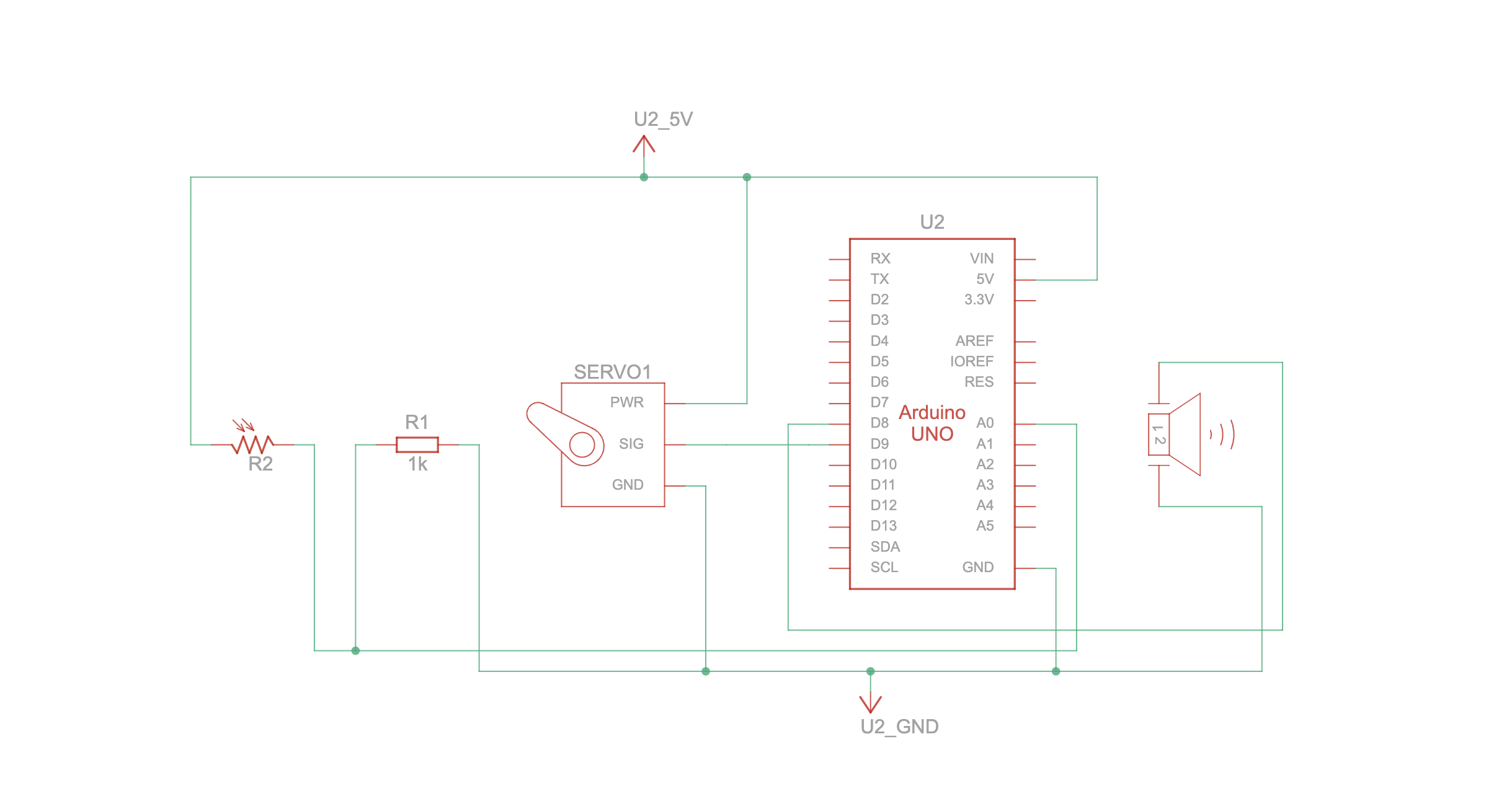
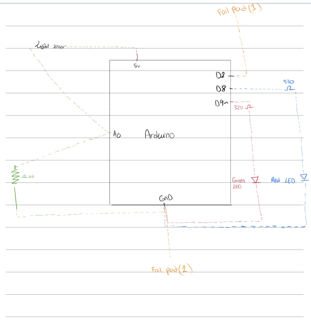
3. schematic
-
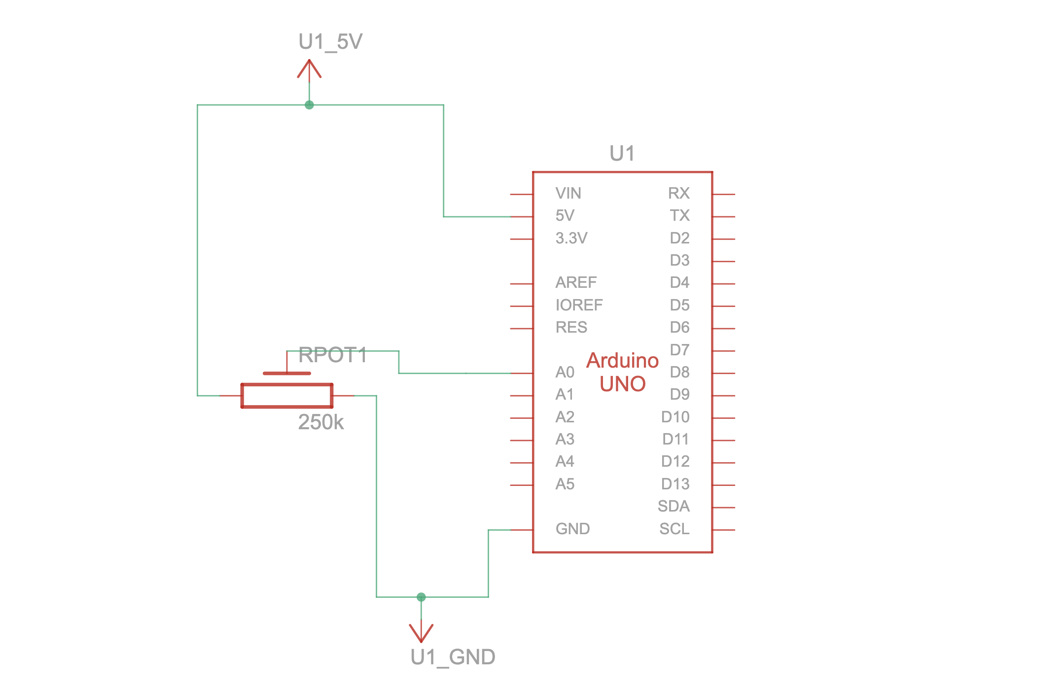
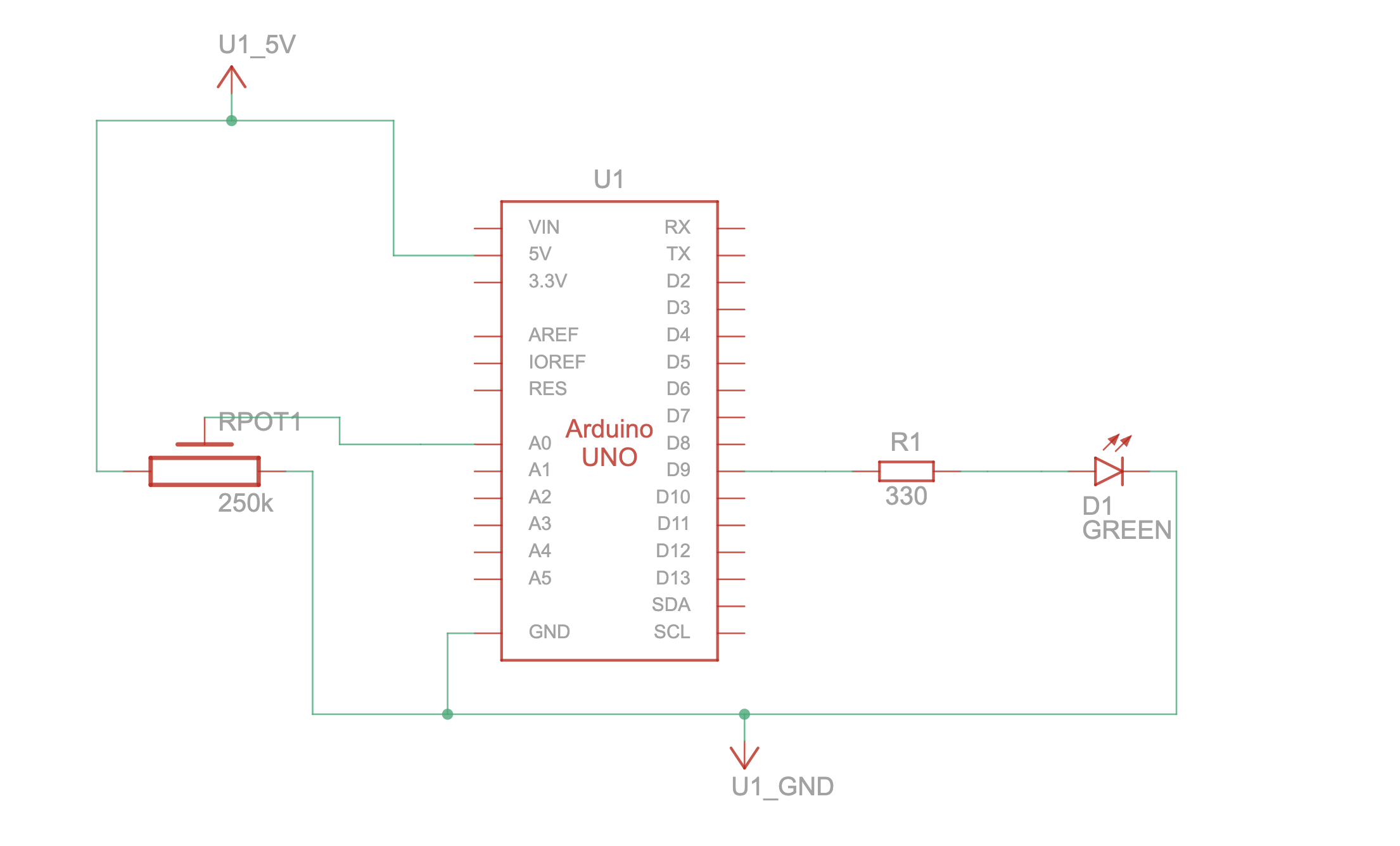
force sensors to A0/A1/A4/A3
-
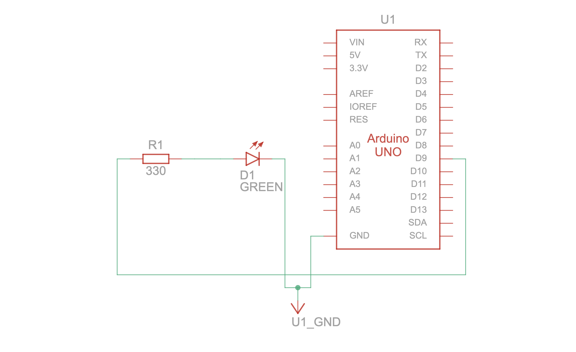
four neopixel strips on pins 6, 5, 4, 3
-
green LED strip on pin 2
-
red LED strip on pin 7
-
external power input → breadboard rail
-
arduino on isolated 5v rail
-
common ground
4. user testing videos
First user testing:
Final user testing:
5. implementation
interaction design
Players stand on four directional pads (left, down, up, right). arrows fall through four color-coded lanes in p5. when an arrow enters its hit zone, the player steps on the matching sensor. if the timing is correct, the game awards a “good” and triggers a green glowing dome; if not, the “miss” dome flashes red.
Each step triggers both a physical LED animation and a digital judgment, merging physical effort with on-screen accuracy.
Arduino code description
The arduino reads all four force sensors, checks whether their values cross a threshold, and sends the corresponding direction (“L”, “D”, “U”, “R”) to p5 via serial.
For visual feedback, each pad has its own neopixel strip that flashes a themed color on impact. the good/miss domes use two small neopixel strips (one mapped to “good” on pin 2, one mapped to “miss” on pin 7).
I added global brightness control with a multiplier B = 0.33 so all LED animations are consistent and safe for long-term use.
arduino snippet: sensor reading + serial output
int valL = analogRead(piezoL);
if (valL > threshL) {
Serial.println("L");
flashLeft();
}
arduino snippet: sending good/miss feedback
if (Serial.available()) {
  char c = Serial.read();
  if (c == 'G') flashGood();
  else if (c == 'M') flashMiss();
}
arduino snippet: RGBW dome color without white channel
uint32_t colorDimRGBW(Adafruit_NeoPixel &strip, uint8_t r, uint8_t g, uint8_t b) {
  return strip.Color(r * B, g * B, b * B, 0);
}
p5.js code description
the p5 sketch handles visuals, timing, scoring, and the overall game loop. arrows are spawned at regular intervals depending on difficulty. each arrow knows its lane, position, and whether it has been judged already.
when p5 receives a direction from the arduino, it calls judgeLaneHit(), which checks if the arrow is inside the hit zone.
p5 snippet: receiving hits
let msg = port.readUntil("\n").trim();
if (gameState === "playing") handleSerialHit(msg);
p5 snippet: judging accuracy
if (cand) {
  cand.hit = true;
  score++;
  sendResultToArduino("GOOD");
} else {
  sendResultToArduino("MISS");
}
Arduino ↔ P5 communication
communication is entirely over serial:
arduino → p5
- sends “L”, “D”, “U”, “R” depending on which sensor is triggered
P5 → arduino
- sends “G” for a correct hit
- sends “M” for a miss
Every feedback is instantaneous. the physical LEDs and digital UI stay perfectly in sync.
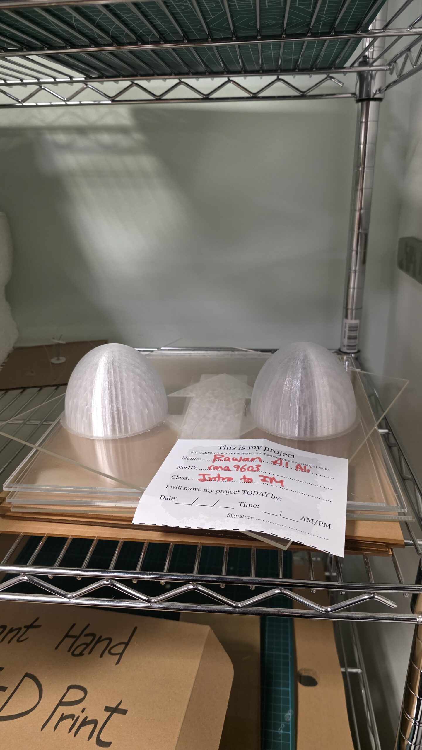
6. 3D-printed domes for good/miss signals
to make the feedback more visible and aesthetically strong, i 3D-printed two translucent domes that sit over the neopixel strips on pins 2 and 7. the domes diffuse the light so players immediately see a soft red glow for a miss or a green glow for a good hit.
the file Rawan Intro.stl is the 3D model that defines the shell shape. after exporting, i passed it through a slicer, which generated the bgcode file—the printer instructions that break the model into printable layers.
the domes were printed in PETG because it diffuses LED light beautifully and is flexible enough to withstand users stepping near them.
7. What I’m proud of
– getting consistent sensor readings after switching from piezos to force sensors
– syncing LED animations perfectly with game logic
– designing a fully embodied rhythm-based experience
– integrating hardware, software, sound, and visuals in one seamless loop
– printing custom physical components that elevate the polish of the project
8. Resources used
– p5.js serial library documentation
– adafruit neopixel reference
9. AI tool usage disclosure
I used an AI assistant (ChatGPT) during development, not for ideation or design direction. its role was limited to:
- debugging wiring and neopixel behavior
- helping me understand how to work with neopixels
- helping clean up and comment code
- rewriting overly technical explanations into clearer documentation
- giving solutions to certain sensor issues
10. challenges and solutions
unreliable piezo sensors
The original design used piezo discs. they produced unstable readings, spiking wildly and making thresholds unusable. After multiple tests, I switched to force-sensitive resistors, which immediately solved the accuracy issues.
26-volt power
At one point, my external 26V power supply shared a rail with arduino’s 5V line. This caused wires to melt and the arduino to fry. With professor Aya’s help, I rewired everything through a solderable breadboard and separated the power rails correctly.
removing the center pad
The early design had a fifth, center pad. user testing quickly revealed players naturally used the center as a neutral resting point, which made the center arrow unintentionally easy. removing it improved gameplay dramatically.
11. future improvements
- adding multiple songs and more difficulty modes
- better platform for stability
- using translucent acrylic for a more durable dome design
- making the song and arrows in sync