- Include some pictures / video of your project interaction
- user testing 2 (see this clip for full interaction):
- https://drive.google.com/file/d/11MYknXjQfZ2JDwCdM1UDdrmKWQnlF0M7/view?usp=sharing (sorry professor I have no idea word press uploaded this long video file for an hour, so I turned to google drive)
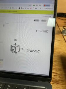
- connecting
- building handshake video clip
- p5 interface
- user testing 2 (see this clip for full interaction):
-
- robot headshot

- robot headshot
- Describe your concept
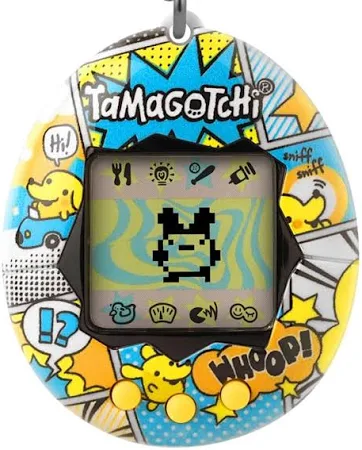
For my final project, I will create a physically interactive Tamagotchi. It is a mini robot creature that the user can pat, touch, spin, and talk to, but instead of being cute and grateful, it responds in unexpectedly pessimistic and slightly hostile ways. The project combines physical interaction through arduino sensors with a character interface and dialogue system in p5. The concept is inspired by classic Tamagotchi toys, small handheld digital pets that demand constant attention and reward care with affection. In contrast, my project imagines a near-future world in which artificial beings no longer need, or even want, human caretaking. This pet has a personality shaped by human environmental destruction and techno-optimism gone wrong, and it is deeply unimpressed by humans.
- How does the implementation work?
- Description of Arduino code and include or link to full Arduino sketch
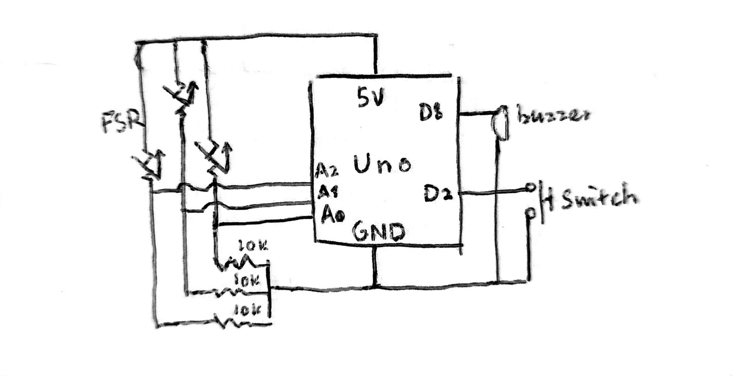
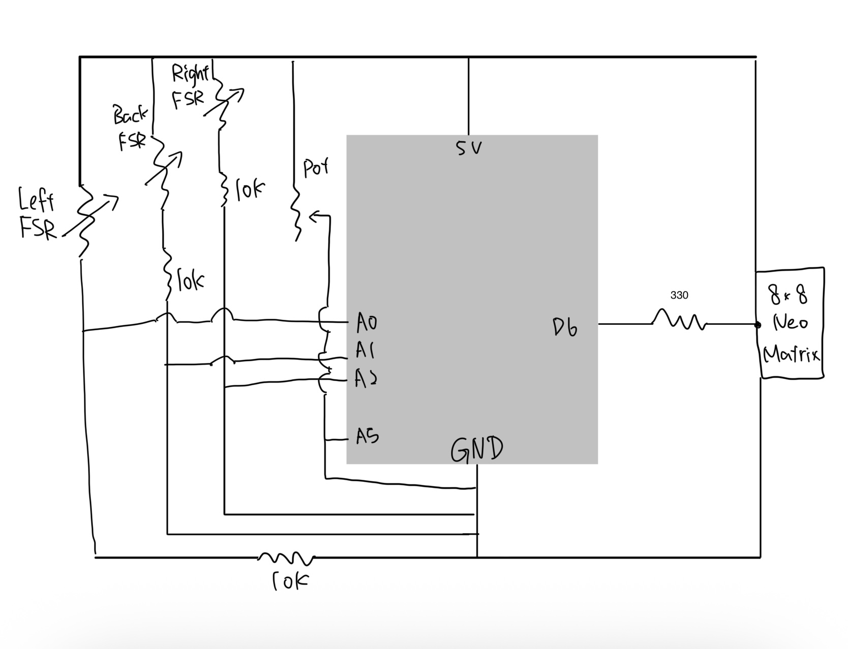
- Schematic of your circuit (hand drawn or using tool)
- Description of p5.js code and embed p5.js sketch in post
-
- link includes both p5 and commented arduino: https://editor.p5js.org/joyzheng/sketches/mmYysys_A
-
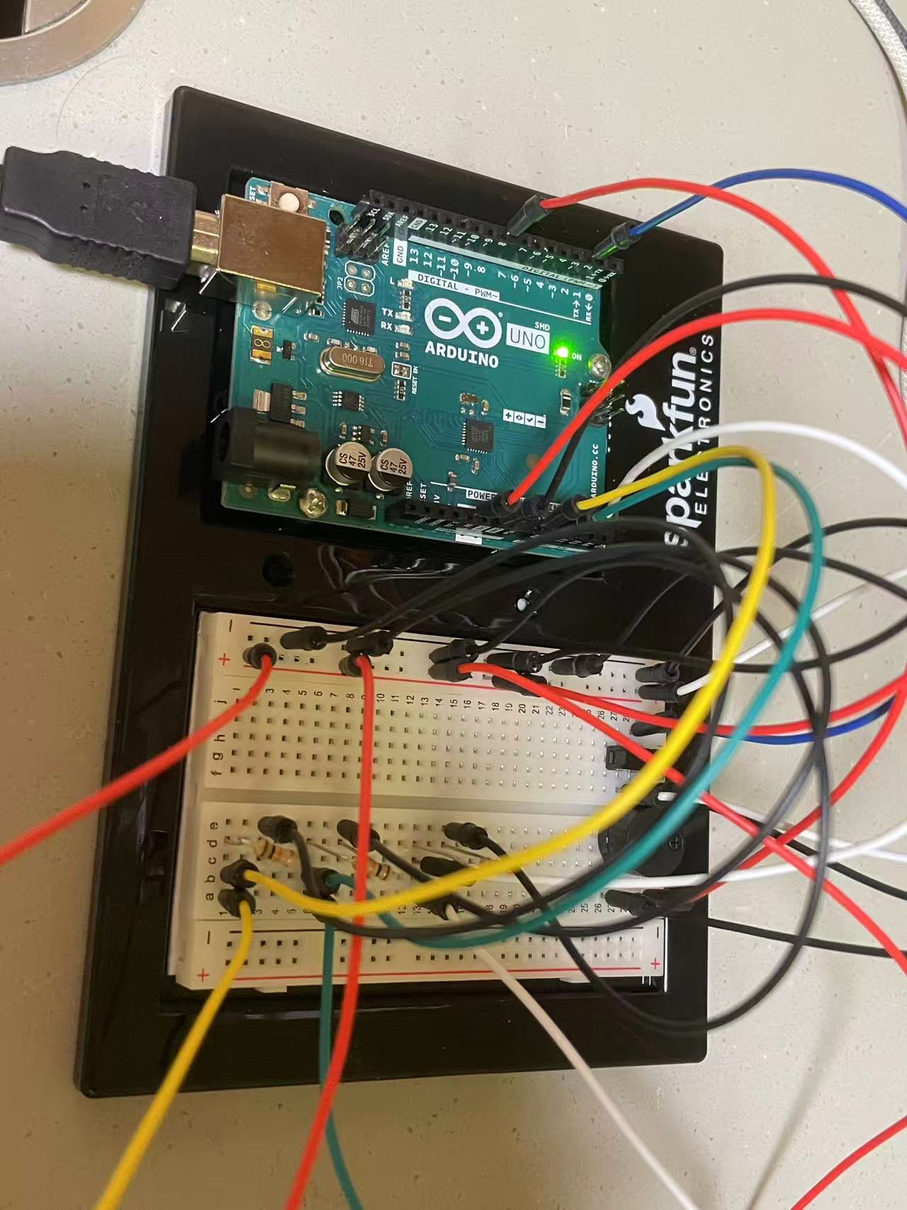
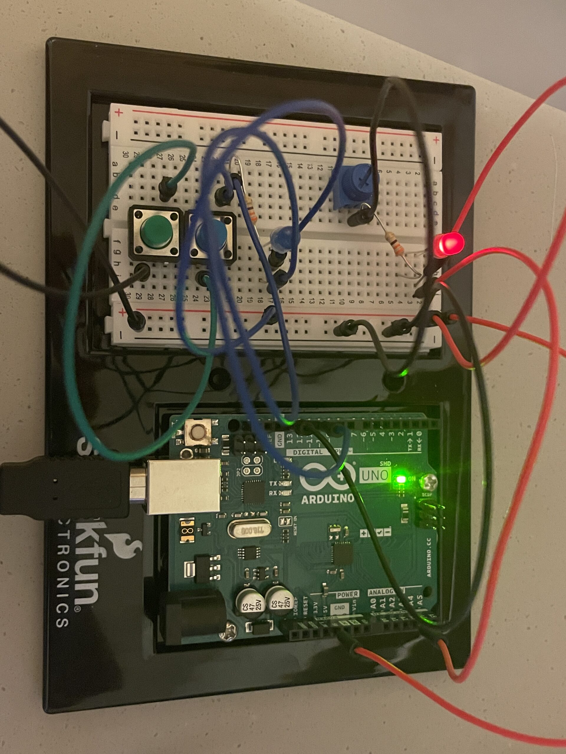
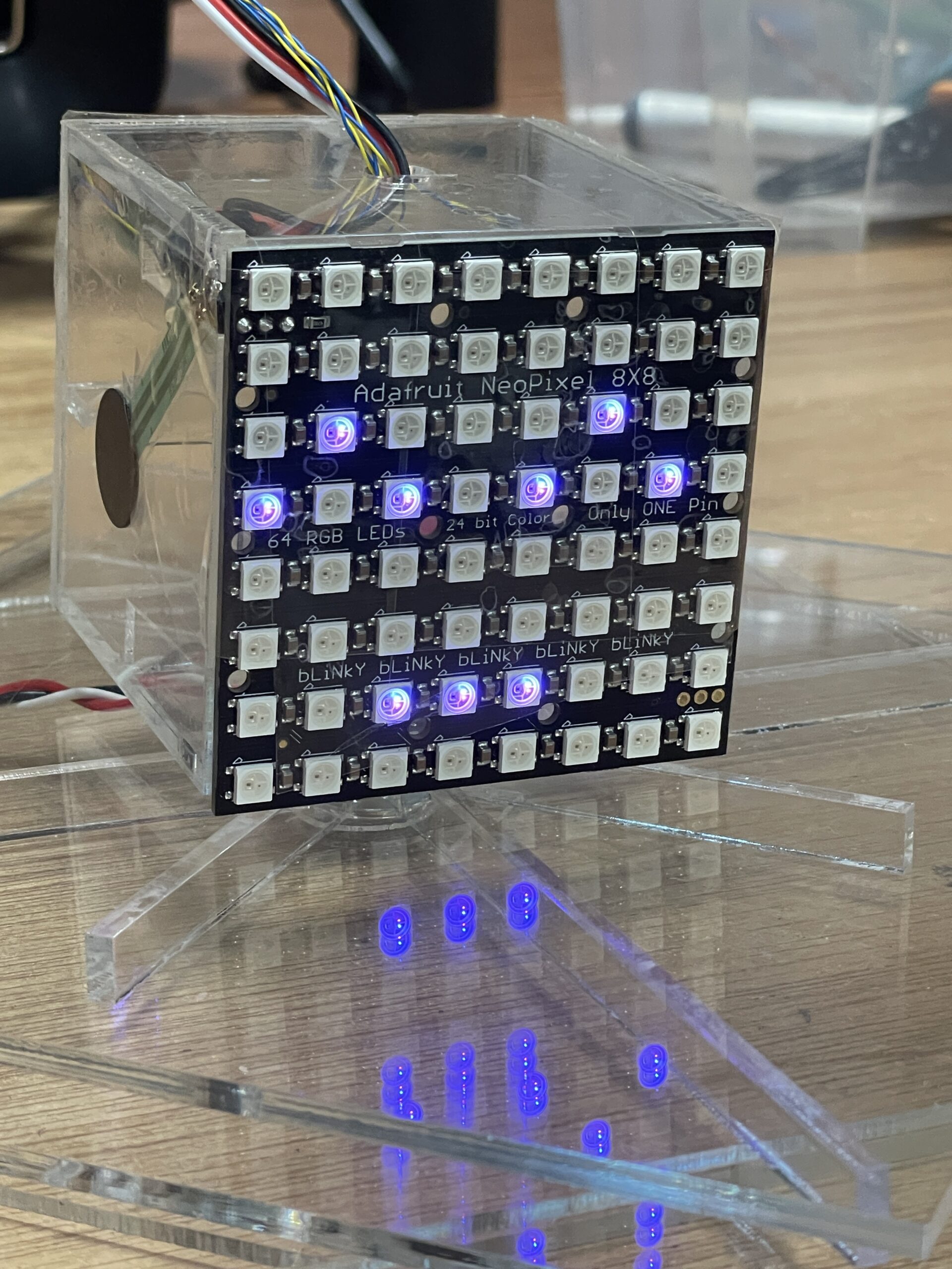
The system consists of two main components: a physical controller powered by an arduino and a visual interface running on p5. The physical body uses a potentiometer to detect rotation (spinning) and three Force Sensitive Resistors (FSRs) placed on the left, right, and back to detect touch. An 8×8 neo matrix serves as the robot’s physical face. p5 handles the complex game logic, visual assets, and audio, while the arduino handles raw sensor data acquisition and LED matrix control.
- Description of interaction design
The interaction is designed to simulate a moody robot. Spinning the potentiometer quickly disorients it, triggering a dizzy or angry state that turns the physical neo matrix into an angry red face. Similarly, squeezing the robot by pressing both the left and right sensors evokes annoyance. In keeping with the creature’s difficult personality, soothing it requires specific back-sensor patting, which is the only way to reset the angry state to calm. When the creature is already calm, playful pokes on individual sensors trigger a single pat reaction, causing the physical face to cycle through various calm colors. Leaving it idle, however, results in aggressive dialogue. After user testing, I added visual cues such as an animated arrow and a wiggling pointer to help guide the user through these interactions. To further immerse the user, the background music dynamically shifts to match the robot’s mood, transitioning from a soothing melody to an intense track whenever the angry state is triggered.
- Description of communication between Arduino and p5.js
The arduino sketch is responsible for reading the four sensors and driving the 8×8 neo matrix. I established a handshake protocol during setup, ensuring the arduino waits for a valid connection before processing loops. The arduino sends raw sensor strings to the computer, while p5 returns specific logic flags like isAngry and triggerColorChange. I wrote a specific algorithm for the triggerColorChange flag to ensure that when the robot cycles through colors, it never selects the same color twice in a row. The p5 sketch functions as the brain of the operation, managing the state machine that dictates whether the robot is calm or angry. It loads pixel art sprites and implements a typing effect for the dialogue, simulating the text scrolling of a retro RPG to enhance the vintage atmosphere.
- What are some aspects of the project that you’re particularly proud of?
I am particularly proud of successfully utilizing laser-cut acrylic for the physical enclosure, marking my first time working with this material. Unlike other prototyping materials, the permanent nature of acrylic demanded rigorous measurement and planning, as there was no room for error once a cut was made. This requirement for precision significantly increased the time investment for the physical build compared to previous projects. However, I’ve overcome this learning curve in my fabrication skills, and I now look forward to designing and creating even more complex acrylic models in future iterations of my work.
- Include a 1-2 paragraph statement “How this was made” that describes what tools you used including how you used generative AI. Explain how the code was written, the design was made, and how the writeup was done. Credit the media sources (e.g. self-created, from a site, or generated).
This project was built on the synthesis of our arduino-p5 serial communication session, so I reviewed Professor Mang’s code mainly to refresh my memory on the mechanics. I also improved my typing effect by referencing this https://editor.p5js.org/xc2736/sketches/1igkPpfX5. The core serial communication structure was adapted from class examples regarding serial potentiometers. I used AI to help plan the robot logic and debug hardware issues. Gemini helped me resolve a conflict between the 16-bit color format of the graphics library and the 32-bit color requirements of the neo matrix. For visuals, I developed assets by using ChatGPT to pixelate my scratchy hand-drawn drafts, while the pointer asset was sourced from Adobe Stock and stretched using Affinity.
- What are some areas for future improvement?
Looking toward future iterations, I plan to expand the physical feedback by integrating neo pixel strips into the robot’s skeleton so its mood colors radiate through its entire body rather than just the face. I also want to enhance visual feedback by adding circular gradient cues in p5 that react to specific sensor inputs, alongside refining the pixel art sprites with more detailed animation frames.