
Concept
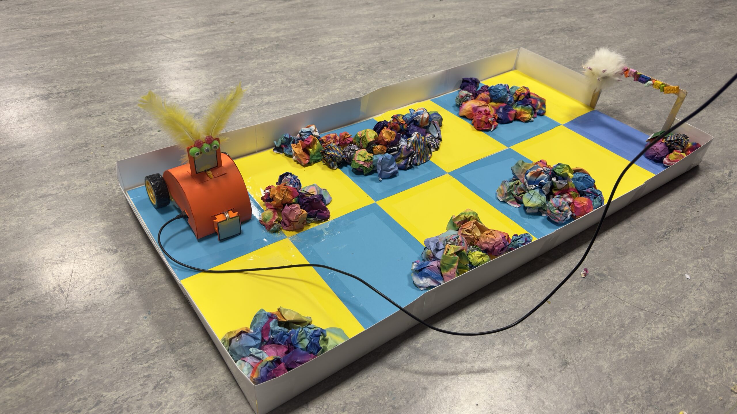
My final project is an interactive robot game where players try to guide a small “student robot” toward its destination inside Monster Academy. The robot has to navigate through an obstacle course with different paths and challenges, and the players must control it carefully to avoid stepping on the lose sensor. If they reach the final pressure pad, the second sensor detects it and triggers a win. The idea was to merge a physical robot with a digital game interface so the whole experience feels like playing a simple video game, but happening in real life.
Process Overview
Hardware
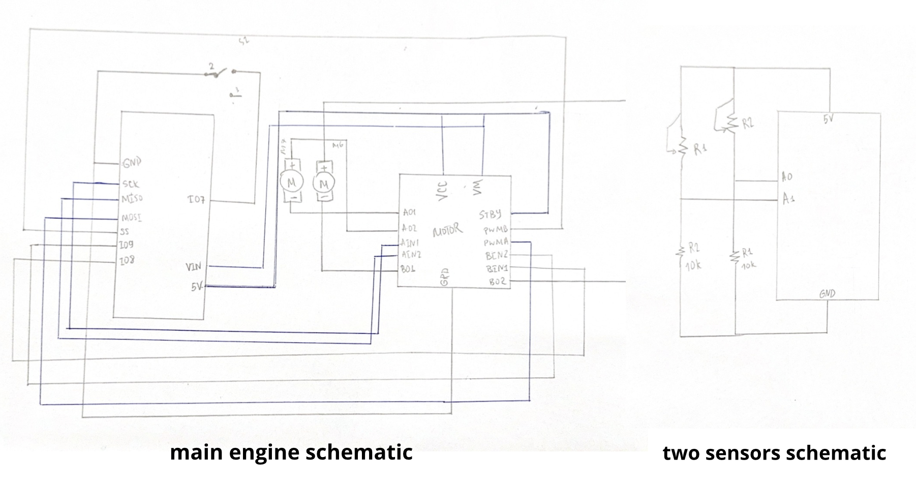
For the hard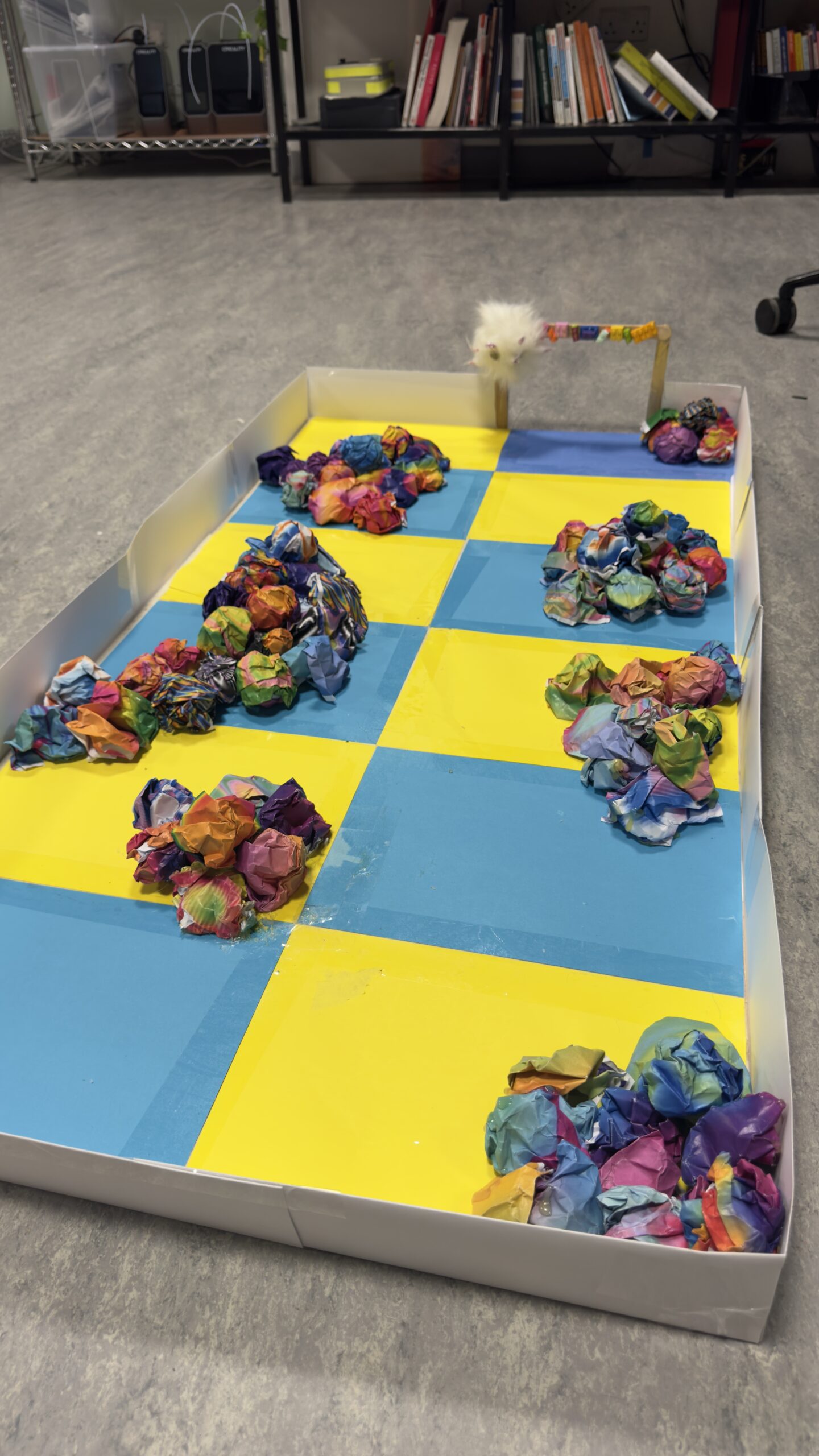 ware stage, I used the SparkFun Inventor’s Kit and followed the tutorial for building a basic remote-controlled robot. The guide helped me wire the motor driver, connect both motors, and set up the power system. After getting the robot moving reliably, I added two FSR sensors: one placed under an obstacle point to detect a “lose” event, and another placed at the end of the track to detect “win.” Both sensors were connected as voltage dividers so that the Arduino could measure changes in pressure using analog inputs.
I also built a large obstacle course from scratch. It was 100 by 80 centimeters, made using three big wooden boards and different colored papers to mark areas for obstacles, safe paths, and start/finish points. This part took a lot of testing, measuring, and redesigning because the robot moves differently depending on surface friction and layout.

Software
The software had two separate components: Arduino code and p5.js code. Arduino handles all the physical behavior of the robot, such as driving the motors forward, backward, left, and right through an H-bridge motor driver. It also reads the two sensors and sends signals back to the computer when the robot wins or loses.
The p5.js side handles the player interface. I created multiple screens: Start, Instructions, Control/Connect, Win, and Lose screens. Each screen appears at the right moment depending on the game flow. When the player presses a button or arrow key, p5.js sends a single-character command over the Web Serial API to the Arduino. The interface also includes a timer and localStorage functionality that saves the best time under the key robotRunner_bestTime.
Interaction Design
During user testing, something interesting happened. Even though I placed on-screen buttons, almost everyone naturally pressed the arrow keys on the laptop. Because of that, I decided to add full arrow-key support for moving the robot. This made the whole experience more intuitive and closer to traditional games. I also made the interface responsive so it adjusts when players press F to go full screen. The Start page transitions into the Instructions, and then the Control page appears, which is where the real-time serial communication and gameplay happens.
Circuit Schematic
Arduino Code and How It Works
In the Arduino sketch, I set up motor control using digital pins for direction and PWM pins for speed. Each movement command, such as forward or left, runs the motors for a short pulse of time and then stops them. This makes movement more precise and prevents the robot from overshooting.
The two FSR sensors are read using analogRead on A0 and A1. Each one has a threshold value. When the reading passes that threshold, the Arduino prints either “BUMP” or “WIN” to the serial port. The p5.js program waits for these exact messages. Getting this communication stable was challenging at first because the sensor values changed based on pressure and surface, so I had to adjust thresholds multiple times.
I also improved motor speed values so the robot had a more controlled movement. I had issues where the motors were too weak when powered only through USB, so switching to the battery pack was necessary.
// REMOTE ROBOT — p5.js CONTROL

// Right motor pins
const int AIN1 = 13;
const int AIN2 = 12;
const int PWMA = 11;

// Left motor pins
const int BIN1 = 8;
const int BIN2 = 9;
const int PWMB = 10;

// FSR sensors
const int fsr1Pin = A0;        // obstacle sensor
const int fsr2Pin = A1;        // win sensor
const int fsrThreshold = 200;  // adjust after testing

// movement durations
const int driveTime = 300;
const int turnTime = 250;

void setup() {
  pinMode(AIN1, OUTPUT);
  pinMode(AIN2, OUTPUT);
  pinMode(PWMA, OUTPUT);
  pinMode(BIN1, OUTPUT);
  pinMode(BIN2, OUTPUT);
  pinMode(PWMB, OUTPUT);

  Serial.begin(9600);
}

void loop() {
  // SENSOR 1 - OBSTACLE -  YOU LOSE
  int fsr1Value = analogRead(fsr1Pin);
  if (fsr1Value > fsrThreshold) {
    stopMotors();
    Serial.println("BUMP DETECTED");
    delay(300);
    return;
  }

  // SENSOR 2 - GOAL - YOU WIN
  int fsr2Value = analogRead(fsr2Pin);
  if (fsr2Value > fsrThreshold) {
    stopMotors();
    Serial.println("WIN SENSOR HIT");
    delay(300);
    return;
  }

  // SERIAL COMMANDS
  if (Serial.available() > 0) {
    char cmd = Serial.read();

    if (cmd == 'f') {
      rightMotor(-255);
      leftMotor(255);
      delay(driveTime);
      stopMotors();
    }
    if (cmd == 'b') {
      rightMotor(255);
      leftMotor(-255);
      delay(driveTime);
      stopMotors();
    }
    if (cmd == 'l') {
      rightMotor(255);
      leftMotor(255);
      delay(turnTime);
      stopMotors();
    }
    if (cmd == 'r') {
      rightMotor(-255);
      leftMotor(-255);
      delay(turnTime);
      stopMotors();
    }
  }
}

// MOTOR FUNCTIONS
void stopMotors() {
  rightMotor(0);
  leftMotor(0);
}

void rightMotor(int speed) {
  if (speed > 0) {
    digitalWrite(AIN1, HIGH);
    digitalWrite(AIN2, LOW);
  } else if (speed < 0) {
    digitalWrite(AIN1, LOW);
    digitalWrite(AIN2, HIGH);
  } else {
    digitalWrite(AIN1, LOW);
    digitalWrite(AIN2, LOW);
  }
  analogWrite(PWMA, abs(speed));
}

void leftMotor(int speed) {
  if (speed > 0) {
    digitalWrite(BIN1, HIGH);
    digitalWrite(BIN2, LOW);
  } else if (speed < 0) {
    digitalWrite(BIN1, LOW);
    digitalWrite(BIN2, HIGH);
  } else {
    digitalWrite(BIN1, LOW);
    digitalWrite(BIN2, LOW);
  }
  analogWrite(PWMB, abs(speed));
}
p5.js Code Description
The p5.js script manages the entire visual and interactive flow of the game. I created states for each screen, and the draw function displays the correct one based on the current state. The Start and Instructions pages have simple navigation buttons. The Control page includes the connection button, movement controls, timer, and status labels.
Once the player connects through Web Serial, the browser can send characters directly to the Arduino. I set up an async text reader so p5.js continuously checks for any messages the Arduino sends back. When a “WIN” or “BUMP” message is detected, p5.js switches to the corresponding screen and stops the timer.
The timer is implemented using millis(), and I store the best time in localStorage so the score stays saved even after refreshing the page. This gives the game a small replayability element.
Communication Between Arduino and p5.js
The communication is simple but effective. p5.js sends commands like “f”, “b”, “l”, and “r”. The Arduino receives them through Serial.read() and triggers the motors. Arduino sends back plain text messages that indicate win or lose events. p5.js reads these messages through a continuous loop using Web Serial’s readable stream. This setup ensures the robot’s physical behavior is always linked to the digital interface.
How This Was Made
The robot’s basic structure comes from the SparkFun guide, which helped me understand the wiring, motor driver logic, and motor control functions. After building the foundation from that tutorial, I added new features: dual-sensor win/lose detection, the full p5.js interface, the multi-screen system, arrow-key controls, the timer, and the localStorage system.
I wrote most of the Arduino and p5.js code myself, but I used generative AI mainly for debugging when errors happened, organizing long sections of code, and helping solve serial communication issues. All visuals, photos, and the physical design are made by me.
Project Media
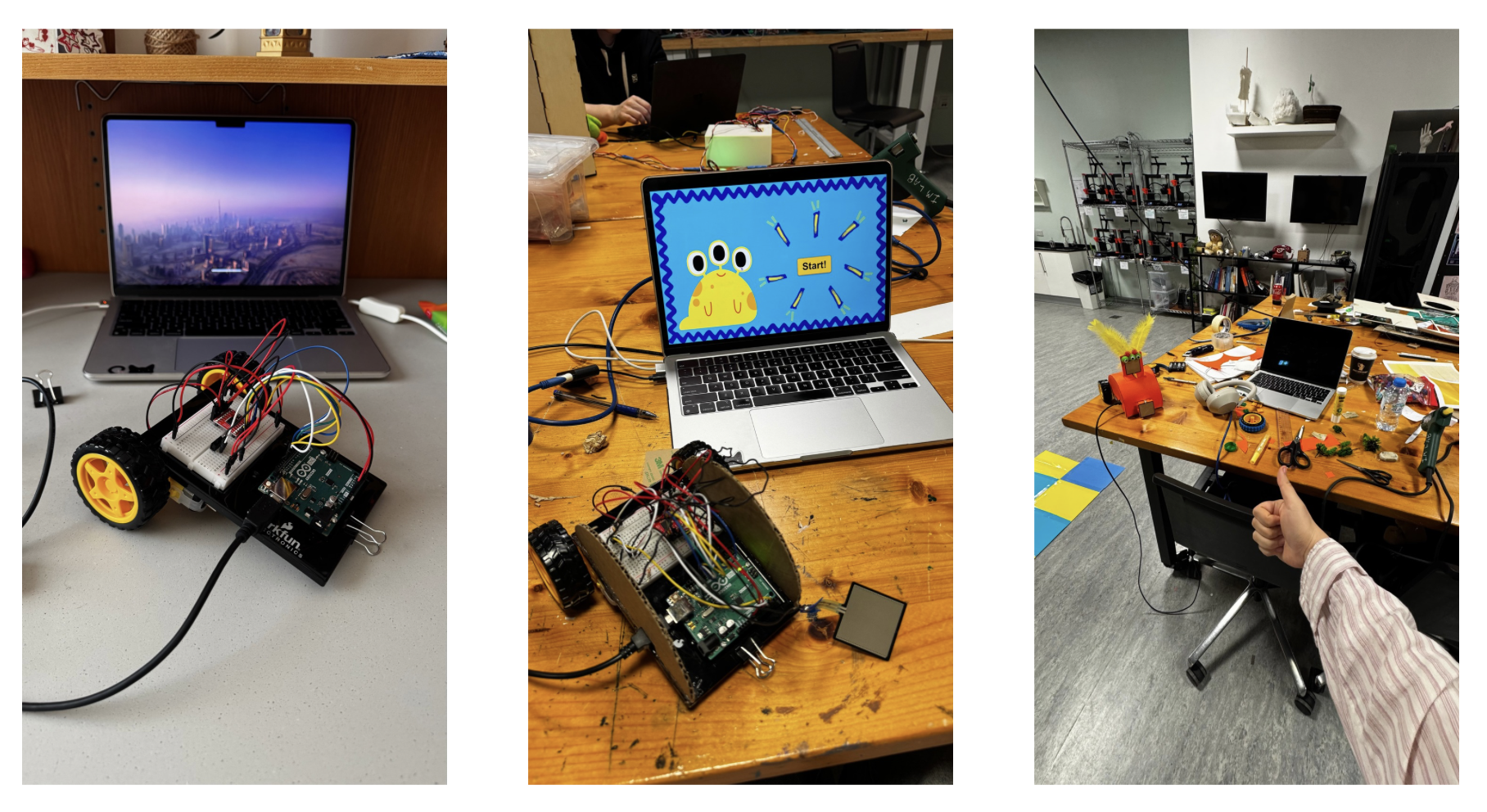 initial stages of setting the robot up

This was the initial design of the robot which was made from carton and covered with paper. However, it stopped working completely and I didn’t know the reason, so I had to reassemble it. Turns out 5V jumper wire got loose and it was causing an issue.
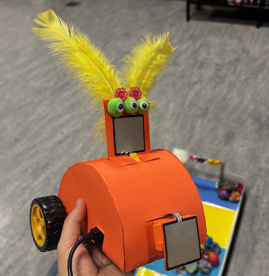
I learned my lesson and taped all the wires to the Arduino board so that these “accidents” don’t happen anymore. The end result turned out to be much better and pretties than before.
What I’m Proud Of
I’m most proud of the amount of design work that went into this project. I spent a lot of time experimenting with layouts, choosing the right materials for the course, and making sure the robot could navigate smoothly. The obstacle course was a huge build and took multiple redesigns to get right. I also used a lot of hot glue during the building phase, to the point where I started recognizing the smell too well.
I’m also proud of how the interface looks and how the robot, sensors, and game flow all connect together. It feels like a small arcade experience.
Future Improvements
In the future, I would like to add a separate physical controller so players don’t have to look at the laptop while playing. I would also include a scoring system with bonus points, a leaderboard that keeps track of previous scores, and maybe multiple levels or different obstacle layouts. These additions would make the game more competitive and engaging.


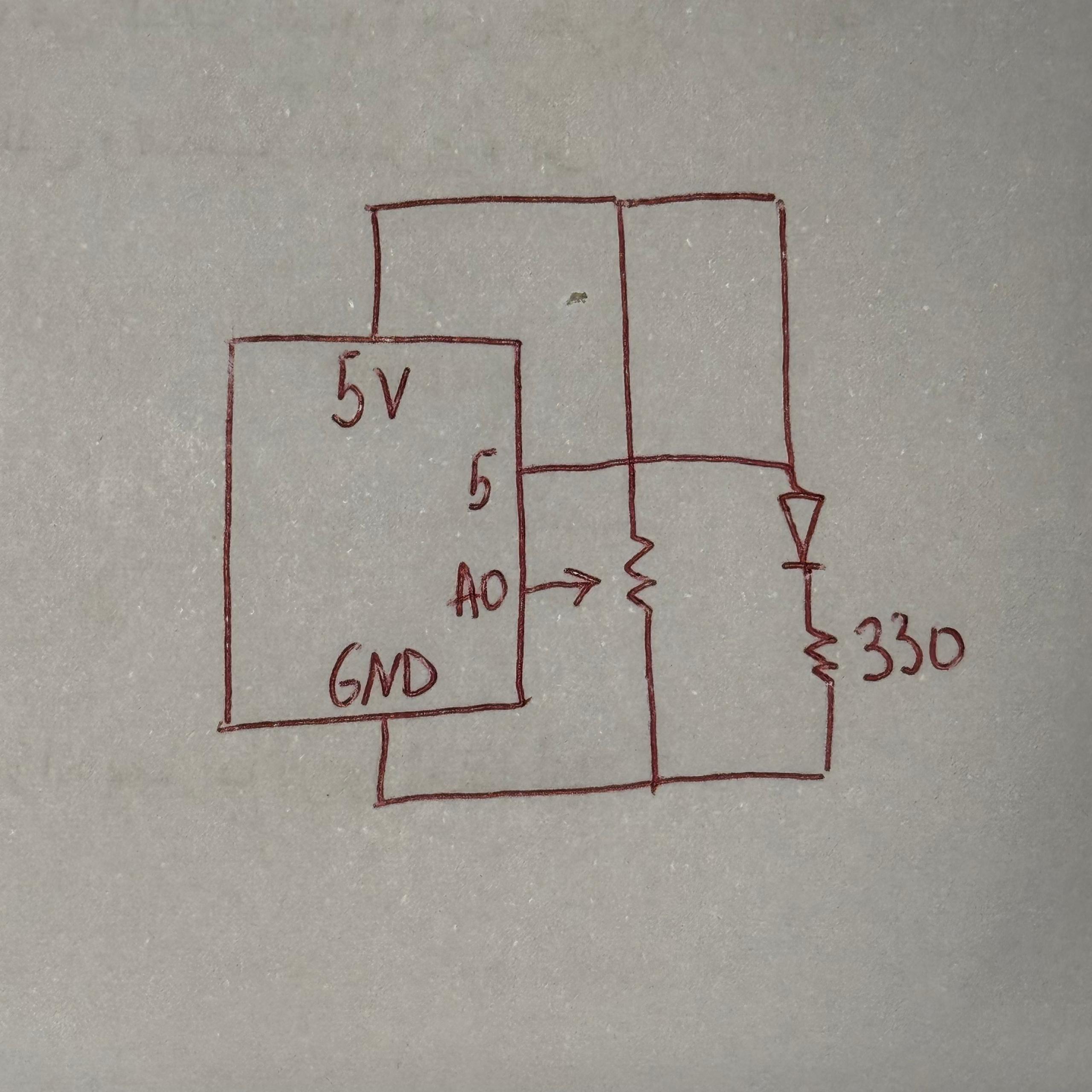


 Figure: the process of sketching the plan
 The Finalized Sketch