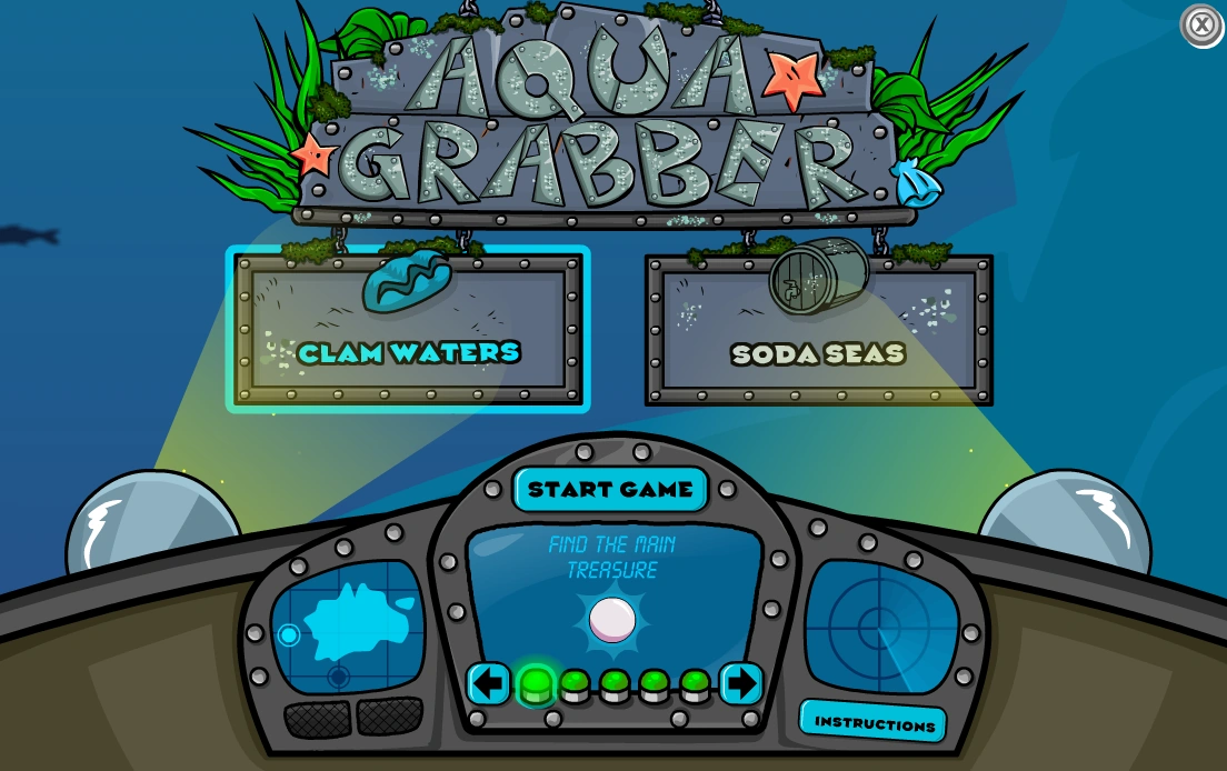
Concept
For my final project, I decided to make it Club Penguin themed. In the Club Penguin universe, once you join the Secret Agency (basically becoming a spy/secret agent), you get assigned missions from G (Gary the Gadget Guy).
So my project is that G assigned the user to a mission to test out his brand-new invention: The Time Trekker 3000. A time-traveling radio device that lets you tune into music and news from different time periods in history.
You twist the Time Selector (a potentiometer) to pick a decade, and then press one of the two radio stations, either Music or News, to hear what was happening back then. It’s basically a time machine, but make it a radio.
It’s inspired by the whole secret-mission vibe of Club Penguin!
How it Works
The user:
• Twists the potentiometer → chooses an era between the 1940s and the 2020s (with a 20 year difference between decades).
• Press a button → pick a station (Music or News).
The screen updates to show the decade you’re currently “in,” and plays the right audio from that time.
Here’s my P5 Sketch:
Here’s my code on Arduino: FullCode
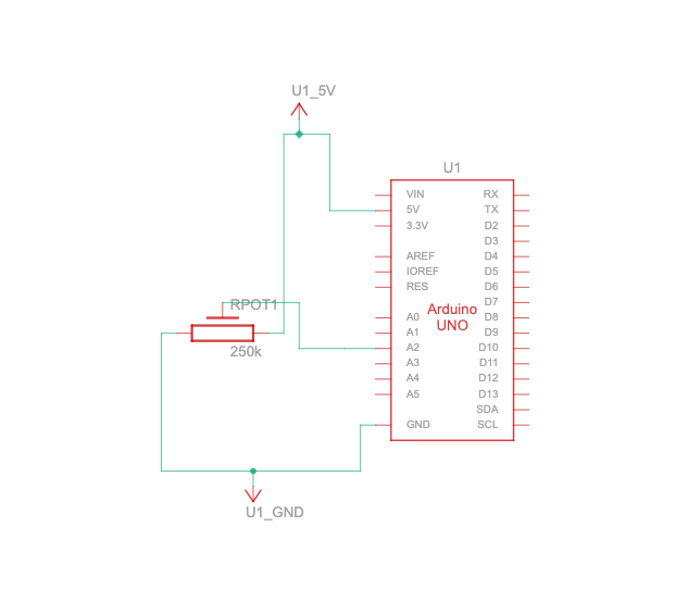
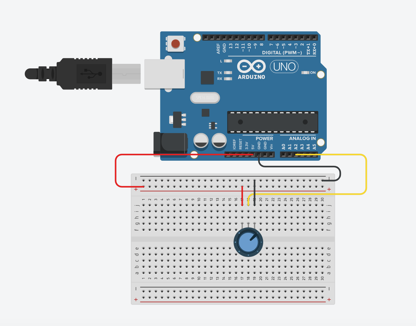
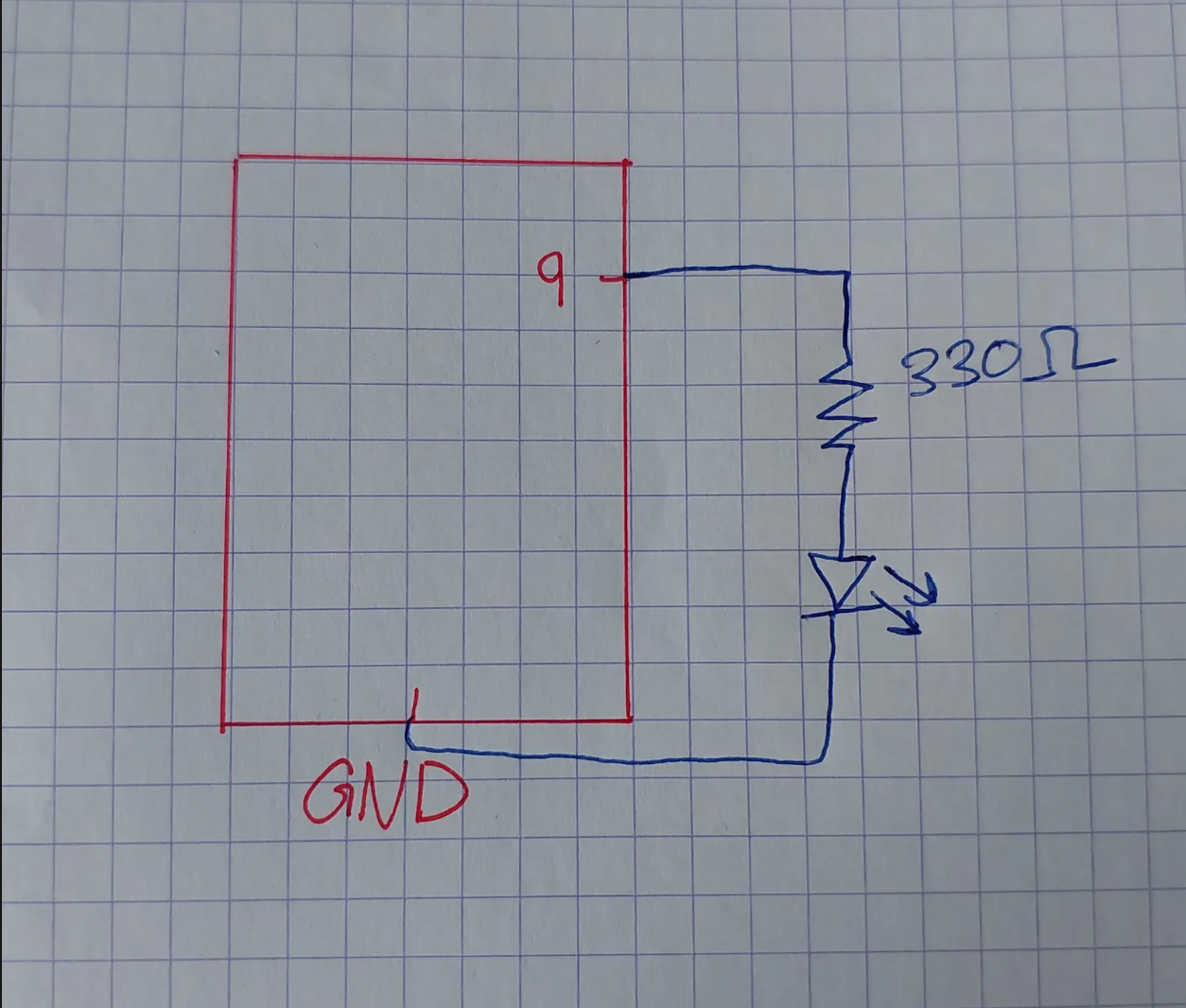
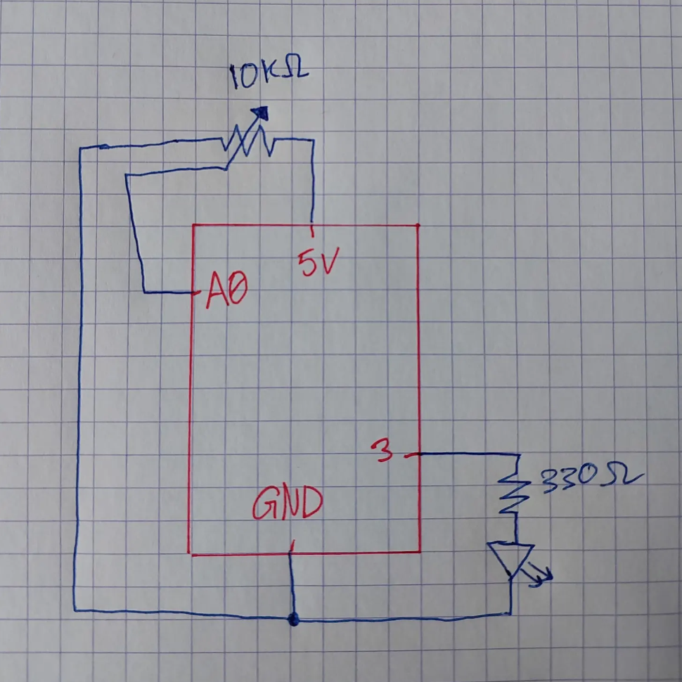
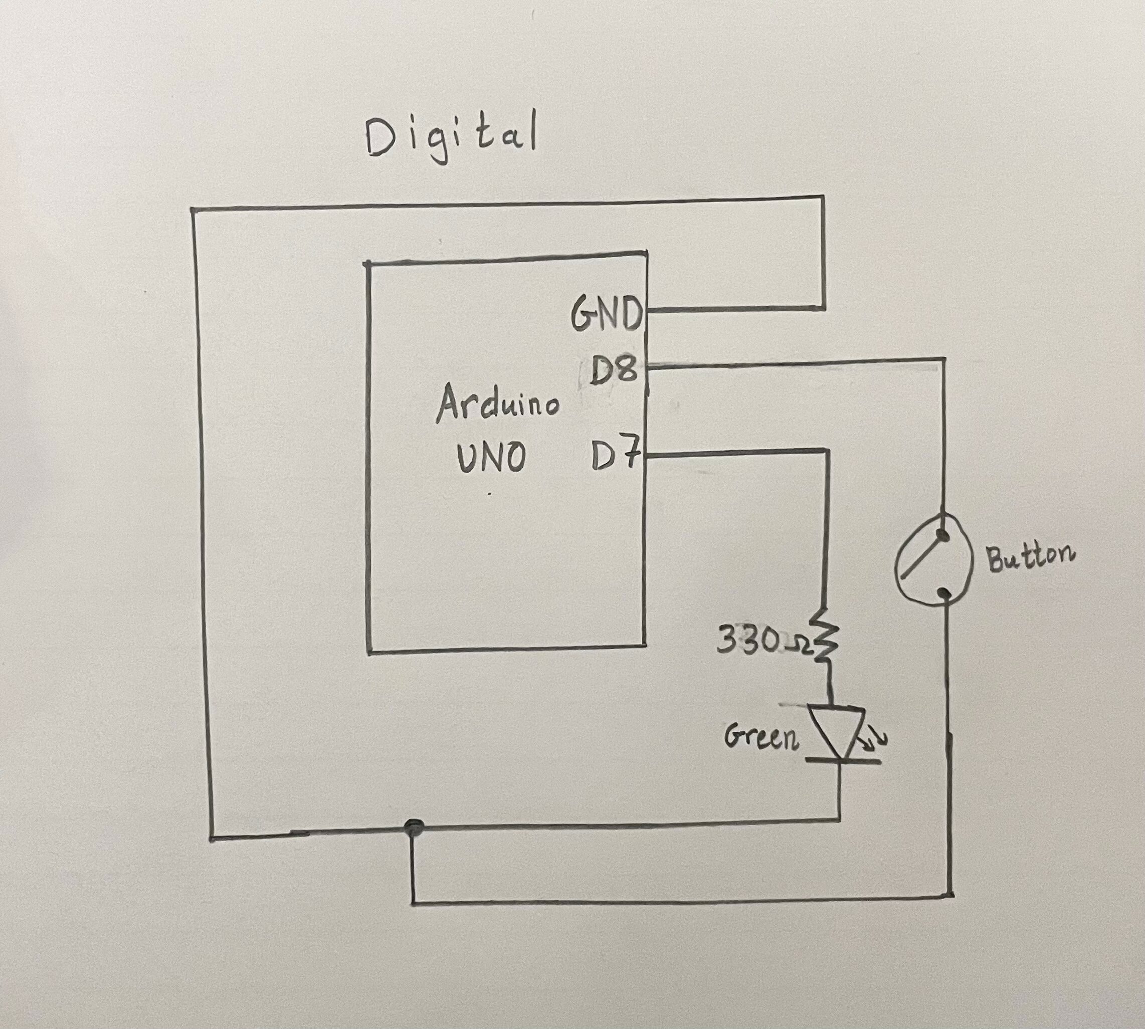
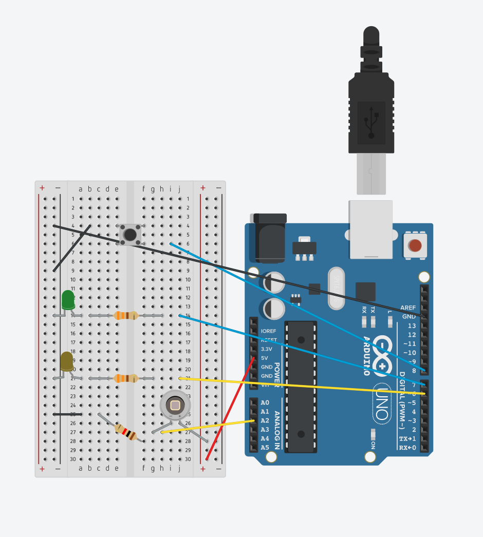
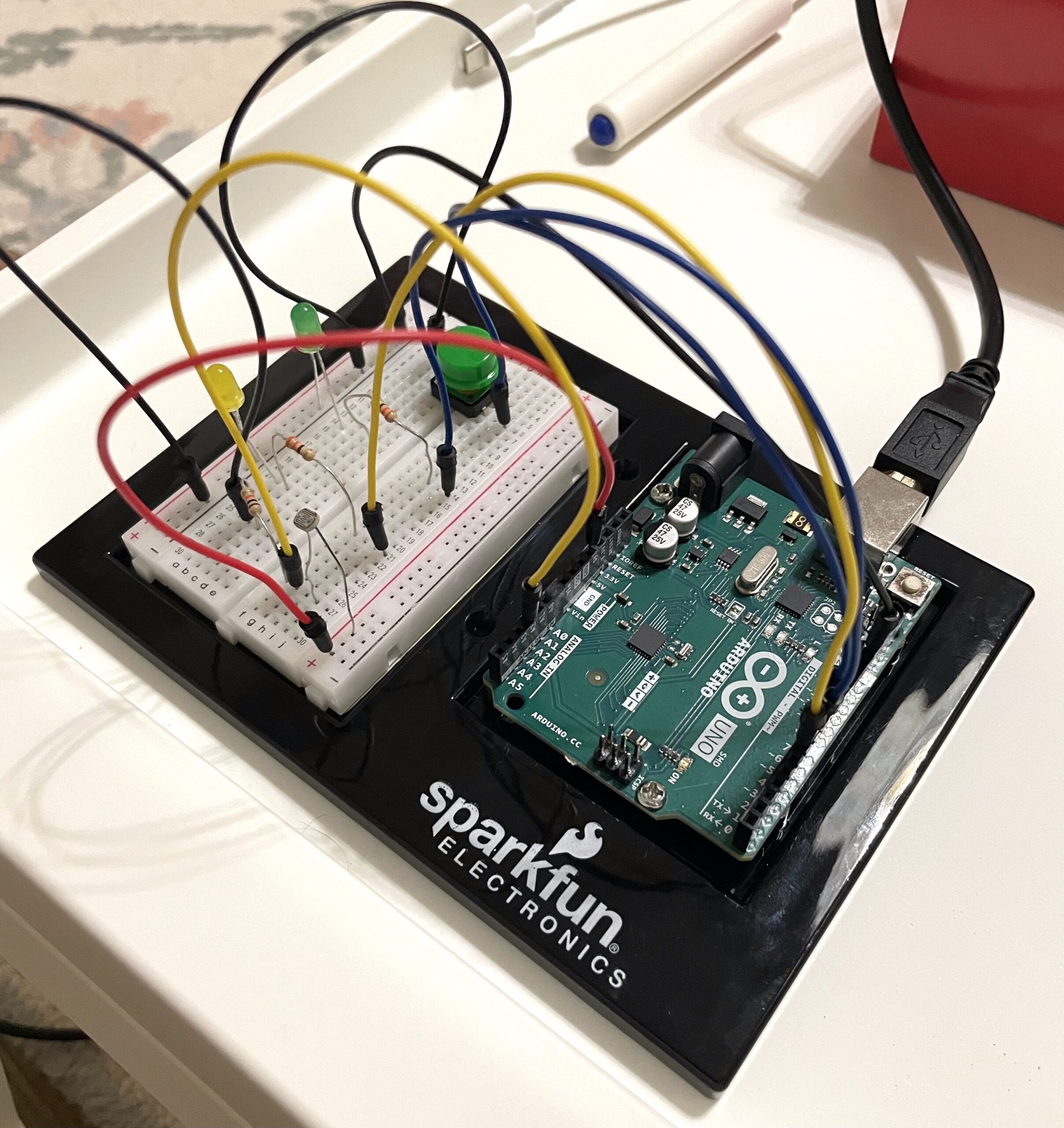
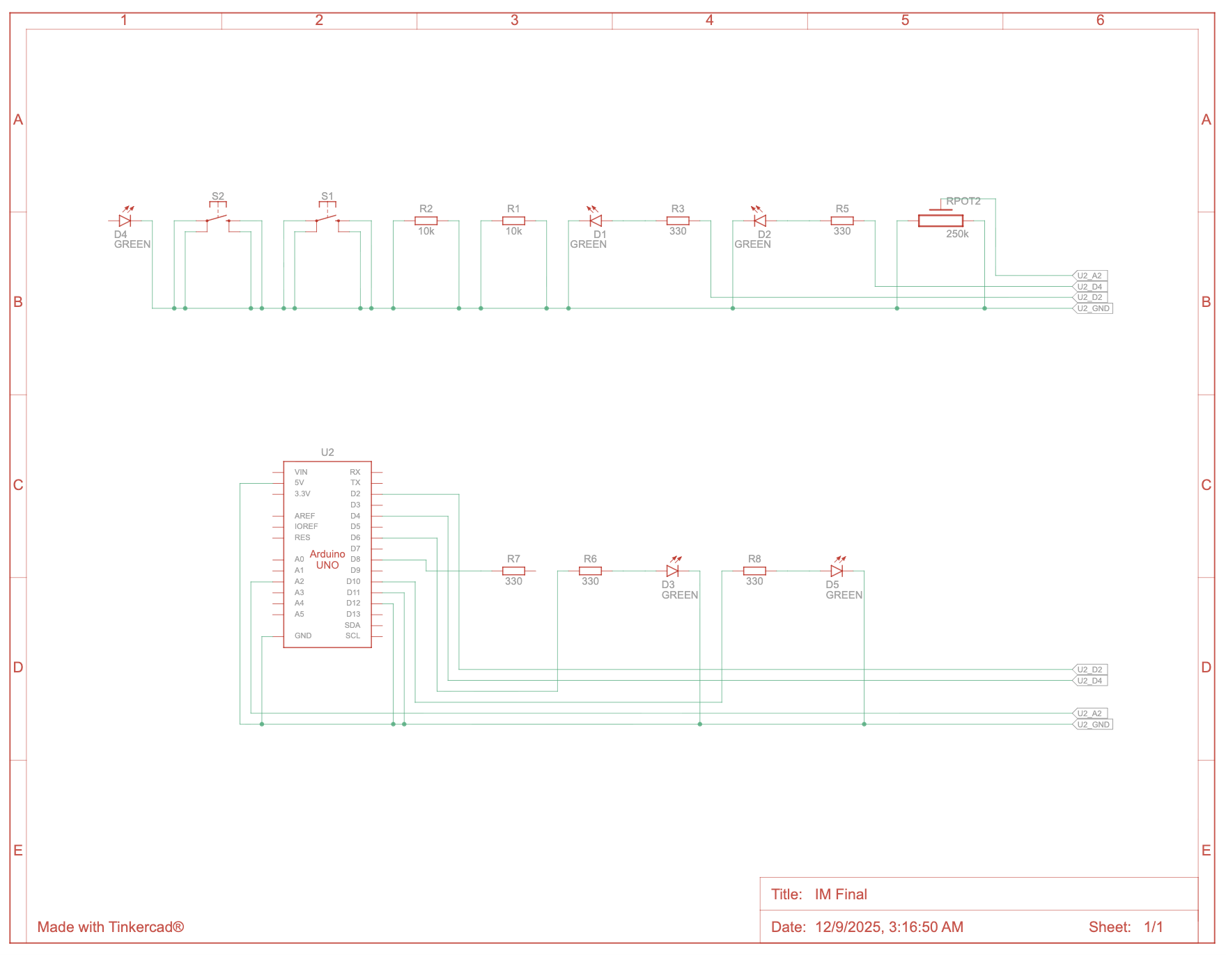
Circuit Schematic
User Testing (from the IM Show):
Communication Between Arduino & p5.js
The potentiometer sends a stream of values from Arduino → p5.js (through serial communication of course). I map those values to different time periods/decades on the screen, so when you twist the knob, the interface changes and the music/news for that decade becomes available.
The two buttons send HIGH/LOW signals to let p5 know when the player presses “Music” or “News.” In p5, I check those button states and trigger the correct audio files depending on the decade selected.
The potentiometer values also control the LEDs: they light up to show which audio mode is active (Music or News), and the LEDs also change based on the decade.
So both systems talk to each other constantly.
Code Snippets
These are the parts I’m most proud of:
Audio Control
  // audio control between gameModes
if (gameMode === 1) { // We are on the Start Screen
    // 1. starts the start screen music
    if (!startMusic.isPlaying()) {
        startMusic.loop();
    }

    // 2. stops ALL main game audio if it's currently playing or exists
    if (currentMusic && currentMusic.isPlaying()) {
        currentMusic.stop();
    }
    if (currentNews && currentNews.isPlaying()) {
        currentNews.stop();
    }
}

else if (gameMode === 2) { // on the main screen
    //stops the start screen mmusic
    if (startMusic.isPlaying()) {
        startMusic.stop();
    }
}
This one was for fixing overlapping music and my biggest headache. This finally made sure only ONE audio layer plays at a time, which is so satisfying after days of chaos.
Button Switching Logic
// //music and news buttons logic (so they dont overlap and "else if" is important here!!)

 // 1. news button is pressed
 if (nState === 1 && prevButtonNState === 0) {
   // activates news mode, deactivates music mode
   currentButtonNState = 1;
   currentButtonMState = 0;
 }

 // 2. music button is prressed (the 'else if' ensures that only ONE mode can be activated in a single frame!)
 else if (mState === 1 && prevButtonMState === 0) {
   // Activate Music Mode, Deactivate News Mode
   currentButtonNState = 0;
   currentButtonMState = 1;
 }

 // updates previous states of both buttons (very imp!)
 prevButtonNState = nState;
 prevButtonMState = mState;
Once I figured this part out, I was able to rest for a bit. So here I used each button’s value to check which one is pressed. I used else if here because if the first statement isn’t true, it’ll go through the second code block and make sure it works, and it did!
Challenges I Faced
Honestly, the biggest challenge in this whole project was sound logic, making sure audio only plays when it’s supposed to. At first, everything was overlapping like crazy, start screen music + main game music + news + music… all at once, the program was going crazy. I had to really think through the logic of stopping whatever is already playing before starting anything new.
Another huge challenge was handling the two buttons and making sure only one “mode” (Music or News) could be active at a time. I solved that by tracking the previous state of each button and updating “current” active states using if statements. That part of the code took me some time to figure out, but I’m super proud of it now because it finally works perfectly. Once I fixed those, everything finally felt like a real interaction. The LEDs, audio, and screen all update correctly with the player’s choices!
I also had a hard time with soldering. I mean I didn’t practice much but it was honestly a disaster at first. But here we are and I’m glad my (current) buttons aren’t fried.
The sound files gave me a hard time as well, p5 would just not load. I had to trim and/or compress some files (even though they weren’t that long) for p5 to be able to handle them. I mean, I get it because I had a LOT of sound files for this project since it relies mainly on sound, but I’m glad I got it working without removing any of my sound files.
Resources Used
- The Club Penguin UI is edited with self-made graphics for this project
- All audio clips sourced from public YouTube news/music archives (then trimmed + converted by me)
- Arduino + p5 Serial communication code is from class resources
How I Used AI Tools
I used AI for help with some parts of the logic that wasn’t working at first, like solving the overlapping audio issue, and creating working arrays for sound files. Everything else like the design, code structure, and media was done by me.