Concept:
The idea behind this project was to create a bi-directional feedback loop between the physical world and a virtual simulation. Instead of treating Arduino and p5.js as separate tools, I wanted them to behave like two parts of the same system, constantly communicating with each other.
The interaction is centered around cause and consequence. A simple physical action, turning a potentiometer, does not directly place or move objects on screen. Instead, it influences a virtual force, wind, that acts on two simulated balls. When those virtual objects collide, the system responds physically by changing the brightness of a real LED connected to the Arduino.
Method & Materials:
This project combines one analog sensor, a virtual physics simulation, and a physical output using serial communication between Arduino and p5.js.
Hardware:
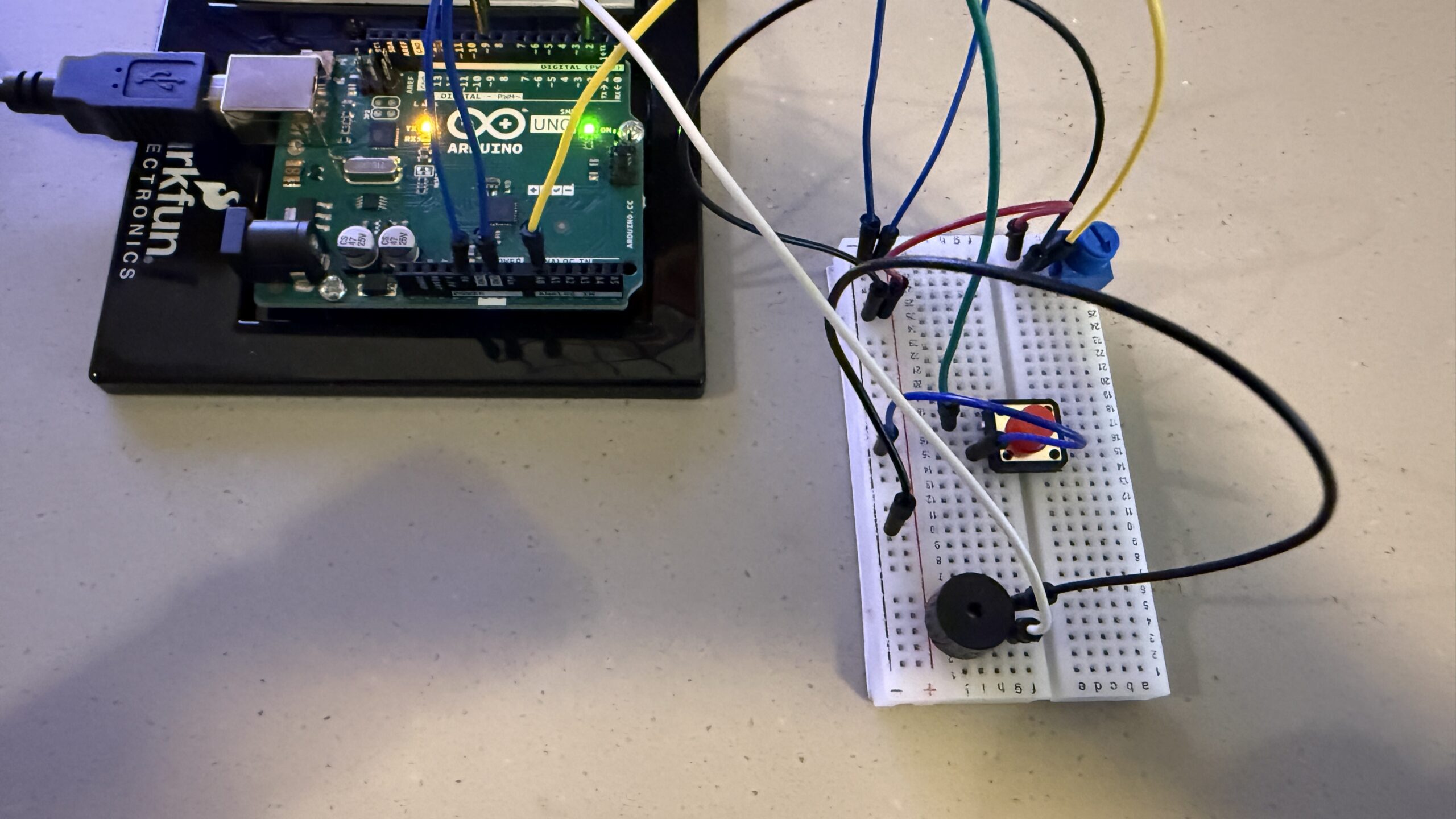
- Arduino Uno
- 10k potentiometer (analog sensor)
- LED
- 220–330 Ω resistor
- Breadboard and jumper wires
Software:
- Arduino IDE
- p5.js with Web Serial
The potentiometer is wired as a voltage divider between 5V and GND, with the middle pin connected to analog pin A0. The LED is connected to digital pin 9 through a resistor and grounded on the other side.
The Arduino continuously reads the potentiometer value (0–1023) and sends it to p5.js over serial. p5.js interprets this value as a wind force that affects two balls in a physics simulation. When the balls collide, p5.js sends a command back to the Arduino, which responds by increasing the LED’s brightness.
Process:
I approached this project by breaking it into three conceptual stages rather than thinking of it as separate exercises.
1. Physical Input → Virtual Force
The potentiometer provides a continuous analog input. The Arduino reads this input as a raw number and sends it to p5.js without assigning it any meaning. In p5.js, this value is mapped to a horizontal wind force rather than a position. This distinction is important: instead of directly placing the balls, the potentiometer influences how they move over time. This makes the interaction feel physical and dynamic, closer to real-world motion than to simple cursor control.
2. The Virtual Event (Decision-Making in Software)
The physics simulation exists entirely inside p5.js. Gravity, wind, velocity, and drag are calculated every frame. The software also monitors the relationship between the two balls. When they touch, p5.js detects a collision event. The Arduino has no awareness of this virtual world; it does not know what balls, gravity, or collisions are. All interpretation and decision-making happen in software.
3. Virtual Event → Physical Consequence
When a collision occurs, p5.js sends a short command back to the Arduino. Under normal conditions, p5.js continuously tells the Arduino to keep the LED dim, so there is always a subtle sign that the system is running. When a collision is detected, p5.js sends a specific command that causes the Arduino to flash the LED at full brightness for a brief moment. This turns an invisible, virtual event into a tangible physical response.
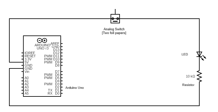
Schematic: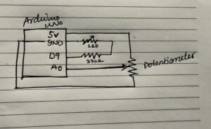
The schematic shows the potentiometer connected as a voltage divider to analog pin A0 and the LED connected to digital pin 9 through a resistor. The Arduino communicates with the computer over USB using serial communication, allowing p5.js to both receive sensor data and send control commands back to the Arduino.
Code:
The part of the code I am most proud of is the event-based communication triggered by the collision. A single character sent from p5.js is enough to cause a visible physical reaction, showing how minimal signals can carry meaningful information when the system is designed carefully.
Link to Code [Contains Arduino code in file arduino.txt]
Result:
The final system behaves as a closed feedback loop. Turning the potentiometer changes the wind, which alters how the two balls move on screen. When the balls collide, the LED connected to the Arduino flashes brightly, translating a virtual interaction into a physical signal.
In the demonstration video, it is clear that the system is responsive in both directions: physical input affects the simulation, and events inside the simulation produce immediate physical feedback. The interaction feels cohesive rather than fragmented across hardware and software.
Reflection:
This project helped me understand interaction design as a system rather than a collection of isolated components. The Arduino and p5.js each have clearly defined roles: hardware acts as the body, sensing and responding physically, while software acts as the mind, handling physics, logic, and decisions.