Creative Switch – Posture Checker

Concept

For this week’s project I had a lot of different ideas of how I wanted to create an “unusual switch.” I thought the mustache and eye-blink-polaroid designs were both really interested and tried to use the creativity and usability from either one in my design. For my project, I created a switch that notifies a user when they need to correct their posture. In my family I am known for having terrible posture and am often corrected for constantly looking at the ground while I walk. The idea of this design is to work as an independent reminder, because it tracks when you are looking down (by creating a connection in the switch), versus when you are looking up (breaking the connection.

Final Product

Design & Build Process

For this project I used the following materials: 4 jumper wires, 2 alligator cables, 1 LED light, Arduino Uno, 1 resistor, 2 cardboard circles, masking tape, and conductive fabric. For the code, I used Arduino’s pre-designed button example code. Originally, I considered using tinfoil as the conductive piece between my jumper wires but then found some conductive fabric in the IM lab so I decided to work with that instead. I found the conductive fabric a bit difficult to work with because it was so flimsy and didn’t provide a stable connection between the wires. However, I was too lazy to go buy tinfoil so before compromising on the conductive fabric I tried to work with what I assumed to be copper wire (it was actually just copper colored magnetic wire). I coiled up little pieces and clipped them on each end of the alligator clips but quickly realized that they were not conductive and resorted back to the original plan.

The circle pieces of cardboard were originally from a different idea I had of “glasses” that connect a switch when you raise your eyebrows or scrunch your nose. After I abandoned that idea I decided to use them to hook the wires onto your ears because I originally just had them hanging down.

The last thing I wanted to quickly highlight was the usage of the alligator clips to extend the jumper wires. The length of the wires caused me a lot of confusion in the design process because I wasn’t sure how I would have anything attached to my face with such short wires. My first solution was to build a small platform for my Arduino board to sit on that would raise it closer to my face but after running into a few issues with that as well a quick Google search reminded me of the convenience of alligator cables.

Reflection

Overall I am pretty satisfied with the design of my project. Although this is a very rough prototype, I have a real need for this design in my life so I was pleased to find a creative solution to the issue at hand. In terms of improvements, I would definitely like to make this design a bit more visually appealing. Although I somewhat solved the issues of the wires by using the alligator cables and ear loops, it still is quite ugly to look at and difficult to put on so that would definitely be my number one priority in improving the design.

 

Week 8 Reading Response

Emotion and Design: Attractive Things Work Better

Don Norman’s essay, Attractive Things Work Better, focuses on clarifying and further elaborating on some ideas that came into conversation from his piece, The Design of Everyday Things. He works to identify a common ground between beauty and commenting on the importance of both of them. In Everyday Things he  focuses on how designer should prioritize usability, which gave users the impression that it should be prioritized at the sacrifice of aesthetics. However, in this piece Norman explores how the aesthetics of a design can also dictate it’s usability for an individual.

For example, he proposes the idea of walking across a 1 meter wide plank at different height intervals. As the plank gets higher and higher off the ground, the likelihood that an individual would be willing to cross it decreases each time, indicating how the external factors, or appearance, can play a part in whether or not an object is usable. This is important because it further instills how the design process has to be user oriented. Not only does the design of an object itself play a role, but the user’s emotions and the greater context of how an object will be used are extremely relevant. Although finding a happy medium between the two (like discussed in the 3 teapots) is far from easy, it also creates a space for unique design as different creations can adapt to the needs of different people.

Her Code Got Humans on the Moon—And Invented
Software Itself

Robert McMillan’s article, Her Code Got Humans on the Moon, discusses Margaret Hamilton’s career while programming the code that would be used to launch the Apollo. It started out as a discussion of her career progression how she got into this field, and then focuses on her pivotal role as an engineer working on the Apollo project. Hamilton’s story is particularly interesting not only because she was a woman working in tech in the 60s, but also because the work she developed has become part of the foundation for developing software today.

As a mother, she faced lots of doubt and criticism from people who did not understand the important work she was doing. However, in her field, she was respected and welcomed for her contributions to the project. Not only did she defy the societal expectations placed on her, but she excelled in every way. Scientists such as Hamilton are strong examples of how people can go against the odds and make great strides in their field.

Midterm: 5R Photo Lab!

Final product 

Make sure to open on the P5 web editor for sound and press f for full screen please!

Concept

My main concept for my midterm was based on the photo lab that I work at in New York. I wanted to create an interactive lab experience in which the user could go through some of the steps of developing/processing film while also hopefully learning a bit more about film in the process. My main goal when designing the program was to make something that was useful to the lab and could be used by my customers.  Therefore, I ended up creating a ‘behind the curtain’ experience for customers to see what developing film is like and get small experiences in the different activities.

How it works

My program functions solely on mouse interaction and features 2 mini-games and 2.5 ‘resource tabs. The first mini-game is what I’ve considered as stage 1 of the development process, making the chemistry. Users are able to reveal the recipe card and then have to memorize the ratios for each chemical in order to make the chemistry needed for the development process. They have only 2 chances to refresh their memory but if they over pour it at all they immediately lose (because in the real world we’d have to throw the chemistry out). The second mini game is the fourth station where they are editing scans. Basically users have 15 seconds to edit 10 randomly generated pieces of ‘dust’ from the scans to prepare them to be sent off to the customer.

The two middle stations, splicing and feeding the machine do not have any major interactive piece. I made this decision for multiple reasons. The first, of course being time management and having figure out what I’d actually have time to compelte, and the second being that these stages don’t really have much that could be digitally represented like with the other two games. Step 2 typically just requires cutting a piece of film and labelling it while step 3 is literally just putting it in the machine. Therefore, by giving them this informative, resource functionality I believe it further instills how this program can be a resource for film photographers.

I also have a small easter egg which appears when you click on the film negatives hanging on the wall that just feature some photos, some of which were shot on film so that were not. While this doesn’t really add anything to the program I thought it was on theme with the design and added another layer of creativity to the project.

What I’m proud of

I am particularly proud of the mix chemicals station because it took many many hours of trial and error to reach the stage its at currently. Originally I wanted to incorporate the g, r, b, and y keys to represent filling up the vials but decided that jumping between input functions might be too much for the user. Also, while working on this station I completely deleted the relevant functions three times which I am honestly quite proud of because it took quite a bit of guts to just start over like that, but I am glad I did.

if (grow.blue && blueHeight < maxHeight) blueHeight += growthRate;
  if (grow.red && redHeight < maxHeight) redHeight += growthRate;
  if (grow.green && greenHeight < maxHeight) greenHeight += growthRate;
  if (grow.yellow && yellowHeight < maxHeight) yellowHeight += growthRate;

  // drawing rectangles
  fill('#4ba0f7');
  rect(windowWidth * 0.2 + 1.5, baseY - blueHeight, 57, blueHeight);
  fill('#f12721');
  rect(windowWidth * 0.31 - 5.5, baseY - redHeight, 57, redHeight);
  fill('#52c204');
  rect(windowWidth * 0.41 + 2, baseY - greenHeight, 57, greenHeight);
  fill('#ffeb67');
  rect(windowWidth * 0.52 - 3.75, baseY - yellowHeight, 57, yellowHeight);

The algorithm I ended up with is actually pretty simple it was just hard for me to conceptualize because I was originally unable to breakdown the mini-game into each separate requirement for what I wanted to happen. Above you can see the main part of the function that illustrates the rectangle growth.

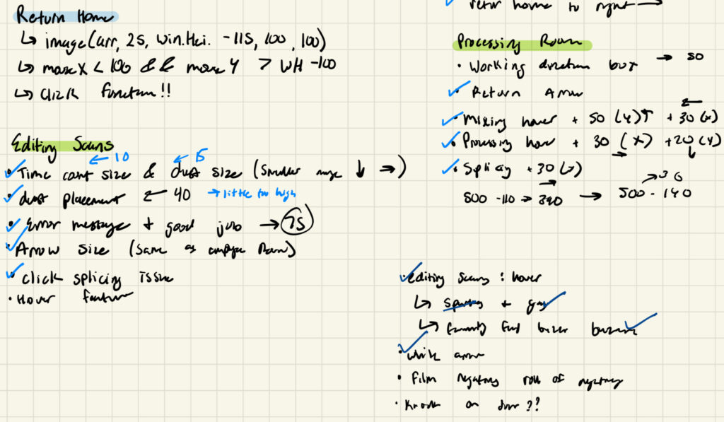
I am also proud of the fact that everything is appropriately ratioed in full screen (or at least on my 13 inch MacBook Air screen it is) because it was a topic of growing anxiety for me as I continued to ratio everything in a split screen when I was actually implementing my ideas. Furthermore, while this is technically an area of improvement, I think that that way I problem solved was particularly effective. Due to poor design and planning I quickly became overwhelmed with the various errors I was dealing with and didn’t really know how to approach them but eventually just went back to the basic and wrote down whatever needed to be changed and I think that really helped reset  my mentality and also the direction of my program.

Please excuse my awful handwriting, it was nearing 3 AM when I wrote this…
Areas of improvement 

Although I am very happy with how my program turned out, I also have a lot of areas of improvement that I’d like to see happen in the future. During the implementation process my code was extremely disorganized and messy which cause for a lot of unnecessary confusion and frustration while I was debugging errors. Also, while the worst of it has since been improved, I did quite a bit of hardcoding that I think with the right approach could be simplified in some creative ways that I’d like to test out. Lastly, I would like to think of some more ways I can further develop the user experience. In conceptualizing this project I considered having some drag and drop features, using the the laptops camera to take a picture, and other unique components that I would like to further explore eventually.

Week 5: Midterm progress update

Concept

For my midterm project, I decided to design an interactive photo lab experience. The user starts the program off with the choice of being a customer for a day or an employee and then that decision guides their experience. As an employee, they have more of a ‘mini game’ experience (comparable to Papa’s Pizzeria on CoolMath) while if they choose to be a customer, it’s more of a learning experience for a beginner film photographer (inspired a bit by Duolingo). My main motivation for this design was based on personal experience because I started working at a photo lab roughly 2 months after I shot my first roll of film so it felt like I was learning a ton as a photographer and an employee super quickly.  I also think it would be cool if my job back home could use this as a fun resource for first-time customers.

Code progress

So far, in terms of ‘code-progress,’ I am pretty satisfied with how things are developing. Because the program is split into two sections (customer and employee experience) I devoted this weekend to just working on the employee experience. Working out small kinks has been quite time consuming because of the complexity to with which I want the program to function but I believe it is still manageable (for now). For the most part, I’ve relied on Canva for basic ‘set-design’ just to lighten the load a bit, and for aesthetic reasons so I’ve been working in layers quite a bit.

For example, this is the base layer of the processing room in the employee section. I’ve added different ‘layers’ on top so that depending on the mouse location, the program produces different signifiers that prompt you to open one of the four mini games or return back to the home page.

Most frightening part

Overall, I don’t think the implementation of my ideas will be all that difficult compelte. However, I am frightened by how tediously time consuming it will be, because it’s already taken be a significant amount of time to being making headway on 2 of the mini games. Furthermore, I still haven’t solidified what I want the customer’s side to look like, so I’m afraid that it won’t balance out appropriately with what I’ve already created.

Lastly, there are smaller things I’m holding off on debugging until the framework is fully complete and I’m really hoping that doesn’t prove to be a huge mistake. I’ve implemented the windowWidth components to try and keep my program (mostly) adaptable to any window size but quickly that it ends up distorting some of the images in a weird way and and making the space a bit awkward at times. So, I’m hoping when I circle back at the end it is a fairly easy solution.

As you can see I am relying heavily on windowWidth and windowHeight for a lot of stuff and don’t really know what to expect/how to solve the issue if it starts to not perform the way I’d like.

Nevertheless, I will try to address these concerns by working in segments, as I have been doing. With a project like this, it’d be very easy to become overwhelmed by the ideas, and implementation and everything else going on so I’m trying to keep everything broken down, into more digestible mini projects for me to complete. More specifically, in regards to the formatting concerns I think I’m gonna start recording the ratios of the important objects just have an easily accessible reference for what I’m most concerned about (i.e. making sure the instruction manual is centered). If something small is a little off, or has some slight variation from time to time, I’ll to address it but don’t want to become too fixated on little things.

Reading Response – Week 5

This week’s reading was very interesting as it dives into the technicalities of computer vision, making it seem a lot more doable, than what one might think. By breaking down computer vision into its algorithm’s basic fundamental nature, it becomes something as simple as is this pixel’s brightness greater than or less than my threshold value. Although this type of algorithmic analysis is completely different from how we as humans use vision to understand the world, it does seem like an interesting idea to conceptualize. The farthest I can reach in comparison between computer vision and human vision (as someone with no visual impairments) might be in looking at a black-and-white photo or viewing something with a stark contrast filter.

These algorithms are super interesting though because we can literally just work from light comparison in order to send different messages to the computer about what it’s seeing. In order to optimize this it is important that we give the computer clear cut distinctions from what we want it to focus on and what we don’t. I also find it interesting how beyond light, we can use things such as heat to act as the eyes of the computer.

I think computer vision’s capacity for tracking and surveillance affects its use in interactive art because opens new avenues for creativity and expression through computers. I think with the term surveillance specifically, it can also significantly reduce an individual’s right to privacy for the sake of “art.” For example, the Suicide Box project, in my opinion is completely unethical and an abuse of ‘public privacy.’ However, that then stems the issue beyond interactive art because it becomes an issue of privacy and security. Nonetheless, because computer vision has a multitude of applications I don’t believe it is at all limited to what it can be used for in interactive art, which is why we need to stay on top of its usage to ensure people’s security.

Week 4 – A web of words

Concept

For this week’s assignment, I knew right off the bat that I wanted to do something with poetry. Having felt inspired by Camille Utterback’s Text Rain piece, I thought that an unexpected poem concept would be interesting and originally wanted to use a database of google searches to generate poetry. However, after not finding any databases that struck my interest I decided to take a break and come back to the assignment later. It was then that I started writing a poem inspired by the feeling of being homesick that I ended up having my idea. In the poem, I kind of jumped around a bit as I dissected how my homesickness portrayed itself in my life and ended up getting the idea of a word web. From there I decided that I wanted lines from my poem to connect to other random lines from poems I’d gathered on the internet.

Components 

Because I was somewhat combining the database option with the generative text output I decided I wanted to keep the design of both aspects to be relatively simple so as to keep my expectations fairly realistic. However, even what I thought would be simple to execute, took a lot of trial-and-error / re-starting for simplicity. Generating the typewriter like output is pretty simple in the code but took a lot of planning and replanning on my part as I kept getting stuck with the line breaks, and how the words were being stored.

Once I got that rolling I wanted to focus on how I would incorporate the database of poetry. I ended up creating a few different methods so that I could randomly generate information in my poem, and then have it located in the provided poems. Then, just for an aesthetic component I imported a font so that each line of poetry had a bit more uniqueness to it and added visual aspect. You can also click the mouse to generate more words with different excerpt of the poems which I think further instils the idea of how everything is connected in some megaweb (even in ways we could never imagine)

An Aspect I Am Proud Of 

I think in writing this program I put more of my ‘programming skills’ to the test than I have in the past. I needed to spend a lot of time on the design process because after hitting a few dead ends I realized the importance my algorithm played into the functionality of my code. Although this is not the part I struggled the most with, I’d like to highlight my functions to generate the random words and phrases seen below.

function randomWord() {
  let randLine = lines[int(random(0,23))]; //choose a line from my poem
  let words = split(randLine, ' '); //make each word
  //an element in an array
  let chosenWord = words[int(random(0, words.length))];
  //choosing a random word from the random line 
  wordInData(chosenWord); //find it in the data set
}
function wordInData(chosenWord) {
  let attempts = 0; //preventing max stack call error
  while (attempts < 1000) {
    let randomDataLine = dataPoems[int(random(0,dataPoems.length))];
    let words = split(randomDataLine, ' ');
    //doing the same thing from my poem
    if (words.includes(chosenWord)) { //if random word is found
      magazineLine = randomDataLine;
      return; //stops the function from continue 
    }
    attempts++;
  }
  // If no match found after maxAttempts, choose a random line
  // = random(dataPoems);
  randomWord();
}

I chose to highlight this code because it took me quite a long time to figure out how to parse the data from both text files to make them into arrays I could work with (although in the end it ended up being quite simply I just didn’t understand the structure of loading files).

Final Product (double click for the random poetry!)


(Also I know from this week’s reading that we should have to explicitly say what to do for it to be good design and user-friendly but Rome wasn’t built in a day!!!)

Reflection

This excerpt however, also brings me to what I’d like to improve about the program. I’m still not really sure if this is an issue with the data set of my program or just poor design on my part but I was running into a maximum stack error when attempting to find words in the data set of poems. Because the program would iterate over 1,000 times trying to find a word, it would end up crashing would also created a lot of stress and wasted time.

Therefore, in the future I’d like to find the root of the issue and redesign the program so that it is solved. Although I am proud of what I designed because of how far I came in terms of hardcoding my version, I know that this algorithm is far from ideal and definitely want to tweak it. Furthermore, I’d love to make it more interactive with maybe the user choosing a word to search for instead of the program generating it for them but just hadn’t gotten that far conceptually with this version.

Week 4 – Reading Response

The Psychopathology of Everyday Things by Dan Norman was an interesting read as it caused me to deeply analyze the very mundane interactions I have with everyday objects in my life. The “Norman Door” phenomenon highlighted an interesting problem that I found to clearly illustrate the importance of addressing usability in what we design. It is a very common (and embarrassing) experience to walk into a glass door or continuously pull an unmarked push door. But if that is the case, if this issue is so prevalent, why aren’t we doing more to fix it? Two hours ago, I might’ve said because that’s just life, and walking into a very clean glass door is sometimes exactly what we need to stay humble. However, after reading Norman’s critique of these confusing designs, I’ve realized it doesn’t necessarily have to be our life.

After doing a bit of googling and further diving into this Norman door concept, I was reminded of the most frustrating design feature I’ve ever come across. If anyone lives in a NYC apartment, or any urban apartment building, they may be able to relate. Most of the time, these building are designed with a lock on the front door to your building and then another lock to your apartment. Many of these apartments will often have one key (for both locks) where one side of it opens building and the other opens your apartment. A common user error is to insert the wrong side of the key into one lock when it should be the other. (I know this sounds a bit confusing, try to imagine something simple, I’m overcomplicating it a bit) After 8 years of living in the same apartment I still sometimes insert the key the wrong way and believe there has to be a better way while still having to only use one key for both doors.

My proposal is that there is some kind of tactile imprinted indicator on each side of the key that tells you which side to use. My key personally is different colors on each side so in theory it should be very straightforward on which side to use but somehow I still couldn’t tell you which one is right (it also doesn’t help that the colors are not uniform for all copies of the key, so you have to memorize multiple combinations). If there was a small “F” for front door, and an “A” for the apartment door, I think even that would help. This may be too simple of a signifier but I think even a raised dot on the front door side and nothing on the apartment door side would help (so you could feel for it in your pocket as your approach the door instead of fumbling around at the front door.

I believe all of Norman’s principles of design are applicable in interactive media because they enhance the interactive experience between the designer and user. Not only does his focus on discoverability clearly correlate to a seamless experience for our user’s, but it reminds us as designers that we can only view our product with the end in mind, while the user’s are the opposite. I conceptualized this a bit more with what it’s like to put together a pen. If you’ve just taken it apart, you remember where every piece goes, and exactly how the pen should function; but if you’ve just been given a bunch of part and told it should make a pen it might be a bit more difficult to assemble.

This also leads me to discuss Norman’s conceptual modeling idea. I think an effective way to gauge your usability is to test this model with someone else. For every project we’ve done so far I usually send it off to my friend’s or my mom with a set of instructions on what they should do in order to generate activity. However, in the future I might just try and show them without any guidance and see what they are able to discover. This works an indicator for me as to what mapping makes sense and what does not. Although implementing all of these ideas is far easier said then done, this reading, in conjunction with the ideas from the previous week about what interactivity truly means has me excited to create a well rounded product that hopefully incorporates most of these standards.

Week 3: Rainbow Wind Chimes

Concept

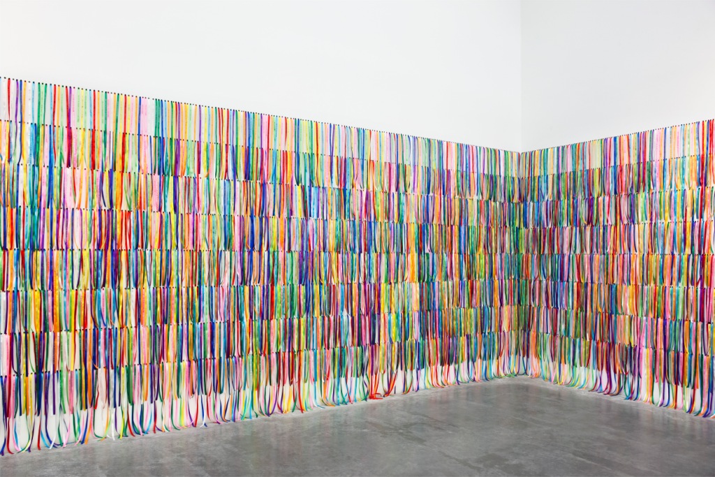
When trying to decide what I wanted to do for this assignment, I found Chris Crawford’s definition of interactivity coming to mind. In previous assignments, I think I was too focused on one or two aspects of interactivity that made my piece feel like it was lacking something, despite me being finished. So in getting started with this one, I took to the internet for some general brainstorming on what interactive art could be. After a quick Google search, I came across the following image: 

This ribbon installation by Benoit Pailley caught my attention and became the main inspiration for my piece. In addition, either in class or through clicking through other people’s  work I saw a cool blending trail element  and definitely wanted to incorporate that feature into my own project.

Lastly, as I began to see the project develop further I was reminded of wind chimes (mostly because of their rectangular shape) and their movement in the fading out of colors so decided to go with that as my overall theme. I briefly considered making all the rectangles hues of green to represent the flow of nature but felt that that was a bit too far of a reach and was more comfortable with the brighter, louder colors for this one. I thought the bright colors on contrast with the black and white background was a nice juxtaposition with the soothing nature with which the objects are moving.

Components 

Although it made a big difference in the final outcome making  the object trail as they move was super simply. I simply added on a second parameter to background(0, 10)  so that the alpha transparency value would smooth out the color of the rectangle for every frame. I got this idea from Ethan Hermsey  on Stack Overflow.  For the foundation of the code (generating the rectangles and having them move) I referenced the code we reviewed in class, more specifically Ball Class 2. From there, I simply added an array og objects so that I could store all of the rectangles in one place, and change them by referencing for (let rectangle of rectangles) .

I added a few ‘interactive’ (not sure if they live up to Crawford’s definition) components for the user that are accessed through the mouse and keys. For starters, when the mouse is double clicked, all of the rectangles become shades of grey and depending on what key is pressed, the rectangles will flow from a different side of the canvas. Also, the spacebar changes the colors back from shades of grey to multi-colored and all the rectangles stop moving when you hold down on the mouse.

An Aspect I Am Proud Of

I am most proud of the interactivity in this assignment. Although once you get one side down, it is rather easy to apply it to the other three I ran into little problems (like dealing with keyCode() and keyPressed() that prolonged the process. Furthermore, I ended up undoing a couple of changes with these moving pieces that took me quite a while was rather proud of myself for doing so because although it made me feel like I wasted time, it was all in the name of the artistic process.

function doubleClicked(){
  //why does it change direction for bw but not back to color?
  whiteBack = true;
  for (let rect of rectangles) {
    rect.color = random(255); 
    rect.speedX *= -rect.speedX;
  }
} //color -> BW change direction (after first time?)
//bw -> no change
function keyPressed() {
  whiteBack = true;
  if (key === ' ') {
    for (let rect of rectangles) {
      rect.color = color(random(255), random(255), random(255));
      // rect.speedX *= -rect.speedX;
    }
  }

The code that I’ve embedded is not my entire keyPressed function but actually a piece of keyPressed() and the entirety of doubleClicked(). I chose these two because they were the first two functions I added to alter the rectangles movement and thus the most difficult for me to implement.

Final Product

Reflection

Overall, I am fairly satisfied with the outcome of this piece. It is by far the most aesthetic thing I’ve created for class so far and was an effective application of the concepts we learned. However, I feel like it lacked depth in terms of meaning and kind of just developed as something I’d enjoy visually.

Also, there are two odd bugs that I couldn’t figure out and would like to solve in the future. The first one being that after switching from black and white to color (or vice versa) there are streaks of the previous paths of the rectangles as if they were created in a background of a different color. From what I could tell, I set it so that the background would be the same throughout (either black or white) but when it is supposed to be white, it almost appears grey against the white-streak contrast. Finally, in some instances when the rectangles are returning back to their starting side (after bouncing on the opposite wall) they just fade away and I could not figure out why. I used the code from class  for the walls of the bouncing ball (if (this.y < 0 || this.y > height) ) for both x and y (when deemed necessary) to ensure they stayed within their boundaries but was unable to get it to work how I imagined.

All in all, I really am pleased with this piece and do actually want to fix these issues because once that is done, I do feel like the project will actually be complete.


Reading Response – Week 3

After reading the excerpt from Chris Crawford’s “The Art of Interactive Design” I am excited to explore my own personal definition  of what interactivity is and how I can apply it to what we create in class. I think I would also use the three categories Crawford gave us to determine whether or not something is interactive. Listening, speaking, and thinking seem to be the standard for ‘quality interaction’ so I believe we should also apply them in our design process. I think the listening part might be the most difficult to implement because I’m not exactly sure how that would be done creatively.

To improve the user interaction in my P5 sketches I think even just consciously asking myself, is this program listening, thinking speaking, will show results in one way or another. However, to go further, I think I’d like to let my imagination go a bit further and consider what I’d enjoy interacting with. So far, I have been limiting myself to rather simple projects because I was afraid of the more daunting aspects of implementation. Using these three key standards I think even implementing my ideas will be easier because I can ask myself, well how do I do this? Ok, if the program is ‘thinking’ about what the user wants, maybe I can code a few options for the program to choose from based on user input and what it hears.

Similar to what Reas seemed to be advocating for, I think Crawford wants us to think a bit more abstractly. Whether or not something is interactive might be a harder question to answer than what one might expect and can be debatable in many different contexts.


Week 2: Comparison is the thief of joy

Concept 

For this week’s assignment I had to spend a lot of time brainstorming and somewhat fumbling through the dark before I had a sound idea of what I wanted to create. Originally, I was stumped as to how I would use effectively use a loop while still creating something ‘artistic’. However, after watching Casey Raes’ talk, I felt more confident in the fact that art did not fit some predetermined definition I made us.

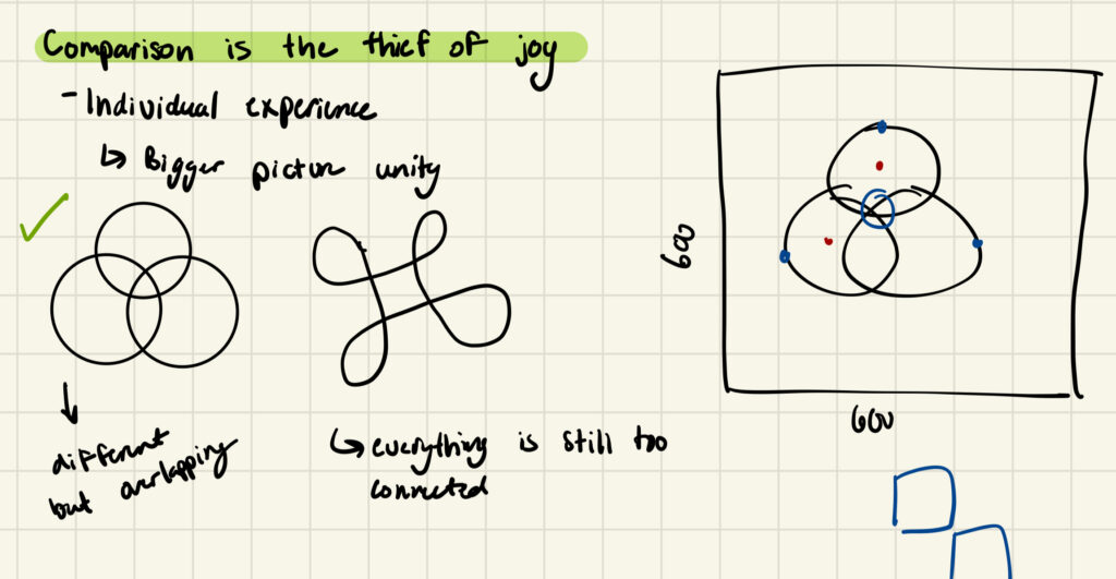
Thus, I came to the conclusion that I wanted my piece to focus on comparison, and how it effects us as people. I started out with a sketch and planned for something much more complicated than what I ended up producing but it gave me a starting point for my code.

Components 

After giving myself a bit of a reality check, I decided the three rings would be stationary and depending on where the user clicks the mouse, a different element of the piece would be highlighted. Each of the three rings (representing unity altogether) also represent separate themes. The highest one represents individuality and when the user clicks on it, the rings separate and display yellow and purple colors. I chose these two because across cultures they represent royalty, wealth, and prosperity which I believe can only flourish through sufficient strength and independence.

When the ring to the left is clicked an image resembling the Seed of Life appears which is a symbol of creation and harmony across many religions (in slightly different variations). I chose this symbol to represent the peace that we find through self-reflection. Lastly, when the ring on the right is clicked, the entire unity symbol changes colors randomly which represents a person’s creativity and unique characteristics.

An Aspect I Am Proud Of

The aspect I am most proud of is what happens when you click outside of the three rings. A static-like image is created in the background which is intended to represent the ‘noise’ from society that often distracts us from understanding who we are. I used nested for loops to create this and was a bit indecisive on what I wanted the image to become. As I was writing the code, I was kind of just moving some loops around to see what worked and what didn’t and when I got to the grid design, became interested in how the image could imitate that of static.

function static(){
  noStroke();
  frameRate(40);
  for (let x=0;x<6;x++){
    for (let y=0;y<6;y++){
      fill(random(255));
      rect((x*100),(y*100),100);
    }
  }
}

Final Product

Reflections

Overall, I’m quite proud of the creative process I went through to come up with this concept. Although I did not meet my original goal in terms of the technicalities, it took a lot for me to generate these ideas and actually get something out of them so I am rather satisfied. However, in terms of improvements, there are a lot of areas in which the code could be written more efficiently (i.e. not redrawing the symbol every time user interacts with the mouse and instead just adjusting the parameters). Furthermore, in the future, I would like to dive in to the ‘oscillating-objects-unity-symbol’ idea I had going just to see it through.