1. Concept + How it Works
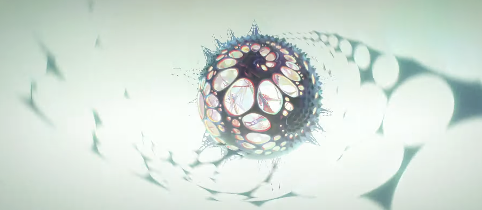
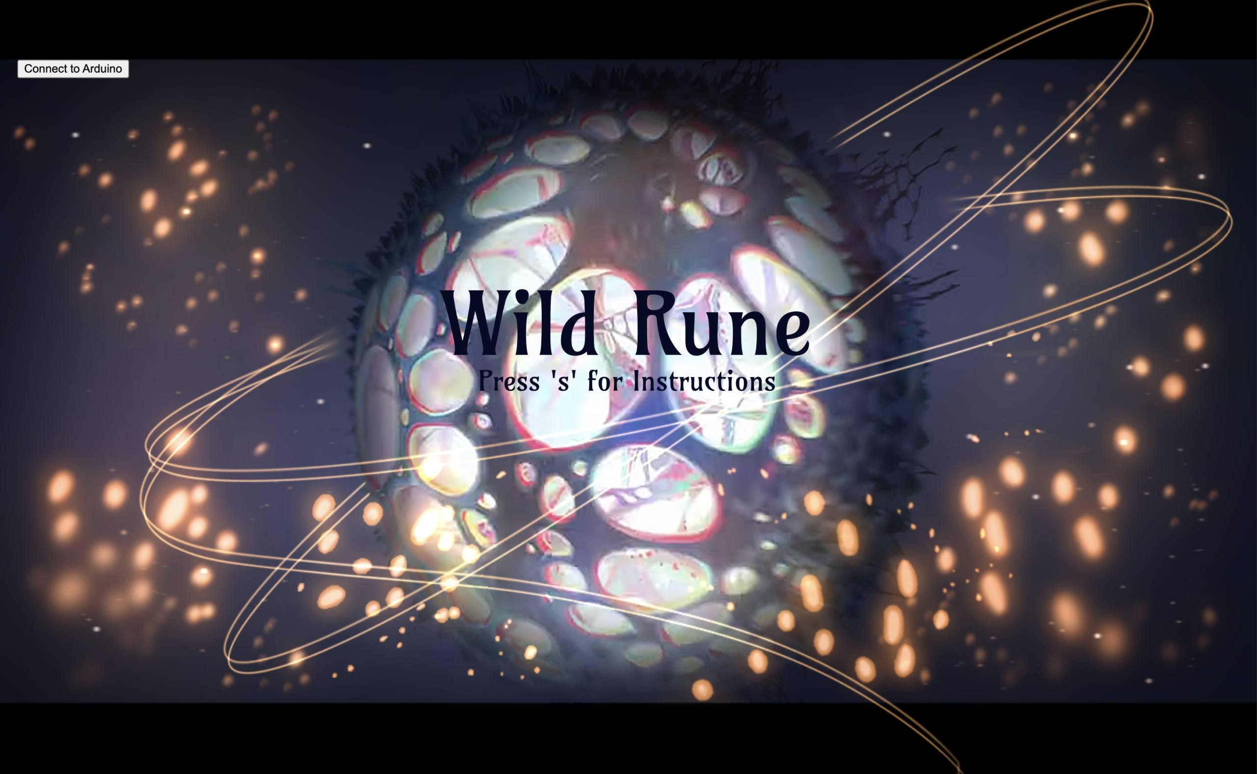
Inspired by Season 2 of the Netflix series Arcane, this project offers an interactive experience that incorporating subtle references to the show. Found in the game page (state is playing) is a colorful sphere, floating in a dark space, inspired by the “Wild Rune”, introduced as a seed of destruction and chaos.. In the series, this is an unstable, magical object that is constantly distorting and causing chaos around it. For this reason, in my project, this sphere will be open to drastic changes. While it is in a constant state of rotating flux, the player must adjust its size, growing it and shrinking it, until it reaches the “ideal size” in order to fix the stability of the rune, all while some of the most popular songs from the season’s soundtrack play.
Goal of the game: “Stabilize the Wild Rune”
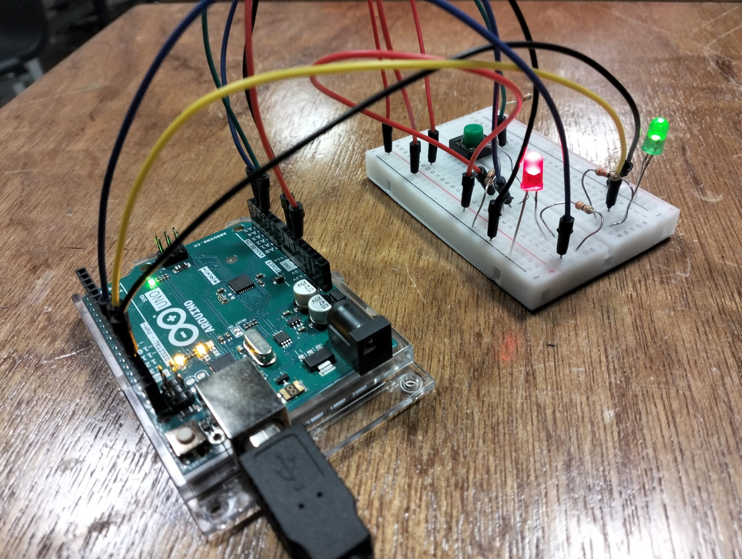
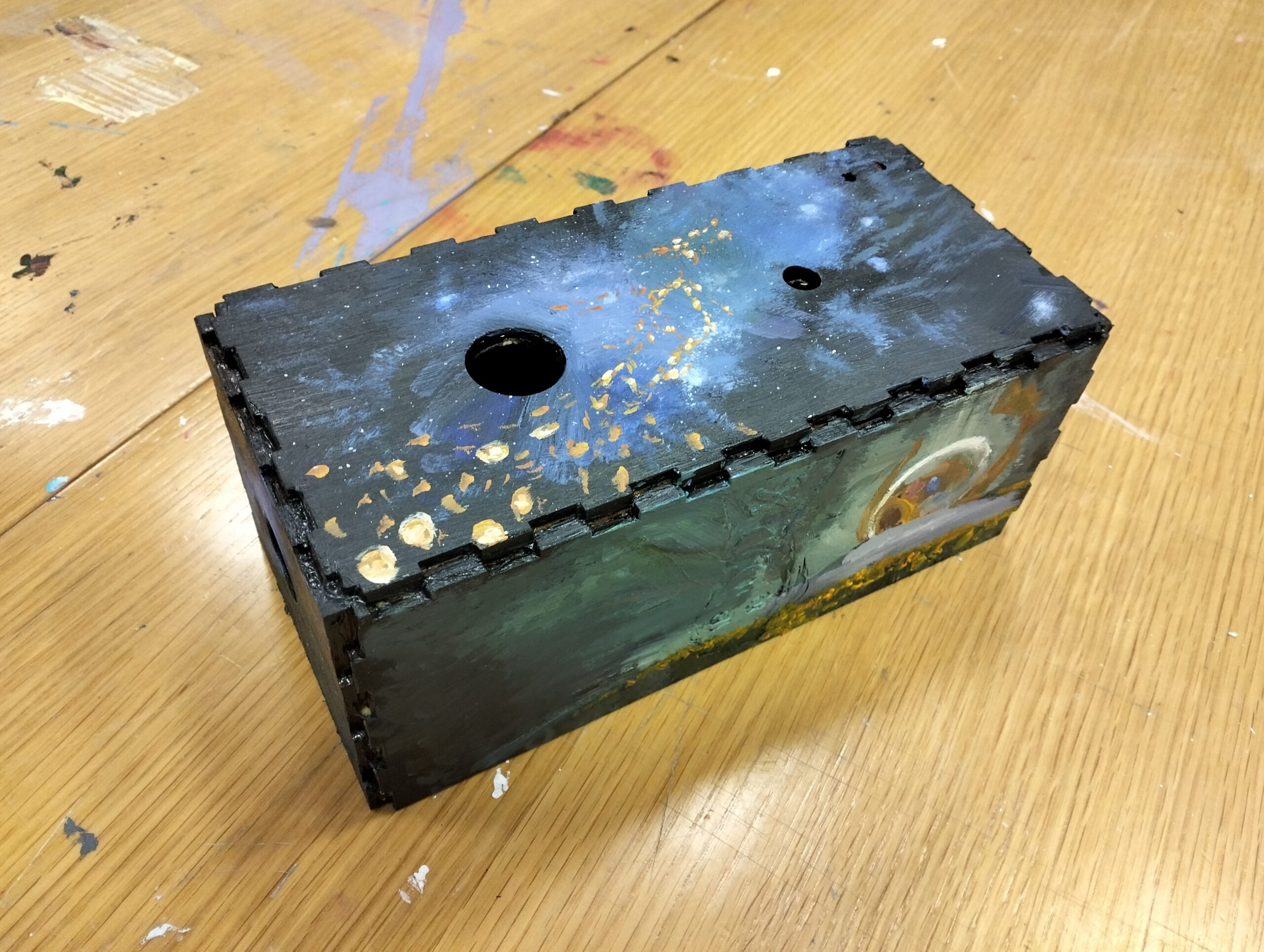
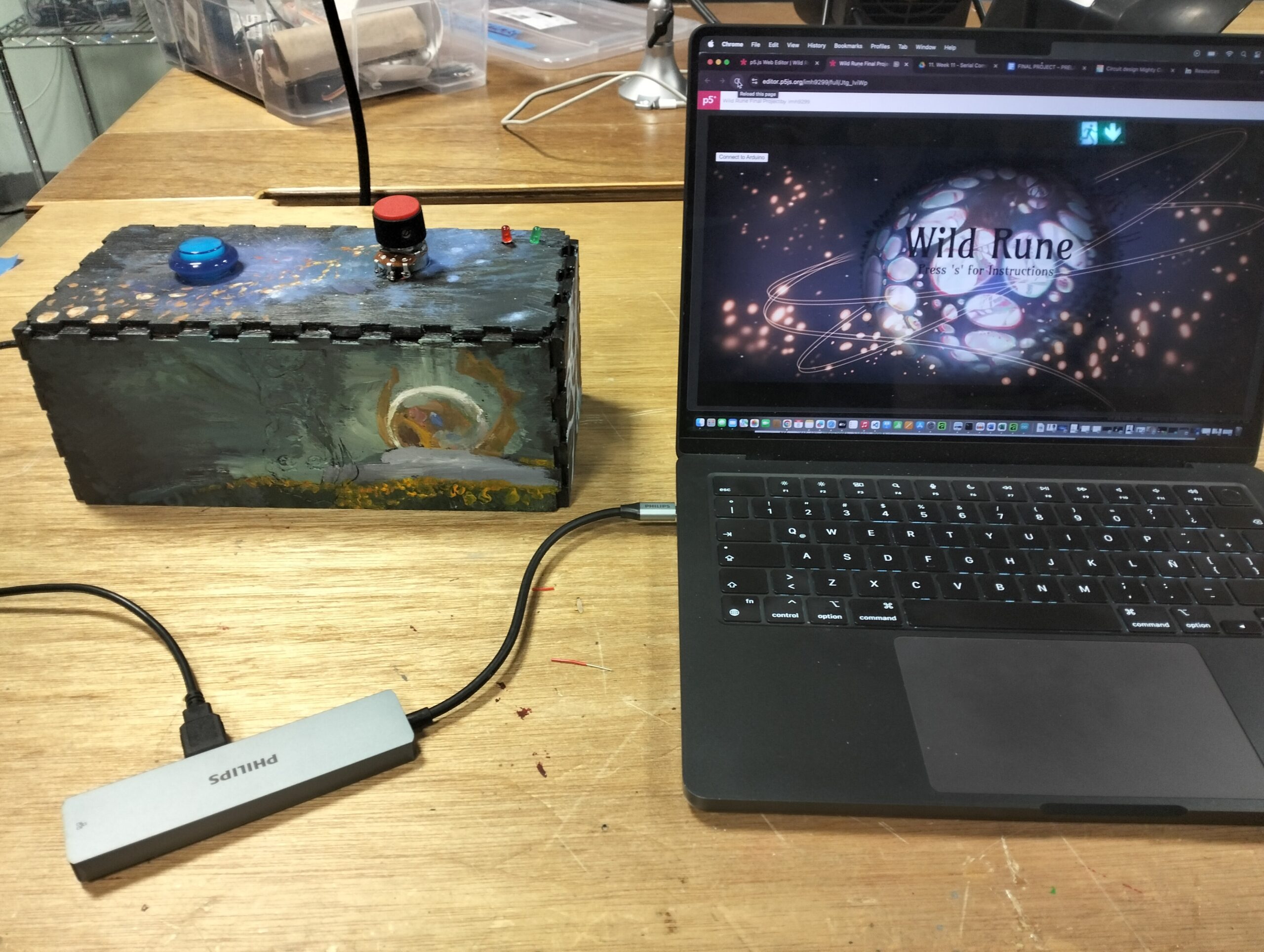
2. Images of project
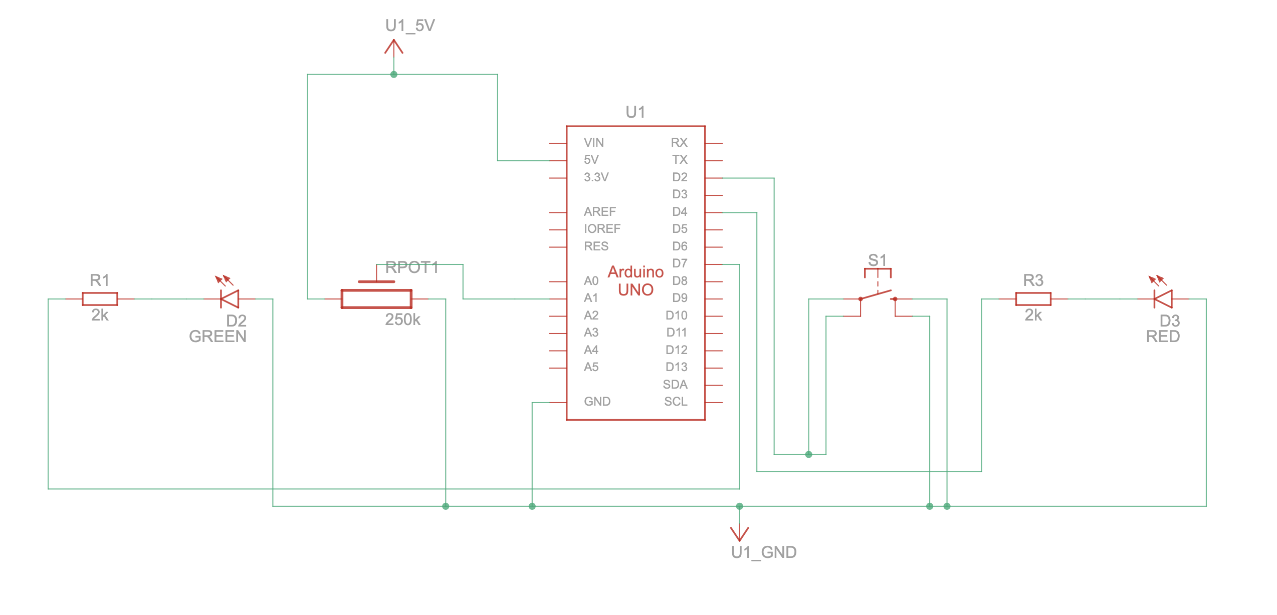
3. Schematic
4. User Testing videos
User testing 1: https://youtu.be/KjYdtzcL7hw
User testing 2: https://youtu.be/kOqq3b2YJ9E
5. How does the implementation work?
5.1 Description of interaction design
- The game begins with the Homepage, a combination of a screenshot taken from the series with illustrations made by myself. Once the players clicks on the lower “s” key on the laptop, they get access to the introduction page, which explains how the game works. Once they click “s” again, they are able to access the game playing state.The sphere begins at the runeSize, or the initial size. Since the sphere was set in a completely black background and the sphere was layered with a thick stroke, this gives the initial illusion that the sphere is not present. Once the user twists the potentiometer, they are able to make the sphere grow larger or smaller according to the potentiometer’s position. If the user grows or shrinks the sphere past the allowed sizes, a red LED turns on only as a warning.Once they find the “winning” size, the green LED flicks for a moment before the player is transferred to end screen and congratulated for their efforts. This page also contains important information regarding the following steps that must be taken, which is clicking on any key to return to the homepage, and returning the potentiometer back to the initial position so the next user can play.
5.2 Description of Arduino code + code snippets + add link to Github full code
Github: finalProject_Wild_Rune: https://github.com/imh9299-sudo/Intro-to-IM.git
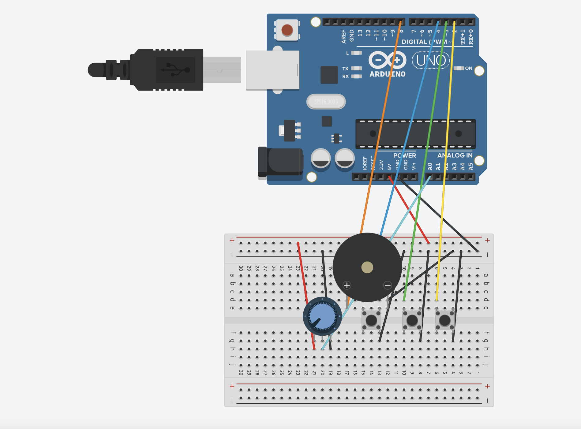
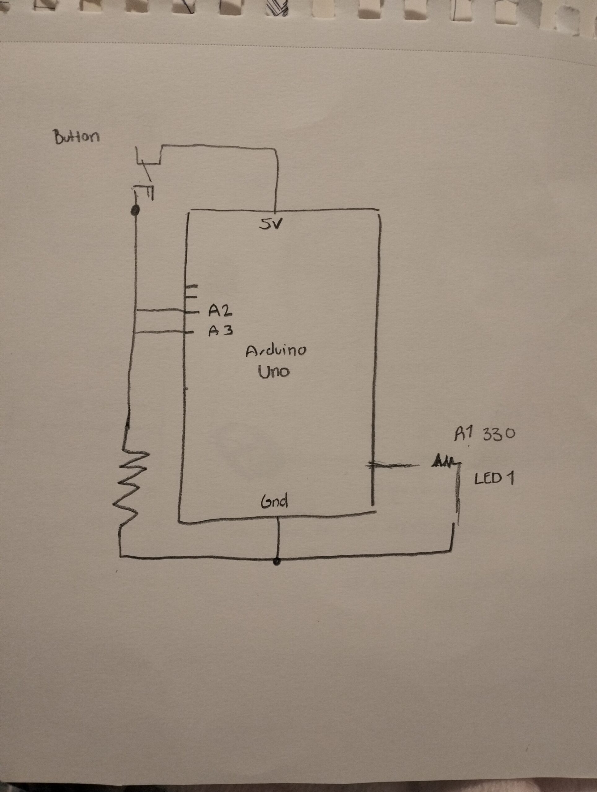
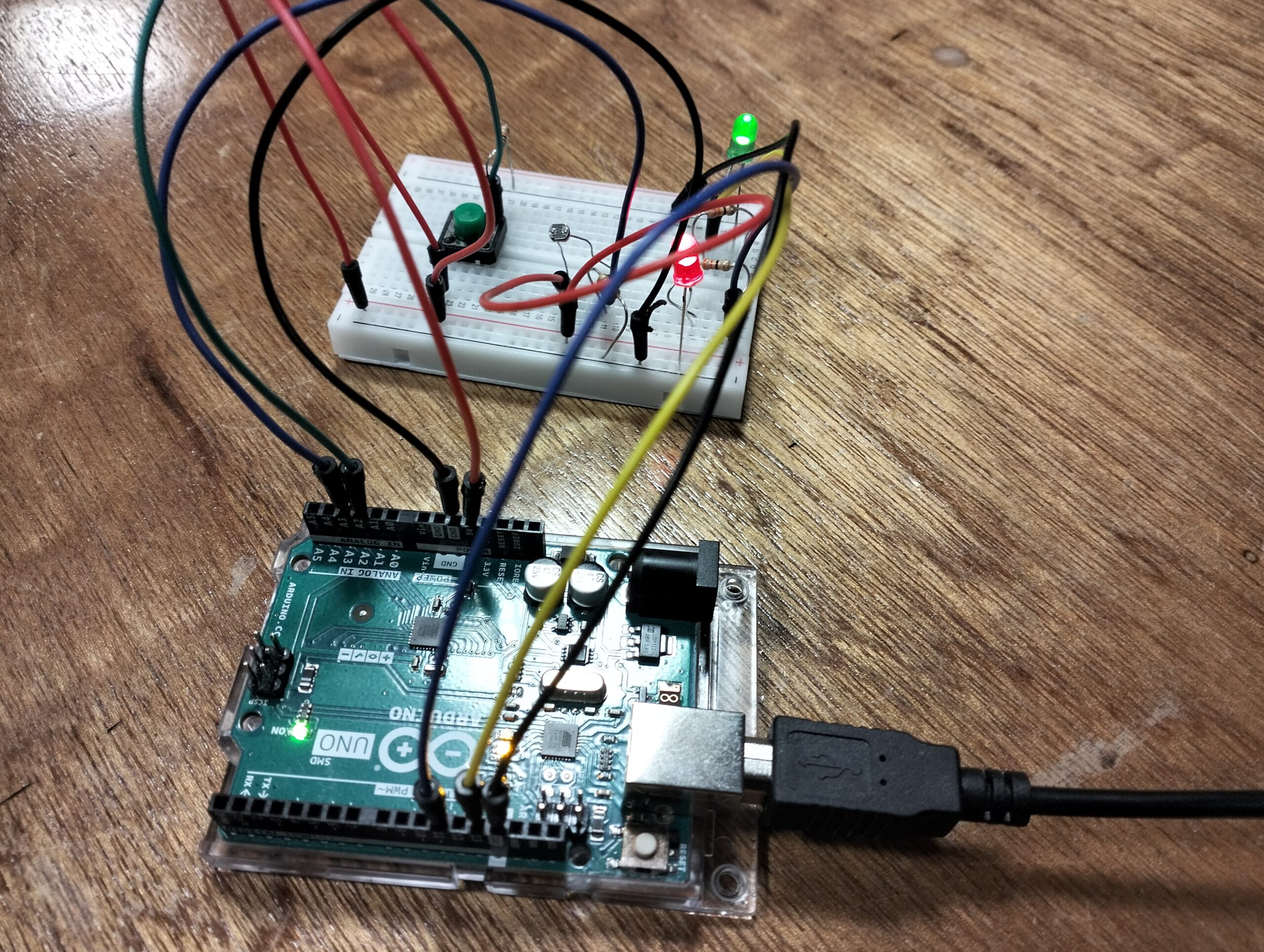
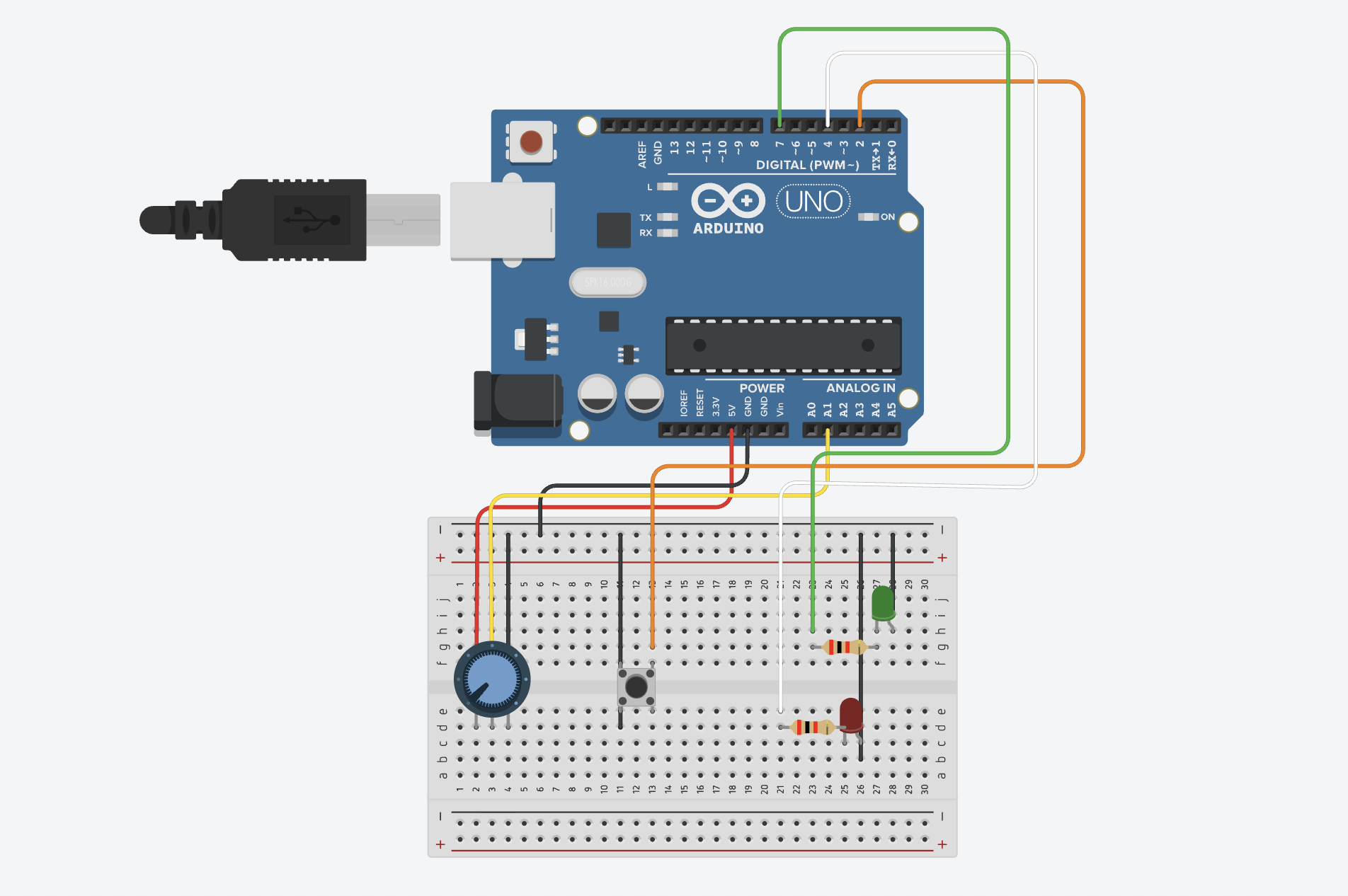
ARDUINO UNO
In the Arduino Uno, the main interactions consist of sending information to p5 from the potentiometer, and the button. At the same time, it introduces essential information from the LEDs, such as their pin location in the Arduino board, or microcontroller board, the pinMode, and digitalWrite that allow P5 to understand how to proceed when each of the LEDs is on, off, and how they must begin the interaction once while(Serial.available()= is executed.
Other important snippets from the code include the “if statement” that contain information regarding the state of the button, whether it is off or on, and what was the last button state.
int lastButtonState = 0; // LOW or GND when pressed

int winLedPin = 7;
int loseLedPin = 4;

// lose = red LED
//win = green LED

void setup() { // setup code

// Start serial communication so I can send data over the USB connection to my p5js sketch
  Serial.begin(9600);
  pinMode(button1, INPUT_PULLUP);
  pinMode(LED_BUILTIN,OUTPUT);

  pinMode(winLedPin,OUTPUT);
  pinMode(loseLedPin,OUTPUT);

}

void loop() {

    while(Serial.available()){
      digitalWrite(LED_BUILTIN,HIGH);

      int win = Serial.parseInt();
      int lose = Serial.parseInt();

      if(Serial.read() == '\n'){

       digitalWrite(winLedPin, win);
        digitalWrite(loseLedPin, lose);


        // digitalWrite(loseLedPin, lose);
      int buttonState = digitalRead(button1);
     delay(5);
      if (buttonState == LOW && lastButtonState == 0) {
      lastButtonState = 1; // BY Gemini. To make sure the code doesn't miss when one presses the button

      }
      else if
        (buttonState == LOW && lastButtonState == 1){
          lastButtonState = 0;
        }
5.3 Description of p5.js code + code snippets + embedded sketch
Full Screen P5 Sketch: https://editor.p5js.org/imh9299/full/Jtg_IviWp
(Use google chrome)
While every line of code matters in programming and is an essential component that contributes to the success of a project, I found these blocks of code to be the most challenging yet crucial fragments of my game.
The first block shown below contains the functions, variables, and statements necessary for the game’s main objective. The “if statement” was built so that: 1) if the rune size (sphere) was larger than 275, the red LED would turn on as a warning, as well was any value under 100. This function also connected with the Arduino, with the “lose” and “win” acting as the states of the LED. Meaning, if lose = 1, the red LED turns on, the green remains off, and will only change if the size is adjusted. On the other hand, if the player “wins”, the red LED remains off, and the green LED turns on, then turns off again when this is no longer true, or to be more specific, when the player is on the ending screen. Lastly, if neither of these statement are true, if the player is not winning or is not above or below the limit sizes, then the LEDs will remain off , otherwise known as the “safe zone”.
The second block was essential to receive the information from Arduino in order to make the button change the song playing upon clicking. By using an “if” statement contains the lastButtonState, playNextSong, and introducing the sections in which the songs would play (when “playing” mode is activated), this allowed for a smooth processing of data and making sure the songs would change only after clicking the button.
The third block is the initial foundation of the game, a Class made to design the sphere and facilitate its use in the main sketch. By implementing all the layers from the shaders in separate files (normalShader.frag, and normalShader.vert), and introducing all the lines of codes I learned from the tutorials, I made the sphere rotate on its own, added a large number to the strokeWeight of the lines around the sphere to give the illusion of multiple fragments making up the object, and set the size open to transform only when the player twists the potentiometer.
  if (rune.size > 375 || rune.size < 100) {
    lose = 1; // RED LED turns on
    win = 0; // GREEN LED is off

    let sendToArduino = win + "," + lose + "\n";
    port.write(sendToArduino);
  }

  // sphere the perfect size between 290 and 300 "win"
  else if (
    rune.size >= 295 &&
    rune.size <= 300 &&
    runeSize >= 295 &&
    runeSize <= 300
  ) {
    lose = 0; // RED LED is off
    win = 1; //GREEN LED turns on
    wonGame = true;

    let sendToArduino = win + "," + lose + "\n";
    port.write(sendToArduino);
    //print (sendToArduino);

    gameState = "end";
  }

  // Safe zone: not winning or losing
  else {
    lose = 0; // RED LED is off
    win = 0; // GREEN LED is off

    let sendToArduino = win + "," + lose + "\n";
    port.write(sendToArduino);
    //print (sendToArduino);
  }
} // END OF ELSE STATEMENT
let fromArduino = split(trim(data), ",");
      if (fromArduino.length == 2) {
        sensorValue = int(fromArduino[0]); // Keeps this updated always
        buttonState = int(fromArduino[1]);

        // play songs if state is in playing or in instructions
        if (
          buttonState === 1 &&
          lastButtonState === 0 &&
          (gameState === "playing" || gameState === "instructions")
        ) {
          playNextSong();
        }

        lastButtonState = buttonState;
      }
class WildRune {
  constructor() {
    this.size = 130;
  }

  display() {
    shader(normalShader);
    normalShader.setUniform("uBrightness", brightness);

    push();
    rotateX(angle);
    rotateY(angle);
    rotateZ(angle);


    stroke(0);
    strokeWeight(25);
    sphere(this.size);
    pop();

    resetShader();
  }
}
P5 Embedded Sketch:
5.4 Description of communication between Arduino and p5.js
From Arduino to P5
- The arcade button allows the users to change the songs played in the background while the “game state” is active. Found in an array, each song plays on infinite loop while it runs in the background, and will only change when the player clicks the button.
- The Potentiometer allows the users to change the size of the sphere. After connecting Arduino UNO on p5, once the user presses “start”, the user is able to increment or decrease the size of the sphere by twisting the potentiometer.
From P5 to Arduino
- If the player grows the sphere past a specific radius on the p5 canvas (above 375), a red LED light will turn on. Once the sphere shrinks back to the “SAFE ZONE” or return to the home page, the LED will turn off.
- Similarly, if the player shrinks the sphere past a specific radius on the canvas (below 100), the red LED light will turn on. Once they grow the sphere back to the “SAFE ZONE” or return to the home page, the LED will turn off.
- When the player keeps the sphere at a certain size (between 295 and 300) for a few seconds, a green LED light turns on and takes the user to the “winning” page. The LED then turns off.
6. What are some aspects of the project that you’re particularly proud of?
One of the main aspects of the project that I am proud of is the p5 to Arduino bidirectional communication. Once the game starts running, without the data of the potentiometer on Arduino to p5, adjusting the size with just a p5 slider would be far too simple. However, the potentiometer adds a whole new layer of value that engages the user through a hands-on practice. Only once this transfer of information was made, it was possible to make the LEDs react to what was happening to the sphere. I found this process fascinating, how an action happening on the screen triggered by an action on a physical, adjustable object (potentiometer), could cause a reaction back on another tangible object (the LEDs). Doing this offered me a glimpse to how the logic behind the arcade games I used to love as a kid work, and reinforces the pride of being a human who can accomplish so much with a. few circuits and programming platforms. While it is not the most advanced game system, I am very happy with the outcome, and making this bidirectional exchange after having no previous experience in coding makes me feel proud of my progress,
7. Links to resources used
Main Inspiration: Arcane Season 2 Clip
https://youtu.be/8PU2iKx0YtQ?si=qtSexmSyrLLJLWcc
Background Songs:
- Imagine Dragons feat. JID – “Enemy (Opening Title Version)” (from Arcane) [Official Visualizer] https://youtu.be/UqcE-IIevf0?si=1fEAqWTDhATXA7Av
- Woodkid – “To Ashes and Blood” (from Arcane Season 2) [Official Visualizer] https://youtu.be/Gj-jmBi0aK8?si=6Yn53yDESy4y0R0K
- Blood Sweat & Tears (from the series Arcane League of Legends) https://youtu.be/ySbgRwQi3Rc?si=uf5mUQyy-rPUKWLz
Coloring 3D
- https://p5js.org/reference/p5/normalMaterial/
- https://p5js.org/examples/3d-materials/
- https://p5js.org/reference/p5/createShader/
- https://archive.p5js.org/learn/getting-started-in-webgl-shaders.html
- https://youtu.be/3mfvZ-mdtZQ?si=62IHOJ-riA4-char
- https://p5js.org/tutorials/intro-to-shaders/
Spheres
Rotating 3D objects
Brightness and shades over sphere
Growing and shrinking
Other student’s work inspiration:
- https://intro.nyuadim.com/2025/05/08/week-14-final-project-2/
- https://drive.google.com/file/d/1cKzZDW381kVPHhkQ_SMRwg62PU8fu88L/view?usp=sharing
- https://intro.nyuadim.com/author/bka2027/
- https://intro.nyuadim.com/2025/05/11/week-14-final-project-5/
8. AI Tools Reference (How they were used and where)
function preload() {
//... rest of code
  normalShader = loadShader("normalShader.vert", "normalShader.frag"); //Allows lights, shaders, textures, in 3D objects.

}

///////////////////////////////////////////////////////////
function restartGame() {
//... rest of code

  sensorValue = 0;
  runeSize =130;

}

/////////////////////////////////////////////////////////////
function draw() {
  background(51);

  readArduino();
  //... rest of code

} // END of draw()

//------- Arduino + Sphere Game -----------------
function drawGame() {
  background(5);

  // resetMatrix(); by ChatGTP so that the arduino button will appear despite the differences of the WEBGL
  if (!port.opened()) {
    push();
    resetMatrix();
    //... rest of code


    }
  } //... rest of code
}
////////////////////////////////////////////////////////////
function drawHome() {
  resetShader(); // disable 3D shader so text can be drawn
  noLights();
  //runeSize=130;

  push(); // Drawing the fullscreen cover image
  translate(-width / 2, -height / 2); // move image to top-left for WEBGL
  translate(0, 0, -30);
}

////////////////////////////////////////////////////////////
function drawEndScreen() {
  if (port.opened()) {
    port.write("0,0\n");
  }

//... rest of code
  }
}

///////------ TO PLAY NEXT SONG----------------////////////////
function playNextSong() {
  // Stop all songs
  for (let s of songList) {
    if (s.isPlaying()) s.stop();
  }

  // Go to next track
  currentSong = (currentSong + 1) % songList.length;

  // Loop the new track
  songList[currentSong].loop();
}

//////////////////////////////////////////////////////

function readArduino() {
  //... rest of code
}
The use of ChatGTP and Gemini was used specifically to assist me organizing my code as I advanced in my project, fix a few problems I was facing that prevented the code from running or affected some aspect of the project, and adding a few lines of codes when there was no other resource that could fix an issue.
Shaders for 3D Shapes
To create the colors shown in the sphere, originally I used this tutorial https://www.youtube.com/watch?v=GYFiu7nLTak as reference and from there I started to read all the instructions in the p5 3D object instructions, and information about types of shaders. Initially I was going for a normalMaterial(); shader to create the colorful layer (check the references section to see all the links). However, I also wanted the sphere to have changes in its brightness to add more realism, just as the Wild Rune appears in the Arcane series. This is when I shifted my focus to the baseMaterialShader, since in one of the examples provided https://p5js.org/reference/p5/baseMaterialShader/ it contained all the properties I wanted for my own sphere. Nevertheless, I faced two problems with this:
- I wanted these elements from the shaders to apply in a Class, since I wanted the main focus on the sketch to be the Arduino and P5 exchange.
- Given that we had only learned how to work with 2D objects, layers, and other variables in class, I struggled to understand how to apply the variables present in the baseMaterialShader into a smooth sphere, combined with the color patterns from the normalMaterial(); from the tutorial.
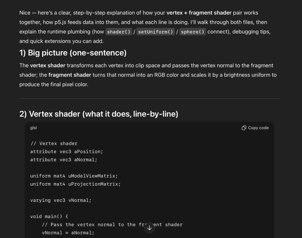
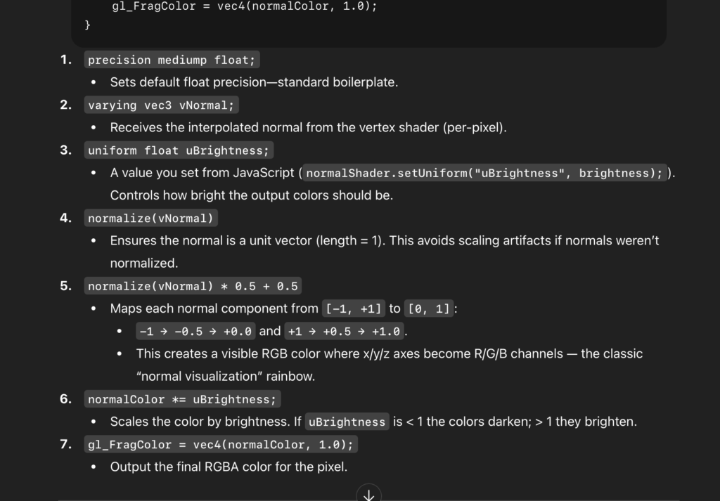
This is why I asked ChatGTP to help me combine the foundation functions for the sphere, and the shaders and integrate them into Classes (normalShader.vert) and (normalShader.frag). Basically, the codes in normalShader.frag are elements from GLSL fundamentals, introduced in the Introduction to Shaders of p5. By following the instructions on how to adjust the properties of brightness over the sphere, this Class simplifies some of the fundamental lines of code from the Shaders, such as precision mediump float; which is needed to calculate the values of the floating points, varying vec3 vNormal; which calculates the color in this case, the Uniform makes the values the same for every pixel, and the uBrightness naturally controls the brightness cast on the sphere.
And for normalShader.vert, this Class focuses more on the general aspects of the sphere, with the aPosition focusing on the position of every vertex in the 3D space in x,y, and z positions, the aNormal which focuses on direction, and the attribute that assigns each vertex its own value.
Winning State and Resetting Sphere Values
After I achieved to make every state of the game function effectively (Homepage, Instructions, drawGame, and end page/winning), I realized a new problem had emerged, one that took me a long time to resolve. After growing the sphere to the “winning” size and ending the game, I noticed that every time I wanted to start a new round, the sphere wouldn’t return to its original size, even after returning the potentiometer to the starting position. This caused the sphere to lock itself on the winning position, and no matter how many times I was taken back to the homepage to restart the game, I would be immediately “win”, unable to change the size of the sphere again. After much trial and error, this was the process towards solving this issue.
- In the restartGame() function, Gemini suggested to add the
sensorValue = 0; runeSize =130; }. With the sensorValue= 0; and the runeSize = 130; the sphere would return back to the original size for the next player, and ensure the value of the potentiometer was at 0 as well. - It also suggested to add the function if (port.opened()) { port.write(“0,0\n”); under drawEndScreen() to make sure the port to the Arduino was functioning and reading the new values after the game ended.
- When these changes didn’t work, Gemini pointed out that the Arduino code was only running during the drawGame (the state of the game is “playing”). This meant that the Arduino was no longer reading the new values and was stuck in the last position the sphere was on. For this reason, I added the function readArduino(), containing the lines of code in which P5 would read the information from Arduino UNO that we learned in class: (if (port.opened()) { let data = port.readUntil(“\n”); ….etc).
After this, I wrote down readArduino(); on top of the data in the draw() function so that it would read the information at any state of the experience:
readArduino();
if (gameState == “start”) {
drawHome();
// rest of code
Fortunately this allowed p5 to reset the game’s data and fix the original problem.
Text on WEBGL Canvas
After learning how to create a sphere and how to hold it in a WEBGL as part of the canvas size, I discovered that the text that I had for my home page was not showing, nor the button to connect p5 with Arduino. Despite watching numerous tutorials and doing research on similar 3D works, I couldn’t find the reason of why the text wouldn’t appear. And without understanding what was happening, I couldn’t search for a solution. After reading every line of code and analyzing its effects on the game, I learned thanks to ChatGTP that the text was designed to be layered on a 2D plane, and not a 3D plane which was only meant to sustain the sphere and other 3D objects. By using the resetShader(); and the noLights(); and translating the background images with negative values, I was able to fix the layer for the introduction, the endGame, and the HomePage so that the text would show, all without affecting the “playingState”. These functions allowed to: 1) Reset the shader for the sphere so that it wouldn’t affect the previously mentioned pages, 2) translate the background image behind the text, and adapt the data in spite of using WEBGL.
Changing Songs with Arduino Button
Lastly, after compiling all the songs that would play, while the game was running, into an array (songList), and following the basic structure to play a sound file (https://p5js.org/reference/p5.sound/p5.SoundFile/), my objective was to have this list of songs ready to play, so that every time the user clicked on the Arduino button, they would be able to change the song. However, doing this required a complicated logic.
- The songs had to play in an infinite loop, so that every time the song playing ended, it would reset itself and play from the beginning.
- The moment the player clicked the button, the old song would stop playing
- After the old song stopped playing, the new song would start playing on loop.
- All of this had to be executed through the Arduino button, and not through p5
So I followed the instructions from the p5 sound loop https://p5js.org/reference/p5.sound/p5.SoundLoop/?utm_source=chatgpt.com and adjusted it accordingly in the lines:
function playNextSong()
{ // Stop all songs for (let s of songList)
{ if (s.isPlaying()) s.stop(); }
// Go to next track currentSong = (currentSong + 1) % songList.length; // Loop the new track songList[currentSong].loop(); }
And Chat GTP helped me understand the logic behind each line. First, I had to create a function (playNextSong) to play each song, stop the current song if the user clicked the button, look back to the song list and pick the next song in line, play the song and make sure the old song is no longer plating. Once the current song was playing, this would go on a loop.
After doing this, it was just matter of introducing this function into the gameState “playing” so that it would run while the game was running and everything was reset when the game was set to restart, as shown in the block of code below inside fuctionKeyPressed()
function keyPressed()

{ //... rest of code

// Start first song on loop currentSong = 0;

songList[currentSong].loop(); }

else if (gameState === "end") { restartGame();

// stop ALL songs for (let s of songList)

{ if (s.isPlaying()) s.stop(); } } }

///////------ TO PLAY NEXT SONG----------------//////////////// function playNextSong() {
9. Challenges faced and how I overcome them
As previously mentioned, the main challenges I faced were understanding the the logic of Shaders for 3D Shapes, how to fix the Winning State and Resetting Sphere Values, adding text on a WEBGL Canvas, and changing the songs with the Arduino Button. Every time I encountered an obstacle, I tried to first resort to tutorials or other sources in the internet to find a solution. If this didn’t work, I would ask my peers or approach Professor Aya. While I wish I hadn’t resort to using AI platforms, when I did, I made sure that they would always provide long explanations, step by step, and simplify the information so I could understand the logic behind every line of code.
WEBGL ChatGTP aid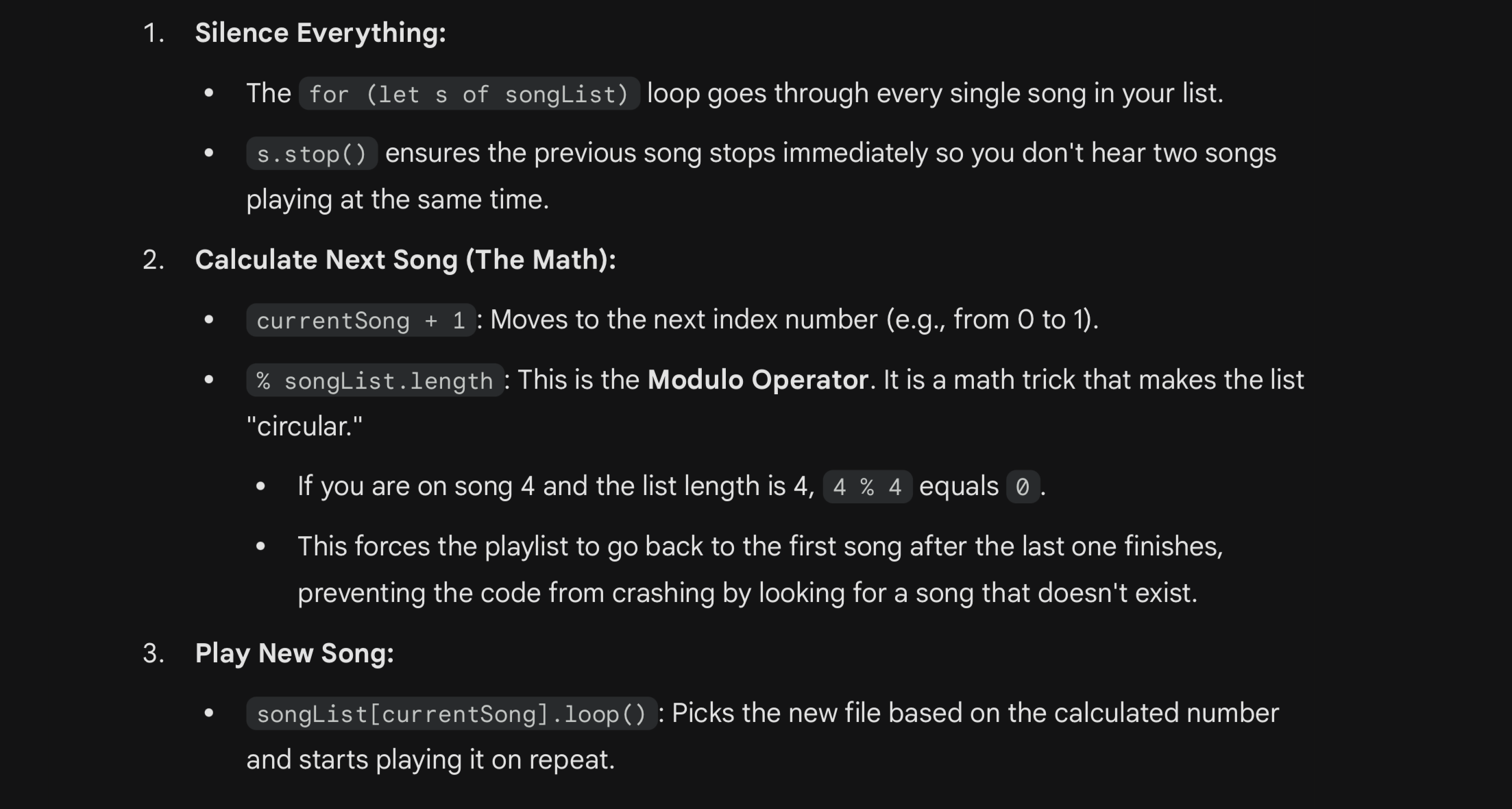 Songs loop aid from Gemini
Shaders aid from ChatGTP
Shaders 2 aid from ChatGTP
LEDs and P5 to Arduino Exchange
Another challenge I struggled with was with the p5 to Arduino interaction. Initially the intention was for a red LED to turn on when the sphere grew past the size of 400 or under 50. However, despite following the template we learned in class to send the information of the LEDs to p5 on Arduino UNO and applying it to work with my “winning” and “losing” format, the LED’s were not turning on once I inserted them inside the code in which p5 received the information from Arduino.
// Start serial communication so I can send data over the USB connection to my p5js sketch
  Serial.begin(9600);
  pinMode(button1, INPUT_PULLUP);
  pinMode(LED_BUILTIN,OUTPUT);

  pinMode(winLedPin,OUTPUT);
  pinMode(loseLedPin,OUTPUT);

}

void loop() {

    while(Serial.available()){
      digitalWrite(LED_BUILTIN,HIGH);

      int win = Serial.parseInt();
      int lose = Serial.parseInt();
After a long session with Professor Aya, however, I finally understood my mistake.
In p5, I set the minimum size of the sphere to be 50, and the maximum size to be 400. However, my bidirectional exchange was stating that the red LEDs would turn on only if the sphere grew under and above these sizes. Naturally it didn’t make sense for the maximum size to also be the size which the sphere could not grow above of. After realizing the mistake in my logic, we changed the maximum size to be 700, and kept the minimum as 50. On the P5 and Arduino exchange, however, we changed the data so that if the sphere was instead above of 375 or under 100, the red LED would turn on. And the green LED would only turn on when the sphere reached a size between 295 and 300. Once this was fixed along smaller adjustments in Arduino UNO, the program ran successfully.
10. What are some areas for future improvement?
For future improvements, I would explore adding more interactive elements to the game, as the current version feels too simple for my liking. While I did integrate music into the project, one suggestion I received and would definitely implement with more time is the addition of sound effects that indicate whether the player is getting closer to or farther from the correct size, similar to the “warm and cold” childhood games. This would not only guide the player more effectively, but would also make the experience more engaging. I would also consider adding more layers of complexity, such as different difficulty levels or challenges where the player must find not only the correct size but also the correct rotation speed of the sphere. These variations could be presented as different rounds, helping to keep players more engaged over time. Another feature that could enhance the experience is a time-based element, where players attempt to beat the shortest completion time. At the end of the game, all records could be preserved and checked for future interest. Finally, I would like to introduce more interactive controls that allow the player to change additional aspects of the sphere, such as its rotation speed and color, in a way that complements the game’s overall aesthetic.
11. IM show documentation, images, videos, people interacting with your project
IM Showcase “Wild Rune” video: https://youtu.be/fethsawtmDY
IM Showcase “Wild Rune” video part 2: https://youtu.be/057bjR7LJNM