Assignment 8: Chopswitch (Unusual Switch)

Concept & Inspiration:

I spent a lot of time trying to come up with a creative switch idea, but nothing was clicking for days. Just today, I was sitting in Marketplace eating a poké bowl while doing some work for my other classes. I was eating it with a pair of wooden chopsticks, and that’s when I realized, I should use chopsticks as my switch. Chopsticks are the one utensil I can always count on, and I’ve used chopsticks to eat a large variety of foods that people wouldn’t usually use chopsticks with, such as hot cheetos so my fingers don’t stain red. I realized I have steel chopsticks in my dorm, so that was a plus because they can act as conductors.

Demo Video:

Chopswitch

Although in my demo I use my hands to turn the LED light on, it’s still possible to turn it on without using hands, as long as the two chopsticks touch each other. You could kick them together with your foot or use your elbow

Github Link:

Chopswitch .ino File

Highlight Code:

if (buttonState == HIGH){
  digitalWrite(13, HIGH); // Turn on light
} else {
  digitalWrite(13, LOW); // Turn off light
}

The code I used is basically the exact same as the one we worked on in class while learning about digital input/output, except I made it so that the light was originally off and would turn on if the circuit is complete. Meanwhile in class, it was originally on and would turn off if the circuit was complete.

Reflection + Future Improvements:

I was originally really scared of this assignment given we learned for just two days before already having to create something with Arduino, which was unfamiliar to me. It ended up being rather easy and straightforward, and I would’ve liked to have come up with a more complex and creative concept to execute, since I didn’t plan on having that because I was so scared it would take me a lot of time to understand the assignment and get it to even work. Maybe I could’ve linked a chopstick to a plushy, and have two plushies to make them sword fight with chopsticks. When their “swords” clash, the light would turn on. I think that would’ve been a cool and fun concept, and would’ve matched the “no hands” aspect of the assignment more because it would be easier to kick them.

Reading Reflection – Week 8

Her Code Got Humans on the Moon—And Invented Software Itself:

I was truly amazed and in awe at Margaret Hamilton’s journey as an incredibly strong, dedicated, powerful, and influential woman and mother. Women in tech at the time were basically unheard of, and even in today’s world, tech is still a male-dominant field. Yet, it was a woman that made such significant advances to software engineering. Not only was she a working money who would bring her 4-year-old daughter to labs as she worked, she wrote the code for the world’s first portable computer  and eventually became Apollo’s command module computer.

It’s a shame that I’ve never once heard of her before reading this article, especially given how pivotal her work was, that even helped Neil Armstrong land on the moon. Something I found interesting was how Hamilton wanted to add code to prevent the simulation to crash if the program P01 was launched, yet NASA overruled her idea despite the fact that it happened already from Lauren accidentally launching P01. NASA insisted that their astronauts would not make any mistakes because they were “trained to be perfect,” which, evenstill, it doesn’t hurt to play things safe. Just five days into the Apollo 8 flight in 1968, astronaut Jim Lovell accidentally pressed P01 and luckily enough, Hamilton and MIT coders were able to plan and upload new navigational data. It makes me wonder, would NASA have listened to her if she was a man presenting that idea instead?

It shows how important it is to be aware of and know how to navigate potential problems in works, even if you’re confident nothing will happen. Reading this made me a lot more aware and cautious of my future work, and I’ll be on the look out for potential problems that could surface and figure out, even just briefly, how to combat those issues should they arise.

Attractive Things Work Better:

I enjoyed reading Norman’s piece on how aesthetic designs can impact the way we feel towards that product. He makes a really interesting case with his three teapots. He definitely proved his point by showing images of those three teapots and explaining when he would use each one, because the design of the Carelman tea/coffeepot is so incredibly ugly to me that it’s actually frustrating to look at, and I wouldn’t even want that in my house let alone use it. Just its presence would probably ruin the calm and peaceful mood I was probably in if I wanted to make some tea.

The whole concept reminds me of pretty privilege and the saying “look good, feel good.” The concept of object pretty privilege is shown with the teapots, as all of them are functioning teapots at the end of the day, but with very different designs. The concept of the phrase is shown as Norman talks about the concept of positive vs negative “affect.” Positive affect enhances problem-solving and performing tasks while negative affect makes it harder. How we feel about things influences how easy or difficult it would be to think through and finish a task.

Something I found interesting was that negative “affect” didn’t necessarily only have a negative effect on us. Although positive affect helps us creatively think better, negative affect can help us focus and concentrate on potential threats or problems. He even mentions how anxiety also helps us concentrate, as people are less distractible.

I do agree that to an extent, (as long as the product functions decently well) aesthetic designs can make a big influence on the same product depending on the influence of positive of negative affect that stems from it. It could even apply to animals. If you saw a pastel colored mini snake vs a black and yellow colored one, would you take them to be the same level of danger? Well, maybe you would, especially if you have a severe fear of snakes. But, the different looks of the snakes could possibly affect the intensity of negative affect.

A real-life example of attractive things working better could be gardening tools. They still function the same, but certain colors that match your aesthetic or match the aesthetic of your garden might boost positive affect that makes you want to garden more than a basic boring colored tool

Midterm Project: Escape From New York

Concept:

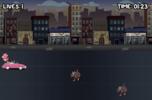
People often have a certain impression of certain places from hearing about it on social media, where people tend to only focus on the good and hide the bad. Meet Madison. Madison is a social media influencer who has fallen victim to the glamorized and romanticized New York City. With such ambition to pursue her career in the huge city, Madison impulsively moved to New York because of the beautiful Christmas movie scenes and “just because it’s New York.”  Now that she has moved to NYC, she is met with several true NYC obstacles…rats, trash, and crackheads. Help Madison escape from New York by preventing her from crashing into the obstacles!

How it Works:

“Escape From New York” is a relatively easy game to learn how to play. After reading the tutorial, users just have to move their arrow keys left, right, up, or down to help Madison avoid the nasty NYC obstacles. If you run into an obstacle, you lose one of your three lives. If you crash three times, you lose and Madison is stuck in the streets of New York. If you manage to stay alive for 1 minute 30 seconds, you win and have successfully helped Madison get out of New York and back to the suburbs!

Highlights:

Project: Overall, I’m quite proud of this project and how I was able to bring the idea to life in the way I had planned it out to be. The idea for the game was something I found funny to me as a Native New Yorker, who has seen and heard many mixed feelings about NYC. It was nice to create a project on a topic that resonates with me and part of my identity. I’m proud of myself in general for being able to create a literal game with code, two things I thought would be impossible for me to do let alone both at the same time. Even though I got a lot of help from the professor and from other students, I’m still proud of myself for piecing everything together and gaining more experience in this new field.

Code:

// Constrain character's Y position to the range [200, height]
charY = constrain(charY, 175, height - charHeight);

// Constrain character's X position to the range [0, width]
charX = constrain(charX, 0, width - charWidth);

The piece of code that I would like to highlight is this small piece of code that helps constrain Madison to the roads. It really bothered me that she was able to drive up into the buildings and to the sides and hide from the obstacles in frame, so I knew I just had to find a way to constrain her so that it looks more logically correct. Not only would it look right, it would also make it harder for players to cheat and win.

The Piece:

Issues & Improvements:

A lot of the issues I faced were due to some silly mistakes from having a } in the wrong place or having old code that wasn’t cleaned up mixed up with my new code. For example, I was extremely frustrated with my project for a solid hour and a half, trying to figure out why the game and sounds loaded, but nothing happened if I pressed anywhere on the screen. It had to do with a missing } that I put in a random space to get rid of the red error. Instead of seeing where the actual problem came from, I tried taking the easy (but wrong) way out that led to more harm than good. I also had issues with music overlapping, which I later realized because of the professor that I had overlapping codes, hence, overlapping music. I also struggled to come up with a creative way to implement a shape into my project, as all of the visuals come from images. I thought of doing confetti for the winner’s page, but it ended up being too messy and complicating. In the end, I ended up just making two “points” to use some kind of shape to make the colon on the “Tutorial” page. Although I could’ve easily just used an actual colon, I couldn’t think of any other way to incorporate a shape.

Although I’m quite satisfied with the outcome of the project, there are many improvements I wish I had the time to make, and would like to implement into my future projects. For one, the game is 1 minute 30 seconds, but the audio is 1 minute 33 seconds, where the last three seconds are pitch silence. This affected the flow of the suspenseful finale, but I didn’t have time to trim and reupload the audio. Another thing would be to make the canvas bigger and be able to resize with the user’s window size, as well as being able to full screen it. This would really help with the overall game experience by making it feel more engaging and fulfilling. One last improvement would be to stop the ending sounds to loop so frequently, as it gets really repetitive and annoying to hear the same sound on loop after every 4 seconds with no silence in between.

Midterm Progress

Idea:

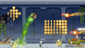
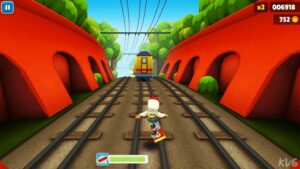
For my midterm, I originally wanted to create an interactive artwork because I assumed it was easier. After looking at some students’ previous pieces, I concluded that neither choice was easier than the other, so I settled for an interactive game that was a combination of some of my favorite childhood games, with a theme that I’ve noticed a lot in recent years. The games I thought of were: Jetpack Joyride, Subway Surfers, and Temple Run.

These endless runner games consist of a character that keeps running (or flying) while avoiding obstacles to reach the furthest distance possible. I don’t think I have the time or knowledge to create a completely endless one, so I’ll go for one that goes “You Win!” if the user can last around 1 minute 30. I decided to make the theme revolve around social media influencers that impulsively move to New York “just because it’s New York.” I’m thinking of naming it Escape from New York as word play on Marketplace’s Escape from New York Pizzeria.

Concept:

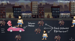
The concept is the user plays as an influencer who severely romanticizes New York and imagines it to be the way it’s portrayed in movies, only to move there and be faced with obstacles such as rats, trash, and crackheads. Their mission is to use the arrow keys to avoid driving her into the obstacles to get her out of New York.

Design:

Above is a brief idea of what I want the actual game to look like. The user will be able to move the arrow keys up and down to move her to the road without an obstacle.

So far, I’ve only worked on setting some functions and coming up with the look of the main menu page and the tutorial. I’m facing some formatting issues that need to be worked on such as the game background image’s scroll and the tutorial going off of the canvas.

Uncertainty:

Honestly, I’m uncertain about being able to properly finish the entire game with just a little over a week left because I feel like it is way too complex and out of my capabilities, so I’ll be needing a lot of help. I snooped around other students’s project codes and got intimidated by how long their codes are. I think I’ll get the hang of it the more I work on it, as my progress and understanding from today was better than that of when I worked on it 3 days ago.

I’m kind of unsure of how I’ll make the game look as if she’s driving and the obstacles are still, rather than the obstacles are moving and she’s still. I’m also uncertain of how to make sure there’s a road without an obstacle, so that she wouldn’t be trapped like in the example design. I also found myself spending a lot of time trying to find the right images to use in the game, and even the ones I found still aren’t the right ones for the final.

I think there’s a lot of planning out and learning to do beyond what I’ve already done, so I’m kind of worried on how fast I’ll have to pace myself, which is way out of my coding comfort zone. To reduce this risk, I’ll have to dedicate a good chunk of my time to it everyday, rather than only working on it the days after I have Intro to IM class. I’ve already spent a good chunk of time finding the images for the game, so now I get to focus on the code and implementation of these images. I’ll also look at and refer to p5.js tutorials, YouTube tutorials, other students’ previous works, and of course the professor’s help to learn more on how to bring this game to life.

Reading Reflection – Week 5

I found this article “Computer Vision” to be quite fascinating, especially when the author talked about how computer vision technologies used to be limited to military and law-enforcement purposes, when it is now also used for programming and creative purposes. Computer vision holds a significant position in creating ideas and designs for areas such as novel artworks, games, and home automation systems. I really liked how this article showed a lot of examples of whatever the author was talking about, such as the first interactive artwork to incorporate computer vision and elementary computer vision techniques, while also showing visual examples of the concept. This really helped me understand the idea and see how it would play out in real life. I also really enjoyed how much I learned in quite a little amount of content compared to our other readings, which I’ll talk about later.

Some of the ways in which computer vision differs from human vision as stated in the article is “generalization,” where computer vision algorithms are not fully general as they are highly dependent on assumptions about the real-world video scene. On the other hand, humans are easily able to adapt and generalize what they’re seeing across a bigger range of contexts. Another difference is computers’ vs humans’ abilities to differentiate and infer what they’re seeing if the subjects are too similar in color or brightness. Computer vision struggles to work well if there isn’t a significant contrast between people and the environments, meanwhile humans are able to tell people and things apart, even if the brightness and color of the backgrounds are very similar. These made me think of how easy it is for us to determine what things are. We’re very lucky to be able to process these things so quickly, because not only would it harm us in terms of survival, it would also harm us in terms of social life. Imagine your friend sees you and waves at you, only for you to not be able to process or see them because they’re unintentionally matching with the wall. It would be embarrassing for them and complicated for you. It also helps that we can generalize enough to be able to tell that our friends are our friends instead of processing them as a newly discovered bug just because they decided to wear a new bright color palette of clothes one day.

One more difference that is also a technique humans can use to help the computer see is by using infrared. Infrared is invisible to the human eye, but helps improve the signal-to-noise ratio of video that’s capture in low-light conditions. This helps computer vision operate in near to complete darkness, something that humans can’t quite do. Another technique is the use of retroreflective marking materials, which helps ensure high-contrast video of tracked objects due to the light illuminating and reflecting back. Reading on this unintentionally reminded me of and answered a question I forgot I had back when I was a kid in elementary school. When crossing the street to get to school, I always wondered why the crossing guards wore bright yellow or orange jackets with silver stripes. This answered why. The high-contrast brightness and reflectiveness is to enhance their visibility, especially in dark conditions, by illuminating light back to the drivers.

Before reading this article, I would think that when it comes to interactive art, computer vision’s ability to track would allow for direct engagement with the artist and/or the audience. It enables immediate user feedback from viewers’ actions, such as Myron Krueger’s “Videoplace,” which analyzed participants’ silhouettes and movements to create graphical responses in real-time based on their interactions. These real-time interactions and visual responses are able to enhance the experience and make it more immersive and engaging. I thought that it would just be for good interactive fun. But after reading this, I realized how many issues could rise from it. It could end up being problematic, like Bureau of Inverse Technology’s “Suicide Box,” which has led to controversy over the ethics of recording suicides and if the suicides are even real. Even with the bad and good, it could also be used in a negative light to help shed light and raise awareness. David Rokeby’s “Sorting Daemon,” inspired by concerns over surveillance and profiling, uses computer vision to survey the environment and extract and sort people in his piece as a way to question the ethics of using technology for reasons such as profiling. I didn’t realize how complex the uses of computer vision could get, but now I’ve seen several perspectives on how it could be viewed as fun, beneficial, or problematic.

Overall, this was a really good read and I learned a lot more than I expected from it. I thought I would just learn what computer vision is and a couple of examples of how it works and how it could be implemented into interactive art, but I ended up learning way more than that

Reading Reflection – Week 4

Norman’s article was a great read, and he definitely captured my attention by being so frustrated over “Norman Doors,” which is something I only started to relate to once I got onto campus here. The automated doors in C2 were not automated at all just last year, despite its big bold yellow and black efforts to flex its automation. Further into last school year, it began to actually automate, and so did D2’s. Only, D2’s doors are so poorly designed that I end up using all of my strength to fight with the door’s pressure, and at times, the door would be open and would close on me as I’m walking through it. Don’t underestimate how strong that thing is!!

These automated doors lack discoverability, where they have such slow and random responses to your actions that it ends up overcomplicating such a simple concept. The doors won’t start to open until you’ve been standing there awkwardly for 5 seconds, and once you start to reach out your arm to manually open the door, that’s when it suddenly decides to get moving. It could be improved by having a faster response rate, and by actually opening when someone “waves to open.” Just like Norman’s story about his friend with the swinging doors, the doors’ discoverability failed and was unnecessarily complex. This, as Norman mentioned, applies to a lot of modern day technology that has too many functions and controls for you to remember, and they’re usually meant as advertisement to show off that this one device can do this many things… even if some of those functions are never played out even once. This reminds me a lot of the piece we read last week on interactivity, where companies slap on “interactive” onto their products to grab customer attention. Similar concept applies here with all of these supposedly everyday friendly machines’ different functions.

Something that drives me crazy is the elevator in A2C. One of the elevators is “locked” for maintenance to go down to the basement, but NYUAD students can still use it if they swipe their card. However, I’ve fallen victim to many cases of elevator confusion. I swipe my card, the elevator goes from B2 to 2 (ground floor for dorms), and I walk in, only for the elevator to go back down to B2. Then, some maintenance people click on 2. Rather than stopping at 2 for maintenance, it suddenly decides to follow my choice to go up to the seventh floor, now inconveniencing the worker. Something so simple ends up being extremely frustrating, and it becomes all the more nerve wracking when it becomes the determining factor over whether you’ll be late or on time to a class or a meeting. It could be improved with some signifiers that indicates floor priority so both parties can know what’s coming ahead. There should also be better signifiers on swiping your card to unlock the elevator, since some buildings have a poster while others don’t. I didn’t know I could do that until well into my first semester of Freshman year. Feedback would also be helpful, where some visual (colors) or auditory feedback could be given to indicate where the elevator is properly responding to your swipe, or if it will just ignore you. The whole problem could also be resolved by adding more elevators!

Norman’s principles of design can be applied to Interactive Media by making the designs of our project discoverable and accessible. In order to achieve this, we should follow human-centered-design, an approach that prioritizes human needs, capabilities, and behavior first, then is designed to match and accommodate those needs, capabilities, and ways of behaving. With strong understandings of psychology and technology as well as good machine to person communication, it would be easier to create an actual good design that performs well when it’s functioning as it should, but also knows how to perform well when it faces inevitable problems and issues. But while doing this for Interactive Media, it’s important to create a balance between the design navigation, the simplicity of how the project actually functions, and the aesthetics. Too much of one or all things can easily get very overwhelming for the user especially when it comes to IM projects that are supposed to be lighthearted and fun. By making designs simple and straightforward, with any affordances, signifiers, and/or feedback when necessary, it’ll be easier for the user to understand what to do and why they must do so. This focus on machine-user communication will makes things a lot more comprehensible

Assignment 4: Know the Numbers

Concept:

Since January 2024, there has been over 50 school shootings in the US, with the four most recent ones being just two days before this post was made, all on September 21, 2024. The frequency of school shootings in the US is devastatingly overlooked, and I wanted to make a piece that could raise awareness on how insanely young a lot of these shooters are. “Know the Numbers” is a generative text output that randomizes statistics from a CSV file that consists of all school shootings in the US from 1990 until September 4, 2024. The link to the Washington Post’s CSV file can be found here. To view these shocking statistics, simply click anywhere on the canvas with your mouse.

Originally, I wanted to do a data visualization to emphasize the regions with the most shootings, but I realized that could easily be found with a quick Google search. Something that wasn’t as common was close up statistics of these shootings, which is what I wanted to do, but I didn’t know how to display it. I scrolled through other students’ works to get a feel of how they did this assignment, and Ahmad’s project looked like a good foundation for my idea, so I took inspiration from his work. I ended up creating this piece that emphasizes the age of these shooters. Some say unknown to keep up with the real statistics. There will also be some where the kills, injuries, and casualties are zero and the age of the shooter might even be unknown. These represent gunshots that went off in a school setting that fortunately didn’t harm anyone.

I wanted to add a dripping blood border to the top edge of the canvas to emphasize the gun violence. I tried to code some blood drips from this YouTube tutorial by Barney Codes, but it ended up being too difficult and it wasn’t static nor was it grouped together, so I decided to keep the poster simple.

The Piece:

Highlight:

The piece of code I’m proud of is ironically one that wasn’t much use to my piece. For the other sections (number of kills, number of casualties, etc) I managed to combine the CSV data with a message, for example, the CSV data on casualties is “16,” but I was able to add “there were” and “casualties” before and after the data was displayed. However, the age was the only one that didn’t work, and I couldn’t figure out the reason why, so on Google Sheets, I manually added “the shooter was #-years-old” in place of just the age, for over 400 rows of data. This way, I would’ve still been able to include context text with the statistic even though the code doesn’t work. I kept looking, and I eventually found out what I did wrong, which was a silly spelling mistake. So I’m proud of my patience and determination in showing these age numbers, otherwise, I would’ve just scrapped the ages. I’m also proud of myself for still trying to find out what was wrong so that I could learn from my mistake.

let numRows = shooting.getRowCount();
let age = shooting.getColumn('shooter_age');
let state = shooting.getColumn('state');
let year = shooting.getColumn('year')
let kills = shooting.getColumn('killed')
let injuries = shooting.getColumn('injured')
let casualties = shooting.getColumn('casualties')

print(age[statistic - 1]);
push();
textSize(53);
fill(233, 210, 18);
text(str(age[statistic - 1]), width/2, height/2 + 210);
pop();

Reflection/Future Improvements:

This project was eye-opening even for me. I already knew how terrible these statistics were, but as I was manually adding text to the ages, I saw the age of every shooter on that list. It was already devastating that the vast majority of shooters were young teens, but the most jaw-dropping were the single digit numbers. The youngest school shooter was just 6-years-old, which is absolutely insane to me. Not to mention, there were three 6-year-old shooters, not just one. I hope others will find this project as informative as I did, because I definitely learned a lot more from it. The project itself was relatively easy because it was text. I know that if I stuck with data visualization, it would’ve been a lot harder for me to complete.

For future improvements, I would like to somehow adjust the grammar to match the statistic. For example, if there’s one causality, it would say “there were one causalities” because it is a fixed text. I would also like to add the blood drip edge that I originally wanted. In general, I’d want to make it pop more so that people would know exactly what it’s about once they see it, without reading anything yet.

Reading Reflection — Week 3

I found myself very entertained by this piece. Crawford’s tone was serious yet unserious, and his examples and references were quite funny to me. I was very shocked over the language and way he framed his words, but I’m not complaining about his writing style at all since it made it way easier for me to read and digest his points. The Boolean property comparison made my jaw drop.

After reading his piece, I learned that what he considers to be the characteristics of a strongly interactive system is the mutual ability to alternately listen, think, and speak. I do somewhat agree with this to an extent after reading his examples of what isn’t interactive, but I also feel like context, intention, interest, and bias of one party can play a much bigger role on how “interactive” something may be viewed as. For example, the difference between a little kid stumbling across your interactive portfolio website could find it to be a higher degree of interactivity than if a professor assigned her students to collectively view and critique the interactive portfolio. The student may have reasonings like jealousy or carelessness that could cause them to find the portfolio as “not interactive enough” because it doesn’t speak out to them. Meanwhile, the little kid might be fascinated with how this portfolio is basically like a short video game.

Just like a conversation, both sides must be interested in one another for it to flow, otherwise, it would be very one-sided and unwanted. There needs to be proper and authentic involvement and engagement between the two. This ties in with the author’s point of the different degrees of interactivity, rather than a concept of “one or the other.”

I find it really interesting how he exposed companies for claiming their products as “interactive” when they are just the same product. The word being tossed around so often under so many different meanings seemed to tick off the author.

Some very brief ideas I had to improve the degree of user interaction was to make my work intriguing from the get go. People’s attention spans have gone down so much, especially with the usage of social media, so I would have to grab their attention immediately if I want them to, in turn, willingly interact with my work. Another improvement would be to find a creative way to “bring out” the interactivity by viewing my piece in several possible lenses to get an assumption of how other people may react to it given their point of view. I’d like to increase the visual and auditory appeal of my work, and to also create content that is for more than one audience group. By this, I mean making it interactive so that it’ll listen and respond to other people’s interests to in turn, maintain and even increase their level of interaction and interest.

Assignment 3: Starry Self-Love


Inspiration:

After attending both RealAD shows this past week, I haven’t been able to get the songs out of my head. RealAD is a theater performance that is offered every year, intended for First Years to know they’re not alone throughout their new college journey, as everyone has their ups, downs, bad, and good. The show being so relatable while remaining positive made it stand out to me since my Freshman year, so I was inspired to somehow implement it into my project. I ended up deciding to use a mix of the mini-projects we tested out to learn in class, and out came “Starry Self-Love.”

For the background of this piece, I got help from Rio’s code.

Concept:

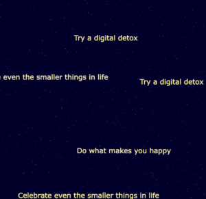
“Starry Self-Love” is a rather simple piece, whose purpose is to be more mindful and caring rather than jaw-dropping. An empty canvas of a starry night sky lies ahead of the audience. When their mouse is clicked, a little self-care tip/reminder pops on screen that floats around and bounces off the edges of the screen. To remove the most recent tip, simply press any keyboard key.

The Piece:

Highlight:

The code I was most proud of was one that can’t do much on its own in p5.js, but can make a big impact on those reading it. It’s the array of self-care tips that I programmed to randomly appear on screen when the mouse is clicked. Being such a huge advocate of self-care and well-being, I find that this piece of code is what carries the project, as the lack of this code would change the concept and overall point of this piece.

// Array of Self-Care Tips
let tipList = ["Why are you competing? Get some sleep in",
"Practice self-care and personal time",
"I've got to make peace with my body",
"Set realistic goals. Burn out is real",
"Set boundaries with yourself and others around you",
"Getting no sleep is not an achievement",
"Spend time doing something you enjoy",
"Stay connected with friends and family",
"Do what makes you happy",
"It's okay to have cheat days",
"Celebrate even the smaller things in life",
"Remember to eat a balanced and nutritious diet",
"Learn to say no",
"Do what makes you feel comfortable",
"Try a digital detox",
"Find a balance in all aspects of your life",
"Out of my mind and into my body"
];

In case I needed to show a piece of “code-code,” this basic code that we learned in class was what I was second most proud of because it allows for the interactivity of the night sky.

function mousePressed() {
  
  let randomTip = random(tipList); // Choose a random tip
  let interactiveTipMovement = new TipMovement(mouseX, mouseY, random(-2,2), random(-2,2), randomTip); 
  movements.push(interactiveTipMovement);
}

  // Remove the last Self-Care tip when any key is pressed
function keyPressed() {
  movements.pop();
}

Reflection & Future Improvements:

This project took me a lot longer than I expected because I was trying so hard to make something cool and sophisticated. I ended up struggling a lot and having to come up with new project ideas. Eventually, I landed on this one because of a RealAD song stuck in my head.  In the last project, I tried sitting there making something from scratch without looking back at the slides that much. For this project, I used the slides and what I learned from class, which made it a lot easier and faster to complete.

Something I didn’t get to resolve was the randomness of the tips popping up. A lot of the time, the same tip pops up twice or even three times in a row even though not all of the phrases have been used yet. I would like to expand the list and fix that issue so that there would be a very slim chance of the same tip coming up twice. Additionally, almost a third of the text would get cut off on the side of the canvas before it “bounced off” the edge. I would want to fix it so the very first or last word would immediately bounce off.

In the future, I would like to make it more colorful and interactive. I would want to add a lot of cute small features, like a moon, meteor, and a planet in the distance.


Assignment 2: Eye-versity

Context:

Rather than creating my own version of an inspiration piece, I decided to spend this time exploring the functions of p5.js and to mess around with one variable at a time to really understand what it does. I knew I wanted to create something colorful and interactive, so I kept adjusting the variables until I got an idea of something I liked. Ironically, the newly learned “for” looping function was the one thing that stayed consistent throughout my trial and error process. I played around with many mouseX and mouseY functions to see the way it affected my piece. The journey to my final piece was a little long and complicated, but I eventually managed to conclude at “Eye-versity.”

Concept:

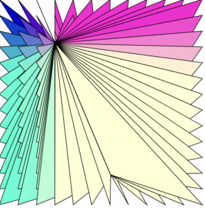
This piece consists of a grid of lines all connected to one eye. When you move your cursor around, the lines stretch to follow the eye and the eye changes shape and color. The different variations of how the eye shape can look depends on how you move your cursor on the x or y-axis, therefore the name “Eye-versity” to represent diversity in eyes. As someone who comes from a culture where I lack the big round eyes that are the beauty standard, this piece resonates a lot with me and my experience of learning how diverse eye shapes can be amongst all ethnicities and my journey with learning to feel secure about my eyes.

The Piece:

Highlight:

 for(let x=0;x<400;x+=35){
    for(let y=0;y<400;y+=35){
      fill(mouseX,mouseY,mouseX,mouseY,x,y)
      ellipse(mouseX,mouseY,mouseX/2,mouseY/4,x)
}
}

I’m proud of this code because it contains everything I wanted to come out of this project: using the looping function, making it colorful, and making it interactive. I’m also proud of it because I managed to fix an issue I had with my old code that eventually resulted in this code to fix that problem.

Reflections & Future Ideas/Improvements:

“Eye-versity” wasn’t the initial project idea that I wanted to create. The piece to the right is what I wanted to keep working on, but I couldn’t manage to get the cursor to follow the main target of the artwork, so I added a small black dot that was aligned with the cursor, and created a piece called “Pesky Fly.” I wasn’t exactly a fan of how it looked despite how cool I found the layered base to be. I tweaked the code a bit to find something that would be centered and the “fly” was still there, so I thought I could turn it into an eye for fun and then came “Eye-versity.”

For improvements, I wish I had more time to try to fix my code and create the ideal centered piece I wanted to achieve with the first idea without having to add a “fly.” I really liked how its colors looked and the way it moved, but it was really unfortunate that the cursor wasn’t centered because it bothered me a lot. In the future, I would like to work with more interactivity to make a work that’s more complex and has more movement to it. I also had an idea to create a loop of multiple paparazzi cameras flashing and clicking, so it would be nice if I could create something more aligned with my personal interests and hobbies (I like being a photographer not paparazzi.)