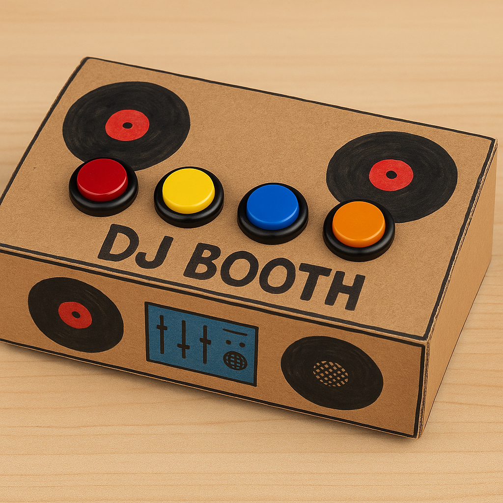
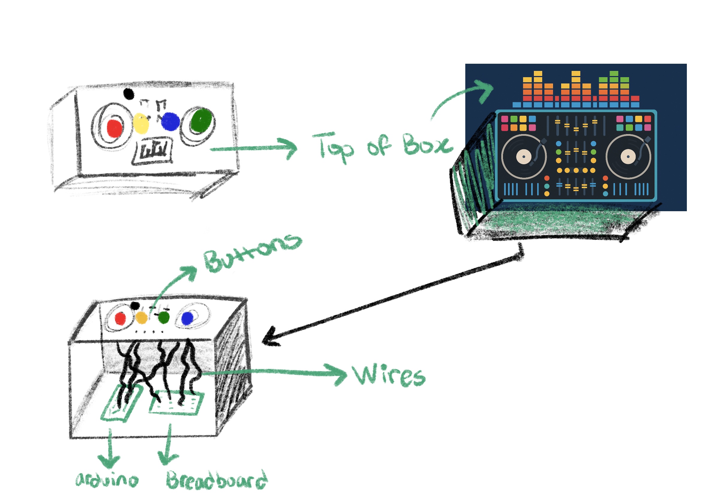
Concept and Inspiration:
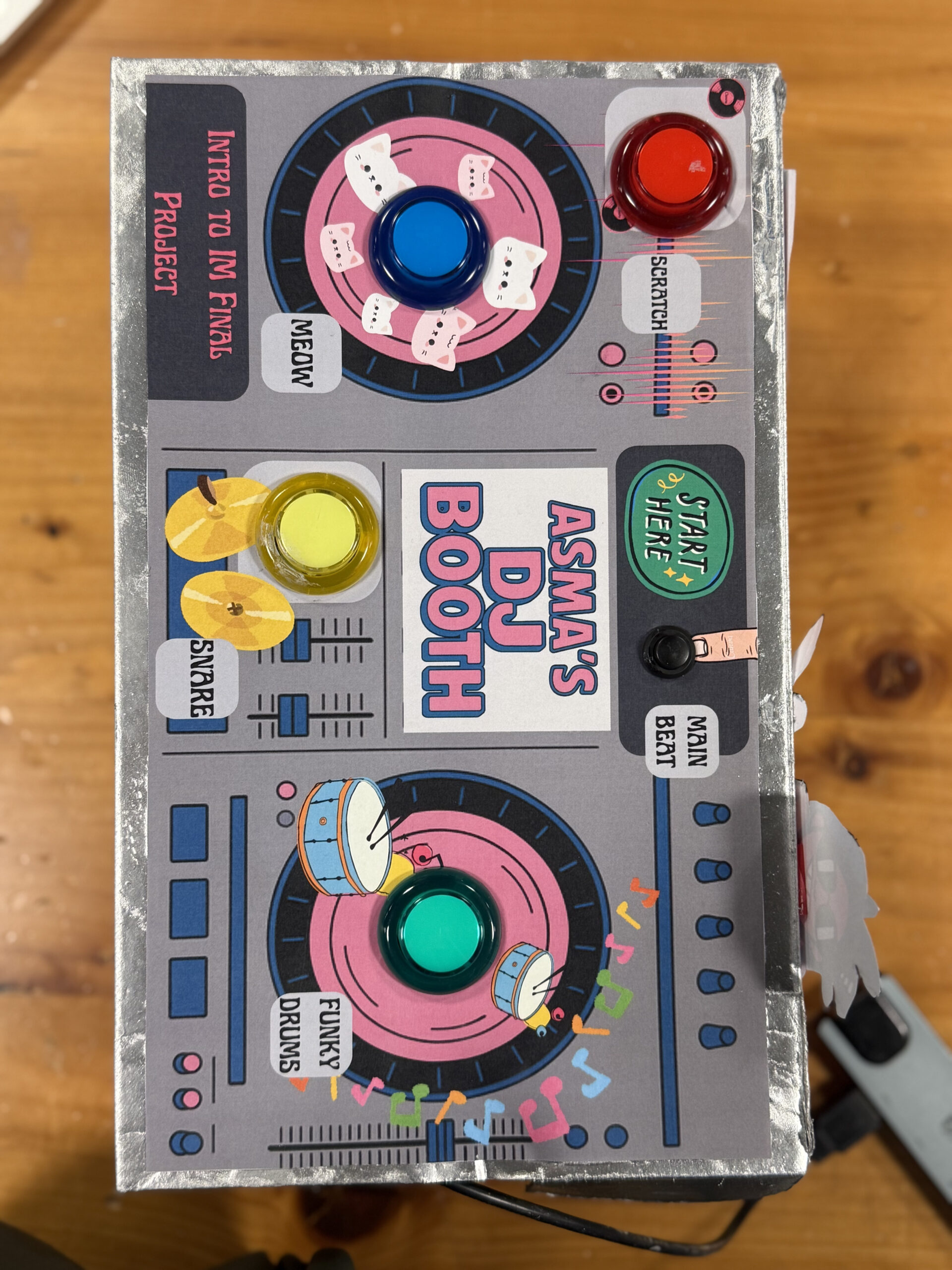
The concept for my project was to create a playful and intuitive physical DJ booth where anyone regardless of technical experience could press buttons and instantly feel like a DJ. My inspiration came from real DJ booths, toy soundboards, and the desire to blend physical interaction with coding and visuals. I wanted something energetic, colorful, and fun that made people smile the second they pressed a button. The design reflects my aesthetic as an IM student: bright colors, cute graphics, and interactive storytelling through sound and visuals.
How the Implementation Works:
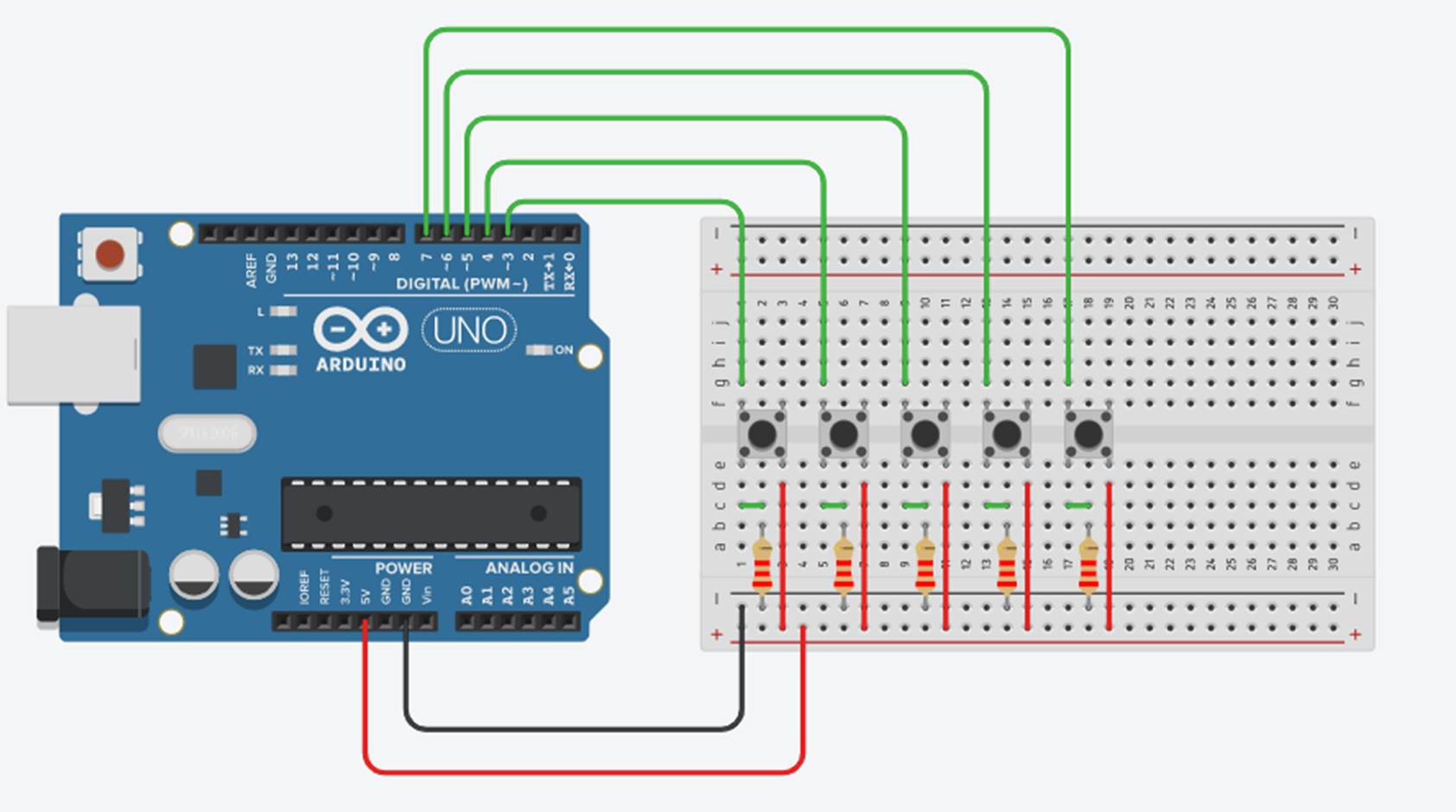
The project uses an Arduino Uno connected to five physical switches (four push buttons and one toggle switch). Each button corresponds to a unique sound effect, while the toggle controls a looping background beat. The Arduino sends signals over Web Serial to p5.js, which handles audio playback, a spinning animated record, sparks effects, and screen navigation. Pressing a button triggers communication from the Arduino to the browser, and the p5.js sketch reacts immediately with sound, visuals, and color changes.
Interaction Design:
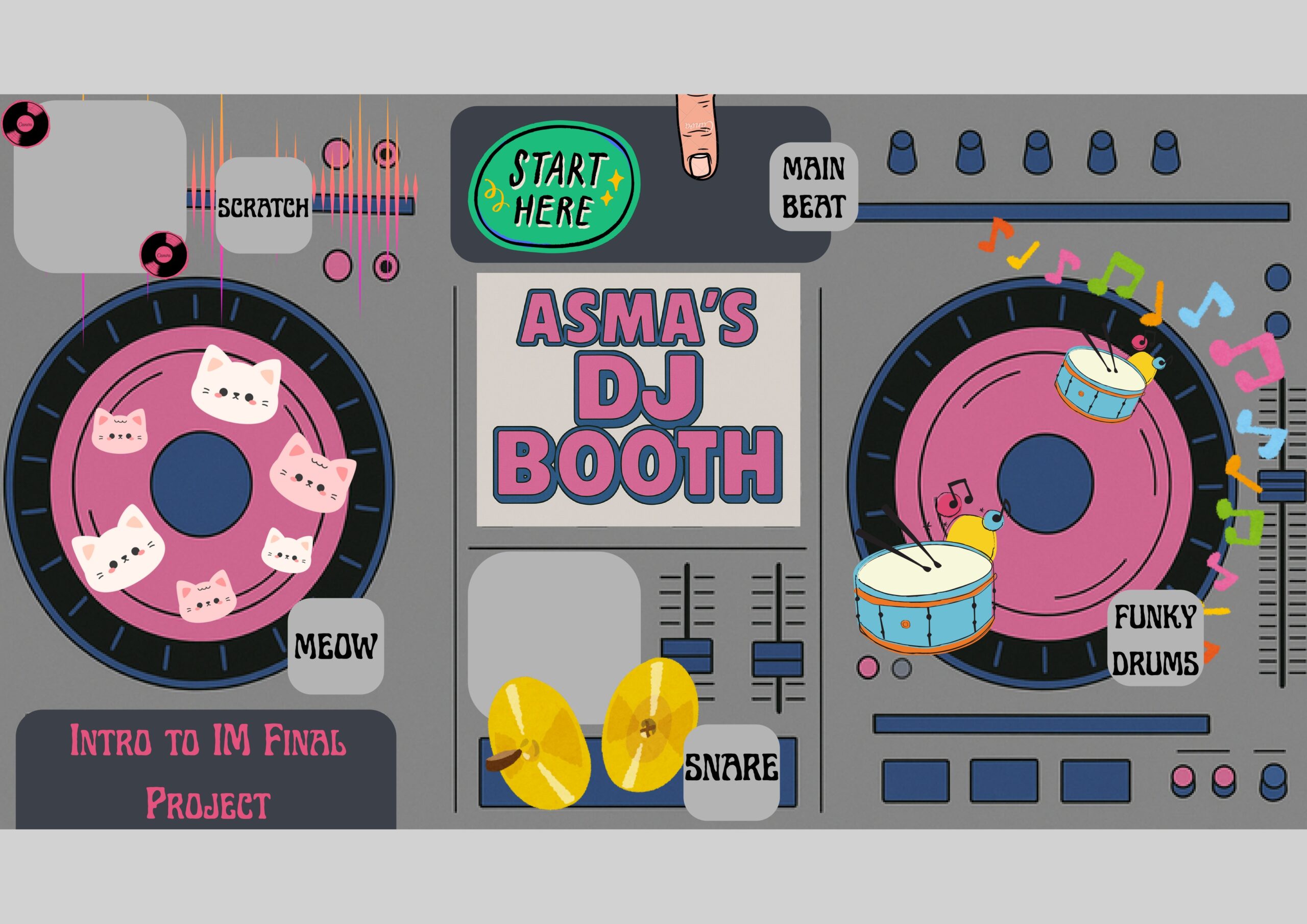
The interaction design is intentionally simple and intuitive. Users begin with a welcome screen, then view instructions, and finally arrive at the DJ booth environment. During user testing, people instantly understood what to do, if you see a button, you press it. The toggle switch clearly communicates “main beat,” while the colored push buttons invite exploration. The interface includes a spinning record that flashes in the color of the button pressed, along with spark effects that reinforce the beat visually. Everything is designed so that the user feels like they are performing music live, without needing instructions.
Description of the Arduino Code:
The Arduino code uses five digital input pins, each connected to a button or toggle switch. Inputs use “pinMode(pin, INPUT_PULLUP)” so the board can detect when each switch is grounded. When a button is pressed, the Arduino sends a single letter over Serial (e.g., `’B’` for blue, `’R’` for red). For the toggle switch that controls the looping beat, it sends `’L’` when switched on and `’l’` when switched off. This communication ensures fast response times and minimal lag. Every press is immediately transmitted to the p5.js sketch.
// DJ Booth Final Project
const int BTN_YELLOW_PIN = 2;   // meow.mp3
const int BTN_BLUE_PIN   = 3;   // funkydrums.mp3
const int BTN_RED_PIN    = 4;   // snare.mp3
const int BTN_GREEN_PIN  = 5;   // scratch.mp3
const int TOGGLE_PIN     = 6;   // loopbeat.mp3

// Track previous states
int lastYellowState = HIGH;
int lastBlueState   = HIGH;
int lastRedState    = HIGH;
int lastGreenState  = HIGH;
int lastToggleState = HIGH;

void setup() {
  Serial.begin(9600);

  pinMode(BTN_YELLOW_PIN, INPUT_PULLUP);
  pinMode(BTN_BLUE_PIN,   INPUT_PULLUP);
  pinMode(BTN_RED_PIN,    INPUT_PULLUP);
  pinMode(BTN_GREEN_PIN,  INPUT_PULLUP);
  pinMode(TOGGLE_PIN,     INPUT_PULLUP);

  Serial.println("DJ buttons ready");
}

void loop() {
  //Read all current states
  int yellowState = digitalRead(BTN_YELLOW_PIN);
  int blueState   = digitalRead(BTN_BLUE_PIN);
  int redState    = digitalRead(BTN_RED_PIN);
  int greenState  = digitalRead(BTN_GREEN_PIN);
  int toggleState = digitalRead(TOGGLE_PIN);

  // Momentary buttons:
  if (yellowState == LOW && lastYellowState == HIGH) {
    Serial.println("Y");
  }
  if (blueState == LOW && lastBlueState == HIGH) {
    Serial.println("B");
  }
  if (redState == LOW && lastRedState == HIGH) {
    Serial.println("R");
  }
  if (greenState == LOW && lastGreenState == HIGH) {
    Serial.println("G");
  }

  // Toggle switch:
  if (toggleState != lastToggleState) {
    if (toggleState == LOW) {
      Serial.println("L");   // loop ON
    } else {
      Serial.println("l");   // loop OFF
    }
  }

  // Update previous states
  lastYellowState = yellowState;
  lastBlueState   = blueState;
  lastRedState    = redState;
  lastGreenState  = greenState;
  lastToggleState = toggleState;

  delay(10);
}
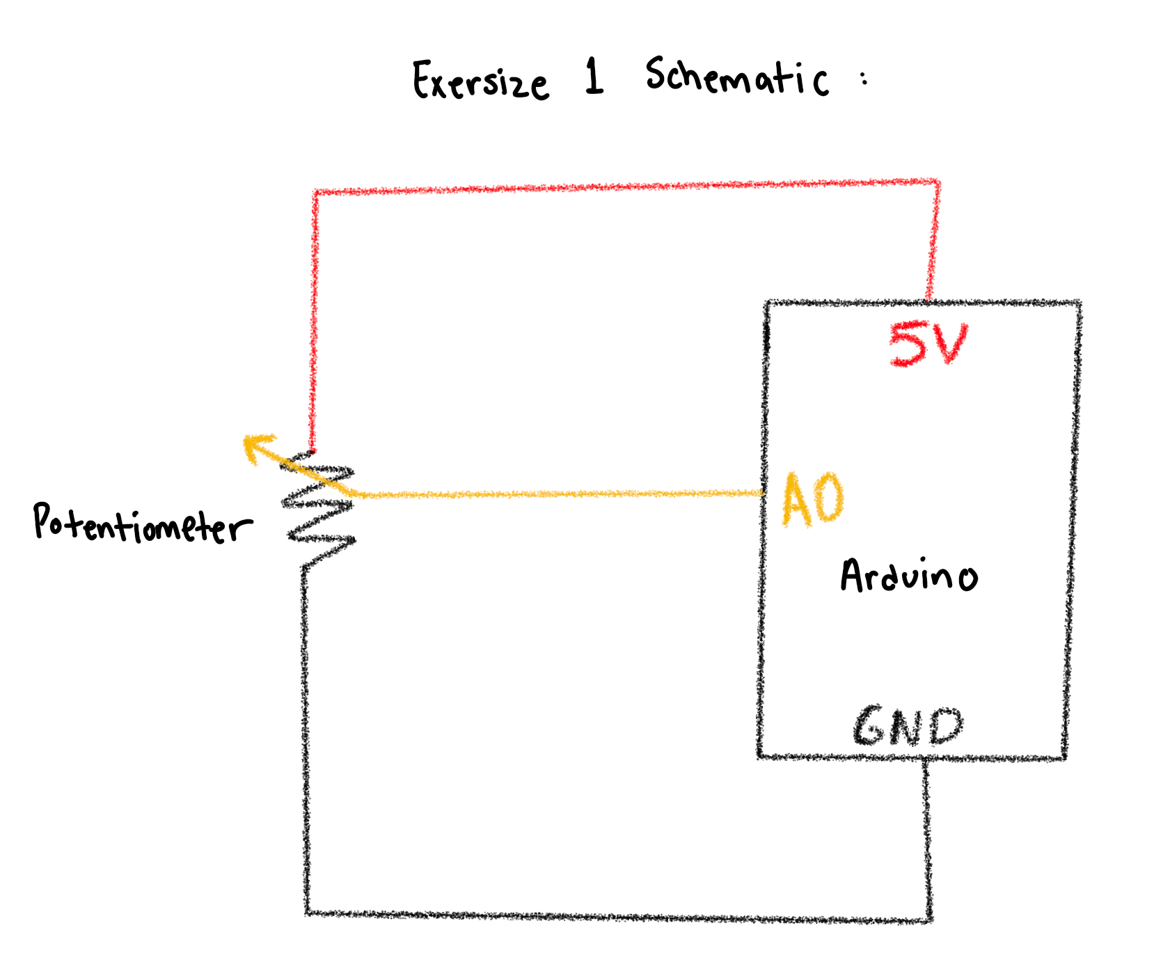
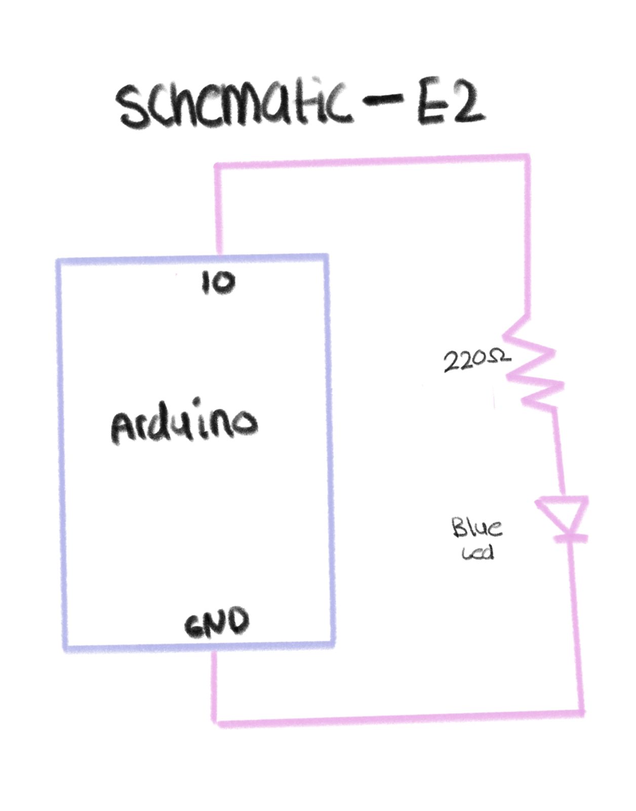
Explanation of the Schematic:
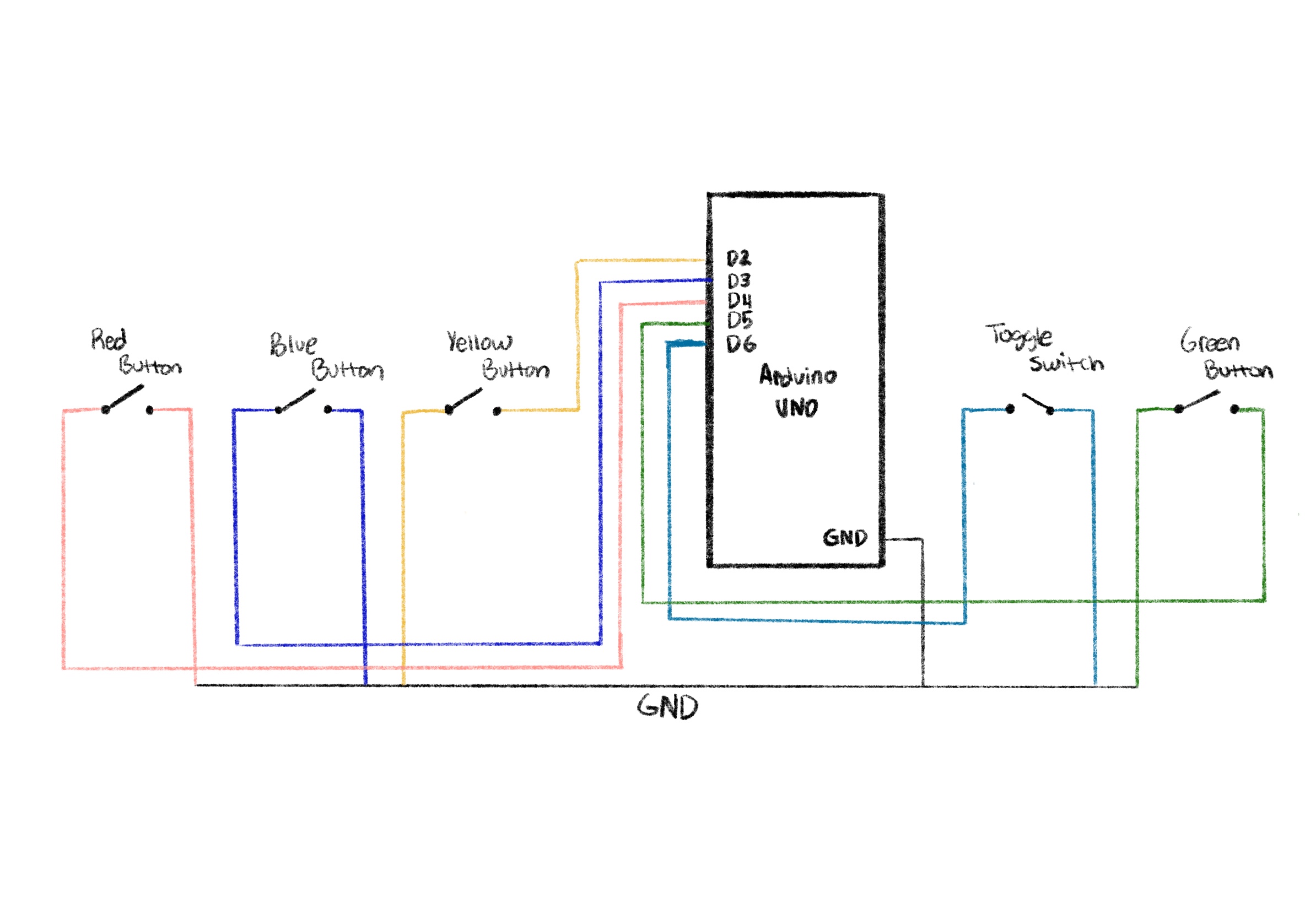
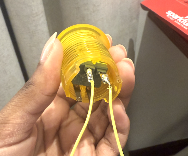
- One leg of every button goes to GND
- The other leg goes to a digital pin on the Arduino (Red→D2, Blue→D3, Yellow→D4, Green→D6, Toggle→D5).
- Because `INPUT_PULLUP` is used, each button reads HIGH when untouched and LOW when pressed.
- Thanks to input pull up I didn’t need any resistors which saved me so much time in the wiring
- All grounds share a common GND rail.
- The toggle switch behaves the same as a button but stays latched, which makes it perfect for a looping beat.
Description of the p5.js Code:
The p5.js code controls the full experience: screen navigation, graphics, audio playback, animations, and effects. It includes three screens: welcome, instructions, and play. For sound, p5.js loads separate “.mp3” files for each button. When a button is pressed, the code plays the sound and triggers a color flash and particle explosion around the spinning record. When the toggle is on, a purple base color is applied to the record and a looping track plays continuously. The code also handles resizing, UI buttons, custom fonts, background images, and smooth animation effects.
Communication Between Arduino and p5.js:
Communication is handled using the Serial Connection, which allows the browser to read Serial data from the Arduino. When the user clicks “Connect to Arduino,” the browser opens a serial port. Every button press sends a letter from the Arduino, which p5.js reads asynchronously inside “handleSerialCommand()”. Depending on the letter received, p5.js plays a sound, updates visuals, and triggers effects. This real-time communication creates a seamless physical to digital interaction.
Aspects of the Project I’m Proud Of:
I’m especially proud of how smooth and responsive the experience feels. The combination of physical buttons, instant audio playback, color flashes, and spark effects makes the project feel alive. The UI design using a custom background and logo gives everything a polished, cohesive aesthetic. I’m also proud of the user testing results, people were genuinely excited to play with it and immediately understood how it worked. I loved how tactile the buttons felt and how the overall design turned out. I’m genuinely very proud that I got the serial connection to work quite easily because that was the part I had least practice with, so it was quite intimidating at the start.
How This Was Made (Tools + Process + AI Disclosure):
This project was created using an Arduino Uno, momentary push buttons, a toggle switch, a breadboard, and the p5.js for visuals and audio. I designed the project through several stages: wiring and prototyping, interface design, audio testing, and finally the integration of everything using serial connection. instruction screen.
For the visuals, the logo and all background illustrations were generated using ChatGPT’s image generation, then edited slightly on procreate and integrated into the p5.js sketch. This allowed the look of the project to match my playful, colorful DJ booth theme.
![]()
I also used ChatGPT when I hit my major roadblock with more advanced p5.js visuals. One moment where I relied heavily on AI help was when I wanted the spinning record to generate spark effects every time a button was pressed. I couldn’t find any tutorials or examples online that matched what I wanted. The spark idea was really important for the UI experience because it gives the user instant visual feedback that their button press produced a beat.
ChatGPT helped me write and understand the logic. These are the exact lines of code that were produced with AI assistance and I tweaked it a bit after:
function spawnSparks(col) {
  for (let i = 0; i < 25; i++) {
    let angle = random(TWO_PI);
    let speed = random(2, 6);
    sparks.push({
      x: 0,
      y: 0,
      vx: cos(angle) * speed,
      vy: sin(angle) * speed,
      age: 0,
      life: random(20, 40),
      col: col
    });
  }
}

function updateAndDrawSparks() {
  for (let i = sparks.length - 1; i >= 0; i--) {
    let s = sparks[i];
    s.age++;
    s.x += s.vx;
    s.y += s.vy;
    s.vx *= 0.95;
    s.vy *= 0.95;

    let alpha = map(s.age, 0, s.life, 255, 0);

    if (s.age > s.life || alpha <= 0) {
      sparks.splice(i, 1);
      continue;
    }

    noStroke();
    fill(red(s.col), green(s.col), blue(s.col), alpha);
    ellipse(s.x, s.y, 8, 8);
  }
}
These functions generate a small explosion of colored sparks around the record every time the user presses a button. Without ChatGPT, I wouldn’t have figured it out, and I might not have included it at all; but it became a core part of the experience. All of the actual board design, sound integration, wiring, physical construction, and final design choices were done by me, but AI supported me when I was genuinely stuck and unable to find online resources.
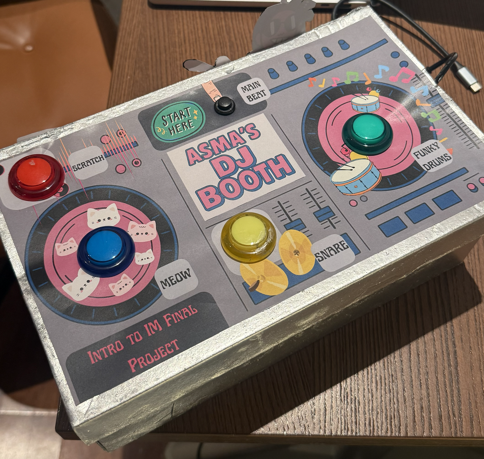
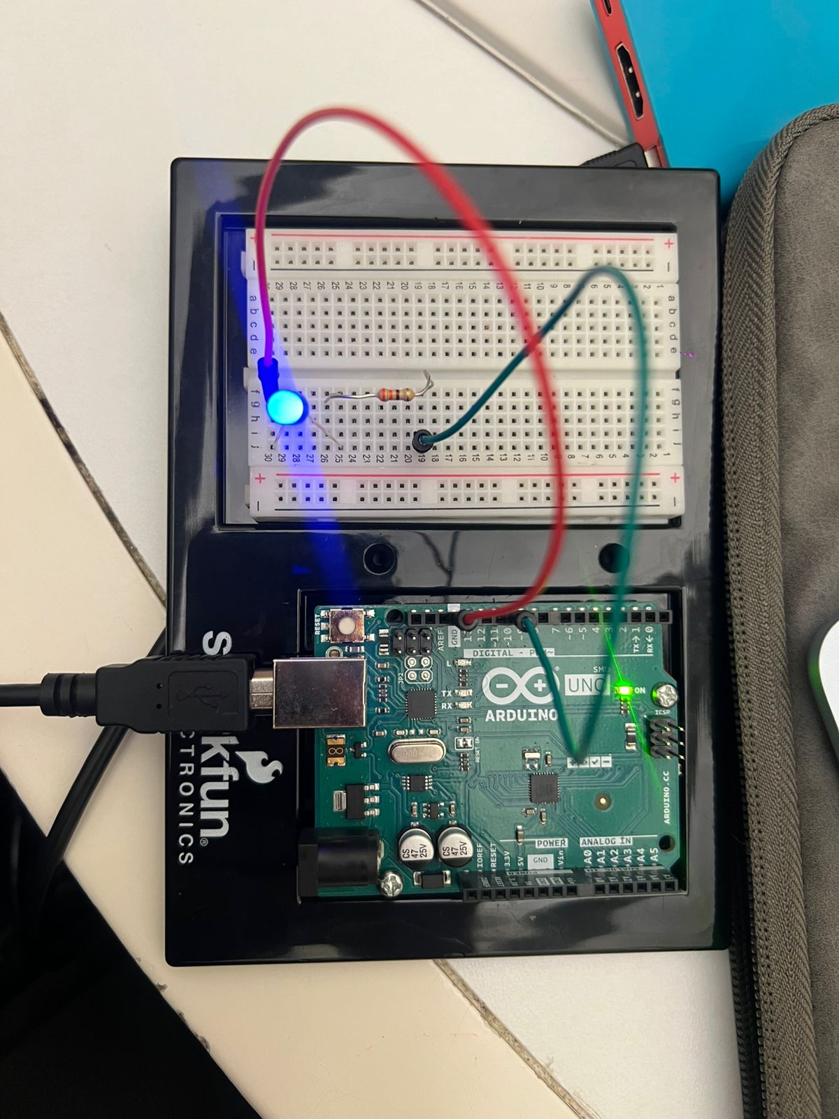
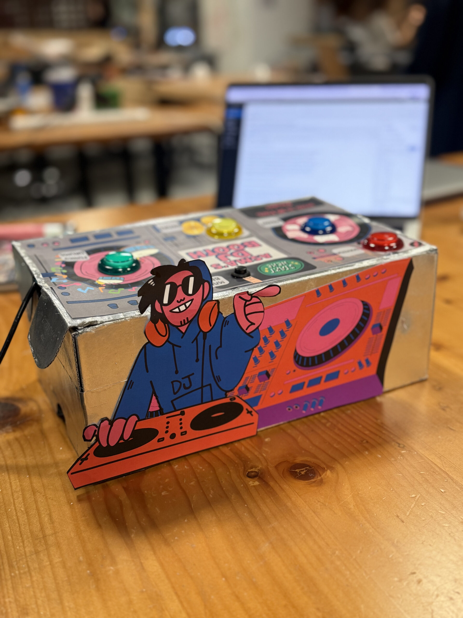
The physical box for my DJ Booth actually started as an old shoebox that I spray-painted and transformed into the final enclosure. I measured each button carefully and cut out holes so they would fit snugly without wobbling, which made the whole build feel more secure and polished. It was also my first time soldering, which was definitely intimidating at first, holding the iron, melting the solder, and checking if it actually was functional with the multimeter was a learning curve. But once I printed and attached the buttons to the board design on top, everything finally looked cohesive and intentional.
Before building it physically, I sketched the layout on Procreate so I could plan the shape and spacing of the buttons. That helped me visualize how the final booth should feel. For the code, I worked on it in clear chunks because I wanted the experience to stay minimal (just three pages) but still feel smooth, refined, and complete. This structured approach made the project feel much more manageable and allowed the hardware and UI to come together cleanly. I wrote the code in clear, manageable chunks so I wouldn’t get overwhelmed by trying to build everything at once. I started with the basics, getting the Arduino buttons to send the correct serial messages, then moved on to the p5.js screens, audio, and visuals. After that, I added more advanced elements like the sparks, color changes, and the spinning record. Breaking it up this way helped me stay organized and made the entire project feel polished and intentional.
Credits/Inspiration:
- The logo and backgrounds were generated on chat GPT
- The board design was made on canva
- Sound: free sound effects libraries specifically www.freesound.org
- Inspiration: I was inspired by the Pioneer DJ All-In-One systems (https://www.pioneerdj.com/en/product/all-in-one-system/), especially their intuitive layouts and the way each button or dial has a clear purpose. I loved how professional DJ booths combine simplicity with powerful control, and I wanted to translate that concept into a playful, beginner-friendly version using Arduino and p5.js. My project recreates the feeling of pressing real DJ buttons and triggering beats, but in a simplified, interactive form that anyone can instantly understand.
- Also I was inspired by arcade-style soundboards specifically from https://www.myinstants.com/en/search/?name=arcade. This website really captures the essence of what I wanted my DJ booth to sound and feel like.
- Special thanks to Prof. Mang for always answering my questions in class 🙂
Challenges & How I Overcame Them:
Debugging this project took much longer than I expected. At one point, nothing was working, the serial messages weren’t reading correctly, the sounds weren’t triggering, and the interface wasn’t behaving the way it should. I kept trying to fix everything at once, which only made the process more overwhelming. Eventually, I realized the best thing I could do was take a break and step away from the code. When I came back with a fresh pair of eyes, it was so much easier to spot the mistakes I had been missing. Small things like typos, out-of-place brackets, or mismatched variable names were suddenly obvious. That moment taught me how important rest is when troubleshooting; sometimes clarity only comes after giving yourself space to breathe.
Future Improvements:
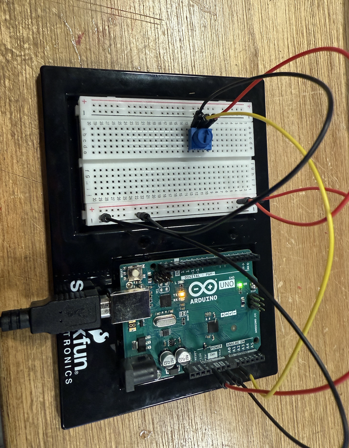
In the future, I would love to add a recording feature that captures the user’s live performance and lets them play it back. I could also add a volume knob using a potentiometer, though during prototyping I realized it cluttered the interface and confused users. Additional ideas include adding more sound banks, using RGB LEDs for visual feedback, and building a more polished physical enclosure to resemble a small DJ mixer.
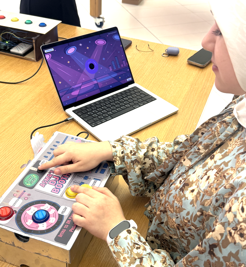
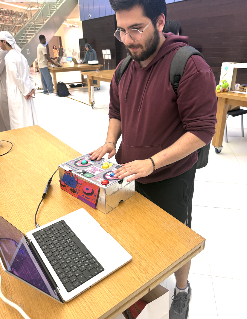
IM Showcase Highlights:
My Interactive Media showcase went really well, people were genuinely excited about my DJ booth, and it felt like everyone wanted a turn to play. What made me happiest was seeing how quickly they understood the user interface without me needing to explain much; the controls felt intuitive, so they could jump straight into the experience and focus on having fun. Watching friends and classmates interact with something I built from scratch was honestly so rewarding, and it made all the time spent designing, testing, and refining the project feel completely worth it. Overall, the showcase experience was both exciting and validating, and it left me feeling proud of how the booth brought people together in such an engaging way.