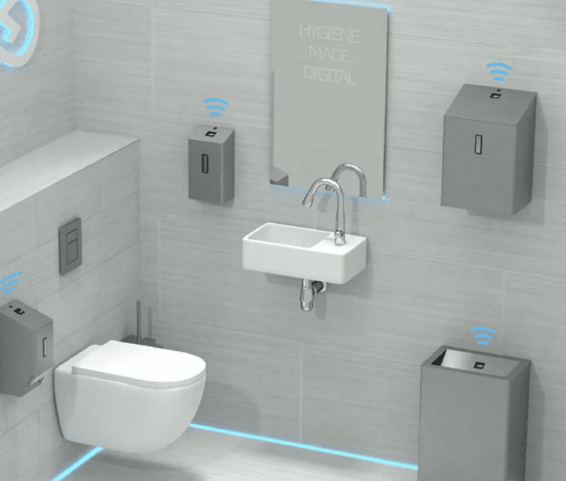
As an international student at NYUAD who often travels, I’ve found sensor-activated washroom taps frustrating and time-consuming, whether in airports or public restrooms in different countries. There are different types of sensors in different locations, many of which behave unpredictably, and sometimes they simply don’t work at all. Even the taps in NYUAD occasionally fail. When I first arrived, I remember waving my hands around trying to figure out where to start the water, unsure if the faucet was broken or if I was using it wrong. From Don Norman’s perspective, this is a textbook example of weak signifiers (no clear visual cue where to place hands), poor feedback (no light or sound to confirm detection), and a missing conceptual model (no simple mental picture of how the sensor works). A better design could include a soft light to indicate the active zone and an immediate, gentle chime when the sensor registers movement. Thinking beyond faucets, In Interactive Media, I want every sketch and installation I build to “explain itself,” so that users can start playing without extra instructions. Don Norman’s principles give me a practical checklist: I can design strong affordances by making buttons and draggable objects look touchable or moveable; create clear signifiers through animated highlights, glowing borders, or subtle sounds; keep mappings natural so a slider that moves right always increases a value; and provide immediate feedback with color changes, vibration, or playful sound effects. Most importantly, I can help visitors form the right conceptual model by giving them a short, visual introduction or letting the interface demonstrate its own rules when the design is complex.