
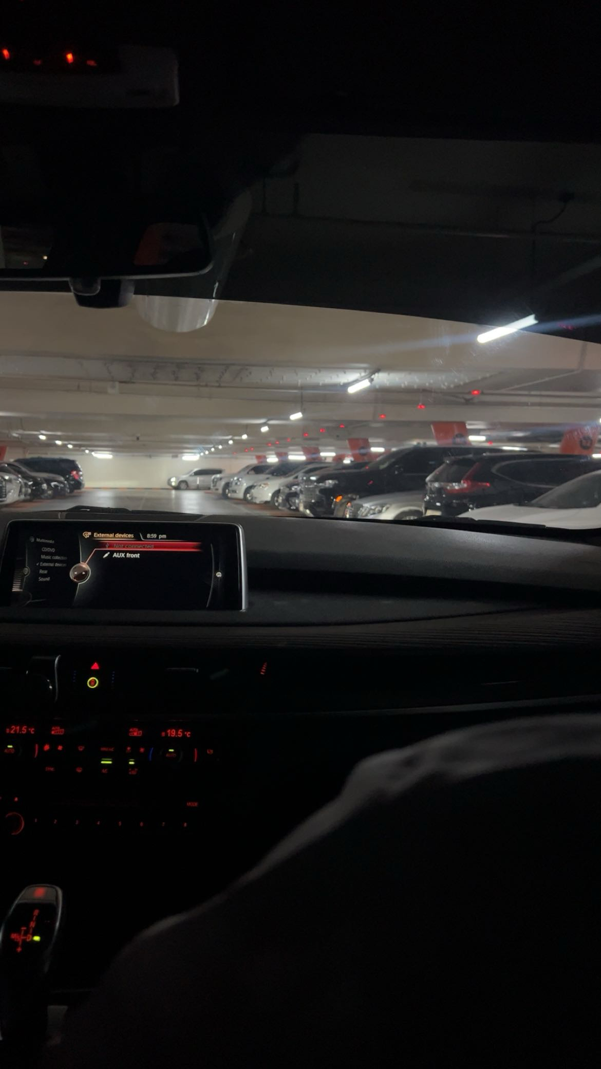
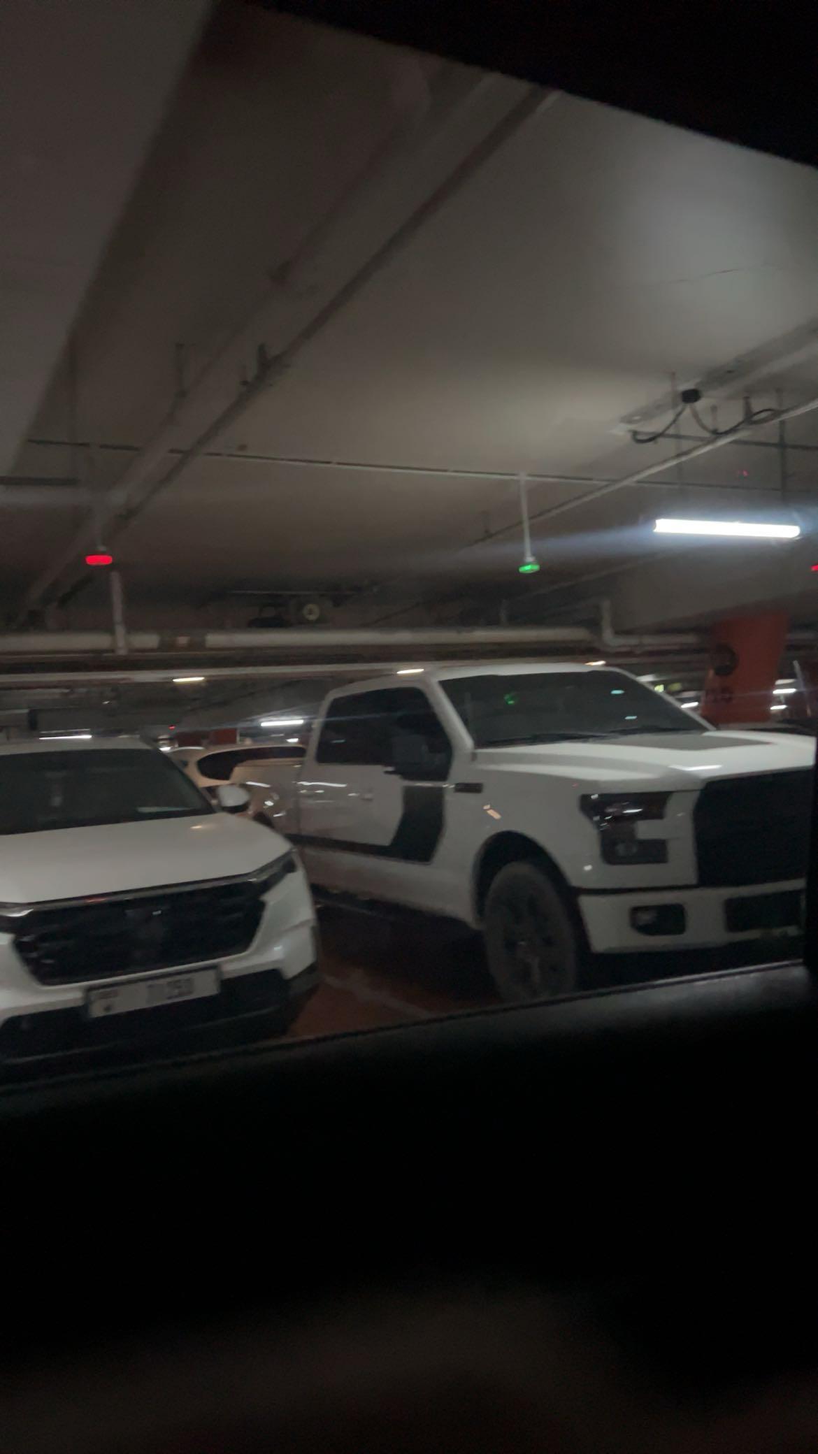
One thing that drives me crazy is when I’m looking for a parking spot in a busy garage that uses red and green lights to show if a spot is taken or free. Yesterday, I was rushing to make it to an appointment. I saw a spot far away, but then I noticed a green light closer to the mall entrance, which was supposed to mean the space was free. I drove toward it, only to find a car already parked there. By the time I went back to the original spot, it was taken. It was so frustrating and a complete waste of time.
From Norman’s perspective, this is a design problem caused by poor visibility and misleading signals. The green light gave me a false cue, similar to the confusing doors and devices he describes. A better design would use more accurate sensors that reliably detect when a car is present. It could even provide feedback, like showing when the spot was last updated, so drivers can trust what they see. This would prevent wasted time and make the whole parking experience smoother and less stressful.
When working on interactive media, especially projects that are heavy on user engagement, I would apply Norman’s principles by making the instructions very clear and giving clear, immediate feedback to every action. Norman emphasizes visibility and feedback, which are key for helping users understand what to do and what is happening as they interact with the program.
I think even in my p5.js projects, I can start practicing this. For example, if a user types an invalid input, instead of the program crashing, I could display a clear message telling them what went wrong and how to fix it. This way, the user isn’t left confused or frustrated. A good approach is to design as if the person using the program is a child, everything should be simple, obvious, and easy to understand without needing extra instructions. This makes the experience smoother, more engaging, and aligned with Norman’s idea of good, user-centered design.