
For this piece, I wanted the text to be the artwork. I was drawn to generative typography and to the way Arabic calligraphy sometimes forms circles and wreaths. That felt right for motivation: words orbiting you like support. Using p5.js, I kept the idea simple: move, rotate, repeat and let those small rules create rhythm.
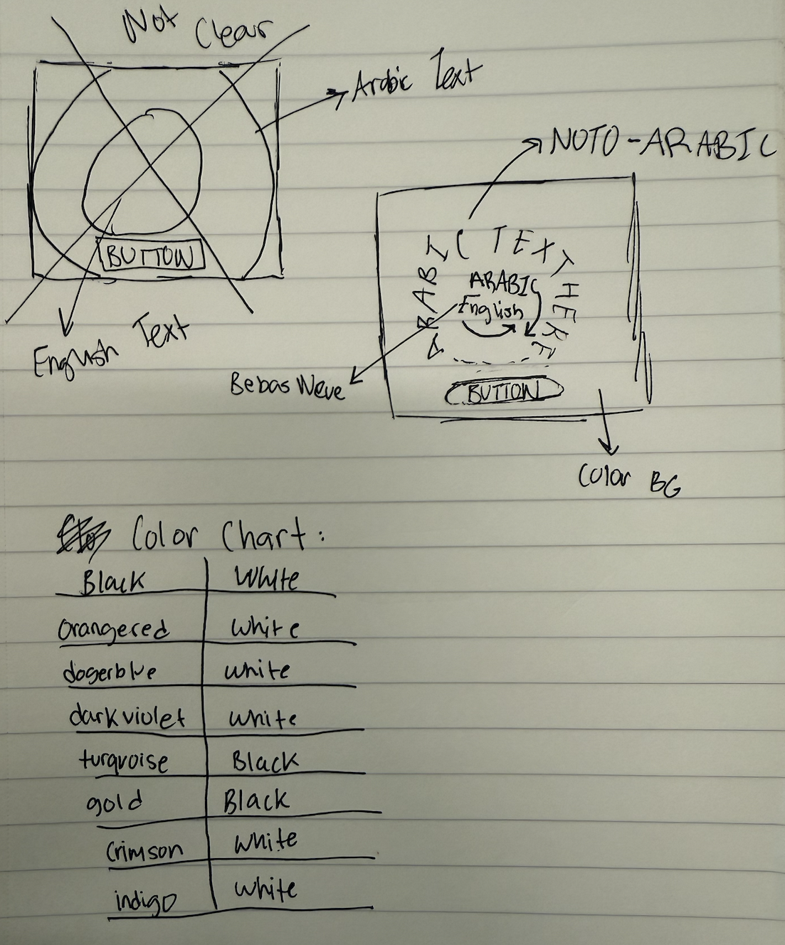
Before I touched the code, I mapped the whole idea on paper. I drew quick thumbnails of a circle in the center, tested where the English and Arabic lines should sit (which one tilts left/right), and marked the button at the bottom so the composition felt grounded. I sketched a few ring sizes to see how the wreath should feel, then noted font options next to each sketch (tall/condensed for English, warm/legible for Arabic). I even made a mini color chart with high-contrast pairs to keep legibility strong. That paper plan made the coding step feel like tracing: I wasn’t guessing; I was just implementing a layout I’d already tested by hand.
The code is organized so the flow is clear. In `setup()` I make the canvas, center the text, and place a button at the bottom. In `draw()` I set the background color, then call one function to draw the ring and another to draw the button. The ring function repeats the Emirati Arabic line around a circle so it looks more like art created through text. Inside the ring, I tilt the English line one way and a slightly larger Arabic line the other way. When I click the button, the quote, colors change, so every press feels like a fresh poster.
Conceptually, I’m showing the message in two voices. English gives punch and clarity; Emirati Arabic gives warmth and a playful touch with design. The outer Arabic circle feels like community, something steady around me while the inner cross of lines pulls my eye back to the center. Bright, high-contrast colors keep it readable and energetic.
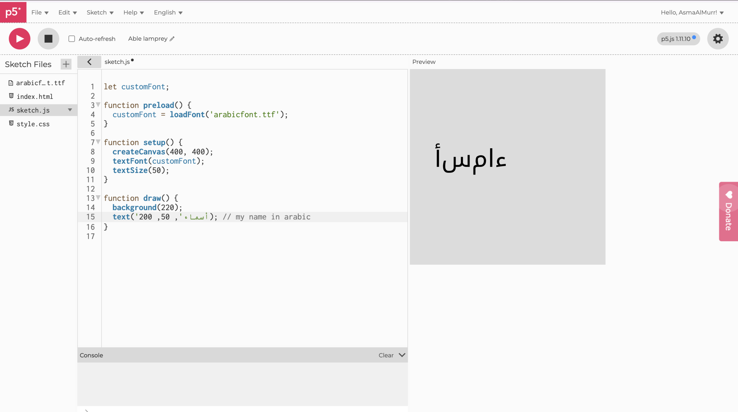
I did hit a bump halfway through when I started messing with Arabic fonts. The letters were not connecting and looked wonky, basically it was unreadable. This set me back a good two hours since I started on a new P5js file as Prof Mang suggested, with just the most simple form of the code before I realized the issue wasn’t my code; it was the font itself. Some fonts don’t include proper Arabic shaping, and p5 will fall back to whatever it can. Then I switched to a full Arabic font (like “Noto Kufi Arabic”) and Instead of downloading the font I embedded it into the HTML which fixed my problem. This was a good learning lesson as it gave me more confidence in my coding abilities. I was so sure that I had probably messed up the code, I didn’t even give myself a chance to consider that the font was the issue.
Here is an image of the issue I was facing:
I’m most proud of the code that draws the Arabic ring. It took me a while to understand not just how to do it, but how I wanted it to feel. I kept imagining the words circling like quiet encouragement, not static but not too free flowing, it was really about finding that in between. Getting there meant a lot of trial and error: turning things a bit, nudging them outward, letting each repetition change in a small way so it didn’t look stiff. When it finally worked, the text stopped feeling like code on a screen and started feeling alive. That moment when something frustrating becomes simple and meaningful is why this section is my favorite.
 // outer ring (Arabic repeated around a circle)
  textFont(AR_FONT);
  let r = min(width, height) * 0.38; // radius
  let copies = 24; // how many stamps
  let spin = frameCount * 0.005; // slow rotation

  for (let i = 0; i < copies; i++) {
    let angle = spin + (TWO_PI * i) / copies; // angle around circle
    let wobble = sin(frameCount * 0.02 + i) * 4; // tiny breathing
    let size; // Cycle the text size
if (i % 3 === 0) size = 16;
else if (i % 3 === 1) size = 18;
else size = 20;
    push();
    rotate(angle);
    translate(0, -r + wobble);
    textSize(size);
    text(quotes[qIdx].ar, 0, 0);
    pop();
  }
Going forward, I want to push the typography and build patterns from text itself experimenting with new pairings (e.g., Amiri or Markazi), and exploring grids, spirals, lattices, and simple art made only from words. I’ll play with rotation and translations to see how meaning shifts as the pattern changes. If I had more time to work on this I would focus more on the interactivity part and less on the generative art part. Although this made a cool visualization, maybe I could explore with the users typing a feeling which would then be met with a motivational quote to match/ respond to that feeling. Overall, this was a great learning experience and made me more confident in using text for generative art.