W8: Emotion and Design writing response

I strongly agree with Norman’s idea that beautiful things often appear more usable than others. His argument immediately reminded me of a simple economic distinction: need vs want. The “need” reflects a product’s functionality, while the “want” represents the emotional desire or aesthetic appeal that creates the illusion of greater usability.

A recent experience illustrates this perfectly. My phone’s screen-guard and cover had broken, making it look worn out and, to me, almost unusable. I even considered buying a new phone, not because it stopped working, but because it looked unattractive. However, as soon as I replaced the cover, the phone suddenly felt smooth, neat, and functional again. Nothing changed technically, yet my perception of usability improved. This small incident made Norman’s point about emotional design feel remarkably real. It stresses on how our positive affect can shape our judgment of an object’s performance.

This also made me wonder: why do we, as humans, lean so strongly toward attractiveness over function? Is it instinctive, a natural response to seek pleasure in what pleases the eye? Consider the popular Longchamp tote bag that have taken over university campuses. They are stylish and easily recognisable, yet lack practical compartments, making it difficult to organise essentials like a laptop or documents. Despite this, they remain a trend. Perhaps this reflects what Norman calls the emotional pull of design. We forgive functional flaws when an object evokes a certain feeling or identity.

Yet, aesthetics are subjective; what one finds beautiful, another may not. This raises an important question for designers: how should one balance usability with aesthetics when beauty itself cannot be universally defined? Norman suggests that effective design lies in harmonising both, where aesthetic pleasure enhances, but does not replace, functionality. Maybe it is acceptable, to some degree, for design to create an illusion of usability through beauty, as long as that illusion inspires engagement rather than deception.

In the end, I believe the power of design lies in its ability to connect both heart and mind to make people feel good while helping them do well. Beauty without function is momentary, but function without beauty rarely delights. The challenge, as Norman describes, is to design for both.

Week 8 – Reading Reflection

For Norman’s piece, I was very surprised to find it very relatable as I initially didn’t quite understand where he was going with his vast knowledge of teapots, but I later realized that he was talking about a feeling I actually had trouble verbalizing a few months ago. I had a conversation with some friends where I wanted to describe how much the visual design of a certain aspect of something I was trying to learn significantly affected how passionate I felt toward learning that ‘something.” While my friends wrote me off as just a little picky with my peripherals, Norman’s point on “aesthetic pleasure” improving perceived usability of something really made me feel validated. For example, just having a pretty bass guitar will make me feel more likely to pick it up to practice it seriously rather than just have it lying around.

The general idea of emotional design was very interesting, and it reminded me of the sound design of my midterm project. The sound design alone was motivating me through countless playtests against myself. It was because I designed the SFX to hit a certain metaphorical chord in my brain that I felt more passionate about the final result. It made me even happier to hear positive feedback on the SFX design from my fellow peers as it was honestly just designed in a way that was personally satisfying to me; other people enjoying it was definitely an unseen externality.

I had previously read about Margaret Hamilton’s story back in 2019 when we had the first visualization of an event horizon/black hole back. One of the parts that resonated with me most was that Hamilton ran to her computer after a late-night party to fix some faulty code she thought about at the party. I think this shows just how much pride Hamilton had in her role on the Apollo missions, and just how brilliant she was. Her quote, “I was always imagining headlines in the newspapers, and they would point back to how it happened, and it would point back to me” shows me a lot of her prideful but grounded nature that I found very inspiring.


Week 8 – Unusual Switch Assignment

Concept & Inspiration

This project began with a video example shown in class where a mustache prop was used as a switch. I was fascinated by the idea that something worn on the face could become part of an electronic interaction. It reminded me that the body itself can be the input device and that playful design can still be technically meaningful. That influenced my first idea. I wanted to place aluminum foil pads above my eyebrows so that every time I scrunched them together, the circuit would close and the LED would react. It felt like a fun and expressive interaction because eyebrows are a natural part of communication.

As I started building, I realized a limitation. The wires available were not long enough to comfortably reach my face while plugged into the Arduino. The setup became impractical and would not stay connected. Instead of forcing the idea, I adapted it while keeping the core concept: using a body gesture that does not involve hands. I moved the conductive pads from my face to my elbows, which allowed me to keep the same interaction logic without fighting the hardware constraints.

The result is a simple but playful design. When the user touches their elbows together, their body closes the circuit which becomes a digital input to the Arduino that changes the LEDs. This transforms a physical gesture into a clear visual response and reinforces the connection between the human body and digital behavior.

How It Works

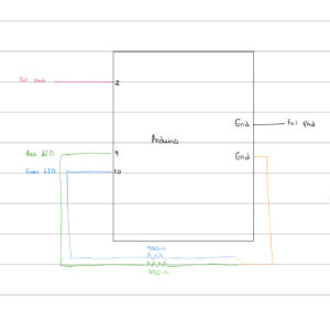
Two small pieces of aluminum foil are taped to the elbows. Each foil pad is connected to the Arduino: Left elbow foil → Digital Pin 2 (input) Right elbow foil → GND When the elbows are apart, the circuit is open, and the Arduino reads a HIGH signal using an internal pull-up resistor. The red LED turns on to indicate no contact. When the elbows touch each other, the conductive path through the body closes the circuit, pulling the input LOW. The green LED turns on, signaling that contact is detected. This simple interaction demonstrates digital input detection, human conductivity, and conditional output control.

Circuit Diagram:

I included a labeled schematic showing the Arduino Uno, foil pads, and LED wiring. Red LED connects to Pin 9 through a 330 resistor, Green LED to Pin 10 through a 330 Ω resistor, and all components share the same GND reference.

Arduino Code:

const int SWITCH_PIN = 2;
const int RED_LED = 9;
const int GREEN_LED = 10;

void setup() {
  pinMode(SWITCH_PIN, INPUT_PULLUP);
  pinMode(RED_LED, OUTPUT);
  pinMode(GREEN_LED, OUTPUT);
}

void loop() {
  int state = digitalRead(SWITCH_PIN);

  if (state == LOW) {
    digitalWrite(GREEN_LED, HIGH);
    digitalWrite(RED_LED, LOW);
  } else {
    digitalWrite(GREEN_LED, LOW);
    digitalWrite(RED_LED, HIGH);
  }
}

The INPUT_PULLUP keeps the signal stable when the body is not closing the circuit.

Heres the video demonstration (I used my little sister as demonstration):

C18BC5EF-F946-4D9D-9A64-42D32D1BC5B3

Challenges:

Ensuring the elbow foil stayed in place during arm movement was a big challenge since the jumper wires are pretty short.

This challenge was resolved by connecting one of the wires to from the Arduino to the breadboard and then connecting another on the same row to give me more extension to work with.

Future Improvements:

More inputs, using additional body contact points.

I could potentially add other outputs, such as sound.

I could learn a way to extend the wires so I have access to make funner projects with no limitations.

Week 8 – Reading Response

Both readings stretched the way I think about design and technology, but in very different directions. Don Norman explains that feelings are part of the user interface, while the story of Margaret Hamilton reminded me that logic and planning literally kept humans alive in space. It is interesting how design can go from a teapot being annoying to astronauts potentially facing real danger if the code is not perfect.

Norman’s point about positive emotions making us better problem solvers stuck with me. Not because I needed permission to love pretty things, but because he explains how emotions influence cognition. When something looks good, I want to engage with it. If it glitches, I will try again instead of giving up quickly. The product earns patience through beauty. He is not saying aesthetics replace usability, but that they work together. That made me rethink how I approach projects. Usability alone might function, but it does not always invite people in.

The Hamilton reading adds another dimension. She was not just writing code. She was establishing the rules of software engineering before the world understood why those rules mattered. Her commitment to planning for human error was not pessimism. It was care. She assumed that even the smartest astronauts could press the wrong button. She designed safety into the system instead of expecting humans to be perfect. That mindset feels extremely modern even though she was working with punch cards and very early computing tools.

Putting the two readings together, one message becomes clear. Design is not only about the object. It is about the human who interacts with it. Norman shows how emotion can make users more capable, and Hamilton shows how systems can support users even when they are not at their best. One focuses on delight. The other focuses on safety. Both center real people who get confused, who make mistakes, and who feel things.

As someone just starting to create interactive work, this combination feels like a guide. If I want to build something that people actually use, not just something that technically functions, I need to care about how it feels and what happens when something goes wrong. Norman gives me permission to design joy. Hamilton reminds me to design empathy. The strongest designs are created when both are valued equally.

Reading Reflection Week 8

What stood out to me in both readings was how they started off with what seemed like simple, everyday stories, but ended up conveying something much deeper. It reminded me of those stories given in TedTalks or podcasts that sound ordinary at first, until the speaker reveals the real lesson behind it.

For example, “Her Code Got Humans on the Moon” wasn’t just about the perseverance of Margaret Hamilton, but about the process that led her to help with the success of the Apollo’s mission; how she build a code to anticipate human error to prevent what could have been a major accident. That shifted how I think about programming, it’s not just about building that works, but planning for when things go south.

In Norman’s “Emotion & Design: Attractive Things Work better”, the example of the mugs seemed simple too, but it lead a much more important point too: just how function and aesthetics aren’t separate, Affect and cognition work together rather than against each other when it comes to processing information in a system, despite their difference functions and parameters. 

Overall, both texts made me more aware that behind things we experience everyday, whether it is when we are programming or designing something to enhance its function or reduce “irrelevancies”, there are consequential decisions, intentions, and values that beyond the surface of what we see.


Reading Reflection – Week 8

Her Code Got Humans on the Moon – And Invented Software Itself

I’ve known about Margaret Hamilton for quite some time. Her name was the one I would give out when people asked me who my favourite woman in STEM was, and the picture in the reading is the same one that went viral on social media a while ago. Nevertheless, I was mostly familiar with her accomplishments, and I was quite shocked to find out that she had a daughter at this time, over whom she would be criticized. It only makes me think even higher of her.

I really liked it when Hamilton said, “I was always imagining headlines in the newspapers, and they would point back to how it happened, and it would point back to me.” This shows that Hamilton was very well aware that the stakes of her work went far beyond code or computation. Also, I think her ability to think of potential failures before they happen is what made her so exceptional, and this is a skill that all programmers should try to build. Therefore, a certain attentiveness to detail and analysis of possible outcomes can help build stronger and more reliable programs.

My favorite quote of hers is, “When I first got into it, nobody knew what it was that we were doing. It was like the Wild West.”

Emotion & Design: Attractive things work better

This reading made me realize that emotion plays such a big role in the things we use. An example is Norman owning three teapots, which I found quite funny. He doesn’t really need 3 teapots, but it’s about the feeling that each one brings, and the fact that each teapot brings its own experience.

This idea also connects to what I’ve been learning in my Have a Seat class, where we design and build chairs. I’ve realized that a chair is never just a chair, it holds an emotional presence in a space. The curve of the backrest, the texture of the wood, even the way light hits it can make someone feel calm, inspired, or comforted. Just like in Norman’s article, emotion becomes part of usability. When people feel good around a design, they tend to engage with it more positively, and that’s when it truly “works better.”

I used to think that attractive designs were somehow less practical. Growing up, I often heard that bright or playful designs were less “serious.” But this article completely challenges that idea. Beauty can enhance function rather than distract from it. So I guess my main takeaway from this reading is that human beings are drawn to designs that are not just usable, but that bring pleasure, comfort, and meaning. 

Reading Reflection – Week 8

“Emotion and Design”
Don Norman says that attractive things work better. When something looks good, it makes us feel happy. This good feeling helps us be more creative and more patient if we have a small problem using the product. A happy user is a better problem solver.

I agree with this. A nice looking design, like a pretty website or a well made phone, is more enjoyable to use. It makes you want to keep using it. Good design is not just about being pretty. It is about making things work better by making the user feel good.

“Her Code Got Humans on the Moon”
Margaret Hamilton was a computer scientist who led the team that created the software for the Apollo moon missions. She did this at a time when there were very few women in her field. Her work was vital to landing astronauts on the moon and bringing them home safely.

I am impressed by how Hamilton planned for mistakes. She wanted to add code to prevent errors that everyone else thought would never happen. She was right. An astronaut later made one of those exact mistakes. Her story shows why it is so important to think about what could go wrong, especially on a big and important project. Good planning can prevent big problems.

Overall
Both readings show that the best designs think about people. Norman teaches us that a product that makes users feel good will work better. Hamilton teaches us that a system designed for human error is stronger and safer. Whether it is a teapot or a spaceship, thinking about the person using it is the key to good design.

W8: Creative Switch

Inspiration

 I drew inspiration from interactive toys and physics-based games where an object’s motion triggers an outcome. I wanted to create a setup where the physical action of dropping an object could directly influence the visual cues.

Concept

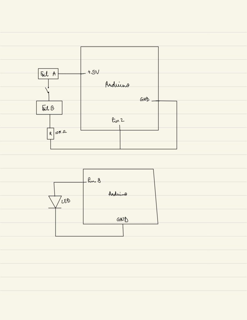
The idea is simple yet engaging: dropping a conductive ball into a cup lights up an LED. The cup contains two strips of conductive material that act as a switch. When the ball touches both strips, it completes the circuit, sending a signal to the Arduino, which then lights the LED. This concept transforms a small, physical action into a clear electronic response, demonstrating the connection between the real world and digital systems.

Implementation

To bring the concept to life:

I attached two strips of copper tape inside a cup, positioned on opposite sides so that the ball could touch both when dropped.

Wires were connected from the copper tape to the Arduino circuit: one to 5V, the other to a digital input pin with a pull-down resistor to stabilize readings.

The LED was connected to another Arduino pin with a series 10K ohm resistor to prevent overcurrent.

Finally, I wrote a simple Arduino code using digitalWrite to read the input from the cup and light the LED whenever the ball completed the circuit. This setup allowed the system to react instantly when the ball was dropped, making it interactive.

Pictures

fig 1: circuit schema

fig 2: circuit

Video Demonstration

Challenges

During development, several practical challenges arose:

Material availability: Initially, I planned to use Aluminum foil as the conductive ball but it was unavailable. I switched to copper as a complementary conductor, which worked well.

Maintaining electrical contact: Attaching wires to the copper tape and ensuring consistent contact was difficult. The wires would often become loose, causing the LED to light only at certain angles. To resolve this, I maximized the contact area between the ball and copper strips and reinforced the connection from the cup to the breadboard. This ensured reliable detection whenever the ball was dropped.

Future Improvements

A possible future enhancement would be to introduce multiple cups or targets, each connected to a different colored LED and sound output. For instance, when the ball drops into a specific cup, it could trigger that cup’s LED to light up in a unique color and play a corresponding sound. This would make the interaction more dynamic and visually appealing.

To make it more game-like, the cups could be arranged in a triangular formation, with each cup representing a different score or difficulty level. For example, the front cup might be worth fewer points while those at the back are worth more. The Arduino could then keep track of the scores based on which input pin was triggered, creating an engaging mini electronic scoring game.

Week 8 – Reading Response

What links Donald Norman’s “Emotion and Design” and Robert McMillan’s profile of Margaret Hamilton is that both quietly insist on humanizing it, instead of just dealing with design . Norman’s argument that beautiful design makes people feel more in control is not just about colors or curves. It’s about the psychology of trust. He claims that people “perform better when they feel better,” suggesting that aesthetics aren’t superficial, but functional. I find this somewhat persuasive, but also a little idealistic. There’s truth to it, I do feel calmer using Notion than some clunky university portal, but sometimes “pretty” products mask poor usability. Attractive things may appear to work better, but that illusion can also hide deeper flaws. Still, Norman’s point stands: emotion isn’t a side effect of design rather it’s part of the system itself.

Reading “Her Code Got Humans on the Moon” right after feels like the necessary reality check. Margaret Hamilton’s code didn’t have the luxury of being “attractive,” it just had to not crash on the Moon. Yet what she achieved was, in its own way, a kind of beauty: the beauty of precision, foresight, and calm under cosmic pressure. Her work (from inventing the concept of “software engineering” to preventing the Apollo 11 disaster) captures design stripped to its core: solving human problems with clarity and empathy. I love how she described her philosophy as “preparing for the unexpected.” That’s the emotional intelligence of a designer without ever calling it that

If Norman celebrates how design makes us feel, Hamilton reminds us what design must do: sustain life when it matters. My takeaway is that emotion in design isn’t always about pleasure; sometimes it’s about responsibility. The most beautiful designs are the ones that don’t panic when everything else does.

Week 8: Reading Response

Norman’s ‘Emotion & Design: Attractive things work better’ was a great complimentary work to his ‘The Design of Everyday Things’ that we previously read this semester. A perspective that may seem contrasting was presented yet upon a closer look it becomes apparent that it is not an opposition to his previous work but a build up. Both the works tie in together to create the full picture of what the essential elements of design are. After reading his previous work, I’d say I definitely increased my focus and attention on functionality and usability in my work without considering the fact that  aesthetics wen hand in hand with them. A work that is appealing to look at is one that encourages attention and engagement with it, as human nature is to be driven by aesthetics and visuals, sometimes even beyond usability. Though that should not take away attention from the importance of usability, and that is why the puzzle is incomplete without the pieces provided by the previous work by Norman.

This work particularly brought to my attention the importance of positive affect in encouraging creativity and breadth of thinking when it comes to design and got me thinking of how I can contextualize this to my upcoming projects. Part of creative interactive art is to create works that encourage exploration of the themes and functionalities of a given work, and the achieve this desired effect while usability is essential to ensure that the users have guidance to what they need to do, it is as important to focus on aesthetics to encourage this exploration of the usability of the work. While the importance of positive affect is undoubtedly present in most designs, I’d say it’s importance is exceptionally present in the design of interactive art works and projects. Therefore, the discussion of the intersection of usability and aesthetic is an important one to present in the beginning stages of the design journey to have a foundation that is strong in both aspects. Though, I do believe that in certain cases usability might prove to be more essential to a project or vise versa due to the nature of the situation.

Further, McMillan’s ‘Her Code Got Humans on the Moon’ about the programmer Margret Hamilton was an inspiring work of the discussion of the career beginnings of a women that navigated her way through the field of software engineer back in it’s initial appearance. Beyond her impressive feat reading the work was interesting dive into the world of programming and engineering before it became what we know it today. The method of punching holes in stacks of punch cards to be sent to guide the threading of copper wires into magnetic rings was a clear indication of the significant progress in the field of software engineering. In particular, the lack of urgency of the use of error-checking code was another aspect that is extremely contrasting to today’s practiced with error-checking becoming a central part of today’s programming. Most systems now are responsible to the functions of so many everyday tasks and manage the flow of large amounts of data, which is why they cannot afford to face errors. Though, the article made it clear that mistakes such as the ones that happened with the Apollo were necessary to understand the importance of such functionalities. Which revealed the importance of the work that was being done by Hamilton and the rest of the team at the time to the foundation of today’s software engineering industry.