
The Sketch
https://editor.p5js.org/sc9425/full/RnrYJ2fls
Concept Development and Final Concept
I originally imagined this project more like a game, where users would have a limited time to quickly label memories as good or bad, and discard the bad ones to “win.” The goal was simple: clean up the mental space by getting rid of what weighs us down. But as I worked on it more, especially while curating the kinds of memories to include my perspective started to shift.
I realized memories aren’t always black or white. They’re messy, layered, and often emotionally ambiguous. A single moment can carry joy and pain, nostalgia and regret. So the project evolved. Rather than forcing users to judge a memory under a timer, I wanted to create a quieter, more reflective experience, one where the user has gentle control: to reveal, sit with, or discard memories at their own pace.
For instance, I studied abroad in Paris and found it magical: exploring the city, trying new foods, feeling independent. But I recently came across a post by someone who had a completely different experience there. They couldn’t afford daily subway rides, had to walk 6.5 kilometers to class, and got by on snacks. For them, Paris wasn’t the city of love, it was a daily struggle. That contrast stuck with me. Same place, completely different emotional weight. And that’s what Mind Palace became about: subjective memories, and giving people space to decide what they mean and what to do with them.
In terms of the UI, I think I made meaningful improvements during development. Initially, I had a simpler design with a pink color scheme, thinking it would naturally signify the brain or mind because that’s the color of the brain icon. However, when I showed it to classmates, several of them were confused about what it represented. Based on that feedback, I decided to pivot. I found an actual artistic image of a brain online that better communicated the theme, and I reduced its transparency so it wouldn’t overpower the rest of the experience. This way, the background sets the mood and context without distracting from the interactive elements.
The previous design was:
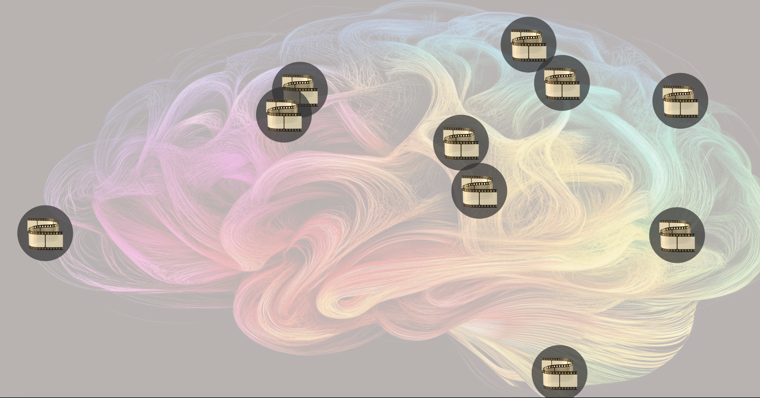
The final design:
How It Works
The Mind Palace starts with a simple instruction screen. Once the user clicks to begin, memories, represented as floating film icons (often associated with memories), gently drift across the screen.
The user interacts using just their index finger, tracked by the webcam. Initially, I had a gesture (open palm) to reveal a memory, but after feedback in class, I realized it felt a bit unituitive. So I simplified it, now just hovering over a memory for 2 seconds reveals it. It made the interaction smoother and avoided asking users to remember too many gestures.
Once a memory is revealed and the user has had a chance to read it, they can discard it using a thumbs-down gesture. I have made sure that users can’t just hover over and directly discard a memory without it being revealed, because then users will just be discarding random memories. To make the gesture recognition more robust and avoid accidental deletion, I also made sure users had to hold the thumbs-down gesture for a second, so it wouldn’t trigger accidentally.
For resetting the experience, I originally thought about using an “OK” gesture, like saying “I’m done.” But since reset is a pretty major action, and misfires could be annoying, I decided to keep it simple: users just press the Escape key. It also felt kind of full circle, like they press a button to enter and a key to exit. I focused on keeping things intuitive and reflective. I meant to give the user space to engage with each memory calmly, without rushing.
Each memory is intentionally ambiguous. For example: “The last message I never replied to”
This could evoke very different emotions depending on the person engaging with it. For some, it might feel empowering, a sign of setting boundaries, moving on, or finally letting go of something that no longer serves them. For others, it might bring up guilt, anxiety, or a lingering sense of “what if.” That’s the heart of the project: recognizing that memories aren’t fixed in meaning. What feels like healing to one person might feel like avoidance to another. By keeping the memories vague yet emotionally charged, I encourage reflection, allowing each user to project their own story onto them.
I’m especially proud of implementing gesture recognition. It’s something I’d seen at IM showcases before, but I didn’t think I’d be able to do it myself. Understanding hand landmarks and translating them into reliable, smooth gestures took time, but I managed to make it functional and fairly intuitive. Here’s the core gesture logic I used:
function isThumbsDown(landmarks) {
  const thumbTip = landmarks[4];
  const wrist = landmarks[0];
  return (
    thumbTip.y > wrist.y &&
    !isFingerUp(landmarks, 8) &&
    !isFingerUp(landmarks, 12) &&
    !isFingerUp(landmarks, 16) &&
    !isFingerUp(landmarks, 20)
  );
}

function isFingerUp(landmarks, tipIndex) {
  const midIndex = tipIndex - 2;
  return (landmarks[midIndex].y - landmarks[tipIndex].y) > 0.05;
}
I also made some simple but thoughtful design choices like placing the webcam feed at the top so users can always see if they’re in frame. That helped during testing and made the interaction clearer.
Challenges and Improvements
Gesture recognition was a big concern for me. It’s surprisingly tricky to get right, too strict, and gestures feel frustrating to perform (and even to code); too loose, and false positives ruin the experience. One major challenge was simply understanding the hand landmark system, there are 21 tracked points per hand, and it took a while to learn which ones corresponded to each finger joint and how to use them meaningfully in gesture logic.
At first, I tried more complex calculations for gestures, but it quickly stopped feeling intuitive. Users had to “perform” gestures perfectly, and the experience lost its flow. Now I’ve simplified it: instead of complicated checks, I just use the thumb and index finger landmarks in straightforward ways, plus a timing delay. For example, the thumbs-down gesture only triggers if it’s held for one full second. This makes it much harder for it to fire accidentally while still keeping the interaction easy and natural for users.
Another improvement would be adding variety, either by generating new memory phrases dynamically or letting users add their own. Right now, the memory list is static. Adding this level of customization could make each user’s Mind Palace feel more personal. I also think sound effects tied to each gesture (reveal, discard, reset) would enhance immersion and make the interactions feel more responsive.